(You may want to maximize your window to see the solution more clearly.)
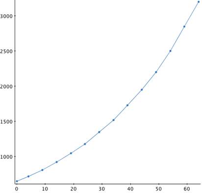
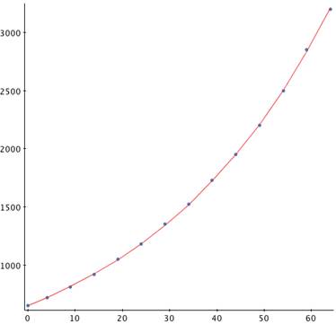
Plotting the data, it does appear to grow exponentially.
In the graph below, the x-axis is relative to the first year, 1946
(that is, 1946 is the 0 value on the x-axis), and the y-axis is the
population in millions.
Construct a table of differences, where
| Difference in Years |
Difference in Populations |
Rate of Change (Column 2/Column 1) |
Relative Rate of Change (Column 3/Column 2) |
|---|---|---|---|
| 4 | 70 | 17.5 | 0.0243 |
| 5 | 90 | 18 | 0.0222 |
| 5 | 110 | 22 | 0.0239 |
| 5 | 130 | 26 | 0.0248 |
| 5 | 130 | 26 | 0.0220 |
| 5 | 170 | 34 | 0.0252 |
| 5 | 170 | 34 | 0.0224 |
| 5 | 210 | 42 | 0.0243 |
| 5 | 220 | 44 | 0.0226 |
| 5 | 250 | 50 | 0.0227 |
| 5 | 300 | 60 | 0.0240 |
| 5 | 350 | 70 | 0.0246 |
| 5 | 350 | 70 | 0.0219 |
The values in the fourth column are our estimates of the time constant for the rate of growth. Averaging these gives k = 0.0234. Thus, our population exponential model is
![]()
In the graph below, the x-axis is relative to the first year, 1946
(that is, 1946 is the 0 value on the x-axis), and the y-axis is the
population in millions.
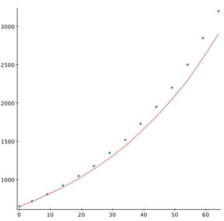
Although the graphs are close together at first, the error increases with larger time values. Instead, plot the natural log of the population against time (log-plot):
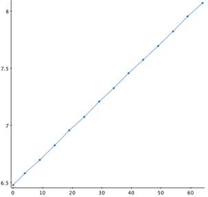
In the graph above, the x-axis is relative to the first year, 1946
(that is, 1946 is the 0 value on the x-axis), and the y-axis is the
(natural) log of the population in millions.
As expected for an exponential model, this graph is almost linear (note the occasional bends). Thus, calculate a least square linear fit (linear regression) to the data. The following was done using the Excel Analysis ToolPak:
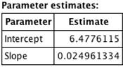
which gives a model of:
![]()
Plotting this model against our data gives the result in the graph below.
Graph of the Exponential Growth Model
Against the Data, 0.02496
In the graph above, the x-axis is relative to the first year, 1946
(that is, 1946 is the 0 value on the x-axis), and the y-axis is the
population in millions.
You can see that plotting the natural log of the population against time gives a much better fit to the data. Using this growth constant (k = 0.02496), we can predict the population in 2050 (or t = 104, because 1946 is "year 0").
![]()
This is in hundred-thousands of Duemans, so the projected population is approximately 871,510,000 (that is, almost a billion Duemans!).