Many MRKT courses require you to submit projects in PowerPoint. The development of this skill is one of the MRKT program intended learning outcomes. The tips here, along with the many useful tools you can find online (some of which are listed below, in the Webliography), will help you present your best work.
With the help of this guide, you will soon find developing PowerPoint presentations easier than writing a paper!
Mastering the art of organizing your thoughts, culling the most important information from your sources, and presenting the information in a clear way will help you stand out and succeed throughout your professional life.
In reviewing this guide, be sure to check out the examples in the Do This, Not That section. These will be either a refresher of points you've already learned or a tutorial for getting started in PowerPoint.
If you'd like more information, either on making or on presenting a PowerPoint project, check out the resources in the Webliography section.
Why do I have to prepare my final project in this marketing class as a PowerPoint
presentation?
Business no longer communicates in long documents, no matter how well-written. This reality is captured
in the MRKT program outcomes, which identify those skills you will learn "here" that you will use "out
there" as a marketing professional, where time is money, people are busy, and bosses demand just the facts. This
project will give you first-time or ongoing experience in selling your ideas using the software employed in business.
What if I don't own PowerPoint software?
Some form of presentation software is included when you buy a computer these days, and if you don't have PowerPoint or similar software, you may want to consider purchasing it. Don't forget to check out the UMUC student discounts on software products:
You can also find free alternatives to PowerPoint online.
If you elect to not obtain PowerPoint or similar software, and you don't have access to it via family, friends, the public library, or a UMUC computer lab, you can construct a presentation in Word or another word-processing software application; however, it will be much more difficult without the slide formats provided by PowerPoint.
Be sure to discuss this with your instructor to make sure that he or she will be able to receive and open your marketing project in the format in which you submit it. Talk with your instructor early in the semester so that there are no issues regarding your submitting your project on time.
I'm a good writer, but I'm not very visual. Can't I just type a paper onto the PowerPoint slides?
Frankly, that would defeat the whole purpose of using PowerPoint. Full-length sentences should be avoided at all cost! PowerPoint presentations don't need to be overly creative—you should use graphics only to enhance your points, not to replace them. So don't fear, there is nothing fancy you need to include in your slides that you can't easily insert from a template or online source.
I'm trying, but how do I know if I'm on the right track?
Your instructor should have offered to review your preliminary slides and give you feedback before you got too far into your project. If not, be sure to ask for his or her assistance.
Are we going to be graded on the format of our PowerPoints?
Your grade will be based partly on your ability to communicate ideas and information. In this sense, yes, how you prepare your PowerPoint will be part of your grade. Check out the project's grading rubric in your syllabus to find out how much of your grade will be assessed based on the format.
Am I going to have to present my PowerPoint in class?
Maybe. If your class has face-to-face meetings, oral presentations are an option your instructor may have included in the syllabus. Oral presentations are a little harder in online courses, so, unless you receive information to the contrary, assume that everything you will cover should appear on the slides and will not be presented orally.
Here are the four Cs of effective PowerPoint presentations:
clear—Is your presentation organized?
concise—Does your presentation avoid extraneous information?
clean—Is your presentation easy to read?
comprehensive—Does your presentation include everything that should be covered or evaluated?
We will discuss the four Cs below.
1. Clear
Your PowerPoint is a road map for a possible oral presentation. Make sure you and your audience can follow along by doing the following:
Begin your presentation with an introductory title slide, including your name and the date of the presentation.
Include an index of the other slides and their corresponding slide numbers, similar to a table of contents, on the slide following your title slide.
Give each slide a title or subtitle (that matches with the ones in your index) so that your audience knows where you are in your presentation.
Number your slides using the slide number function in the Insert menu on your PowerPoint menu bar.
Don't get too fancy with your numbering system (e.g., A.2.c.iii). Stick with two levels at maximum (e.g., 1.a). Use any topic numbers given in the project description in your syllabus as a guide.
Select the best words to make your point.
Avoid ambiguity.
Avoid excessive jargon.
Pay attention to aesthetics! Slides should not be dull. Remember, you want your audience (including your instructor) to stay awake.
2. Concise
Your PowerPoint presentation should enable your audience to understand the points you are making. The presentation should thus not drift into irrelevant or extraneous material. This means that the KISS principle applies (keep it simple, silly).
If you will also be giving an oral presentation, prepare it ahead of time and decide carefully on what you will say to supplement your slides. The audience will want to pay more attention to you than to the PowerPoint.
The following tips will help you apply KISS in your slides:
Address only the topic required in each part of the presentation.
Use bullet points, not sentences. Bullet points generally begin with a verb, not a noun.
Use tables and charts to communicate data that would take too many bullets to explain.
Only insert other visual elements, such as links to YouTube videos or a company website, if they add to your main point.
Be sure to check your links before submitting the presentation to your instructor.
Include in your slide the source of the link and the reason why the link should be followed.
Use endnotes, not footnotes, for your bibliographic references.
Reference only those sources you used for your presentation, not all the sources you found while
conducting research.
3. Clean
Your PowerPoint presentation, just like any other presentation or assignment, reflects both you and the work you've done. Here's how to make it polished and presentable:
Don't overload your slides with too much text, graphics, or data.
Add extra slides at the end in an appendix for supplemental information that substantiates your ideas, but that would detract from them if placed
in the main presentation.
Let graphics such as charts, logos, and graphs make your point if they can. A picture can tell a thousand words.
Use other simple visuals to support your key points.
Select a clean slide format. The slide format should have contrast, but not so much that it will be visually tiring to the audience.
Avoid white backgrounds.
Use the same slide theme throughout the presentation.
Use an easy-to-read font:
OVERALL: Times New Roman and Verdana, Arial, and other sans serif fonts are usually effective. Avoid "script"
fonts, which are difficult to read.
TITLE SLIDE: 44-point font, bold
SUBTITLE SLIDES: 28–34-point font
TEXT: no less than 12-point font
Edit your slides. Are there points you can eliminate or tighten? Any typos?
4. Comprehensive
Review your final presentation to make sure that it includes all key information. Cross-referencing with the grading
rubric is a good idea to ensure that your work is comprehensive and that you have given yourself the best chance to earn maximum points.
Resist the urge to do a "brain dump." It won't impress your instructor if you include everything you found out about or thought regarding the topic.
Make every bullet point relevant to your thesis.
Don't duplicate your points. Say it once—say it right.
Don't add graphics just because you can. If a graphic element does not speak to the topic, do not include it.
If you want to add supplemental information, do so in an appendix. Be sure to reference it on the appropriate slide, telling your audience
why the information may be beneficial.
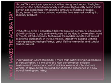
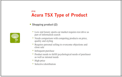
The slide covers three different topics: description of product, type of product, and life cycle
stage.
The headline and third bullet point look as if they were lifted from some sales materials, and, aside from that, they are not in quote marks or cited.
The text is hard to read, with white type on a dark background and a vertical title that you have to strain your eyes to make out.
The bullet points are paragraphs rather than short, concise statements.
How could you improve this slide?
Use three slides to clearly cover the three topics.
Relate what you are evaluating to the concepts you are covering from the course materials.
Provide clarity by using the numbering system from the project description in the syllabus.
Use colors and fonts that are easier to read.
Use your bullets to make concise points (the bullet points here do not function the way bullet points used in PowerPoints and other documents should).
Provide links to product information not critical to the points you are making (or include this information in an appendix) so that the audience can view it if inclined.
Include quotes, citations, and references if needed and use endnote numbering
for the references.
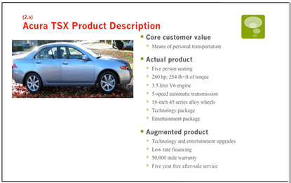
Here are some slides on the same subject that are much more visually and textually appealing:
Photo source for slide 1: Wyzik, 2003, Flickr. Used with permission under the terms of the Creative Commons
Attribution 2.0 Generic license.
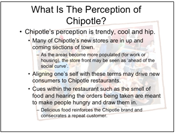
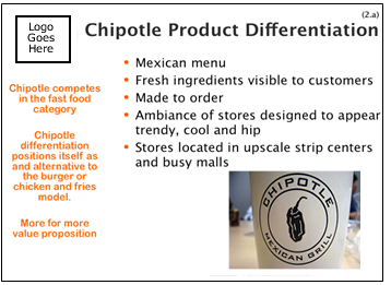
Example 2
What's wrong with this slide?
The graphic in background makes the text hard to read.
The points are written in complete sentences, taking up too much space.
There is no substantiation for the "facts" presented.
The wording is inaccurate: perception should really be positioning concept.
How could you improve this slide?
Make the slide cleaner with the use of white space.
Make the separate components of the slide visually distinct:
for example, do as shown in the slide below—in the left-hand column, provide your conclusions on the product differentiation.
In the right-hand column, provide evidence for your conclusions.
Use the logo, which should appear on every slide pertaining to a company or product (you don't need
to obtain permission from the corporation to use the logo, so long as it is used solely for the purposes of
the assignment).
Use graphics to reinforce your points.
Here is a slide on the same subject that is much more visually and textually appealing:
Photo source: sun dazed, 2008, Flickr. Used with permission under the terms of the Creative Commons
Attribution–ShareAlike 2.0 Generic license.
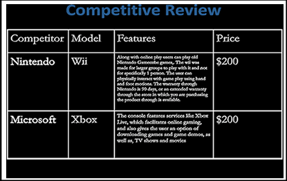
Example 3
What's wrong with this slide?
The background color makes the text hard to read.
The title does not include the name of the product—the subject of the presentation.
The slide does not compare the product that is the subject of the presentation with the competitors listed.
The Features column is too wordy.
The slide does not include any analysis of the table.
How could you improve this slide?
You will sometimes need to put forth a fair amount of information, if you aren't
orally presenting. In a case like this, you could consider using two
slides: one with data, and one with conclusions. The slide below shows a way to incorporate all of this information on one slide.
Don't forget to endnote your references. In this case, the information came from
the Best Buy website, which is not listed as a source.
Here is a slide on the same subject that is much more visually and textually appealing:
There are also numerous videos online on how to and how NOT to use presentation software. Try searching for some, and share
the best ones with your class in a conference.
UMUC PowerPoint workshops presented by David Taylor:
This site provides guidance on many types of business communications. These include stockholder communications, government communications,
and other communications illustrated in case studies.
UMUC also offers highly effective writing courses. WRTG 391 and WRTG 391X are
technical writing courses that can be used for upper-level credit. WRTG 394 is an advanced course in
business writing. Do not delay taking these courses; students find them very helpful!
This classic treatise offers entertaining, well-written guidance on concise writing. William Strunk wrote it in 1918; see below for the updated version of the guide by Strunk and E. B. White.
This organization has chapters worldwide and an excellent public speaking program.
UMUC offers courses in speech, including SPCH 397, on presentations, and SPCH
424, on complex organizational communications. These can be taken as electives.
Books to Consider
Effective Writing, 9/e
May, Clare & May, Gordon
2011 | Prentice Hall |
ISBN-10: 0132567245 | ISBN-13: 978-0132567244
Pocket Guide to APA Style, 4/e
Perrin, Robert
2008 | Wadsworth Publishing
ISBN-10: 0547201931 | ISBN-13: 978-0547201931
The Elements of Style, 4/e
Strunk, William & White, E. B.
1999 | Longman
ISBN-10: 020530902X | ISBN-13: 978-0205309023
sun dazed (Katy Warner). (2008). Chipotle cup [Photograph]. Retrieved October 14, 2011, from http://www.flickr.com/photos/sundazed/2989655099/sizes/s/in/photostream/. Used with permission under the terms of the Creative Commons Attribution–ShareAlike 2.0 Generic license.
Wyzik, C. (2003). 2004 Acura TSX [Photograph]. Retrieved October 14, 2011, from http://www.flickr.com/photos/wyzik/155629463/in/photostream/. Used with permission under the terms of the Creative Commons Attribution 2.0 Generic license.