Page 1
Lesson 1: A Meteorologist's Toolbox
You might be used to the idea of a carpenter or "handy" person carrying a toolbox containing all the tools he or she needs to complete a job. But, in reality, all people use various tools all the time, and in this lesson, we're going to focus on the tools that meteorologists use. Of course, meteorologists aren't using hammers and screwdrivers to understand the world around them, so we need to think more generally about tools. In general, a tool is something that makes a particular task easier. Think about it. Everything that you use to make something easier is a tool. When you clean your teeth, you use a tool (a toothbrush). When you communicate with someone, you often use some sort of tool (perhaps a cell phone). When you want to collect and analyze information, you use tools (perhaps computer software). Indeed, you are surrounded by a multitude of tools that you use without even thinking about it!
Of course, also knowing how to use tools is extremely important. Think back to the last time you got a new cell phone or some other device made to make your life easier. There's a good chance that it didn't make your life easier right away. In fact, until you became familiar with the new tool, it often took longer than the "old" way of doing things. But, once you integrate a new tool into your life, you can't imagine life without it! This is typical of all tools: you must know what the tool does, how to use it, and actually get comfortable using it. Only then can you realize the power of the tool itself. Alas, the only way to get comfortable with using a certain tool is to actually use it.
So, what's all this talk about tools have to do with meteorology? Well, Lesson 1 is all about the tools that meteorologists use to understand the world around them. We'll start off examining such tools as map projections, universal time, temperature scales, and mathematical tools such as climate statistics. Then we'll move on to tools that deal with the analysis of meteorological data, in both time and space. Remember, these tools exist to make understanding meteorology easier (you need to learn them well). And, as with all tools, you not only need to learn about them, but you also need to practice using them. That is the only way to make these tools work for you.
Before we get started the tools in a meteorologist's toolbox, however, since this course is an introduction to meteorology, it's probably a good idea to define exactly what meteorology is (and identify the types of things that meteorologists study). Let's get started!
By the time you are finished reading this page, you should be able to define meteorology, and identify common applications of meteorology.
We can't really begin studying meteorology if we don't know what it is first! For starters, let me tell you what meteorology is not. It is not the study of meteors (small rocks and metallic objects) flying through outer space. Perhaps you already knew that, but believe it or not, I've encountered a number of people who have that notion. Meteorology is not the study of meteors, so if you had that misconception coming into the course, erase it from your mind!
So, what is meteorology? You're probably most familiar with meteorology as the study of the science of weather and weather forecasting. Indeed, understanding various aspects of the weather will be our focus for much of this course. But, meteorology isn't just about the weather forecast. More broadly, meteorology is the study of the physics and chemistry of Earth's atmosphere, including its interactions with Earth's surface (both land and water). In short, meteorologists want to completely understand how Earth's atmosphere works (and often use that knowledge for future predictions). That means meteorologists need to know about the composition, structure, and air motions within the atmosphere.
In case it wasn't clear from the definition above, there's a lot of physics and chemistry in meteorology! If you were pursuing an undergraduate degree in meteorology, your course schedule would be filled with courses in calculus, differential equations, and calculus-based physics courses (dynamics, thermodynamics, energy transfer, etc.). In this course, I'm going to do my best to spare you the gory details whenever I can so that you can walk away with a practical understanding of common weather events, and better consume the large variety of weather information available. Don't worry: there won't be any complex math (just a little arithmetic here and there).
How do meteorologists apply their knowledge of the atmosphere? The list below provides some common applications of meteorology (it's far from exhaustive, but it will give you an idea of the types of things meteorologists are involved in):
Meteorologists work in these areas in academia, public-sector (government), and private sector (business) settings. You might be surprised at some of the companies and organizations that have meteorologists on staff or use various meteorological services! In this course, our focus is mainly going to be on weather analysis and forecasting (although we'll touch on a few other areas, too). After all, the weather impacts everyone, in some way, every single day.
Since meteorologists are so interested in the atmosphere, we need to start off by finding out what the atmosphere is "made of." Read on.
When you've finished this page, you should be able to discuss the composition of the atmosphere, including identifying which gases are most and least abundant, and which gases have permanent versus variable (changing) concentrations.
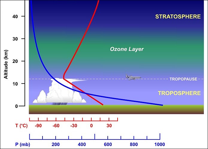
Why is there a picture of apple slices on this page, and what does it have to do with the composition of the atmosphere? I'm going to use it as an analogy to help us get a feeling for the size of Earth's atmosphere. If you imagine that the fruit inside the apple skin is akin to Earth, it turns out that the thickness of Earth's atmosphere can be likened to the thickness of the skin of an apple.
To put some numbers to this analogy, imagine an average sized apple with a radius of 40 millimeters (a little more than 1.5 inches). The skin has a thickness of about 0.3 millimeters (about 0.1 inches), which is 0.75 percent of the apple's radius. Now, our atmosphere has no definite upper boundary, but nearly all of the mass of the atmosphere lies below an altitude of 50 kilometers (a little more than 30 miles above Earth's surface). So, if we use 50 kilometers to compare with the average radius of Earth (6,368 kilometers), the thickness of our atmosphere is about 0.8 percent of the radius of Earth.
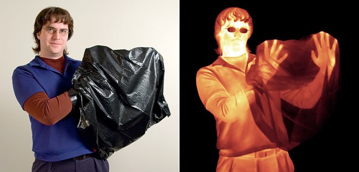
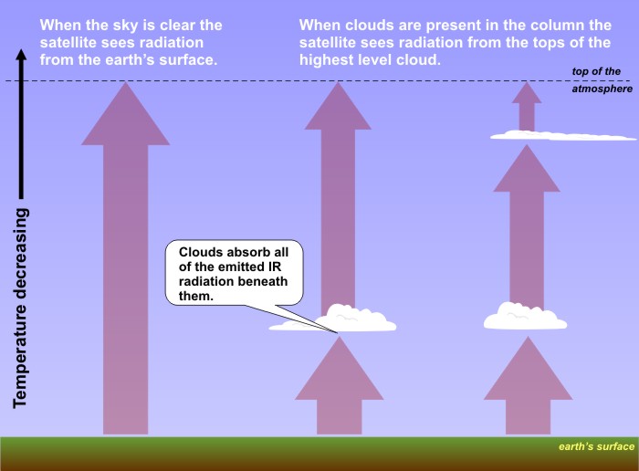
What does that all mean? Well, the atmosphere is actually quite thin (when you compare it to the size of the earth) even though it seems so vast to us standing on the ground. This high-resolution view of Earth and its atmosphere [9] shows the thin atmosphere surrounding our planet, just as the skin of an apple surrounds the fruit inside.
What is the atmosphere made of? Obviously, the air we breathe is critical for our survival, but it's actually a mixture of many different types of molecules. Some of the gases are "permanent," meaning that their concentrations are basically constant. Other gases are "variable," meaning that their concentrations vary from time to time and place to place. I've summarized the gases that comprise our atmosphere and their concentrations in the table below:
Permanent Gases | Variable Gases | ||
---|---|---|---|
Gas (Symbol) | Percent (by volume of dry air) | Gas (Symbol) | Percent (by volume) |
Nitrogen (N2) | 78.08 | Water Vapor (H2O) | 0 to 4 |
Oxygen (O2) | 20.95 | Carbon Dioxide (CO2) | about 0.041 |
Argon (Ar) | 0.93 | Methane (CH4) | about 0.00018 |
Neon (Ne) | 0.0018 | Nitrous Oxide (N2O) | about 0.00003 |
What should you take away from this table? First of all, even though we need to breathe oxygen to survive, oxygen is not the most abundant gas in the atmosphere. Nitrogen is, by far. There's nearly four times as much nitrogen as there is oxygen! However, nitrogen and oxygen, combined, account for roughly 99 percent of "dry air" in the atmosphere, so they're the "big two" in terms of total concentration.
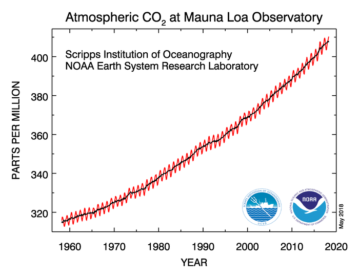
Of course, air isn't perfectly "dry." Water vapor also exists in our atmosphere, but note that the concentration of water vapor is rather small and is variable (it varies from 0 to 4 percent). Furthermore, while you might hear a lot about carbon dioxide in the news because of its connection to climate change, it only accounts for about 0.041 percent of the atmosphere. In other words, carbon dioxide accounts for a little more than 400 molecules out of every million molecules in the atmosphere. Surprised? That doesn't mean carbon dioxide is an insignificant gas, however. Indeed, it's a very important gas for reasons we'll cover later on.
With a little background about meteorology and the atmosphere out of the way, now we're going to start filling our meteorologist's toolbox. For starters, since weather occurs all over the globe constantly, meteorologists must have a handle on time zones and time conversions in order to interpret data and communicate it correctly. Therefore, it's time to talk about time in the next section.
It's critical that you understand universal time conventions and be able to convert between universal time (aka UTC, GMT, or Z-time) and local time zones within the United States. You will use this skill throughout the course, so make sure you are comfortable making such conversions before moving on.
"Does anybody really know what time it is? Does anybody really care...?"
Those words come from this section's theme song--"Does Anybody Really Know What Time It Is" by Chicago [10] (that's right, this section has a theme song). Well, I can tell you that meteorologists must know what time it is, and they definitely care about time. Weather is a global phenomenon, and since our world is sliced into individual time zones, meteorologists need a universal standard to keep it all straight.
That standard is Greenwich Mean Time (GMT). "Greenwich" refers to the English village of Greenwich, a borough of London, through which the Prime Meridian [11] (zero degrees longitude) passes. The advantage of adhering to one time standard is that observers all over the world can record weather conditions in Greenwich time. Such a universal time system is indispensable for synchronizing when weather observations are collected. If observers worldwide were to record observations in local time, then interpretation would become much more complicated and confusing. Ultimately, it's important to remember that GMT is a time zone, just like any other. It just happens to be the time zone at Greenwich, England, along the Prime Meridian.
GMT goes by a couple of other aliases--"Zulu time" (often shortened to Z-time), or UTC (Coordinated Universal Time). "Zulu" is a funny sounding name, but it's the U.S. Navy's and our civil aviation's version of GMT. The bottom line is that if you see time expressed as GMT, Z-time, or UTC, they're all referring to the same thing--the time in Greenwich, England. Most often, we'll use UTC or Z-time in this course. Meteorologists universally use this time to synchronize the times of weather observations and forecasts, so it's important for us to be able to convert from UTC to other local time zones, as well as from other local time zones to UTC.
You can convert to Local Time at any location by referring to a map of world time zones [12] (zones are labeled along the bottom of the map). That's a pretty "busy" map, so let's streamline our discussion a bit. Focus your attention on the map of standard time zones for a large portion of the Western Hemisphere (shown below). Further note that each time zone is labeled with its corresponding time difference from Greenwich, England (expressed in hours UTC). How does this map work?
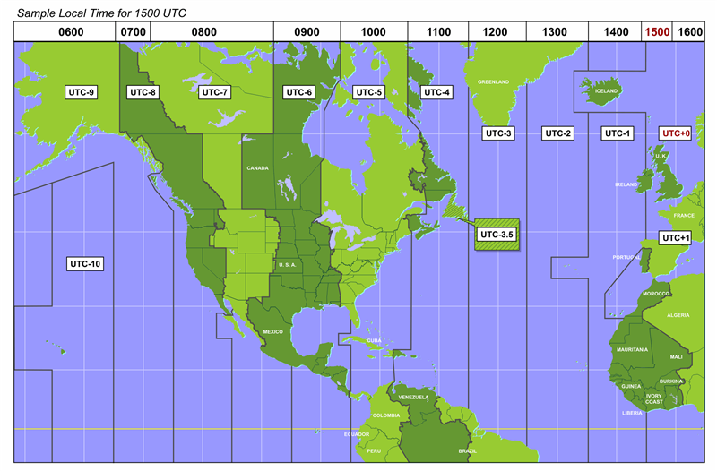
First, we're using the military's 24-hour clock system [14]. For this system, 0000 hours ("zero hundred hours") corresponds to local midnight, and 1200 hours ("12 hundred hours") represents local noon. Okay, let’s assume that it’s 1500 hours in Greenwich (alternatively, 15 UTC, 15Z or 15 GMT...take your pick!). On a 12-hour clock, the local time in Greenwich would be 3 P.M. At any rate, you can see, across the top of the colorful map above, the corresponding local times for each of the represented time zones. For example, at 15 UTC (1500 hours in Greenwich), it’s 1000 hours (10 A.M.) local time in the eastern United States (Eastern Standard Time is UTC - 5 hours), and 0600 hours (6 A.M.) local time in Alaska (Alaska Standard Time is UTC - 9 hours).
On the flip side, if you lived in Chicago, Illinois and it was 9 A.M. local time (0900 hours), and you wanted to convert to UTC, you would simply add 6 hours because Central Standard Time (where Chicago is located) is 6 hours behind UTC. So, 0900 hours + 6 hours = 1500 hours, or 15 GMT (or 15 UTC or 15Z).
Ultimately, converting from UTC to local time (or the other way) is really no different than figuring out what time it is in California if you live in, say, New York. If it's 5 P.M. local time in New York, we have to subtract 3 hours to get the local time on the West Coast in California, so we know its 2 P.M. local time in California. Converting to or from UTC is no different: It's just addition or subtraction. You have to figure out how many hours difference there is between whatever location you're interested in and UTC.
Many of the time-zone boundaries are parallel to longitude lines, although, for convenience, there are several exceptions (Alaska, for example). Each time zone spans approximately 15 degrees of longitude, which is the longitudinal distance that the Earth rotates in one hour. Of course, you must adjust for Daylight Saving Time [15] during the warmer months (from the second Sunday in March to the first Sunday in November in the United States). While 15 UTC corresponds to 10 A.M. Eastern Standard Time (EST) in New York City, from early March to early November it's 11 A.M. Eastern Daylight Time (EDT) in the New York (Eastern Daylight Time is 4 hours behind GMT). So, when Daylight Saving Time is in effect, the difference between GMT and time zones in the U.S. is one hour less than what's indicated on the map above. By the way, it is bad form to say "Daylight Savings Time." Save yourself the trouble, and don't put the "s" on the end of "saving."
Please note that the International Date Line [16] zig-zags across the Pacific Ocean in an attempt not to inconvenience local time keeping (traveling westward across the date line results in the calendar advancing one day). For convenience, the abrupt zig-zag in the International Date Line south of Siberia allows Alaska's long Aleutian Island chain to be in the same time zone as the rest of the state (Alaska Standard Time, AST, is 9 hours behind UTC).
Now that you know how time conversions work, the best way to really get comfortable with knowing what time it is anywhere in the world is to do some practicing. Make sure to spend some time on the Key Skill questions and the Quiz Yourself tool below.
Time conversions are one of the most basic and important early skills that you must learn in this course. You must understand the concept of UTC and know how to convert it to a location's local time (as well as convert a location's local time back to UTC). You really need to know this, because this time convention is going to show up over and over again throughout the semester (not to mention on quizzes and lab assignments).
Here are a few examples for you to try (you'll likely need to refer to the map of time zones above)...
Example #1:
Say that it starts raining at your house in Denver, Colorado, and the time is 20Z on June 23. What was the local time in Denver when the rain started?
You pull up a weather map on your favorite smartphone app at 10:35 P.M. local time on December 18 in New York, NY. What time stamp would be on this image if it was expressed in Z-time?
Example #3:
You're vacationing on big island of Hawaii, and your plane lands at 03Z on January 3. What local time is this (in Hilo, Hawaii)?
Think you understand how to convert between local time and "Z-time"? Take this self-quiz below to see how you do. Select whether you want to practice converting local time to GMT or GMT to local time (or "Either"). Then hit the "Quiz me" button. Use the provided drop-down menus to fill in the missing time and date. Click "Submit" to check your answer. Good luck! If you've got the hang of it, you should be able to get the correct answer each time!
When you finish this page, you should be able to discuss temperature, dew point, visibility and their units of measurement. You should also be able to identify and interpret temperature, dew point, visibility, and present weather (obstructions to visibility) on a station model.
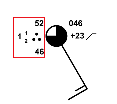
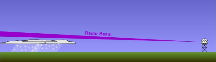
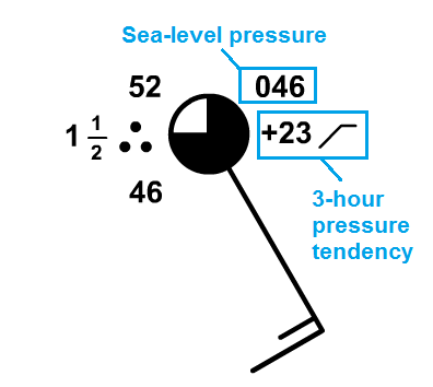
For meteorologists, the first step in studying the atmosphere is making observations. Commonly, meteorologists display these observations in something called a station model (check out the example on the right), which is a graphical template showing current weather conditions at a weather station (often located at an airport). Over the next couple of sections, I'm going to introduce you to the key variables displayed on the station model and show you how to interpret one. On this page, we're going to focus on temperature, dew point, visibility, and "present weather" (obstructions to visibility), which I've put in a red box in the station model on the right.
I'll briefly discuss each variable (what it is and its common units of measurement), and then I'll discuss how you can interpret each one on a station model. Let's start with something I'm sure you're familiar with--temperature.
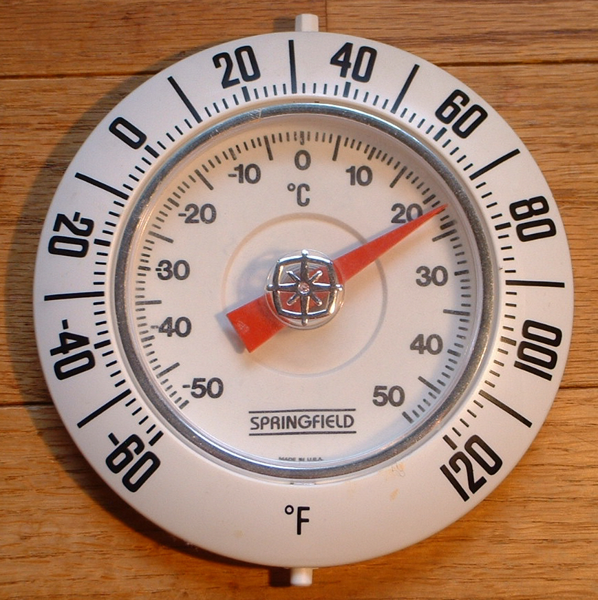
Temperature: While you probably think of temperature as "how hot or cold something is," that's a pretty ambiguous definition (since "hot" and "cold" are somewhat subjective). More precisely, temperature is a measure of energy. You see, air molecules are restless little lumps of matter, continually vibrating, wriggling and bumping into their many neighbors. As air temperature increases, the molecular dance becomes increasingly frenetic. At a temperature of 72 degrees Fahrenheit, the average speed of air molecules is about 1,000 miles an hour, which translates into ample kinetic energy (energy of motion). Thus, air temperature is a measure of the average kinetic energy of air molecules.
In the United States, we typically express temperature using the Fahrenheit temperature scale [17], but most countries in the world use the Celsius temperature scale [18] (undoubtedly, you've heard temperature expressed in "degrees Fahrenheit" or "degrees Celsius" before). By the way, if you ever need to convert between the two scales, the National Weather Service temperature conversion calculator [19] is great!
To give you some weather context, the North American all-time marks for highest and lowest temperatures are, respectively, 134 degrees Fahrenheit (56.7 degrees Celsius) in California's Death Valley, and minus 81.4 degrees Fahrenheit (minus 63 degrees Celsius) at the village of Snag in the Yukon Territory of Canada. You may also be familiar with some (non-weather) common temperature markers:
There are other temperature scales besides Celsius and Fahrenheit. For example, there's the Kelvin scale [20] (sometimes called the "absolute temperature scale"). Please note that the number of kelvins = the number of degrees Celsius + 273.15. So, the melting point of water is 273.15 kelvins and the boiling point of water, at standard pressure, is 373.15 kelvins. For the record, it's bad form to say "degrees kelvin." Indeed, the proper way to express the units of absolute temperature is simply "kelvins." The Kelvin scale is used commonly in the physical sciences, and in fact it's the most direct way to describe the relationship between the average speed of air molecules and their temperature (higher temperatures = faster average molecule speeds).
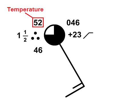
On a station model, reading the temperature is pretty easy. The number located in the upper-left corner of the model is the station temperature expressed in degrees Fahrenheit (or Celsius, depending on the country of origin). In the case of the station model on the right, the temperature is 52 degrees Fahrenheit. Unless otherwise indicated, you can assume in this course that we're using degrees Fahrenheit on the station model.
Dew Point: By definition, the dew point is the approximate temperature to which the water vapor (the gaseous form of water) in the air must be cooled (at constant pressure) in order for it to condense into liquid water drops. We're going to talk a lot more about dew point later on, but for now, focus on the fact that dew point is a temperature, so it's typically expressed in degrees Fahrenheit or Celsius.
As it turns out, the dew point temperature is also an absolute measure of the amount of water vapor present. The higher the concentration of water vapor, the higher the dew point, and as such, the dew point affects the way the air “feels” – whether it be dry or muggy. Since our skin temperature is regulated to some degree by evaporation of sweat, it would be logical that we would be affected to some degree by the dew point temperature. Certainly, describing how something “feels” can be a bit dicey in a science course because it’s a somewhat subjective topic, but examine the table below for a rough guide on how the air might “feel” based on dew point temperature.
Dew Point | General level of comfort |
---|---|
60 degrees | For most people, the air starts to feel a tad "muggy" or "sticky." |
65 degrees | The air starts to feel "muggy" or "sticky." |
70 degrees | The air is sultry and tropical and generally uncomfortable. |
75 degrees or higher | The air is oppressive and stifling. |
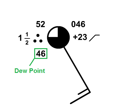
Finding the dew point on a station model is also pretty easy. The number located in the lower-left corner of the model is the station dew point in degrees Fahrenheit (or Celsius depending on the country of origin). In the case of the station model on the right, the temperature is 46 degrees Fahrenheit.
Visibility and Present Weather: I'm going to cover these two observations together since they're highly related. Meteorologists are very interested in the horizontal visibility (essentially, how far you can see) because it has major implications for transportation. If visibility is very low, conditions can be quite hazardous for drivers or landing aircraft!
Horizontal visibility can run the gamut. On a perfectly clear day, you can't see forever, but visibility can reach approximately 100 miles in the mountainous western U.S. On the other hand, visibility can lower to near zero in heavy, "pea-soup" fog [21], fierce blowing and/or falling snow [22], blowing sand/dust [23], smoke [24], etc. On a station model, the visibility is expressed in miles in the United States (you can assume we're using miles in this course, unless noted otherwise), and is located below and to the left of the temperature.
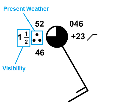
On the annotated station model to the right, I've labeled the visibility (1 1/2 miles, in this case). Please note, however, that if visibility is not greatly reduced, it is often omitted from the station model. However, if visibility is reduced to seven miles or less, the offending obstruction to visibility ("present weather") is also included in the station model, immediately to the right of the visibility and just below the temperature. While there are many, many possible symbols, here are the most commonly used symbols for present weather [25]. In the sample station model to the right, the three "dots" indicate that moderate rain was the culprit, reducing visibility to one-and-a-half miles.
Because of the varying degrees that precipitation can reduce horizontal visibility, the qualifiers of light, moderate, or heavy are added (such as "light rain" or "heavy snow"). I should also note that if precipitation is falling, it is always reported on the station model, no matter how light or how little it affects visibility. But, as I mentioned before, non-precipitating obstructions to visibility (fog, haze, and smoke are perhaps the most common) are only reported in the station model when visibility drops to seven miles or less.
Ultimately, while you don't need to memorize every single symbol for present weather, you should spend some time familiarizing yourself with the common ones, and you should certainly memorize the location of temperature, dew point, visibility, and present weather on the station model. To help you get started, take some time to examine the Key Skill box below.
Below in an interactive station model that allows you to input your own data, and the station model will adjust so you can see how it looks. The tool includes some parts of the station model that we haven't talked about yet, but for now, focus on changing the temperature, dew point, visibility, and obstruction to visibility (present weather) to see how the station model changes. This will help you cement where each of these is located on the station model, and help you become familiar with the common symbols for present weather.
You can also look at the most current surface observations [26] and you should be able to pick out the temperature and dew point at each station (many may not have visibility or present weather plotted).
Page 5
When you finish this page, you should be able to:
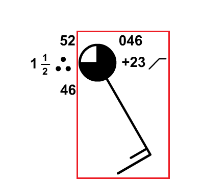
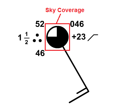
We're going to continue tackling the information contained in the station model, and now we're going to turn our attention to cloud coverage and wind direction and speed. I've outlined the part of the station model that includes this information in the sample on the right, but note that the station model also includes information about air pressure, which we'll mostly ignore for now and come back to later on. As I did with temperature, dew point, visibility, and present weather, I'll briefly describe each variable and its common units of measurement (if applicable), and then describe how to interpret it on a station model. Let's start with sky coverage:
Sky Coverage: Sky coverage simply describes the portion of the sky covered by clouds. Let me start with the age old question: "Which phrase do you think describes a cloudier sky? Partly sunny or partly cloudy?" It might be tempting to think "partly cloudy" suggests more clouds will be present than sunshine, but in reality a partly-cloudy day means that less than half the sky is covered by clouds (which means, of course, that more than half the sky has unfiltered sun reaching the ground). Thus, a "partly-cloudy day" is sunnier than a "partly-sunny day." On a "partly-sunny day," more than half the sky is actually filled with clouds.
Most weather forecasters don't want to get drawn into such an argument of semantics, so when it comes to quantifying the coverage of the sky by clouds, they rely on a specific "pie-chart" system that leaves little room for debate (see table below). The "pie" that makes up the sky coverage observation is divided into 8 sections. Clear conditions (0/8 cloud coverage) constitute a perfectly sunny sky, while a "few" clouds (1/8 to 2/8 coverage) represent mostly sunny conditions. "Scattered" clouds (3/8 to 4/8 cloud coverage) correspond to a partly cloudy sky, with "broken" clouds (5/8 to 7/8 cloud coverage) describing a partly sunny to mostly cloudy sky. When the sky is nearly overcast except for a few breaks, forecasters refer to the cloud coverage as breaks in the overcast (abbreviated as "BINOVC [27]"). Picturing "overcast" conditions (8/8 coverage) is straightforward. When the sky is broken or overcast, weather observations will include the corresponding cloud ceiling, which is simply the height of the base of a broken or overcast layer of clouds. Cloud ceiling is not included in the station model, but it is particularly important for airplane pilots.
Official Sky Cover Categories | Fractional Coverage | Plain-Language Descriptions |
---|---|---|
CLEAR | 0/8 | Sunny (or clear) |
FEW [28] | 1/8 - 2/8 | Mostly Sunny |
SCATTERED [29] | 3/8 - 4/8 | Partly Cloudy |
BROKEN | 5/8 - 7/8 | Partly Sunny [30] to Mostly Cloudy [31] |
OVERCAST | 8/8 | Cloudy (or overcast) |
SKY OBSCURED | (no fraction) | The weather observer can't determine the coverage or ceilings of clouds because low-level fog, haze, or smoke obscures the sky. |
Interpreting sky coverage on the station model is fairly intuitive, as the circle in the station model serves as the "pie chart" that shows the cloud coverage. The greater the cloud coverage that exists, generally the larger the portion of the circle that is filled in. In the sample station model below on the right, the circle is mostly filled in, corresponding to a "mostly cloudy" sky with 6/8 cloud coverage.
I should add that on occasion, the sky cover cannot be seen due to a low-level obstruction such as heavy fog, heavy rain, blowing snow, etc. In such cases when the observer cannot determine the sky coverage, the condition "sky obscured" is reported. The station model is thus marked with an "X" in the sky cover circle to designate that an obstruction prevents the weather observer from observing the rest of the sky. Even if the observer is fairly confident that the sky is overcast, if the ceiling cannot be observed, "sky obscured" would still be reported. Also, when sky obscured conditions exist and vertical visibility is very low, you'll sometimes see references to an indefinite ceiling. This simply means that the surface obscuration (such as heavy fog, blowing snow, etc.) has limited vertical visibility to the point that the cloud ceiling can't be determined.
Wind Direction: Wind is the horizontal movement of the air, and one of the most fundamental rules that you need to know is that the direction of the wind is always expressed as the direction FROM which the wind blows and NOT the direction toward which the wind blows. Make sure to commit that to memory! So, if the wind blows from the north, for example, you'll hear a meteorologist say that the wind is "northerly" (or there's a "north" wind), NOT a "southerly" or "south" wind. Meteorologists are always interested in where the air is coming from because it can help with weather forecasting. For example, if a wind is blowing from a region of warm air toward a region of colder air, a weather forecaster would want to know that!
So, wind direction is always the direction from which the wind is blowing. Rather than brand the wind with a general direction such as "north" or "southeast," weather forecasters routinely use standard compass angles [32] to fine-tune the wind direction. For sake of illustration, the wind direction from the north blows from a direction of 0 degrees. A wind that blows from the east is a 90-degree wind, while a wind direction of 70 degrees corresponds to a wind that blows from the east-northeast.
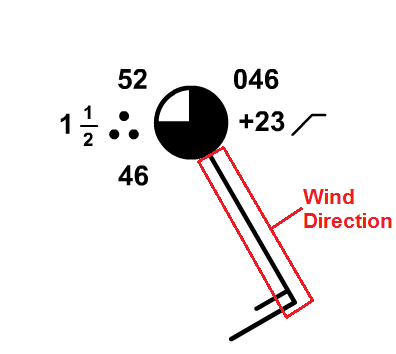
On a station model, the thin-solid line (often referred to as the "flag") extending outward from the sky coverage symbol in the direction that the wind is blowing from. In the example on the right, I've highlighted the wind "flag." Can you tell what the wind direction is on this station model? Remembering that wind direction is the direction that the wind is blowing from, it's apparent that the wind is blowing from the southeast (so we would say that we have a "southeast" wind, or "winds are southeasterly"). More precisely, we could say that winds were 150 degrees (you may want to refer to the image of standard compass angles to confirm).
Wind Speed: Wind speed is simply how fast the air is moving. You may hear references to "sustained" wind speeds, which are wind speeds averaged over a certain time period (usually 1 or 2 minutes), but the wind is sometimes unsteady, with brief, sudden increases in wind speed called gusts. As a general rule, gusts last less than 20 seconds. Weather observers typically only report gusts when the wind varies by greater than 10 knots (between the peaks and lulls). However, reported wind gusts usually do not appear on station models.
In the United States, we usually talk about wind speed in miles per hour (just like automobile speed limits), but on station models, wind speed is always expressed in units of knots (nautical miles per hour). For the record, 1 knot = 1.15 miles per hour. On station models, the speed of the wind is expressed as a series of notches, called "wind barbs" on the clockwise side of the line representing wind direction. Each longer wind barb counts as a tally of 10 knots (actually, each longer barb represents a speed of 8 to 12 knots, but weather forecasters operationally choose the middle value of 10 knots for simplicity). The shorter barbs count as a tally of five knots. So, to figure out the wind speed, you need to add the values associated with any long and short wind barbs present.
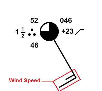
In the sample station model on the right, there's one long barb (10 knots) and one short barb (5 knots), so we add 10 knots and 5 knots together to get our wind speed of 15 knots (which converts to 17 miles per hour). If the surface wind is "calm," then it has neither direction nor speed. In this case, a larger circle is drawn around the circle that represents sky coverage. To see an example, check out the 1828Z map of station models [33] over a portion of the western United States on May 16, 2017. The two stations I've highlighted (Havre and Glasgow, Montana) were both reporting calm winds.
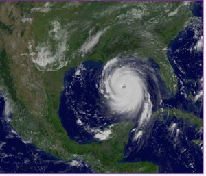
On the other hand, for very strong winds, a "triangular" barb counts as a tally of 50 knots.The use of the 50 knot symbol doesn't happen at the surface very often in most locations, however, because sustained winds rarely reach such speeds. Of course, wind gusts of 50 knots occur a little more frequently (severe thunderstorms, strong cold fronts, etc.). You're more likely to observe a sustained 50-knot wind near the Atlantic and Gulf Coasts with a hurricane nearby, such as the sustained 50-knot wind at Cape Hatteras, North Carolina, early on August 27, 2011 [34] as Hurricane Irene approached.
Finally, I should quickly note that I haven't covered a couple of parts of the station model dealing with air pressure [35]. The remaining information to the right of the sky coverage circle represents sea-level pressure in millibars (upper right) and sea-level pressure tendency (the change over the past three hours). Sea-level pressure is the air pressure (the force per unit area exerted by air molecules) that would be exerted at sea level. We'll talk much more about the relevance of air pressure later in the course, and cover how to decode the pressure information from a station model, too. So, for now, don't worry about the pressure information on the station model.
Before you move on, be sure to spend some time on the Key Skill and Quiz Yourself sections below. They'll help you become familiar with interpreting sky coverage and wind direction / speed on a station model. Make sure you're comfortable with interpreting these variables on a station model before you move on!
On this page, you learned about sky coverage, wind direction, and wind speed on the station model. The interactive station model below allows you to change these variables and see how the station model will look. I especially recommend entering various sky coverages, wind directions, and speeds (all the way from calm to speeds greater than 50 knots) in the "Current Conditions" panel.
I've also created a short video (3:20) that walks through a translation of all the variables we've covered so far in the station model, with an emphasis on wind direction and speed. Check it out!
Think you have a good handle on wind speed and direction on a station model? Take this self-quiz below to see how you do. Begin by hitting the "Quiz me" button. Fill in the missing wind direction and speed, and then hit "Submit" to check your answer. Wind direction can be rounded to the nearest 10 degrees and wind speed is to the nearest 5 knots. You may also turn on some directional hint lines if you have trouble estimating angles. If you've mastered wind direction and speed on the station model, you should be able to get the right answer just about every time!
Upon completion of this page, you should be able to describe and interpret simple statistical measures of weather and climate information. Specifically, students should focus on "normal," mean (average), extremes (records), the climate period of record, and range.
Perhaps you've heard the saying, "There are three kinds of lies: lies, damned lies, and statistics [36]." There's no doubt that statistics can be used to deceive, or that some statistics can be misinterpreted, but statistics are a huge part of a meteorologist's toolbox. In fact, they're often used in weather forecasts that you probably see all the time!
For example, one statistic that you've probably seen is the probability (or chance) of precipitation. If you hear that there's a 40 percent chance of rain tomorrow, do you know what that actually means? Study after study shows that most people don't! The probability of rain doesn't tell us anything about how long it will rain, how heavy the rain will be, or what percentage of a given area will get rain (those are all common misconceptions).
A 40 percent chance of rain tomorrow means there's a four in ten chance that any point (your backyard, perhaps) in a forecast area will receive at least 0.01 inches of rain tomorrow. Alternatively, if the same forecast scenario occurred ten times, at least 0.01 inches of rain would fall on four days at any point in the forecast area, and no measurable rain would fall in the forecast area the other six days.
Some statistics that meteorologists use are a little more straightforward than probability of precipitation. For example, the observations that you learned about that go into the station model can be tracked over a long period of time to determine the long-term averages and extremes (highest and lowest values) at a location. These long-term averages and extremes constitute a location's "climate" and meteorologists often refer to them as "climatology." The National Weather Service is the keeper of many weather records in the U.S., and each day, each office of the National Weather Service issues a "climate report," which summarizes the previous day's temperature and precipitation and compares them to the climate record. Below is a sample display of temperature data in an NWS Climate Report from February 14, 2012 at Chicago's O'Hare Airport.
Climatology is extremely useful for weather forecasters because it gives an expectation (based on history) of types of weather that are typical at the location. While climate information runs the gamut from temperatures to dew points, to winds, to precipitation, etc., here we'll focus our discussion on temperatures since temperature statistics are cited so commonly. We'll start with so-called "normal" temperatures.
One of the statistics in the climate report above is the "normal value" of maximum, minimum, and (daily) average temperature [38]. What does that mean? Well, "normal" temperatures are based on perhaps the most often used statistical measure in meteorology (and in general)--the mean (or "average"). The mean is simply the sum of a set of observations, divided by the number of observations. Meteorologists average lots of things, such as temperatures over the course of a day, a week, a month, a year, or even longer.
So, how did the NWS come up with 35 degrees Fahrenheit for the normal maximum temperature in the report above? They calculated the mean of all of the high temperatures for February 14 over a 30 year period in Chicago. Similarly, the "normal minimum temperature" of 20 degrees Fahrenheit is just the mean of the minimum temperatures for February 14 over a 30-year period. So, normal temperatures are 30-year means (averages). In case you're wondering how to interpret the "normal average" temperature of 27 degrees Fahrenheit, it's the 30-year mean of the daily average temperature (the average of the daily high and low temperatures for February 14 at Chicago).
Note that in Chicago's climate report above, the 30-year means ("NORMAL VALUE") came from weather observations taken during the period from 1981 to 2010 [39]. Every ten years, the averaging period for calculating normals changes. We started using 1981-2010 in the year 2011, but in 2021 the averaging period becomes 1991-2020. The switch to "new normals" every ten years usually results in normal temperatures that are a little different than previous normals. Moreover, the common use of the term "normal" is unfortunate because weather seldom behaves exactly in a "normal" way. In winter, for example, a season renowned for occasionally abrupt temperature swings, it sometimes turns out that a city's normal high for the date never actually occurred as a high temperature on the date in question during the previous 30-year period! So, there's nothing "normal" about "normal" temperatures!
Still, normal temperatures are useful for meteorologists because on most days, temperatures don't deviate all that much from normal. Indeed, a forecaster should be cautious about forecasting a high temperature that's 25 degrees above the normal high for the date. Such large departures from normal are possible, but they may only occur a few times each year.
The climate period of record refers to the length of time that weather observations have been taken for a given city. For example, the "CLIMATE RECORD PERIOD" in Chicago's climate report [40] indicates that weather records in Chicago started in 1871; however, the period of record varies from city to city. Some places in the United States have reliable weather records dating back to the late 1800s, while others only date back to the 1930s to 1950s (or even more recently). Keep the idea of a "climate period of record" in mind whenever you hear someone tout an extreme, or record value (the highest or lowest temperature observed in the period of record), for a given day as "the highest (or lowest) temperature ever" for the date. What they really mean is that it's the highest or lowest temperature for the date in the period of record. So, the record high and record low for February 14 in Chicago [41] represent the highest and lowest temperatures observed on February 14 since 1871. Before records began, we have nothing reliable to compare to.
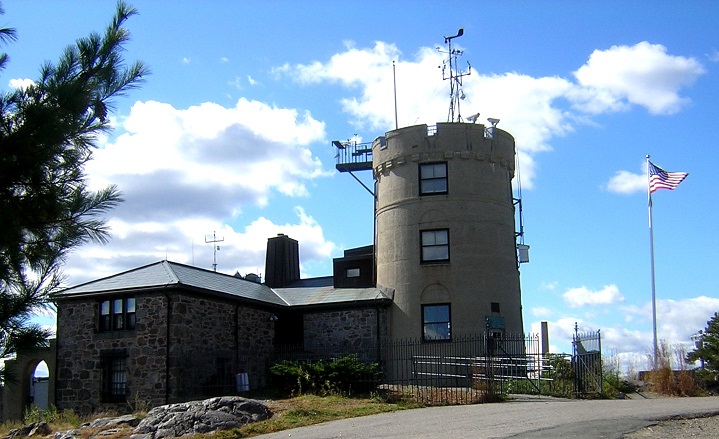
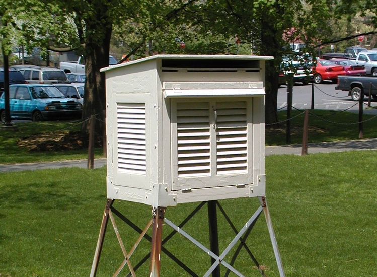
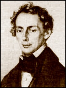
Furthermore, if you hear about a record high (or low) temperature being broken, it's always worth asking "what's the period of record?" A record high at a station that has only been keeping records for 30 or 40 years might not be a big deal. In other words, it might be setting a record only because they've been keeping weather observations for such a short period of time. It takes more extreme weather events to break records at locations that have a period of record 100 years or longer, such as the Blue Hill Meteorological Observatory (pictured on the right) in Milton, Massachusetts. The Blue Hill Observatory has the longest single, continuous set of weather records in the U.S. (going back to 1885). The location for taking weather observations in most cities (like Chicago) has changed at least once since the late 1800s (if they've been taking observations that long).
Another statistic that meteorologists commonly use is the range of a set of observations, which is simply the difference between the maximum observation and minimum observation. Meteorologists often look at the range of temperatures over the course of a single day (called the "diurnal range"), or the range of temperatures over the course of a month, year, etc.
For example, take this table of climatological data for State College, Pennsylvania from February, 2015 [45], which was the coldest February on record at Penn State, where weather records began in 1893. The highest temperature measured during the month was 44 degrees Fahrenheit (in red in the "Max Temperature" column). Meanwhile the lowest temperature measured during the month was -8 degrees Fahrenheit (in blue in the "Min Temperature" column). So, during February 2015 temperatures in State College ranged from 44 degrees Fahrenheit to -8 degrees Fahrenheit. If we take the difference between the two, that gives us 44 degrees Fahrenheit - (-8 degrees Fahrenheit) = 52 degrees Fahrenheit. So, February 2015 had a 52 degree Fahrenheit temperature range in State College. If you wanted to find the range of monthly temperatures for all Februaries in State College, you would take the highest temperature on record for the entire month and subtract the lowest temperature on record for the entire month (and that would give you a much larger range than the range for February 2015).
These statistics (means, normals, and ranges) are pretty straightforward, but make sure you remember what each of them is telling you. Meteorologists use them a lot, and they'll certainly come up again in this course!
Now we're going to shift gears a bit. In the past few sections, we've talked about weather observations at a single location, but meteorologists need to observe the weather over large areas, too, and that requires us to talk a bit about maps and map projections. We'll start "mapping things out" in the next section.
After completing this page, you should be able to identify / discuss map features such as latitude lines, longitude lines (meridians) and projections. You should also be able to orient yourself on certain map projections (specifically polar stereographic and mercator projections).
Meteorologists are always looking at maps! But, anyone who uses maps regularly can tell you that all maps are not created equal. For starters, (most) maps are flat., and while that's very convenient (far more convenient than carrying around a globe to simulate the spherical Earth), there's a trade-off for using flat maps. To see what I mean, think about unraveling the skin of an orange in one piece and then trying to make it lie flat without breaking or distorting it. Good luck! Trying to create a flat map of our spherical Earth brings the same problems: No matter how you do it, you'll always have distortions.
A number of imperfect techniques (called map projections) exist for making flat maps of Earth. Each projection has its own strengths and weaknesses, and it's important for you to know what those are in order to analzye weather maps that you see. We're going to focus on two common projections here: polar stereographic projections and mercator projections.
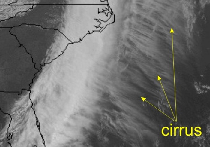
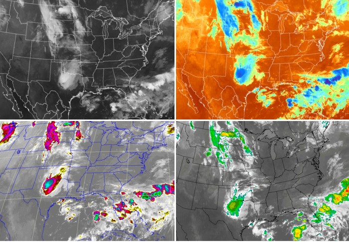
On a polar stereographic projection, the observer's perspective comes from looking down at either the north or south pole. This unique vantage point allows operational weather forecasters to watch, for example, the movements of weather system over long distances. You'll get a pretty good idea of what I mean by watching this hemispheric mosaic "loop" of satellite images [46] stitched together from several weather satellites. Don't worry about exactly what these satellite images are showing (we'll talk about that later), but I wanted you to see a polar stereographic projection in action.
But, there's a catch (of course). Latitude lines, which run west-east (paralleling the equator) and mark the distance from the equator (0 degrees latitude), are not straight on polar stereographic projections. Instead, latitude lines appear as large circles (or arcs, if you're not looking at the entire hemisphere). Meanwhile, longitude lines (also called "meridians"), which run north-south and mark the distance from the Prime Meridian (0 degrees longitude), are straight, and they all converge at the poles. To see what I mean, check out the polar stereographic projection below.
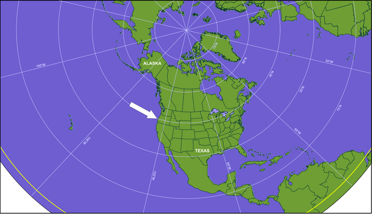
So, on polar stereographic projections, finding east and west isn't simply a matter of looking to the right or the left. Similarly, finding north and south isn't as easy as looking up or down on the image. Those directions will change orientation on the map depending on what area of the map you're looking at. For example, the arrow off the West Coast of the United States in the image above might look like it's blowing from the northwest, but if you look closely, it's blowing parallel to the nearest latitude arc. That means the wind is actually blowing from due west (270 degrees).
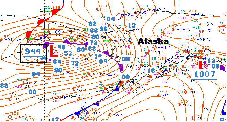
For a real-life example, take a look at this map including station models near Alaska from 06Z on December 1, 2011 [47]. I've outlined the weather station on tiny St. Paul's Island. Knowing that this is a polar stereographic projection, can you determine the wind direction? It might look like it's from the southeast at first, but it's really from due east (90 degrees). If you look carefully, the wind is blowing parallel to the nearest latitude arc. The bottom line is simply that you must orient yourself to the local latitude arcs and longitude lines on polar stereographic projections. Latitude arcs run west-east and longitude lines run north-south (and they intersect at right angles). Without orienting yourself, you can't properly determine things like wind direction. To further illustrate this issue, I created a short video below (2:37) that shows how the same wind direction can appear very differently on station models in different areas of a polar stereographic maps.
There's one other big issue with polar stereographic maps--size and distance distortion. Note in the idealized polar stereographic map shown above that Alaska and Texas look to be about the same size. But, in reality, Alaska is more than twice the size of Texas! In fact, the farther you get away from the pole on a stereographic projection, the more signifcant the size and distance distortion, and that causes some issues when analyzing weather features closer to the equator. For analyzing weather features closer to the equator, meteorologists often turn to mercator projections.
Mercator projections are routinely used for weather maps and other imagery that focus on low latitudes (near the equator). This type of projection minimizes distortion near the equator, which makes it better for tracking weather systems at low latitudes. The closer you are to the equator on a mercator projection, the more accurate the distance representation.
Another benefit of the mercator projection is that compass directions are preserved. That's a huge benefit when tracking weather features over some distance. For example, north is always oriented in the same direction when looking at the image, regardless of where you are on the map. So, typically, north, south, east, and west are easy to find on mercator projections. You should still find latitude and longitude lines to orient yourself, but because each is a straight line, the directions are more intuitive, as shown in the sample mercator map below. North is at the top of the image, south is at the bottom, west is on the left, and east is on the right (regardless of location on the image).
Since compass directions are preserved and distances at low latitudes are depicted with reasonable accuracy, why don't meteorologists just use mercator projections all the time? Well, size and distance distortion are significant farther away from the equator. As weather systems move north or south, that can be a problem because they might appear to change size, when in reality the changes are just an artifact of the map projection. On the mercator map above, for example, Alaska absolutely dwarfs Texas (far more than in reality). At even higher latitudes, Greenland looks to be about the size of Africa, but in reality, Africa is more than 13 times larger than Greenland. At the extreme, the North and South Poles (single points, in reality) appear as straight lines at the top and bottom of Mercator maps. Now that's distortion!
Ultimately, no map projection is perfect, and meteorologists use the strengths of each type to their advantage. But, they must be familiar with the quirks of each type of projection, or else they could easily draw an incorrect conclusion about the direction, distance moved, or the size of a weather feature. Most often, it seems that students are a bit less familiar with polar stereographic projections, so to help you get comfortable with working them, check out the Key Skill and Quiz Yourself boxes below so that you can further explore the interpretation of these maps, and practice with determining wind direction on them.
Determining wind direction on polar-stereographic plots can be a challenge, so to help you get the hang of it, check out the interactive tool below that allows you to enter a wind direction (in degrees) and then move the tool's station model across a polar stereographic map. By moving the station model over the polar stereographic map, you can see how the look of the wind flag on the station model changes relative to local latitude and longitude lines. You can also pick a location for the station model, and input different wind directions to see what the wind flag looks like.
If you think that you have a handle on reading wind direction on a polar stereographic map, give this quiz a try. Start by clicking "Quiz Me." Look at the station model on the polar stereographic map and enter the wind direction on the right. Don't forget to round answers to the nearest 45 degrees, and hit submit to see how you did. If you really understand the concept, you should be able to get it right every time! If you find that you need more practice, you might want to revisit the "Key Skill..." section.
When you've finished this page, you should be able to discuss what isopleths are, and you should be able to apply the idea of isoplething to an elevation contour map (a topographic map).
Now that we've covered some basics about maps, let's start investigating some ways that meteorologists use maps! To begin with, if you are an avid hiker or skier, you've probably consulted a topographical map [48] for insights into elevation and the "grade" (steepness) of slopes and hiking trails. Believe it or not, deciphering topographical maps actually lends itself to the process of interpreting weather maps.
To get you started, let's look at the the Big Island of Hawaii. Just in case you're not familiar with the topography of Hawaii, let's take a virtual fly-by of the Big Island [49] to get a sense of the dramatically changing elevation on the Big Island. As you might have guessed, elevation changes rapidly, varying from sea level to the volcanic summits of Mauna Loa and Mauna Kea at 13,452 feet and 13,796 feet (respectively) in a relatively short distance.
Now that you have a sense for the wildly varying elevations on Hawaii, focus your attention on a topographical map of the Big Island (below). Such a two-dimensional map represents a "plan" or "top-down" view."
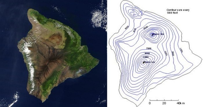
Each contour on the map is an isopleth, which is a contour connecting points of equal value ("iso" translates to "equal" and "pleth" means "value"). In this case, the isopleths connect points of equal elevation above sea level, and are drawn for every 1,000 feet of elevation above sea level. I point out, however, that such a choice is strictly arbitrary. Isopleths could have been drawn for every 250 feet above sea level, meaning that there would be four times the number of isopleths on the map, probably making it look a little cluttered. The arbitrary choice of 1000 feet for the "contour interval" was a trade-off between the look of the map and its detail.
To explain what I mean by "detail," consider the southernmost tip of the island. Suppose I asked you to locate the point precisely due north of the southernmost tip that has an elevation of 400 feet. With isopleths drawn every 1000 feet, you must visually estimate distance from the southernmost tip to the 1000-foot contour and then pick a reasonable intermediate spot to place the point. Had contours been drawn every 250 feet instead of every 1,000 feet (the cluttered look), your task would have been a little easier and your answer would likely have been more accurate. Just in case you're having difficulty making the connection between a three-dimensional mountain and a two-dimensional topographical map, I've created a short video (2:00) showing a virtual representation of Hawaii's topography [50] (video transcript [51]) to help you to better visualize what I'm talking about.
Looking at this virtual representation of Hawaii in the video, you might get the mistaken notion that all isopleths are closed curves or circles. Depending on the breadth of the map, however, some contours could conceivably extend from one side of the map to another without making a closed loop. Indeed, zooming in on the topographical map of the Big Island and restricting the focus just to Mauna Kea (see image on the right), some elevation contours now simply end at a boundary. We'll see this quite often when we start looking at contoured maps of weather variables.
The great thing about contour maps like our elevation map of Hawaii is that it allows us to see the elevation pattern relatively easily (much more easily than if we just plotted individual elevation numbers at random points). And, that's why meteorologists use contour maps regularly: contour maps help meteorologists easily find patterns in weather data. But, meteorologists must also be able to look at a contour map and, using the pattern of contours, estimate a value at any point. That's our next task at hand. Read on.
When you've completed this page, you should be able to name the isopleths for temperature ("isotherms") and pressure ("isobars"). You should also be able to estimate a value at a point on a contour map of temperature or pressure (or any variable, for that matter).
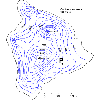
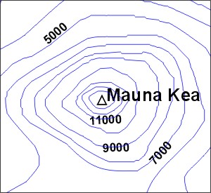
Meteorologists regularly use contour maps to see how weather variables (temperature or pressure, for example) change over large areas, but they also use them to estimate values of weather variables at individual points. To get us started on interpreting contour maps, we're first going to revisit our topographic map of Hawaii (right).
How would we go about figuring out the elevation of the point marked "P"? First, we must identify the two contours that lie on either side of "P." In some cases the contours that we need are clearly labeled; however, in other instances, you will need to use the contour interval (1,000 feet, in this case) to "count" up or down from a labeled contour. On our map, point "P" lies between 3000 feet and 4000 feet contours, so the elevation at point "P" is greater than (but not equal to) 3000 feet but less than (but again, not equal to) 4000 feet. We know that point "P" is not equal to either of these values because it does not lie on one of the contour lines.
Technically, this is all that we can say for sure about the elevation at point "P" -- it can be anywhere between 3,000 and 4,000 feet. However, often instead of giving a range of elevation, we would prefer a single number. In such cases, we can interpolate (make an estimate by assuming the elevation changes linearly) between the two known contours. In this case, we can see that point "P" is about half-way between the two contours and thus has an elevation of approximately 3,500 feet. Using interpolation usually provides us with a sufficient approximation, but we must always realize that it's only an estimate.
What about closed contours that have no other contours drawn within them? Look again at the contour map and focus your attention on the southern-most peak, Mauna Loa. How might we estimate the height of this peak? Clearly, we do not have two contours to use... or do we? The last drawn contour is 13,000 feet. This means that the peak is higher than 13,000 feet. However, we know that the summit of Mauna Loa is not higher than 14,000 feet. Why? Well, if it were, then the 14,000 feet contour would have been drawn around the summit. So, for an inner-most closed contour, the range is always between the last drawn contour and the next undrawn contour. You should also note that interpolation cannot be performed in such cases because we have no way of knowing how far away the undrawn contour is. The summit of Mauna Loa is 13,452 ft (within our deduced range of 13,000-14,000 feet), but we really couldn't have known that just from our topographic map (unless the peak elevation was labeled).
Two variables that are commonly contoured by meteorologists are temperature and air pressure. Isopleths of temperature are called isotherms (contours of constant temperature), and isopleths of pressure are called isobars (contours of constant pressure). Don't confuse the two! It would be incorrect to look at a map that shows only contours of constant temperature and call them "isobars," for example.
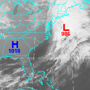
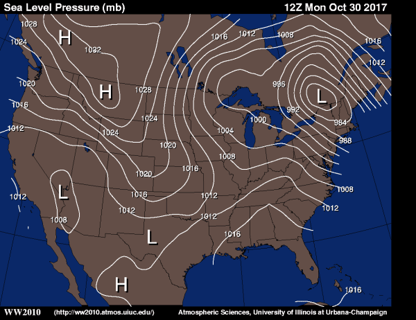
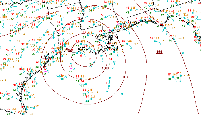
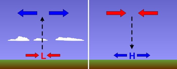
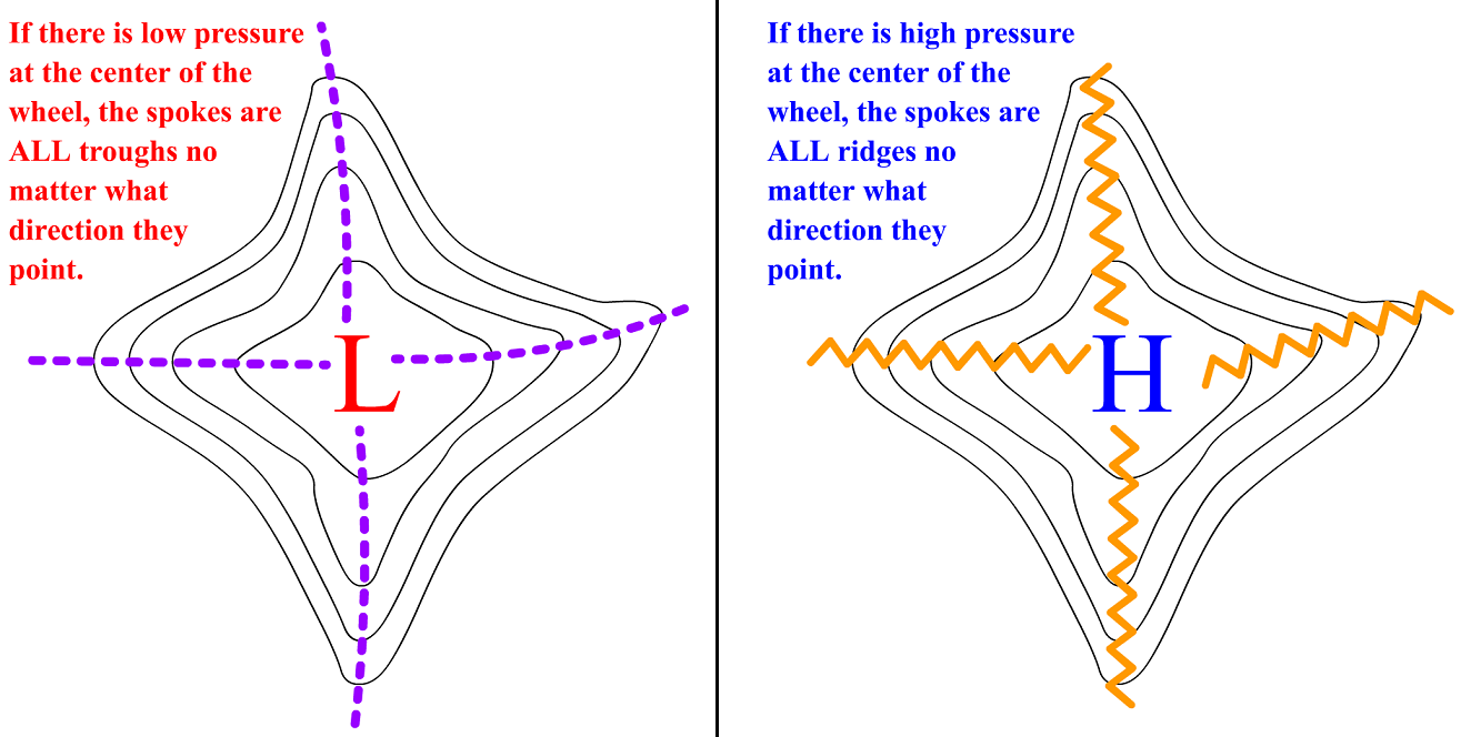
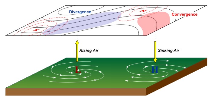
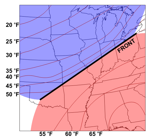
Maps with isobars of sea-level pressure help meteorologists recognize areas of high and low pressure. Why is this important? Well, generally speaking, areas of high pressure at the surface are often areas of "fair" weather (relatively calm, with at least some sunshine). Meanwhile, regions of low pressure are often somewhat unsettled (cloudy with precipitation). To see a map with isobars of sea-level pressure, check out the image below, from 15Z on May 1, 2017.
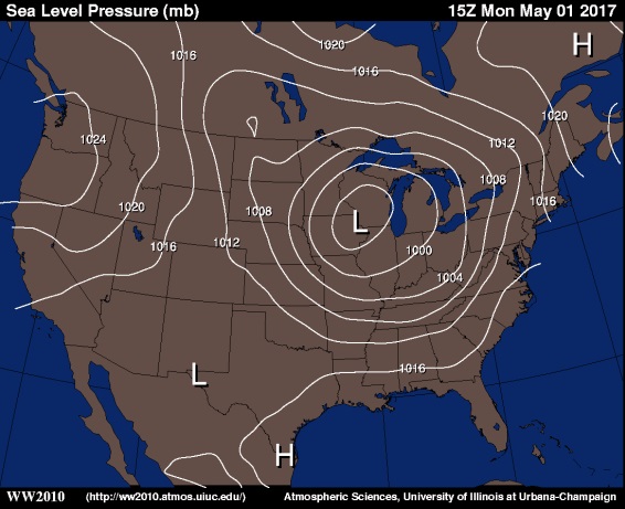
The H's mark centers of high pressure (highest pressure in the region), while the L's mark centers of low pressure (lowest pressure in the region). The feature that would immediately jump out at a weather forecaster as a region of "active" weather is the large area of low pressure centered over the Midwest (near the Iowa / Wisconsin border).
The first step in interpreting values from this image is to figure out the contour interval, which is four millibars (millibars is a standard unit of pressure). Knowing that, we can estimate the pressure near the center of the low over the Midwest. The inner-most closed isobar is 996 millibars (it's unlabeled, but it's inside of the 1000 millibar isobar and values are decreasing toward the center of the low), so the pressure must be less than 996 millibars. However, there's no 992 millibar isobar drawn, so the pressure must be greater than 992 millibars.
Similarly, meteorologists contour maps of temperature because such maps allow them to easily spot areas of cold and warm air. But, maps of isotherms are often color-coded to help make the interpretation easier (for what it's worth, colors are sometimes used on topographic maps [52], too). I caution you that color schemes and contour intervals can vary widely on images you may see on television or online, and determining which color is which can sometimes be a real challenge. But, if you understand how to interpret contour maps, you can keep your wits about you and use the isotherms (in conjunction with the colors, if you'd like) to gather useful information.
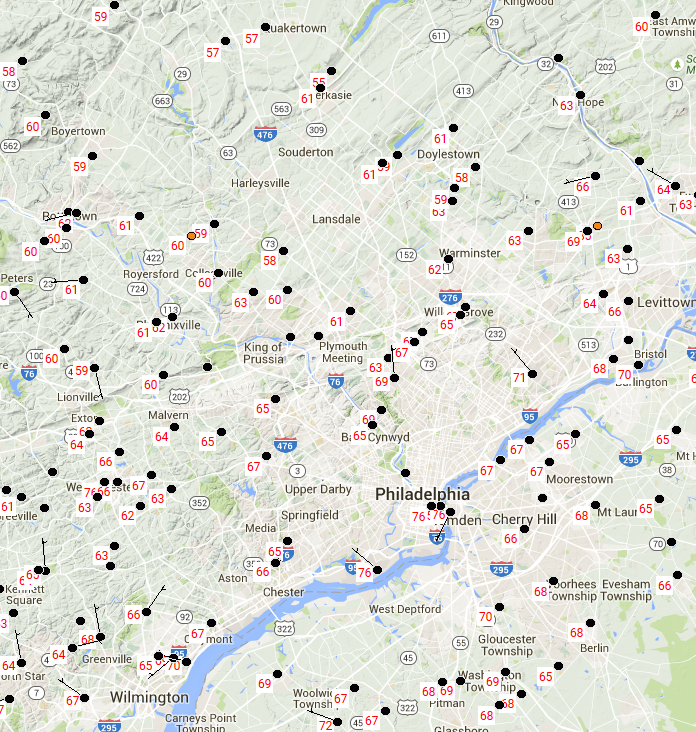
For example, check out the map of isotherms at 15Z on May 1, 2017, below. The contour interval on the image is 5 degrees Fahrenheit. Given that, what would you say is an appropriate range in temperature for somewhere in Indiana? Given that the 60 degree Fahrenheit isotherm and 55 degree Fahrenheit isotherm nearly match the eastern and western borders of the state (respectively), it's fair to say that temperatures in Indiana were greater than 55 degrees Fahrenheit, but less than 60 degrees Fahrenheit. And, if you look at the color key on the right of the image, the shade of yellow-green (or is it green-yellow?) over Indiana matches the color used for temperatures between 55 and 60 degrees Fahrenheit (although some might find it hard to tell).
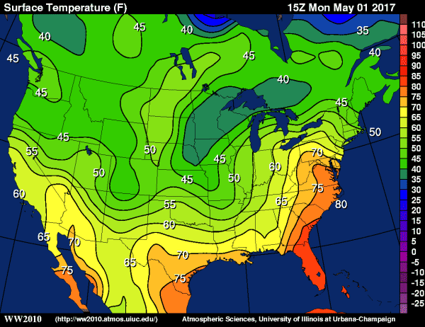
If we wanted to pick a specific point, "P," on the map, near Indianapolis, Indiana [53], and estimate a specific temperature, we could do that, too. Point "P" is approximately half-way between the 55 and 60 degree Fahrenheit isotherms, so the temperature at "P" is about half-way between 55 and 60 degrees Fahrenheit. We'll call it 57 or 58 degrees Fahrenheit, knowing that we're just making our best estimate based on the isotherms.
I should also point out that sometimes you won't even see isotherms plotted, and instead, a temperature map will just be shaded. In reality, every boundary where colors change is an isotherm (even if it's not drawn or labeled), and sometimes very small contour intervals are used. On such maps, like this analysis of temperatures from 17Z on May 24, 2017 [54]. Using the color key is the only way to go, and even then (because colors change every degree in this case), estimating a specific temperature at a point can be difficult when the shadings are so similar.
To see a few more examples of interpreting values from a contour map, watch the short video (3:28) below.
Finally, before you continue on, make sure to check the Key Skill and Quiz Yourself sections below. They'll help you make sure that you can interpret contour maps on your own, which is a useful skill outside of meteorology, too (elevation and many other variables can be isoplethed, and the principle for interpreting the values is the same, regardless of what's being plotted).
Consider the examples below using various different kinds of contour maps.
Example #1:
Let's start with an easy one. Consider this contour map of temperatures [55] with a point "P" located on the Iowa/Nebraska border. What temperature range would you specify at point "P"?
Here's another easy one. Consider this contour map of temperatures [56] with a point "P" located in western Virginia. What temperature range would you specify at point "P"?
Example #3:
Ready for a problem that is a bit more challenging? Consider this contour map of sea-level pressure [57] with a point "P" located in Montana. What range of pressures would you consider possible at point "P"?
Think you understand how to extract information from contour maps? Take this self-quiz below to see how you do. First, hit the "Quiz me" button and look for the red push-pin on the map provided. Fill in the range in values that the pin represents, and hit "Submit" to check your answer.
The change in a quantity over a certain distance is called the gradient. When you've finished this page, you should be able to discuss gradients, why they're important to meteorologists, and identify / interpret relatively large and small gradients on contour maps.
Besides allowing meteorologists to estimate values of weather variables at specific points, contour maps are also useful tools that help meteorologists to see patterns in the data. In other words, contour maps make it easy for meteorologists to see how a weather variable (like temperature or pressure) is changing over a large area. Maps of isotherms allow meteorologists to identify regions of warm and cold air, as well as how temperatures change over certain areas. Similarly, maps of isobars allow meteorologists to find areas of high and low pressure, and see how pressure changes over certain areas.
The change in a variable over a certain distance is called the gradient, and gradients are very important in meteorology. Zones where weather variables have large changes are often zones of active weather, so meteorologists like to keep tabs on areas with so-called "large gradients." Tuck this idea away, as the importance of gradients will come back again and again in our studies of meteorology.
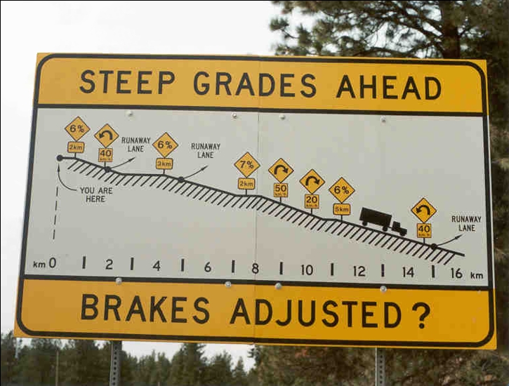
But, to start us off in our discussions of gradients, let's return to the example of elevation. Driving to the summit of the beautiful mountains in central Pennsylvania, motorists are greeted by signs that warn of "steep grades" ahead, which refers to large gradients. What does that mean in practical terms? For the mountain road to have a large gradient, the elevation of the road must change relatively rapidly over a short traveling distance. In other words, you're driving on a steep hill. Similarly, a small gradient means that the elevation of the road changes very little with distance (the road is relatively flat).
How do we distinguish between a large and small gradient on a topographical map? Let's return to the video showing the virtual topography of Hawaii [50] (video transcript [51]) you saw earlier. Remember that the contours of constant elevation are packed close together in areas where the elevation changes rapidly over short distances (like near the mountain summits). Thus, a large gradient on a topographical map, which marks a large change in elevation over a relatively short horizontal distance (steep terrain), corresponds to a tight packing of contours.
Meanwhile, the "packing" of contours of constant elevation is rather loose where the terrain is flatter. In other words, the gradient is small. Thus, a small gradient, which marks little change in elevation over a relatively short horizontal distance (fairly flat terrain), corresponds to a loose packing of contours.
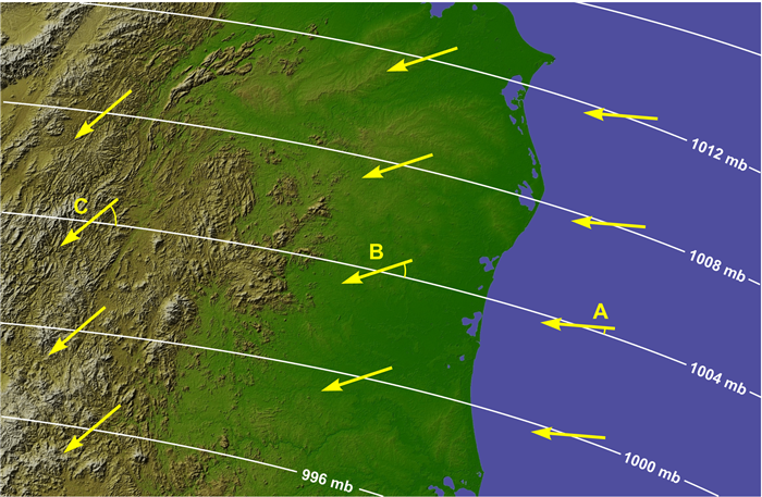
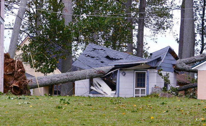
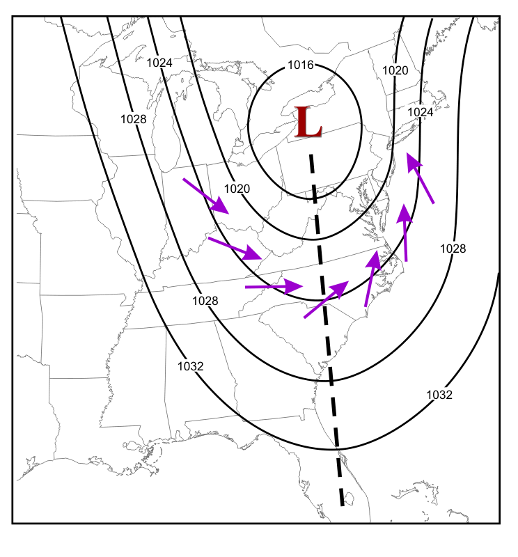
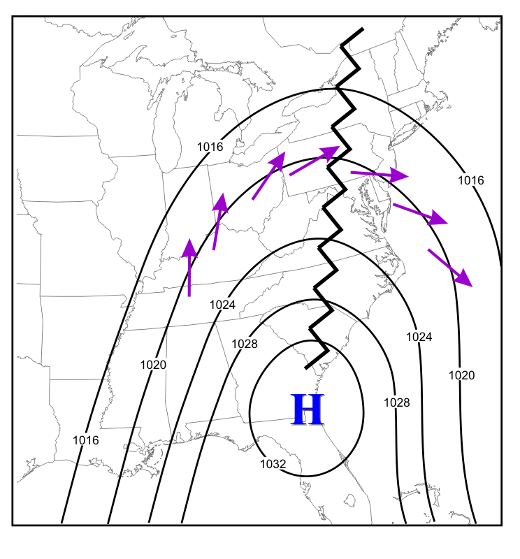
Now let's take what we've learned from topographical maps and generalize it to weather maps. Check out the 06Z analysis of sea-level pressure on March 15, 2017 (below), which shows a powerful low-pressure system along the New England Coast. Note the tight packing of isobars over the northeastern U.S. and eastern Canada, indicating a large pressure gradient over this region (relatively large pressure changes over a short distance). As you'll learn in later in the course, tight packings of isobars (large pressure gradients) correspond to strong surface winds. This case was no exception! This area of low pressure was dubbed "The Blizzard of 2017 [58]" and winds along the coast in Massachusetts gusted to more than 70 miles per hour.
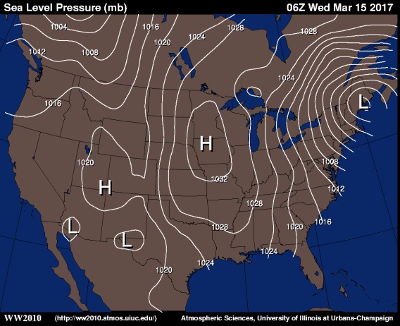
On the flip side, for an example of a small pressure gradient, look at the western United States on the map above. There's not a single isobar in California or Nevada, and overall isobars are packed very loosely in the West, so pressure changes very little over the entire region.
Turning our attention to temperature, tightly packed isotherms represent large horizontal changes in temperature over a relatively short distance (that is, a large temperature gradient). For example, the analysis of surface isotherms from 19Z on May 18, 2017 [59] shows a very large temperature gradient (tight packing of isotherms) stretching all the way from the Southwestern U.S. to the Great Lakes and into Canada. Such a large temperature gradient marks a contrast between very warm air and colder air. For example, check out the change in temperature just in the state of Kansas (outlined in the black box [60]). In the southeast corner of the state, temperatures were in the 80s. In the northwest corner, temperatures were in the 40s! As we will learn in later lessons, large temperature gradients often indicate the presence of cold and warm fronts, which you've probably heard weathercasters talk about before (and that was certainly the case here)
On the other hand, if you want to see an example of a small temperature gradient, look no further than the Gulf Coast States. The packing if isotherms was very loose, and temperatures didn't change very much with distance. In fact, temperatures over a several state area were mainly between 85 and 90 degrees.
To see another example of interpreting temperature gradients, check out the short video (1:40) showing some large and small temperature gradients in the winter time!
One quick note: When talking about gradients, be careful that you use the proper terminology. For example, if temperature changes rapidly over a short distance, you might refer to this as a "strong," "tight," "steep," or "large" gradient. You wouldn't, however, say that the "temperature gradient is changing rapidly." Doing so means that the change in temperature is changing. While this is certainly possible, it's not how we talk about a single gradient, because the gradient itself IS the change over a certain distance.
The bottom line is that meteorologists really pay attention to gradients in temperature and pressure (among other variables), mainly because large gradients can be zones of very "interesting" weather! Before wrapping up the lesson, make sure you try your hand at the Key Skill section below, to make sure you can "size up" gradients.
After studying this section, you should be able to identify and describe gradients based on contour maps. You should be able to look at a location on a contour map and describe a gradient as relatively large or small compared to other locations on the map, and be able to describe what that means for changes in the variable (is it changing by a lot or by a little?).
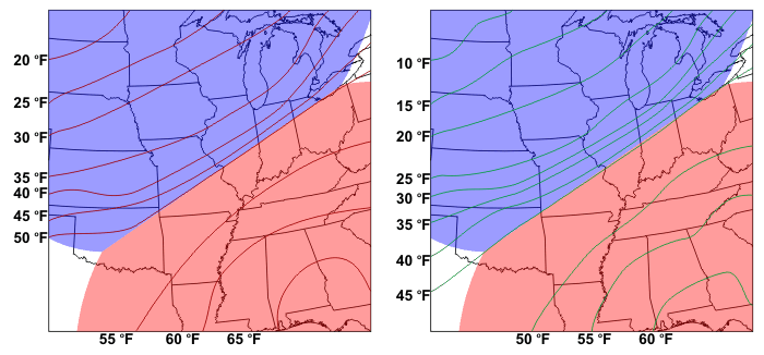
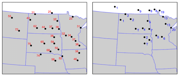
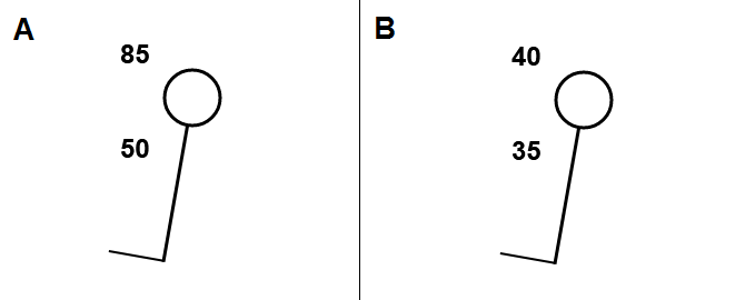
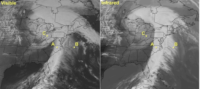
Try these examples out for yourself. For each example, use the image below...
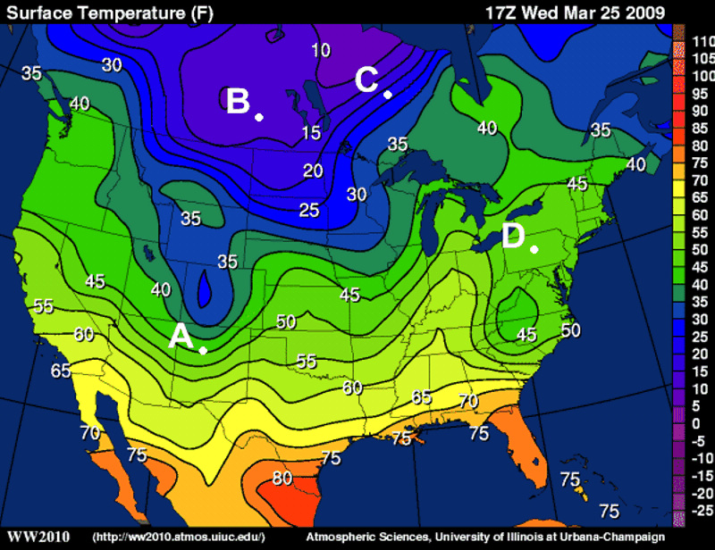
Compare the magnitudes of the temperature gradients at stations A and B. For example, which station has the larger gradient? How do you know? Are the gradients large or small compared to other locations on the map?
Perform the same analysis that you did in Example #1, but with stations C and D.
Links
[1] https://www.flickr.com/photos/22280677@N07/2504310138/in/photolist-4Pifa1-n1GWFu-9rPDkF-8x4RCw-76kYTa-4c9L2-qrDUdc-5etMtM-pexVmh-efoWfy-4ZREm3-63KHzf-imbgwP-2HCnJN-6t59b-pE754E-oj6c3-ejYozd-9JN1fC-qrYD7n-fdUY1p-6YHtYJ-jKESwZ-7KXb8L-924SmZ-9QKxv-EBJpv-32N3ho-8DiwUH-7VuShM-9aXqae-bz6igw-5cE5kR-4qxGRq-32HtCK-7arjd2-57Swx2-5qLPrf-u1FLs-iS1MdJ-2h819u-28A3Y-rds4KY-k88eCY-4LFjre-6eHnyM-b5GyUF-aypDGP-2Z2rR-5nPGJe/
[2] https://www.flickr.com/photos/22280677@N07/
[3] http://creativecommons.org/licenses/by-nd/2.0/
[4] https://commons.wikimedia.org/wiki/File:Leonid_Meteor.jpg
[5] https://commons.wikimedia.org/wiki/User:Navicore
[6] https://creativecommons.org/licenses/by/3.0/
[7] http://www.flickr.com/photos/djt23/2738590109/
[8] http://www.flickr.com/photos/djt23/
[9] https://www.e-education.psu.edu/meteo3/sites/www.e-education.psu.edu.meteo3/files/images/lesson1/blue_marble0601.jpg
[10] https://www.youtube.com/watch?v=lzLbmOHTYcI?rel=0
[11] http://en.wikipedia.org/wiki/Prime_Meridian
[12] http://upload.wikimedia.org/wikipedia/commons/a/ad/Standard_time_zones_of_the_world.png
[13] https://www.e-education.psu.edu/meteo3/sites/www.e-education.psu.edu.meteo3/files/images/lesson1/timezones0103.png
[14] http://en.wikipedia.org/wiki/24-hour_clock
[15] http://en.wikipedia.org/wiki/Daylight_saving_time
[16] http://en.wikipedia.org/wiki/International_Date_Line
[17] https://en.wikipedia.org/wiki/Fahrenheit
[18] https://en.wikipedia.org/wiki/Celsius
[19] http://www.weather.gov/epz/wxcalc_tempconvert
[20] http://en.wikipedia.org/wiki/Kelvin
[21] https://www.e-education.psu.edu/meteo3/sites/www.e-education.psu.edu.meteo3/files/images/lesson1/goldengate_fog0105.jpg
[22] https://www.e-education.psu.edu/meteo3/sites/www.e-education.psu.edu.meteo3/files/images/lesson1/squall.jpg
[23] https://www.e-education.psu.edu/meteo3/sites/www.e-education.psu.edu.meteo3/files/images/lesson1/sand_storm0105.jpg
[24] https://www.e-education.psu.edu/meteo3/sites/www.e-education.psu.edu.meteo3/files/images/lesson1/smoke0105.jpg
[25] http://www.wpc.ncep.noaa.gov/html/stationplot.shtml
[26] http://www.wpc.ncep.noaa.gov/html/sfcloop/currobs.html
[27] https://www.e-education.psu.edu/meteo3/sites/www.e-education.psu.edu.meteo3/files/images/lesson1/binovc0107.jpg
[28] https://www.e-education.psu.edu/meteo3/sites/www.e-education.psu.edu.meteo3/files/images/lesson1/few_clouds0107.jpg
[29] https://www.e-education.psu.edu/meteo3/sites/www.e-education.psu.edu.meteo3/files/images/lesson1/scattered_clouds0107.jpg
[30] https://www.e-education.psu.edu/meteo3/sites/www.e-education.psu.edu.meteo3/files/images/lesson1/broken_ps0107.jpg
[31] https://www.e-education.psu.edu/meteo3/sites/www.e-education.psu.edu.meteo3/files/images/lesson1/broken_mc0107.jpg
[32] https://www.e-education.psu.edu/meteo3/sites/www.e-education.psu.edu.meteo3/files/images/lesson1/compass_points0109.jpg
[33] https://www.e-education.psu.edu/meteo3/sites/www.e-education.psu.edu.meteo3/files/images/lesson1/calm_stations.png
[34] https://www.e-education.psu.edu/meteo3/sites/www.e-education.psu.edu.meteo3/files/images/lesson1/irene_annotated0109.png
[35] https://www.e-education.psu.edu/meteo3/sites/www.e-education.psu.edu.meteo3/files/images/lesson1/sample_station_pressure_tendency.png
[36] https://en.wikipedia.org/wiki/Lies,_damned_lies,_and_statistics
[37] http://w2.weather.gov/climate/
[38] https://www.e-education.psu.edu/meteo3/sites/www.e-education.psu.edu.meteo3/files/images/lesson1/climate_report0402_normal.gif
[39] https://www.e-education.psu.edu/meteo3/sites/www.e-education.psu.edu.meteo3/files/images/lesson1/climate_report0402_norm_period.gif
[40] https://www.e-education.psu.edu/meteo3/sites/www.e-education.psu.edu.meteo3/files/images/lesson1/climate_report0402_por.gif
[41] https://www.e-education.psu.edu/meteo3/sites/www.e-education.psu.edu.meteo3/files/images/lesson1/climate_report0402_records.gif
[42] https://commons.wikimedia.org/wiki/File:Great_Blue_Hill_Weather_Station_Milton_MA_03.jpg
[43] https://commons.wikimedia.org/wiki/User:Jameslwoodward
[44] https://creativecommons.org/licenses/by-sa/3.0/
[45] https://www.e-education.psu.edu/meteo3/sites/www.e-education.psu.edu.meteo3/files/images/lesson1/sce_feb_2015.png
[46] http://mp1.met.psu.edu/~fxg1/SAT_NHEM/anim16jap.html
[47] https://www.e-education.psu.edu/meteo3/sites/www.e-education.psu.edu.meteo3/files/images/lesson2/alaska_ps0208.png
[48] https://www.e-education.psu.edu/meteo3/sites/www.e-education.psu.edu.meteo3/files/images/lesson2/mountnittany0202.gif
[49] https://www.e-education.psu.edu/meteo3/sites/www.e-education.psu.edu.meteo3/files/images/lesson1/hawaii_orbit.gif
[50] https://www.youtube.com/watch?v=5E1vXpVgNPw?rel=0
[51] https://www.e-education.psu.edu/meteo3/sites/www.e-education.psu.edu.meteo3/files/transcripts/virtual_hawaii_transcript.docx
[52] https://www.e-education.psu.edu/meteo3/sites/www.e-education.psu.edu.meteo3/files/images/lesson2/hawaii_color0205.jpg
[53] https://www.e-education.psu.edu/meteo3/sites/www.e-education.psu.edu.meteo3/files/images/lesson1/201705011500_T_annotate.jpg
[54] https://www.e-education.psu.edu/meteo3/sites/www.e-education.psu.edu.meteo3/files/images/lesson1/rtma_tmp2m_conus.png
[55] https://www.e-education.psu.edu/meteo3/sites/www.e-education.psu.edu.meteo3/files/images/lesson2/keyskill1_0205.gif
[56] https://www.e-education.psu.edu/meteo3/sites/www.e-education.psu.edu.meteo3/files/images/lesson2/keyskill2_0205.gif
[57] https://www.e-education.psu.edu/meteo3/sites/www.e-education.psu.edu.meteo3/files/images/lesson2/keyskill3_0205.gif
[58] https://en.wikipedia.org/wiki/March_2017_North_American_blizzard
[59] https://www.e-education.psu.edu/meteo3/sites/www.e-education.psu.edu.meteo3/files/images/lesson1/201705181900_N.gif
[60] https://www.e-education.psu.edu/meteo3/sites/www.e-education.psu.edu.meteo3/files/images/lesson1/201705181900_N_kansas.jpg
SOURCE: Steven Seman, Introductory Meteorology, Penn State’s College of Earth and Mineral Sciences OER Initiative. https://www.e-education.psu.edu/meteo3/
Do you remember when you opened your first checking account? That was certainly a watershed moment of personal finance! My parents tried to impress upon me the importance of writing every transaction down in the check ledger and always knowing my account balance. Maintaining an account ledger allows you to track exactly what money is coming into your account and what money is going out. The difference between the in-coming and out-going funds determines whether your account grows or shrinks in value.
While more and more people are using technology to keep tabs on their account balances, it's still critical to be aware of how much money is entering and leaving your account (lest you overdraft your account and incur unfortunate banking fees). In the study of the atmosphere, the Earth's currency is energy (much of that in the form of heat energy), and we have to understand the flow of energy into, around, and out of the earth-atmosphere system. This is true at all scales, from why cloudy nights tend to be warmer than clear nights (all else being equal), to being able to properly think about the Greenhouse Effect and Global Warming. As with your checking account, you must keep track of all transactions within the system to know whether there is a net gain or net loss in energy. In this lesson, we are going to learn about the various means by which energy moves and learn such terms as conduction, convection, and radiation. We will also see several examples where tracking the movement of energy can explain situations commonly observed in the atmosphere.
So, dust off your green CPA's visor and your adding machine, and let's dive into the Earth's energy ledger.
At the completion of this section, you should be able to define radiation, wavelength, and micron. You should also be able to discuss the organization of radiation in the electromagnetic spectrum by wavelength (you should know which types of radiation have longer wavelengths and which have shorter wavelengths, for example).
First up in our study of Earth's energy ledger is radiation. While the mention of "radiation" may conjure up thoughts about nuclear reactors or nuclear bombs, it turns out that the scientific use of the term "radiation" is considerably more broad. Radiation is defined as the emission and transfer of energy through a medium via particles or waves. In fact, the vast majority of radiation that you encounter on a daily basis has nothing to do with nuclear radiation at all. From an everyday light-bulb, to the microwave that heats your frozen lunch, to the radio that you listen to on your morning commute, you're surrounded by devices that make use of radiation. Even light from the sun is a form of radiation, so radiation is occurring all around you!
At some point in a science class, you probably studied the electromagnetic spectrum of radiation, but how is this electromagnetic spectrum created? To begin with, you probably know that the building blocks of all matter are atoms and molecules. Within these atoms and molecules are smaller particles which have positive and negative charges -- protons and electrons, respectively. These charged particles tend to oscillate or vibrate (especially electrons). Without getting into the details, physics tells us that any charged particle like an electron has an electrical field surrounding it (electrical charges and electrical fields go hand-in-hand). Furthermore, moving charges also possess magnetic fields. Thus, when an electron oscillates, its surrounding electric and magnetic fields change. Like moving your hand rapidly back and forth in a pool of water, oscillating electrons send out ripples of energy (that is, "waves") that have both electrical and magnetic properties (hence, electro - magnetic radiation).
So, how is it that different kinds of electromagnetic waves exist to create an entire spectrum? First let's talk about the different kinds of EM radiation in terms of wavelength. The wavelength of any wave is simply the distance between two consecutive similar points on the wave (for example from wave crest to wave crest). Now think about our pond analogy above. If you move your hand slowly in the water, you will create a few waves with long wavelengths. However, if you move your hand rapidly in the water, you create lots of waves with very short wavelengths. The same is true for an oscillating electron. If the oscillation is very quick (we say the oscillation has a high frequency), then the EM radiation produced will have a short wavelength. If the oscillation is slower (having a lower frequency) then the electromagnetic waves will have long wavelengths.
Now, the frequency at which electrons oscillate is essentially set by the temperature of the matter in which the electron resides (remember we defined an object's temperature as the average kinetic energy of its atoms or molecules). The higher the temperature, the higher the frequency of oscillation. So, when temperature increases, the wavelength of the electromagnetic radiation emitted by the electron decreases. Conversely, as temperature decreases, the frequency of oscillation slows and the wavelength of the emitted electromagnetic radiation increases. For a visual, check out this short video demonstrating the relationship between oscillation frequency and wavelength [7] (0:57; video transcript [8]).
Before we move on, let me add one quick caveat: the brief description I gave above doesn't fully describe all emissions of radiation. For simplicity, we focused on the generation of EM radiation by a single oscillating charged molecule. In reality, matter exists as a system of charged particles. This means that the resulting electromagnetic radiation field is much more complex than I have outlined here. Furthermore, very high-frequency EM emissions require a different mechanism to generate the high energy waves in addition to moving particles, but that's beyond the scope of what we need for this course.
With that caveat out of the way, check out the entire spectrum of electromagnetic radiation below. First, note that the range in wavelengths for different types of electromagnetic radiation is staggering -- from hundreds of meters to the size of an atom's nucleus. Also note that visible light does indeed qualify as electromagnetic radiation, despite taking up only a tiny sliver of the entire spectrum. This means that our eyes are completely blind to almost all electromagnetic radiation.
Starting from the end of the spectrum with the longest wavelengths (the "long-wave" portion of the spectrum), radio waves and microwaves have wavelengths of hundreds of meters to a few millimeters (a millimeter is 10-3 meters or one-thousandth of a meter). As wavelengths further decrease, they tend to be expressed in micrometers, more commonly called microns (10-6 meters, or one-millionth of a meter), and as wavelengths shrink to 10s of microns (the size of a bacterium or a virus) we label these emissions as infrared, visible, and ultraviolet light. Finally, in the very short-wave portion of the spectrum, with wavelengths the size of an individual molecule or atom, we have X-rays and gamma rays.
The types of radiation that we'll be working with most commonly in this course are microwave, infrared, and visible because of their applications in helping meteorologists observe the atmosphere. Furthermore, as we'll investigate more in this lesson, beyond the longest wavelengths associated with visible light lies the infrared ("beyond red") band of the electromagnetic spectrum. A majority of the infrared spectrum, spanning from approximately 3 to 100 microns, essentially constitutes "terrestrial radiation" (radiation "of the earth") because the oscillating charges that emit at these wavelengths are consistent with temperatures commonly observed on this planet as well as in Earth's atmosphere.
Now that you know the terminology behind the different regions of the electromagnetic spectrum, we need to discuss the properties by which objects emit radiation. These properties have been grouped into what I call the "four laws of radiation." Read on.
After completing this section, you should be able to describe the relationships governed by the "Four Laws of Radiation." You should also be able to solve observational "problems" using the relationship between an object's temperature, total emission, and peak emission wavelength as described by the Stefan-Boltzmann Law and Wien's Law.
In order to best make use of the of information that comes to us via the electromagnetic spectrum, we need to understand some basic properties of radiation. A complete treatment on the subject of radiation theory would take an entire course at least (indeed, folks pursuing a degree in meteorology are usually required to take a Radiative Transfer course). Instead, you just need to know the fundamental principles describing the electromagnetic radiation that originates from an object, and how that radiation travels through space (which we'll get into soon).
For electromagnetic radiation, there are four "laws" that describe the type and amount of energy being emitted by an object. In science, a law is used to describe a body of observations. At the time the law is established, no exceptions have been found that contradict it. The difference between a law and a theory is that a law simply describes something, while a theory tries to explain "why" something occurs. As you read through the laws below, think about observations you've made in everyday life that might support the existence of each law.
Planck's Law can be generalized this way: Every object emits radiation at all times and at all wavelengths. Does that surprise you? We know that the sun emits visible light (below left), infrared waves [9], and ultraviolet waves (below right), but did you know that the sun also emits microwaves, radio waves, and X-rays [10]? Of course, the sun is a big nuclear furnace, so it makes sense that it emits all sorts of electromagnetic radiation. However, Planck's Law states that every object emits over the entire electromagnetic spectrum. That means that you emit radiation at all wavelengths, and so does everything around you!
Now before you dismiss this statement out-of-hand, let me say that you are not emitting X-rays in any measurable amount. The mathematics behind Planck's Law hinge on the fact that there is a wide distribution of vibration speeds for the molecules in a substance. This means that it is possible for matter to emit radiation at any wavelength, and in fact it does, but the amount X-rays you're currently emitting, for example, is unimaginably small.
Another common misconception that Planck's Law dispels is that matter selectively emits radiation. Consider what happens when you turn off a light bulb. Is it still emitting radiation? You might be tempted to say "No" because the light is off. However, Planck's Law tells us that while the light bulb may no longer be emitting radiation that we can see, it is still emitting at all wavelengths (most likely, it is emitting copious amounts of infrared radiation). Another example that you hear occasionally on TV weathercasts goes something like this: "When the sun sets, the ground begins to emit infrared radiation..." That's just not how it works. The ground doesn't "start" emitting when the sun sets. Planck's Law tells us that the ground is always emitting infrared radiation, a fact that we'll explore later on in this lesson.
So, Planck's Law tells us that all matter emits radiation at all wavelengths all the time, but there's a catch: Matter does not emit radiation at all wavelengths equally. This is where the next radiation law comes in. Wien's Law states that the wavelength of peak emission is inversely proportional to the temperature of the emitting object. Put another way, the hotter the object, the shorter the wavelength of maximum emission. You have probably observed this law in action all the time without even realizing it. Want to know what I mean? Check out this steel bar [11]. Which end might you pick up? Certainly not the right end! It looks hot, doesn't it? Why does it "look hot?"
Well, for starters, the peak emission for the steel bar (even the part that looks really hot) is in the infrared part of the spectrum. But, the right side of the bar is hotter than the left, and therefore the right side has a shorter wavelength of peak emission compared to the left side. You see this shift in the peak emission wavelength as a color change from red to orange to yellow as the metal's temperature increases. In fact, the right side is hot enough that its peak emission is pretty close to the visible part of the spectrum (which has shorter wavelengths than infrared); therefore, a significant amount of visible light is also being emitted from the steel.
Judging by the look of this photograph, the steel has a temperature of roughly 1500 kelvins, resulting in a max emission wavelength of 2 microns (visible light has wavelengths of 0.4-0.7 microns). Here is a chart showing how I estimated the steel temperature [12]. To the left of the visibly red metal, the bar is still likely several hundred degrees Celsius. However, in this section of the bar, the peak emission wavelength is far into the infrared portion of the spectrum, and no visible light emission is discernible with the human eye.
So, how do we apply Wien's Law to the emission sources that effect the atmosphere? Consider the chart below showing the emission curves (called Planck functions) for both the sun and the earth.
Note the idealized spectrum for the earth's emission of electromagnetic radiation (dark red line) compared to the sun's electromagnetic spectrum (orange line). The radiating temperature of the sun is 6000 degrees Celsius compared to the earth's measly 15 degrees Celsius. This means that given its high radiating temperature, the sun's peak emission occurs in the visible light portion of the spectrum, near 0.5 microns (toward the short-wave end of the EM spectrum). That wavelength is also the reason why we see the sun as having a yellow hue. Meanwhile, the earth's peak emission is located in the infrared portion of the electromagnetic spectrum (having longer wavelengths, by comparison).
Look again at the graph of the sun's emission curve versus the earth's emission curve (above), and take note of the energy values on the left axis (for the sun) and right axis (for the earth). The first thing to notice is that the energy values are given in powers of 10 (that is, 106 is equal to 1,000,000). This means that if we compare the peak emissions from the earth and sun we see that the sun at its peak wavelength emits nearly 3,000,000 times more energy than the earth at its peak. In fact, if we add up the total energy emitted by each body (by adding the energy contribution at each wavelength), the sun emits over 150,000 times more energy per unit area than the earth!
I calculated the number above using the third radiation law that you need to know, the Stefan-Boltzmann Law. The Stefan-Boltzmann Law states that the total amount of energy per unit area emitted by an object is proportional to the 4th power of the temperature. You won't need to do any specific calculations with the Stefan-Boltzmann Law, but you should understand that as temperature increases, so does the total amount of energy per unit area emitted by an object (hotter objects emit more total energy per unit area than colder objects). This relationship is particularly useful when we want to understand how much energy the earth's surface emits in the form of infrared radiation. It will also come in handy when we study the interpretation of satellite observations of the earth, later on.
In the preceding radiation laws, we have been talking about the ideal amount of radiation that can be emitted by an object. This theoretical limit is called "black body radiation." However, the actual radiation emitted by an object can be much less than the ideal, especially at certain wavelengths. Kirchhoff's Law describes the linkage between an object's ability to emit at a particular wavelength with its ability to absorb ("take in") radiation at that same wavelength. In plain language, Kirchhoff's Law states that for an object with constant temperature, an object that absorbs radiation efficiently at a particular wavelength will also emit radiation efficiently at that wavelength. Kirchoff's Law has lots of consequences for how we observe weather from space using satellites (a topic we'll revisit later).
Now that we've covered the basic behavior of radiation and how it relates to temperature, we need to wrap-up our look at radiation by examining at the possible fates of "beam" of radiation as it passes through a medium.
After completing this section, you should be able to describe transmission, absorption, and scattering as they pertain to electromagnetic radiation passing through a medium. You should also be able to define albedo and be able to discuss earth's average albedo and that of various surfaces.
Unlike the traveler in Robert Frost's poem, The Road Not Taken [13], electromagnetic radiation doesn't have much of a choice whenever it encounters objects in its direct path. Indeed, the fate of electromagnetic radiation depends on wavelength and the physical composition of the atoms and molecules in the medium that it is passing through. It is impractical (and impossible) to sort through each atom and molecule in a given object in order to judge its potential effect on the radiation that strikes it ("incident" radiation), so we will consider chunks of matter as whole objects in order to describe their overall effect on incident radiation.
When radiation first encounters some medium (whether it be a collection of gases, a liquid, or a solid), only three things can occur to that radiation. The electromagnetic energy can either be absorbed by the medium, scattered by the medium, or it can pass through the medium unaffected (a process called transmission). In most cases, all three processes can and do occur to some degree. Examine the figure below showing the three processes that can affect radiation passing through a medium.
Let's briefly discuss each of these potential outcomes:
Now let's see these processes (particularly absorption and scattering) in action in the atmosphere. First, the atmosphere, like snow, is a highly discriminating absorber (it only absorbs certain wavelengths of the electromagnetic spectrum. The plot of absorption spectra by various gases (below) indicates how efficiently certain gases and the atmosphere, taken as a whole, absorb various wavelengths of electromagnetic radiation. To interpret the graph, note the "0 to 1" scale on the left of the plot, indicating zero percent absorption and 100 percent absorption, respectively. At any specific wavelength, the upward reach of the color shading indicates the percentage of absorption by a particular gas (or the atmosphere, taken as a whole).
For example, focus your attention on the row for oxygen and ozone, labeled "O2 and O3." Note, to the left of this label, that nearly 100 percent of the radiation emitted at wavelengths ranging from 0.1 to about 0.3 microns is absorbed. Recall that these wavelengths correspond to potentially dangerous ultraviolet radiation emitted by the sun. Ozone, a gas composed of three oxygen atoms (O3), absorbs much of the incoming ultraviolet radiation in the stratosphere, which is a layer that spans from 10 to 30 miles above the Earth's surface. Thank goodness for ozone in the stratosphere! Otherwise, cases of skin cancer and other afflictions associated with overexposure to the sun would likely be much more rampant in our society than they actually are.
Scattering, on the other hand, makes things look the way they do. You can't see objects if visible light isn't scattered to your eyes. But, scattering doesn't have to be a one-time event. Often, radiation will enter an object and encounter many (hundreds/thousands) of scattering events before emerging. This is what happens to make clouds appear white on top and darker on the bottom (cue the obligatory storm photo [14]). It's also what makes snow, salt, sugar, and milk white. Furthermore, multiple scattering increases the time that the radiation resides in the medium (as it bounces around unable to escape). This longer residence time increases the chance that the radiation will also be absorbed by the medium. A great example is the blue hue that ice sometimes develops. Water (even in frozen form) tends to absorb wavelengths associated with red light at a faster rate than those associated with blue light, so over time with multiple scattering events, more blue light is scattered to our eyes (see below)!
Keep in mind that all three processes (transmission, absorption, and scattering) often occur to some degree when radiation passes through a medium. For example, let's focus on what happens when solar radiation encounters earth's atmosphere:
So, of the solar radiation reaching Earth's atmosphere, about half never even makes it to the surface. It turns out we have a special name for the portion that is reflected--albedo, which simply refers to the fraction of radiation striking a surface that is reflected (again, using "reflected" loosely). So, Earth's albedo, on average, is about 30 percent, but albedo over parts of the earth varies from location to location and time to time. For example, thick thunderstorm clouds can have an albedo greater than 70 percent, and fresh snow cover can have an albedo greater than 90 percent (both reflect much of the solar radiation that strikes them). On the other hand, surfaces like asphalt parking lots, forests, or ocean water tend to have low albedos (less than 30 percent) because they don't reflect much of the solar radiation that strikes them.
Obviously, for us here on Earth, the sun is a major source of radiation, but it's not the only important source. Indeed, clouds and atmospheric gases are sources of radiation, too, and they play a critical role in the flow of energy through the earth-atmosphere system. Read on.By the end of this section, you should be able to discuss the concept of an energy budget and its impacts for temperature. You should also be able to discuss downwelling radiation and its sources. Finally, you should be able to infer sky coverage (clear versus cloudy) and basic events from radiation plots (such as sunrise / sunset times, and major changes in sky coverage).
You learned early on in this course that temperature is a measure of the motion (or vibration) of molecules within a substance. The fact that the molecules are moving means that temperature must be a measure of energy -- often referred to as "thermal energy" (or "heat energy"). Therefore, understanding the temperature change at a particular location is simply a matter of identifying all of the ways that energy enters, leaves, changes form or is transferred at that location.
To begin this process, let's begin with identifying how energy enters or leaves a location via radiation. Returning to our checking-account analogy from earlier in the lesson, deposits increase the amount of money in your account, while withdrawals decrease the amount of money in your account. The difference between the two determines whether the balance in your account grows or shrinks in value. You can think of the earth's energy "account balance" as its surface temperature. If more radiation is coming in than leaving, the surface will heat up (temperature will increase); if more radiation is leaving than coming in, then the surface will cool (temperature will decrease).
But, how do we know whether we have a net gain or loss of radiation? Well, every financial planner will tell you that you need to make a budget so that you can see exactly what money is coming in and what you are spending so that you know if your bank account is growing or shrinking over time. Likewise, we can make an energy budget in order to keep track of the radiation that is being absorbed and emitted by a surface. For our budget, we treat all downwelling radiation (radiation traveling downward toward the surface) as income (that is, a positive contribution), and upwelling radiation (radiation traveling upward, away from the surface) as an expense. So, our energy budget based on radiation boils down to this simple equation:
net gain or loss of radiation = downwelling radiation - upwelling radiation
By examining the net gain or loss of radiation, we can determine if temperature will increase or decrease. To get started, let's look at the earth's radiation "income" -- downwelling radiation.
If I asked you to name a source of downwelling radiation for the earth, my guess is many would immediately answer "the sun." That's a good answer! The sun is obviously a major source of downwelling radiation for the earth (during the daylight hours, of course). Remember that the sun's peak emission lies in the visible spectrum, which is convenient for us on Earth because the atmosphere is largely transparent to visible light. Therefore, most of the energy received at the Earth's surface is in the visible spectrum. So, how much radiation does the Earth's surface receive from the sun? Check out the plot below showing the 24-hour plot of the power (energy per unit time) per unit area from downwelling solar radiation at Penn State University on March 11, 2012. At its peak on this date (between 17Z and 18Z), downwelling solar radiation was almost 800 Watts per square meter, so it's as if eight 100-Watt light bulbs were shining on each square meter of the earth.
The first thing that you should notice about the shape of the graph is that the sun contributes radiation for only a portion of the 24-hour day (the daytime, obviously). Next, notice that the shape of the radiation curve looks like the top half of a wave. This results from the fact that the heating power of the sun depends on the angle of incoming sunlight. You encounter this concept anytime you shine a flashlight against a surface and change the angle (you can use our virtual flashlight tool [17] to see the concept in action). When the sun is low in the sky (just after sunrise and before sunset), a lower sun angle results in less heating power per unit area. The sun's heating power per unit area peaks when the sun is highest in the sky (toward the middle of the day). I should also point out that the time of year can dramatically change this curve as well. For example, compare similar plots for downwelling solar on December 11, 2011 and June 2, 2011 [18]. The sun's heating power per unit area is greater in the summer, which probably doesn't surprise you.
But, the curves for downwelling solar radiation aren't always as nice and smooth as the one above. To see what I mean, check out this downwelling solar plot for March 18, 2012 [19]. Why the jagged appearance in the plot? If you answered "clouds," then you're spot-on! Clouds can block varying degrees of downwelling solar radiation, depending on sky coverage and the thickness of the clouds. On a completely overcast day, for example, peak values of downwelling solar are much lower (note that the peak was only around 270 Watts per square meter on this very cloudy day [20]), because of clouds scattering a significant amount of incoming solar radiation back to space.
So how do we enter this "income" on our energy budget balance sheet? Just like you don't get to keep all of the income you make, technically the surface isn't allowed to keep all of the radiation that strikes it, either. Remember that Earth's albedo is about 30 percent, meaning that about 30 percent of incoming solar radiation is reflected back to space. But, that's an average value. The amount of the sun's visible light that is absorbed by the surface and converted to heat energy depends on surface albedo at any given location, and dark surfaces (asphalt, forests, etc.) will have lower albedos than brighter surfaces. To avoid that complexity, we're going to ignore albedo in our calculations, so we'll just use the raw value of downwelling solar as the amount of solar radiation being absorbed by the surface. We'll refer to the contributions from downwelling solar as + downwelling solar (the "+" here indicates a positive contribution to our energy budget).
Downwelling solar, however, isn't the only source of incoming radiation. Indeed, downwelling infrared radiation is also a major source of radiation absorbed by the surface of the earth.
Did you know that the amount of infrared radiation the earth receives from the atmosphere over a 24-hour period is, on average, comparable to (if not greater than) the incoming solar radiation during the day? Pretty amazing! Keep in mind that, even though the sun is way, way hotter, it occupies much less of the sky than our atmosphere. Moreover, the atmosphere emits infrared radiation all day and all night (instead of just during the daytime, like the sun). And like the persistent tortoise, slow and steady often wins the race in terms of radiation.
To see what I mean, examine the radiation plot below. This is the same plot as above (March 11, 2012 at Penn State), only with downwelling infrared (IR) added. Notice that the downwelling IR radiation is, on average, around 250 Watts per square meter and doesn't change much throughout the day. To understand where this radiation comes from, remember that all matter emits radiation at all wavelengths at all times (Planck's Law). In addition, the atmosphere is a fairly efficient absorber of IR radiation due to atmospheric gases such as water vapor and carbon dioxide. In turn, these gases emit IR radiation as well as they absorb it (Kirchoff's Law), and thus, some of this emitted radiation makes it down to the surface. If I add up the total contribution to the downwelling IR radiation, I get a value of approximately 6,000 Watt-hours per square meter for a whole 24-hour period. Likewise, if I add up the total solar contribution, the value comes out to be around 6,100 Watt-hours per meter squared. Pretty surprising, eh?
This graph came from a nearly perfectly sunny day, so the downwelling IR is mainly from invisible air molecules. But, what about clouds? Do they affect downwelling IR? Indeed they do! However, instead of limiting downwelling radiation (as they do for solar radiation), they actually increase downwelling IR radiation. And, the warmer the clouds are, the more IR radiation they emit. In this light, think of clouds as "space heaters," emitting energy toward the ground. For this reason, a cloudy night will tend to be much warmer than a clear night (all else being equal).
To prove my point using actual data, check out this plot on March 12, 2012 [21]. Notice that the solar component contains the signature of increasing clouds (some abrupt drops in downwelling solar late in the day). Likewise, note that the downwelling IR component increases from a low of 250 Watts per square meter in clear sky (around sunrise) to nearly 400 Watts per square meter (later in the day, after 20Z). It turns out that these were pretty warm clouds, and we'll learn later that warmer clouds reside lower in the atmosphere. For another example, examine this plot from March 10, 2012 [22]. It is indeed mostly clear throughout the daylight hours, but what about the night before? Just look at the elevated values of downwelling IR from 02Z to 10Z. The elevated values of downwelling IR tell you that clouds were present, and the somewhat "bumpy" appearance in the downwelling IR plot overnight suggests some changes in the cloud cover during that period.
Since downwelling IR is a second source of income for the surface, we need to add it to downwelling solar. Let's designate the surface's IR income as + downwelling IR. That covers the major sources of radiation "income" for the surface. Up next, we'll turn our attention to the surface's radiation "spending habits" (emissions of radiation) and complete the picture of our energy budget.
By the end of this section, you should be able to discuss upwelling infrared radiation, and what controls its magnitude. You should also be able to complete an energy budget calculation as shown and assess whether temperature would increase, decrease or stay the same based on the result of the calculation.
Before we complete our radiation-based energy budget, let's quickly review some basics. It's the net gain or loss of radiation that determines whether temperature will increase or decrease, based on this calculation:
net gain or loss of radiation = downwelling radiation - upwelling radiation
So far, we've covered our important sources of downwelling radiation: downwelling solar and downwelling infrared (from atmospheric gases and clouds). So, we can rewrite our simple radiation-based energy budget like this:
net gain or loss of radiation = downwelling solar + downwelling IR - upwelling radiation
Now we just need to tackle that last piece of the puzzle--upwelling radiation. As it turns out, the main source of upwelling radiation that we need to consider is upwelling infrared radiation from the earth's surface. Let's explore.
You may have heard a weathercaster say something along the lines of "conditions are great for radiational cooling tonight." Often, if they try to explain that process, they'll say something like, "When the sun goes down, the Earth's surface begins to emit IR radiation to space." But, that's not quite right. Remember Planck's Law: all objects emit radiation at all wavelengths at all times. This means that the ground is always emitting infrared radiation, and the amount of upwelling IR from the ground depends on its temperature. For example, on a chilly winter morning you could expect an upwelling IR value below 300 Watts per square meter, while on a hot summer's day you might see values exceeding 500 Watts per square meter. To see an example, consider the "upwelling infrared" curve on the plot below from Penn State University March 11, 2012 (the same date as the plots on the previous page).
Remember that March 11, 2012 was a very sunny day at Penn State, and note that upwelling IR increases dramatically during the day as surface temperature rises, and then drops more slowly over the nighttime period as the surface temperature slowly cools. So, the ground actually tends to emit more IR radiation during the daytime, when the surface is hotter (and less at night, when the surface is cooler). In other words, any notion that the ground starts emitting IR radiation after the sun sets is nonsense.
Let's see how upwelling IR impacts our energy budget. Upwelling IR represents radiation leaving the surface of the Earth and therefore should be subtracted from our energy budget (much like expenses are subtracted from income in a household budget). Let's designate the surface's expense term: - upwelling IR.
If you combine the three terms of the surface energy budget, we get our final equation for the net gain or loss of radiation at the earth's surface:
net gain or loss of radiation = downwelling solar + downwelling IR - upwelling IR
This simple equation can be used to get a rough idea of the temperature trend of the surface. For example, using the graph above, look at the values of the three components at 1800Z. Downwelling solar is about 800 Watts per square meter, downwelling IR is about: 270 Watts per square meter, and upwelling IR is about 410 Watts per square meter. Insert those values into our calculation and we get:
net gain or loss of radiation = 800 W/m2 + 270 W/m2 - 410 W/m2
net gain of radiation = 660 Watts per square meter
Since this is a positive value, we have a net gain of radiation, and that means that temperature would be increasing at this time (the ground is warming because it's gaining energy overall). If we had a negative result, we would have a net loss of radiation, and the surface temperature would be decreasing (a final result of zero means there would be no net gain or loss, and temperature would remain the same).
Need another example? Take a look at the graph around 0600Z. That's nighttime at Penn State, so downwelling solar is 0 Watts per square meter. The downwelling IR is around 240 Watts per square meter and the upwelling IR is approximately 310 Watts per square meter. Using our budget equation, we have:
net gain or loss of radiation = 0 W/m2 + 240 W/m2 - 310 W/m2
net loss of radiation = -70 W/m2
Since the result is negative, we have a net loss of radiation, and that means temperature would be decreasing at this time (the ground is cooling because it's losing energy overall).
To see a couple more examples, watch this short video (4:47) I created, which summarizes energy budgets and walks through some energy budget calculations.
Of course, radiation isn't the only way that energy flows through the earth-atmosphere system, and it's certainly not the only controller of temperature. If only forecasting temperature was as easy as making a simple radiation-based energy budget! Still, weather forecasters must consider the local energy budget when thinking about temperature trends because it's an important piece of the puzzle. We'll start expanding our knowledge of other types of energy transfer and impacts on temperature soon, but up next we're going to apply your new knowledge about energy budgets to the "greenhouse effect" and global warming. Before you move on, however, check out the Quiz Yourself section below, which will allow you to test your understanding of energy budgets and the resulting impacts on temperature.
The interactive calculator below will give you some more practice thinking about surface temperature trends based on a given energy budget (which you can adjust). To orient yourself, the surface temperature slider on the left controls the upwelling IR component, while the day/night toggle at the top controls the downwelling solar component. If you want to complicate the problem, add high or low clouds by clicking their respective check boxes. After you select a scenario, try to figure out the heating or cooling trend at the surface. Check your reasoning by placing your mouse over the budget panel on the right. You might also compare similar scenarios (for example, look at the nighttime temperature trend with a low cloud versus no cloud).
Once you've completed this page, you should be able to discuss the so-called "greenhouse effect," and the "greenhouse gases" that contribute to it, as well as its importance for life on Earth. You should also be able to describe the connection between the greenhouse effect and global warming and make a distinction between the two.
I hope that over the last few sections you've gotten the idea (which maybe surprised you initially) that the atmosphere itself is an important contributor to Earth's energy budget. That's right, even invisible atmospheric gases (and clouds) emit some radiation toward the earth's surface! The key to understanding this observation lies in our laws of radiation. Recall that Planck's Law tells us that all objects emit radiation at all wavelengths at all times.
As you've learned, the earth's peak emission occurs at infrared wavelengths (from Wien's Law), so what happens to that radiation after it's emitted upward from the surface? Some is absorbed by air molecules, in particular, so-called "greenhouse gases," such as water vapor, carbon dioxide, methane, and nitrous oxide. Of the greenhouse gases, water vapor is the most abundant in the atmosphere, followed by carbon dioxide (although recall that in the overall scheme of the atmosphere, these are trace gases). It turns out that some of the wavelengths that carbon dioxide and water vapor absorb readily (particularly those around 15 microns and a little larger) coincide with the wavelengths of earth's peak emission.
Kirchoff's Law tells us that if an object is an efficient absorber of radiation at a particular wavelength, then it's also an efficient emitter of radiation at that wavelength. A consequence of Kirchoff's Law then is that greenhouse gases like water vapor and carbon dioxide also emit IR radiation efficiently at those wavelengths, some of which is emitted toward Earth's surface. The emissions that reach the surface are a major contributor to the "downwelling infrared" traces on the graphs we were using for our energy budgets [23].
The fact that greenhouse gases absorb and emit infrared radiation so readily works out very well for humans. Without emissions of downwelling IR from greenhouse gases, the average temperature of Earth's surface would be about 0 degrees Fahrenheit (-18 degrees Celsius). That's a pretty harsh environment for life on earth, and certainly life as we know it could not exist. However, observations show that the average temperature of Earth's surface is about 59 degrees Fahrenheit (15 degrees Celsius), and it's downwelling IR from greenhouse gases that are responsible. Without greenhouse gases, the temperature of Earth's surface would be nearly 60 degrees lower -- much, much colder!
The contributions of downwelling IR from greenhouse gases to warming the planet are called the greenhouse effect. To be honest, the names "greenhouse effect" and "greenhouse gases" are pretty unfortunate, because the processes at work to create the planetary warming are not the same as those in a greenhouse, but I'll touch on that shortly. The bottom line is that the warming from the greenhouse effect is essential to sustaining life as we know it on Earth.
The existence of earth's greenhouse effect is perhaps as important as its distance from the sun in determining the average global surface temperature, so there's no doubt that some greenhouse effect is desirable. But, can we have too much of a good thing? Might the magnitude of the greenhouse effect change if we change the concentration of greenhouse gases in the atmosphere?
Before the Industrial Revolution in the late 1700s, the atmospheric concentration of carbon dioxide was around 280 parts per million, but through the burning of fossil fuels like coal, oil, and natural gas, humans have added carbon dioxide to the atmosphere. The concentration of carbon dioxide in the atmosphere now exceeds 400 parts per million, and you can see the upward trend in atmospheric carbon-dioxide concentration since the late 1950s in the data from the Mauna Loa Observatory [24] in Hawaii below.
Remember that carbon dioxide is the second most important greenhouse gas (behind water vapor) so increasing its concentration gradually results in a stronger greenhouse effect, which means more downwelling IR being emitted toward Earth, causing the planet to warm additionally (a "global warming"). So, if you've read an article or watched a news story about global warming, the strengthening of the greenhouse effect from an increased concentration of greenhouse gases is the basic science behind it. That's far from the whole picture, though, and we'll explore other issues related to global warming and climate change in a later lesson.
Finally, I mentioned earlier that the "greenhouse effect" and "greenhouse gases" are rather unfortunate because the processes involving emission of radiation from gases is a different process than what keeps a greenhouse warm. The name "greenhouse effect" was dubbed in the early 1800s when it was thought that greenhouses stayed warmer because the panes of glass allowed solar radiation to enter, but prevented radiation emitted from plants and other objects inside the greenhouse from escaping. It turns out that a big reason why greenhouses stay warmer inside has to do with the fact that the air inside cannot mix with cooler air outside the greenhouse. The warm air in a greenhouse essentially gets trapped inside the panes of glass, but there is no "trapping" with respect to the atmospheric "greenhouse effect" (even though you may still see it described in terms of "trapping heat"). The atmospheric "greenhouse effect" is all about the absorption and emission of infrared radiation by some atmospheric gases. But, alas, the name "greenhouse effect" stuck and the rest is history.
The idea of air not being able to mix with cooler air outside a greenhouse leads us to our next topics. Indeed, we've talked a lot about how energy is transferred via radiation, but it's time to look at how energy is transferred through the earth-atmosphere system by contact between objects and by the movement of air (the very movement of air prevented by the panes of glass on a greenhouse). Read on.
After reading this section, you should be able to describe how energy is transferred via conduction, as well as discuss the speed of the process and where in the atmosphere it's most relevant. You should also be able to discuss the term thermal conductivity, and discuss the role of conduction in creating nocturnal inversions.
We've already talked about how the earth's surface warms or cools in response to absorption and emission of radiation at the surface, but radiation processes by themselves don't determine the temperature of the air. Now we need to discuss other ways that energy from the earth's surface is transferred to the atmosphere, namely "conduction" and "convection." We'll start with conduction, which as you're about to see, is "a touchy subject."
Recall from our definition of temperature that the molecules and atoms in warm objects have high kinetic energy, on average. The kinetic energy of molecules and atoms in cold objects is much more low key. When warm and cold objects come into contact, fast-moving atoms and molecules collide with slower ones, imparting kinetic energy as a result of the collision. To see what I mean, imagine a dance floor full of of wildly dancing teenagers and some retired couples who are dancing cheek-to-cheek to a slow ballad. Inevitable collisions cause slow dancers to gain unwanted kinetic energy and lurch awkwardly across the dance floor. Meanwhile, frenetic teenagers lose kinetic energy during collisions.
Our odd mixture of wildly dancing teenagers and slow-dancing retired couples illustrates the idea of conduction--the transfer of energy by contact, via molecular collisions. For a visual example, check out the short video below (1:33).
Keeping with our dance-floor metaphor, what happens when a relatively warm object comes into contact with a cooler object? Not surprisingly, the warmer object gets colder as its wildly dancing molecules lose kinetic energy when they collide with the slower dancing molecules of the colder object. In turn, the colder object gets warmer as it gains kinetic energy during contact.
For example, your hand feels cold when you grasp a metal object in your apartment or house. That's because metal has a high thermal conductivity (a measure of a material's ability to conduct heat energy). In other words, metal conducts kinetic energy rapidly away from the fast-vibrating molecules in your skin. As a result, your hand feels cool.
Unlike most metals, air has low thermal conductivity. That's why porous materials such as wool (porous means that there are small pockets for air to occupy) are effective thermal insulators. Given air's low thermal conductivity, it shouldn't come as a surprise that conduction between the ground and the overlying air proceeds at a relatively slow pace. To get a sense of what I mean, suppose you were to press a slab of wood a few inches thick against a hot burner on your kitchen stove that is much too hot to touch. The temperature of the wood in contact with the oven burner is very close to that of the burner (thanks to conduction), but the top of the wood slab can be touched without any pain. Why? The block of wood takes time to heat up because wood has a relatively low thermal conductivity, causing the transfer of molecular kinetic energy through the thickness of the wood to be slow.
The low thermal conductivity of the wood slab on your kitchen stove is akin to a slab of air overlying the hot ground on a sunny summer day. After sunrise, the ground typically warms rapidly as it absorbs relatively intense solar radiation, and incoming solar energy concentrates in the first few inches of the ground (even on a sunny, hot day, you don't have to dig very far to reach cool soil). In turn, a very thin layer of air in contact with the ground warms dramatically via conduction, albeit rather slowly.
On paved roads, temperatures in this thin layer of air can reach as high as 140 degrees. Air temperatures at nose-level, however, are, say 85 degrees, marking a rapid drop-off with height. Hot bare feet (ouch!) but tolerable nose-level temperatures prevail, in part, because of the air's low thermal conductivity.
Conduction also plays a role on clear, calm nights in creating relatively large vertical temperature variations near the ground. Thinking back to energy budgets, you know that the ground routinely starts to cool after the sun sets on a clear night because it emits more radiation than it gains from the atmosphere. In other words, the temperature of the ground starts to lower because it runs a radiation deficit. In turn, a thin layer of air next to the ground starts to cool by conduction as a transfer of heat energy takes place from the initially warmer air to the cooler ground. This downward transfer of heat energy serves only to slightly slow down the cooling rate of the ground, which continues to lose more radiation than it receives.
On a clear night with light winds, the delay in cooling the air not in contact with the ground often results in the air temperature increasing with increasing height above the ground. This vertical temperature profile is called a nocturnal inversion, "nocturnal" meaning occurring in the night and "inversion" referring to the fact that temperature increases with height in the atmosphere. As we'll discuss later, temperatures usually decrease with height in the lower part of the atmosphere, so inversions are contrary to that "typical" state.
To understand how a nocturnal inversion forms, remember that the net radiation loss at the surface (and resulting cooling) is indirectly driving the cooling of the air above. When downwelling IR is small due to a lack of clouds, the cooling rate at the surface is maximized, and once the ground begins to cool, a thin layer of air in contact with the ground turns colder and denser as energy is transferred down to the ground via conduction (heat energy is transferred from the initially warmer air to the colder ground). As a thin layer of "cool" air in contact with the surface develops, the result is that the layer of air just above it remains warmer, so then that layer also begins to cool via conduction as heat energy is transferred downward. The process continues, causing the "cool" layer of air in contact with the surface to thicken, but it's a relatively slow process because of the air's low thermal conductivity. Eventually, temperatures start to decrease even at the level where temperatures are officially measured (about 5 feet above the ground) and modestly higher altitudes. Meanwhile, warmer air resides above the deepening layer of nocturnal chill. Here, the downward heat transfer is painstakingly slow because of the thickness of the insulating layer of air below it.
To illustrate how dramatic the nocturnal temperature profile can be at the surface, consider this: frost (ice crystals) can sometimes form on the grass (or plants) at night when the official low temperature is 36 degrees Fahrenheit. Given the structure of a nocturnal inversion, it is quite feasible that the air temperature at grass-blade level falls below 32 degrees while the air temperature at the official measurement height (roughly 5 feet) is 36 degrees.
The bottom line is that on a clear night with calm (or very light) winds, nocturnal inversions often form via conduction and temperatures near the ground actually increase with height. The requirement of a clear sky should make sense to you because it maximizes the ground's radiation deficit and subsequent cooling to get the process started. But, what's up with the requirement that winds be calm (or very light)? Indeed, a windy night disrupts the processes that help form the nocturnal inversion, and that leads us to our final method of energy transfer--convection. Read on.
When you've finished this page, you should be able to describe energy transfer via convection, as well as discuss ways to generate convection such as buoyancy and mechanical eddies.
Our final method of energy transfer is convection. First I'm going to define convection and describe two ways to generate it, and then we'll apply that knowledge to see why winds help inhibit the development of nocturnal inversions.
While conduction can be a painfully slow method of energy transfer, convection is more like a speedy locomotive. Convection is the transfer of heat energy via the vertical movement of the air. Remember those very thin layers of air in contact with paved surfaces on hot summer days? They can approach 140 degrees Fahrenheit thanks to conduction, but convection limits the thickening of those blazing hot layers of air. Just like a hot-air balloon lifting off the ground, blobs or "parcels" of hot air rise from the ground, carrying hot air skyward. This transfer of heat energy away from the ground by the vertical movement of air is called "free convection" or "natural convection."
To understand the nuts and bolts of free convection, let's with the concept of buoyancy. Suppose that, while taking a swim, you submerge your favorite beach ball and then let it go. In a heartbeat, the beach ball will bob to the surface of the water. In scientific terms, the beach ball is positively buoyant. Now submerge a rock and then release it. It falls to the bottom of the pool because the rock lacks sufficient positive buoyancy to keep it afloat. Formally, we say that the rock has negative buoyancy.
What makes the difference in the buoyancy between a rock and a beach ball? The answer is density. Formally, the density of an object is its mass (akin to weight) divided by its volume. The beach ball has a relatively large volume and small mass, making its density rather small and far less than the density of water. A rock, on the other hand, has a greater density than water, so it sinks. We can generalize these observations in this way: an object immersed in a fluid (water, air, etc.) is positively buoyant if the density of the object is less than the density of the fluid. Moreover, the magnitude of the buoyancy force depends on the difference in densities between the submersed object and the fluid - the greater the difference, the greater the buoyancy force.
Okay, let's take our discussion out of the water and into the air. For the time being, let's start with a "parcel" of air ("parcel" is just a fancy name for a generic blob of air that we assume does not interact with surrounding air). Several factors can cause the density of the air to change, but we're going to focus on the effects of temperature on air density.
To understand the connections between changes in temperature and changes in density, let's conduct a simple experiment. First, I'll place a soda bottle in a pan of cold water for a few minutes and then cover the opening with a cheap party balloon. With the balloon sealing off the air in the bottle, we've isolated a "parcel" of air with a constant mass (provided we don't remove the balloon). Now, I'll heat the container of water in which the bottle sits. As the water warms the bottle and the inside air, air molecules increase their kinetic energy, and the air inside the bottle expands and inflates the balloon. In other words, the volume occupied by the "air parcel" is now larger, despite the mass of the air remaining the same. It follows that the air density, which is mass divided by volume, is now less.
Our experiment gives us an important result: Increasing the temperature of the air inside a parcel causes its density to decrease (and vice versa). In turn, the positive buoyancy of the parcel increases and, as a result, it shows a tendency to rise if it's "submersed" in air with higher density.
Now let's connect this discussion on density and buoyancy to free convection. On a sunny day, the sun heats the ground and, in turn, the ground heats a thin layer of air in contact with it by conduction. But the ground heats the overlying air unevenly, so there are spots that are hotter than others. For example, think about a sunny summer day and the torridly hot air in contact with the concrete surface of a parking lot. Now think about the cooler air that overlies the surrounding grassy area. The air over the parking lot is less dense than the surrounding air and therefore more positively buoyant. In turn, air parcels rise more readily from the parking lot, transferring heat energy upward. This transfer of heat energy is, of course, a consequence of free convection.
Manifestations of free convection vary from sensational cumulonimbus [33] clouds (thunderstorm clouds) that reach miles into the sky to the "thermals" routinely ridden by hawks, glider pilots, and hang gliders. To the naked eye, these thermals, which are currents of rising air associated with free convection, are often invisible. However, a striking form of imaging called Schlieren photography (explanation [34]) allows for us to visualize the rather subtle variations of density of air parcels rising from a relatively warm object like the ground. Below is a Schlieren photo showing convection from a former meteorology instructor at Penn State, Lee Grenci. Notice the thermals of warm buoyant air that can be seen rising from his skin. You can really see the thermals in this Schlieren video showing more of Lee's "heat" [35]. A Transcript for this Visualizing Convection [36] video is here.
The turbulent swirls of air shown in the image above (also shown in the video) are called eddies, and whether we can see them or not, they're the essence of convection. But, free convection that results from positively buoyant air parcels isn't the only source of convective eddies. Indeed, when the wind blows over the rough surface of the earth, it creates turbulent eddies [37]. These eddies result because friction slows wind speeds near the earth's surface, but higher up, wind speeds are faster because friction is weaker. Faster winds blowing over slower winds causes eddies to develop. You can simulate this idea yourself if you place a pencil in the palm of your hand and then slide your other hand over the pencil. The pencil rolls, doesn't it? That's the basic process that allows the wind to churn up convective eddies, which meteorologists call "mechanical convection" to differentiate it from free convection.
It is ultimately mechanical convection generated by wind that can prevent the formation of nocturnal inversions, even on clear nights. At night, invisible eddies mix colder air in contact with the cooling ground upward, while also circulating slightly warmer air toward the ground from higher up. To help you visualize the mixing effects of eddies, check out this (28 second, silent) video from the Department of Mechanical Engineering at the University of Melbourne [38]. Researchers were looking at how eddies are formed in a fluid flowing over a surface, which is very similar to what happens when air blows over the ground. Notice how eddies mechanically mix the light and dark layers of the fluid. You can think of the light-colored fluid as cold air in contact with the ground, while the dark-colored fluid is warm air above the ground. With time, you can see the eddies mix the two fluids--the same process that occurs on a windy night.
As the speed of the wind increases, eddies become more turbulent and more vigorously circulate air upward to an altitude of several thousand feet. Eddies try to run a balanced budget and, in compensation, circulate air toward the ground from similar altitudes, effectively satisfying the popular adage that "what goes up must come down." In addition to the speed of the wind, the local roughness of the earth's surface also determines the upward reach of eddies.
In windy conditions, the ups-and-downs associated with turbulent eddies thoroughly stir and mix the lower atmosphere. What is the impact on temperature? Well, when you add cold milk to a cup of hot coffee and mix the two, the resulting fluid has a temperature that is warmer than the cold milk but cooler than the hot coffee, and so it is with mixing from eddies. Mixing from eddies keeps air near the surface warmer than it would be if winds were calm and conduction was allowed to dominate. So, all other meteorological factors being equal, a windy night is warmer than a calm night. This result may seem contrary to your experience because a windy night often "feels" cooler than a calm night, but that chilly feeling of the wind results from an accelerated loss of body heat.
As I mentioned before, eddies from free convection (and/or mechanical convection, if it's windy) on sunny, summer days are also responsible for limiting the thickness of those blazing hot, thin layers of air in contact with the surface. As hot air parcels become positively buoyant and rise, other parcels sink and bring cooler air toward the surface. So, thank goodness for the mixing from eddies from both mechanical and free convection!
Now that we've covered all the modes of energy transport, we're going to wrap up the lesson by debunking a commonly heard myth about clouds and blankets. Keep reading!
You should be able to apply your knowledge of energy transfer (particularly via radiation and convection) to explain why clouds do not act like blankets to keep nights warmer.
You now know that all else being equal, a clear, calm night will be colder than a cloudy and/or windy night. That's because clear, calm nights maximize the earth's surface radiation deficit, paving the way for nocturnal inversions to develop as conduction dominates. But, either wind or the presence of cloud cover can limit nocturnal chill near the ground. We just covered at length how wind can limit nocturnal chill (by mixing from mechanical eddies). But, with your knowledge of radiation, we can debunk what is easily the most popular explanation for why clouds keep nighttime temperatures higher:
Motivating Myth: Clouds act like blankets to keep nights warmer.
Likening clouds to blankets to explain their role in keeping nighttime temperatures higher near the surface of the earth is very common, and you've likely heard that "clouds act like blankets" if you took a weather course at some point in your previous education, or you ever heard a meteorologist try to explain the phenomenon quickly on a TV weathercast. "Clouds act like blankets" gets repeated so frequently because it's a simple analogy, but it's also very wrong. Yes, both clouds and blankets keep things warmer, but that's where the similarities end, and with our knowledge of radiation and convection, we can cast the idea of clouds acting like blankets onto the scientific scrap heap.
For starters, have you ever thought about how a blanket keeps you warm? If you haven't, the Schlieren photography that I introduced in the last section provides the answer. Check out the side by side images below. On the left is a Schlieren photograph of former meteorology instructor Lee Grenci's bare arm. On the right is a Schlieren photograph of Lee's arm covered with a (relatively porous) cotton blanket.
Notice how the blanket greatly reduces the escape of convective thermals away from Lee's skin. You can still see some convective thermals escaping even from Lee's blanketed arm because the cotton blanket is so porous, but there's still obviously a significant reduction compared to Lee's bare arm. So, now do you know how blankets keep you warm? Blankets suppress convection away from your skin, which reduces the transfer of heat energy away from your body.
For a blanket to be effective, it must be close to your body so that it can keep the warm air right next to your skin, and prevent it from rising away and mixing with colder air in the room. Think about it: would a blanket keep you warm if it was it was suspended above you like a tent with no sides? Of course not! You could verify this by nailing a blanket to your bedroom ceiling and seeing if it makes you feel warmer, but I wouldn't recommend it. The result is intuitive: A blanket fastened to your ceiling will not warm you up. Yet, we're asked to believe that clouds located hundreds or thousands of feet above the earth's surface keep nights warmer because they "act like blankets." Nonsense!
Clouds have no ability to suppress convection or trap warm air near Earth's surface. Furthermore, at night, there's typically no free convection to suppress anyway. So, clouds can't act like blankets. They are simply sources of downwelling IR radiation that is absorbed by the earth's surface, reducing (or sometimes completely eliminating) the ground's typical nighttime radiation deficit, which helps keep surface temperature higher than it would be on a clear night.
To seal the deal, check out the plot of downwelling IR from Penn State University on May 8, 2017 below. Toward the bottom of the image, I've included the corresponding sky coverage as reported on the local station model. Note the big spike up in downwelling IR after 08Z (from about 225 Watts per square meter to about 290 Watts per square meter), which corresponded to an increase in cloud cover. After 10Z, downwelling IR dipped again, and we can see from the station models that between 10Z and 11Z, the cloud coverage went from "broken" (mostly cloudy), to scattered (partly cloudy), so fewer clouds meant a reduction in downwelling IR.
The trends from the graph are unmistakable: every time cloud coverage increased, downelling IR increased, too, and when cloud coverage was reduced, downelling IR displayed a corresponding decrease. So, the take-home message here is that clouds act like space heaters because clouds serve as additional sources of radiation (downwelling IR) for the earth's surface. Clouds don't suppress convection like blankets do, so clouds do not "act like blankets" in keeping nights warmer. Of course, blankets emit some radiation, too (all things emit radiation at all wavelengths at all times), but no more than any other household object. Radiation emitted by a regular blanket is not enough to make you feel warmer.
Now, whenever you hear someone say that "clouds act like blankets," you know better, and you can avoid believing such "junk science!"
Links
[1] https://www.flickr.com/photos/teegardin/5912231439/in/photolist-a1rJqP-54fHqn-6jCNY3-iTX8bg-a1vKe3-ejYEkq-99HMHB-iPFPxL-ejYDHb-ejYEPd-9cfbbX-9VTAtE-c19wVJ-cmJFDs-ejYDSS-gTocsz-9Wm6Tn-9SowyW-9NUNXV-ejSVeP-9StoR6-bRYAp4-94PK3n-dBCVKA-7CwmTW-bpJHfA-c19wUw-iDQFmY-8BicGk-FLPq-5n9amr-8f4Mzj-c19yJh-c19wWy-c19wTq-4CwStM-4nEfgh-9NUQqi-9NXCXw-oksUFC-8QkR2w-nZhUFt-rAdHmp-5Wwxi9-cVmQr-6wCBw5-9NXDJ5-693zHq-9NXDkN-4QauZ9
[2] https://www.flickr.com/photos/teegardin/
[3] http://creativecommons.org/licenses/by-sa/2.0/
[4] http://www.flickr.com/photos/spartacusjunkie/157687231/in/photostream/
[5] http://www.flickr.com/photos/spartacusjunkie/
[6] http://creativecommons.org/licenses/by-nc/2.0/
[7] https://www.youtube.com/watch?v=RpCYlavUris?rel=0
[8] https://www.e-education.psu.edu/meteo3/sites/www.e-education.psu.edu.meteo3/files/transcripts/temperture_wavelength.docx
[9] https://www.e-education.psu.edu/meteo3/sites/www.e-education.psu.edu.meteo3/files/images/lesson3/ir_sun0303.gif
[10] https://www.e-education.psu.edu/meteo3/sites/www.e-education.psu.edu.meteo3/files/images/lesson3/xray_sun0303.gif
[11] https://www.e-education.psu.edu/meteo3/sites/www.e-education.psu.edu.meteo3/files/images/lesson3/heated_steel0303.jpg
[12] https://www.e-education.psu.edu/meteo3/sites/www.e-education.psu.edu.meteo3/files/images/lesson3/steel_color0303.jpg
[13] http://en.wikipedia.org/wiki/The_Road_Not_Taken_%28poem%29
[14] https://www.e-education.psu.edu/meteo3/sites/www.e-education.psu.edu.meteo3/files/images/lesson3/sd_storm0304.jpg
[15] http://www.flickr.com/photos/tholub/365640515/
[16] http://www.flickr.com/photos/tholub/
[17] https://www.e-education.psu.edu/meteo3/sites/www.e-education.psu.edu.meteo3/files/flash/flashlight0403.swf
[18] https://www.e-education.psu.edu/meteo3/sites/www.e-education.psu.edu.meteo3/files/images/lesson4/solar_plot_compare0405.gif
[19] https://www.e-education.psu.edu/meteo3/sites/www.e-education.psu.edu.meteo3/files/images/lesson2/psu_downwelling_solar_0318.png
[20] https://www.e-education.psu.edu/meteo3/sites/www.e-education.psu.edu.meteo3/files/images/lesson2/psu_downwelling_solar_0301.png
[21] https://www.e-education.psu.edu/meteo3/sites/www.e-education.psu.edu.meteo3/files/images/lesson2/psu_solar_downIR_0312.png
[22] https://www.e-education.psu.edu/meteo3/sites/www.e-education.psu.edu.meteo3/files/images/lesson2/psu_solar_downIR_0310.png
[23] https://www.e-education.psu.edu/meteo3/sites/www.e-education.psu.edu.meteo3/files/images/lesson2/psu_solar_downIR_upIR_0311.png
[24] https://www.esrl.noaa.gov/gmd/obop/mlo/
[25] http://www.flickr.com/photos/katerha/5961333209/
[26] http://www.flickr.com/photos/katerha/
[27] http://creativecommons.org/licenses/by/2.0/
[28] https://www.e-education.psu.edu/meteo3/sites/www.e-education.psu.edu.meteo3/files/images/lesson4/burner0406.jpg
[29] http://www.flickr.com/photos/fdecomite/4526590326/
[30] http://www.flickr.com/photos/fdecomite/
[31] http://www.flickr.com/photos/ericlbc/3422934788/in/set-72157616486400336
[32] http://www.flickr.com/photos/ericlbc/
[33] https://www.e-education.psu.edu/meteo3/sites/www.e-education.psu.edu.meteo3/files/images/lesson4/thunderstorm0406.jpg
[34] http://people.rit.edu/andpph/text-schlieren.html
[35] https://www.youtube.com/watch?v=cbcgyVWcLwE
[36] https://www.e-education.psu.edu/meteo3/sites/www.e-education.psu.edu.meteo3/files/transcripts/Visualizing%20Convection.docx
[37] https://www.e-education.psu.edu/meteo3/sites/www.e-education.psu.edu.meteo3/files/images/lesson4/eddy_creation0408.jpg
[38] https://www.youtube.com/watch?v=ATYL711xuB8
When you're getting ready to start your day, do you ever wonder, "what's the high temperature going to be?" As a meteorologist, it's a question I get asked all the time (it's an occupational hazard, I suppose). Perhaps the only question I get more frequently is, "Do you think it's going to rain today / tomorrow?"
Most likely, your expectations for daily temperatures help you make decisions about what clothes to wear (whether to wear a coat or not, etc.), and you might be tempted to think that this important meteorological variable is easily determined by a few simple factors, but it isn't. Temperature is affected by many processes at several different time and space scales. Some of these factors are well understood and very predictable (like the seasons), while others present bigger challenges.
To complicate things, weather forecasters must be aware of other aspects of the forecast when they make a temperature prediction. For example, you've already learned that one of the factors for determining temperature on a local scale is the surface's energy budget, and clouds have a great influence on surface temperature during both the day and night. Therefore, in order to properly predict surface temperatures, a meteorologist must get the cloud prediction correct first. The same goes for wind direction and speed, which affects mixing from mechanical eddies and something called "temperature advection," which we'll learn about in this lesson. Temperature is also affected by precipitation, ground cover, urban versus rural landscapes, etc., and the list goes on. While the science of weather forecasting has advanced to the point where high and low temperature forecasts for the next few days are usually pretty accurate, sometimes predicting the temperature can be a real challenge, even for professionals.
In short, this lesson is all about controllers of temperature--from the global scale (such as seasons) to the local scale (such as temperature advection, clouds precipitation, ground cover, etc.), and everything in between. There's a lot to learn, so let's get started!
By the end of this section, make sure that you can discuss how the earth's tilt on its axis of rotation impacts sun angle throughout the year, and how seasons result from the changing angle at which the sun strikes the earth. You should also be able to explain how "meteorological seasons" differ from astronomical seasons.
You've probably heard the saying, "It's a small world." But, that's not necessarily the case when we're talking about the seasons. If you live in the northern hemisphere, did you know that when it's winter where you are, it's summer in the southern hemisphere? It's as if the United States and Australia (for example) are worlds apart! While the depths of winter's chill numbs the middle latitudes of the northern hemisphere in January, temperatures can soar to the 90s during January in Australia (where it's summer). The reason for such seasonal disparity between hemispheres is that Earth's axis of rotation tilts at an angle of 23.5 degrees away from the line drawn perpendicular to the plane of our planet's orbit around the sun (as shown in the figure on the right).
The tilt of the earth's axis governs the heating power of the sun's energy. Just so you're not in the dark with regard to this claim, direct your attention to our virtual flashlight [5] (credit: David Babb). Please note that when the light from the flashlight strikes the surface at a rather direct angle, the light focuses on a rather small area. In other words, the light is intense. On the other hand, if you interactively tilt the flashlight so that the light strikes the surface at a lower angle, the light spreads over a larger area, making the light less intense. If you're not convinced, find a dark room and a flashlight and try it out for yourself.
The sun's radiation, for all practical purposes, travels in parallel "rays" of energy because of its distance from the Earth. Therefore, like our flashlight, the tilt of the earth controls the heating power of solar radiation and, on a grander scale, the seasons. So the tilt of Earth's axis of rotation explains the seasonal disparity between the northern and southern hemispheres, but it doesn't explain why we have four seasons (winter, spring, summer, and autumn).
To explain why we have a climate with four seasons, I'll start with the observation that the Earth's axis always points to the same position in space (namely, toward Polaris, the North Star). In addition, Earth travels in an elliptical orbit around the sun, which means that the northern hemisphere can be tilted toward or away from the sun, depending on its orbital position. To see what I mean, check out this interactive animation showing earth's orbit around the sun [6], and click on the "summer" text in the animation.
When the northern hemisphere tilts toward the sun, solar energy strikes the ground more directly during the daytime. Like a nearly downward pointing flashlight shining directly on the surface, concentrated sunlight has heating power consistent with the elevated temperatures of summer. Note that, at the start of summer, the Arctic Circle, which spans from about 66.5 degrees latitude to the North Pole, lies in daylight 24 hours a day. Thus, "nighttime" forecasts such as "partly sunny and cold" are not far-fetched in northern Alaska. For proof, check out this time-lapse movie of the Arctic sun [7] and note that while it dips towards the horizon, it never sets!
At the same time the sun's rays are striking the ground more directly in the northern hemisphere, the southern hemisphere tilts away from the sun and sunlight strikes at a lower angle (like light from a nearly horizontally held flashlight spreading out over a large area). This diffuse sunlight has low heating power that is consistent with the typically low temperatures of winter.
Now click on "winter," "spring," and "fall" in the animation and investigate firsthand the effects of sun angle on seasonal heating power. I've also created a short video (3:45) using the virtual flashlight tool and the animation showing earth's orbit around the sun to discuss and summarize the reason for the seasons.
Astronomically speaking, the seasons break down like this for the northern hemisphere:
However, weather forecasters use different criteria to determine the "meteorological seasons" (also called "climatological seasons"). For example, meteorological winter in the northern hemisphere runs from December 1 to February 28 (or 29, if it's a leap year), a period that statistically includes the three coldest calendar months of the year. Meteorological summer in the northern hemisphere runs from June 1 to August 31, a period that includes the warmest three calendar months of the year. Meteorological spring and fall in the northern hemisphere (March 1 - May 31 and September 1 - November 30, respectively) mark the three-month periods that transition between the coldest and warmest seasons. So, meteorologists define their seasons by normal temperatures, not sun angle like astronomers do.
Of course, individual weather events can sometimes belie astronomical seasons (based on sun angle) and meteorological seasons (based on normal temperatures). To see what I mean, consider the average monthly snowfall for State College, PA [9]. As expected, most of the snow occurs during meteorological winter (December, January, February). However, record snowstorms in State College tend to occur during the spring (not necessarily winter). Check out the graph to the left, showing the top-ten 2-day snowfall totals for State College. Five out of six of the largest snowstorms occurred in March, and the biggest storm on record occurred near the end of March,1942, when 30.5 inches crippled the region.
You should realize that while sun angle is the driving factor for seasonal temperature variations, there are other factors at play as well. For example, consider this NASA movie from 2000-2001 [10], which shows that the rhythms of the most intense ultraviolet radiation coincide with the most direct rays of the sun (around the summer solstices). Of course, there's nothing surprising about this movie. But what may be surprising to you is that average air temperatures lag behind the astronomical lead of the sun's most direct days.
To see what I mean, let's look at the plot of annual average high temperatures for Pittsburgh, Pennsylvania (below). Note that the maximum daily temperature occurs in the latter half of July, on average, nearly a month after the summer solstice (the day when the midday rays of the sun strike Pittsburgh at their most direct angle). Similarly, the coldest days, on average, do not occur until the latter half of January, almost a month after the winter solstice. The bottom line here is that the greatest average daily high temperature at Pittsburgh does not occur on the day with the most intense radiation. Indeed, the greatest average daily high occurs about a month later when the sun's rays strike Pittsburgh at less direct angles.
To understand why this happens in the most simple terms, imagine that you take a piece of cold pizza from the refrigerator and place it in a preheated oven. After a minute or so, you get impatient and remove the pizza from the oven. In salivating expectation, you take your first bite and are immediately annoyed that it's still cold. You turn up the oven to maximum and cook the pizza another minute, but it's still not piping hot.
Just as it takes time for cold pizza to heat up in a hot oven, the atmosphere, chilled by winter's refrigerator, takes time to warm up, not reaching its highest temperature, on average, until after incoming solar radiation reaches its maximum around the summer solstice. As we'll see a bit later, temperature lags often occur in the daily temperature cycle as well. That is, the maximum incoming solar radiation occurs near local noon but the high temperature for the day usually is recorded in the mid- to late-afternoon.
Now that you know the reason for the seasons, let's examine some other "big picture" factors that control temperature. Read on.
In this section, make sure that you can describe and explain the effects of latitude and proximity to large bodies of water seasonal temperature variations.
In the last section you learned that seasons (that is, yearly temperature trends that occur over a large region of the earth) are created by the tilt of the earth's axis and that the amount of solar radiation impinging on a surface depends on the angle at which it strikes the surface. If we look at slightly smaller regions over shorter time spans, we'll discover that characteristics of the earth itself act as temperature controllers. Specifically, the average surface air temperature across the earth's surface depends on location. The "big three" controllers of temperature based on location are latitude, proximity to bodies of water, and altitude (we'll deal with the first two in this section).
In the last section, we discussed the importance of sun angle on determining the seasons. A more direct sun angle in the northern hemisphere causes the warmth of summer, while simultaneously, a lower sun angle in the southern hemisphere brings less solar heating power and the chill of winter. But, the earth is (approximately) a sphere, and its surface is curved. The curvature of the earth's surface means all points in a given hemisphere are not receiving incoming solar radiation at the same angle, regardless of season.
The maximum height that the sun reaches at local "solar noon" (the time of day when the sun is highest in the sky) on any given day, and thus the maximum angle at which the radiation strikes the earth, depends on the date at the latitude of your location. For example, consider two locations -- Bismarck, North Dakota (located at 46.5 degrees North latitude) [11] and Oklahoma City, Oklahoma (located at 35.2 degrees North latitude) [12]. Clearly, Bismarck's latitude is greater than Oklahoma City's (Bismarck is farther from the equator). Using the NOAA Solar Calculator [13] (it's a neat tool, if you want to check it out) along with some math which I'll skip here, I calculated the peak sun angles and corresponding percentages of the maximum possible solar radiation (often called the "direct beam") for December 21 (near the winter solstice) and June 21 (near the summer solstice) at Bismarck and Oklahoma City. The results are in the table below:
City |
Peak Sun Angle (December 21) |
% of the Direct Beam (December 21) |
Peak Sun Angle (June 21) |
% of the Direct Beam (June 21) |
---|---|---|---|---|
Bismarck | 19.8 degrees | 34 percent | 66.7 degrees | 92 percent |
Oklahoma City | 31.1 degrees | 52 percent | 78.0 degrees | 98 percent |
You should take a couple of important messages from these numbers. First, the peak sun angle at the higher-latitude city (Bismarck) is lower than at Oklahoma City near both solstices. As you know from the last section, a lower sun angle means Bismarck consistently receives less intense solar radiation compared to Oklahoma City, ignoring clouds of course. To confirm, note that Bismarck's percentage of possible solar radiation compared to the "direct beam" is lower near both solstices.
Furthermore, the numbers in this table should match your experiences. Perhaps you've noticed that during the winter, the sun at local "solar noon" isn't as high in the sky as it is in the summer. These numbers support that observation: at both cities, the peak sun angle is much larger (meaning the sun is higher in the sky) near the summer solstice than near the winter solstice.
So, Oklahoma City consistently receives more radiation than Bismarck throughout the year because the sun's angle is always higher in Oklahoma City. How does this fact impact average temperatures? Check out the graph below, which compares daily average high temperatures at the two cities.
As we would expect, Oklahoma City is, on average, warmer than Bismarck, because Oklahoma City consistently receives more solar radiation. But, also notice that Bismarck has a much wider range in average temperatures than does Oklahoma City. Average high temperatures in Bismarck increase from about 20 degrees Fahrenheit in January to about 85 degrees Fahrenheit in July (a range of 65 degrees Fahrenheit), while Oklahoma City's average high temperatures increase from about 44 degrees Fahrenheit in January to 95 degrees Fahrenheit in July (a range of 51 degrees Fahrenheit). That's because the higher-latitude city (Bismarck) experiences a greater variation in solar radiation between winter and summer (34 percent to 92 percent of the sun's direct beam) than Oklahoma City (which receives 52 percent to 98 percent of the sun's direct beam during the year). So, a location's latitude impacts not only its average temperatures, but also the range in temperatures during the year. We can generalize our findings from Bismarck and Oklahoma City into the important "lesson learned" below:
To begin our discussion on the effect of large bodies of water on local temperatures, consider this color-coded temperature map [14] (constructed from NASA satellite data). The top map indicates the average daytime air temperatures in January 1979, and the middle map represents the average nighttime temperatures during the same month (on both maps, brown represents the hottest regions and temperatures decrease from red to yellow to light blue to dark blue, which represents the coldest regions).
The bottom map represents the difference between daytime and nighttime temperatures during January 1979. The whitish appearance of Earth's oceans means that there was little or no change between daytime and nighttime temperatures over the course of the month. This map tells us that water is particularly slow to warm or cool -- much slower than land. That's because water has a heat capacity that is three times that of land, which means that water requires about three times as much energy compared to a similarly sized volume of land to achieve the same temperature increase. Because water, with its relatively high heat capacity, is relatively slow to warm or cool, we might expect locations that are near large bodies of water to have smaller seasonal temperature changes, and indeed that's the case. For what it's worth, locations near large bodies of water tend to have smaller diurnal (daily) temperature changes, too, because of the moderating influence of water.
If you examine the average temperatures for a west-coast city such as San Francisco, where prevailing winds blow from the ocean most of the time, you can observe the moderating influence of the Pacific which limits the variation in temperature from day to day and month to month. Indeed, note the relative flatness of the plot of daytime average high temperatures at San Francisco compared to St. Louis, Missouri (both cities lie at approximately the same latitude). The flatness in San Francisco's trace of daily average highs indicates a smaller annual variation in temperature. Indeed, average daily highs during summer at San Francisco are not nearly as high as St. Louis. During winter, however, the average daily highs in San Francisco are higher than St. Louis, again due to the moderating influence of the ocean. Practically speaking, the Pacific Ocean keeps San Francisco from getting hot in summer and cold in winter.
Oceans do not own a monopoly on moderating temperatures. To a lesser extent, large lakes, rivers, and seas modify air temperatures. For example, the moderating effects of Lake Ontario and the Finger Lakes transform western New York into a favorable place to grow grapes for making wine. Because large bodies of water cool much more slowly than land, milder air overlying the Finger Lakes delays the first frost [15] (courtesy: PlantMaps.com) of autumn, extending the growing season and allowing grapes to adequately ripen before harvest (note in the image the later average date for the first frost in the region south of Lake Ontario). We say that bodies of water cause temperatures to "lag" those farther away from the water because air temperatures surrounding large bodies of water will stay milder in the fall and winter, but will also be slow to warm during the spring and early summer (because the nearby water will be slow to warm).
I should quickly point out that this effect is greater for locations "downwind" of the large body of water. For example, in the United States, the moderating influence of the Pacific Ocean over the course of individual days and through the entire year is more dramatic for West Coast cities than the moderating influence of the Atlantic Ocean is for cities on the East Coast. Why? Weather systems at these latitudes tend to move from west to east, and winds commonly blow onshore from the Pacific Ocean, ushering the air over the ocean into West Coast cities. Along the East Coast, winds sometimes blow onshore from the Atlantic, but not as often, which lessens its moderating influence, on average.
Other characteristics of the earth's surface beyond simply land versus water can alter local heating characteristics (and impact local temperatures), too. Urban landscapes absorb radiation differently than rural landscapes, etc., but we'll talk more about some of these finer details later on. For now, we have to leave the surface of the earth and start thinking about elevation. It's time to get vertical! Read on.
In this section, make sure that you can describe and explain the effects of altitude on a location's average yearly temperatures. You should also be able to apply terms associated with vertical temperature variations, such as lapse rate, environmental lapse rate, and tropopause.
In the last section, we saw the impact that latitude has on incoming solar radiation and seasonal temperature variations. But, now we have to account for another characteristic of earth's surface: it has varying terrain. Earth has mountains and valleys, which range in elevation from below sea level (such as California's Death Valley) to over 29,000 feet above sea level (the peak of Mount Everest). The varying altitudes of the earth's surface impact average temperatures, too, and perhaps in a way that's not intuitive.
How does altitude impact temperatures? Let me start with a personal story (perhaps you've experienced something similar). On a hot, summer day during August, 2006, my family was in the midst of a cross-country road trip. As we approached Denver, Colorado from the north at elevations near 5,000 feet, temperatures were near 90 degrees as the clock turned to early afternoon. My family then drove west into Rocky Mountain National Park [16], where some of the roads crest over 12,000 feet. As we drove higher, temperatures dropped all the way to the low 50s, and sight-seers were wearing jackets at the scenic overlooks. Even in August, some patches of snow [17] (credit: Steve Seman) still remained from the snowstorms of winter and spring. Indeed, the relative chill of such high elevations is typical, and you might be wondering, if mountains are closer to the sun, why are they colder?
Temperatures typically decrease with increasing height in the lower part of the atmosphere, and the reason for these temperature decreases is that the primary heat source in this region is the earth's surface. Remember that the earth's atmosphere is relatively transparent to solar radiation -- only the earth's surface absorbs most solar radiation. The absorption of solar radiation, of course, warms the ground, which then transfers its heat to the atmosphere via conduction, convection, and the emission of infrared radiation. The end result is that the farther away from the earth's surface you are, the colder the surrounding air.
Of course, mountain tops are still the surface of the earth and thus should have the same heating properties as lower elevation surfaces, but the key to this conundrum is that while the surface of the mountaintop may indeed heat up just like any similar surface, the air surrounding the mountaintop is vastly cooler than air at lower elevations. Therefore, as air near the surface of a mountain warms via conduction, air parcels over the mountaintop quickly become positively buoyant and rise. As convection quickly transports heat energy away from the mountaintop, the warm air is quickly replaced by much cooler air. If the wind is blowing, this effect is compounded, and the end result is that air at higher elevations (even on mountain tops) stays cooler than air at lower elevations.
As an example, consider two cities: Columbia, Missouri and Eagle, Colorado. Both cities lie at the same latitude and are located near the center of the United States. The difference between these two cities is elevation. Columbia's elevation is 705 feet above sea-level; Eagle's elevation is 6,600 feet above sea-level. Below is a comparison of the mean high temperatures for these two cities.
As you can see in the graph, Eagle's higher elevation causes it to have a slightly lower average high temperature than the lower-elevation city of Columbia.
The fact that temperatures tend to decrease with increasing altitude is an important part of your understanding about the structure of our atmosphere, so let's take a closer look at this issue and put a few numbers to it. First, let's start with an important term -- lapse rate. Formally, a lapse rate is the rate of decrease in temperature with increasing height, and while atmospheric lapse rates vary from time to time and place to place, the average environmental lapse rate is about 6.5 degrees Celsius per kilometer (3.6 degrees Fahrenheit per 1000 feet). In other words, for every kilometer of ascent, on average, the temperature decreases by 6.5 degrees Celsius (this applies to roughly the lowest 10 kilometers of the atmosphere).
Take special note that the "decrease" in temperature is built right into the definition, so when temperatures are decreasing with increasing height, lapse rates are expressed as positive numbers (as with the average environmental lapse rate). Only when a temperature inversion is present (temperatures increase with increasing height) is a lapse rate expressed as a negative number. So, if the lapse rate is -5 degrees Celsius per kilometer, temperatures are increasing by 5 degrees Celsius for every kilometer of ascent (it's getting warmer as you go up). That might not be intuitive from the negative number, so make sure you're aware of this quirk involving lapse rates.
You might be asking yourself, "if temperatures typically decrease with increasing height in the lower part of the atmosphere, is there a point where it stops getting colder as altitude increases?" The answer is "yes!" The lowest layer of the atmosphere, where most of the processes we call "weather" occur is called the troposphere. Temperature decreases with increasing height in the troposphere (on average) until we reach the tropopause, which is the transition zone between the troposphere and the layer above, called the stratosphere.
The graph above shows the idealized structure of the troposphere and stratosphere, with temperatures (red line) decreasing with increasing height until the tropopause, and then increasing with increasing height in the stratosphere. While the troposphere extends to an altitude of about 10 kilometers, on average, its height depends on latitude (it's higher at lower latitudes near the equator), along with other weather conditions. The atmosphere does contain layers above the stratosphere [18], but 99.9 percent of the air molecules that make up the atmosphere reside in the bottom two layers.
So, altitude is a major controller of average temperature, and along with latitude and proximity to bodies of water, altitude helps to determine average temperatures in a region throughout the year. But, what helps determine how temperatures change from one day to the next? Let's shift gears now and think shorter term, and examine some temperature controllers that impact day-to-day weather changes.
When you've finished this page, you should be able to explain air mass formation, name and describe the types of air masses, as well as discuss their source regions. You should also be able to define and describe "fronts" and describe the placement of fronts on weather maps.
So far, we've been talking about the controllers that affect the average temperature patterns all across the globe. In other words, we've been talking about temperature controllers that shape a region's climate. But, obviously temperature changes from day to day (sometimes by quite a lot). So, what factors control the variations that we tend to notice on a daily basis? Let's explore.
For starters, weather forecasters track large blobs of warm and cold air, called "air masses," around the globe. By definition, an air mass is a large blob of air [19] with horizontal dimensions of several hundred to a couple of thousand miles within which temperatures and moisture (dew points) at the surface (or at any other arbitrary altitude) are fairly uniform (they don't change very much with distance). In other words, temperature and moisture gradients within an air mass are small.
Essentially, air masses acquire their relatively uniform surface temperature and moisture characteristics by remaining over one region (its source region) for an extended period of time, and acquiring the characteristics from the underlying ground or body of water. For example, an air mass that sits over a warm, tropical ocean for a long period of time will become warm and humid. On the other hand, an air mass that sits over the very cold, ice-, and snow-covered ground near the North Pole will be very cold and dry.
Meteorologists identify five main types of air masses, with designations like "maritime" (originating over the ocean) or "continental" (originating over land). The image below shows the source regions for the air masses that impact North America.
Let's break down these air masses and their specific characteristics:
While air masses are known for their relatively uniform temperature and moisture (dew point) characteristics, the edges of air masses are areas where the weather is anything but uniform. For example, if you have a maritime-Tropical (mT) air mass (warm and humid) adjacent to a continental-Polar (cP) air mass (cold and dry), temperature and dew point are bound to change quite a bit near the transition zone between air masses! Meteorologists have a name for the boundary that separates contrasting air masses -- a front. Not surprisingly, fronts lie in zones with large contrasts in temperature and dew point (large gradients of temperature and dew point).
For some quick background, the term "front" has roots traceable to World War I when opposing infantries clashed along battle lines called "fronts." Shortly after the war, a group of observant Norwegian meteorologists adopted the military term to describe zones where opposing cold and warm air masses met and vied for control. Befitting their wartime origin, fronts are often sites of active weather, with clouds and precipitation often drawing the battle lines between opposing air masses.
On the idealized weather map above, a continental polar (cP) air mass from Canada abuts against a maritime tropical (mT) air mass that originated over the Gulf of Mexico. Note the slight and gradual change in temperature and dew point with increasing distance from the center of each air mass. Furthermore, focus your attention on the narrow zone where the two air masses meet. Clearly, the gradients in temperature and dew point are large near the intersection of two air masses.
By convention, operational weather forecasters place fronts just on the warm side of the temperature gradient. In other words, a front lies just on the warm side of the narrow ribbon of tightly packed isotherms [21] that mark the boundary between the two contrasting air masses. Although fronts can indeed be located on maps that do not have isotherms plotted, it sure helps to have them when looking for fronts.
Recalling our study of gradients from earlier in the course, I mentioned that areas with large gradients tend to be areas where interesting weather happens, and fronts give us a great example. Big changes in temperature, dew point, wind speed and direction, as well as clouds and precipitation can all come with the passage of a front. We'll break down the different types of fronts and the temperature trends that go along with their passage coming up in the next section.At the end of this section, you should be able to define cold, warm, and stationary fronts, and identify them by their symbols. You should also be able to describe temperature trends associated with the passage of cold and warm fronts.
You just learned that air masses acquire the characteristics of their underlying land or water surface by remaining in place for an extended period of time, but air masses don't remain nearly stationary forever. Eventually air masses move around, and that's when a particular location can see significant changes in the weather. Those big changes happen near fronts, and we're going to concentrate on three main types of fronts here -- cold fronts, warm fronts, and stationary fronts. There's also a fourth type of front, called an occluded front, which I'll briefly introduce, although we'll cover them more later on in the course. If you've ever looked at a surface weather map on television or online, you've probably seen the symbols for cold, warm, stationary, and occluded fronts, as shown on the surface analysis from April 25, 2010, below (I've labeled each type of front).
So, what's the difference between these types of fronts? Let's explore.
Simply put, a cold front marks the leading edge of an advancing cold air mass, and is marked on a weather map as a chain of blue triangles [22] pointing in the direction of movement (toward the warmer air). Meteorologists track the winds on the cold side of the front to see if cold air is advancing. Given that a cold front marks the leading edge of advancing colder air, you can probably guess that temperatures decrease after a cold front passes a given location. Indeed, that's usually (although not always) the case. Furthermore, dew points typically drop in the wake of a cold frontal passage, since the advancing colder air masses are often drier, too.
To see what I mean, check out the graph below, from Findlay, Ohio from February 14, 2015. On this particular morning, a strong cold front, marking the boundary between continental-Polar (cP) air and continental-Arctic (cA) air was barreling through the Midwest [23]. The cold front passed through Findlay around 15Z (10 A.M. local time). Can you spot the footprint of the passing front in the temperature and dew point traces on the graph (note that local time is expressed at the bottom)?
Note that at 10 A.M. local time, both temperature and dew point started a notable decline. The 10 A.M. temperature in Findlay was 28 degrees Fahrenheit, but just two hours later at noon, the temperature had dropped to 16 degrees Fahrenheit as cA air rushed in. By evening, temperatures were dropping into the single digits. Even more notable was the decline in dew points. At 10 A.M., the dew point was 23 degrees Fahrenheit, but just four hours later at 2 P.M., the dew point had dropped to 1 degree Fahrenheit (and eventually fell below zero). Remember, cA air is the coldest of the cold and the driest of the dry, so such temperatures and dew points are commonplace in cA air masses during winter.
While temperatures and dew points usually decline, and can sometimes really plunge in the wake of a cold front, occasionally temperatures don't drop much (if at all) behind a cold front. Especially during the summertime, strong solar heating behind a cold front can help warm things up and erase the temperature drop entirely.
In addition to typically bringing a drop in temperatures and dew points, the other weather associated with cold frontal passages can be quite dramatic. Cold frontal passages are often accompanied by sharp changes in wind direction, gusty winds, and precipitation. Arctic cold frontal passages like the one on February 14, 2015 are notorious for producing dangerous snow squalls (bursts of heavy snow and strong winds) in the Great Lakes region. In fact, when the Arctic cold front passed through State College, Pennsylvania later on February 14, a snow squall reduced visibility to a few hundred feet [24] (credit: Steve Seman), creating dangerous driving conditions.
If a cold front marks the leading edge of advancing cold air, then a warm front must mark the leading edge of advancing warm air, right? It's actually not that simple. To see what I mean, take a look at the idealized weather maps below:
The image on the left shows a classic warm front, which is marked by a chain of red semicircles [25] directed toward the cold air. This boundary is a warm front because the cold air is retreating (winds on the cold side of the front are blowing away from the front). Why is the retreat of cold air important? Because cold air is more dense than warm air at the surface of the earth, cold air is "the boss" and can push its way around as it pleases. So, warm air can only advance if cold air retreats, and the presence of warm front signals that cold air is retreating.
What about the boundary on the right? Is it a warm front? The winds in the warm air (south of the boundary) make it look like the warm air is advancing, but that's not the case because the cold air is not retreating: The winds on the cold side of the front are actually blowing slightly toward the front, meaning this is actually a cold front. So, determining the type of front is a matter of figuring out whether the cold air is retreating or advancing (and forecasters do so by examining the winds on the cold side of the front).
When a warm front passes a given location, temperatures tend to increase (as colder air retreats and a warmer air mass arrives). Winds often change direction, and clouds and precipitation can occur near warm fronts, too, though the weather changes are typically not as sudden and dramatic as they can be with cold frontal passages.
If cold air is neither advancing or retreating, then we have a stationary front, which is marked by a chain of alternating blue triangles and red semicircles [26]. In such a scenario, winds on the cold side of the front blow mostly parallel to the front, resulting in a frontal movement of less than five knots (fronts moving at less than 5 knots are considered stationary). Again, the winds on the warm side of the front don't really matter: Cold air is the boss, and if the cold air isn't advancing or retreating, the front is stationary.
Finally, there's a fourth type of front, called an "occluded front," marked by purple triangles and semicircles alternating on the same side of the front [27]. Occluded fronts tend to develop late in the life of low-pressure systems, and we'll talk a bit more about them later in the course. But, the bottom line for now is that the temperature and dew point changes, and the other "active" weather near fronts are really important for weather forecasting. A bad forecast for the movement of a strong front could mean huge forecast errors, and maybe you end up choosing to wear a t-shirt and shorts based on the forecast, when you really needed a sweater (brrrrr!). For now, however, let's explore just how temperature changes at a given location in the wake of a front's passage. Up next, we'll focus on the movement of warm and cold air by the wind. Read on.
After you've completed this section, you should be able to discuss temperature advection and its proper units, discuss its impacts on temperature trends, and perform simple temperature predictions based on a given temperature and value of temperature advection.
We just learned about temperature trends that occur with the passage of cold and warm fronts, and now it's time to look at how those temperature trends occur. For starters, let's think really big-picture for a moment. Over polar regions in the winter hemisphere, where the sun doesn't rise above the horizon for months on end, very cold cA air masses form, and temperatures can occasionally plummet to minus 60 degrees Fahrenheit or lower! Meanwhile, over low latitudes, where sunshine remains relatively intense, daytime temperatures frequently reach the 80s or higher. The contrast between cold air at higher latitudes and warmer air at lower latitudes results in the existence of fronts (boundaries between air masses).
If air masses never moved, polar regions would get progressively colder and low latitudes would grow increasingly warmer, but the atmosphere tries to run a tidy ship, tirelessly working to smooth out large horizontal contrasts in temperature. How is this possible? Well, air masses move, and the wind carries cold air southward and warm air northward in an attempt to moderate the large north-south temperature contrasts. Meteorologists describe the horizontal movement of cold and warm air by the wind as temperature advection (the word "advection" loosely translates to "transport"). Specifically, cold-air advection (sometimes abbreviated "CAA") describes the horizontal transport of cold air by the wind, and warm-air advection (abbreviated "WAA") represents the horizontal transport of warm air by the wind.
Acting alone, warm-air advection causes local temperatures to increase with time, and is the primary cause of temperature increases associated with warm frontal passages. Meanwhile, acting alone, cold-air advection causes local temperatures to decrease with time, and it's the primary cause of temperature decreases behind cold frontal passages. Temperature advection is measured as a change in temperature per unit time, and the common units on temperature advection are degrees Fahrenheit per hour, with positive values indicating warm-air advection and negative values representing cold-air advection. To figure out the total change in temperature due to advection (in degrees F, for example), simply multiply the advection (degrees F per hour) by the time duration (hours).
For example, check out the contour map of temperature advection above from 12Z on January 28, 2010, and imagine you're located near Cincinnati, Ohio (located on the -2 degrees Fahrenheit per hour temperature advection contour). If the 12Z temperature at Cincinnati was 30 degrees Fahrenheit, temperature advection remained constant and was the only factor impacting temperature, what would the temperature be two hours later at 14Z? Well, if the temperature advection remains at -2 degrees Fahrenheit per hour, temperature will drop by 4 degrees Fahrenheit in two hours (-2 degrees Fahrenheit per hour multiplied by 2 hours). Subtract 4 degrees Fahrenheit from 30 degrees Fahrenheit (the 12Z temperature), and you get 26 degrees Fahrenheit. Pretty simple, right?
Granted, temperature forecasting is not really that simple. In our calculation, we assumed that temperature advection was the only factor controlling temperature, but as you already know, many factors can affect the temperature change at a particular location (such as the energy budget). Advection is only one temperature controller, so don't be surprised in reality if the observed temperature trend doesn't match up with the temperature trend from advection alone.
In many cases, the magnitude of surface temperature advection is 5 degrees Fahrenheit per hour or less, with larger values of cold-air advection sometimes observed during the throes of winter. Note in the image above that values of cold-air advection (blues and purples on the image below) reached minus 2.5 degrees Fahrenheit per hour in Indiana and western Ohio, with a very small pocket of minus 3 degrees Fahrenheit per hour over east-central Indiana. This broad area of cold-air advection was a result of northwesterly winds transporting cold air southeastward behind a cold front [30].
Lest I leave you with the impression that warm-air advection is inconsequential, keep in mind that profound warm-ups during winter over the northern tier of the nation typically result from strong warm advection. On the above image, warm advection wasn't particularly strong, however, with the strongest areas located over southwest Texas. Near the Big Bend in the Rio Grande River Valley, warm-air advection was greater than 1 degree Fahrenheit per hour, but less than 1.5 degrees Fahrenheit per hour.
Handy analyses of temperature advection aren't always available, so meteorologists are always looking at patterns of temperature and winds to get a handle on temperature advection. Take for example, the computer model forecast for temperatures and winds at an altitude of roughly 5,000 feet, valid at 21Z on March 8, 2016 (below). I've circled an area where winds were clearly predicted to blow from a region of colder air (indicated by blue shadings) toward a region of warmer air (green and yellow shadings), signifying cold advection. The impact of the cold advection (colder air surging southward) is evident in the temperature pattern, too.
Note that other, unlabeled areas of temperature advection also exist on the map: Can you see an area of warm advection occurring north of the Great Lakes [31] where winds were predicted to blow from warmer air toward colder air? Weather forecasters couldn't have used such a map by itself to make specific temperature predictions, because temperature advection is only one factor that controls temperature. Still, when weather forecasters identify areas of warm and cold advection, they factor them into their temperature forecasts.
In fact, in the winter hemisphere, temperature advection can be the dominant temperature controller because low sun angles reduce the power of solar heating. Have you ever experienced a day when temperatures actually declined throughout the entire afternoon? Strong cold advection behind a cold front was likely a culprit, as it can overwhelm weak solar heating in the winter and cause temperatures to decrease during the daytime (recall our example from Findlay, Ohio when temperatures began falling at 10 A.M. local time [32] when a cold front passed). On the other hand, on winter nights, strong warm advection can actually cause temperatures to increase through the night, and sometimes daily maximum temperatures occur overnight, while it's dark out. Ah, the power of advection!
In the summer hemisphere, temperature advection is typically weaker, and has much stiffer competition from solar heating because higher sun angles provide more intense solar radiation. So, in the summer, cold advection can easily be overwhelmed by the strength of solar heating during the day, and temperatures can actually rise while cold advection is occurring behind cold fronts, for example (this is often true in the late spring and early autumn, too).
Finally, I should point out that the wind doesn't always produce temperature advection. Temperature advection would be "neutral" if winds transport air with equal temperature. Even in such cases, winds can still impact temperatures via mixing of mechanical eddies, as you know. So, there's no doubt that the wind can play a big role in determining day-to-day temperature changes. What other factors impact temperatures over short periods of time (during the course of a day)? We'll explore more in the next section! But, before you move on, try out the practice problems in the Key Skill box below.
A key skill in this section is to make a temperature prediction based on an initial temperature and a value of temperature advection (assuming advection is the only factor impacting temperature).
Ready for some practice?
Example #1:
Assume that particular location has a current temperature of 45 degrees Fahrenheit and is experiencing a temperature advection of -3 degrees Fahrenheit per hour. If no other factors affect the local temperature, and the value of temperature advection doesn't change, what will the temperature be in two hours?
Assume that particular location has a current temperature of 60 degrees Fahrenheit and is experiencing a temperature advection of 2 degrees Fahrenheit per hour. If no other factors affect the local temperature, and the value of temperature advection doesn't change, what will the temperature be in four hours?
After reading this section, you should be able to describe how clouds and water vapor affect temperatures and diurnal (daily) temperature ranges.
In addition to the temperature controllers we've already covered, some other important factors act as temperature controllers, too. I'll start this section with a temperature controller we've already talked quite a bit about -- clouds. It's a good chance to review some concepts you've already learned, and tie things together.
Clouds alter temperatures by both absorbing and scattering incoming solar radiation and by emitting infrared radiation. The net impact of this, as you should recall, is that all else being equal, a cloudy day is cooler than a sunny day, because clouds back-scatter much more solar radiation to space than the amount of infrared radiation that they emit toward the ground. At night, with solar radiation out of the picture, the emission of infrared radiation by clouds keeps the ground warmer than it would be on a clear night, so clouds act like space heaters (clouds emit more infrared radiation than a clear sky).
To see a quick example of this in action, check out the official daily observations from Penn State University on July 6, 2017 [33]. The day's high was 71 degrees Fahrenheit, while the day's low was 68 degrees Fahrenheit. That's only a three-degree diurnal range in temperature, which is really remarkable for July, in the midst of summer when solar heating is near maximum. In fact, it's one of the smallest diurnal temperature ranges on record for July at Penn State (records date back to 1893)!
Clouds were so persistent and thick throughout the day, that the ground was absorbing less solar radiation than downwelling infrared radiation from clouds and air molecules (check out the surface radiation plot below). Still, the additional downwelling infrared didn't make up for the huge reduction in downwelling solar radiation, which helped limit the daytime high to just 71 degrees Fahrenheit (which is below normal for July).
With no solar radiation to block at night, clouds took on their "space-heater" role, emitting infrared radiation toward the ground, and keeping nighttime temperatures higher than if skies had been clear. The end result? Temperatures only fell a few degrees, to a low of 68 degrees Fahrenheit.
I should point out that some other factors contributed to the small diurnal temperature range on July 6, 2017 at Penn State, but clouds were a major one. Even when clouds aren't present, however, invisible water vapor acts as a temperature controller, especially at night.
On sultry, very humid nights during the summer, lows in the 70s are common. However, in arid, desert regions, nighttime temperatures can fall considerably. For example, during the Gulf War in 1991-92, the military endured searing desert heat by day. Away from the tropical Persian Gulf, dew points were mercifully low, setting the stage for hot days to be followed by nights so chilly that soldiers needed blankets to stay warm. For further proof, check out the Sahara Desert in northern Africa in the global average temperatures for January, 1979 (below). Note that the Sahara is hot during the day (top map) and cool at night (middle map), making this desert and others the areas of the world with the greatest diurnal change (lower map).
Why do the largest diurnal temperature ranges occur in desert regions? For starters, frequently cloud-free skies during the day make for maximum solar heating and blazing hot afternoons. Furthermore, dry continental-Tropical (cT) air masses with low dew points allow for major cooling at night. For one example in the United States, El Paso, Texas frequently finds itself within cT air masses, and daytime highs near 90 degrees Fahrenheit are sometimes followed by nights with temperatures near 50 degrees Fahrenheit.
Why do lower dew points favor significant cooling at night? On the flip side, why do higher dew points favor warmer nights? Recall that dew point temperature is a way to assess the concentration of water vapor present, so low dew points equate to low concentrations of water vapor and high dew points equate to high concentrations of water vapor. To see how dew points affect nighttime temperatures, let's simplify things and assume the wind is calm and the sky is clear.
On a night with high dew points, ample water vapor emits infrared radiation to the readily absorbing ground (remember that water vapor is the most prominent greenhouse gas), helping to slow its cooling rate. In turn, the ground, radiating at an elevated temperature courtesy of water vapor emissions, now provides a boost in infrared energy for water vapor to absorb and warm up. This radiative synergy between the ground and water vapor keeps the ground and the overlying air warmer at night, resulting in elevated nighttime temperatures. If you've ever spent time in the Southeast U.S. during summer, you've experienced this effect first hand. Temperatures during the day frequently reach 90 degrees or more in warm, moist, maritime-Tropical (mT) air masses, but high dew points (high concentrations of water vapor) often help keep nighttime lows in the 70s (even with clear skies and calm winds).
On nights with relatively low dew points (like you could find in a cT air mass, for example), reduced concentrations of water vapor limit the amount of infrared radiation that the ground receives from the atmosphere. Like you would expect when reducing a source of income, the ground's energy budget will run a much larger radiation deficit than when dew points are high. The result is that temperatures can fall like a rock toward the dew point. Indeed, on clear, relatively calm nights, the dew point serves as a reasonable lower bound for the nighttime minimum temperature (air temperatures do not measurably fall below the dew point temperature, for reasons we'll discuss later).
So, water (in the form of clouds or invisible water vapor) certainly impacts temperature. What about if we have precipitation? We'll tackle that in the next section, and we'll check out the impacts of varying ground cover (namely snow cover and urban versus rural landscapes). Read on!
After you complete this section, you should be able to describe how falling precipitation and the presence of snow cover affect temperature. You should also be able to discuss the effects of urbanization on temperature (the "urban heat-island effect").
If clouds and invisible water vapor can affect temperature, it stands to reason that precipitation falling from the sky (rain, snow, etc.), can also have an impact. And, indeed it does! We'll explore that in this section, along with how ground cover (particularly snow cover and urbanization) affect temperature.
When precipitation falls from the clouds, the overall impact is usually a cooling of the air. Why is that? When precipitation falls, some rain drops typically evaporate, meaning that they change phase from liquid into water vapor. The process of evaporation requires energy, however, and that energy comes from the surrounding air. As you know, temperature is a measure of energy, so as energy is used for evaporation, the air cools.
You've probably experienced this when you get out of a swimming pool on a hot day -- water drops on your skin begin to evaporate, which cools your skin. You've also noticed "evaporative cooling" in action if you've ever felt a rush of cool air before a shower or thunderstorm arrives. Note that sometimes you'll hear weathercasters say that the rain cools the air, but it's really not the rain causing the cooling, it's the evaporation of rain drops. Of course, if a lot of rain falls and the ground remains wet for a time, daytime temperatures may be suppressed somewhat, because some of the sun's energy will be used to evaporate liquid water on the surface, instead of being absorbed by the ground.
I should also point out that a similar cooling can occur when other types of precipitation fall, like snowflakes. Furthermore, when enough snow falls to cover the ground, the impacts on temperature can last for days! Let's explore.
A covering of snow increases the albedo of the earth's surface, which means a greater fraction of incoming solar radiation gets reflected back to space. So, during the day, the reflection of some of the sun's energy back to space means less incoming solar radiation gets absorbed by the ground. Plus, a portion of the sun's energy absorbed by the snowpack goes toward melting the snow pack, as well as evaporating meltwater. Like evaporation, melting requires energy, too, and energy used for phase changes is not available to warm the surface.
As a result of these two factors, daytime air temperatures are sometimes noticeably lower than if there had been no snow cover. In the case shown below, chilly air overlying a snow pack slowed the advance of the leading edge of much warmer air from the south and west. Notice the dramatic temperature change from western North and South Dakota (where there was little or no snow cover) to Minnesota (where many areas had at least six inches of snow on the ground).
I point out that the effect of lower daytime temperatures in regions that have snow cover is much more pronounced over the Middle West, where there is a lack of forests. In the northeastern U.S., for example, dense coniferous and deciduous forests (which have low albedos) often mask the high albedo of snow on the ground, presenting a much darker appearance to space.
The effect of snowpack on nighttime temperatures can be also be dramatic. Snow readily absorbs and emits infrared radiation, and at night, snow emits infrared radiation with similar efficiency as bare ground. So why would there be any difference in nighttime temperatures over snow cover compared to bare ground? Good question. Snow is an effective insulator, which is why people stranded in the wilderness during winter will dig a protective burrow in the snow to stay warm. In general, a snowpack of two inches or more seals off heat energy stored in the ground, and with heat energy stored in the ground effectively sealed off, the temperature of the snow surface drops precipitously on a clear, calm night. In turn, overlying air temperatures plummet, setting the stage for very low temperatures around dawn.
The bottom line is that the presence of snow cover tends to make both days and nights colder than they otherwise would be (ignoring potential impacts from temperature advection, etc.), and the underlying reasons have to do with the all-important surface energy budget! But, snow isn't the only "ground covering" that impacts the surface energy budget. Urban development, such as paving streets, parking lots, and constructing buildings, changes the surface energy budget, too, so let's look at the effects of urbanization.
On a sunny day with light winds, temperatures in any big city can be several degrees higher than surrounding rural areas, as paved surfaces and buildings readily absorb solar radiation due to their relatively low albedos. Moreover, heat from cars, industry and other human activities accent the warmer city environment. Meanwhile, over the surrounding countryside, higher albedos typical of vegetation, along with evaporation of water released from trees and plants (which "sweat" in a process called "transpiration") serve to help to keep the daytime rural environment cooler than its urban counterpart. The fact that urban environments tend to be warmer than surrounding suburban and rural areas is often referred to as the urban heat-island effect.
Though noticeable differences between urban and rural temperatures exist during the day, the effect of the urban-heat island stands out more dramatically at night, particularly on clear, calm winter nights that follow sunny days. This is because sunshine warms the city more than surrounding rural areas, so city temperatures are already higher than rural temperatures as the sun starts to set. The temperature gap between the warmer city and the cooler countryside widens throughout the night as concrete and buildings, which absorbed plenty of solar radiation by day, slowly and steadily conduct, convect, and radiate energy to other parts of the urban environment. So, urbanized landscapes tend to be warmer than surrounding suburban and rural landscapes both during the day and at night.
During summer, when dew points are high, urban nights can be oppressive as water vapor absorbs large amounts of infrared radiation emitted by buildings and concrete. This absorption causes the water vapor to warm and emit even more radiation, thereby slowing or essentially halting nocturnal cooling in the city. To see an example of the urban heat-island effect in summer, check out the image below, showing temperatures in and around Philadelphia, Pennsylvania around dawn on August 5, 2015.
Note that temperatures in Center City Philadelphia and at the airport (just southwest of downtown along the Delaware River) were 76 degrees Fahrenheit. But, the surrounding suburbs were much cooler! Most suburbs were in the 60s, and a few toward the top of the map, such as Quakertown, were actually in the 50s. There was as much as a 20-degree difference between the suburbs and the city itself!
Clear, calm nights maximize the urban heat-island effect, and the above example was no exception (the black circles on the map are not station models, so they don't indicate cloud cover). Notably, wind reduces the temperature contrasts between urban and rural environments because as winds increase, the lower troposphere gets blended and mixed, thereby making surface temperatures more uniform (in much the same way that eddies help to diminish the effects of the nocturnal inversion). Widespread precipitation and its associated evaporative cooling also tend to equalize daytime temperatures between urban and rural environments.
That about wraps up our look at controllers of temperature. But, before we wrap up this lesson, I want to make a point about measuring temperature. As it turns out, it's not as simple as you might think, and not all measurements are trustworthy!
After completing this section, you should be able to describe proper thermometer placement to ensure accurate temperature measurements, as well as discuss reasons why common "air" temperature readings on bank thermometers, car thermometers, and "on the field" at sporting events may be inaccurate.
When deciding on a title for this section, I strongly considered, "Measuring Temperature: Why your Car Thermometer is Lying to You," but that seemed a little long. You see, measuring the temperature of the air might seem straightforward, but it's more complicated than you might think. And, while you can find many sources of temperature observations, some are certainly more accurate and meaningful than others. So, let's start with some common instruments for measuring temperature, and discuss the proper way to measure temperature. Then we'll talk about the flaws of some common temperature observations. As it turns out, you should be leery of temperatures from bank thermometers, car thermometers, and those taken "on the field" at sporting events!
For starters, did you know that multiple types of thermometers (instruments for measuring temperature) exist? I'll quickly describe some common types:
Liquid-in-glass thermometers [34] (credit: NOAA) have been around for more than 200 years, and haven't changed much because they're simple, inexpensive, and reasonably accurate. A liquid (usually alcohol or mercury) is free to move within a thin opening inside a glass enclosure. Temperature changes cause the liquid to either expand or contract, resulting in a change of the length of the liquid in the thermometer.
Bimetallic Thermometers, an example of which is shown on the right, are often mounted on patios or used for cooking thermometers, and don't contain any liquid. Instead, two types of metal are welded together into a strip that is coiled into a spiral (usually on the back side of the thermometer face). Temperature changes cause the strip to expand or contract unevenly, and move the pointer on the face of the thermometer.
Thermistors [35] (Credit: Ansgar Helwig [36] / CC-BY-SA 2.0 [37]) are a common breed of electrical thermometer that measures temperature using the relationship between temperature and electrical resistance. Thermistors are commonly the source of exterior temperature readings on car dashboards [38] (Credit: Steve Seman), and are also used to measure temperatures above the earth's surface when weather balloons are launched.
So, why is your car thermometer lying to you? The fact that it uses a thermistor to measure exterior temperature isn't the issue (thermistors are reasonably accurate), but it's the placement of the thermistor that's the problem. To see why, let's start with how temperatures should properly be measured.
For temperature readings to be accurate and meaningful, thermometers should be located five to six feet above the ground (ideally not over a paved surface) to minimize the effect that the underlying ground itself might have on temperature. Thermometers also should not be exposed to direct sunlight. The bimetallic strip or "bulb" of a liquid-in-glass thermometer absorbs solar radiation more efficiently than surrounding air, so exposure to direct sunlight causes it to measure a temperature that's higher than the surrounding air. To truly measure air temperature, a thermometer should be in the shade, where the temperature of the thermometer itself should be the same as the air temperature. Finally, thermometers shouldn't be located too close to buildings since warmth from buildings (via emitted radiation or the escape of air through vents, etc.) could contaminate the temperature reading.
In order to accomplish proper thermometer "siting" at many of the nearly 10,000 official U.S. Cooperative Observer (COOP) Network [39] sites, thermometers are placed in "cotton-region shelters," (shown below) which are also known as "Stevenson Screens" (named after their designer, the father of author Robert Louis Stevenson). Cotton-region shelters sit roughly five feet above ground atop a base, and have open vents on the sides to allow air to flow freely through the shelter and contact the thermometers. To maximize the reflection of incoming solar radiation, cotton-region shelters are painted white, and in addition to protecting the thermometers from direct solar radiation, cotton-region shelters also protect the instruments inside from falling precipitation.
Other official temperature measurements taken via the Automated Surface Observing System (ASOS) [40], mostly located at airports, have shields that serve the same basic function of a cotton-region shelter [41], and if you have ever purchased a home weather station, its thermometer should have come with a shield to attempt to protect it from direct solar radiation, yet still allow for free air flow.
So, now that you know how temperature should be measured, what's the problem with temperatures measured by bank thermometers, car thermometers, or "on the field" at sporting events? For starters, bank thermometers are often housed very close to (or are attached to) buildings. Furthermore, they're often exposed to direct sunlight, or are encased in a dark-colored shelter, which maximizes the absorption of solar radiation. So, when you see a really high temperature on a bank thermometer on a sunny day, don't buy it! The thermometer is likely not sited properly, and is in an environment causing it to read much too warm.
What about your car thermometer? In most cars, the thermistor is located behind the car's front grille, which means it is influenced by the temperature of the car's engine, exhaust from surrounding vehicles, as well as the underlying road. Most automobile grilles are only a couple of feet off the ground, which is close enough to the hot pavement (which is efficiently emitting radiation), to additionally warm the thermistor's environment. As a result, like bank thermometers, your car's external temperature reading is often too high, especially when you're in stop-and-go traffic on a sunny day. When you're traveling down the road at highway speeds, the fast flow of air near the thermistor does help make temperature readings a bit more accurate and meaningful, although still not ideal. The temperature readings should also be a bit more accurate at night or on cloudy days (although again, still not ideal). Despite their shortcomings, however, a car's thermistor can give you a good idea about temperature changes while you travel (temperature increases and decreases as you drive up and down mountainous terrain, for example).
Finally, what about temperatures measured "on the field" at sporting events? Often, they're too high, as well. For starters, the thermometers are often exposed to direct sunlight. Furthermore, placing a thermometer on the field means that temperature is being measured inches above the ground, where conduction can make it blazing hot. Remember that temperatures can approach 140 degrees Fahrenheit in a thin layer of air in contact with the ground on a sunny, summer day thanks to conduction. Darker artificial playing surfaces only exaggerate the problem, since they more readily absorb solar radiation (similar to how paved surfaces more readily absorb solar radiation compared to grassy surfaces). Either way, temperatures measured on the playing surface are not representative of air temperatures five or six feet above ground, where official measurements are taken.
My final comments in our lesson on temperature are practical ones: If you ever invest in a home weather station, and you want to ensure accurate and meaningful temperature measurement, place your thermometer away from any buildings, five to six feet above ground (ideally not over a paved surface), and make sure it's shielded from direct solar radiation, yet can get as much open air flow as possible. Furthermore, don't buy into the temperatures displayed on car or bank thermometers. They're not sited properly and are usually lying to you!
Links
[1] http://en.wikipedia.org/wiki/Galileo_thermometer
[2] https://www.flickr.com/photos/ckhowley/444118140/in/photolist-ortje-4KCANG-88eikw-axh3k-gMqHZ-gMq7Z-bwyFC-bwyFb-vqYWV-9kmd8q-SkMDo-cadzVd-4kneZT-nMAe6-9fkt37-ahGYm-ffMmqe-5ReV25-7zqkdS-9FEqFM-chP3K-7zqkL5-NnY1-8skUP7-atEwHy-7ArbeH-mHHz65-4e7wDs-bfKEUT-brDU1v-Ffdaf-FfdRj-fuaJCK-eKRD3D-Febd9-4A14H-9g9o1b-dq93gW-7R6bAG-2ZcLVF-7EpgxP-5EjgJH-2GNJnm-4mUhXf-5XWHAZ-9LgPwG-7zQnz5-ezNUn-ceCpg-6zqwsC
[3] https://www.flickr.com/photos/ckhowley/
[4] http://creativecommons.org/licenses/by-nd/2.0/
[5] https://www.e-education.psu.edu/meteo3/sites/www.e-education.psu.edu.meteo3/files/flash/flashlight0403.swf
[6] https://courseware.e-education.psu.edu/courses/meteo003/javascript/Lesson3/seasons.html
[7] https://www.youtube.com/watch?v=ndlQNicOeso
[8] https://www.e-education.psu.edu/meteo3/sites/www.e-education.psu.edu.meteo3/files/images/lesson4/snowstorms0403.gif
[9] https://www.e-education.psu.edu/meteo3/sites/www.e-education.psu.edu.meteo3/files/images/lesson4/snowfall0403.gif
[10] https://www.e-education.psu.edu/meteo3/sites/www.e-education.psu.edu.meteo3/files/images/lesson4/seasons0403.gif
[11] https://www.e-education.psu.edu/meteo3/sites/www.e-education.psu.edu.meteo3/files/images/lesson3/bismarck.png
[12] https://www.e-education.psu.edu/meteo3/sites/www.e-education.psu.edu.meteo3/files/images/lesson3/okc.png
[13] http://www.esrl.noaa.gov/gmd/grad/solcalc/
[14] https://www.e-education.psu.edu/meteo3/sites/www.e-education.psu.edu.meteo3/files/images/lesson4/globaltemp0404.gif
[15] https://www.e-education.psu.edu/meteo3/sites/www.e-education.psu.edu.meteo3/files/images/lesson4/ny_first_frost0404.gif
[16] https://www.nps.gov/romo/index.htm
[17] https://www.e-education.psu.edu/meteo3/sites/www.e-education.psu.edu.meteo3/files/images/lesson3/Picture%20053.jpg
[18] https://www.e-education.psu.edu/meteo3/sites/www.e-education.psu.edu.meteo3/files/images/lesson3/layers0602.jpg
[19] https://www.e-education.psu.edu/meteo3/sites/www.e-education.psu.edu.meteo3/files/images/lesson9/airmass0902.jpg
[20] https://www.e-education.psu.edu/meteo3/sites/www.e-education.psu.edu.meteo3/files/images/lesson9/arcticairmass0902.gif
[21] https://www.e-education.psu.edu/meteo3/sites/www.e-education.psu.edu.meteo3/files/images/lesson9/front_blackline0902.gif
[22] https://www.e-education.psu.edu/meteo3/sites/www.e-education.psu.edu.meteo3/files/images/lesson3/cold_front.png
[23] https://www.e-education.psu.edu/meteo3/sites/www.e-education.psu.edu.meteo3/files/images/lesson3/namussfc2015021415.gif
[24] https://www.e-education.psu.edu/meteo3/sites/www.e-education.psu.edu.meteo3/files/images/lesson3/feb14_squall.jpg
[25] https://www.e-education.psu.edu/meteo3/sites/www.e-education.psu.edu.meteo3/files/images/lesson3/warm_front.png
[26] https://www.e-education.psu.edu/meteo3/sites/www.e-education.psu.edu.meteo3/files/images/lesson3/stat_front2.png
[27] https://www.e-education.psu.edu/meteo3/sites/www.e-education.psu.edu.meteo3/files/images/lesson3/occluded_front.png
[28] http://coolwx.com/usstats/tempadvstats.php
[29] http://www.coolwx.com
[30] https://www.e-education.psu.edu/meteo3/sites/www.e-education.psu.edu.meteo3/files/images/lesson3/namussfc2010012812.gif
[31] https://www.e-education.psu.edu/meteo3/sites/www.e-education.psu.edu.meteo3/files/images/lesson3/850temps_wind_waa.png
[32] https://www.e-education.psu.edu/meteo3/sites/www.e-education.psu.edu.meteo3/files/images/lesson3/fdy_temp_dew.png
[33] https://www.e-education.psu.edu/meteo3/sites/www.e-education.psu.edu.meteo3/files/images/lesson3/psu_20170706.png
[34] https://www.e-education.psu.edu/meteo3/sites/www.e-education.psu.edu.meteo3/files/images/lesson3/maxmin0102.jpg
[35] https://www.e-education.psu.edu/meteo3/sites/www.e-education.psu.edu.meteo3/files/images/lesson3/NTC_bead.jpg
[36] https://commons.wikimedia.org/wiki/User:Ahellwig
[37] https://creativecommons.org/licenses/by-sa/2.0/de/deed.en
[38] https://www.e-education.psu.edu/meteo3/sites/www.e-education.psu.edu.meteo3/files/images/lesson3/2015-06-17%2012.57.01.jpg
[39] http://www.nws.noaa.gov/om/coop/what-is-coop.html
[40] http://www.nws.noaa.gov/asos/
[41] https://www.e-education.psu.edu/meteo3/sites/www.e-education.psu.edu.meteo3/files/images/lesson3/hygrothermometer0102.jpg
What would our weather be like without water? Have you ever thought about what water, in all of its forms -- solid (ice), liquid, and gas (water vapor), contributes to the weather as we know it? Sure, water is responsible for obvious things like clouds and precipitation, but would we still have other types of "weather" (wind, temperature changes, etc.) without water?
Mars is a good place to consider when answering this question. The Martian atmosphere is devoid of water. Does that mean that there is no weather on Mars? Certainly not! In fact, Mars can have some pretty cool weather -- if you like whirlwinds of dust, called "dust devils" (check out this series of images from the Spirit Rover [4] of one such dust devil). So, water in the atmosphere is not a necessity for creating "weather," but it sure makes our weather more varied and interesting (not to mention allowing life to flourish on our planet).
In this lesson, we will begin to examine the varied roles that water plays in the atmosphere. We will begin by looking at the hydrological cycle and by becoming familiar with the various processes that move water through the earth-atmosphere system. Next, you will learn the physical principles behind cloud formation and why something that you likely learned in your previous science education (the idea that "warm air holds more water than cold air") is a fallacy. We'll apply the physical principles of cloud formation to a variety of different practical scenarios, including fog formation, clouds that form from "orographic lifting," and contrails. Finally, you will learn about the ways that meteorologists keep track of water in the atmosphere and the variables that they use to describe the state of the atmosphere with respect to water (like dew point and relative humidity).
Now it's time to get your "feet wet," so to speak. Let's get started in learning about water!
When you're finished with this page, you should be able to discuss the main components of the hydrologic cycle, especially the main mechanisms by which water enters and exists the atmosphere. You should also be able to define evaporation, condensation, transpiration, and sublimation.
Water is essential for life on our planet, and it's a critical part of many weather processes. But, it can be easy to take water, and all of its quirks, for granted. I mention "quirks" of water because water, for lack of a better phrase, is a bit "weird." For example, water is one of the rare substances that can simultaneously exist in all three phases (solid, liquid, and gas) in the same place at the same time. Think about it: when it's raining, you have liquid rain drops and cloud droplets as well as invisible water vapor (gas) in the atmosphere. But, did you also know that many clouds also contain frozen ice crystals? That means water exists in gas, liquid, and solid form in close proximity at the same time!
Water certainly has some unique properties, and it's all around us here on Earth. You may already know that a little more than two-thirds of the earth's surface is covered by water, and most water resides in the oceans. Actually, about 97 percent of Earth's water is in the oceans, which contain an almost unimaginable amount of water -- more than a billion cubic kilometers (that's more than 100 quintillion gallons, for reference). The remaining three percent exists in ice caps near the North and South Poles, in lakes, rivers, and streams, or as groundwater (water held in soil, sand, or cracks in rocks).
A very tiny amount of the water in the earth-atmosphere system exists in the atmosphere (about 0.03 percent), and nearly all of it exists as water vapor. Still, the small fraction that exists as water vapor in the atmosphere is enough to fuel huge rain and snowstorms. Amazing, eh? But, what little water vapor exists in the atmosphere at any given moment doesn't last for long, because water is regularly changing phases, and being exchanged between the earth and the atmosphere. Remember, water vapor is a variable gas, meaning that its concentration changes in time and space, from near zero to four percent of atmospheric gases (by volume). The possible paths that water can take as it changes phases and gets transported between the earth and atmosphere make up the hydrologic cycle (or "water cycle"), a simplified version of which is shown in the graphic below.
Before we analyze the components of the hydrologic cycle, we first need to formally define some important processes (some of which you may already be familiar with):
With these definitions under our belts, we can now understand how water cycles through the earth-atmosphere system. Essentially, liquid water in lakes, streams, rivers, and oceans evaporates into the air (additional water vapor enters the air through transpiration from plants or as evaporation of groundwater in soil, etc.). As air rises, some water vapor condenses into cloud droplets, and when clouds grow sufficiently, water falls back to the earth (precipitation), where some gets stored as groundwater, while the rest runs off into lakes, streams, rivers, and oceans, where it can (eventually) evaporate into the air, and so on.
The biggest supplier of water vapor to the atmosphere is evaporation (by far), with transpiration and sublimation making smaller contributions, and overall in the hydrologic cycle, the largest volumes of water are transferred between the earth and atmosphere via evaporation and precipitation. The amount of water at or near the earth's surface stays relatively constant over short time-periods (say, a year), which means that average global precipitation must be roughly balanced by average global evaporation. So, over the course of a year, water that evaporates into the air as water vapor is balanced (approximately) by the water that falls back to earth as precipitation.
As I mentioned before, once a water molecule evaporates into the atmosphere, it doesn't stay there for long. On average, it takes about 11 days for a molecule to evaporate into the air (or enter via transpiration or sublimation), condense into a cloud droplet, and fall back to earth as precipitation. On the other hand, water tends to stay in liquid (or solid) form on earth for a much longer time. Liquid water molecules reside in the ocean for roughly 2,800 years before evaporating. A water molecule that ends up in a glacier may stay there for tens of thousands of years (but this happens to relatively few water molecules in the scheme of things).
Now you can see why so little water in the earth-atmosphere system is located in the atmosphere as water vapor: water's time in the atmosphere is short before it returns to the earth. Most water exists in the oceans (or in ice sheets) because water molecules reside there for such long times before evaporating. In reality, only a small fraction of water molecules are able to escape the "clutches" of the ocean to take a trip through the atmosphere as water vapor and eventually precipitation, but even this small fraction has a huge impact on weather! Clearly, water's phase changes play a key role in various aspects of the hydrologic cycle, especially evaporation (liquid to gas) and condensation (gas to liquid), so we need to explore these phase changes more in-depth. Keep reading!
When you've finished this page, you should be able to describe the processes of evaporation and condensation, as well as how/why these processes impact temperature. In particular, you should be able to explain temperature and dew point changes that often occur with falling precipitation.
Since evaporation and condensation are such important phase changes for water, they deserve more of our attention. I briefly defined them in the previous section, but now I want to take a closer look at how these processes actually work, and what their consequences are for some weather variables that we've already talked about -- temperature and dew point.
For starters, evaporation is the process by which liquid water molecules break the bonds with neighboring molecules and escape into the air as water vapor, and as I mentioned briefly in the last lesson, evaporation is a cooling process, for a couple of reasons. First, water molecules with the greatest kinetic energy (fastest vibrations) are most likely break the bonds with their neighbors and evaporate, which means the average kinetic energy of the remaining liquid water is reduced (because the most energetic molecules are no longer liquid). A lower kinetic energy of the remaining water means a lower water temperature. Secondly, the breaking of bonds between liquid water molecules requires energy, and that energy comes from the surrounding air.
All of water's phase changes actually either use energy from the surrounding air, or release energy to the surrounding air, as illustrated by the "energy staircase" diagram for ice, water, and water vapor below. Although the diagram includes all of water's possible phase changes, we're going to focus on the two of greatest interest to us for now -- evaporation and condensation. If we start with liquid water, a few highly energetic, free-spirited water molecules can eventually break the bonds with surrounding molecules over time and escape to the vapor phase. Energy is required (600 calories [5] per gram, to be exact) to break all the bonds to allow all the water to rather quickly evaporate and enter the gaseous phase of water vapor (the highest energy step), which cools the surrounding air.
So, if evaporation is a cooling process, what about its reverse -- condensation (the process by which water vapor changes to liquid)? When water vapor condenses back into water, there's a step down in energy levels, so if you're thinking that condensation is a warming process, you're correct! Indeed, the energy used to evaporate water in the first place is never lost (a consequence of the conservation of energy), so as water vapor condenses into liquid water and bonds form between molecules, energy is released (600 calories per gram -- identical to the amount required for evaporation) to keep the energy books balanced. The release of this energy, called "latent heat of condensation," warms up the surrounding air.
So, any time a phase change (such as evaporation) causes water to go "up the energy staircase," energy is required to break bonds between molecules, which cools the surrounding air. Any time a phase change (such as condensation) causes water to go "down the energy staircase," energy is released, which warms up the surrounding air.
The warming that occurs with condensation is not easily noticeable to humans, but I bet you've noticed the impacts of evaporational cooling. When you get out of a swimming pool on a hot day, water drops on your skin begin to evaporate, which cools your skin. You've also noticed evaporational cooling in action if you've ever felt a rush of cool air before a shower or thunderstorm arrives. Indeed, temperatures often decrease just before, and after rain arrives. That's because the smallest raindrops evaporate along their descent to the ground, which extracts energy from the surrounding air.
To see a real-life example, check out the graph below, which plots surface temperatures and dew points at Louisville, Kentucky on June 11, 2014. I've highlighted a sharp drop in temperature (black line) that occurred in the middle of the afternoon, between 1500 and 1600 local time (between 3 P.M. and 4 P.M.). At 3 P.M. (15:00 on the graph), Louisville reported a temperature of 81 degrees Fahrenheit, but an hour later, the temperature was only 73 degrees Fahrenheit.
Why did the temperature fall during this hour? Evaporational cooling! It started to rain between 3 P.M. and 4 P.M., and during that hour, 0.13 inches of rain fell in Louisville [6], but as precipitation began, evaporation of rain drops cooled the air and temperatures decreased. Also note that dew points increased during the time highlighted in the graph above. Why is that? Well, if liquid raindrops were evaporating into water vapor, that means more water vapor was present in the air, and as you may recall, higher concentrations of water vapor go along with higher dew points.
You probably don't realize it, but evaporation and condensation are occurring around you simultaneously all the time! You just can't see the results because they're happening on the molecular level. Obvious phase changes occur when there's "net" condensation, meaning that the condensation rate exceeds the evaporation rate (liquid water droplets form), or if there's "net" evaporation (assuming you have some liquid water to start with), which means that the evaporation rate exceeds the condensation rate. The evaporation of rain drops on their descent to the ground is a great example of net evaporation. Tiny raindrops end up shrinking or disappearing altogether as the rate of evaporation exceeds the rate of condensation.
I should point out that the potential for evaporational cooling is greatest when a large difference between temperature and dew point exists because large differences between temperature and dew point allow for the greatest net evaporation. As temperatures and dew points get closer, net evaporation is reduced, which yields less evaporational cooling. To really understand why this is the case, we need to explore what controls the rates of evaporation and condensation. We'll do that in the next section, as well as see why comparing evaporation rates and condensation rates is so important to weather forecasters. Read on!
After completing this page, you should be able to discuss the controllers of evaporation rates and condensation rates. You should also be able to define and discuss relative humidity in terms of evaporation rates and condensation rates, and discuss the state of equilibrium.
In the last section, I asserted something that may have been surprising: evaporation and condensation are occurring around you simultaneously all the time, but you often don't see the results because they're happening on the molecular level. Obvious phase changes occur when there's either "net" condensation or "net" evaporation (assuming you have some liquid water to begin with). "Net" condensation means that the condensation rate exceeds the evaporation rate causing liquid water droplets to form. On the other hand, assuming you have some liquid water present to begin with, "net" evaporation, which means that the evaporation rate exceeds the condensation rate, causes liquid water droplets to shrink (or disappear altogether), or puddles on the ground to dry up, etc.
The states of net evaporation and net condensation are extremely important to weather forecasters, because they have implications for cloud and precipitation formation, as well as evaporation of precipitation (and subsequent evaporational cooling) among other things. To better understand how net evaporation and net condensation are achieved, we need to understand a bit more about what controls the evaporation rate (the number of water molecules evaporating in a given area over a given time period) and the condensation rate (the number of water vapor molecules condensing into liquid water in a given area over a given time period).
For starters, the bonds that loosely connect water molecules in the liquid phase aren't all that strong, so occasionally, the natural vibration of water molecules breaks these bonds, resulting in evaporation. Of course, as you know, the vibration of molecules depends on temperature: the higher the temperature, the faster the molecular vibrations, and the more likely a liquid water molecule will break free from its neighbors and evaporate into water vapor. So, that means water temperature is a major controller of the evaporation rate. Lower water temperatures yield lower evaporation rates, while higher water temperature yield higher evaporation rates.
What about the condensation rate? To explore the controllers of the condensation rate, let's perform a little experiment, starting with a closed, empty container filled with dry air (no water vapor molecules). Now, let's pour some water into the container and see what happens. In time, the most energetic water molecules break the molecular bonds with their neighbors and evaporate into the space above the water, gradually increasing the number of water vapor molecules there. As time passes and as and more water molecules enter the vapor phase in the space above the water, some water vapor molecules condense back into liquid as they come in contact (by chance) with the interface between the liquid water and the air above.
Initially, the condensation rate is small because only few water vapor molecules are present, and the probability that any one of them will come in contact with the interface between air and water is low. In fact, the evaporation rate far exceeds the condensation rate early on (net evaporation occurs). But, as time goes on, and net evaporation continues, the air above the water contains an increasing number of water vapor molecules. As the number of water vapor molecules increases, the chance of a water vapor molecule contacting the interface between air and water and condensing back into liquid also increases, which translates to an increase in the condensation rate.
So, as the number of water vapor molecules increases in the air above the water, the condensation rate increases, too. The condensation rate will continue to increase until it matches the evaporation rate, which is a state called equilibrium, meaning the condensation rate equals the evaporation rate. At equilibrium, the temperature of the remaining water on the bottom of the container is lower than the temperature of the water that was present at the start of the experiment. That's because the most energetic water molecules evaporated, thereby lowering the average kinetic energy (in other words, the temperature) of the water left behind. Moreover, the temperature of the remaining water equals the temperature of the "air" above the water. This state of equilibrium, where the condensation rate equals the evaporation rate, is depicted on the left below.
If we take our container in equilibrium and increase the temperature (depicted on the right above), what happens? The increase in water temperature causes the evaporation rate to increase and, for a time, net evaporation occurs. But, with increased evaporation, more water molecules exist in the air above the water, which in turn increases the condensation rate. The condensation rate again increases until it equals the evaporation rate, and a new equilibrium is achieved (with greater evaporation rates and condensation rates than the original equilibrium, shown above on the right).
So, how do evaporation rates and condensation rates relate to weather? Well, they're the basis for a variable which perhaps you've heard of -- relative humidity. Although you may have heard the term "relative humidity" before, you may not know what it's really telling you. For starters, relative humidity is the rate of condensation divided by the rate of evaporation, multiplied by 100 percent (shown on the right). Relative humidity usually ranges from just a few percent (when the evaporation rate is much larger than the condensation rate) to 100 percent, which occurs at equilibrium. However, 100 percent is not the upper limit of relative humidity because, in reality, the condensation rate does sometimes exceed the evaporation rate slightly (that's how water droplets grow).
What does relative humidity tell us? It tells us how close the condensation rate is to the evaporation rate. As relative humidity nears 100 percent, the condensation rate nears the evaporation rate. Low relative humidity values mean that the evaporation rate greatly exceeds the condensation rate. But, because relative humidity depends on the evaporation rate, which depends on temperature, relative humidity doesn't tell us how much water vapor is present in the air. For example, the relative humidity is 100 percent in both stages of our experiment above in which the condensation rate equals the evaporation rate [7] (equilibrium), but more water vapor molecules are present in the state of equilibrium after we've increased the temperature. By itself, relative humidity is also not a good indicator of how muggy or humid the air feels to most humans.
In practice, we can't calculate relative humidity using the equation above on the right because we can't easily determine the evaporation and condensation rates at any given time. However, we can relate evaporation and condensation rates to weather variables we can measure easily. Since we know that the condensation rate is controlled by the amount of water vapor present, and we use dew points to assess the amount of water vapor present, it stands to reason that condensation rates are connected to dew points. Indeed, higher dew points yield higher condensation rates. Meanwhile, temperature controls evaporation rates (higher temperatures yield higher evaporation rates), so relative humidity depends on dew point (which reflects the amount of water vapor present) and temperature. I should point out, however, that we can't just substitute dew point and temperature into the equation for relative humidity above and do a simple calculation. The mathematical connections between condensation rates and dew point, and evaporation rates and temperature are too complex for that, and are beyond the scope of this course. Still, understanding the basic connections between temperature and evaporation rates, and dew point and condensation rates leads us to the following important lesson learned:
This lesson has many important applications. For starters, it helps us understand the assertion I made in the last section that the potential for evaporational cooling when rain falls is greatest when there's a large difference between temperature and dew point. When there's a large difference between temperature and dew point, the rate of evaporation is much larger than the rate of condensation (relative humidity is low), meaning there's large net evaporation, which causes notable cooling.
These concepts also help us understand the conditions needed for cloud formation (net condensation). We'll be exploring how net condensation is achieved for cloud formation in the coming sections, but commonly, you may hear some folks erroneously explain cloud formation by saying that "clouds form as air cools because cold air can't hold as much water vapor as warm air." But, that's not really true -- it all comes down to evaporation and condensation rates. In the next section, we're going to explore the fallacy of warm air holding more water vapor than cold air.
By the end of this section, you should be able to discuss why the idea that warm air holds more water vapor than cold air is a fallacy, and discuss how water drops grow in terms of condensation rates and evaporation rates.
Have you ever been taught that "warm air holds more water vapor than cold air," or perhaps heard it when reading or watching a story about weather? If you search around on the Web, you can find plenty of sites that explain processes like cloud formation with the idea that cold air can't hold as much water vapor as warm air. The explanations usually go something like this: "air cools to the point where it can't hold any more water vapor, and liquid water drops form." But, don't believe everything you read on the Internet [8]! This idea is scientific garbage, and it poorly describes what's really happening when net condensation causes liquid water droplets to form.
Motivating Myth: Warm air holds more water vapor than cold air. Or alternatively, cold air can hold less water vapor than warm air.
For starters, let's examine what accepting this myth really implies. By accepting this myth, we're basically treating air like a sponge, and once all the pores in the sponge get filled with water, it can't absorb any more water, so water starts dripping from the saturated sponge. But, air isn't like a sponge. Air is also not like a hotel, which posts a "No Vacancy" sign when all of its rooms are filled with water vapor. If these ideas sound a little silly, it's because they are!
What we call "air" is really mostly empty space with tiny molecules flying around independently of each other. If we had a box filled with air, the "air" molecules (oxygen, nitrogen, carbon dioxide, etc.) would occupy a really tiny fraction of the space in the box, regardless of the temperature. In other words, no matter what the temperature is, there's always enough room for more water vapor molecules. So, the idea that colder air doesn't have enough room to hold more water vapor molecules is nonsense!
So, why is the myth that "warm air holds more water vapor than cold air" so common? Well, it's an "easy" explanation, and sometimes folks (even those who should know better) take unfortunate shortcuts. This particular myth seems to explain the observation that net condensation (and the formation of liquid water drops) more easily occurs at lower temperatures. But, what's really going on? Let's explore.
From the recent discussion of condensation rates and evaporation rates, you already know what's going on when liquid water drops form and grow -- net condensation is occurring because the condensation rate is greater than the evaporation rate. But, at higher temperatures, evaporation rates increase, and with increased evaporation rates, even higher condensation rates are required for net condensation to occur. As you know, higher condensation rates occur when the number of water vapor molecules increases, so when the air is warm, the high evaporation rates give the potential for a higher number of water molecules to remain in the vapor state without net condensation occurring. In other words, when it's warm, more water vapor molecules are needed in order for liquid water drops to form and grow. When the air is cooler, evaporation rates are decreased, meaning that fewer water vapor molecules are required for net condensation to occur.
We can use these ideas to analyze what's going on in the photograph on the left, which shows something that you've probably observed before -- liquid water drops forming on the outside of a glass containing a cold beverage. This photograph shows a metal cup partially filled with cold water. The bottom half of the cup (approximately) is coated with a layer of small liquid water drops (often called “dew”), while the top half is not. So, should we believe that somehow the air near the bottom half of the cup can't "hold" any more water vapor, which caused liquid water droplets to form on the side of the glass, while the air just above can magically "hold" more water vapor (since no water drops had formed on the top part of the cup)? Absolutely not!
Remember, evaporation and condensation are occurring around you all the time, even if you can't see the results. Therefore, water molecules are impacting (condensing) and leaving (evaporating) all over the surface of the cup, but the rates of evaporation differ from the bottom half of the cup to the top half. Recall that the cup is partially filled with cold water, which has made the bottom part of the cup relatively cold, and in turn, a thin layer of air surrounding the bottom half of the cup cools as well.
Near the cold bottom half of the cup, water vapor molecules move more slowly and the rate of evaporation is reduced. When the air in contact with the cup cools enough so that the rate of evaporation is slightly less than the rate of condensation (net condensation occurs), liquid water drops form and grow. Meanwhile, the top-half of the cup, and the thin layer of air immediately surrounding it, are warmer, leading to a higher rate of evaporation, and the rate of evaporation is greater than the rate of condensation. In other words, any microscopic water droplets that temporarily form on the top half of the cup evaporate almost immediately (because net evaporation is occurring), causing the outside of the top-half of the cup to remain dry.
So, cooling the air (decreasing its temperature) is one way to achieve net condensation. If the air cools enough (temperature decreases enough) that the evaporation rate becomes less than the condensation rate, net condensation can occur and liquid water drops can form and grow. Another way to achieve net condensation is to increase the amount of water vapor molecules present (increase the dew point), which leads to a greater rate of condensation. If the amount of water vapor molecules increases enough (dew points increase enough) to make the condensation rate greater than the evaporation rate, then net condensation can occur and liquid water drops can form and grow.
However, in the atmosphere, the most common way for net condensation to occur (especially for processes like cloud formation) is to cool the air. For example, in theory, clouds form when the air cools and the temperature drops to, and ever so slightly below, the dew point. Observations show that the relative humidity inside clouds is usually slightly greater than 100 percent (say, 100.2 percent as a representative value), which means the condensation rate slightly exceeds the evaporation rate. In a cloud that forms from rapidly rising air, the rate of condensation exceeds the rate of evaporation because the rate of cooling is faster than the rate that water vapor is being removed from the air via condensation. In other words, the evaporation rate decreases more quickly than the condensation rate (which declines as liquid water drops grow and fewer water molecules are in the vapor phase), causing the condensation rate to exceed the evaporation rate (and resulting in a relative humidity slightly higher than 100 percent).
The bottom line is that the growth of liquid water droplets as "dew" on the side of your drinking cup, on blades of grass in the morning, or as cloud droplets (just as a few examples), depends on evaporation rates and condensation rates. Liquid water drops grow when net condensation occurs and not because the air just can't "hold" any more water vapor. Remember, there's always plenty of room in cold air for water vapor molecules.
The real issue is that as the temperature of the air decreases, water vapor molecules slow down and evaporation rates decrease making it possible for condensation rates to exceed evaporation rates (if enough cooling occurs). But, in order to achieve net condensation in the real atmosphere, we need another ingredient. We'll explore that on the next page, as well as discuss the overall recipe for making clouds.
When you've completed this section, you should be able to discuss the basic recipe for making clouds. In particular, you should be able to discuss why condensation nuclei (aerosols) and lifting the air are critical parts of the recipe, as well as define the term hygroscopic.
We've talked a lot about evaporation rates and condensation rates, which are two key components to understanding the conditions that lead to sustained net condensation and the growth of liquid water drops in the atmosphere. Why are meteorologists so interested in net condensation? Clouds are a product of net condensation! After all, clouds are simply collections of liquid water drops (and / or ice crystals) suspended in the air. In this section, I'm going to outline a simple recipe for making clouds. With apologies to a certain fast-food restaurant chain, in order to make a cloud, our basic recipe is the "Big MAC." The acronym "MAC" contains the key ingredients for a making a cloud:
We've already dealt with a couple of these ingredients, but now I want to put them together to complete the picture of how net condensation occurs in the atmosphere.
The fact that moisture is required to make a cloud is no surprise, so I won't spend much time on it. By "moisture," I specifically mean water vapor. If we're going to make a cloud (which is made of water in various forms), obviously we need to have some water vapor present.
Aerosols are essentially tiny particles suspended in the air, such as specks of dust, dirt, particles of air pollution, salt, etc. Yes, even though you can't usually see them, lots of tiny particles are suspended in the air. So, what do they have to do with cloud formation? In all of our previous discussions about evaporation rates, condensation rates, and relative humidity, water vapor had a surface to condense on to (liquid water in a container [7], or on the side of a cup [12], for instance).
The presence of an existing surface is extremely important to achieving sustained net condensation. While I didn't explicitly say so at the time, our initial discussion about evaporation rates, condensation rates, and relative humidity was based on the existence of a flat surface of water. Without a surface on which to condense, water vapor alone is very reluctant to condense onto itself -- so reluctant that relative humidity values near 400 percent are necessary for water molecules in the gas phase to cling to each other and grow into a detectable drop before evaporating.
In other words, in a world without a surface on which water vapor can condense, a lot of water vapor molecules need to hover near an embryonic water drop to locally boost the condensation rate and sustain net condensation, allowing the water drop to grow before it evaporates. That's because liquid water molecules have an easier time escaping (evaporating) from a tiny spherical drop than they do from a large, flat water surface. Therefore, evaporation rates from tiny, spherical drops are much greater than evaporation rates from a flat surface of water at the same temperature. But, we never see relative humidity values in the atmosphere anywhere near 400 percent, and yet cloud drops still form and grow. So, there must be some "preferred sites" for water molecules to condense in the atmosphere.
To get an idea about why this is true, consider the following analogy. Suppose that there's a wild dance party where there are no tables and chairs (only a dance floor). As long as the energy of the dancers is high, there is no need for them to sit down and collect in groups. They simply keep bouncing around the dance floor like energetic water vapor molecules. At some point in the evening however, some of the dancers' energy begins to wane, and they would happily sit out the next few dances if there were some tables and chairs available. Unfortunately there are none, and sitting down on the floor would be very uncool (and quite embarrassing). So, they just keep on dancing. Similarly, without sites where water molecules can easily condense (called "nucleation sites"), they are very reluctant to lose their gaseous state.
Now what if someone brings in several tables surrounded by chairs into the dance party? Many of the tired dancers will immediately grab a seat around a table, changing their state from "dancers" to "sitters." In this example, each table serves as a site where dancers can easily change state, and they do so readily. In the atmosphere, aerosols (dust, dirt, particles of air pollution, salt, etc.) provide surfaces onto which water vapor can easily condense into liquid water drops. These particles are called condensation nuclei. Without condensation nuclei, relative humidity would have to reach 300 to 400 percent in order for cloud drops to grow and not readily evaporate.
The presence of condensation nuclei in the atmosphere allows water vapor to condense at much lower values of relative humidity than 300 or 400 percent. Many condensation nuclei are hygroscopic, meaning that they attract water vapor, and some are sufficiently hygroscopic that they can actually help initiate net condensation when the relative humidity is a little less than 100 percent (because the increased population of water vapor molecules around the hygroscopic particles gives a local boost to condensation rates). But, by and large, the water drops that comprise most clouds form and grow with relative humidity values just slightly greater than 100 percent (say, a few tenths of a percent greater). That's why we see liquid water drops form in the atmosphere when the condensation rate slightly exceeds the evaporation rate associated with a given temperature.
To complete the recipe for making a cloud, we need to cool the air. As I mentioned in the last section, cooling the air is the most common way to achieve net condensation in the atmosphere. Cooling allows water vapor molecules to slow down and reduces evaporation rates. Furthermore, with water vapor molecules moving more slowly, more of them sluggishly huddle around condensation nuclei, paving the way for them to condense and form liquid cloud drops.
So, what's the most common way to cool the air until net condensation occurs? Lifting it! To understand how lifting the air causes it to cool, let's start with the understanding that air pressure is greatest near the earth's surface, and decreases with increasing altitude. The number of air molecules per unit volume decreases at higher altitudes, and this reduced air density goes along with a reduction in air pressure at higher altitudes.
Now, imagine a "bubble" of air that rises from the ground. Initially, the bubble has the same air density and air pressure as the surrounding air outside the bubble. But, if the bubble of air is lifted, that's no longer the case. The air inside the bubble has a higher density and pressure than its surroundings. To balance things out, the air molecules inside the bubble push out on the sides of the bubble, causing it to expand. But, molecules are doing work to cause this expansion, which costs them kinetic energy. As a result, the air temperature in the bubble decreases, and this cooling continues as long as the parcel continues to rise and expand. If the parcel cools enough that the evaporation rate becomes slightly less than the condensation rate (relative humidity is slightly greater than 100 percent), then net condensation occurs onto cloud condensation nuclei and a cloud is born!
I should also point out that sinking air is the enemy of clouds. Sinking "bubbles" of air encounter higher pressures at lower altitudes, which cause the bubble to compress and warm up. So, while rising air is a common ingredient in cloud formation because it's associated with cooling, sinking air tends to evaporate clouds because it's associated with warming (and thus, higher evaporation rates and lower relative humidity).
Lesson Learned: Our basic recipe for cloud formation in the atmosphere is the Big MAC! We need Moisture (water vapor), Aerosols (particles to serve as condensation nuclei), and Cooling (typically accomplished by lifting the air because rising air expands and cools). If enough lifting and cooling occurs, then the evaporation rate will become slightly less than the condensation rate (net condensation occurs) and a cloud is born!
While this basic recipe covers most cloud formation in the atmosphere, some clouds require special recipes: they require special twists on the basic recipe outlined in this section. We'll explore them up next. Read on!
When you've completed this section, you should be able to describe the formation of clouds via orographic lifting, describe fog formation, and describe the formation of mixing clouds such as contrails.
To start, let's review the basic recipe for net condensation and cloud formation -- the Big MAC. M = moisture (water vapor), A = aerosols (condensation nuclei), and C = cooling (usually by lifting the air). This recipe gives us the basis for net condensation and explains how most clouds in the atmosphere form. As we'll learn later in the course, various weather features, such as cold or warm fronts, can serve as locations where air rises and cools to form clouds. Air can also rise when it becomes buoyant and rises via convection, for example. But, some clouds require special twists on this basic recipe (and some don't form from lifting at all). Namely, we're going to look at how clouds form via "orographic lifting," how fog forms, and how "mixing clouds" such as contrails form.
Some clouds form because of variations in the earth's terrain. For example, what happens when the wind blows and encounters a mountain or hill? The air can't go through the mountain or hill, and it can't go down into the ground, so the air has no choice but to ascend the slope. Formally, the forced lifting of air by the terrain is called orographic lifting, although meteorologists sometimes describe this ascent as an upslope flow of air ("upslope flow" or "upsloping winds" for short). Regardless of the slightly different terminology, all of these terms are synonymous with orographic lift. On the flip side, air descending a mountain is a downslope flow of air ("downslope flow" or "downsloping winds" for short).
As you know, the lifting of the air causes it to cool. When air sinks, the opposite occurs: it warms up. As winds encounter a mountain or hill and air flows up the slope, if the air cools enough, net condensation can occur and clouds can form. Some clouds that form via orographic lifting can be really spectacular, as shown in the YouTube clip below (50 sec., no sound), which shows an awesome time-lapse of clouds forming over Mount Rainier in Washington. These particular clouds are called "lenticular clouds" because of their smooth lens-like shape, although not all clouds that form via orographic lifting are lenticular. Note in the video how the cloud forms as air blows up the mountainside and cools to the point of net condensation. Meanwhile, as air blows down the mountain on the other side, the cloud dissipates somewhat as air warms up and some cloud drops evaporate.
Orographic lifting is a major "weather controller" in mountainous regions of the world, and in fact, some of the rainiest and snowiest places in the world are on the "windward" side of mountains (the side of the mountain the air ascends). On the other hand, regions that experience persistent downsloping winds (the "leeward" or "lee" side of the mountains) tend to be quite dry, because clouds (and therefore precipitation) tend to evaporate as air flows down the mountain side and warms up.
For example, the image on the right shows a satellite-derived vegetation map superimposed on a topographical map of the State of Washington. Greens represent lush vegetation in areas with ample precipitation, while pinks mark regions that with less vegetation because they tend to be dry. Note the abundance of dry land east of the Cascade Mountains, created by downslope flow, which warms and causes evaporation of clouds and precipitation. Meanwhile, farther west in the upslope regions, precipitation is more frequent and vegetation is much more lush.
For starters, what exactly is fog? Well, fog is basically a cloud that forms at (or very near) the ground. For liquid water drops of fog to form and grow, obviously we need conditions suitable for sustained net condensation. Cooling the air is the primary way that's accomplished in the atmosphere, and as you know, that's typically accomplished by lifting the air. But, if fog forms at (or very near) the ground, then lifting the air must not be part of the equation. How else can we cool the air?
Recall that on clear nights with calm or very light winds, net radiational cooling of the ground and conduction cause a significant chill to originate near the ground and spread upward slowly. Eventually, as evaporation rates decrease with declining temperatures, there may be enough water vapor present so that condensation rates exceed evaporation rates. If that's the case, then fog forms as net condensation causes liquid water drops to grow.
One striking example of such "ground fog" occurs in valley locations (often called "valley fog"). Cold dense air settles on the floor of the valley at night, and as the layer of cold air thickens, net condensation can cause dense fog throughout the valley. The image below shows an example of dense valley fog captured from above, by a webcam mounted on a communications tower on a mountain outside of State College, Pennsylvania (where Penn State's main campus is located) on the morning of October 6, 2016 just after dawn.
While this valley is commonly known as "Happy Valley," it could have been called "foggy valley" on this particular morning, as the view from the ground on Penn State's campus [16] around the same time as the webcam image shows. Visibility was very poor, and you can barely make out some light towers located only a couple hundred feet from the camera. The daily skycam time lapse focused on Penn State's Beaver Stadium [17] is worth a look, too. You can see the fog develop overnight as the lowest part of the atmosphere cools to the point of net condensation. Then, through the morning, the fog gradually dissipates and Beaver Stadium emerges. Eventually clouds break for blue skies and a beautiful, sunny afternoon.
Fog can form in other ways, too. For example, a moist air mass with higher concentrations of water vapor (and therefore higher condensation rates) can move over a chilly surface such as a snow pack (with low evaporation rates), leading to net condensation. You may have also seen fog forming over lakes or streams, especially on cool autumn mornings. In such cases, the water is relatively warm, while the overlying air is cool, and such "steam fog" forms from the mixing of warm, moist air near the water surface and cooler, drier air just above. How can the mixing of air create net condensation? Let's find out!
The "steam fog" that I just mentioned is a type of mixing cloud, meaning that it forms when warm, moist air mixes with cooler, drier air. Even if you haven't noticed steam fog over a lake or stream before, I bet you've noticed that sometimes on cold days, you can see your breath, as a fleeting cloud forms as you exhale. You've also probably noticed that sometimes, "exhaust clouds" appear behind the tailpipes of automobiles, or contrails (short for condensation trails) form behind airplanes flying in the sky. These are all just mixing clouds.
When you mix air with different properties (say, your breath, or car / airplane exhaust with the surrounding air), you will get air with different temperature and water vapor content. A mixture of warm, moist air from your breath, for example, with cooler, drier air surrounding you will yield a plume of air that is cooler with a lower concentration of water vapor than your breath, but is warmer with more water vapor than the surrounding environment. If the new, mixed plume of air has enough water vapor so that condensation rates are greater than the evaporation rates associated with the temperature of the air mixture, a cloud will form!
On the other hand, if there's not enough water vapor present, and / or the temperature of the new mixture of air isn't low enough, no mixing cloud will form (which is why often, you don't see your breath, or car exhaust, etc.). Mixing clouds are usually short-lived, although contrails can last for hours or even days. The air is quite cold at the altitudes where airplanes fly, and airplane exhaust is chock full of water vapor and aerosols to serve as nucleation sites (as is your car exhaust). Technically, given the very cold air at the altitudes where planes fly, contrails are mostly made of ice crystals, so the aerosols are really serving as "freezing nuclei" instead of condensation nuclei, but their general purpose is the same.
The bottom line is that very low evaporation (and sublimation) rates associated with such low temperatures mean that contrails can have some staying power, as suggested by the multiple contrails shown in the photo on the right taken near Virginia Beach, Virginia in June, 2014. No planes were in sight at the time, but there were contrails galore from planes that had flown hours ago. Also, winds at the altitudes where planes fly are typically pretty speedy, so contrails can drift and spread out over hundreds of miles. If you're interested in learning more about contrails, the NASA contrail page [18] is a good resource. If you search around on the Web, you may find some chatter alleging that contrails are part of some vast government conspiracy, but they're really just a result of the processes discussed in this lesson.
By now, you know a lot about evaporation rates, condensation rates, and cloud formation. But, before I end the lesson, I want to focus the discussion on weather variables that we commonly measure (and that are commonly cited in weather reports) that can help us understand net condensation and some common weather observations. The discussion will also give us an opportunity to review some key ideas from earlier in the lesson (and course). Read on.
At the completion of this section, you should be able to define and interpret dew point temperature in terms of condensation rates and measuring the amount of water vapor present, and use it as a general guide for human comfort. You should also be able to discuss the typical range of dew points observed at the surface of the earth and the types of air masses characterized by the highest and lowest dew points.
While the focus of our discussion in this lesson has been on evaporation rates and condensation rates as they relate to net condensation and net evaporation, I want to refocus the discussion on moisture variables that meteorologists commonly measure or calculate (namely dew point and relative humidity). In this section, I'm going to focus on dew points. You may have heard dew points mentioned in weather reports or articles, but how do we interpret them? What can we do with dew points? You've encountered some of this information about dew points already in the course, but reviewing the basics and applying them to common weather situations will help you make practical use of dew points.
For starters, recall the definition of dew point: the approximate temperature to which the water vapor in the air must be cooled (at constant pressure) in order for it to condense into liquid water drops. In addition, you've also learned that (assuming air pressure doesn't change) the dew point temperature is an absolute measure of the amount of water vapor present. In other words, the higher the dew point, the more water vapor molecules in the air. The lower the dew point, the fewer water vapor molecules in the air.
As you've learned, when more water vapor molecules are in the air, the likelihood that any water vapor molecule will condense onto a surface increases. So, more water vapor molecules in the atmosphere (higher dew points) mean higher condensation rates. When fewer water vapor molecules are in the atmosphere, dew points are lower, and the likelihood that any water vapor molecule will condense onto a surface decreases. So, lower dew points mean lower condensation rates.
What constitutes "high" and "low" dew points? At the surface of the earth, the lowest dew points tend to be found during winter, in bitterly cold, dry continental Arctic (cA) air masses. In cA air masses, dew points can be well below 0 degrees Fahrenheit. On rare occasions, dew points in cA air masses in the northern United States can drop to -50 degrees Fahrenheit or lower! Dew points in cA air masses are so low because low evaporation rates over the bitterly cold ice and snow-covered grounds of polar latitudes mean that few water vapor molecules enter the air.
The most obvious way to increase the dew point is to evaporate water into the air, and that explains why the highest dew points tend to be found during summer in warm, moist, maritime Tropical (mT) air masses. In the summer, mT air masses sometimes cause air with dew points above 70 degrees Fahrenheit to overtake much of the eastern United States. On occasion in the United States (usually for short periods of time), dew points can even rise into the low 80s, but extremely rarely climb higher than that. But, the region of the world with the highest dew points is near the Persian Gulf in the Middle East [19], where dew points in the summer can exceed 90 degrees Fahrenheit on rare occasions. Such high dew points correspond to some of the highest water vapor concentrations on Earth!
To see an example of a warm, moist, maritime Tropical air mass in the eastern U.S., check out the analysis of surface dew points below from 19Z on August 21, 2017. Dew points greater than 75 degrees Fahrenheit extended from the Gulf Coast northward to central Missouri. Dew points greater than 65 degrees reached north of the Canadian border in the Great Lakes region.
Regions like the eastern U.S. (and the Persian Gulf) are prone to high dew points with mT air masses because the waters of the Gulf of Mexico (and the Atlantic Ocean near the southeast U.S. coast) are very warm in the summer, which leads to high evaporation rates. The high evaporation rates from the Gulf of Mexico lead to high concentrations of water vapor in the atmosphere and high dew points. This high dew-point air can then spread throughout the eastern U.S. by the wind. That's right, just as the wind can bring warmer or cooler air into a region (temperature advection), it can also bring moist or dry air into a region (moist advection or dry advection, respectively). On August 21, 2017, note the general wind flow [20] off the Gulf of Mexico and off the warm Atlantic Ocean waters into the Southeast U.S., which over a period of days had helped usher moist air into much of the eastern U.S.
Of course, when dew points climb during the summer, the air can begin to feel very humid or "muggy." Obviously, how something "feels" is somewhat subjective, but dew point can help you determine whether the air will feel uncomfortable. Recall the table below, which shows how the air feels to most humans, based on dew points.
Dew Point | General level of comfort |
---|---|
60 degrees | For most people, the air starts to feel a tad "muggy" or "sticky." |
65 degrees | The air starts to feel "muggy" or "sticky." |
70 degrees | The air is sultry and tropical and generally uncomfortable. |
75 degrees or higher | The air is oppressive and stifling. |
So, once dew points creep into the middle or upper 60s, most folks start to feel like the air is "muggy" or "sticky," and when dew points climb into the 70s, most folks find the air to be truly uncomfortable and stifling. By itself, dew point is a much more useful number to gauge human comfort than relative humidity (which depends on temperature, as you know). Also, because high dew points signal a high concentration of water vapor in the atmosphere, they may signal the potential for heavy rain and flooding from intense rainfall rates if showers and thunderstorms develop.
Lesson Learned: To summarize, dew points are useful:
Weather forecasters always keep tabs on dew points because they're a critical part of making and communicating weather forecasts. Dew points are useful for everything from describing comfort levels to providing a piece of the puzzle in determining whether net condensation will occur. But, forecasters can't just concentrate on dew point when it comes to assessing the potential for net condensation and cloud formation; they have to be concerned with the evaporation rate (which depends on temperature), too. As you know, we have a variable that is useful for comparing the condensation rate and the evaporation rate--relative humidity. We'll wrap up our lesson next by discussing the best uses of relative humidity and some applications to everyday weather. Read on!
When you've finished this section, you should be able to define and interpret relative humidity as it relates to net condensation, describe the effects of increasing and decreasing temperature on relative humidity, and be able to define and discuss the lifting condensation level (LCL).
There's no doubt that dew points can tell a meteorologist (or any weather-savvy person) quite a bit about moisture. But, it's probably not the most commonly cited moisture variable in weather reports. My guess is that you've heard weather forecasters mention relative humidity many times in weather broadcasts or weather-related articles.
While relative humidity is not an absolute measure of how much water vapor is present (it doesn't tell us about the concentration of water vapor in the air), it's still an extremely useful variable. Let's review a few important points you've already learned:
I'll discuss some practical applications for relative humidity shortly, but first I want to mention a little quirk about relative humidity observations. Relative humidity values calculated from standard weather instruments range from as low as near 1 percent when the evaporation rate greatly exceeds the condensation rate (a huge difference between temperature and dew point), to 100 percent when the evaporation rate equals the condensation rate (temperature and dew point are equal). But, you already know that for net condensation to occur, the condensation rate has to be slightly greater than the evaporation rate. In other words, the temperature has to fall slightly below the dew point. But, the standard instruments that we use to make measurements are not precise enough to accurately measure the small difference between dew point and temperature when net condensation is occurring. Still, in reality, when net condensation is occurring, the dew point is ever so slightly lower than the temperature (even if we can't measure it). This leads to relative humidity values slightly greater than 100 percent within clouds, for example.
So, for all practical purposes, the temperature does not measurably fall below the dew point and we don't see relative humidity values greater than 100 percent reported. Since the dew point serves as a lower bound for temperature, on clear, calm nights when dew points won't change much, weather forecasters sometimes use the dew point as a guide for what the nighttime low temperature might be. Remember that, by definition, the dew point is the approximate temperature to which the water vapor in the air must be cooled at constant pressure in order for it to condense into liquid water drops. Once the temperature falls to the dew point, relative humidity increases to 100 percent, and the measurable cooling ceases as long as dew points don't decrease further. Net condensation occurs onto condensation nuclei when there's a little extra cooling that we can't measure with a standard thermometer.
I hope that by now, you understand that relative humidity, dew point, and temperature are all closely intertwined. After all, relative humidity depends on both dew point (which is connected to condensation rates) and temperature (which is connected to evaporation rates). As the temperature nears the dew point, the evaporation rate and condensation rate become increasingly similar, and relative humidity increases. On the other hand, if the difference between temperature and dew point grows, relative humidity decreases.
To see this relationship in action, watch the short video (2:44) below, in which I discuss temperature, dew point, and relative humidity trends in State College, Pennsylvania from 00Z October 6, 2016 through 00Z October 7. From the video, you should clearly see how relative humidity changes based on trends in temperature and dew point, as well as how the changes in relative humidity impact the observed weather.
You should have noticed in the video that when the relative humidity was 100 percent for an extended period of time, fog was reported. Did you notice, however, that rain was never reported? Sometimes, students assume that if they surface relative humidity is 100 percent it must be raining, but that's not necessarily true. When relative humidity is 100 percent at the surface, the temperature equals the dew point, and it's very likely that net condensation may be occurring around hygroscopic condensation nuclei suspended in the air. If net condensation occurs for a long enough period of time, the end result is essentially a cloud at (or very near) the ground. In other words, fog!
When it's raining, the relative humidity must be near 100 percent somewhere, and it is -- up in the clouds! That's where net condensation is occurring as tiny cloud drops grow. Larger rain drops that fall from the clouds actually develop from a variety of processes, but once the rain drops fall beneath the cloud, they're usually falling into an environment with relative humidity that's less than 100 percent. If the relative humidity near and above the surface is too low, most or all of the rain drops can evaporate before reaching the ground (remember that low relative humidity values indicate major net evaporation), paving the way for significant evaporational cooling, as we've already discussed. But, even when rain does reach the ground, usually some drops have evaporated partially or entirely along the way. In other words, for rain to reach the ground, relative humidity need not be 100 percent in the lowest part of the atmosphere; it just can't be too low, or else all of the rain drops will evaporate before reaching the ground.
Another practical application of relative humidity is that it gives us a basic idea of whether a little or a lot of cooling is needed for net condensation to occur. If relative humidity is high (near 100 percent) very little cooling is needed in order to achieve net condensation (there's a small difference between temperature and dew point). If relative humidity is low (say, less than 50 percent), then quite a bit of cooling is needed to achieve net condensation because a large difference between temperature and dew point exists.
To see what I mean, take a look at the two simplified station models below. The station model on the left has a temperature of 85 degrees Fahrenheit and a dew point of 50 degrees Fahrenheit. The station model on the right has a temperature of 40 degrees Fahrenheit and a dew point of 35 degrees Fahrenheit.
Now, let's apply our knowledge of temperature, dew point, and relative humidity to recap some main ideas from this lesson and see what we can determine from these station models:
Question: Which station has a higher concentration of water vapor in the air?
Answer: Station A has a higher concentration of water vapor in the air as evidenced by the fact that the dew point is higher at Station A.
Question: Which station has a higher relative humidity?
Answer: Station B has a higher relative humidity because the difference between temperature and dew point is much smaller (only a 5 degree Fahrenheit difference, compared to a 35 degree Fahrenheit difference at Station A). The actual calculation for relative humidity based on temperature and dew point is complex, but you can easily calculate the exact relative humidity at each station with this handy relative humidity calculator [22] to confirm that the relative humidity at Station B is higher. You should find that Station A has a relative humidity of about 30 percent, while the relative humidity at Station B is about 82 percent.
Question: Would more cooling be required for net condensation at Station A or Station B?
Answer: We know that more cooling would be required for net condensation at Station A because of its lower relative humidity and larger difference between temperature and dew point. Meanwhile, less cooling would be required at Station B, because the relative humidity is higher.
The answer to this last question has practical implications for some types of cloud formation. Remember that the most common way for clouds to form is by cooling the air by lifting it until the temperature decreases to the dew point, which increases relative humidity to 100 percent, paving the way for net condensation to begin. Meteorologists call the altitude at which net condensation begins in these situations the lifting condensation level (or "LCL" for short), which marks the cloud base [23]. So, imagine for a moment that air is being lifted from the ground to form clouds at Stations A and B. At which station will clouds form first, at a lower altitude? Clouds will form at a lower altitude at Station B because less cooling is needed for net condensation, so less lifting is required.
Ultimately, the LCL (or altitude of the cloud base) depends on surface relative humidity when air parcels are rising from the surface to form clouds. When relative humidity values are low, there's a large difference between temperatures and dew points, which means that a lot of cooling must occur before the temperature drops to the dew point (which requires lifting the air to higher altitudes). So, the LCL will be high (cloud bases will be high) when surface relative humidity values are low. When surface relative humidity is high, the LCL will be lower (cloud bases will be at a lower altitude) because the difference between temperature and dew point is small, so not much cooling is required for the temperature to equal the dew point (not as much lifting is required).
The bottom line that I want you to take away from these applications is that relative humidity is useful for assessing the difference between temperature and dew point, and for assessing how much cooling is needed for net condensation to occur (useful for predicting cloud and fog formation). Relative humidity won't tell you how much water vapor is in the air, or give you an idea of how humid the air might feel by itself, but when you see clouds in the sky or fog near the ground, you're seeing the results of 100 percent relative humidity and net condensation!
Links
[1] https://www.flickr.com/photos/urbanduck/2751488132/in/photolist-5c96yy-4ZxwNK-6r3qaU-cZj14U-2RBKqM-6UZvQr-6J9HJF-cZiUeQ-6Lxd6o-axxcGN-4s2n57-7bTL8k-awa34j-4ZxwV2-6A74fn-7dSs1t-s4k1AC-6Hr6dy-omUBiU-aH3SSz-4ZBLa9-4ZxwRD-6eSKP9-8eubU3-4tR9dv-fddtPn-68XBBa-8eqV1T-jiWpP3-gSopCS-nBvFCD-5otrcT-hb3nR7-8Q9iFX-gf65SV-cFeDbh-cYuxGW-7DA6Fp-7VPsiQ-8JHUoB-cXuCmm-dCCziv-dNpiur-7tiXxv-54woX1-9JSUqD-2VdxAU-2wz8Pn-9AtVDn-2RGbKQ
[2] https://www.flickr.com/photos/urbanduck/
[3] http://creativecommons.org/licenses/by-nc/2.0/
[4] https://www.e-education.psu.edu/meteo3/sites/www.e-education.psu.edu.meteo3/files/images/lesson4/marsdustdevil2.gif
[5] https://en.wikipedia.org/wiki/Calorie
[6] https://www.e-education.psu.edu/meteo3/sites/www.e-education.psu.edu.meteo3/files/images/lesson4/klou_20140611_p.png
[7] https://www.e-education.psu.edu/meteo3/sites/www.e-education.psu.edu.meteo3/files/images/lesson4/evp_experiment2_0403.jpg
[8] https://www.e-education.psu.edu/meteo3/sites/www.e-education.psu.edu.meteo3/files/images/lesson4/lincoln_meme.png
[9] https://www.flickr.com/photos/andrewbain/523798334/
[10] https://www.flickr.com/photos/andrewbain/
[11] https://creativecommons.org/licenses/by/2.0/
[12] https://www.e-education.psu.edu/meteo3/sites/www.e-education.psu.edu.meteo3/files/images/lesson4/condensation_s0106.jpg
[13] http://www.flickr.com/photos/ptgreg/1007264679/in/photostream/
[14] http://www.flickr.com/photos/ptgreg/
[15] http://creativecommons.org/licenses/by-nc-nd/2.0/
[16] https://www.e-education.psu.edu/meteo3/sites/www.e-education.psu.edu.meteo3/files/images/lesson4/beaver_stadium_fog.png
[17] https://www.youtube.com/watch?v=aIowv3x-on4
[18] https://science-edu.larc.nasa.gov/contrail-edu/science.html
[19] https://www.e-education.psu.edu/meteo3/sites/www.e-education.psu.edu.meteo3/files/images/lesson4/persian_gulf.png
[20] https://www.e-education.psu.edu/meteo3/sites/www.e-education.psu.edu.meteo3/files/images/lesson4/namussfc2017082118.gif
[21] https://www.e-education.psu.edu/meteo3/sites/www.e-education.psu.edu.meteo3/files/images/lesson4/RH.png
[22] https://courseware.e-education.psu.edu/courses/meteo003/javascript/RH_calc.html
[23] https://www.e-education.psu.edu/meteo3/sites/www.e-education.psu.edu.meteo3/files/images/lesson6/LCLphoto0607.jpg
By this point in the course, you've already encountered many different weather observations (temperature dew point, wind, etc.). But, most of the observations we've learned about so far have something in common: they're collected by a sensor in direct contact with the medium being measured. For example, a standard thermometer measures temperature by being in contact with the air it's measuring. Obviously, such measurements aren't possible over the entire breadth and depth of the atmosphere. We can't have weather stations covering every single point on Earth (although some meteorologists might have dreams about such things)!
To help fill the many gaps between our direct measurements, we need to be able to measure the atmosphere from afar, or "remotely." So called "remote sensing" is just that -- taking a measurement without having a sensor in direct contact with the medium being measured. If this idea sounds odd, keep in mind that humans have very sophisticated remote sensors on their bodies. It's true! Consider human eyes: they allow humans to observe and measure things from great distances by "seeing" wavelengths over a relatively large band of the electromagnetic spectrum (which is something that most remote sensors can't do).
So, what types of remote sensing instruments do meteorologists use? I'm sure that you are very familiar with satellite and radar images available online and shown on TV weathercasts. These are two very important types of remote sensing observations, and we will discuss how they're created and how to interpret them in this lesson. In addition to common radar and satellite images, many more types of remote sensing data exist, which measure a vast array of atmospheric properties. Although many of these data lie beyond the scope of this course, they all have something in common: All remote sensing data is based on measurements of electromagnetic radiation.
You already know quite a bit about the behavior of electromagnetic radiation (remember the "four laws of radiation" from earlier in the course?), and knowing how radiation behaves helps meteorologists understand the creation and interpretation of remote sensing data. One of the most important things to keep in mind when using remote sensing data is that no perfect, one-size-fits-all, remote sensors exist. Again, think about human eyes. Although they can see in the visible spectrum, they cannot see in the infrared spectrum. Remote sensing instruments are typically designed to measure a specific thing, and can't measure other things beyond their capabilities.
Other limitations stem from the fact that what the sensor "sees" is often not actually what's happening or what we're interested in measuring. The measurements taken by remote sensors must be interpreted or converted into the observation that you really desire, but to make this conversion, we have to make assumptions. Optical illusions are a good example of this idea. Why does this optical illusion involving forced perspective [1] work? Our eyes play "tricks" on us because we make certain assumptions about how light travels to our eyes, and those assumptions are hard to break, even though our brain says, "Hey, that can't be happening!" Interpreting other types of remote sensing data requires assumptions, too. Sometimes those assumptions are perfectly appropriate and sometimes they're not. But, anyone looking at remote sensing data needs to know the limitations so that they can draw the correct conclusions!
We'll focus a lot on satellite and radar images in this lesson because they're so common, and I hope that by the end of the lesson, you really understand what you're looking at when you see such imagery online or on TV. To get started, though, we need to talk a little bit more about remote sensing (and where remote sensing data comes from), and contrast it with more direct measurements. Let's get started!
When you've finished this page, you should be able to distinguish between in-situ and remote sensing measurements, and be able to give examples of each. You should also be able to determine whether a remote sensing instrument is active or passive.
There's no doubt that we've talked a lot about weather observations in this course (that's because they're really important to meteorologists). As I mentioned previously, many of the observations we've covered so far are taken by instruments that are in direct contact with the medium that they're "sensing." Formally, any observation taken by an instrument in direct contact with the medium it "senses" is called an in-situ observation.
What are some common in-situ observations? Temperatures measured by standard thermometers, wind speeds and directions measured by a cup anemometer and wind vane [2], and precipitation measured by a rain gauge are all very common in-situ weather observations. You may have even taken your own "homemade" in-situ weather observations before. Picking up blades of grass and tossing them in the air to get a sense for the wind direction, for example, would be an example of an in-situ observation.
In-situ observations are extremely helpful to meteorologists, but they don't exist everywhere. Huge gaps exist between weather stations where temperature, dew point, winds, and precipitation are measured. That's where remote sensing comes in. By definition, a remote sensing instrument is not in direct contact with the medium that it "senses." Conventional radar and satellite images that you've probably seen online or on TV are products of remote sensing, but other types of remote sensing equipment exist even outside the world of meteorology. A medical X-ray machine, for instance, is another example of a remote sensing instrument.
Ultimately, many types of remote sensors exist, and we can further break down remote sensors into two basic types -- active and passive remote sensors. To really understand the capabilities of remote sensing instruments, it's important that you understand the difference between the two:
The difference between active and passive remote sensors is easy to remember if you remember that active remote sensors are "doers" (they emit radiation, which is scattered back to the sensor). One example of an active remote sensor would be an X-ray machine. These machines emit low doses of of X-ray radiation into the body, which pass through and strikes a special plate, causing a chemical reaction that produces an image. Conventional weather radar is another example of an active remote sensor (as we'll cover later, the radar emits radiation which strikes targets in the atmosphere, and scatters back to the radar unit).
On the other hand, passive remote sensors just wait around and detect the radiation that comes to them naturally from other objects. Human eyes are a good example of passive remote sensors because they collect visible light scattered and emitted by objects. Satellite imagery, such as the image above, showing Hurricane Harvey just before landfall in southeast Texas on August 25, 2017, is also a product of passive remote sensing.
This particular satellite image was created from reflected visible light that was "seen" by a weather satellite orbiting high above the earth. Data from these satellites is transmitted back to Earth, where computers process the data and covert it into cloud pictures and other products. Also of note, the yellow dots and associated text superimposed on the satellite image above show in-situ weather observations around southeast Texas and just offshore. Obviously, there's lots of real estate not being measured by those in-situ observations! The remotely sensed satellite image, on the other hand, was able to show meteorologists the position and structure of Hurricane Harvey.
Ultimately, meteorologists get a lot of data from weather satellites, and not all satellites are created equal. Up next, we'll devote some attention to learning the differences between "geostationary satellites" and "polar-orbiting satellites." As it turns out, they each have different views of Earth because their orbits are very different. Read on!
At the end of this section, you should be able to distinguish between geostationary and polar-orbiting satellites. You should also be able to describe their differences and roles in observing the earth, and be able to identify a satellite image as being collected by a geostationary satellite or a polar-orbiting satellite.
Today, meteorologists have an ever-increasing number of sophisticated, computerized tools for weather analysis and forecasting. But, before 1960, meteorologists drew all their weather maps by hand and no useful computer models existed. Seems like the dark ages, right? Furthermore, before 1960, forecasters did not have weather satellites to afford them a birds-eye view of cloud patterns. The dark ages ended after NASA launched Tiros-I on April 1, 1960.
Though the unrefined, fuzzy appearance of this image may seem crude and almost prehistoric, it was an eye-opener for weather forecasters, paving the way for new discoveries in meteorology (not to mention improved forecasts). Today, satellite imagery with high spatial resolution [3] allows meteorologists to see fine details in cloud structures. For example, check out this close-up view of the eye of Hurricane Irma on September 5, 2017 [4]. We've come a long way, wouldn't you agree?
Two types of flagships exist in the select fleet of weather satellites that routinely beam back images of Earth and the atmosphere -- geostationary satellites and polar-orbiting satellites.
Geostationary satellites orbit approximately 35,785 kilometers (22,236 miles) above the equator, completing one orbit every 24 hours. Thus, their orbit is synchronized with the rotation of the Earth about its axis, essentially fixing their position above the same point on the equator (hence the name "geostationary"). In the United States, the National Oceanic and Atmospheric Administration's (NOAA) geostationary satellites go by the name of "GOES" (Geostationary Operational Environmental Satellite) followed by a number. To get an idea of what a geostationary satellite looks like, check out the artist's rendering of GOES-16 on the right.
Two operational GOES satellites currently orbit over the equator at 75 and 135 degrees west longitude, respectively. The terms "GOES East" and "GOES West" are the generic terms for the operational satellites stationed at those longitudes. GOES-East is in a good spot to keenly observe Atlantic hurricanes as well as weather systems over the eastern half of the United States. GOES-West is in better position to observe the eastern Pacific and the western half of the United States. If you are interested in learning more about the current condition of any particular GOES satellite, you can check out the GOES Spacecraft Status [5] page run by the NOAA's Office of Satellite Operations.
From their extremely high vantage point in space, GOES-East and GOES-West can effectively scan about one-third of the Earth's surface. Their broad, fixed views of North America and adjacent oceans make our fleet of geostationary satellites very effective tools for operational weather forecasters, providing constant surveillance of atmospheric "triggers" that can spark thunderstorms, flash floods, snowstorms and hurricanes (among other things). Once threatening conditions develop, the broad, fixed view of geostationary satellites is especially handy because we can create loops of geostationary satellite imagery, which allow forecasters to monitor the paths and intensities of storms. For example, this loop of GOES satellite images [6] spans from 1345Z to 1745Z on September 27, 2017, and shows Hurricane Maria spinning just off the East Coast.
Geostationary satellites are far from perfect, however. Geostationary satellites don't have a very good view of high latitudes because they're centered over the equator. Therefore, clouds at high latitudes become highly distorted and at latitudes poleward of approximately 70 degrees, geostationary satellites become essentially useless.
I don't want you with the impression that the GOES program is unique, however. Other countries also own and operate geostationary weather satellites (here's an international perspective on geostationary weather satellites [7] if you're interested). If you want to access images from GOES or geostationary weather satellites operated by other countries, surf to the University of Wisconsin's website [8], or try NOAA's GOES Satellite Server [9].
Summary: Geostationary satellites provide fixed views of large areas of the earth's surface (a large portion of an entire hemisphere [10], for example). The fact that their view is fixed over the same point on earth means that sequences of their images can be created to help forecasters track the movement and intensity of weather systems. The primary limitation of geostationary satellites is that they have a poor viewing angle for high latitudes and are essentially useless poleward of 70 degrees latitude.
Polar-orbiting satellites pick up the high-latitude slack left by geostationary satellites. In the figure below, note that the track of a polar orbiter runs nearly north-south above the earth and passes close to both poles, allowing these satellites to observe, for example, large polar storms [11] and large Antarctic icebergs [12]. Polar-orbiting satellites orbit at an average altitude of 850 kilometers (about 500 miles), which is considerably lower than geostationary satellites.
Each polar orbiter has a track that is essentially fixed in space, and completes 14 orbits every day while Earth rotates beneath it. So, polar orbiters get a worldly view, but not all at once! Like making back-and-forth passes while mowing the lawn, these low-flying satellites scan the Earth in swaths [13] about 2600 kilometers (1600 miles) wide, covering the entire earth twice every 24 hours. The appearance of a "lawn-mowing-like" swath against a data-void, dark background on a satellite image is a dead give-away that it came from a polar orbiter, as illustrated by this visible image of smoke sweeping over the Northeast States [14] from fires in Quebec in early July, 2002.
NOAA designates its polar orbiters with the acronym "POES" (Polar Orbiting Environmental Satellite) followed by a number. NOAA currently classifies the newest satellite as its "operational" polar orbiter, while slightly older satellites that continue to transmit data are classified as "secondary" or "backup" satellites. As a counterpart to the GOES satellites, the NOAA Office of Satellite Operations operates a POES Spacecraft Status [15] page as well. NASA and the Department of Defense also operate polar orbiters.
Summary: Polar-orbiting satellites orbit at a much lower altitude than geostationary satellites, and don't have a fixed view since the earth rotates beneath their paths. The benefit of polar-orbiters is that they can give us highly-detailed images, even at high latitudes. The main drawback is that they have a limited scanning width, and don't provide continuous coverage for any given area (like geostationary satellites do). A single image from a polar orbiter will often show a swath with sharply defined edges that mark the boundaries of what the satellite could see on a particular pass.
Data from satellites has truly revolutionized weather analysis and forecasting. Satellites can measure atmospheric temperatures, moisture, and winds, among other things. Roughly 80 percent of all data used to run computer forecast models comes from polar orbiting satellites alone, so satellites are a critical part of weather forecast operations around the globe! Now that you have some background about the different types of satellites providing crucial weather data, we'll soon turn our attention to interpreting some main types of satellite images. First, however, we're going to examine some basic cloud types, which will help us in our discussion about interpreting satellite images.
At the completion of this section, you should be able to name and describe the three basic cloud types (cirrus, stratus, and cumulus). You should also be able to describe the meaning of the prefixes cirro, alto, cumulo, and nimbo (and the suffix nimbus) in order to decipher common cloud names.
Meteorologists regularly look at clouds from above via satellite imagery, but before we get into learning how to interpret clouds on satellite images, we need to learn about some basic cloud types. From the perspective of an observer standing on Earth's surface, clouds can be classified by their physical appearance. Accordingly, there are essentially three basic cloud types:
From these basic cloud types, meteorologists further classify clouds by their altitudes:
Image | General Description |
---|---|
![]() |
High clouds (cirrus, cirrocumulus, cirrostratus) observed over the middle latitudes typically reside at altitudes near and above 20,000 feet. At such rarefied altitudes, high clouds are composed of ice crystals. |
![]() |
Middle clouds (altostratus, altocumulus) reside at an average altitude of ~10,000 feet. Keep in mind that middle clouds can form a couple of thousand feet above or below the 10,000- foot marker. Middle clouds are composed of water droplets and/or ice crystals. |
![]() |
Low clouds (stratus, stratocumulus, nimbostratus) can form anywhere from the ground to an altitude of approximately 6,000 feet. Fog is simply a low cloud in contact with the earth's surface. |
![]() |
Clouds of vertical development (fair-weather cumulus, cumulus-congestus, cumulonimbus) cannot be classified as high, middle or low because they typically occupy more than one of the above three altitude markers. For example, the base of a tall cumulonimbus cloud often forms below 6,000 feet and then builds upward to an altitude far above 20,000 feet. |
Just by knowing the three basic cloud types (cirrus, stratus, cumulus) and the four classifications (high, middle, low, and clouds of vertical development), along with their corresponding prefixes and suffixes, we can name lots of different types of clouds.
To get a better feel for these various cloud types, I highly recommend checking out this interactive cloud atlas [16]. Move your cursor over each red pin to see an example photo and description of that particular cloud type. Exploring this tool should give you a better feel for the various cloud types.
Learning to identify and describe the major cloud types can help you "read the sky," and as we learn more about the processes that make clouds throughout the course, you may be able to make your own simple weather forecasts just based on the types of clouds you see in the sky! However, now that you've looked at clouds from the bottom side, you're ready to look at clouds from the top side and tackle the principles of interpreting clouds on satellite imagery.
At the completion of this section, you should be able to describe how a satellite constructs an image in the visible spectrum, and describe how to discern the relative thickness of various clouds types on visible satellite imagery. In particular, you should be able to describe how very thick clouds (such as cumulonimbus) appear compared to very thin clouds (like cirrus).
Perhaps you've heard a television weathercaster use the phrase "visible satellite image" before. Perhaps you also thought, "Of course it's visible if I can see it!" So, why make the distinction that a satellite image is "visible?" In short, visible satellite images make use of the visible portion of the electromagnetic spectrum. If you recall the absorptivity graphic [17] that we used back when we studied radiation, notice that from a little less than 0.4 microns to about 0.7 microns, there's very little absorption of radiation at these wavelengths by the atmosphere. In other words, the atmosphere transmits most of the sun's visible light all the way to the Earth's surface.
Along the way, of course, clouds can reflect (scatter) some of the visible light back toward space. Moreover, in cloudless regions, where transmitted sunlight reaches the earth's surface, land, oceans, deserts, glaciers, etc. unequally reflect some of that visible light back toward space (with little absorption along the way). You might say that visible light generally gets a free pass while it travels through the atmosphere.
An instrument on the satellite, called an imaging radiometer, passively measures the intensity (brightness) of the visible light scattered back to the satellite. I should note that, unlike our eyes, or even a standard camera, this radiometer is tuned to measure only very small wavelength intervals (called "bands"). The shading of clouds, the earth's surface (in cloudless areas) and other features, such as smoke from a large forest fire or the plume of an erupting volcano, all can be see on a visible satellite image because of the sunlight they reflect.
What determines the brightness of the visible light reflected back to the satellite and thus the shading of objects on a visible satellite image? Well to start with, we need to have a some source of light. To see what I mean, check out this visible satellite loop of the United States [18] spanning from 0815Z to 1945Z on September 29, 2017. The image is completely dark at the beginning because 0815Z is the middle of the night in the United States, but gradually we start to see clouds appear on the image from east to west as the sun rose and the reflected sunlight reached the satellite. The bottom line is that standard visible satellite imagery is only useful during the local daytime because we are measuring the amount of sunlight being reflected from clouds and the surface. If there's no sunlight, there's no image.
Now, assuming that it's during the day, the brightness of the visible light reflected by an object back to the satellite largely depends on the object's albedo, which as you may recall is simply the percentage of light striking an object which gets reflected. Since the nature of Earth's surface varies from place to place (paved streets, forests, farm fields, water, etc.), the surface's albedo varies from place to place.
For example, take a look at the visible satellite image showing Pennsylvania and surrounding states around 18Z on October 2, 2017 (below). For the full effect, I recommend opening the full-sized version of the image [19] for a better look. This particular day was nearly cloudless over Pennsylvania, so it gives us a great opportunity to really see how albedo makes a difference in the appearance of an object on visible satellite imagery. The surface in Pennsylvania hardly looks uniform, and that's a result of differing albedos associated with different surfaces. For example, bare soil reflects back about 35 percent of the visible light that strikes it. Vegetation has an albedo around 15 percent. By the way, bodies of water, with a representative albedo of only 8 percent, typically appear darkest on visible satellite images. See how the labeled bodies of water all look darker than the land surfaces?
If you want another comparison point, check out the "true color" satellite view of Pennsylvania and surrounding states from Google [20]. Can you see how the heavily forested areas of northern Pennsylvania match up with the darker shaded areas I've highlighted above? Can you see how the largely agricultural valleys of southeastern Pennsylvania (with their higher albedo) appear a bit brighter on the image above? Of course, the brightest areas on the visible satellite image above correspond to clouds, which have a much higher albedo than the surface of the earth under most circumstances.
But, many different types of clouds exist, and they all have varying albedos, too! To see what I mean, let's perform an experiment. First, start with a tank of water (upper left in the photograph below). Now add a just tablespoon of milk (upper right), which increases the albedo a bit. By adding the water, some of the radiation that is passing front-to-back through the tank is being scattered back towards the observer and the water-milk mixture takes on a whitish appearance. In frames #3 and #4 (lower-left and lower-right, respectively), we've added more milk. Now we see that the tiny globules of milk fat further increase albedo as more of the visible light is being scattered back toward the observer, while the transmission of light through the water-milk mixture decreases (that's why the word "SURFACE" is obscured).
Some key observations that you should note from this experiment:
This last point is true of clouds as well; once a cloud becomes "thick enough," additional growth will not change its albedo (and appearance on visible satellite imagery) appreciably. The bottom line is that thick clouds, like cumulonimbus (which are associated with showers and thunderstorms), are like tall glasses of milk in the sky; they contain lots of light-scattering water droplets and/or ice crystals. Meteorologists say that such clouds have a "high-water (or ice) content" and can have albedos as high as 90 percent, which causes them to appear bright white on visible satellite imagery.
More subdued clouds, such as fog and stratus [21], typically have a lower water content and a lower albedo (like a glass of water with only a tiny bit of milk). Indeed, the albedo for thin (shallow) fog and stratus can be as low as 40 percent. So, as a general rule, fog and stratus often appear as a duller white compared to thicker, brighter cumulus clouds. Here's an example of valley fog [22] over Pennsylvania and New York on the morning of October 2, 2017, for reference. Wispy, cirrus clouds (high-altitude, thin clouds made of ice crystals) have the lowest albedo (low ice content), averaging about 30 percent. They appear almost grayish compared to the bright white of thick cumulonimbus clouds outlined on the satellite image below.
As a general caveat to our discussion about determining shading on visible satellite images, I point out that brightness also depends on sun angle. For example, the brightness of the visible light reflected back to the satellite near sunset is limited, given the low sun angle and the relatively high position of the satellite. To see what I mean, check out this loop of visible satellite images [23] from the afternoon and evening of March 7, 2017, when severe thunderstorms erupted over Nebraska and Iowa. The tall, thick cumulonimbus clouds that developed appear bright white initially, but as sunset approaches, the appearance of the clouds darkens. If you look closely at the images later in the loop, you'll be able to see tall cumulonimbus clouds casting shadows to the east. Pretty cool, eh?
One more quick point about interpreting visible images. Clouds aren't the only objects that can have very high albedos; therefore, they're not the only objects that can appear whitish. Indeed, cloudless, snow-covered regions can have albedos as high as 80 percent, and they also appear bright white on visible imagery. So, how can you tell the difference between clouds and snow cover on standard visible imagery? Two main ways exist:
That about wraps up our section on visible satellite imagery. If you're interested in looking at current visible satellite images, NOAA's GOES satellite server [9], the National Center for Atmospheric Research (NCAR) [26], the College of DuPage [27], and Penn State [28] all serve as good sources. On those pages, you'll also find other types of satellite imagery, which we're about to cover. But, before you move on, make sure to review the following key points:
Visible satellite imagery...
After reading this section, you should be able to describe what is displayed on infrared satellite imagery, and describe the connection between cloud-top temperature retrieved by satellite and cloud-top height. You should also be able to discuss the key assumption about vertical temperature variation in the atmosphere that meteorologists make when interpreting infrared imagery.
Visible satellite imagery is of great use to meteorologists, and for the most part, its interpretation is fairly intuitive. After all, the interpretation of visible imagery somewhat mimics what human eyes would see if they had a personal view of the earth from space. But, visible satellite imagery also has its limitations: it's not very useful at night, and it only tells us about how thick (or thin) clouds are.
By limiting our "vision" only to the visible part of the spectrum, we diminish our ability to describe the atmosphere accurately. Consider the images below. The image on the left shows a photo (which uses the visible portion of the spectrum) of a man holding a black plastic trash bag. On the right is an infrared image of that same man. Notice that switching to infrared radiation gives us more information (we can see his hands) than we had just using visible light. Furthermore, the fact that the shading in the infrared image is very different from the visible image suggests that perhaps we can gain different information from this new "look."
Before we delve into what we can learn from infrared satellite imagery, we need to discuss what an infrared satellite image is actually displaying. Just like visible images, infrared images are captured by a radiometer tuned to a specific wavelength. Returning to our atmospheric absorption chart [29], we see that between roughly 10 microns and 13 microns, there's very little absorption of infrared radiation by the atmosphere. In other words, infrared radiation at these wavelengths emitted by the earth's surface, or by other objects like clouds, gets transmitted to the satellite with very little absorption along the way.
You may recall from our previous lesson on radiation that the amount of radiation an object emits is tied to its temperature. Warmer objects emit more radiation than colder objects. So, using the mathematics behind the laws of radiation, computers can convert the amount of infrared radiation received by the satellite to a temperature (formally called a "brightness temperature" even though it has nothing to do with how bright an object looks to human eyes). Finally, these temperatures are converted to a shade of gray or white (or a color, as you're about to see), to create an infrared satellite image. Conventionally, lower temperatures are represented by brighter shades of gray and white, while higher temperatures are represented by darker shades of gray.
While visible satellite images pretty much all look the same, that's not the case with infrared images (see the montage of images below). Some infrared images are in grayscale so that they resemble visible images (upper-left), while others include all the colors of the rainbow! Such infrared images that contain different color schemes are usually called enhanced infrared images, not because they are better, but because the color scheme highlights some particular feature on the image (usually very low temperatures). There's really no fundamental difference between a "regular" (grayscale) infrared image and an enhanced infrared image; the coloring does not change the data it is presenting. The key with any IR image is to locate the temperature-color scale (usually on the side or bottom of the image) and match the shading to whatever feature you're looking at. Here are the uncropped images for the "traditional" IR image [30] and lower-right "enhanced image" [31], for reference.
So, we know that an infrared radiometer aboard a satellite measures the intensity of radiation and converts it to a temperature, but what temperature are we measuring? Well, because atmospheric gases don't absorb much radiation between about 10 microns and 13 microns, infrared radiation at these wavelengths mostly gets a "free pass" through the clear air. This means that for a cloudless sky, we are simply seeing the temperature of the earth's surface. To see what I mean, check out this loop of infrared images of the Sahara Desert [32]. Note the very dramatic changes in ground temperatures from night (light gray ground) to day (dark gray/black ground). This is because surface temperatures often dramatically change during the day over deserts, where the broiling sun bakes the earth's surface by day. At night, however, the desert floor often cools off rapidly after sunset.
Of course, sometimes clouds block the satellite's view of the surface; so what's being displayed in cloudy areas? Well, while atmospheric gases absorb very little infrared radiation at these wavelengths (and thus emit very little by Kirchhoff's Law), that's not the case for liquid water and ice, which emit very efficiently at these wavelengths. Therefore, any clouds that are in the view of the satellite will be emitting infrared radiation consistent with their temperatures. Furthermore, infrared emitted by the earth's surface is completely absorbed by the clouds above it. Remember that since clouds emit infrared radiation effectively at this wavelength, they also absorb radiation very effectively. So even though there is plenty of infrared radiation coming from below the cloud and even from within the cloud itself, the only radiation that reaches the satellite is from the cloud top. Therefore, infrared imagery is the display of either cloud-top temperatures or Earth's surface temperature (if no clouds are present).
So, infrared imagery tells us the temperature of the cloud tops, but how is that useful? Well, remember that temperature typically decreases with increasing height in the troposphere, and if we make that assumption, then we can equate cloud-top temperatures to cloud-top heights. In other words, clouds with cold tops are at high altitudes (for example: cirrus, cumulonimbus). Clouds (such as stratus, stratocumulus, or cumulus) with warmer tops have tops that reside at a low altitude.
Given that infrared imagery can tell us about the altitude of cloud tops, and visible imagery can tell us about the thickness of clouds, meteorologists use both types of images in tandem. Using them together makes for a powerful combination that helps to specifically identify types of clouds. Let's apply this quick summary to a real case so I can drive home this point. Check out the side-by-side visible and infrared images below, and we'll use both types of images to diagnose the cloud type at each labeled point. Note that even though no temperature scale is shown on the infrared image, brighter shades of gray and white correspond to lower temperatures (as is typically the case).
The lesson learned here is that you can use both visible and infrared imagery to identify cloud types during the daytime. For another example of how forecasters interpret infrared and visible imagery in tandem to maximize their usefulness, check out this short video (4:53) below:
Video Transcript: Interpreting Visible and Infrared Satellite Imagery [33]
At night, routine visible imagery is not feasible, so weather forecasters must rely almost exclusively on infrared imagery. Still, infrared imagery has some limitations. Detecting nighttime low clouds and fog can be difficult because the radiating temperatures of the tops of low clouds and fog are often nearly the same as nearby ground where stratus clouds haven't formed, for example. Thanks to newer satellite technology (with more available channels), however, meteorologists can often get around this problem and better identify low clouds and fog at night.
Of course, another limitation of infrared imagery is that we have to make a major assumption (that temperatures decrease with increasing height) to interpret it. While that assumption is usually true, it's not always true. Remember that on calm, clear nights, nocturnal inversions can form (temperatures increase with increasing height in a layer of air near the ground). Therefore, at night or early in the morning, the ground in cloud-free areas can sometimes actually be colder than the tops of nearby low clouds. For example, check out this infrared image collected at 1131Z on February 25, 2008 [34]. Focus your attention on the slightly darker patch over south central Texas that I've circled. Is this region covered by clouds, or is it clear?
It's tempting to think that the darker patch is warmer and thus must be the bare ground. But, check out the station model observations. The stations in the dark region show overcast skies or sky obscured by fog. In fact, the colder areas surrounding the circle have clear skies and the warmer region within the circle is covered by low clouds and fog! The time of the image is 1131Z, which is right before sunrise, and a nocturnal inversion developed in the clear areas as the ground became very cold. The top of the low clouds and fog was higher and warmer than the ground, which is why the region of fog and low clouds appeared darker than its surroundings. The bottom line here is that you must remember that you're looking at temperature when you're looking at an infrared image. In situations where our assumption about temperatures decreasing with increasing height isn't true, your eyes might play tricks on you (brighter areas might not actually be clouds after all).
If you're interested in looking at current infrared satellite images, NOAA's GOES satellite server [9], the National Center for Atmospheric Research (NCAR) [26], the College of DuPage [27], and Penn State [35] all serve as good sources. Up next, we'll briefly discuss another type of imagery from satellites -- water vapor imagery. But before you move on, review the following key points on infrared imagery.
Infrared satellite imagery...
At the completion of this section, you should be able to describe and interpret what is displayed on water vapor imagery, describe what it's most commonly used for, and discuss its limitations (in other words, what it typically cannot show).
Our look at visible and infrared imagery has hopefully shown you that using a variety of wavelengths in remote sensing is helpful because this approach gives us a more complete picture of the state of the atmosphere. Meteorologists can use visible and infrared imagery to look at the structure and movement of clouds because these types of images are created using wavelengths at which the atmosphere absorbs very little radiation (so radiation reflected or emitted from clouds passes through the clear air to the satellite without much absorption). Now, what if we took the opposite approach? What if we looked at a portion of the infrared spectrum where atmospheric gases (namely water vapor) absorbed nearly all of the terrestrial radiation? What might we learn about the atmosphere? Water vapor imagery addresses that question.
In case you didn't catch it in the paragraph above, let me be clear: Water vapor imagery is another form of infrared imagery, but instead of using wavelengths that pass through the atmosphere with little absorption (like traditional infrared imagery), water vapor imagery makes use of slightly shorter wavelengths between about 6 and 7 microns. As you can tell from our familiar atmospheric absorption chart [36], these wavelengths are mostly absorbed by the atmosphere, and by water vapor in particular. Therefore, water vapor strongly emits at these wavelengths as well (according to Kirchoff's Law). Thus, even though water vapor is an invisible gas at visible wavelengths (our eyes can't see it) and at longer infrared wavelengths, the fact that it emits so readily between roughly 6 and 7 microns means the radiometer aboard the satellite can "see" it.
This fact makes the interpretation of water vapor imagery different than traditional infrared imagery (which is mainly used to identify and track clouds). Unlike clouds, water vapor is everywhere. Therefore, you will very rarely see the surface of the earth in a water vapor image (except perhaps during a very dry, very cold Arctic outbreak). Secondly, water vapor doesn't often have a hard upper boundary (like cloud tops). Water vapor is most highly concentrated in the lower atmosphere (due to gravity and proximity to source regions like large bodies of water), but then the concentration tapers off at higher altitudes.
The fact that water vapor readily absorbs radiation between roughly 6 and 7 microns also raises an interesting question -- just where does the radiation that ultimately reaches the satellite originate from? The answer to that question is the effective layer, which is the highest altitude where there's appreciable water vapor. In other words, the effective layer is the source for the radiation detected by the satellite. Above the effective layer, there is not enough water vapor to absorb the radiation emitted from below, nor is there enough emission of infrared radiation to be detected by the satellite. Any radiation emitted below the effective layer is simply absorbed by the water vapor above it. Therefore, the satellite measures the radiation coming only from the effective layer, and like traditional infrared imagery, this radiation intensity is converted to a temperature. Here's the key point: Water vapor imagery displays the temperature of the effective layer of water vapor (notice that the water vapor image below has a temperature scale, just like traditional infrared imagery).
So what can we infer by knowing the temperature of the effective layer? Just like traditional infrared imagery, we make the assumption that temperature decreases with increasing altitude, which implies that colder effective layers reside higher in the atmosphere. This means that if we know the height of the effective layer, we can infer the depth of the dry air above it (remember that we cannot make any assumptions about what lies below the effective layer). For example, consider the region shaded orange over southern California in the image above. Here the temperature of the effective layer is a relatively balmy -18 degrees Celsius. This temperature corresponded to a height of 19,000 feet (5.8 km) on this date -- approximately in the middle region of the troposphere (I looked up the temperature profile for this location and time). So, if the effective layer is located at 19,000 feet, then we can infer that some of the mid-level and all of the upper-level atmospheric column is dry.
For a location over Denver, Colorado, which shows a temperature of - 30 degrees Celsius, the height of the effective layer was nearly 30,000 feet (9.1 km) on this date, and we can conclude that the upper troposphere contains more water vapor here than over southern California. Finally, turn your attention to the region of -60 degrees Celsius over central Texas (light blue). Here, the effective layer was way up at 40,000 feet (12.2 km) on this date. Such a cold, high effective layer can only be caused by high ice clouds typical of the tops of cumulonimbus clouds. I should point out that at such low temperatures very little water exists in the vapor phase. However, ice crystals also have a fairly strong emission signature between 6 and 7 microns, so if you see such cold effective layers (less than -45 degrees Celsius or so), you are most likely looking at ice clouds (cirrus, cirrostratus, cumulonimbus tops, etc.) rather than at water vapor.
In the case above, did you notice that the lowest effective layer that we observed was 19,000 feet? That's not uncommon. Because emissions from water vapor near the earth's surface are absorbed by water vapor higher up, it's often impossible to detect features at very low altitudes. In other words, low clouds (stratus, stratocumulus, and nimbostratus) are rarely observable on water vapor imagery. To see what I mean, check out the pair of satellite images below (infrared on the left, water vapor on the right). The yellow dot represents Corpus Christi, Texas, which was shrouded in low clouds (gray shading on the infrared image). The surface observation from Corpus Christi at this time [37] actually showed low clouds at 2,500 feet. Now examine the water vapor image. The effective layer resided in middle troposphere as evidenced by the dark shading on the water vapor image (indicating a warm effective layer). However, not even a hint of the low clouds can be seen. In this case, the effective layer (located above the low clouds) absorbed all of the radiation emitted from below, rendering the low clouds undetectable on the water vapor image.
I should note that newer satellite technology, which allows meteorologists to look at water vapor imagery created from multiple wavelengths allows for features below 10,000 feet to be seen more commonly than in "the old days." However, features right near the surface are still only viewable in very cold, dry air masses (when the effective layer is near the surface).
Now that we've discussed how to interpret water vapor imagery, what might we use it for? Well, because water vapor is everywhere, and it moves along with the wind, forecasters most often use water vapor imagery to visualize upper-level circulations in the absence of clouds. In other words, water vapor can act like a tracer of air movement, much like smoke from an extinguished candle [38]. For example, consider this enhanced infrared satellite loop [39] and focus your attention on the Southwest U.S. Since no clouds are present, we can't really tell how the air is moving over this region. Now, check out the corresponding loop of water vapor images [40] and focus your attention on the same area. What do you see? Do you notice the ever-so-slight counter-clockwise circulation of the air off the California coast? Such upper-level circulations are important to weather forecasters (they can sometimes be triggers for inclement weather), and we were only able to identify this circulation with the aid of water vapor imagery.
To see another example of how to interpret water vapor imagery, and to see the types of insights that meteorologists can get from examining it, check out the short video (2:33) below. In the video, ignore the black arc over the Pacific Ocean toward the left. That's just the satellite filtering out some bad data.
Video Transcript: Interpreting Water Vapor Imagery [41]
Water vapor imagery's ability to trace upper-level winds ultimately allows forecasters to visualize upper-level winds, and computers can use water vapor imagery to approximate the entire upper-level wind field. Here's an example of such "satellite-derived winds [42]" in the middle and upper atmosphere at 00Z on August 26, 2017 (on the far left side of the image, you can see Hurricane Harvey about to make landfall in Texas). Having such observations over the data-sparse oceans is extremely valuable to forecasters, and much of this information gets put into computer models so that they better simulate the initial state of the atmosphere, which leads to better forecasts than if we didn't have these observations.
If you're interested in looking at current water vapor images, NOAA's GOES satellite server [9], the National Center for Atmospheric Research (NCAR) [26], the College of DuPage [27], and Penn State [43] all serve as good sources. Now that we've covered the three most commonly used types of satellite imagery, we're going to shift gears from remotely observing the weather from space, to remotely observing the weather from right near the ground with radar. Before moving on to radar imagery, take a moment to review the key points about water vapor imagery.
Water Vapor imagery...
After reading this section, you should be able to describe how a radar works and what portion of the electromagnetic spectrum that modern radars use. You should also be able to define the term "reflectivity" as well as its units. Furthermore, you should be able to explain how a radar locates a particular signal and describe concepts such as beam elevation and ground clutter.
I'd guess that most folks have seen weather radar imagery before, either on television, on the Web, or on your favorite weather app. Radar imagery is perhaps the remote sensing product that's most commonly consumed by the public. Radar imagery has been helping weather forecasters detect precipitation since World War II, but the roots of modern radar can be traced all the way back to the late 1800s and German physicist Heinrich Hertz's work on radio waves. While early radars used radio waves (radar is actually an acronym for RAdio Detection And Ranging), the United States, in a joint effort with Great Britain, advanced the design of radar by using microwaves, which have shorter wavelengths than radio waves as you may recall from our discussions on the electromagnetic spectrum.
The shift to shorter wavelengths provided more precision in detecting and locating objects relative to the microwave transmitter, and in World War II radar was to detect enemy aircraft, as well as squadrons of airborne raindrops, ice pellets, hailstones, and snowflakes. Ultimately, the World War II radars served as the prototypes for the WSR-57 radars that were used by the National Weather Service for decades (WSR stands for "Weather Surveillance Radar" and the "57" refers to 1957, the first year they became operational). This image, taken from a WSR-57 radar [44], which looks rather crude by modern standards, shows the pattern of precipitation in Hurricane Carla near the Texas Coast on September 10, 1961. The yellow arrow in the north-east quadrant of the storm points to the location where a tornado (a rapidly rotating column of air extending from the base of a cloud all the way to the ground) occurred near Kaplan, Louisiana.
The next generation of radars, appropriately tagged with the acronym, NEXRAD for NEXt Generation RADars, became operational in 1988. Weather forecasters often refer to one of these radars as a WSR-88D. The "WSR" is short for "Weather Surveillance Radar," the "88" refers to the year this type of radar became operational and the "D" stands for "Doppler," indicating the radar's capability of sensing horizontal wind speed and direction relative to the radar (we'll talk more about this later). Check out the sample image (below) from the WSR-88D radar at State College, PA, at 23Z on April 27, 2011.
So, ultimately, how do radars work? Well, for starters, radar is an active remote sensor, unlike the satellite-based sensors we've just covered. While radiometers sit aboard satellites orbiting in space and passively accept the radiation that comes their way from Earth and the atmosphere, the antenna of a WSR-88D [45], housed inside a dome, [46] transmits pulses of microwaves at wavelengths near 10 centimeters. Once the radar transmits a pulse of microwaves, any airborne particle lying within the path of the transmitted microwaves (such as bugs, birds, raindrops, hailstones, snowflakes, ice pellets, etc.) scatters microwaves in all directions. Some of this microwave radiation is back-scattered or "reflected" back to the antenna, which "listens" for "echoes" of microwaves returning from airborne targets (see the animation below, click on the "close-up" box to see some individual drops).
The radar's routine of transmitting a pulse of microwaves, listening for an echo, and then transmitting the next pulse happens faster than a blink of an eye. Indeed, the radar transmits and listens at least a 1000 times each second. But, like a friend who's a good listener, the radar spends most of its time listening for echoes of returning microwave energy. The radar's antenna has to have a really "good ear" for listening because only a tiny fraction of the power that's emitted by the radar actually gets scattered back. Indeed, the pulse emitted by the radar has about 100 million times more power than the return signal. It turns out that it's easiest for meteorologists to convert these weak radar return signals to an alternative measure of echo intensity called reflectivity with units of dBZ (which stands for "decibels of Z"), which is a logarithmic measure of reflectivity. Don't worry about the details of "logarithmic" measure; the bottom line is that the value of dBZ increases as the strength (power) of the signal returning to the radar increases.
To pinpoint the position of an echo relative to the radar site (within the circular range of the radar), the target's linear distance and compass bearing [47] from the radar must be determined. First, realize that the transmitted and returning signals travel at the speed of light, so by measuring the time of the "round trip" of the radar signal (from the time of transmission to the time it returns), the distance that a given target lies from the radar can be determined. For example, it takes less than two milliseconds for microwaves to race out a distance of 230 kilometers (143 miles) and zip back to the radar antenna (143 miles represents the maximum range of radars operated by the National Weather Service).
How does the radar know the direction or bearing of the target relative to the radar? Well, in order to "see" in all directions, the radar antenna rotates a full 360 degrees at a speed usually varying from 10 degrees to as much as 70 degrees per second. A computer keeps track of the direction that the antenna is pointing at all times, so when a signal is received, the computer calculates the reflectivity, figures out the angle and distance from the radar site, and plots a data point at the proper location on the map. Believe it or not, all of this happens in just a fraction of second!
I need to mention, however, that the radar never transmits its signal parallel to the ground. Indeed, the standard angle of elevation is just 0.5 degrees above a horizontal line through the radar's antenna (see the schematic below). In other words, the radar "beam" is initially not much higher above the ground than the radar itself; however, with increasing distance from the radar, the "beam" gets progressively higher above the ground (and its width increases). At a 0.5 degree scanning angle and a distance of 120 kilometers (about 75 miles) from the radar transmitter, the radar "beam" is more than 1 kilometer above the surface (nearly 3,300 feet). Near the maximum range of 230 kilometers, the radar beam is at twice that altitude.
Don't worry about the specifics of calculating specific "beam" heights, but I do want to make you aware of several implications of the increasing elevation of the radar scan. First, you should realize that radar imagery often shows reflectivity from the precipitation targets within a cloud, and not necessarily what is falling out of the cloud. If you don't realize this fact, you can sometimes get confused when looking at radar imagery. For example, often when light precipitation falls into a layer of dry air below, it evaporates entirely before reaching the ground. Yet, it may look like it's precipitating on a radar image because the radar "sees" the precipitation at the level of the cloud.
Secondly, you should realize that radar signals are not typically obstructed by geography at distances more than, say, 25 miles from the radar (the "beam" is more than 1,100 feet off the ground at that point). The only exception to this rule is that there are certain locations, particularly in the western United States, where tall mountains can block portions of the radar "beam." Check out this image showing the coverage of NEXRAD radars [48] for the U.S. Note how some of the "circles of echoes" in the West look like somebody took a bite out of them. The irregular radar coverage over the western U.S. is a direct result of the mountainous terrain blocking some of the radar "beams."
At most sites, however, less than 25 miles from the radar site, a collection of stationary targets called "ground clutter [49]," including buildings, hills, mountains, etc., frequently intercepts and back-scatters microwaves to the radar. Computers routinely filter out the common ground clutter so that radar images don't lend the impression that precipitation is always falling near the radar site.
So, now that you know how radar works, what determines the strength of the returning radar signal? And, how do you interpret the rainbow of colors on radar images? We'll cover these questions in the next section. Before continuing, however, please review these key facts about radar imagery.
Radar imagery...
At the completion of this section, you should be able to list and describe the three precipitation factors that affect radar reflectivity. You should also be able to discuss why snow tends to be under-measured by radar, and explain the difference between "base reflectivity" and "composite reflectivity."
Now that you know how a radar works, we need to discuss how to properly interpret the returned radar signal. As with any remote sensing tool, we have to understand what factors influence the amount of radiation that is received by the instrument. As you recall, radar works via transmitted and returned microwave energy. The radar transmits a burst of microwaves and when this energy strikes an object, the energy is scattered in all directions. Some of that scattered energy returns to the radar and this returned energy is then converted to reflectivity (in dBZ). Ultimately, the intensity of the return echo (and therefore, reflectivity) depends on three main factors inside a volume of air probed by the radar "beam":
Allow me to elaborate a bit on each of these factors impacting radar reflectivity. For starters, the size of the precipitation targets always matters. The larger the targets (raindrops, snowflakes, etc.,) the higher the reflectivity. By way of example, consider that raindrops, by virtue of their larger size, have a much higher radar reflectivity than drizzle drops (the tiny drops of water that appear to be more of a mist than rain). Secondly, the power returning from a sample volume of air with a large number of raindrops is greater the power returning from an equal sample volume containing fewer raindrops (assuming, of course, that both sample volumes have the same sized drops). The saying that "there's power in numbers" certainly applies to radar imagery!
To see how the size and number of targets impact reflectivity, consider this example. Many thunderstorms often show high reflectivity on radar images, with passionate colors like deep reds marking areas within the storm with a large number of sizable raindrops. A large number of sizable raindrops falling from a cumulonimbus cloud also leads to high rainfall rates at the ground. Thus, high radar reflectivities are usually associated with heavy rain.
The radar image above from 2255Z on June 1, 2012 shows a line of strong thunderstorms (called a "squall line") just to the west of State College, Pennsylvania (UNV on the map). Although the storm moved through the region very quickly, rainfall rates at the Penn State Weather Center exceeded 0.6 inches in a 10 minute period. This converts to a rainfall rate of 3.6 inches (91.4 mm) per hour! That said, let me caution you that inferring specific rainfall rates from radar images can be tricky business. A given reflectivity can translate to different rainfall rates, depending on, for example, whether there are a lot of small drops versus fewer large drops.
The presence of large hail [50] in thunderstorms can really complicate the issue of inferring rainfall rates from radar reflectivity. Typically, radar reflectivity from a thunderstorm is greatest in the middle levels of the storm because large hailstones have started to melt as they fall earthward into air with temperatures greater than 0 degrees Celsius (the melting point of ice). Covered with a film of melt-water, these large hailstones look like giant raindrops to the radar and can have reflectivity values higher than 70 dBZ. So, when large, "wet hailstones" are present in thunderstorms, rainfall rates inferred from the very large reflectivity are typically overestimated. The bottom line is that higher reflectivity usually corresponds to higher rainfall rates, but the connection is not always neat and tidy.
Okay, lets move on to the final controller of radar reflectivity -- composition. The intensity of the return signal from raindrops is approximately five times greater than the return from snowflakes that have comparable sizes. Snowflakes have inherently low reflectivity compared to raindrops, so it's easy to underestimate the area coverage and intensity of snowstorms if you're unaware of this fact. It might be snowing quite heavily, yet radar reflectivity from the heavy snow might be less than from a nearby area of rain (even if the rainfall isn't as heavy) because the return signal from raindrops is more intense.
For all of radar's benefits, it has some limitations, too. One big limitation relates to something we covered in the last section -- the increasing elevation of the radar "beam" at increasing distance from the radar transmitter. Indeed, nimbostratus clouds (especially those bearing snow in the winter) are often shallow (not very tall). This fact can cause problems because the radar beam will sometimes overshoot snow-bearing clouds located relatively far away from the radar site (see radar beam on the left, below). When this occurs, snow can fall while the radar shows no reflectivity whatsoever.
To see what I mean, check out the graph showing weather conditions [51] at Islip, New York (on Long Island), from 14Z on January 26, 2011, to 14Z on January 27, 2011. Note the report of heavy snow at 07Z on the 27th. Now take a look at the 07Z reflectivity from the radar at Boston [52], and focus your attention on the very weak reflectivity at Islip. Clearly, Islip is almost out of the range of the Boston radar (the white circle), so the radar beam really overshot the relatively shallow nimbostratus clouds producing heavy snow at Islip at the time. Fortunately, the radar at Upton, New York is located closer to Islip, and as you can see its 07Z image of reflectivity [53], it gives a much more realistic look for Islip. The moral of this story is that you need to be careful interpreting radar images in winter where snow might be falling.
To further complicate interpreting radar images during winter, I point out that partially melted snowflakes present a completely different problem to weather forecasters during winter. When snowflakes melt, they melt at their edges first. With water distributed along the edges of the "arms" of melting flakes, partially melted snowflakes appear like large raindrops to the radar. Thus, partially melted snowflakes have unexpectedly high reflectivity. For pretty much the same reason, wet or melting ice pellets (sleet) also have a relatively high reflectivity. During winter, radar images sometimes show a blob of high reflectivity embedded in an area of generally light rain. Often, this renegade echo of high reflectivity is "wet sleet".
The principles I've just described serve as the basis for interpreting most radar reflectivity products that you'll encounter. But, if you regularly watch television weathercasts, or you frequently use an app to look at radar, there's a good chance you've encountered some "enhancements" on basic radar reflectivity. I want to quickly summarize some of these common radar reflectivity products.
Radar Mosaics: While the National Weather Service maintains a network of individual radars covering most of the United States [48], you've learned that the range of each radar is only 143 miles. That's not very helpful for tracking very large areas of precipitation, so meteorologists often create "radar mosaics," which "stitch together" the reflectivity from the individual radars into a single image covering a larger region (or even the entire country), as shown in the example on the right.
Precipitation-Type Imagery: Commonly, regional or national radar mosaics visually distinguish areas of rain from snow and mixed precipitation (any combination of snow, sleet, freezing rain, and/or rain) using different color keys. Note that rain, mixed precipitation, and snow each has its own color key in this larger version of the radar mosaic above on the right [54]. While the exact methods for creating such images vary, they all start with radar reflectivity, and often incorporate surface temperature and other observations to give a "best guess" of precipitation type. Radars now have some additional capabilities to help discern precipitation type, too, which we'll cover in the next section. Still, keep in mind that such "precipitation-type" radar images aren't perfect (they don't always show the correct precipitation type).
Composite Reflectivity: The radar reflectivity derived from a single radar scan is called "base reflectivity." However, the regional and national radar mosaics that you see on television or online actually show something called composite reflectivity, which represents the highest reflectivity gleaned from all of the radar's scan angles. That's right, radars scan at more than just the 0.5 degree angle we've discussed. NEXRAD units are capable of tilting upward and regularly scanning at angles of elevation as large as 19.5 degrees [55], which helps forecasters get a feel for the three-dimensional structure of precipitation. For example, if a powerful thunderstorm erupts fairly close to the radar, a scan at the shallowest angle of 0.5 degrees would likely intercept the storm below the level where the most intense reflectivity occurs. Such a single, shallow scan falls way short of painting a proper picture of the storm's potential. As a routine counter-measure, the radar tilts upward at increasingly large angles of elevation, scanning the entire thunderstorm [56] like a diagnostic, full-body MRI.
So, a radar image created from composite reflectivity will likely display a higher dBZ level (more intense colors) than a radar image of base reflectivity. For example, on August 19, 2008, Tropical Storm Fay was moving very, very slowly over the Florida peninsula. The 1938Z base reflectivity (on the left, above) shows fairly high dBZ values (orange) in the immediate vicinity of the radar site at Melbourne, FL (KMLB). At the time, heavy thunderstorms were pounding the east-central coast of Florida. Now shift your attention to the image of composite reflectivity on the right (above). Notice the reddish colors near Melbourne, which indicate higher dBZ values (compared to the corresponding radar echoes on the image of base reflectivity). Composite reflectivity may not be representative of current precipitation rates at the ground, but it can show the potential if the precipitation causing the highest reflectivity (often well up into the cloud) can fall to the surface.
Now that you know how to interpret radar reflectivity, we're going to look at some additional capabilities of NEXRAD, which allow weather forecasters to infer wind velocities and and better detect severe weather like hail and tornadoes. Read on.
Upon completion of this page, you should be able to discuss the Doppler effect, its use in radar data collection, and the benefits of Doppler radar data. You should also be able to discuss what is meant by dual polarization radar and discuss its advantages.
Modern radars are capable of much more than just measuring reflectivity. As I mentioned briefly before, the generation of radars known as NEXRAD, which have been in operation since 1988, also are "Doppler" radars. Those radars have since been upgraded to include "dual polarization" capabilities, which provide meteorologists with a variety of other useful information. While we won't cover the details of Doppler radar or dual polarization in depth, I do want you to have a basic understanding of how they work and what they're useful for.
Johann Christian Doppler [57] was an Austrian mathematician who applied his expertise to astronomy. In 1842, he wrote a landmark paper, in which he explained that an observer's perception of the change in the frequency of starlight was a result of the relative motion between the observer and the star (or stars).
Doppler broadened the scope of his hypothesis to include sound, suggesting that the pitch of a sound (frequency of the sound waves) would change when the source of the sound was moving. He tested his hypothesis in 1845, when he employed two groups of trumpeters to participate in an experiment: One group rode in an open, moving train car while the other group prepared to play at a train station. He instructed both groups of musicians to hold the same note (we assume that they all had perfect pitch). As the train passed the station, there was a noticeable difference in the frequency of the notes -- essentially proving Doppler's hypothesis. The change in frequency of a wave when either the source or an observer moves became known as the Doppler effect, and Doppler's work paved the way for the modern network of NEXRAD Doppler radars.
You may be most familiar with the Doppler effect as it relates to moving automobiles or trains. For example, check out this short video of a driver sounding the horn on a minivan [58] traveling 45-50 miles per hour past a stationary camera. Listen to the change in the horn's pitch as the minivan moves toward the camera and then away from the camera. It is important that you do not liken the change in pitch (a change in the frequency of sound waves) to a change in loudness, which is how most people erroneously perceive the Doppler effect.
The Doppler effect also applies to pulses of microwaves transmitted by radars. Baseball scouts rely on the Doppler effect when they point radar guns at the fastballs hurled by prospective pitchers. The change in frequency of the returning signal after it bounces off a thrown baseball is quickly translated into a velocity. Radar guns used by police to catch speeders operate in the same way. In a nutshell, the frequency of microwaves back-scattered from a radar target changes if the target is moving.
In terms of radar, microwaves back-scattering off raindrops moving toward the radar return at a higher frequency, and the faster the speed of the raindrops, the higher the frequency of the reflecting microwaves. Conversely, microwaves back-scattering off raindrops that are moving away from the radar return at a lower frequency. Changes in frequencies are then translated, by computer, into velocities, which are sometimes simply called "Doppler velocities." I should note, however, that Doppler radars can only "see" two directions of motion -- toward the radar (inbound) and away from the radar (outbound).
So, what is Doppler velocity data useful for? One major benefit of this data is that it can help forecasters detect areas of rotation within thunderstorms, which can be precursors to tornado formation. When forecasters spot strong outbound velocities (conventionally depicted by reds and pinks) adjacent to areas of inbound velocities (conventionally depicted by greens and blues), as shown on the image of Doppler velocities on the right below, the apparent rotation definitely catches their attention! If you imagine a pinwheel located between the two arrows I've drawn, do you see how it would rotate? In this particular case, a violent tornado was tracking near Yazoo City, Mississippi at the time of these corresponding reflectivity and Doppler velocity images. Fortunately, thanks in part to Doppler velocities, forecasters had issued a tornado warning roughly a half hour before the tornado struck Yazoo City. Still, 10 people died, but it would likely have been much worse without the advanced warning made possible by Doppler radar.
In addition to helping forecasters detect storms that may produce tornadoes, Doppler radar can also help forecasters measure wind speeds above the surface (remember the radar "beam" increases in elevation at greater distances from the radar), which can help forecasters assess the potential for damaging wind gusts, even in non-tornadic thunderstorms. So, there's no doubt that Doppler radar is an invaluable public-safety asset, but radar coverage in the U.S. is not perfect. Because the radar "beam" rises in elevation at greater distances, some areas of the U.S. are not adequately covered with the low-altitude radar scans that are ideal for severe weather forecasting. If you're interested in reading more about this topic, I suggest this article from the Capital Weather Gang in The Washington Post [59] from 2015.
Historically, radars (even NEXRAD Doppler radars) sent out pulses of microwave radiation that traveled in the horizontal dimension [60]. But, in early 2012, the National Weather Service began to upgrade its fleet of radars with dual polarization capability ("dual pol," for short). A dual-polarized radar transmits (and eventually detects) pulses of microwave energy in both horizontal and vertical dimensions (see the idealized schematic below). In this way, the radar provides information about the horizontal and vertical configuration of targets that scatter radar-transmitted microwave energy back to the radar. In other words, dual polarization gives meteorologists a better sense for the size and shape of the atmospheric targets detected by the radar.
With the additional information about the size and shape of targets, the bottom line is that dual-pol radars can:
Dual pol radar gives forecasters several additional products to look at, but I'll spare you the details (they're beyond the scope of this course). Still, I want to give you an idea of the value of dual pol data, using one of the additional products that dual pol provides, called "correlation coefficient."
In short, "correlation coefficient" helps forecasters identify whether an area as a large or small variety of radar targets and can help forecasters discern whether an area has "meteorological" targets (rain, snow, hail, etc.) or "non-meteorological" ones, like flying debris in a tornado. The ability to better identify airborne debris can give weather forecasters additional confirmation that a tornado is actually occurring (with Doppler velocity data alone, we usually can't be sure).
To see what I mean, check out this animation showing the simultaneous images of base reflectivity, Doppler velocities, and correlation coefficient [61] from February 29, 2012 in Missouri. Focus near the center of the image, where there's an area of rotation on the Doppler velocity image (outbound velocities in red, adjacent to inbound velocities in green). On the image of correlation coefficients, the corresponding area has low values [62] (the circled blob of blue and green), which marked a "tornado debris signature." The low values of correlation coefficient in that area signaled that the dual pol transmission had encountered irregularly shaped debris flying through the air. I should note, however, that forecasters must use dual pol data in conjunction with reflectivity and Doppler velocity data to identify tornado debris signatures. The key to identifying this as a tornado debris signature was that the blob of low correlation-coefficient values was co-located with a strong area of rotation in the storm.
I'm just scratching the surface, but in addition to better identifying airborne debris from tornadoes, dual pol data also helps forecasters distinguish between raindrops, snowflakes, and hailstones, which helps improve the accuracy of "precipitation type" radar reflectivity images [63], and improves the radar's ability to estimate rainfall rates and totals. So, there's no doubt that dual pol radar is becoming an increasingly important tool for weather forecasters!
Up next, we'll wrap up our lesson with a brief summary of the remote sensing tools that we've covered in this lesson.
This page is meant to summarize the characteristics and capabilities of the various types of satellite and radar images we've covered in this lesson. At this point, you should be able to decide which remote sensing product (visible, infrared, or water vapor satellite imagery, or radar imagery) is appropriate given a particular need.
We've covered several different types of remote sensing products in this lesson, ranging from images created by passive remote sensors aboard satellites to those created by active remote sensors located in ground-based radars. Before we wrap up, I want to quickly summarize the characteristics and capabilities of each product. Knowing the characteristics and capabilities of each type of imagery will help you choose the most useful type of remote sensing product given a particular need. For example, if you needed to know where the nearest area of rain was located, which type of imagery would you use? If you needed to know if skies were cloudy overnight, which type of imagery would you use? You should be able to answer those types of questions based on your knowledge of these products.
Links
[1] https://xenophilius.files.wordpress.com/2009/11/forced-perspective.jpg
[2] https://www.e-education.psu.edu/meteo3/sites/www.e-education.psu.edu.meteo3/files/images/lesson5/anemometer0102.jpg
[3] https://www.e-education.psu.edu/meteo3/sites/www.e-education.psu.edu.meteo3/files/images/lesson5/sat_resolution.png
[4] https://www.e-education.psu.edu/meteo3/sites/www.e-education.psu.edu.meteo3/files/images/lesson5/irma_sept_5_2017.png
[5] http://www.ospo.noaa.gov/Operations/GOES/status.html
[6] https://www.e-education.psu.edu/meteo3/sites/www.e-education.psu.edu.meteo3/files/images/lesson5/goes13_vis_09272017.gif
[7] http://en.allmetsat.com/weather-satellites.php
[8] http://www.ssec.wisc.edu/data/geo/
[9] http://www.goes.noaa.gov/
[10] https://www.e-education.psu.edu/meteo3/sites/www.e-education.psu.edu.meteo3/files/images/lesson5/goes16_full_disk.jpg
[11] https://www.e-education.psu.edu/meteo3/sites/www.e-education.psu.edu.meteo3/files/images/lesson3/arcticccean_cyclone0306.jpg
[12] https://www.e-education.psu.edu/meteo3/sites/www.e-education.psu.edu.meteo3/files/images/lesson3/newiceberg0306.gif
[13] https://www.youtube.com/watch?v=BGTX9ZKo1Y8
[14] https://www.e-education.psu.edu/meteo3/sites/www.e-education.psu.edu.meteo3/files/images/lesson3/quebec_fires0306.jpg
[15] http://www.ospo.noaa.gov/Operations/POES/status.html
[16] https://courseware.e-education.psu.edu/courses/meteo003/javascript/Lesson5/cloud_rollover.html
[17] https://www.e-education.psu.edu/meteo3/sites/www.e-education.psu.edu.meteo3/files/images/lesson5/absorptivity_vis_window.png
[18] https://www.e-education.psu.edu/meteo3/sites/www.e-education.psu.edu.meteo3/files/images/lesson5/vis_loop_20170929.gif
[19] https://www.e-education.psu.edu/meteo3/sites/www.e-education.psu.edu.meteo3/files/images/lesson5/vis_18Z_20171002_annotate.jpg
[20] https://www.e-education.psu.edu/meteo3/sites/www.e-education.psu.edu.meteo3/files/images/lesson5/pa_google_sat.png
[21] https://www.e-education.psu.edu/meteo3/sites/www.e-education.psu.edu.meteo3/files/images/lesson3/fog0307.jpg
[22] https://www.e-education.psu.edu/meteo3/sites/www.e-education.psu.edu.meteo3/files/images/lesson5/valley_fog_pa_2017_10_2_annotate.jpg
[23] https://www.youtube.com/watch?v=WuC8wk_B5to?rel=0
[24] https://www.e-education.psu.edu/meteo3/sites/www.e-education.psu.edu.meteo3/files/images/lesson3/pa_snow0307.png
[25] https://www.e-education.psu.edu/meteo3/sites/www.e-education.psu.edu.meteo3/files/images/lesson3/snow_anim0307.gif
[26] http://weather.rap.ucar.edu/satellite/
[27] http://weather.cod.edu/satrad/
[28] http://mp1.met.psu.edu/~fxg1/SAT_US/recentvis.html
[29] https://www.e-education.psu.edu/meteo3/sites/www.e-education.psu.edu.meteo3/files/images/lesson5/absorptivity_ir_window.png
[30] https://www.e-education.psu.edu/meteo3/sites/www.e-education.psu.edu.meteo3/files/images/lesson3/ir_bw0308.jpg
[31] https://www.e-education.psu.edu/meteo3/sites/www.e-education.psu.edu.meteo3/files/images/lesson3/ir_enhanced0308.gif
[32] https://www.e-education.psu.edu/meteo3/sites/www.e-education.psu.edu.meteo3/files/images/lesson3/meteosat0308.gif
[33] https://www.e-education.psu.edu/meteo3/sites/www.e-education.psu.edu.meteo3/files/transcripts/Interpreting%20Visible%20and%20Infrared%20Satellite%20Imagery_Transcript.docx
[34] https://www.e-education.psu.edu/meteo3/sites/www.e-education.psu.edu.meteo3/files/images/lesson5/ir_fog0308.png
[35] http://mp1.met.psu.edu/~fxg1/SAT_US/recentir.html
[36] https://www.e-education.psu.edu/meteo3/sites/www.e-education.psu.edu.meteo3/files/images/lesson5/absorptivity_wv.png
[37] https://www.e-education.psu.edu/meteo3/sites/www.e-education.psu.edu.meteo3/files/images/lesson5/kcrpmetar0309.gif
[38] https://www.e-education.psu.edu/meteo3/sites/www.e-education.psu.edu.meteo3/files/images/lesson3/smoke0309.jpg
[39] https://www.e-education.psu.edu/meteo3/sites/www.e-education.psu.edu.meteo3/files/images/lesson3/ir_loop0309.gif
[40] https://www.e-education.psu.edu/meteo3/sites/www.e-education.psu.edu.meteo3/files/images/lesson3/wv_loop0309.gif
[41] https://www.e-education.psu.edu/meteo3/sites/www.e-education.psu.edu.meteo3/files/transcripts/transcript_interpreting_wv_imagery.docx
[42] https://www.e-education.psu.edu/meteo3/sites/www.e-education.psu.edu.meteo3/files/images/lesson5/mid_upper_winds_harvey.png
[43] http://mp1.met.psu.edu/~fxg1/SAT_US/recentwv.html
[44] https://www.e-education.psu.edu/meteo3/sites/www.e-education.psu.edu.meteo3/files/images/lesson3/oldwsr0310.jpg
[45] https://www.e-education.psu.edu/meteo3/sites/www.e-education.psu.edu.meteo3/files/images/lesson3/nexrad_antenna0310.jpg
[46] https://www.e-education.psu.edu/meteo3/sites/www.e-education.psu.edu.meteo3/files/images/lesson3/nexrad_dome0310.jpg
[47] https://www.e-education.psu.edu/meteo3/sites/www.e-education.psu.edu.meteo3/files/images/lesson1/compass_points0109.jpg
[48] https://www.e-education.psu.edu/meteo3/sites/www.e-education.psu.edu.meteo3/files/images/lesson5/WSR-88DCONUSCoverage1000.jpg
[49] https://www.e-education.psu.edu/meteo3/sites/www.e-education.psu.edu.meteo3/files/images/lesson3/groundclutter0310.gif
[50] https://www.e-education.psu.edu/meteo3/sites/www.e-education.psu.edu.meteo3/files/images/lesson3/hail0311.jpg
[51] https://www.e-education.psu.edu/meteo3/sites/www.e-education.psu.edu.meteo3/files/images/lesson5/isp_meteogram0311.png
[52] https://www.e-education.psu.edu/meteo3/sites/www.e-education.psu.edu.meteo3/files/images/lesson3/kbos_radar0311.png
[53] https://www.e-education.psu.edu/meteo3/sites/www.e-education.psu.edu.meteo3/files/images/lesson3/okx_radar0311.png
[54] https://www.e-education.psu.edu/meteo3/sites/www.e-education.psu.edu.meteo3/files/images/lesson3/ptype_radar0311.gif
[55] https://www.e-education.psu.edu/meteo3/sites/www.e-education.psu.edu.meteo3/files/images/lesson1/vcp215.png
[56] https://www.e-education.psu.edu/meteo3/sites/www.e-education.psu.edu.meteo3/files/images/lesson5/Volume_display.png
[57] https://en.wikipedia.org/wiki/Christian_Doppler
[58] https://www.youtube.com/watch?v=a3RfULw7aAY
[59] https://www.washingtonpost.com/news/capital-weather-gang/wp/2015/07/22/u-s-radars-have-come-a-long-way-but-gaps-in-coverage-remain-big-a-risk/?utm_term=.94af9292c93a
[60] https://www.e-education.psu.edu/meteo3/sites/www.e-education.psu.edu.meteo3/files/images/lesson5/conventional_radar_schematic.png
[61] https://www.e-education.psu.edu/meteo3/sites/www.e-education.psu.edu.meteo3/files/images/lesson5/cc_animation.gif
[62] https://www.e-education.psu.edu/meteo3/sites/www.e-education.psu.edu.meteo3/files/images/lesson5/cc_tds.png
[63] https://www.e-education.psu.edu/meteo3/sites/www.e-education.psu.edu.meteo3/files/images/lesson5/nwrad25.jpg
In his 1965 song, "Subterranean Homesick Blues [4]," Bob Dylan famously quipped, "you don't need a weatherman to know which way the wind blows." I'm sure he didn't know at the time that this lyric would become one of the most influential in modern music history (it's apparently a favorite among judges and lawyers [5] in legal proceedings). When it comes to weather forecasting, Bob is right -- kind of. You don't need a weather forecaster to know which way the wind blows right now. Just about anyone can take their own observation, or look at a weather vane (see photograph at the right) if one happens to be nearby. But, you do need a competent weather forecaster to consistently tell you which way the wind will blow in the future.
Although wind may not get much attention in casual discussions of the weather (you don't often hear people say, "I wonder if it's going to be windy this weekend."), wind forecasting is really important. For starters, if you think back to our lesson on controllers of temperature, several of them were based on the wind (such as temperature advection and mechanical mixing of eddies caused by the wind). So, if weather forecasters make significant errors in their wind forecasts, the accuracy of temperature forecasts can suffer, too.
Furthermore, wind forecasting is pivotal in many other contexts. Sailors and pilots, for example, rely on accurate wind forecasts for safe and successful travel. The wind is also increasingly being used as an energy source via the generation of electricity from wind farms [6]. These are just a few examples, but in a nutshell, being able to predict wind direction and speed accurately is beneficial in many settings. Indeed, we do need weather forecasters to know which way the wind will blow.
In this lesson, we're going to talk about the main forces that cause the wind to blow as it does. You'll learn that the main driving force of the wind is caused by pressure differences across the earth's surface, but other forces, namely the "Coriolis Force" and friction, also impact wind speed and direction. With an understanding of these forces, you'll be able to learn about how air circulates around high- and low-pressure systems, and how pressure and winds change across air-mass boundaries (fronts). Ultimately, this lesson won't make you a wind forecasting expert, but by the end, you should be able to interpret basic surface maps like this one [7], and use the pattern of isobars to determine whether winds will be relatively fast or slow, as well as determine what direction winds will blow from.
So, this lesson has lots of useful weather analysis skills, and our first stop is to take a closer look at pressure. As you're about to see, this is a "weighty" topic! Let's get started!
When you've finished this page, you should be able relate surface pressure to the weight of an air column above a point. You should also be able to express pressure with the proper units and discuss the typical range of sea-level pressure on Earth.
"Pressure...pushing down on me, pressing down on you..."
Those lyrics come from this section's theme song -- "Under Pressure" by Queen (featuring David Bowie) [8] from 1981. As we start our investigations of pressure (and ultimately wind), we have to start with the basics. For starters, what is pressure? On that matter, Queen basically nailed it. It's a force that pushes down on me and you (and everything else). More formally, you may remember from a high school science class that pressure is defined as a force per unit area.
Meteorologists are concerned about atmospheric pressure -- the pressure exerted by air molecules. The pressure exerted by air molecules at a weather station is approximately the weight of the air in a column that extends from a fixed area on the ground to the top of the atmosphere. At sea level, the weight of a column of air on one square inch of area is roughly 14.7 pounds, resulting in an air pressure of 14.7 pounds per square inch. For perspective, that amounts to a total force of more than 1.5 tons on just the area covered by a single base on a baseball field (a 15-inch by 15-inch area). Surprised?
Meteorologists typically don't work with pressure in pounds per square inch, however. Most home barometers (instruments for measuring atmospheric pressure), for example, express pressure in inches of mercury, which is based on the mercury barometer [9]. Mercury barometers measured pressure after air was evacuated from a glass tube, and the open end of the tube was immersed in a reservoir of mercury, allowing air pressure to force mercury to rise in the glass tube. At sea level, the standard height of the mercury column is 29.92 inches. More commonly, meteorologists often work with pressure in units of millibars (abbreviated "mb"). For reference, an atmospheric pressure of 14.7 pounds per square inch (when the height of a Mercury barometer would be 29.92 inches) is equal to about 1013 millibars.
The connection between surface pressure and the weight of a column of air that extends above the surface has many important consequences. For starters, processes that reduce the weight of an air column also act to decrease the surface pressure. On the other hand, processes that add weight to air columns act to increase surface pressure. Evolving horizontal patterns of air pressure are crucial to weather forecasting, which is one of the reasons why forecasters pay such close attention to centers of highest and lowest pressure on weather maps (typically marked by a blue "H" and a red "L", respectively). In a very general sense, low-pressure systems tend to bring inclement weather (clouds and precipitation), while high pressure systems tend to bring "fair" weather (sunshine and relatively calm conditions).
The bottom line here is that when you hear a meteorologist refer to a "low pressure system," he or she is really talking about is a "lightweight." In other words, the air column above the center of a low weighs less than any of the surrounding air columns. On the flip side, a high pressure system is a "heavyweight" because the air column above the center of the high weighs more than any of the surrounding air columns. Now, I should point out that the difference in pressure between a run-of-the mill high-pressure system and a pretty strong low-pressure system is only about five percent. In the image on the right, for example, the difference between the labeled high and low is only 32 millibars (1018 millibars - 986 millibars), so the difference was even less than five percent in this case. Still, these differences have very important consequences for the weather, as you'll learn!
To get a feel for the range of pressures at sea-level, check out the graph below. Remember that standard sea-level pressure is around 1013 millibars, while a very strong high pressure system in the winter may measure around 1050 millibars. On the other hand, a representative value for sea-level pressure at the center of a formidable low-pressure system that can cause, for example, heavy snow during winter might be in the neighborhood of 960 to 980 mb.
The bottom of the observed range of sea-level pressures is populated by the "kings" of all low-pressure systems on our planet -- hurricanes (called "typhoons" in some parts of the world). Very intense hurricanes can have sea-level pressures down near 900 millibars. In 2017, for example, at its peak intensity, Hurricane Maria [10] had a minimum sea-level pressure of 908 millibars. The storm later went on to devastate Puerto Rico, and its fierce winds completely destroyed the island's NEXRAD Doppler radar (this short video highlights Maria's damage to Puerto Rico [11], and includes some stunning images of the damage to the radar, if you're interested). A handful of hurricanes and typhoons globally have even had sea-level pressures drop a bit below 900 millibars.
Ultimately, the pressures associated with very intense hurricanes and very strong high-pressure systems in the winter (more than 1050 millibars) are pretty rare. As a general guideline, nearly all sea-level pressures lie between 950 millibars and 1050 millibars, with most sea-level pressure readings falling between 980 millibars and 1040 millibars.
You'll want to keep this range in mind, because it will come in handy as we interpret pressure data from various maps. You also may have noticed that I was careful to specify "sea-level" pressure when discussing pressure values. Why is that? You'll find out in the next section as we explore contour maps of pressure (maps of "isobars"). Read on.
At the end of this section, you should be able to discuss the change of atmospheric pressure with increasing height, the difference between "station pressure" and "sea-level pressure," analyze maps of isobars (contoured maps of pressure), and decode pressure from a station model.
In the last section, our discussion of pressure was focused on the pressure at sea level. But, most of the United States (and the rest of the world's land masses) aren't at sea level, so why make that distinction? Well, in order to analyze the horizontal patterns of surface air pressure that govern weather, meteorologists require a "level playing field," and that's why they're interested in "sea-level pressure."
To see what I mean, consider this: if you brought a barometer with you on a trip to Denver, Colorado (elevation about one mile above sea level), it would regularly measure a pressure of about 850 millibars. That's much lower than the typical range of sea-level pressures we talked about in the previous section. The pressure on your barometer would be so low because pressure decreases with increasing height everywhere in the atmosphere. The reason why that's the case is fairly intuitive: the higher the altitude, the less air (and weight) there is above you in an atmospheric column. In fact, pressure at the top of the troposphere [12] is typically less than 300 millibars (less than 30 percent of the pressure at sea level).
So, the fact that pressure decreases with increasing height explains why the surface pressure at high elevation locations (like Denver) is much lower than at sea level. For meteorologists, surface pressure's dependence on elevation presents a bit of a problem. To see what I mean, check out the map of long-term average surface pressure (called station pressure) across the United States below.
The first thing you might notice on the map is the area of very low pressures in the Rocky Mountains (less than 780 millibars in some areas). Is there some kind of monster low-pressure system permanently parked in the Rockies? Of course not! The station pressures are always low there because of the high elevations in the Rockies. The dramatic variation in station pressure based on elevation makes it virtually impossible for meteorologists to use station pressure to track centers of high and low pressure. Regardless of the strength and position of various high- and low-pressure systems, the map of station pressure would always look something like the one above (lowest pressures in the highest-elevation regions). So, in order to level the playing field, meteorologists adjust station pressure to sea level.
By adjusting to sea level, meteorologists are essentially pretending that high-elevation locations (like Denver) are located at sea level, and as such, they adjust all barometer readings to what they would be if they were located at sea level. To do so, meteorologists "correct" the station pressure to sea level by estimating the weight of an imaginary column of air that extends from station to sea level. I'm skipping the details, but the bottom line is that this estimated weight of the imaginary air column gets converted into a pressure adjustment that is added to the observed station pressure (this schematic may help you visualize the adjustment process [13]). While the estimating process isn't perfect (especially for very high elevation locations), the end result is a sea-level pressure value that can be used to plot useful weather maps, which help meteorologists track high- and low-pressure systems more effectively.
Thus, the contour maps of pressure that meteorologists most commonly work with (and that we'll most commonly work with) are maps of sea-level isobars (remember that "isobar" is the name of a contour of equal pressure). Maps of sea-level isobars help weather forecasters quickly spot areas of low and high pressure, which can help them identify areas of potentially stormy weather. For example, check out the analysis of sea-level pressure from 12Z on October 30, 2017 below, and note the strong low-pressure system centered just north of New York state (marked by the "L") in the Canadian Province of Quebec).
If you remember how to interpret contour maps, you should be able to estimate the pressure at the center of this strong low. The contour interval on this map is four millibars and the innermost labeled closed isobar around the low is 984 millibars. There's one unlabeled closed isobar inside the 984-millibar isobar, which represents 980 millibars. The center of the low is located inside that isobar, so its lowest pressure must have been less than 980 millibars, but greater than 976 millibars (otherwise there would have been a 976-millibar isobar drawn).
To place this sea-level pressure in perspective, check out the barograph showing the range of sea-level pressures [14] again. A sea-level pressure less than 980 millibars represents a pretty strong low, so we might expect some pretty "active" (stormy) weather in the Northeast U.S. around the low-pressure system depicted above. Indeed, that was the case! Check out the 1145Z infrared satellite image from October 30 [15], and note the fairly bright white shading in the region, indicative of an organized area of cold cloud tops. This storm brought drenching rains to the Northeast, along with damaging wind gusts (the National Weather Service office in Boston compiled this list of strongest wind gusts [16], including several reports of gusts greater than 75 miles per hour). More than a million people lost power in New England from this storm.
So, where do the pressure observations come from that are used to make maps of sea-level isobars like the one above? Station pressure is routinely measured at surface weather stations (along with temperature, dew point, wind, etc.) and is reported in the station model after being adjusted to sea level. Back when we first covered the station model, we didn't discuss the pressure information that it contains (highlighted in the image on the right), but now it's time. In particular, we're going to focus on the three digits in the upper-right corner (the pressure tendency information is not always reported, so we're going to ignore it in this course). The three digits in the upper-right-hand corner of the station model represent the last three digits of the station's sea-level pressure, expressed to the nearest tenth of a millibar. Thus, to decode the pressure reading, you must first add a decimal in front of the right-most digit. Then you need to place either a "9" or a "10" in front of the three digits.
How do you decide whether a "9" or a "10" should go in front of the three digits? This is where knowing the typical range of sea-level pressures is helpful. Remember that nearly all values of sea-level pressure are between 950 millibars and 1050 millibars (unless you're dealing with an intense hurricane, or an extremely strong Arctic high in winter). So, in the example on the right, we must need a "10" in front of the "046" to give 1004.6 millibars. Placing a "9" in front would have given 904.6 millibars, which wouldn't make sense (unless an extremely intense hurricane was right near the station).
Ultimately, if the three digits you see on the station model are less than "500," you'll typically place a "10" in front of them, while if the three digits are greater than "500," you'll typically place a "9" in front of them. In most cases, you want to choose whichever will give you a sea-level pressure between 950 mb and 1050 mb. Some exceptions to this rule exist (intense hurricane or very strong Arctic highs in the winter), but in the scheme of things, the exceptions are rare. To get some practice with decoding sea-level pressure from station models, check out the Key Skill and Quiz Yourself sections below. After you've finished with those, up next we'll start to examine the forces that control the wind so that we can use patterns of isobars to diagnose how the wind will blow.
A key skill in this section is decoding pressure on a station model. Experiment with the station model tool and observe how different pressures are coded. For example, type in pressures of 999.6 mb, 986.2 mb, and 1028.9 mb and see how they appear on the station model. Practice decoding some random 3-digit coded pressures (decode "953", "069", and "395", for example) and check your answers with the tool by typing your answer into the "Current Conditions" panel and see if the station model displays the 3-digit code that you started with.
Think you have a good handle on decoding pressure from a station model now? Here are a few more examples for you to try. If you don't get these right on the first try, you may need to spend more time exploring with the interactive station model...
Example #1:
You see a station model with "957" in the upper-right corner. What is the sea-level pressure at this station?
You see a station model with "234" in the upper-right corner. What is the sea-level pressure at this station?
Example #3:
You see a station model with "701" in the upper-right corner. What is the sea-level pressure at this station?
After completing this section, you should be able to describe the main force that creates the wind (the pressure-gradient force). You should also be able to identify the direction of the pressure gradient force given a map of isobars, and qualitatively relate the strength of the pressure gradient force to the speed of the wind
The first step in analyzing the wind direction and speed at a given location is to identify all of the forces that play a part in moving the air. So, let's start with the most basic question: what force causes the air to move horizontally in the first place? In other words, what causes the wind to blow? As you might have guessed, since we've been discussing atmospheric pressure, the reason that air moves horizontally is related to pressure. Specifically, differences in pressure across the globe result in a force, called the "pressure gradient force" that sets air in motion. Let's explore.
Recall that a low pressure system is a "lightweight" (the air column above the center of a low weighs less than any of the surrounding air columns) and a high pressure system is a "heavyweight" (the air column above the center of a high weighs more than any of the surrounding air columns). But, as we also learned, the sea-level pressure difference between a fairly strong high-pressure system and a strong low-pressure system usually isn't much more than about five percent. Still, it's this contrast in sea-level pressure (difference in column weights) between highs and lows that drives the wind.
To see what I mean, let's perform a simple experiment. A Plexiglas container (pictured below) has two compartments separated by a removable partition. There's more water in the left compartment than there is in the one on the right, translating to a greater weight of water on the left than on the right. Thus, there's higher water pressure on the bottom of the left compartment than on the bottom of the right compartment. If I remove the partition, there's a flow of water from higher pressure to lower pressure. In other words, the water, initially at rest while the partition was in place, accelerated from rest once I removed the partition.
Isaac Newton's second law of motion states that when a net force is applied to an object, it accelerates; therefore, there must have been a net force acting on the water in order to set it into motion. In this case, the catalyst force was the pressure-gradient force, which acts from higher pressure toward lower pressure.
If the amounts of water in each compartment differ by a smaller amount, then the pressure-gradient force (PGF) is much smaller because the weights of the water in both compartments start out nearly the same. With a smaller pressure-gradient force, the flow of water will be much slower. Thus, we arrive at the following result: The magnitude of the pressure-gradient force (represented by the difference in water pressure across the partition in this experiment), dictates the speed of the flow of water.
In a sense, the atmosphere is like an "ocean of air," and switching our discussion from water to air gives the same result. Recall that the gradient of an atmospheric variable measures the difference over a given distance. So, if we're talking about the pressure gradient, we're measuring the difference in pressure over a certain distance. How do we assess the magnitude of the pressure gradient? You may recall that the pattern of isobars tells us how large or small the pressure gradient is:
I should note that, mathematically, the values of most sea-level pressure gradients seem small. Even tight packings of isobars (equating to a "strong" pressure gradient force) ultimately amount to a change of a tiny fraction of a millibar per mile. Yet, when isobars are tightly packed, wicked winds can blow! For example, check out the seal-level pressure gradient around the extremely strong 944-mb low-pressure system over the Bering Sea on November 9, 2011 (see 06Z surface analysis below). The pressure-gradient force caused winds to really whip, as you can tell from this YouTube video from Nome, Alaska [17] (winds gusted over 50 miles per hour for several hours).
So, identifying areas with a relatively strong pressure-gradient force is as simple as finding areas on a map of sea-level pressure with where isobars are packed closely together. But, in what direction does the pressure-gradient force act? On maps of isobars, the pressure-gradient force is always directed perpendicularly to the isobars, and is directed from high to low pressure.
To see what I mean, check out the idealized surface weather map below. Ultimately, the pressure-gradient force has both a magnitude and a direction, so it's drawn as a vector that points from high to low pressure. Note how the orientation of the vector changes depending on the orientation of the isobars, but the pressure-gradient force always points perpendicular to local isobars, from higher toward lower pressure. The magnitude of the force is depicted by the length of the vector; note how the vector is longer where the isobars are packed closer together, indicating a stronger pressure-gradient force.
So, when isobars are packed closer together, the wind should blow faster as the data from the intense low over the Bering Sea on November 9, 2011, indicate. The 12Z surface analysis from April 30, 2011 [18] provides another good example. First, note the 40-knot sustained winds over eastern Montana and western North Dakota compared to the 10-15 knot sustained winds over eastern North Dakota (where the isobars are packed more loosely). You should also notice that the winds aren't blowing directly perpendicular to the isobars, from higher pressure to lower pressure. What's up with that?
The wind would blow directly from higher to lower pressure if the pressure-gradient force was the only force acting on the air, but that's not the case. We have to account for other forces as well when trying to assess wind direction and speed. We'll examine another one of those forces up next. Read on.
At the completion of this section, you should be able to discuss the meaning of an "apparent force" and how apparent forces are created. You should also be able to discuss the Coriolis force, specifically what causes it, what determines its magnitude, what its effects are, and the time/space scales on which its effects are visible (and not visible).
Perhaps the title of this section has you a bit puzzled. What exactly is an "apparent" force? Well, "real" forces like the pressure-gradient force, can cause motion. But, we perceive some forces because of motion (these are "apparent forces"). Yes, perception is important when it comes to apparent forces, and to see what I mean, check out this time lapse of the sky over Penn State's Beaver Stadium from August 21, 2017 [19]. After a vibrant sunrise, you can watch the sun move across the sky. To us here on Earth, it looks like the sun is moving. But, is that what's really going on? Of course not! The earth revolves around the sun, and we're the ones moving, not the sun.
So, even though we perceive the sun moving across the sky, it's a false perception that arises from our frame of reference. By frame of reference, I mean the part of your immediate surroundings that you sense is not moving. Indeed, if you're standing still on earth, you perceive that you're not moving, but you're really flying through space at about 10,000 miles per hour along with the earth!
Our frames of reference give rise to "apparent" forces, too. For example, did you know that you accelerate every time you drive around a curve in a car (even if you keep your speed constant)? Acceleration, by definition, is a change in in a velocity vector, which means any change in speed or direction is an acceleration. There's an acceleration toward the center of the curve, but you perceive that your car is not accelerating as it negotiates the curve at constant speed. This perception leads you to falsely sense that some force, which acts to pull your body outward, is at work (more so if you're going too fast around the curve). But, this outward-accelerating force, called the "centrifugal force," is only an "apparent" force that arises from the false impression that the car's interior is not accelerating. If you've ever gone on a "tilt-a-whirl" type of ride at an amusement park (like the one below) you've felt the centrifugal force at work!
So, the fact that we falsely sense that our earthly surroundings are unaccelerated has big impacts for how we perceive the world around us, and that's a big issue when it comes to assessing the movement of air. Specifically, an apparent force, called the "Coriolis force" has a real impact on our observations of the direction of the wind.
Remember that I demonstrated the consequences of the pressure gradient force using a two-compartment water tank [23]. In that experiment, water flowed directly from high to low pressure over a short period of time. Air behaves much the same way on small time and spatial scales (for example, letting the air out of a balloon). On the much longer time scales and much larger spatial scales of high and low pressure systems, air does not flow directly toward low pressure. For example, check out the 18Z surface analysis on September 8, 2011 (below). Focus your attention on the closed, circular isobars and the wind barbs around Tropical Storm Lee (its center was just off the central coast of Louisiana at this time). Note that the winds don't blow directly toward the lowest pressure located at the center, so the pressure-gradient force must not be the only force at work.
What is this mysterious force that prevents air from moving directly inward toward the center of lowest pressure? It's the Coriolis force, which, like the centrifugal force, is an "apparent" force. Indeed, the Coriolis force arises simply as a consequence of the eastward rotation of our spherical earth. The Coriolis force is named after the French engineer and mathematician, Gustave Coriolis [25], who actually didn't study the effects of the rotating earth at all. He noticed the apparent force that would later be named after him during his work with rotating parts of machines.
So, how does the Coriolis force come into play in the atmosphere? Let's consider two points [26] at the same longitude, one at latitude 40 degrees north (we'll call Point N) and the other at 20 degrees north (Point S). Because the latitude circle at 40 degrees north is noticeably smaller than the latitude circle at 20 degrees north, Point S must move eastward faster than Point N because it must travel a greater distance around the equatorial circle during one 24-hour revolution of the earth. Indeed, Point S moves at approximately 900 miles per hour, while, at 40 degrees North latitude, the eastward speed of Point N (and all other points at 40 degrees north) is about 800 miles per hour. For sake of reference, the eastward speed at the North Pole is zero.
Peculiar things happen when points on the earth's surface move at different speeds as the planet rotates on its axis. Suppose a projectile is launched directly northward [27] from the equator toward latitude 40 degrees north. The projectile retains its great eastward speed as it starts its northward journey. With each passing moment, the northward-moving projectile moves over ground that has an eastward speed less than its own. In effect, the projectile surges east ahead of the lagging ground below. To an observer on the launching pad [28], the projectile appears to swerve to the right as a natural consequence of our spherical, rotating earth.
Launching the projectile from north to south results in a similar rightward deflection relative to the observer on the launching pad at 40 degrees north. The projectile, by retaining much of its original eastward speed of about 800 miles an hour, moves progressively over ground with faster eastward speed. In effect, the projectile falls behind the ground below, lagging increasingly to the west. To the observer on the launching pad at latitude 40 degrees north, the projectile again appears to deflect to the right. The bottom line is that no matter what direction the observer launches the projectile, the deflection will always be to his or her right in the Northern Hemisphere. I can make similar arguments for the Southern Hemisphere by first noting that if an observer in space looks "up" at the South Pole, the sense of the Earth's rotation appears to be clockwise [31], which is the opposite of the counterclockwise sense an observer gets while looking "down" at the North Pole. You can contrast the two in this animation showing each perspective [32]. Thus, deflections due to the Coriolis force in the Southern Hemisphere are to the left of the observer.
I've used an object moving north-south to demonstrate the impacts of the Coriolis force because I think it's the easiest to visualize. But, rest assured, Coriolis deflections to the right in the Northern Hemisphere (left in the Southern Hemisphere) occur regardless of the direction of motion. Coriolis deflections even occur for objects moving due east or due west, but I'll spare you the explanation (it's more abstract and harder to visualize than the north-south case).
I emphasize that the Coriolis force is not a true force in the tradition of gravity or the pressure gradient force. It cannot cause motion. Rather, it is an apparent effect that simply results from an object moving over our spherical, rotating planet. The Coriolis force does not discriminate, either. Indeed, no free-moving object, including wind and water, is exempt from its influence. Given enough time, the Coriolis force causes air to move 90 degrees to the right of its initial motion caused by the pressure-gradient force. So, that means instead of air parcels crossing isobars directly from higher to lower pressure (as would happen if the pressure-gradient force was the only force acting), the combination of the Coriolis force and the pressure-gradient force causes air to move parallel to local isobars, counterclockwise around low pressure and clockwise around high pressure in the Northern Hemisphere (as depicted by the air parcel traces in the idealized weather map below). In the Southern Hemisphere, the circulation around highs and lows is reversed (it's clockwise around lows and counterclockwise around highs).
However, the magnitude of the Coriolis deflection depends on a number of factors. These factors depend on 1) the latitude of the moving object, 2) the object's velocity, and 3) the object's flight time. Its impact on air movement is clear because air moves over long distances for long periods of time. But, what about the impact of the Coriolis force on shorter events that happen on smaller scales? You may have heard that the Coriolis force determines the rotation of water swirling down a drain, or perhaps you've heard that the Coriolis force has a big impact on sporting events (like a baseball thrown from the pitcher's mound to home plate). Are these things true?
To begin to answer these questions, let's see how these three factors impact the magnitude of the Coriolis force:
So, what's the upshot of these factors? Well, you typically cannot observe the Coriolis deflection of water emptying from a drain (the speed is too slow and the time is too short), for starters. This is also true of water swirling down a toilet bowl. Water circulates in a certain direction because the basin is designed to move water in that direction (as the case for toilets) or the swirling water is simply residual motion left-over from filling the basin. I point to these specific examples because they are often misunderstood in popular culture. Many videos on the Internet claim to show the Coriolis Effect via water draining out of a basin, such as this video taken in Equatorial Kenya [33]. This "experiment" has numerous problems (like using a different bowl in each case, for example), but the water draining from these small bowls occurs over too short a time for the Coriolis force to have a noticeable effect. Furthermore, at very low latitudes (right near the equator), remember that the magnitude of the Coriolis force is practically zero! Such video demonstrations are full of nonsense and bad science.
What about objects that move faster? I'll spare you the math, but let's see what the Coriolis force does to a 100 mph fast ball thrown from the pitcher's mound to home plate at Citizen's Bank Park in Philadelphia, Pennsylvania (near 40 degrees North latitude). At that speed, it takes the pitch about 0.4 seconds to reach home plate. Using these values, the Coriolis deflection is only 0.39 millimeters (0.015 inches)! That's far too small for anyone to see with the naked eye (or for any hitter to try to account for). How about a bullet fired at a long-distance target from a competition rifle? If we assume we're at 40 degrees North again, a bullet traveling 800 meters per second over a distance of 1,000 yards (0.57 miles) would have a flight time of 1.14 seconds and a Coriolis deflection of just 2.22 inches.
The "take away" point here is that although the Coriolis force affects all free-moving objects, these affects can be really small (perhaps undetectable), unless the speeds are very great or the travel time is long. The atmosphere has the advantage when it comes to the latter because air moves over long distances for long periods of time, and the Coriolis deflection becomes significant over the course of hours or days. So, when estimating wind direction we will need to consider both the pressure-gradient force as well as the Coriolis force. But, there's one more force that has important impacts near the surface of the earth that we have yet to tackle. Read on.
When you've finished this section, you should be able to describe the impacts of friction on wind speed, as well as describe the magnitude of the frictional force given a particular terrain.
So far, we've covered the main force that causes the wind (the pressure-gradient force), and the Coriolis force, which is an apparent force that arises because of the movement of air over our spherical, rotating earth. But, we have one more important force to cover in order to really get a handle on how the wind blows, and it's a force you're probably familiar with from other aspects of your life -- friction. In short, friction is a force that resists motion. If you try to "skate" across a floor with shoes on, you'll quickly realize it doesn't work very well because friction between the bottom of your shoes and the floor stops your feet from sliding easily. When driving, friction between your tires and the road helps you maintain control of your vehicle as you go around a curve. So, friction is a very important force!
How does friction impact the movement of air? Well, like the title of the 1980 Bob Seger song [37], friction is a force that works "against the wind" near the surface of the earth. I'll start by showing a quick example that I think will make the point. Below is an analysis of surface winds around Hurricane Irma as it was making landfall in southwest Florida around 21Z on September 10, 2017. The shadings denote wind speed, with darker oranges indicating faster winds. The arrows indicate the general direction of air movement (which is counterclockwise around the center of the storm).
If you look closely, you'll notice that there's an abrupt drop in wind speed over Florida compared to over the surrounding water. This decrease in wind speed over land is evident not only near the center of the storm (just north-northwest of the "+" sign), but throughout Irma's entire wind field. Also, note how the abrupt decrease in speed closely mimics the shape of Florida's coastline. Near the coast of southeast Florida, for example, winds were blowing at 50 to 60 miles per hour over the waters of the Atlantic, but only 40 to 50 miles per hour on land. Without reservation, this rather abrupt reduction in wind speed was a consequence of friction over rougher land.
It may not be intuitive to you that air in motion near the earth's surface is slowed by friction. After all, at slow wind speeds, friction between the air and the ground (or other objects like trees and buildings) is indeed rather small. But, once the pressure-gradient force puts air in motion, collisions between air molecules and the stationary, rough ground cause the air to slow down a bit. So, when the wind blows, friction at the earth's surface acts to produce a wind-speed profile that increases with height because air right near the earth's surface is slowed the most by friction. The effects of friction decrease with increasing height above the ground, leading to faster wind speeds with increasing height (all else being equal).
So, what determines the magnitude of the frictional force? For starters, the magnitude of the force of friction increases with increasing speed: the faster surface winds blow, the greater the force of friction. The magnitude of friction also depends on the "roughness" of the surface. For example, air blowing across the flat plains of Kansas will encounter much less friction than say, air crossing the rugged Rocky Mountains. Wind blowing over water (oceans, lakes, etc.) encounters the least amount of friction. The difference in friction over land versus water explains the abrupt decrease in wind speed over land in the surface wind analysis for Hurricane Irma above. Wind speeds over land were slower because of stronger friction over the relatively rough land compared to over the open ocean waters.
But, friction doesn't just impact wind speed. It also impacts wind direction. Recall that given enough time, if only the pressure-gradient force and the Coriolis force were acting, air would flow counterclockwise, parallel to local isobars, around low pressure in the Northern Hemisphere.
In the analysis of sea-level pressure around Tropical Storm Lee from September 8, 2011 that I introduced in the previous section, you can clearly see the sense of counterclockwise circulation from the wind barbs around the center of low pressure. But, the winds aren't blowing parallel to local isobars as we would expect if just the pressure-gradient force and the Coriolis force were acting. In fact, winds (especially those over land, where friction is stronger) are crossing isobars in toward lower pressure somewhat. For a better look, I've drawn some wind arrows [38] over the northern half of the storm to better highlight the fact that the wind is crossing the isobars in toward lower pressure somewhat.
Ultimately, friction was the main reason why the winds were crossing the isobars as they circulated counterclockwise around the center of low pressure because friction disrupts the balance that develops between the pressure-gradient force and the Coriolis force. We'll talk more about that in the next section and put together all the forces we've covered to help you make judgments about wind direction and speed. Read on!
At the end of this section you should be able to describe how the pressure-gradient force, the Coriolis force, and friction act to determine the wind direction and speed. You should be able to define the geostrophic wind, and be able to determine the geostrophic wind and surface wind directions given a map of sea-level pressures.
Now that we've learned about all of the forces that play a role in determining the speed and direction of the wind, let's see how they all work together. Ultimately, the air's motion depends on the sum of the forces that act on it, so to examine the movement of the air we'll consider a sample "parcel" of air released in a uniform pressure field in the Northern Hemisphere, and examine how each force impacts the air parcel. To do so, we'll look at this interactive force diagram [39] (keep the window open for the duration of our discussion), which will help you see the effects of adding various forces to a parcel of air. By convention, I'll use arrows to keep track of the pressure-gradient force, friction, the Coriolis force, and the parcel's velocity.
When you first open the interactive force diagram, only the pressure gradient force (PGF) is acting (the Coriolis force and friction are turned off. Leave it that way for now). Change the magnitude of the pressure-gradient force and watch how the spacing of the isobars changes. Also notice that the parcel's velocity increases (the velocity arrow gets bigger) as the pressure-gradient force increases. Conversely, the velocity decreases as the pressure-gradient force decreases. At this point, the velocity vector points northward, blowing directly from higher to lower pressure [40], which is unrealistic, because we know other forces are at work.
Now let's add the contribution of the Coriolis force (make sure friction is "off"). Remember that the Coriolis force depends, in part, on latitude; its magnitude is relatively small at low latitudes and relatively large at high latitudes. Select the latitude where you want the action to take place by moving the marker up (higher latitude and larger Coriolis force) or down (lower latitude and smaller Coriolis force). With both the pressure-gradient force and the Coriolis force acting on the parcel, you can see that the forces exactly balance each other, and the air parcel now moves parallel to the isobars with low pressure to the left of the direction of motion (again, we're assuming we're in the Northern Hemisphere).
This balance between the pressure-gradient force and the Coriolis force is called geostrophic balance, and the wind that results is called the geostrophic wind. But, how does geostrophic balance develop? I won't focus on the details, the process goes something like this:
The atmosphere is constantly striving for balance, and in geostrophic balance, there is no net force acting on the air parcel (because the pressure-gradient force and Coriolis force balance each other). Therefore, (according to Newton's laws of motion) the parcel will cease its acceleration and continue to move in a fixed direction at a constant speed. In this case, the final direction of the air parcel is directly eastward (in other words, the wind blows from the west), but in general, the geostrophic wind blows parallel to local isobars. Regardless of the strength of the pressure-gradient force (you can try varying it in the interactive force diagram), the end result is geostrophic balance, with a stronger pressure-gradient force leading to faster wind speeds.
I should point out, however, that the geostrophic wind is an idealized wind. It never perfectly occurs in nature. As you know, near the surface of the earth, friction is a factor (which we're about to get into) that disrupts geostrophic balance. However, the real atmosphere is often very close to geostrophic balance at high altitudes, where friction becomes negligible. So, we could look at isobars on an upper-air weather map and immediately get an idea of the wind direction by always remembering that the geostrophic wind blows parallel to the isobars. Knowing that narrows down the possibilities for wind direction to essentially two choices. But, if you imagine standing on the map with the geostrophic wind at your back, low pressure should be on your left in the Northern Hemisphere, which will allow you to find the correct wind direction.
Near the surface, however, we have to deal with friction, so let's add it on the interactive force diagram. Make sure that the pressure gradient, Coriolis, and frictional forces are all turned on so that we can simulate real conditions on a surface weather map and observe the magnitude and the direction of the surface wind. Notice that the wind velocity vector got smaller (because friction slowed the wind speed) and now the wind blows across isobars in toward lower pressure somewhat [44]. If you imagine standing with the surface wind at your back in the Northern Hemisphere, low pressure is still on your left, but on average, it will lie about 30 degrees clockwise from your left arm (as shown above on the right). By the way, these "rules" are known in meteorology as Buys Ballot's Law [45].
Even with friction in the mix, the forces still achieve balance. Again, I'm going to skip some of the details of how the balance is achieved, but the process basically works like this:
So, ultimately, both friction and the Coriolis force work to oppose the effects of the pressure gradient force, but eventually a balance develops between the three forces and the parcel moves at a constant direction and speed. The bottom line is that the final path of the parcel takes it across the isobars inward toward lower pressure and away from higher pressure.
The angle at which a parcel crosses local isobars is determined largely by the magnitude of friction, and as you'll recall, friction depends on the velocity of the parcel as well as the roughness of the surface. Over land, the wind crosses the isobars at approximately 30 degrees, on average. Over the ocean and Great Lakes, the crossing angle (the angle at which the wind crosses the isobars) is generally less than 30 degrees, owing to less friction over usually smoother water (compared to rough land). Essentially, with less friction, the wind over the water is a bit closer to geostrophic than it is over land. In mountainous areas, where the effects of friction are greater, the crossing angle can be 45 degrees or even more. The difference in crossing angles can frequently be seen on weather maps (like the idealized map below).
It's the combination of the forces you've learned about that give rise to the counterclockwise flow around areas of low pressure (and clockwise flow around areas of high pressure) that you've seen on surface weather maps, like the sea-level pressure analysis from 18Z on September 8, 2011 [46] that I showed previously. In order to help you visualize the movement of air on maps of sea-level pressure, I created a couple of short videos that I think will help summarize the concepts we've covered, and help you determine wind direction from a map of isobars. The first video (1:46) will help you see how air parcels move depending on which forces are acting on them.
Video Transcript: Getting a Handle on the Wind [47]
To see the process of determining wind direction on a real map of sea-level isobars, check out the short video (3:09) below, in which I walk through a "recipe" for determining wind direction.
Video Transcript: Determining Surface Wind Direction [48]
Using the recipe described in the video above, you should be able to estimate the wind direction just about anywhere on a map of isobars, but I think it's important that you get some practice. Therefore, I've dedicated the next section to an activity that will help you refine this Key Skill. Read on!
Using the interactive tool on this page, you should be able to apply the recipe given in order to estimate the geostrophic and surface wind directions at any point on a map of isobars.
Being able to determine wind direction from a map of isobars is a key skill from this lesson. Make sure that you do not move on from this page without this skill. You can use the interactive tool below to practice applying the recipe for determining wind direction that I described in the video in the previous section:
Are you ready to practice? Using the map below, pick a point on the map and estimate the wind direction. To check your answer, hold down the left-mouse button over the location that you chose and the local wind vector will appear along with the wind direction expressed in degrees. The orientation of the arrow represents the local wind direction and the length of the arrow serves as a qualitative measure of wind speed. If you'd rather see the wind depicted as it would be on the station model, simply click on the Simulated Station Model in the menu below the surface analysis. This option will also give you a more specific sense for wind speeds, but the wind speeds are merely a reference. This tool does not actually calculate the real wind speed (it's a very complex calculation). Note that you can also select the Geostrophic Wind Vector, which shows you the idealized geostrophic wind that results from the balance between the pressure-gradient force and the Coriolis force.
If you can consistently "predict" the correct wind direction at any point you choose on the map, you've got the hang of it, and you're ready to move on to the next section. Up next, we'll start exploring some of the weather "consequences" of patterns of surface winds.
After completing this section, you should be able to define convergence and divergence and discuss the impacts of convergence and divergence (at the surface and aloft) on vertical motion, surface pressure tendency, and general weather conditions.
Recall from earlier in the lesson that surface air pressure can be closely approximated by the weight of an air column with a small fixed area that extends from the ground to the top of the atmosphere. Therefore, the center of a low-pressure system marks the air column that weighs less than any other column in the vicinity. But, our newfound understanding of how winds blow around low pressure at the surface (counterclockwise in the Northern Hemisphere, with winds crossing isobars in toward low pressure) presents a bit of a dilemma. If you look at the pattern of winds around Tropical Storm Lee [38] at 18Z on September 8, 2011, you can see that air essentially spirals inward toward the center of the low. This process of air "coming together" is called convergence.
Do you see the problem? As air spirals in toward the low's center, the mass of air columns near the center increases, thus making the weights of columns also increase. So, a surface low, by its own circulation, acts to increase pressure around its center, and thus ultimately causes its own demise. Seems sort of self-destructive, doesn't it?
Why would a low seemingly contribute to its own destruction? Think of the atmosphere as a place where there is a culture of "column peer pressure." In other words, there is a sort of atmospheric peer pressure at work that compels neighboring air columns to weigh about the same. How does this culture of column peer pressure work? Suppose there's an air column that's a bit of a lightweight (in other words, assume the air column lies over the center of a newly formed low-pressure system). The weight-conscious atmosphere immediately tries to add weight to this column by having surface air move toward this column. This general movement of air toward lower surface pressure is, very simply, the wind.
In a way, the culture of column peer pressure is similar to the cultures of human peer pressure. Such compelling peer pressure has the potential, when taken to extremes, to cause personal hardships (think about the negative consequences that peer pressure can have on school-aged children, for example). Column peer pressure, when taken to extremes, is no different! That's because column peer pressure, as you just learned, sets the stage for the wind to blow. When a low-pressure system rapidly develops and its central pressure drops like a rock, column peer pressure kicks into high gear, causing the wind to blow strongly toward the low's center. The fast speed of the wind is an attempt to compensate for the great weight loss in the air columns near the low's center. In turn, such strong winds can cause damage.
Sometimes, the strong winds associated with intense low-pressure systems can lead to unimaginable damage. The photograph above of destruction in the aftermath of Hurricane Ike strikingly proves my point. Ike was no longer a hurricane by the time it reached Indiana, but it was still a strong low-pressure system, and the effects of the accompanying winds were felt very far inland.
Just so I give equal time to highs, suppose that an air column is a tad on the heavy side (in other words, assume the air column lies over the center of a very modest high-pressure system). Remember that winds at the surface will flow clockwise around the center of the high (in the Northern Hemisphere), with winds crossing isobars away from the center of high pressure. Air essentially spirals away from the center of a high, and this process of air spreading apart is called divergence. With air moving away from the center of the high at the surface, the weight of local air columns decreases. Here again, the weight-conscious atmosphere generates the wind to shed weight from the heaviest columns near the center of the high.
So how do centers of high and low pressure maintain themselves for any length of time? Let's focus our attention on a newly formed low. The traffic jam of air (congestion, convergence of air, etc.) around the center of the low, which surely adds weight to local air columns, would prevent surface pressures from decreasing any further if acting alone. But, after most lows form, they don't start to die immediately. Indeed, most low-pressure systems reach maturity, attaining a central pressure much lower than the values they started out with. and I think an analogy will help you understand the corrective measures that lows take to manage extra weight they take on from convergence near the surface. Imagine a dollop of whipped cream sitting on a table top. If you were to smash the dollop by clapping your hands together (simulating convergence), the whipped topping would squirt upward (it can't squirt downward because the solid table just won't let it).
Though not as violent or as messy, the convergence of surface air around the center of a low promotes rising air (air can't go down because the ground just won't let it). Currents of rising air often lead to clouds and sometimes precipitation. Of course, this doesn't really solve the low's weight problem. Air moving upward in the column is still in the column, and its weight will contribute to the surface pressure (if you raise your hands while standing on a scale, you certainly don't weigh less). NOTE: Rising air does NOT cause low pressure. If you go searching around on the Web, you may very well find explanations that say that rising air causes surface pressure to decrease (or that low-pressure systems strengthen because of rising air). Not true!
So how does a low do it? A low-pressure system must compensate for the convergence of mass near the surface and shed that mass at high altitudes. Therefore, you will usually see a region of air diverging from the column over the center of a developing low-pressure system. As long as the low loses more weight at high altitudes than it gains near the surface, the total column weight will decrease, the surface pressure will decrease and the low will continue to develop.
The weight program for a high-pressure system is just the opposite. Rather than trying to maintain weight loss over a central column, a high pressure center must maintain the mass build-up that has resulted in a higher pressure than its surroundings. But, surface air diverges from the center of a high, thereby helping to lower column weight. Obviously, the atmosphere must take measures that allow column weights and surface pressures to increase at the center of developing high pressure systems.
To understand the measures that the atmosphere takes so that high-pressure systems can maintain their weight, let's return to my dollop of whipped cream on the table. To simulate the divergence of surface air, imagine dropping a book on the whipped cream. Sure enough, whipped cream squirts out horizontally (a messy form of divergence) as the book smashes down on the dollop. Though not as violent or as messy, sinking currents of air go hand in hand with the diverging low-level winds around a surface high-pressure system. Weatherwise, sinking air tends to cause clouds to evaporate, paving the way for dry, bright weather.
Of course, air sinking from higher up and then horizontally diverging near the earth's surface doesn't solve the high's weight problem. How does a body-building high maintain the weight of the air column at its center? As with the low pressure center, the key is to look for what's going on aloft. In the case of a developing high pressure system, more air converges or "piles up" in the column of air over the center of the high, offsetting the weight loss near the surface and allowing the column to undergo an overall weight gain. In turn, the surface pressure increases.
Surface pressure...
So, patterns of convergence and divergence (at the surface and aloft) are critical in determining trends in surface pressure. But, convergence and divergence at the surface doesn't just occur near the centers of lows and highs (respectively). Up next, we'll look at other features in the pattern of sea-level pressures that can help us identify zones of surface convergence and divergence.
At the completion of this section you should be able to define the terms "ridge" and "trough" as they pertain to surface pressure. You should also be able to discuss the patterns of surface convergence and divergence, as well as the vertical motion and typical weather associated with surface troughs and ridges.
Like spokes on a bicycle wheel [51], there are "spokes" that extend outward from the hubs (centers) of low and high pressure systems, called "troughs" and "ridges." On the idealized surface weather map on the left below, the bulgings of the isobars south, north, east and west of the center of the low-pressure system are called troughs, which are simply elongated areas of low pressure. Instead of closed, oval-shaped isobars encircling a discrete center of low pressure, the isobars that form a trough are "open," with their cusps aligned to form a trough axis (the dashed lines running through the cusps in the isobars mark four distinct trough axes in the image below on the left).
On the flip side of lows and troughs, spokes emanating from the center of a high-pressure system are called ridges of high pressure, which are simply elongated areas of high pressure. Instead of a few closed, oval-shaped isobars encircling a discrete center of highest pressure, the isobars that form a ridge are "open," with their cusps loosely aligned to form a ridge axis (the serrated line running through the cusps in the isobars mark four distinct ridge axes in the image above on the right).
Troughs and ridges are key features to look for when examining a sea-level pressure map. Sometimes these features are easy to spot and identify, but other times identification can be tricky. Either way, you can always identify troughs and ridges by studying the pattern of isobars. For example, check out this idealized surface weather map [52], and focus on the low pressure system and its trough. Even if the center of low pressure wasn't labeled and the axis wasn't marked with a dashed line (the conventional symbol for a trough), we could identify southward bulge in the isobars as a trough by performing a simple check. Note that any two points A and B lying on opposite sides of the marked axis (at some small perpendicular distance) have pressures greater than the pressure of the corresponding point T on the axis. In this example, point T has a pressure of 1024 millibars, while points A and B likely have sea-level pressures of approximately 1026 millibars. Thus, the pressure at point T is a relative minimum. All points on the axis pass a similar test, so it's an elongated area of relatively low pressure, which by definition, is a trough.
Like the more compact closed-isobar centers of low pressure, troughs mark areas of convergence and rising air, making them potential breeding grounds for clouds and precipitation. To understand this claim, look at the wind direction following a single isobar (below) as it traverses the trough (all wind directions are consistent with previous discussions about the typical angles that surface winds cross isobars because of friction).
Note that, west of the trough axis extending south of the center of low pressure, winds blow from the west-northwest. East of the trough axis, winds blow from the south-southwest. It should be clear that trough axes always mark a shift in wind direction. Moreover, wind shifts at a trough axis are linked to convergence. As proof, picture the wind vectors as cars trying to round a sharp corner. In a trough, notice that each car is "cut off" by the car in front. Clearly, there is plenty of traffic congestion at the trough axis. In other words, there is convergence, and the air rises as a result.
In the real world, surface lows do not necessarily have four well-defined troughs that lie directly north, south, east and west of the low's center. Indeed, the number and orientation of well-defined surface troughs can vary from low to low. To see what I mean, check out this 15Z surface analysis from May 7, 2012 [53]. I've marked (with dashed orange lines) the troughs emanating from a pair of low-pressure centers. Just for the record, I removed the cold and warm fronts from the analysis just for clarity. It should be clear to you that surface troughs can extend in any direction (they certainly don't all sag southward).
In fact, when a trough extends northward, weather forecasters call it an "inverted trough." Sometimes, inverted troughs form north of developing low-pressure systems during the cold season. When they form over the Gulf States, inverted troughs have easy access to moist air overlying the Gulf of Mexico and are notorious for producing heavy precipitation as moist air converges and rises near the trough axis. In such cases, inverted troughs rank high on my list of big "weather makers."
Now let's turn our attention to ridges of high pressure. Remember that ridges are simply elongated areas of high pressure, and that's evident when you check out this idealized sea-level pressure map with a center of high pressure and associated ridge [54]. As with our trough above, we can perform a simple check to identify this northward bulge in the isobars as a ridge, even if the "high" wasn't labeled and the axis wasn't marked with a serrated line (the conventional symbol for a ridge). Let's choose any two points C and D lying on either side of the axis at some small perpendicular distance. Note that the point R that lies exactly on the axis has a surface pressure of 1020 millibars while air pressures at points C and D (about 1018 millibars) are less than at point R. Thus, the pressure at point R is a relative maximum. All points on the axis pass a similar test, so the axis marks an elongated area of high pressure, which is a ridge, by definition.
Like the more compact closed-isobar centers of high pressure, ridges of high pressure produce surface divergence. If we again draw wind vectors along a single isobar that traverses a ridge axis (like in the image below), note how air spreads out or diverges as it traverses the ridge. In compensation for surface divergence, air sinks in the columns of air located over the ridge axis, typically resulting in dry, bright weather.
Like troughs, the number and orientation of well-defined ridges around a high pressure system varies from high to high. Here's a realistic example of a high-pressure system and its associated ridges [55]. Ultimately, weather forecasters are always on the lookout for surface troughs and ridges because of the implications for wind shifts, surface convergence and divergence, and rising or sinking air.
Surface troughs
Surface ridges
Troughs, in particular, are of great importance to weather forecasters because they also hold a connection to the air masses and fronts that we've studied previously. Read on to explore this connection!
At the completion of this section, you should be able to discuss why fronts are located in troughs and discuss trends in sea-level pressure associated with a frontal passage.
Now that you've learned about the circulations around high- and low-pressure systems, we're going to tie that new knowledge in with some topics that we covered previously in order to help you better see the big picture. For starters, let's review a couple of key definitions:
So how are air masses, fronts, and the pressure pattern related? For starters, recall how air masses get their characteristics. In order for a large chunk of air to acquire the temperature and moisture characteristics of the underlying surface of the earth, it must stay over a given source region long enough for land or water to modify the overlying air. For this process to occur, it stands to reason that surface winds must be generally light. Broad regions of light winds are often found surrounding centers of surface high pressure, thus high-pressure systems mark the centers of air masses.
To see what I mean, check out the analysis of sea-level pressure from January 12, 1982 [57]. Note the strong high pressure system over Siberia, a region renowned as a source region for continental-Arctic (cA) air masses. Now, compare the pressure gradient around the high's center to the gradient around the low-pressure system centered over the Sea of Japan. Clearly, the pressure gradient associated with the high is much weaker than the pressure gradient around the center of low pressure, which translates to very light winds around the Siberian high. Those light winds allow the snow-covered, frigid ground to modify the overlying air and create a bone-chilling continental-Arctic (cA) air mass (the fact that northern Siberia, at latitudes above the Arctic Circle, tallies 24 hours of darkness each day during the heart of winter certainly helps).
So, if the "meteorological center" of an air mass is marked by a center of high pressure, then pressure must naturally decrease as you move toward the periphery of the air mass. When two air masses meet, the boundary must be a region of lowest pressure (because as you cross the boundary, pressure will start to increase again toward the center of another high). I think the schematic on the right, showing two opposing air masses and their high-pressure systems provides a helpful visual. Clearly, the transition zone between the two air masses must lie in a region of relatively low pressure.
Of course, the boundaries that separate contrasting air masses are called fronts, which leads us to the following conclusion: fronts lie in troughs of low pressure. Now, not all surface troughs coincide with fronts, but the bottom line is that fronts naturally exist in elongated regions of low pressure (troughs). Also recall that surface troughs are regions of wind shifts and surface convergence. Therefore, since fronts lie in troughs, then it also stands to reason that shifts in wind direction and surface convergence occur along fronts.
Wind shifts along fronts are also supported by the notion that a front is a boundary between opposing high pressure systems. Notice in the diagram below that the flow of air associated with the two high-pressure systems is divergent -- spreading outward away from a center of high pressure. Along the stationary front (alternating blue barbs pointing toward warmer air and red circles directed toward cold air) that marks the boundary between the air masses, winds from markedly different directions meet. Ultimately, the stationary front lies just on the warm side of the large temperature gradient associated with the frontal zone (right).
The shift in wind direction, surface convergence, and the fact that fronts lie in troughs all have consequences for the weather you may experience when a front passes. To see what I mean, let's turn to the morning of February 14, 2015, when a cold front was passing through northwestern Ohio. You can see the location of the front on the 15Z surface analysis [58], and note how the front lies essentially between different areas of high pressure (contrasting air masses) similar to our schematics above. If we zoom in on the analysis [59], it becomes more apparent that the cold front also lies in a southwestward bulge in the isobars, which marks a surface trough. Also note the dramatic wind shift across the front -- southwest winds ahead of the front in eastern Ohio, compared to north-northwest winds behind it in northwestern Ohio, Indiana, and Michigan.
When the front passed Findlay, Ohio around 15Z, the change in weather was notable, as you can tell from the graphs below. The top graph plots temperature, dew point, and relative humidity from 04Z on February 14, 2015 through 05Z on February 15. I've marked 15Z with a vertical black line. At 15Z, both temperature and dew point (purple and green traces, respectively) started to decline as colder, drier air arrived behind the cold front (so temperatures started dropping, even though it was 10 AM local time). Winds (as marked on the station models below the top graph) shifted from southwesterly and west-southwesterly ahead of the front to northwesterly after the front passed.
Finally, the bottom graph shows sea-level pressure, and pressure reached a minimum around the time the cold front passed at 15Z. That should make sense to you since fronts lie in troughs. Pressures steadily decreased until the front (and its trough) arrived, then pressure began increasing after the front passed (and the trough moved away with it). You can also tell that the frontal passage came with some snow (note the station model symbols for snow beneath the top graph), thanks in part to surface convergence and rising air in the vicinity of the front.
So, understanding the circulation of air around highs and lows, and how the pressure pattern ties in with air masses and fronts allows us to understand a lot of weather events that we experience! But, I've just scratched the surface here. We're just getting started in discussing the various types of weather (clouds, rain, snow, thunderstorms, etc.) that we experience every day. Specifically, this lesson has laid an important foundation, and we'll be applying many of its concepts during our look at low-pressure systems and the wide variety of weather that they bring (in the next lesson).
Links
[1] http://www.flickr.com/photos/ianturton/3477449776/
[2] http://www.flickr.com/photos/ianturton/
[3] http://creativecommons.org/licenses/by-nc-sa/2.0/
[4] https://www.youtube.com/watch?v=MGxjIBEZvx0?rel=0
[5] http://en.wikipedia.org/wiki/Subterranean_Homesick_Blues#Influence
[6] http://en.wikipedia.org/wiki/Wind_farm
[7] http://www.wpc.ncep.noaa.gov/sfc/bwsfc.gif
[8] https://www.youtube.com/watch?v=a01QQZyl-_I?=0
[9] https://www.e-education.psu.edu/meteo3/sites/www.e-education.psu.edu.meteo3/files/images/lesson1/mercury_barometer0108.png
[10] https://en.wikipedia.org/wiki/Hurricane_Maria
[11] https://www.youtube.com/watch?v=DwIvgCOidiU?rel=0
[12] https://www.e-education.psu.edu/meteo3/sites/www.e-education.psu.edu.meteo3/files/images/lesson3/layers_crop0602.jpg
[13] https://www.e-education.psu.edu/meteo3/sites/www.e-education.psu.edu.meteo3/files/images/lesson1/sea_level0108.jpg
[14] https://www.e-education.psu.edu/meteo3/sites/www.e-education.psu.edu.meteo3/files/images/lesson1/barograph0108.png
[15] https://www.e-education.psu.edu/meteo3/sites/www.e-education.psu.edu.meteo3/files/images/lesson6/g13.2017303.1145_US_irbw.jpg
[16] https://www.e-education.psu.edu/meteo3/sites/www.e-education.psu.edu.meteo3/files/images/lesson6/box_gusts_1030.png
[17] https://www.youtube.com/watch?v=UwTFHNB_vFU&feature=youtu.be
[18] https://www.e-education.psu.edu/meteo3/sites/www.e-education.psu.edu.meteo3/files/images/lesson5/isobars_winds0503.png
[19] https://www.youtube.com/watch?v=3p2qBVjUDFQ?rel=0
[20] http://www.flickr.com/photos/jgarn/446817339/#/
[21] http://www.flickr.com/photos/jgarn/
[22] http://creativecommons.org/licenses/by-nc-nd/2.0/
[23] https://www.e-education.psu.edu/meteo3/sites/www.e-education.psu.edu.meteo3/files/images/lesson5/pgf_exp0503.jpg
[24] https://www.e-education.psu.edu/meteo3/sites/www.e-education.psu.edu.meteo3/files/images/lesson5/ts_icon0504.png
[25] http://en.wikipedia.org/wiki/Gaspard-Gustave_Coriolis
[26] https://www.e-education.psu.edu/meteo3/clean/2290
[27] https://www.e-education.psu.edu/meteo3/clean/2291
[28] https://www.e-education.psu.edu/meteo3/clean/2292
[29] http://www.flickr.com/photos/drakegoodman/3283181947/
[30] http://www.flickr.com/photos/drakegoodman/
[31] https://en.wikipedia.org/wiki/Clockwise
[32] https://www.e-education.psu.edu/meteo3/sites/www.e-education.psu.edu.meteo3/files/images/lesson6/2Earths-1.gif
[33] http://www.youtube.com/watch?v=Pb69HENUZs8
[34] http://www.flickr.com/photos/eiriknewth/16193921/in/photostream/
[35] http://www.flickr.com/photos/eiriknewth/
[36] http://creativecommons.org/licenses/by/2.0/
[37] https://www.youtube.com/watch?v=f0Tsnqa8uaQ
[38] https://www.e-education.psu.edu/meteo3/sites/www.e-education.psu.edu.meteo3/files/images/lesson6/ts_lee0504_annotate.png
[39] https://courseware.e-education.psu.edu/courses/meteo003/javascript/Lesson6/wind_forces.html
[40] https://www.e-education.psu.edu/meteo3/sites/www.e-education.psu.edu.meteo3/files/images/lesson6/just_pgf.png
[41] http://www.flickr.com/photos/justincrash/2619225313/#/
[42] http://www.flickr.com/photos/justincrash/
[43] http://creativecommons.org/licenses/by-nc/2.0/
[44] https://www.e-education.psu.edu/meteo3/sites/www.e-education.psu.edu.meteo3/files/images/lesson6/pgf_coriolis_friction.png
[45] https://en.wikipedia.org/wiki/Buys_Ballot%27s_law
[46] https://www.e-education.psu.edu/meteo3/sites/www.e-education.psu.edu.meteo3/files/images/lesson5/ts_lee0504.png
[47] https://www.e-education.psu.edu/meteo3/sites/www.e-education.psu.edu.meteo3/files/transcripts/idealized_wind_transcript.docx
[48] https://www.e-education.psu.edu/meteo3/sites/www.e-education.psu.edu.meteo3/files/transcripts/Determining%20Surface%20Wind%20Direction_Transcript.docx
[49] http://www.flickr.com/photos/cindy47452/2858075192/#/
[50] http://www.flickr.com/photos/cindy47452/
[51] https://www.e-education.psu.edu/meteo3/sites/www.e-education.psu.edu.meteo3/files/images/lesson6/bike_wheel.png
[52] https://www.e-education.psu.edu/meteo3/sites/www.e-education.psu.edu.meteo3/files/images/lesson5/trough_a0508.gif
[53] https://www.e-education.psu.edu/meteo3/sites/www.e-education.psu.edu.meteo3/files/images/lesson5/surface_map0508.gif
[54] https://www.e-education.psu.edu/meteo3/sites/www.e-education.psu.edu.meteo3/files/images/lesson5/ridge_a0508.gif
[55] https://www.e-education.psu.edu/meteo3/sites/www.e-education.psu.edu.meteo3/files/images/lesson5/ridges_map0508.gif
[56] https://www.e-education.psu.edu/meteo3/sites/www.e-education.psu.edu.meteo3/files/images/lesson9/sourceregions0902.png
[57] https://www.e-education.psu.edu/meteo3/sites/www.e-education.psu.edu.meteo3/files/images/lesson9/siberia0902.jpg
[58] https://www.e-education.psu.edu/meteo3/sites/www.e-education.psu.edu.meteo3/files/images/lesson3/namussfc2015021415.gif
[59] https://www.e-education.psu.edu/meteo3/sites/www.e-education.psu.edu.meteo3/files/images/lesson6/zoom_feb15_2015.gif
At one point or another, you've probably heard a weather forecaster use the term "low-pressure system," but perhaps you've never heard it called by its formal name -- mid-latitude (or extratropical) cyclone. Indeed, as long as you live in the middle latitudes (where the United States, most of Canada, Europe, and Asia lie in the Northern Hemisphere), the phrase "low-pressure system" really refers to a mid-latitude cyclone. Mid-latitude cyclones are responsible for much of the "active" weather that you experience from day to day. If it's raining, snowing, very windy, etc., there's a good chance that a mid-latitude cyclone is involved somehow! In the winter, weather with mid-latitude cyclones can be especially dramatic. For example, check out the photo below, taken after the "Snowmageddon [1]" (not a technical term) storm that struck the mid-Atlantic states on February 5-6, 2010. When the storm finally moved out to sea, many of the affected residents emerged to find snow totals between 20 and 39 inches!
However, impacts from mid-latitude cyclones are not just limited to winter weather. In the springtime another threat emerges. Strong mid-latitude cyclones moving through the central United States can provide ideal conditions for large outbreaks of severe weather, including tornadoes. Indeed, that was the case when a strong mid-latitude cyclone swept across the central and eastern U.S. from April 25-28, 2011 [5]. Over the three day period, 358 tornadoes were spawned by thunderstorms associated with this strong low pressure system.
So, it's pretty easy to see why weather forecasters would be interested mid-latitude cyclones! Much of what we know about how mid-latitude cyclones work is based on a model (called the "Norwegian Cyclone Model") developed by Jacob Bjerknes and Halvor Solberg in 1922, and there's no doubt that this model has shaped the way that meteorologists understand the weather that occurs in the middle latitudes.
While we experience the weather that occurs with mid-latitude cyclones at the surface of the earth, in reality, mid-latitude cyclones are complex, three-dimensional systems. We'll talk a little bit about some of the mechanisms aloft that drive the formation and evolution of mid-latitude cyclones, but I'll spare you most of the gory details. Instead we'll focus mostly on the aspects of mid-latitude cyclones that people experience on a regular basis. In particular, we'll talk more about air masses and fronts and focus on the types of weather that often occur with various types of fronts. We'll also explore how mid-latitude cyclones can cause a variety of hazardous winter weather and discuss some important winter weather safety tips.
This lesson will require you to put some "pieces together" from previous lessons, including convergence and divergence, air masses, fronts, gradients, and temperature advection, so we'll do a little reviewing along the way, too. Of course, if you feel rusty any on of these topics, don't hesitate to go back and review. Up first, I want to establish a framework about why mid-latitude cyclones exist in the first place. Let's get started!
At the end of this section, you should be able to define the jet stream, describe the movement of weather systems in the middle latitudes, and describe the differences between a meridional pattern and a zonal pattern (as well as their consequences for mid-latitude cyclone development).
Way back when you studied the global controllers of temperature, you learned that lower latitude locations (closer to the equator) receive more direct incoming solar radiation throughout the year (ignoring clouds) than higher latitude locations closer to the poles. The end result is that lower latitude locations tend to be warmer and experience less seasonal variability in temperature than higher latitude locations. Of course, that discussion was focusing on surface temperature, but the same holds true above the surface in the troposphere: Lower latitude air columns tend to be warmer than those at higher latitudes.
The resulting temperature gradient throughout the troposphere in each hemisphere (warmer at lower latitudes and cooler at higher latitudes) has consequences, namely in helping to create horizontal pressure gradients aloft. To see what I mean, examine the schematic below, which shows the air molecules in three idealized, sealed air columns. Imagine that the column on the left is a warm, low-latitude air column, the column in the middle represents an air column in the middle latitudes, and the column on the right represents a cold, high-latitude air column near the North Pole.
Now, recall that pressure always decreases with increasing height in the atmosphere (the higher you go up, the fewer air molecules are above you). So, pressure decreases with increasing height in each of these air columns, but notice how the pressure has decreased from the value at the surface (likely near 1000 millibars) to 500 millibars at a different altitude in each column. The altitude where the pressure is 500 millibars is highest in the warmest column and is lowest in the coldest column. Because colder air is more dense, air molecules huddle closer together at lower altitudes in colder air columns, meaning more of the column's weight is distributed in the lower part of the column. Meanwhile, in warmer columns, air molecules are less tightly packed and more spread out vertically in the column. This observation is along the lines of the balloon experiment [6] we conducted earlier in the course, too. When the burner was turned on and the air warmed up, the number of air molecules in the bottle and balloon didn't change, but the balloon expanded as the air molecules occupied a larger space (the air became less dense as it warmed up).
The end result is that pressure decreases more rapidly with increasing height in colder air columns than in warmer ones, which has consequences for horizontal pressure gradients aloft. In the schematic above, note the altitude where the pressure is 500 millibars (marked by the yellow dashed line) in the warm air column. In the colder air columns, the pressure at the same altitude [7] is some value less than 500 millibars (and would be lowest at that altitude on the coldest air column) because fewer air molecules exist above that altitude. So, at any given fixed altitude above the surface in the troposphere, on average, the pressure will be lower in the colder air columns closer to the poles than in the warmer columns closer to the equator, as suggested by this map of approximate yearly average pressure near 20,000 feet [8].
The map of approximate yearly average pressure near 20,000 feet also shows that horizontal pressure gradients exist over the middle latitudes, resulting in a pressure gradient force aloft that points from low latitudes toward the poles. But, of course, air doesn't flow directly from low latitudes toward the poles in line with the pressure-gradient force. The Coriolis force deflects the air toward the right in the Northern Hemisphere (toward the left in the Southern Hemisphere), which creates a predominant west-to-east flow aloft in the middle latitudes of the Northern Hemisphere. In fact, this flow culminates in something near the top of the troposphere that you may have heard of -- the jet stream, which is a relatively narrow channel of fast winds that blows generally from west to east in the upper troposphere.
The image above shows a computer model's analysis of wind direction and speed near the top of the troposphere (near 30,000 feet) at 18Z on December 3, 2017. The channel of fastest winds (shaded) blowing generally west-to-east across the United States marks the jet stream. Note that wind speeds in the jet stream at this time were greater than 100 knots (115 miles per hour) in the areas with dark purple and red shading. This general west-to-east flow aloft is the reason why weather systems tend to move from west-to-east across the middle latitudes of the Northern Hemisphere.
But, the jet stream isn't just important for the movement of weather systems. Many commercial airplanes fly at the altitudes where the jet stream typically lies, and its west-to-east flow gives planes traveling from the West Coast toward the East Coast of the U.S. a strong tailwind, resulting in a faster trip and lower fuel consumption. Meanwhile, flights from the East Coast toward the West Coast often have a significant headwind (they're flying against the wind), which increases fuel consumption and results in longer flight times.
When looking at the image above, you may have noticed that the winds aloft don't blow perfectly west to east in the middle latitudes. In fact, the flow looks kind of "wavy," doesn't it? Indeed, we live at the bottom of a dynamic ocean of air, and like in oceans of water, waves of all sizes ripple mainly from west to east across the middle latitudes. If we look at a zoomed-out version of the model analysis of upper-level winds above [9] showing more of the Northern Hemisphere, you can see that the jet stream isn't some nice, tidy, steady current of winds. It has lots of waves and some interruptions. The waves and the changes in wind speed result in some localized accelerations and decelerations of winds aloft, which result in areas of upper-level divergence and convergence. As you've learned, divergence and convergence aloft are important to the formation of low- and high-pressure systems, respectively.
In particular, weather forecasters try to keep tabs on regions aloft where upper-level divergence is occurring because they tend to be regions of active weather, and they can help incite the development of surface low-pressure systems by removing weight from local air columns and reducing surface pressure. In fact, if you've heard a weather forecaster refer to an "upper-level disturbance," they were likely referring to a feature in middle or upper troposphere that was causing divergence aloft and leading to some kind of active weather.
When the jet stream gets particularly wavy, meteorologists call it a meridional pattern because air flow is mostly parallel to meridians (lines of longitude) in some areas. In meridional patterns, areas of divergence (and convergence) aloft become more pronounced, which favors the formation of more intense mid-latitude cyclones. On the other hand, when the jet stream is "flatter" (more west to east), meteorologists call it a zonal pattern. In zonal patterns, areas of divergence (and convergence) aloft tend to be weaker, which favors weaker mid-latitude cyclones.
I've skipped a lot of details here because they're beyond the scope of this course, but I at least wanted you to have a basic idea of why the upper-level pattern is important in understanding and forecasting mid-latitude cyclones. The bottom line is that divergence in the upper-level pattern is a critical part of the formation of mid-latitude cyclones because it works to reduce surface pressure. Although we've covered this idea before, we're going to explore it further in the next section. Read on!
At the completion of this section, you should be able to describe the general pattern of convergence and divergence within an air column located over steady-state, strengthening, and weakening high- and low-pressure systems. You should also be able to explain how (for example) a surface low pressure system deepens as a result of unequal magnitudes of convergence and divergence.
Previously, you learned that surface low-pressure systems are essentially "lightweights." Air columns at the center of the low weigh a bit less than surrounding air columns. On the other hand, surface high-pressure systems are "heavyweights." Air columns at the center of the high weigh a bit more than their surrounding air columns. You also learned that air swirls inward toward lower pressure near the surface, and that this convergence adds weight to local air columns (which is a problem for a developing low).
Imagine for a second that air converges into a column over a surface low all the way from the ground up to the tropopause. Using typically observed values for convergence, such a concentration of mass in this column from convergence would result in an increase in sea-level pressure on the order of 500 millibars over the course of 24 hours (I'm skipping the details of the calculations). Given what you know of the typical range for sea-level pressures, you should realize that such a huge pressure change is completely unrealistic. Indeed, typical sea-level pressure changes amount to only a few to several millibars in one day.
Meteorologists have coined a term for cases with "extreme" sea-level pressure changes with rapidly-developing low-pressure systems (such as occasionally happens along the Atlantic Coast during winter). When sea-level pressure in a rapidly-developing low-pressure system decreases by at least 24 millibars in 24 hours, meteorologists call it "bombogenesis" (pronounced "bomb-o-genesis") because of the "explosive" nature of the weather that occurs with such storms (typically very strong winds and heavy precipitation). Such meteorological "bombs," are extreme cases, however, and may only happen a few times a year, even in parts of the globe prone to such rapid development.
Ultimately, however, such huge sea-level pressure tendencies are so rare because low- and high-pressure systems have "checks and balances" that limit their ability to strengthen. For example, recall that divergence aloft removes weight from local air columns and reduces sea-level pressure (acting alone, creating a weak low at the surface). But, in order to avoid a significant depletion of air from local air columns, air spirals in toward low pressure at the surface. This convergence of air in the lower part of the air column works against the divergence aloft and limits its ability to reduce sea-level pressure.
Thus, a much more realistic profile of convergence and divergence in the column of air over the center of a developing low-pressure system has a more balanced look to it. In the figure below, examine the left panel which shows the pattern of convergence and divergence characteristic of a "steady-state" low-pressure system (neither strengthening or weakening). Surface low-pressure systems which are neither strengthening or weakening have convergence near the surface with an equal magnitude of divergence aloft. On the other hand, check out the right panel below which illustrates a realistic profile of the air column at the center of a steady-state high-pressure system. Surface highs have divergence in the lower half of the troposphere and convergence in the upper half of the troposphere.
For sea-level pressure to change, either convergence or divergence must get the upper hand within an air column. For a modestly developing low-pressure system (sea-level pressure decreases in time), the total amount of air diverging from the low's central air column at high levels (a weight loss) must exceed the total amount of air converging into the low's central air column at low levels (a weight gain). Thus, there must be a net divergence and a net loss of weight, allowing the sea-level pressure to decrease and the low to "deepen" (intensify). On the other hand, for a developing high-pressure system (sea-level pressure increases in time), the total amount of air converging into the high's central air column at high levels (causing weight gain) must exceed the total amount of air diverging from the column at low levels (a weight loss). There must be a net convergence into the column and a resulting weight gain.
Consider the following two graphs below. These graphs show a plot of convergence and divergence with height. Convergence is shaded in red while divergence is shaded in blue. To figure out the net convergence or divergence, compare the sizes of the shaded areas. If the blue area is greater than the red area, then there is more mass divergence out of the column than mass convergence into the column. If the red area is greater than the blue area, then there is more mass convergence into the column than divergence out of the column.
In the plot (above) on the left, notice first that the divergence and convergence profile is associated with a surface low pressure system. How do we know? We know that air swirls in and converges toward the center of low pressure in the lower atmosphere, and this profile shows low-level convergence. But, also notice that the total divergence aloft is much larger than the total convergence, so the column will lose weight over time. That weight loss means that sea-level pressure will decrease and the low-pressure system is deepening (becoming stronger).
We know that the graph on the right above is associated with a surface high-pressure system because there's divergence in the lower part of the atmosphere. But, also notice that the region of convergence aloft is larger than the region of divergence, so the column will gain weight over time. This means that the sea-level pressure will rise in time, further strengthening the high-pressure system.
On the other hand, what if there was a low-pressure system in which the convergence in the lower half of the troposphere was exceeding the divergence aloft? The low would weaken in time because the central air column would be gaining more weight from convergence than it was shedding via divergence aloft. A similar argument holds true for a high that is shedding more weight through divergence in the lower half of the troposphere than it is gaining from convergence aloft. Such a high would weaken in time because sea-level pressure would decrease.
The bottom line is that whenever you're thinking about changes in sea-level pressure, you need to think about weight management. Obviously, divergence and convergence in the upper-half of the troposphere play a pivotal role in the fate of surface low- and high-pressure systems, so weather forecasters are always looking at upper-air patterns to spot regions of convergence and divergence. To give you more of a three-dimensional view of how the vertical patterns of convergence and divergence with low- and high-pressure systems fit together, check out the schematic below.
In particular, forecasters are always on the lookout for waves and accelerations or decelerations in the winds aloft, often referred to as "upper-level disturbances" which cause divergence aloft (marked by the blue shaded area in the image above), which cause air columns to shed weight and sea-level pressures to decrease. The resulting low-level convergence and rising air frequently causes the clouds and precipitation typically associated with low-pressure systems. On the other hand, regions of convergence aloft cause sea-level pressures to increase. The resulting low-level divergence and sinking air typically leads to the calm and mostly clear conditions associated with surface high-pressure systems.
So, it's all about weight management, and ultimately low-pressure systems need a source of upper-level divergence to form and thrive, while high-pressure systems need a source of upper-level convergence to form and thrive. But, for these systems (particularly low-pressure systems) to really develop, they need other ingredients, too. Read on!
After completing this section, you should be able to discuss the ingredients needed for a mid-latitude cyclone to form and thrive. You should also be able to discuss the resulting temperature advections caused by a mid-latitude cyclone's circulation, define the warm sector, and discuss the conditions that bring about the demise of a mid-latitude cyclone.
Some low-pressure systems become legendary. When mid-latitude cyclones are particularly strong in winter, snowstorms can leave entire regions crippled for days or weeks. The fierce weather and resulting disruption (and perhaps damage and loss of life) leave such an impression that tales of their ferocity get passed on through generations. Have you ever heard of, or did you live through, any of these historic mid-latitude cyclones?
If you read any of the descriptions of these historic storms, perhaps you noticed a couple of things. First, a few of them impacted the East Coast of the United States. Second, several of the descriptions reference "temperature gradients" or quick changes from warmth to cold. The description of the "Children's Blizzard" of 1888 is particularly poignant in this regard. Residents of Minnesota described a "beautiful mid-winter day" that was "warm enough to melt the snow." But, when frigid, Arctic air arrived rapidly in the afternoon, temperatures quickly plunged below 0 degrees Fahrenheit, with piercing winds and heavy snow. Hundreds of people died because they were caught unprepared out in the storm (it's called the "Children's Blizzard" because many of its victims were school children who were trying to make it home from school).
The mention of temperature changes and the frequent appearances of East Coast storms on the list above isn't a coincidence. The East Coast is an area that can be prime for explosive cyclone development in winter. But, just what ingredients are necessary for the formation and development of formidable mid-latitude cyclones?
That's it! The basic ingredients for a mid-latitude cyclone are an upper-level disturbance that causes divergence aloft and a surface front (remember that fronts mark boundaries between contrasting air masses [15], so they naturally have large temperature gradients). More specifically, a mid-latitude cyclone is born when an upper-level disturbance passes over a surface stationary front, creating a weak area of low pressure along it as divergence aloft reduces the weight of local air columns.
Imagine an idealized stationary front [16] with a colder air mass north of the front and a warmer air mass to the south. When divergence aloft from an upper-level disturbance creates a weak surface low, a circulation develops. How? Remember that the pressure-gradient force and Coriolis force combine to create a counterclockwise circulation around low pressure in the Northern Hemisphere, while friction near the surface causes winds to cross local isobars in toward lower pressure. The circulation begins to move the edges of the air masses as the southerly flow east of the low tends to cause cold air to retreat northward and warm air to begin advancing northward. Meanwhile, on the western side of the low, colder air starts to plunge southward.
So, the stationary front is no longer "stationary" as air begins to move around the low. East of the low, a warm front (which marks the retreat of colder air) develops as cold air retreats northward, allowing warm air to advance. Meanwhile, a cold front (which marks the leading edge of advancing cold air) forms west of the low as cold air begins to plunge southward. Gradually, the cold front moves counterclockwise around the low as colder air wraps around its southern side (depicted on the right above), helping to form a well-defined warm sector (the area ahead of the cold front and south of the warm front [17] for a cyclone in the Northern Hemisphere), where it's relatively warm and often humid, especially in the warmer months. When a cold front passes your location, the transition from the warm sector to the colder air behind the cold front can be really dramatic!
Ultimately, the low's circulation results in a pattern of temperature advection (recall that temperature advection is the movement of warm or cold air by the wind) similar to what's shown in the idealized schematic on the right. The strongest warm advection occurs north of the warm front, while the strongest cold advection occurs behind the cold front. These temperature advections help to modify the upper-air pattern (depicted by the thick, black contours on the schematic) and strengthen the upper-level disturbance that causes the upper-level divergence. With greater upper-level divergence, sea-level pressure decreases further and the low gets stronger, which strengthens pressure gradient, the low-level winds, and the temperature advections. Stronger temperature advections further strengthen the upper-level disturbance, and so on. Essentially, strong temperature gradients are required for mid-latitude cyclone development because the temperature advections play a key role in a positive feedback process that strengthens the cyclone (the cyclone strengthens itself).
But, as you know, the atmosphere has checks and balances that limit the strength of the cyclone. For example, as the surface low strengthens, the stronger winds in the lower troposphere create stronger convergence in toward the center of the surface low (which adds weight to local air columns), thereby slowing the low's intensification somewhat.
Of course, all good things must come to an end, and a low can't just strengthen forever. What brings an end to a mid-latitude cyclone's life? First of all, the main source of upper-level divergence eventually moves away. Once that happens, air columns near the center of the low are gradually overwhelmed by convergence and sea-level pressures increase. Secondly, the low ends up getting somewhat separated from the large temperature gradients associated with the fronts. This separation occurs late in the cyclone's life, called "occlusion" (or "the occluded stage"). During the occluded stage, you'll see a purple occluded front on surface weather maps, which marks the boundary between "stale" cool air north of the warm front, and the "fresher" cold air being ushered in behind the cold front. Note how in this schematic of the occluded stage [18], the low is no longer located in the zone of largest temperature contrasts as it was earlier in the low's life [19].
So, removed from strong surface temperature gradients and lacking upper-level divergence, the low weakens and dies, but it has done its job. You might be asking yourself, "A mid-latitude cyclone has a job?" Indeed, it does! By transporting warmer air poleward and colder air equatorward, the low has helped to reduce horizontal temperature contrasts between cooler high latitudes and warmer low latitudes. In other words, mid-latitude cyclones help the atmosphere strive for balance by reducing hemispheric temperature gradients.
The importance of large temperature gradients in the formation and development of mid-latitude cyclones explains why so many "big" storms end up forming along the East Coast of the United States. In the winter, there's often a naturally large temperature gradient near the coast. The water of the Atlantic, which has a high heat capacity as you may recall, tends to be warmer than the chilly land in the Mid-Atlantic and Northeast U.S. The resulting naturally large temperature gradient near the coast creates fertile breeding grounds for strong mid-latitude cyclones.
One such storm was the "Blizzard of 2016," which was actually "born" in Texas as a weak area of low pressure along a stationary front. As the low developed and strengthened on its path up the East Coast, it dumped more than 30 inches of snow [20] on parts of West Virginia, Virginia, Maryland, and Pennsylvania. To get a sense for the birth, life, and death of a mid-latitude cyclone, check out this animation of surface maps spanning the life of the Blizzard of 2016 [21]. Note the initial set up -- a "baby" 1009 millibar low along a stationary front in Texas, separating warm Gulf-of-Mexico air (temperatures in the 60s and 70s) from a much colder air mass anchored by the high pressure over Ohio. Over the course of a day, the low becomes much stronger, with a stronger pressure gradient and notable cold and warm advection. By the time the storm was off the Mid-Atlantic coast, it was a fierce 987-millibar occluding low. This storm went from a "baby" low over Texas to a dying low over the Atlantic in a little less than three days (most mid-latitude cyclones last for a few days to a little more than a week).
But, what causes the fierce weather with strong mid-latitude cyclones? The winds are largely explained by a strong pressure gradient. But, what about the heavy precipitation? It all comes down to rising air, and up next, we'll start looking at various sources of rising air associated with low-pressure systems. As it turns out, fronts play an important role in the pattern of rising air with mid-latitude cyclones, so we need to examine fronts further. Read on.
After reading this section, you should be able to describe the structure of a cold front, explain what typically causes rising air near cold fronts, and describe the weather that often accompanies cold frontal passages (including temperature and dew point trends, clouds and precipitation, and winds). You should also be able to describe the difference between katafronts and anafronts.
As you just learned, cold fronts form as a natural consequence of the circulation of mid-latitude cyclones (the circulation causes a cold air mass to advance on the west (and eventually south) side of the low (in the Northern Hemisphere). You already studied the basics of cold fronts in a previous lesson, primarily the idea that a cold front is the leading edge of an advancing cold air mass. Cold fronts, marked by a chain of blue triangles [22] pointing in the direction of movement (toward the warmer air), often mark the boundary between a maritime-Tropical (mT) and an advancing continental-Polar (cP) air mass or perhaps the boundary between a cP air mass and an advancing continental-Arctic (cA) air mass (the coldest of the cold). As a result, temperatures and dew points often decrease after a cold front passes (as colder, drier air arrives at your location). But, now it's time to look more closely at cold fronts so that we can better understand their other weather impacts.
For starters, what determines whether cold air advances, retreats or just holds its ground? To answer this question, weather forecasters always look at the winds on the cold side of a front. As long as the surface wind on the cold side of a front is blowing at least somewhat toward the front, cold air advances and the forecasters classify the front as cold. However, if cold air advances at a speed less than 5 knots (about 5 miles an hour), forecasters classify the front as "stationary" by convention.
But, air masses aren't just two-dimensional. They are three-dimensional blobs of air, so when cold air advances at the surface, cold air at higher altitudes also advances on warm air. Therefore, the narrow frontal zone that separates the two contrasting air masses must extend upward from the surface. To see what I mean, focus your attention on the cross-sectional profile of an advancing continental-Polar air mass below. The cold front is steepest in the lowest several hundred meters of the atmosphere with a slope of about 1/100, meaning that elevation increases about 1 kilometer for every 100 kilometers of horizontal distance from the surface front. Then the upward slant relaxes into a much more gentle slope (e.g. 1/300). All along the upward slant of the cold wedge, cold air abuts with warmer air, creating an upward-slanting boundary characterized by large temperature contrasts.
The depth of this frontal zone associated with a cP air mass typically extends to altitudes as high as five kilometers, so there can be fronts in middle troposphere (and on occasion, in the upper troposphere). Upper-air fronts are favored locations for turbulence that affects aircraft, so pilots are always on the lookout for these high-altitude frontal features.
After a surface cold front passes a given location, cold-air advection always follows in its wake (remember, cold air advances in concert with a cold front). During winter, temperatures usually tumble in response to strong cold-air advection associated with the arrival of a chilly continental-Polar air mass or a frigid continental-Arctic air mass. From late spring through early fall, however, daytime temperatures often rise after a morning passage of a cold front, provided, of course, that skies become sunny and strong solar heating can overwhelm the usually weak cold advection following summer cold fronts.
As pointed out previously, fronts lie in troughs of low pressure and are thus marked by a wind shift. Below is a typical pattern of isobars (black lines) forming the trough that houses a cold front. Note the wind shift from south-southwesterly winds (green arrows) on the warm side of the front to west-northwesterly winds on the cold side of the front.
Besides being housed in a pressure trough, a cold front also lies in a thermal ridge, which is a northward bulge in the surface isotherms (red lines on the graphic above). A thermal ridge marks an elongated area of maximum warmth, supporting the notion that temperatures typically increase along or just ahead of a cold front. That may seem puzzling to you, but it's generally true. As a cold front approaches a given location, winds start to blow from the south, allowing increasingly warm air to move northward. As the cold front bears down on the location, southerly winds intensify, enhancing the build-up of warm air. Thus, by the time the cold front reaches the given location, winds have blown from the south there for the longest time (compared to locations farther east), allowing temperatures to spike. Taking into account all locations along and just ahead of the cold front, the general spike in temperatures takes the form of a thermal ridge.
So, cold fronts typically bring a surge of warmth just ahead of them, and their passage brings a wind shift and cold advection. But, what are the other weather impacts of a cold frontal passage? First, consider that surface air converges at the cold front (remember, a cold front lies in a trough which always marks a wind shift and a zone of convergence). The relatively "steep" nature of the cold front near the surface can result in strong surface convergence, and surface convergence promotes rising currents of air [23]. Second, consider that warm, moist air along and ahead of the cold front can be favorable for the development of thunderstorms (you may recall that warm, moist air has greater positive buoyancy, which favors rising air parcels via convection). Thus, showers and / or thunderstorms often precede the passage of a cold front [24] (although not as often in the winter).
In the wake of the front, cold-air advection tends to promote currents of sinking air, which helps cause clouds to evaporate, promoting clearing or partially clearing skies. Cold fronts that promote currents of sinking air in their wakes are called katafronts. A katafront, by definition, is a front with sinking air currents on its cold side. Most cold fronts are katafronts.
However, not all cold fronts behave this way. For particularly slow-moving cold fronts, it is possible to have rising air behind the surface front (along the upper-level frontal zone). Weather forecasters refer to any kind of surface front characterized by upward motion on its cold side as an anafront. Anafrontal cold fronts often have steady rain or snow that develops within the cold air behind the front. For example, check out the 12Z surface analysis on January 13, 2007 [25]. The green blobs mark areas where precipitation was falling at the time (note the area of precipitation on the cold side of the cold front in the East).
Wind speeds also often increase near cold fronts, especially after a katafrontal cold front passes. These fast winds can help cause eddies to form [26], and these eddies mix momentum toward the surface from relatively fast winds several thousand feet above the ground, increasing the surface wind speed and often causing the wind to become quite gusty.
I should point out that most occluded fronts behave somewhat like cold fronts. They, too, bring a wind shift and low-level convergence that can lead to clouds and showers. Anafronts, however, are a different story, as they cause rising air in a different way. We'll explore the main types of anafronts (warm fronts and stationary fronts) in the next section. Read on.
By the end of this section, you should be able to define warm fronts and stationary fronts and properly characterize them as anafronts. You should also be able to describe the process of overrunning and the resulting clouds and weather associated with these types of fronts.
As with cold fronts, we've also studied the basics of warm and stationary fronts previously, but we mainly defined the difference between the two. Now it's time to look a bit closer at the structure of these fronts and the weather associated with them. To review, a warm front isn't simply the leading edge of advancing warm air (as a cold front is the leading edge of advancing colder air). To see what I mean, review the idealized weather maps below:
The image on the left shows a classic warm front, which is marked by a chain of red semicircles [27] directed toward the cold air. This boundary is a warm front because the cold air is retreating (winds on the cold side of the front are blowing away from the front). Why is the retreat of cold air important? Because cold air is more dense than warm air at the surface of the earth, cold air is "the boss" and can push its way around as it pleases. So, warm air can only advance if cold air retreats, and the presence of a warm front signals that cold air is retreating.
What about the boundary on the right? Is it a warm front? The winds in the warm air (south of the boundary) make it look like the warm air is advancing, but that's not the case because the cold air is not retreating: The winds on the cold side of the front are actually blowing slightly toward the front, meaning this is actually a cold front. Remember that determining the type of front is a matter of figuring out whether the cold air is retreating or advancing (and forecasters do so by examining the winds on the cold side of the front).
If cold air is neither advancing nor retreating, then we have a stationary front, which is marked by a chain of alternating blue triangles and red semicircles [28]. In such a scenario, winds on the cold side of the front blow mostly parallel to the front, resulting in a frontal movement of less than five knots (fronts moving at less than 5 knots are considered stationary). Again, the winds on the warm side of the front don't really matter: Cold air is the boss, and if the cold air isn't advancing or retreating, the front is stationary.
In the context of mid-latitude cyclones, stationary fronts east of the low's center typically become warm fronts [29] as the low's circulation causes cold air northeast of the low's center to retreat northward (allowing warm air to advance), but if stronger winds on the warm side of a front are of no consequence in pushing back the cold air, this would suggest that warm fronts are structurally different from cold fronts. Remember that near the surface, a cold front is quite steep, as the cold air wedges its way underneath the warmer air mass. Because cold air is retreating near the surface of a warm front, its profile looks different from that of a cold front. Notice that with a warm front (in the cross-section schematic below), the slope of the frontal zone is uniform throughout the lower atmosphere and is on average about 300 to 1 (1 kilometer vertical for every 300 kilometers in the horizontal). This gentle, consistent slope has a dramatic impact on the type of clouds and precipitation generated by a warm front.
Generally speaking, dense (heavy) cold air retreats more slowly than the wind speeds on the warm side of the front. As a result, warm air rapidly overtakes the cold air at the surface. However, because warm air is less dense than cold air (at equal pressures), it is forced up the incline created by the cold-air wedge [30]. Meteorologists often say that the warm air overruns the cold air -- the process is often called overrunning, which results in air gliding up the frontal zone.
Thus, all conventional warm fronts are anafronts because overrunning produces rising air on the cold side of the front (all stationary fronts are anafronts as well). Unlike the convective clouds along and ahead of a cold front, clouds that form north of a warm front are usually stratiform in nature (layered clouds). That's because parcels rising along the frontal zone of a warm front quickly find themselves cooler than their surroundings, which prevents them from rising via convection (they are negatively buoyant). But, with steady overrunning continuing below the now negatively buoyant parcels of cloudy air, rising parcels take a more lateral path, spreading out in large horizontal sheets. Thus, clouds that form as a consequence of overrunning tend to form in multiple, shallow layers (you may recall that such layered clouds fall into the "stratus" family).
Typically, the further you are from an approaching warm front, the higher the stratiform clouds. As a warm front approaches a given location, a deck of cirrostratus [31] clouds dims sunshine or moonshine, and sometimes a 22-degree halo [32] or sundogs [33] appear as ice crystals in cirrostratus refract light like glass prisms. Then, a deck of altostratus [34] builds, with only a faint image of the sun now visible through this layer of middle clouds. Finally, the ceiling continues to lower toward the ground, with steady rain or snow falling from nimbostratus (see photo on the right). Cloud ceilings can be as low as a few hundred feet, sometimes resulting in heavy fog on hill tops or mountain tops.
There's an old saying in weather folklore that states "Halo around the sun or moon, snow or rain is coming soon." The progression of clouds ahead of a warm front I just described explains why that saying often has some merit. High cirrostratus clouds can create a halo, but as a warm front draws closer, cloud bases typically lower to altostratus, and eventually nimbostratus clouds which produce precipitation (the progression from cirrostratus to nimbostratus may take a day or a little more).
Not surprisingly, upward speeds associated with the relatively gentle ascent from overrunning are on the order of several centimeters per second. Compare this with the several to tens of meters per second ascent found in the line of strong thunderstorms along a fast-moving cold front. This benign lifting causes warm fronts contain light, but widespread stratiform precipitation. As an example, consider the 09Z surface analysis on April 25, 2010 [35], and note the warm front associated with a deep low-pressure system centered over western Illinois. The widespread overrunning associated with the warm front produced a wide swath of stratiform precipitation as seen in the 0910Z radar reflectivity map (below). You can easily identify stratiform precipitation on the radar image by noting the large, relatively uniform region of 15-35 dBZ reflectivity values (greens and pale yellows) from off the East Coast back to the eastern Great Lakes. Although typically benign in terms of severe weather, we will learn that warm fronts in winter can bring a mixed bag of snow, sleet, and freezing rain.
I should note that, once in awhile, convective showers can develop north of the warm front within a mostly stratiform area of precipitation. This can happen when a strong upper-level disturbance creates strong divergence aloft [36] that can force the layer of air above the overrunning warm air to also rise. Precipitation in these areas of convection can be briefly heavy (but typically not as heavy as the thunderstorms that sometimes develop along and ahead of a cold front). Nonetheless, convection on the cold side of a warm front can, during winter, for example, produce splotches of extremely heavy snow, or even "thunder snow" (which gets some meteorologists awfully excited [37] because it's relatively rare) within a large area of generally moderate snow.
When a warm front passes a given location, temperatures tend to increase (as colder air retreats and a warmer air mass arrives). Pressure also reaches a minimum with a warm frontal passage (remember that all fronts lie in pressure troughs). The steady rain typically comes to an end after a warm front passes as your location enters the warm sector, but the chances for showers and possibly thunderstorms increase again as the mid-latitude cyclone's cold front approaches.
As a reminder, stationary fronts are also anafronts and generate rising air on their cold sides via overrunning as well. Therefore, layered stratiform clouds and precipitation are often found on the cold side of stationary fronts, too. Furthermore, since the cold air mass isn't moving, precipitation can occasionally be long-lasting, which can increase the risk for flooding (especially in the warmer months).
Now that we've looked at the types of fronts associated with mid-latitude cyclones and the types of weather that they bring, let's look at mid-latitude cyclone features on satellite and radar imagery. I think this look will help you reinforce some of the concepts from the last few sections. Read on.
At the completion of this section, you should be able to name the three conveyor belts associated with a mature mid-latitude cyclone. You should also be able to describe each conveyor belt and discuss its impacts on the mid-latitude cyclone (precipitation, appearance, etc.).
One of the common characteristics of mid-latitude cyclones is their distinctive appearance on radar and satellite imagery. In fact, visual cues from radar or satellite imagery can give weather forecasters clues about what's "going on" with a cyclone. For example, as a cyclone is being born (a weak low forms along a stationary front), the cloud structure of an infant low often resembles a leaf on a tree [38] on geostationary satellite imagery. Forecasters call this a "baroclinic leaf" (baroclinic is just a technical term that refers to large temperature gradients).
As a mid-latitude cyclone reaches maturity (the occluded stage), most typically develop a network of three distinct, coiling air streams. Meteorologists call these streams conveyor belts. Conveyor belts associated with a maturing low are a bit complicated to visualize because they transport air in both horizontally and vertically, but this interactive visualization [39] should help you visualize these air streams. This three-dimensional model will give you a better perspective on how all three conveyor belts contribute to the circulation of a mid-latitude cyclone, and help explain why mature mid-latitude cyclones often resemble the shape of a comma on satellite [40] and (sometimes) radar imagery [41]. Let's break down each conveyor belt and the role it plays in the cyclone (as we've been doing, we'll assume we're talking about mid-latitude cyclones in the Northern Hemisphere).
The warm conveyor belt [42] transports warm and moist air northward from lower latitudes, steadily and gradually rising during its northward trek and eventually overrunning cold air north of the system's warm front, which helps to create stratiform clouds and precipitation. As it overruns the cold-air wedge on the northern side of the warm front, the warm conveyor belt can reach altitudes near 30,000 feet. Here, the warm conveyor usually encounters high-altitude winds from the west, and, in response, turns eastward. Meanwhile, the western edge of the warm conveyor belt gets drawn westward by the upper-level disturbance that is helping to spur the low-pressure system. As a result, a classic S-shape [43] develops in the band of high clouds that mark the warm conveyor belt. Weather forecasters recognize this classic S-shape as a sign that the cyclone is mature.
Focus your attention on the water-vapor images below. The left image shows the developing Blizzard of 1993 at 12Z on March 13, 1993. In this case, the low's warm conveyor belt transported moist air from the Caribbean and central America northward over much of the eastern U.S. The water-vapor image on the right shows a less spectacular (but still classic) warm conveyor belt of a mature low-pressure system in March, 1996.
On each of the images above, notice the dark swath on the water vapor image west of the back edge of the warm conveyor belt. As you recall, dark shading on water vapor imagery represents areas where the effective layer is warm and relatively low (likely in the middle troposphere), which implies that the upper troposphere is dry. This drying of the mid and upper troposphere is indicative of air sinking from great altitudes where water vapor is scarce. In the case of a maturing low-pressure system, dry air near the tropopause sinks west of the low's center (keep in mind that upward motion characterizes the region around the center of the low so that there is a natural tendency for the air to sink further west). Upon descent, this dry air starts to wrap counterclockwise around the low's periphery, helping to scour out clouds and thus creating what weather forecasters call the dry slot [44] west of the cold front.
This stream of dry air that sinks from lofty altitudes near the tropopause and then wraps counterclockwise around a mature low pressure system is called the dry conveyor belt [45]. The dry conveyor belt helps to give a classic "comma" shape to the mass of clouds generated by a mature low-pressure system. However, for the full effect, we need to discuss how the clouds that compose the comma head west of the surface low's center are formed.
The cold conveyor belt [46] helps create the clouds that compose the comma head. The cold conveyor belt is so named because it is responsible for westward transport of cool, moist air north of the warm front and back into the cold air west of the low. While the warm conveyor belt takes the high road north of a low's warm front, this cold conveyor takes a lower road. Like traffic moving under an overpass, a stream of cold air starts to move westward near the earth's surface on the northern side of the maturing low's warm front.
To see what I mean, check out this infrared satellite image [47] on October 9, 2007, which shows a mature cyclone off the Pacific Northwest Coast. Note the lower, warmer cloud tops associated with the cold conveyor belt (compared to the warm conveyor belt). As the cold conveyor belt passes under the higher-flying warm conveyor, it gains moisture as some overrunning precipitation [48] evaporates into its westward-moving stream of cold air (evaporation from underlying bodies of water can also moisten the cold conveyor).
As the moistening cold conveyor heads westward, it starts to rise as it enters the general pattern of strong upward motion around the periphery of the low-pressure system's center (thanks to the pattern of low-level convergence and upper-level divergence that occurs near the center of the low). Strong ascent continues until the cold conveyor belt reaches the northwest flank of the low (approximately 75 to 150 miles northwest of the low's center). Here, the ascending conveyor of cold, moist air often contributes to a swath of heavy precipitation. In winter, the northwest flank of a maturing cyclone often marks a maximum in snowfall, owing largely to the influence of the cold conveyor belt. Powerful lows often leave a relatively narrow swath of heavy snow that you can sometimes observe on satellite imagery, like this swath of snow created by a powerful mid-latitude cyclone [49] that moved up through the Midwest on December 1, 2006 (courtesy of VisibleEarth [50], NASA). These swaths of heavy snow typically coincide with the track of the favored northwest flank of the storm system.
After reaching the northwest flank of a mature low-pressure system, the cold conveyor splits into two tributaries. One branch turns (clockwise) and then heads eastward. The other branch of the cold conveyor belt turns cyclonically as it heads southward, generating clouds that help to sculpt the comma head of a mature low pressure system's cloud structure. These clouds often precipitate, inspiring some weather forecasters to refer to rain or snow falling from the coiling cold conveyor belt as "wrap-around precipitation." In this radar image of a Midwestern blizzard [51] the wrap-around precipitation is quite extensive and contributed to the blizzard conditions in Nebraska, South Dakota, and Minnesota. Farther south in a mature low's comma head, surface convergence produced by air swirling in toward the low's center helps to create rain or snow showers.
To conclude and summarize this section, watch the development of a classic cyclone and its cloud structure in this fantastic animation of satellite images from October 26-27, 2010 [52]. During the daytime, visible images document the low's development, while at night, infrared images appear, so don't be startled by the abrupt change. Do you see how the cyclone ends up resembling a comma? As you watch the video, try to identify the three conveyor belts that we have discussed in this section. To further help you identify the conveyor belts and connect back with the concepts you recently learned about fronts, check out the short video below (4:59), in which I take a "tour" of a classic mid-latitude low-pressure system.
Video Transcript: A "Tour" of a Low-Pressure System [53]
I hope you have the picture by now that mid-latitude cyclones are complex, three-dimensional features, which can cause a wide variety of weather (from various precipitation types to abrupt temperature changes to strong winds). In the colder months, mid-latitude cyclones can be responsible for a variety of precipitation types, from rain, to freezing rain, to sleet, to snow. Each of these brings their own hazards, and I think it's important that you understand how each type forms and where each type tends to fall within a winter mid-latitude cyclone. Read on.
At the completion of this section, you should be able to define freezing rain and sleet. You should also be able to describe the temperature profile in the lower atmosphere that causes the formation of each (in addition to the temperature profiles that cause snow and rain), as well as generally where each type of precipitation is common within the context of a winter mid-latitude cyclone.
I'll start this section with something that may shock you. Imagine it's a hot, humid summer day and you get stuck outside in an afternoon downpour of rain. While you're getting soaked, it's probably snowing within five miles of your location. It's true! It's probably snowing five miles above you! Actually, most rain originates from snow, even in the summertime! Most precipitation begins as ice crystals (also called snow crystals), which are often shaped like columns [54] or hexagonal plates [55]. Ice crystals grow high up within the clouds where it's very cold, so even when it's raining at the surface, it's usually snowing somewhere up in the clouds.
That background helps us understand how many winter storms have more than snow in their arsenal of weather weapons, including freezing rain, sleet, steady rain, and thunderstorms. While most everyone knows what snow and rain are, have you ever thought about the conditions that cause each to fall? It's not all about conditions at the surface of the Earth! For starters, when temperatures throughout the entire troposphere are less than than the melting point of ice and when clouds are sufficiently cold enough for ice crystals to grow, only snow can reach the ground.
But, what about when temperatures aren't lower than the melting point of ice throughout the entire troposphere? Well, when snowflakes fall through a layer of air that is warmer than the melting point of ice (temperatures greater than 0 degrees Celsius, or 32 degrees Fahrenheit), snowflakes start to melt. Assuming that temperatures in the "warm" layer are a few degrees above the melting point of ice, snowflakes will melt completely into raindrops, and rain will be the observed precipitation type at the surface if the "warm" layer extends down to the ground.
Simple enough, right? But, what about other precipitation types like sleet and freezing rain (the two most frequently confused types of wintry precipitation)? Sometimes in the atmosphere, a "warm-air sandwich" of sorts develops. In other words, there can be a layer of very cold air near the ground, a slab of "warm air" a few thousand feet aloft, and cold air above the warm slab. When a "warm-air sandwich" develops, that's when sleet and freezing rain enter the picture. Check out the short video below (2:51) to see the vertical temperature profiles associated with sleet and freezing rain (and rain and snow, too).
Ultimately, when the slice of cold air next to the ground is relatively thick, the rain or partially melted snowflakes can refreeze into ice pellets, called sleet (assuming that snowflakes completely or partially melt when they fall through a warm layer above the relatively thick slice of cold air). Sleet (shown in the image on the right) tends to make a tapping noise and bounce when it hits objects. The formation of sleet requires that the slice of air next to the ground is thick and cold enough to refreeze raindrops while still in the air because raindrops don't refreeze immediately when entering the bottom slice of cold air (it takes time).
When the layer of cold air near the ground (temperature less than 0 degrees Celsius) isn't thick enough to refreeze the rain drops, freezing rain is the result. When freezing rain is observed, liquid rain drops don't have time to freeze in the layer of cold air near the ground, so they become "supercooled," which means that they're liquid that exists at temperatures less than the melting point. These supercooled raindrops freeze on contact with cold objects such as untreated roads and sidewalks, power lines, and trees.
Freezing rain creates a slippery glaze, and when heavy, it can produce devastating ice storms as the weight of ice accumulating on tree branches and power lines brings them down. Indeed, after a devastating ice storm, it can take days (or longer) for power to be restored, which leaves many without heat for their homes during very cold weather. The photograph above, which was taken in the aftermath of an ice storm on January 28, 2009, gives a good example of the carnage that an ice storm can bring (more photos are linked in the caption).
So, ultimately, the surface temperature only partly determines the type of precipitation that is observed at the ground, and sometimes even with very cold air near the surface, the precipitation type may not be snow. Freezing rain, for example, has been observed at surface temperatures less than 10 degrees Fahrenheit. If you are wondering why it just wouldn't snow at such low temperatures, keep two things in mind. Near the leading edge of an Arctic air mass, the depth of the cold air is very shallow. That means there's much warmer air above the thin slice of Arctic air next to the ground (producing the "warm air sandwich"). Second, given the slab of "warm" air above the thin slice of Arctic air, the destiny of snowflakes is a foregone conclusion -- they melt. Once snowflakes melt into raindrops, they can't turn into snowflakes again. Snowflakes are not frozen rain drops! Because the cold air layer is thin, rain drops do not have a chance to freeze while in the air, so they freeze on contact with the very cold surface.
How do "warm-air sandwiches" develop in the context of mid-latitude cyclones? Overrunning is a common culprit, as warmer air overruns cold air near the surface north of the warm front. In the colder months, the overrunning north of the warm front often brings a mixed bag of wintry precipitation types, and this general template for the distribution of wintry precipitation [64] around a mid-latitude cyclone will help you to get a rough idea for the locations of the various types of wintry precipitation relative to the low's warm front. Generally, the "line" that separates snow from other forms of wintry precipitation lies north of a mid-latitude low's warm front, but I caution you that this template is highly generalized. The details vary from storm to storm. Some storms produce only snow, while others produce only rain. Others can produce all precipitation types. Determining exactly where the lines between snow, sleet, freezing rain, and rain will occur can be one of the toughest forecasts a meteorologist has to make.
The cross section above shows how overrunning can create a variety of precipitation types north of the warm front. Warm air cools as it glides upward along the frontal zone, and areas farthest north have the best chance of having temperatures low enough to support snow surviving all the way to the surface. A bit farther south (closer to the warm front), the overrunning can create a thin melting layer above the cold wedge, but the cold wedge near the surface is thick enough for raindrops to freeze into sleet before reaching the surface. Even closer to the warm front, the melting layer is deeper, and the cold wedge near the surface isn't thick enough for raindrops to refreeze before hitting the ground, so freezing rain results as supercooled raindrops freeze on contact with the surface. Finally, south of the warm front in the warm sector is the most likely region for warm air to extend all the way to the ground (commonly resulting in rain). Again, however, I remind you that this template is very general, and every storm is a little bit different.
Forecasting exactly where and when precipitation types will change in a winter storm can be extremely challenging. Sometimes, small distances (maybe as little as several miles) separate an area that gets buried with heavy snow from an area that gets less snow, but instead gets periods of freezing rain and sleet. The exact details of where and when those changes will occur are not always obvious!
With the potentially dangerous winter weather that mid-latitude cyclones can bring, from snow, sleet, and freezing rain, to bitter cold and strong winds, I think it's important that we cover some winter weather safety basics before we wrap up this lesson. Read on.
When you've completed this section, you should be able discuss the criteria needed for a true blizzard and be able to identify the recommended components for an emergency supply kit for a car. You should also be able to describe wind chill and identify the signs of hypothermia.
How do you feel about winter weather? Do you like big snow storms? Do you hate shoveling snow? Do you love cold weather, or have you tried to avoid it by moving to an area where it rarely gets cold? Regardless of your feelings on these questions, winter weather can be downright dangerous. Wintry precipitation can create hazardous driving conditions. Ice storms and / or strong winds can knock out power for days, perhaps leaving you without heat for your home. Bitterly cold air can cause frostbite and / or hypothermia for those overexposed to the cold. Perhaps you've experienced such conditions yourself or know someone who has.
Given that winter weather can literally bring "life and death" situations, I want to briefly discuss winter weather safety. Knowing how to prepare for the hazards of winter weather could save your life! The National Weather Service maintains an extensive site on winter weather safety [65], covering big snow storms, ice storms, blizzards, avalanches, and extreme cold, and I encourage you to check it out and follow the tips provided. Here, we're going to focus on some general things you can do to prepare an emergency supply kit for your car and identify the signs of hypothermia, which is caused when your body temperature becomes dangerously low, typically because of prolonged exposure to cold.
Before we get into those topics, however, did you notice that I separated "big snow storms" and "blizzards" in the list above? There's a reason I kept them separate. You see, the term "blizzard" tends to be overused. In order to qualify as a "blizzard," a very specific set of criteria must be met. Specifically a blizzard requires at least three consecutive hours of:
So, a blizzard can actually occur when snow is not falling if strong winds (at least 35 miles per hour) can blow snow already on the ground around enough to reduce visibility to 1/4 mile or less for three consecutive hours. Many snow storms that dump heavy snow get referred to as "blizzards" but may not be blizzards at all (or may only be blizzards over a small fraction of the affected area). For example, the storm commonly known as the "Blizzard of 2016" dropped more than 10 inches of snow from Kentucky all the way to southern New England (check out the snowfall analysis below).
But, was it really a blizzard? Yes, but in a much smaller area than you might think. This plot shows the number of hours of "near blizzard" conditions [66] recorded during the storm. Blizzard conditions occurred from Nantucket and Martha's Vineyard in Massachusetts, to areas of Long Island, New York, to isolated areas of New Jersey and Virginia. Outside of those areas, it was a disruptive, heavy snow storm, but not really a blizzard. The fact is, most heavy snow storms are not actually blizzards because it's really difficult to sustain winds (or to experience frequent gusts) to 35 miles per hour or more AND maintain visibility of 1/4 mile or less simultaneously for three consecutive hours. Meanwhile, blizzards can actually occur when snow is not falling at all (often called "ground blizzards"). Back in 2013, Dr. Jon Nese of Penn State's Department of Meteorology and Atmospheric Sciences created a short video (3:31) on the overuse of the term "blizzard" [67] for the department's Weather World [68] television program, which shows some great examples of how some "blizzards" are really only true blizzards over small area.
Even in areas where the "Blizzard of 2016" wasn't actually a blizzard, it was still a dangerous storm. In fact, hundreds of vehicles became stranded in the heavy snow on the Pennsylvania Turnpike [69] for more than 12 hours with little or no food and no access to restrooms. When traveling during winter storms, the reality is that even if you are taking it slow and being careful, you can still get stranded because of accidents caused by others and / or by unexpected road closures. Ultimately, in some cases it's best not to travel at all, but when traveling during the winter, it's always a good idea to start any long trip with a full tank of gas or full electric charge (and make sure your tank or charge levels don't get too low along the way), and prepare an emergency supply kit in your car, just in case.
The ability to keep your car running (at least occasionally for heat) is important, which is why you shouldn't let your gas tank or charge levels get too low during your trip. You should also carry battery jumper cables with you, so that you can jump start a dead battery, if needed. What other items should you include in your emergency supply kit? Items to help you keep warm are essential, such as mittens, hats, boots, and blankets. Also, be sure to pack water and high-calorie, non-perishable snacks, which could be a life-saver should you become stranded for an extended period of time. Should your car become stuck in snow and / or ice, a tow rope, sand or kitty litter (for traction), and a snow shovel and brush will be helpful. Meanwhile, a flashlight and flares can help others see you, and can help you see in the dark.
If you have a cell phone, make sure to bring its charger, too. You don't want a badly-timed dead cell-phone battery if you need to call for help! Finally, make sure to include a first-aid kit, which can be a life-saver if anyone in your party (or nearby) becomes injured. For more tips for preparing for travel during winter weather, I encourage you to check out the National Weather Service Winter Weather Safety site [70]. It also includes important tips for preparing for (and surviving) winter storms when you're at home or at work.
Regardless of any wintry precipitation that causes disruption, winter cold can be a danger all by itself. Not only can continental-Arctic air masses bring dangerously cold air, but the biting chill is worse when it's windy. Why is that? Well, as you may recall, warm air travels away from the body via convection, but when the air is still, that process leaves a layer of relatively warm air near our skin. When it's windy, however, the moving air transports warm air away from our bodies faster [71], making us feel colder.
So, to help people gauge the chilling effects of the wind, scientists developed the wind-chill temperature (commonly called "wind-chill factor" or just "wind chill"), which attempts to estimate the wind's cooling effect on exposed skin. The wind chill depends on air temperature and wind speed and is based on models of energy transfer away from the body. Lower temperatures and faster wind speeds result in lower (and potentially dangerous) wind-chill values. For example, using the official National Weather Serivice wind chill chart [72], an air temperature of 0 degrees Fahrenheit and a wind speed of 25 miles per hour results in a wind chill of -24 degrees Fahrenheit. In such conditions, frostbite (a potentially serious injury occurring when the skin and possibly underlying tissues freeze) can occur in as little as 30 minutes. In extreme cold, staying dry, dressing warmly, and covering as much of your skin as possible (preferably in in layers [73] with waterproof shoes or boots) is ideal.
Besides frostbite, another potential danger in cold weather is hypothermia, a condition in which the body can't keep itself sufficiently warm due to prolonged exposure to cold. Hypothermia sets in when the human body's core temperature drops below 95 degrees Fahrenheit (that's just a few degrees below "normal" body temperature), and severe cases can cause death. In fact, severe cases of hypothermia cause more than 1,000 deaths, on average, each year in the United States.
When hypothermia occurs, a person may display confusion, shivering, difficulty speaking, sleepiness, and sore / stiff muscles. Keep in mind that the weather need not be bitterly cold for hypothermia to occur. Indeed, even when it's merely cool (temperatures above 40 degrees Fahrenheit), hypothermia can occur when the human body becomes chilled by rain, sweat, or submersion in cold water. So, it's extremely important to stay dry in cool or cold weather. People with hypothermia should be moved to a warm shelter, if at all possible, and warmed with dry clothes, blankets (an electric blanket is ideal), and hot, non-alcoholic beverages. Of course, you should seek medical attention as soon as possible.
My discussion here really only scratches the surface when it comes to winter weather safety. Again, I encourage you to check out the National Weather Service Winter Weather Safety site [70] to learn more. The tips discussed on this page and on the National Weather Service site could save your life, or the life of a loved one. At the very least, they could make a future encounter with winter weather go much more smoothly and comfortably. During the winter, make sure that you keep up with the latest weather forecast for your area (or any area where you may be traveling), so that you're aware of the risks posed by mid-latitude cyclones and wintry precipitation or extreme cold. Of course, keeping up with the latest weather forecast is advisable any time of year, as the other seasons carry their own risks, which we'll be exploring in future lessons!
Links
[1] http://en.wikipedia.org/wiki/February_5%E2%80%936,_2010_North_American_blizzard
[2] http://www.flickr.com/photos/onemean98gt/4335349393/
[3] http://www.flickr.com/photos/onemean98gt/
[4] http://creativecommons.org/licenses/by-nc-nd/2.0/
[5] http://en.wikipedia.org/wiki/April_25%E2%80%9328,_2011_tornado_outbreak
[6] https://www.e-education.psu.edu/meteo3/sites/www.e-education.psu.edu.meteo3/files/images/lesson4/balloonexp0406.jpg
[7] https://www.e-education.psu.edu/meteo3/sites/www.e-education.psu.edu.meteo3/files/images/lesson7/three_columns_annotate.jpg
[8] https://www.e-education.psu.edu/meteo3/sites/www.e-education.psu.edu.meteo3/files/images/lesson7/500mb_heights_climo.png
[9] https://www.e-education.psu.edu/meteo3/sites/www.e-education.psu.edu.meteo3/files/images/lesson7/na_300mb_20171203.png
[10] https://www.minnpost.com/minnesota-history/2013/01/125-years-ago-deadly-children-s-blizzard-blasted-minnesota
[11] https://www.weather.gov/jkl/appalachianstorm1950
[12] https://en.wikipedia.org/wiki/Great_Blizzard_of_1978
[13] https://www.weather.gov/ilm/Superstorm93
[14] https://en.wikipedia.org/wiki/January_2016_United_States_blizzard
[15] https://www.e-education.psu.edu/meteo3/sites/www.e-education.psu.edu.meteo3/files/images/lesson9/front_zone0902.gif
[16] https://www.e-education.psu.edu/meteo3/sites/www.e-education.psu.edu.meteo3/files/images/lesson7/wave1.jpg
[17] https://www.e-education.psu.edu/meteo3/sites/www.e-education.psu.edu.meteo3/files/images/lesson7/18Z_surface%20analysis_annotate.GIF
[18] https://www.e-education.psu.edu/meteo3/sites/www.e-education.psu.edu.meteo3/files/images/lesson7/occluded_stage.png
[19] https://www.e-education.psu.edu/meteo3/sites/www.e-education.psu.edu.meteo3/files/images/lesson7/open_stage.png
[20] https://www.e-education.psu.edu/meteo3/sites/www.e-education.psu.edu.meteo3/files/images/lesson7/RSI_20160122_20160124-cf.png
[21] https://www.e-education.psu.edu/meteo3/sites/www.e-education.psu.edu.meteo3/files/images/lesson7/blizzard_of_2016.gif
[22] https://www.e-education.psu.edu/meteo3/sites/www.e-education.psu.edu.meteo3/files/images/lesson3/cold_front.png
[23] https://www.e-education.psu.edu/meteo3/sites/www.e-education.psu.edu.meteo3/files/images/lesson9/surface_conv0903.jpg
[24] https://www.e-education.psu.edu/meteo3/sites/www.e-education.psu.edu.meteo3/files/images/lesson9/cf_onvection0903.gif
[25] https://www.e-education.psu.edu/meteo3/sites/www.e-education.psu.edu.meteo3/files/images/lesson9/anacoldfront0903.gif
[26] https://www.e-education.psu.edu/meteo3/sites/www.e-education.psu.edu.meteo3/files/images/lesson9/eddy_creation0903.jpg
[27] https://www.e-education.psu.edu/meteo3/sites/www.e-education.psu.edu.meteo3/files/images/lesson3/warm_front.png
[28] https://www.e-education.psu.edu/meteo3/sites/www.e-education.psu.edu.meteo3/files/images/lesson3/stat_front2.png
[29] https://www.e-education.psu.edu/meteo3/sites/www.e-education.psu.edu.meteo3/files/images/lesson7/low_development.jpg
[30] https://www.e-education.psu.edu/meteo3/sites/www.e-education.psu.edu.meteo3/files/images/lesson7/warm_front_slice0904_annotate.png
[31] https://www.e-education.psu.edu/meteo3/sites/www.e-education.psu.edu.meteo3/files/images/lesson9/cirrostratus0904.jpg
[32] https://www.e-education.psu.edu/meteo3/sites/www.e-education.psu.edu.meteo3/files/images/lesson9/halo0904.jpg
[33] https://en.wikipedia.org/wiki/Sun_dog
[34] https://www.e-education.psu.edu/meteo3/sites/www.e-education.psu.edu.meteo3/files/images/lesson9/altostratus0904.jpg
[35] https://www.e-education.psu.edu/meteo3/sites/www.e-education.psu.edu.meteo3/files/images/lesson9/surface_analysis0904.gif
[36] https://www.e-education.psu.edu/meteo3/sites/www.e-education.psu.edu.meteo3/files/images/lesson9/warm_front_convect0904.gif
[37] https://www.youtube.com/watch?v=xSweKAp_Icc?rel=0
[38] https://www.e-education.psu.edu/meteo3/sites/www.e-education.psu.edu.meteo3/files/images/lesson9/baroleaf0905.jpg
[39] https://www.e-education.psu.edu/meteo3/sites/www.e-education.psu.edu.meteo3/files/flash/cyclone_vr0909.swf
[40] https://www.e-education.psu.edu/meteo3/sites/www.e-education.psu.edu.meteo3/files/images/lesson7/satellite_ir_national_201010261910_comma.jpg
[41] https://www.e-education.psu.edu/meteo3/sites/www.e-education.psu.edu.meteo3/files/images/lesson7/national_201010261400.gif
[42] https://www.e-education.psu.edu/meteo3/sites/www.e-education.psu.edu.meteo3/files/images/lesson9/WarmConveyor0909.jpg
[43] https://www.e-education.psu.edu/meteo3/sites/www.e-education.psu.edu.meteo3/files/images/lesson9/s_warmconveyor0909.jpg
[44] https://www.e-education.psu.edu/meteo3/sites/www.e-education.psu.edu.meteo3/files/images/lesson9/dry_slots0909.gif
[45] https://www.e-education.psu.edu/meteo3/sites/www.e-education.psu.edu.meteo3/files/images/lesson9/dryconveyor0909.jpg
[46] https://www.e-education.psu.edu/meteo3/sites/www.e-education.psu.edu.meteo3/files/images/lesson9/coldconveyor0909.jpg
[47] https://www.e-education.psu.edu/meteo3/sites/www.e-education.psu.edu.meteo3/files/images/lesson9/conveyor_ir0909.gif
[48] https://www.e-education.psu.edu/meteo3/sites/www.e-education.psu.edu.meteo3/files/images/lesson9/cold_precip0909.gif
[49] https://www.e-education.psu.edu/meteo3/sites/www.e-education.psu.edu.meteo3/files/images/lesson9/modis0909.jpg
[50] http://visibleearth.nasa.gov/
[51] https://www.e-education.psu.edu/meteo3/sites/www.e-education.psu.edu.meteo3/files/images/lesson9/wrap_around0909.gif
[52] http://www.youtube.com/watch?v=uh2zwbqWplM
[53] https://www.e-education.psu.edu/meteo3/sites/www.e-education.psu.edu.meteo3/files/transcripts/Tour_%20of%20a%20Low%20Pressure%20System_Transcript.docx
[54] http://www.its.caltech.edu/~atomic/snowcrystals/class/w050118a072.jpg
[55] http://www.its.caltech.edu/~atomic/snowcrystals/class/w031223d079.jpg
[56] http://www.flickr.com/photos/85182154@N00/89028719/
[57] http://www.flickr.com/photos/85182154@N00/
[58] http://creativecommons.org/licenses/by-nc-sa/2.0/
[59] https://www.e-education.psu.edu/meteo3/sites/www.e-education.psu.edu.meteo3/files/images/lesson12/ice_trees1206.jpg
[60] https://www.e-education.psu.edu/meteo3/sites/www.e-education.psu.edu.meteo3/files/images/lesson12/ice_stormlines1206.jpg
[61] http://www.flickr.com/photos/laserbub/3234798282/
[62] http://www.flickr.com/photos/laserbub/
[63] http://creativecommons.org/licenses/by-nc/2.0/
[64] https://www.e-education.psu.edu/meteo3/sites/www.e-education.psu.edu.meteo3/files/images/lesson12/cyclone_precip_pattern1206.jpg
[65] https://www.weather.gov/safety/winter
[66] https://www.e-education.psu.edu/meteo3/sites/www.e-education.psu.edu.meteo3/files/images/lesson7/2016_blizzard.jpg
[67] https://www.youtube.com/watch?v=HB9bWWA-lgw?rel=0
[68] http://weatherworld.psu.edu/
[69] http://triblive.com/news/adminpage/9838259-74/pennsylvania-turnpike-stranded
[70] https://www.weather.gov/safety/winter-before
[71] https://www.e-education.psu.edu/meteo3/sites/www.e-education.psu.edu.meteo3/files/images/lesson7/science_of_wind_chill.png
[72] https://www.e-education.psu.edu/meteo3/sites/www.e-education.psu.edu.meteo3/files/images/lesson7/windchill.gif
[73] https://www.e-education.psu.edu/meteo3/sites/www.e-education.psu.edu.meteo3/files/images/lesson7/Winter-Dress-Infographic.jpg
Have you ever been affected by a thunderstorm? Most folks probably have been. Perhaps a thunderstorm has altered your outdoor plans before. Or, perhaps a thunderstorm has had a more dramatic impact on you, by perhaps threatening your life and / or damaging property. Thunderstorms often evoke feelings of curiosity and perhaps fear, and it's clear that humans have long been captivated by lightning, thunder, and dark, swirling clouds. Even ancient cultures had a great respect and admiration for the power of thunderstorms. For example, the "king of the gods" in ancient Roman and Greek cultures was the god of thunder. The Romans called this god "Jupiter" (the Greeks called him "Zeus"), and his symbol was a lightning bolt.
While much of the myth and mysticism surrounding thunderstorms has faded away thanks to the scientific discoveries of the past few centuries, even today, thunderstorms still manage to inspire us. In fact, I'd venture to say that the dramatic weather brought about by thunderstorms makes them one of the top recruiting tools for new meteorologists. The next time that you find yourself talking to a meteorologist (or a self-professed "weather geek") ask them what inspired their passion for weather. There's a good chance you'll get an answer that involves thunderstorms (if not thunderstorms, often snow storms or hurricanes).
In this lesson, you're going to learn about what causes thunderstorms, and to do so, we have to talk about the vertical movement of air. By now, you should have an inkling that rising and sinking air really impact the type of "weather" a location experiences, but the types of rising and sinking air that we've talked about previously (resulting from patterns of convergence and divergence, or overrunning) are pretty gentle in the scheme of things. In other words, they create vertical motions that are fairly slow. But, in this lesson, you'll learn that small regions can have air that rises much faster (perhaps violently) even while the weather over a larger surrounding area is fairly quiet! We already discussed some of the principles behind such rapidly rising air when we discussed convection and buoyancy earlier in the course, but we'll take a closer look in this lesson.
We will also look at the climatology (that is, the "where" and "when") of thunderstorms, explore the life-cycle of a typical thunderstorm, and also learn about lightning and lightning safety. In the end, I hope that the next time you watch a thunderstorm, this lesson will enhance your appreciation and keep you safe, too! Let's get started!
After finishing this section, you should be able to define the term hydrostatic equilibrium (hydrostatic balance) and discuss the implications of hydrostatic equilibrium on vertical motions in the atmosphere. You should also be able to define buoyancy and the buoyancy force, as well as discuss under what conditions an object (like a parcel of air) is positively or negatively buoyant.
As you may recall, cooling is the most common way to make a cloud, and because air cools as it rises, upward motion in the atmosphere (rising air) is required for clouds and precipitation. When we studied mid-latitude cyclones, you saw a number of mechanisms that cause air to rise, such as overrunning and low-level convergence along a cold front. But, these mechanisms that cause rising air result in fairly slow upward motions, often roughly a few or several centimeters per second (at most maybe 10 to 20 centimeters per second). For reference, 10 centimeters per second is about 0.22 miles per hour.
To understand why vertical motions in the atmosphere tend to be quite gentle (even those that cause large areas of clouds and precipitation), we have to take a closer look at the vertical structure of the atmosphere. First, recall that pressure always decreases with increasing height. The vertical decrease in pressure naturally means that an upward pointing pressure-gradient force exists. In fact, the upward pointing pressure-gradient force is much stronger than the horizontal pressure-gradient force that drives the wind that we experience at the surface. Remember that even a large horizontal gradient in sea-level pressure amounts to a tiny fraction of a millibar per mile. But, the vertical pressure gradient is much, much larger. The pressure drops by more than 100 millibars just in the first mile above sea level!
Given such a huge upward directed pressure-gradient force, why isn't there constantly a ferocious wind sucking everything upward off the face of the earth? The answer is that, on average, the downward force of gravity roughly balances the large vertical pressure-gradient force. This approximate balance between the vertical pressure-gradient force and gravity is called hydrostatic equilibrium (or hydrostatic balance).
Over large areas, the atmosphere exists approximately in hydrostatic equilibrium, which means that vertical accelerations tend to be small. With small vertical accelerations, upward and downward air motions also tend to be gentle (again, a few centimeters per second is common). But, not all vertical motions in the atmosphere are slow, especially those that occur over small areas. For example the speed of rising air of cumulus clouds like the ones in this time lapse movie over Mount Washington, New Hampshire [1] are closer to 1 meter per second (a little over 2 miles per hour). That's still not super speedy, but it's much faster than a few centimeters per second!
Furthermore, updrafts in powerful thunderstorms can approach a whopping 50 meters per second (a little over 100 miles per hour). So, what's the mechanism for generating such fast speeds? Obviously, the atmosphere must deviate from hydrostatic equilibrium in order for air to accelerate upward to such impressive speeds, and we've already touched on the basic mechanism for generating such fast upward motions -- convection driven by buoyancy.
Recall that convection is the transfer of heat energy via the vertical movement of air, and to understand why air rises freely via convection, we have to review buoyancy. When an object is submerged in a fluid, the buoyancy force on the object is equal to the weight of the fluid displaced by the object. To put this in practical terms, suppose that, while taking a swim, you submerge your favorite beach ball and then let it go. What happens? Very quickly, the beach ball will bob to the surface of the water. In scientific terms, the beach ball is positively buoyant. Now submerge a rock and then release it. It falls to the bottom of the pool because the rock lacks sufficient positive buoyancy to keep it afloat. Formally, we say that the rock has negative buoyancy.
What makes the difference in the buoyancy between a rock and a beach ball? The answer is density. Formally, the density of an object is its mass (akin to weight) divided by its volume. The beach ball has a relatively large volume and small mass, making its density rather small and far less than the density of water. A rock, on the other hand, has a greater density than water, so it sinks. The magnitude of the buoyancy force depends on the difference in densities between the submersed object and the fluid - the greater the difference, the greater the buoyancy force.
How then does buoyancy apply to the air? Well, when determining the buoyancy of the air, meteorologists often refer to "air parcels." I've used this term before, but as a reminder, a parcel is basically a small chunk of air (you could think of it as a bubble or a balloon filled with air). The air in the parcel initially has the same properties as the surrounding air; however, we'll assume that a parcel remains isolated from the surrounding atmosphere (except for pressure changes) when it moves vertically. That's not a perfectly realistic assumption, but it's very useful for meteorologists to draw conclusions about how the air will behave.
It turns out that the difference in temperature between an air parcel and its immediate environment governs the buoyancy of the parcel because the temperature and density of air parcels are related. A relatively warm parcel of air has a lower density than the cooler air surrounding it; therefore, it will be positively buoyant and have a tendency to rise. As the temperature (density) difference between an air parcel and its immediate environment increases, so does the buoyancy. So, relatively warm or hot air parcels are like beach balls that you drag to the bottom of a swimming pool. An inflated beach ball would be much less dense than the water at the bottom of a swimming pool, and therefore, positively buoyant. When you let go of the ball, it will race to the top of the pool.
By the same token, a relatively cool air parcel has a higher density than warmer air immediately surrounding it; therefore, it is negatively buoyant. In other words, it has a tendency to sink if it was initially at rest somewhere above the ground. So, cool air parcels are kind of like rocks that you might hold at the surface of a swimming pool. If you let go of the rock, the very dense rock (compared to the water in the pool) will sink to the bottom.
How high a positively buoyant parcel will rise (or how low a negatively buoyant parcel will sink from higher altitudes) depends, of course, on the density (temperature) of the parcel compared to the density (temperature) of its immediate, surrounding environment. Ultimately, a positively buoyant parcel will continue accelerating upward as long as it remains warmer than its immediate surroundings. But, you may recall that as air parcels rise, they expand and cool. So, parcels that accelerate upward to great heights and attain great upward speeds must end up cooling more slowly than their surrounding environments (so that the parcels remain warmer, by comparison).
Another way to think about this is that an environment in which temperatures decrease rapidly with increasing height helps air parcels remain positively buoyant longer because it becomes easier for a parcel to remain warmer than its surroundings as it rises. Such environments are often referred to by meteorologists as very "unstable." But, what does it really mean when a meteorologist says that the environment is "stable" or "unstable?" We'll explore that in the next section. Read on!
At the end of this page, you should be able to explain the meaning of the terms unstable equilibrium, stable equilibrium, and neutrally stable with respect to parcels of air. You should also be able to compare the cooling rates of rising "dry" and "moist" air parcels to describe why "moist" air parcels have a better chance to remain positively buoyant.
So far, we've established the idea that the atmosphere is usually close to hydrostatic equilibrium over large areas, which results in vertical accelerations and vertical velocities that are quite small. But, that's not always the case over smaller areas. The strongest thunderstorm updrafts can be near 100 miles per hour, and air parcels need positive buoyancy to achieve such impressive speeds.
If you've listened to a meteorologist when thunderstorms were in the forecast, you may have heard him or her make reference to the stability of the atmosphere. He or she may have described it as "stable" or "unstable," but what do those terms really mean? Well, in short, they help weather forecasters describe the behavior of air parcels that get slightly displaced from their initial positions. Whether an air parcel will continue in the direction it was displaced or return to its initial position depends on stability.
Stability is always discussed in the context of a system in equilibrium (remember that the term equilibrium means that everything is in balance). To help you visualize these concepts, think about a marble sitting in the bottom of a bowl. This marble is in equilibrium: It will sit in the bottom of the bowl forever if nothing disturbs it. Now let's say that you drag the marble up the side of the bowl with your finger. This is not an equilibrium state because as soon as you remove your finger, the marble will begin to move. Although it may roll around a bit, it will settle again at the bottom of the bowl. This is an example of a stable system. In a stable system, small disturbances to the equilibrium always result in a return to that initial state.
Now consider turning the bowl upside down and balancing the marble exactly at its apex. This is also an equilibrium state (the marble will stay there forever if not disturbed). If you displace the marble slightly and let go, what happens now? In this case, the marble does not return to its initial position. It rolls down the side of the bowl onto the table (and perhaps onto the floor and under the refrigerator). It eventually finds a new equilibrium position, often far different from its original state. This is the definition of an unstable system. In an unstable system, small disturbances of the initial equilibrium always result in a new (and perhaps very different) equilibrium state.
We can apply a similar stability test to air parcels that are initially in equilibrium with their environment. By equilibrium, I mean that the temperature (density) of the air inside a stationary parcel is the same as its environment. What happens if our parcel gets a little push upward? Technically, parcels above the ground could get an initial push upward or downward, but we'll focus on upward pushes because they're more relevant to thunderstorm formation. Essentially, one of three scenarios could occur after the parcel is nudged upward:
In order for thunderstorms to form, meteorologists are looking for scenarios in which air parcels could continue accelerating upward because of positive buoyancy after being given a nudge. So, the question becomes, how do meteorologists assess stability to see whether parcels could accelerate upward because of positive buoyancy? In order to make these judgments, meteorologists study vertical profiles of temperature and dew point in the atmosphere on rather complex diagrams that help forecasters determine how parcels will behave after being nudged. I'll skip the gory details because they're beyond the scope of this course.
The bottom line is that assessing stability requires meteorologists to pay attention to lapse rates. Recall that a lapse rate is the rate of decrease in temperature with increasing height, and while atmospheric lapse rates vary from time to time and place to place, the average environmental lapse rate is about 6.5 degrees Celsius per kilometer (3.6 degrees Fahrenheit per 1000 feet). In other words, for every kilometer of ascent, on average, the temperature decreases by 6.5 degrees Celsius (this applies to roughly the lowest 10 kilometers of the atmosphere). But, rising air parcels also cool as they expand, and meteorologists have to compare the existing environmental lapse rates (which may be different than the average of 6.5 degrees Celsius per kilometer) to the rates of cooling experienced by rising air parcels.
To see what I mean, check out the schematic below, which shows identical air parcels in a stable environment (left) and an unstable environment (right). Both parcels start with the same temperature and cool at the same rate as they rise and expand. The big difference is in the environmental lapse rate. Temperatures decrease more rapidly with increasing height in the unstable environment on the right, which allows the parcel to remain warmer (less dense) than its surroundings as it rises. Such a parcel would accelerate upward because of positive buoyancy if nudged from its initial position. Meanwhile, in the stable environment on the left, environmental temperatures decrease more slowly with increasing height, and the air parcel would be cooler (more dense) than its surroundings if nudged upward. In the stable environment, the parcel would sink back to its initial position because of negative buoyancy.
So, if the environmental lapse rate is relatively large (temperatures are decreasing fairly rapidly with increasing height), it's more likely that a rising parcel can remain warmer than its surroundings, and keep accelerating upward because of positive buoyancy (an unstable environment). But you might asking yourself what determines the rate that the parcel itself cools as it rises. As it turns out, parcels can cool at different rates as they rise:
If you're wondering why air parcels in which net condensation is occurring cool more slowly than "dry" air parcels, recall that condensation is a warming process [8]. The release of energy during condensation (formally called the "latent heat of condensation") to the surrounding air offsets some of the cooling that occurs as air parcels rise, resulting in a slower cooling rate overall. The rate of cooling in "moist" air parcels is not constant because it depends on just how much condensation is occurring, but you can think of 6 degrees Celsius per kilometer as an average.
The formation of liquid water drops in a rising air parcel, therefore, tends to extend positive buoyancy for a longer time on ascent because of the slower cooling rate in a "moist" parcel ("moist" parcels have a better chance to remain positively buoyant). But, ultimately, layers in the atmosphere are stable or unstable based on the environmental lapse rate within the layer. Layers in which temperatures decrease more rapidly than 10 degrees Celsius per kilometer (the rate at which "dry" parcels cool) are wildly unstable because all rising parcels are easily warmer than their surroundings. Fortunately, such layers are fairly rare and don't last very long in the atmosphere. On the other hand, layers in which temperatures decrease by less than the rate experienced by "moist" parcels are very stable because all rising parcels quickly find themselves cooler than their surroundings. Often times, the stability is "in between" because environmental lapse rates are between those experienced by "dry" and "moist" parcels. Such conditions are called "conditionally" unstable, because the fate of a rising parcel depends on the "condition" of whether it cools to the point of net condensation or not.
Forecasters also have to keep tabs on any process that causes temperatures to decrease more rapidly with increasing height in a layer of the atmosphere because that tends to decrease the stability in the layer. Layers can become less stable by either warming the bottom of the layer (perhaps you've heard a weather forecaster say something like, "The heat of the afternoon sun will destabilize the atmosphere"), or by cooling the top of the layer. That's right, cooling the air aloft can also be a destabilizing mechanism that can lead to positively buoyant air parcels and thunderstorms!
Now that you know what "stability" means and how meteorologists assess it, let's explore the types of clouds and precipitation that form in stable and unstable environments. Read on!
At the completion of this section, you should be able to name and describe the clouds that form in an unstable atmosphere and the clouds that form in a stable atmosphere, including their observed characteristics. You should also be able to discern stratiform from convective precipitation on radar.
Now that we've covered the difference between stable and unstable environments, we can tackle the question of what kinds of clouds and precipitation form in each type of environment. As you're about to see, the stability of the atmosphere plays a big role in the types of clouds and precipitation that can form!
Let's start with clouds in an unstable environment. When the environment is unstable, air parcels are able to rise via positive buoyancy if nudged upward from their initial position (say, near the surface). To get a visual on this process, let's perform a little experiment. We'll start with a small Plexiglas cylinder into which we'll blow some smoke (to help us trace the movement of the air). Next, we'll put the cylinder on a hot plate and turn it on. What happens? As air parcels near the bottom of the cylinder warm up and become positively buoyant, convective eddies form and plumes of smoky air rise. In turn, cooler air that's higher up in the cylinder sinks, resulting in "convective overturning," the results of which you can see in the image below on the right.
Our experiment in the smoky cylinder mimics what happens when the sun-baked ground heats the atmosphere from below causing air to become positively buoyant and rise via convection. If the air rises far enough that it cools to the point of net condensation, clouds will form, as shown in the image above on the left. Note the "bubbly" or "billowy" appearance to the convective cloud shown above on the left, which develops as eddies rise via positive buoyancy. Clouds forming in such unstable environments are of the cumulus variety, which as you may recall, means "heap cloud."
When the layer of instability in the atmosphere is fairly shallow, clouds are often "fair-weather cumulus [9]" (credit: David Babb) which aren't very tall because the layer in which air parcels are positively buoyant is fairly thin. Air parcels rising within fair-weather cumulus clouds typically rise at speeds less than 1 meter per second (often much less). If the layer in which air parcels are positively buoyant is thicker, clouds can become "cumulus congestus [10]" (credit: Steve Seman), also called "towering cumulus" clouds, which are taller and have faster upward velocities (owing to the deeper layer where upward accelerations occur). When the layer in which air parcels are positively buoyant is quite deep, clouds grow into "cumulonimbus clouds [11]" (credit: Steve Seman), which produce precipitation, and can soar to the top of the troposphere (or even a little higher). At the extreme, upward velocities in cumulonimbus clouds can reach near 50 meters per second (more than 100 miles per hour), owing largely to strong positive buoyancy and upward accelerations through a deep layer of the troposphere.
I should also point out that the transition from a fair-weather cumulus to cumulus congestus to a precipitating cumulonimbus cloud isn't as simple as cloud drops growing via net condensation until they're large enough and heavy enough to fall. Cloud drops are typically much smaller than raindrops and can't grow large enough from net condensation alone. Indeed, other processes are at work to make raindrops. Cloud drops can collide and "stick together" within the turbulent air motions in the cloud, which helps the drops grow larger, and more importantly, ice crystals grow high up in the colder parts of the cloud (remember that most precipitation actually starts as snow in the cold upper troposphere).
Precipitation that forms in unstable environments from cumulonimbus clouds comes in the form of showers and thunderstorms, which can be somewhat brief, dumping rain on some places while leaving surrounding areas totally dry. Even when cumulonimbus clouds organize into a line or cluster of thunderstorms (ahead of a cold front, for example), the area that gets precipitation can be larger but convective rains still tend to be relatively brief. Check out the 1745Z mosaic of composite radar reflectivity [12], showing thunderstorms over the Deep South on the afternoon of July 22, 2006, for example. Some thunderstorms are discrete (completely separated from other areas of precipitation), while other thunderstorms organized into lines and clusters of storms. Either way, the "splotchy" nature of the radar reflectivity is the hallmark of convective precipitation that formed in an unstable environment.
Now, what about clouds and precipitation in stable environments? At first, it might be tempting to think that clouds and precipitation don't form in stable environments at all, because air parcels are negatively buoyant (and don't accelerate upward). But, that's not true! Stable environments can certainly be favorable for stratus (layered) clouds to form. To see what I mean, let's return to our demonstration with the Plexiglas cylinder into which we've blown some smoke to trace the movement of the air. In this case, however, we'll place the bottom of a Plexiglas cylinder in a tub of ice to let the lower portion chill down for a while. Putting the cylinder on ice simulates the cooling of the ground (and a layer of air in contact with the ground) on a clear, calm night and actually makes the air in the bottom of the cylinder colder than air above it. Such an environment is quite stable since temperatures actually increase with increasing height.
Given the stable environment, it's not surprising that the cold, dense air simply stays at the bottom of the cylinder, as shown in the photograph below on the right. This is much like what happens during the formation of ground fog -- fog forms when stable air near the ground is cooled by the surface. This cooling can occur overnight when the ground loses more energy than it receives (this type of fog is called "radiation fog"). Or, the cooling of the air near the ground can occur as the relatively warm air passes over cold water or snow (which can result in "advection fog").
So, fog (a stratus cloud at the ground) forms in a nocturnally cooled layer of air next to the ground (which is extremely stable), but what about stratiform (layered) clouds above the ground? Stratiform clouds that form aloft don't have the luxury of the ground's nocturnal chill. Instead, the lifting of a layer of stable air by a low-pressure system is the most common way to achieve sufficient cooling for stratiform clouds to develop away from the ground. Such lifting by lows is often persistent and slow compared to fast, abrupt uplift in powerful thunderstorms. Indeed, upward speeds associated with stratiform clouds are typically gentle, averaging on the order of several centimeters per second or less.
Keep in mind that stable layers of air, if left undisturbed, resist upward displacement, so some external factor, such as overrunning, must do the heavy lifting. As an entire layer of air glides upward [13], it cools to the point of net condensation and clouds form. But, air parcels within this layer are negatively buoyant, so they don't accelerate upward. In fact, they would tend to sink if the process of overrunning wasn't forcing the entire layer to glide upward. Once air parcels' negative buoyancy becomes too great to be overcome by overrunning, parcels simply spread out horizontally, resulting in widespread, layered clouds. The clouds that form as a result of lifting a stable layer are typically rather shallow, meaning that stratiform clouds are much wider than they are tall (in stark contrast to cumulus congestus or cumulonimbus clouds). So, stratiform clouds naturally come by their name "stratus," (which, derived from Latin, means "to spread out").
Moreover, stratiform clouds have fairly smooth bottoms and tops (think of the smooth top of a layer of fog) compared to cumuliform clouds, which look like uneven heaps of cotton. You can see the visual "smoothness" of stratiform clouds in the images below, which show cirrostratus (left), altostratus (middle), and stratus (right). The visual cues that characterize these clouds (in terms of their height and thickness) provide key clues to weather forecasters and savvy weather watchers about impending weather, as you may recall from our study of the progression of clouds associated with warm fronts.
When stratiform clouds precipitate (nimbostratus), rain, snow, sleet, or freezing rain tends to be steady, relatively long-lived (a few to several hours), and spread out over a fairly large region. To see what I mean, check out the 12Z surface analysis on December 16, 2010 [14]. At the time, there was a low-pressure system centered over the Tennessee-Kentucky border with a warm front extending southeastward to eastern South Carolina. If you closely examine the station models, you will note a blob of stratiform precipitation over parts of the Carolinas, Ohio Valley and the Middle Atlantic States (primarily freezing rain and light snow). The mosaic of composite reflectivity at 12Z on December 16, 2010 [15] confirms the breadth of the stratiform precipitation north of the low's warm front.
So, the gentle, broad upward motion that occurs in stable environments results in layered, stratiform clouds and large areas of steady precipitation (if nimbostratus clouds form). That's in stark contrast to the potentially vigorous upward motions caused by positively buoyant air parcels in unstable environments. Convective updrafts can lead to heavy (although often brief) showers and thunderstorms that may only affect limited areas. The vigorous upward motion can also ultimately put the "thunder" in thunderstorms through the creation of lightning. We'll tackle the basics of lightning and lightning safety up next!
When you've finished this page, you should be able to discuss why fast convective updrafts are required for lightning formation. You should also be able to discuss the myth of "heat lightning," trends in lightning fatalities (who is most often struck and when the greatest risk for fatalities occurs with respect to a passing thunderstorm), and key safety tips for avoiding lightning strikes.
The annual list of fatalities from severe weather in the United States is compelling (see chart below). Most of the lines show lots of year-to-year variability, and major individual events easily stick out, like the spike of heat-related deaths in 1995, when a great heat wave overtook the Midwest in July, and several hundred people died in Chicago [16]. But, of all the lines on the graph, one really sticks out to me -- the red one representing deaths from lightning. It shows a clear downward trend from 1940, and lightning deaths have settled below 50 per year, on average.
Despite the decrease in lightning fatalities (even while a large increase in population occurred), each year in the United States a few hundred people are struck by lightning and a few dozen die (on average), so there's still work to be done. Of those killed each year by lightning, on average, nearly 80 percent are male [17]. Research suggests that more men may be struck by lightning because they're more likely to be in vulnerable outdoor situations where finding shelter may be difficult (boating, fishing, camping, doing construction work, etc.), and they're too slow (or reluctant) to be convinced of the imminent threat of lightning.
You might think of lightning as a "bolt" from a cloud to the ground, but such "cloud-to-ground" (CG) lightning only accounts for about a fourth to a third of all lightning. Intra-cloud (IC) and cloud-to-cloud (CC) lightning are much more common and account for two-thirds to three-fourths of all lightning flashes. Other, much less common forms of lightning also exist, such as cloud-to-air lightning, and sprites [18]. By the way, you may have noticed that I didn't mention "heat lightning" as a type of lightning. That's because there's no such thing as "heat lightning" (as in, lightning caused by heat). What most people refer to as "heat lightning" is just lightning that's created in a distant thunderstorm (too far away to hear the thunder). I'd imagine that people started using the term "heat lightning" because they noticed lightning without thunder on very warm, humid summer nights as thunderstorms roamed in the distance.
Regardless of the type of lightning, there's much more to lightning than meets the eye. A lightning bolt is not a single "flash in the pan." Lightning is actually quite complex, as the spectacular slow-motion lightning video on the right shows. Here's another slow-motion video of a lightning strike [19] (credit: NOAA) which confirms that there seem to be multiple "parts" to a lightning strike (here's the same video slowed down even more [20]). If you want to read more about the "parts" that make up a lightning strike (namely "stepped leaders," "return strokes," and "dart leaders") check out this series of pages on the anatomy of lightning [21] from the National Weather Service.
Complexities aside, lightning is the difference between a convective rain shower and a thunderstorm. In the most basic sense, lightning is like a spark from a light switch to your finger after you walked across a carpet during the wintertime. Lightning is simply an electrical discharge from a cumulonimbus cloud that occurs when an imbalance in electric charge exceeds the electrical resistance of the air (the electrical resistance is substantial because air near sea level has a low electrical conductivity). As a result of air's high resistance, lightning rapidly heats a narrow channel to temperatures near 50,000 degrees Fahrenheit (resistors warm when electricity passes through them). That's hotter than the surface of the sun! Such intense heating prompts the emission of visible light. Moreover, super-heated air expands rapidly, producing shock waves that are heard as sharp claps or bangs near the strike. Farther away, shock waves give way to sound waves, and peals of thunder reverberate for several miles. So, you can't have a thunderstorm without lightning.
And, if you can't have a thunderstorm without lightning, you can't have a thunderstorm without speedy, convective updrafts. Why is that? Well, for lightning to occur, we need an electric field that results from electrically charged particles, and air rising rapidly thanks to positive buoyancy within cumulonimbus clouds can create a separation of charges as large as several hundred million volts (a million times greater than the voltage in a typical home). Let's first look at the typical distribution of electrical charges in a typical thunderstorm (see image below).
In a nutshell, an area of positive charge develops in the upper reaches of the cloud, while the lower and middle parts of the cloud take on a negative charge as positive charge develops on the ground. How does this distribution arise? Well, truth be told, more than 250 years after Ben Franklin's initial work in 1752, we still do not fully understand the processes by which cumulonimbus clouds become electrified. There are several theories that aim to describe the electrification of cumulonimbus clouds, but I'll only quickly summarize one leading theory, which is based on the idea that the electrification of cumulonimbus clouds hinges on fast convective updrafts above the melting level, which results in collisions between ice particles, causing charge separation.
High up in cumulonimbus clouds, supercooled liquid cloud drops, ice crystals, hail (frozen raindrops), and graupel [22] (also called "snow pellets," which are snowflakes coated with ice that formed as supercooled cloud drops froze on contact) all coexist. The fast convective upward motions cause ice particles to collide and exchange ions (charged particles), and in doing so, they become electrically charged [23], with graupel taking on a net negative charge and smaller ice crystals a net positive charge. I'm skipping the details, but the bottom line is that heavier graupel, with its net negative charge ends up distributed in the lower and middle parts of the cloud, while smaller, lighter ice crystals with their positive charge, get swept toward the top of the cloud in the storm's speedy updraft. As all this occurs, positive charge develops at the earth's surface, which follows the storm like a shadow, and after the seperation of charges becomes great enough, lightning occurs. So, ultimately, lightning requires speedy, convective updrafts to cause collisions between ice particles and charge separation in the cloud.
As visually spectacular and fascinating (at least in my opinion!) as lightning can be, it is extremely dangerous. While about 90 percent of lightning-strike victims live to tell the tale, many survivors suffer permanent disabilities, often from injuries to the nervous system. So, how can you keep yourself safe? Well, make no mistake about it: you are NOT safe outside when a thunderstorm is nearby. The National Weather Service has adopted the phrase, "When thunder roars, go indoors," and those are good words to live by. If you can hear thunder, lightning is close enough to potentially strike you. And, lightning need not directly strike you to injure or kill you. People can be injured or killed by "side flashes," which occur when lightning strikes another object near a person (usually within a few feet) and a portion of the current jumps to the victim. Another danger stems from the fact that when lightning strikes any object, much of the energy travels outward along the ground, and can enter the body where it contacts the ground (most lightning injuries and deaths actually occur from such "ground current"). Lightning can also travel long distances in wires or other metal surfaces (like the plumbing in your home, electrical wires, corded phones, etc.), which provide a path for the lightning to follow. Such "strikes by conduction" through metal objects are the leading cause of indoor lightning injuries and deaths.
When it comes to outdoor lightning fatalities, the greatest risk actually doesn't occur when the storm is right overhead (when most of the lightning is occurring). That might seem odd, but there's a fairly simple reason -- most people have taken shelter by the time the worst part of the storm occurs. As this animation about lightning casualties [24] from NOAA shows, the greatest risk for lightning deaths actually occurs as a storm approaches because people don't take shelter quickly enough (they mistakenly think they still have time before the lightning arrives). There's another spike in casualty risk after a storm passes because people go outside too soon as the storm departs. Keep in mind that some lightning bolts seemingly come "out of the blue," from parts of the cumulonimbus cloud where it's not raining, so even though you think a storm might be over, the risk posed by lightning isn't.
So, if you can hear thunder, you really should head to a safe shelter (a sturdy building or at least a metal-topped automobile with the windows up), and you should remain inside for at least 30 minutes after you hear the last rumble of thunder. Whenever you're involved in an outdoor activity, you should always plan ahead and have a reliable source of weather information. If thunderstorms are in the forecast, keep in mind that you may need to seek shelter at some point. If you absolutely cannot get inside ahead of a thunderstorm, the National Weather Service lists some things you can do to slightly decrease your chances of getting struck:
Certainly being indoors is much safer during a thunderstorm, but lightning can still pose dangers when you're inside. The National Weather Service recommends the following in order to stay safe indoors during a thunderstorm:
If by chance you are with someone who has been struck by lightning, they may need immediate medical attention. Call 911 immediately, and start CPR if needed. Keep in mind that lightning-strike victims are safe to touch (they do not carry electrical charge). I should also note that lightning poses a risk to property, as well, as it can ignite fires and damage household electronics (even miles away from the strike point).
If you're interested in learning more about lightning and lightning safety, I encourage you to check out the National Weather Service Lightning Safety site [25]. The information there could save your life! Now we must tackle the issue of what regions are most susceptible to thunderstorms (and why). We'll explore the climatology of thunderstorms next! Read on.
When you've completed this section, you should be able to identify favorable geographical locations for thunderstorms in the United States and worldwide, and discuss why coastlines and mountain ranges can be favorable regions for thunderstorms.
Given the potential dangers posed by lightning, are there any parts of the globe that are immune from thunderstorms? Not entirely, although some areas only rarely experience them. This map from NASA showing worldwide lightning strikes [26] from April 1995 to February 2003 (values are strikes per square kilometer per year) shows that lightning strikes (and therefore, thunderstorms) are common on six of the seven continents. Antarctica has very few lightning strikes (although they do occur on rare occasion), and areas over cooler oceans also experience lightning strikes relatively infrequently.
Thunderstorms tend to be most frequent over continents in areas where strong solar heating favors positively buoyant air parcels and convection. The greatest frequency of lightning occurs over equatorial Africa, and other low-latitude land areas also have relatively high frequencies of lightning. In fact, some equatorial locations experience thunderstorms on about half the days each year, on average.
In the United States, thunderstorms occur in all 50 states as shown by the map of the average number of "thunderstorm days" each year (below). Thunderstorms are most frequent in the Southeast U.S., especially along the Gulf Coast from Louisiana to Florida. Thunderstorms are also fairly frequent in the rest of the Southeast U.S. into the Great Plains of the U.S. (more than 50 days per year, on average, with thunderstorms).
The frequent occurrence of thunderstorms in the Southeast U.S. over toward the Great Plains results from the regular presence of warm, moist maritime-Tropical air from the Gulf of Mexico. Especially in the warmer months, this warm, humid air often favors positively buoyant air parcels that can blossom into cumulonimbus clouds and thunderstorms. But, this map has a couple of interesting features that I want to explore further. In particular, Florida takes the trophy for most thunderstorms in the U.S., on average, with parts of Florida experiencing thunderstorms more than 100 days per year, on average. Furthermore, there's a curious maximum in thunderstorm frequency over the central Rocky Mountains in Colorado and New Mexico (60+ days per year with thunderstorms, on average). You might not think of the Rockies as a "hotbed" for thunderstorms, but indeed, they are! Let's explore the reasons why thunderstorms are so frequent in Florida and the Rockies. Up first -- Florida.
The main reason for many of the thunderstorms in the warmer months along the Gulf Coast and over Florida is a small-scale wind circulation called the "sea breeze." If you've ever noticed a strong, cooling onshore breeze that often develops in the afternoon at the beach, you've noticed the sea breeze! The sea breeze develops because of uneven heating between land and water. On a sunny day, the land warms more quickly than adjacent ocean waters, which causes the mean density of air columns over land to decrease slightly, which reduces the weight of local air columns and reduces surface pressure. Meanwhile, the air over water remains cooler (and more dense) and an area of high pressure develops offshore. These pressure differences cause low-level air to flow from the water to the land, generating an onshore wind called the sea breeze. In order for a sea breeze to form, the temperature difference between land and water must be large enough to generate a sufficient pressure difference between land and water, and the day otherwise cannot be too windy. If the day is windy before the sea breeze even develops, the winds will overwhelm the sea breeze.
The sea breeze is actually a three-dimensional circulation [27], in which low-level air flows onshore, rises over land, and then flows offshore aloft (about one kilometer above the surface). But, the boundary between the cooler maritime air flowing onshore and the hotter air over land (called the sea-breeze front), is a source of great interest to weather forecasters because it acts like a miniature cold front, meaning that low-level convergence occurs along it as cooler air pushes onshore. Low-level convergence along the sea-breeze front gives hot, humid air parcels on land an upward nudge, and sometimes that's all they need. Their positive buoyancy takes over and off to the races they go, growing into cumulonimbus clouds and thunderstorms.
The regular occurrence of sea breezes is a big reason behind the high frequency of thunderstorms along the Gulf Coast and Southeast Coast of the U.S. But, why is Florida, in particular, such a prime area for thunderstorms? Of course, an abundance of warm, moist maritime-Tropical air is a helpful ingredient because it favors positively buoyant air parcels. But, the schematic below tells the rest of the story. On sunny days with fairly weak winds overall, there's often not just one sea-breeze front in Florida; sea-breeze fronts press inland from both the Atlantic Ocean from the east and the Gulf of Mexico from the west.
In addition, lakes and other smaller bodies of water can also create circulations similar to the sea breeze. In Florida, "lake-breeze" fronts can push onshore from Lake Okeechobee [28], for example. So, the combination of sea-breeze fronts and a lake-breeze front from Lake Okeechobee means that there are boundaries galore in Florida, as this annotated visible satellite image from May 5, 2007 [29] shows. Each boundary has low-level convergence along it, and when these boundaries collide, the low-level convergence can get even stronger, which gives air parcels a stronger push upward, initiating thunderstorms if the air parcels happen to be positively buoyant. To see a real example, watch numerous thunderstorms blossom over Florida on this loop of visible satellite images from May 30, 2002 [30]. The corresponding radar loop [31] shows the numerous storms that developed, which brought heavy rain and hail. So, the regular presence of air parcels that can become positively buoyant and a plethora of boundaries and low-level convergence to give parcels a push upward makes Florida the thunderstorm (and lightning) capital of the U.S.!
What about the maximum in thunderstorm frequency over the Rocky Mountains in Colorado and New Mexico? How could a mountainous region favor thunderstorm development? In a nutshell, it comes down to uneven heating again. On a sunny day with weak winds overall, as the sun heats the mountain, surface air in contact with the mountain warms, causing air density and, thus, air pressure to decrease (relative to the surrounding "free atmosphere" not in contact with the mountain). In this way, mountains serve as "high-level heat sources," and the resulting pressure gradient causes air to move toward and up the mountain as shown in the schematic below.
With air rising up the slopes of the mountain during the day, the mountain peak becomes a zone ripe for convergence and further uplift (as suggested by the schematic above). The convergence near the mountain peak, then, gives air parcels a nudge upward, and if they're positively buoyant, thunderstorms can develop. Thunderstorms forming over the mountaintops of the Rockies are more common in the summer if the air flowing up the eastern sides of the mountains is warm, moist air from the Gulf of Mexico. Once thunderstorms blossom near the mountain peaks, they often drift off the mountains (typically toward the east) depending on the winds aloft.
When mountains act as high-level heat sources, initially sunny days with weak winds in the Rockies often aren't very sunny by afternoon. For example, I took this photo in Rocky Mountain National Park [32] in Colorado on an initially sunny day in August, 2006. As commonly happens in the summer, numerous cumulus clouds built throughout the afternoon, which eventually became thunderstorms. To see an example on satellite, check out this sequence of visible satellite images [33] (from 12Z, 17Z, and 21Z on July 7, 2001), and watch the cumulonimbus clouds develop. If you compare the sequence of images with this relief map cropped to the same view [34], you'll see that the thunderstorms developed over the mountaintops.
So, there's no doubt that topography can play a crucial role in initiating thunderstorms, and that's why thunderstorms are more frequent over parts of the Rockies compared to their surroundings. You may also be wondering why relatively few thunderstorms occur west of the Rockies [35]. The simple answer is that the region lacks a source of warm, moist air needed for positively buoyant air parcels. The Pacific Ocean along the West Coast is actually fairly chilly, and as that cool air flows onshore, it tends to stabilize the atmosphere (favoring negatively buoyant parcels). So, the instability needed for thunderstorms is less common in the western U.S., leading to less frequent thunderstorms there (the same can be said for parts of the northern U.S., too).
But, even though some areas experience less frequent thunderstorms, they can happen anywhere in the United States and most land areas of the world. Chances are just about everyone has been affected by a thunderstorm at one time or another (if not many times!). If we want to learn more about thunderstorms, we need to examine their anatomy and life cycle. We'll start exploring those topics in the next section.
When you're finished with this section, you should be able to describe the life cycle of a single-cell thunderstorm (including characteristics of the cumulus, mature, and dissipating stages). You should also be able to define the following terms -- updraft, entrainment, downdraft, gust front / outflow boundary, and anvil.
Have you ever heard a weather forecaster predict "random" afternoon "pop-up" thunderstorms on a summer day? In hot, humid summer air masses, it may seem that thunderstorms erupt rather randomly. But, thunderstorms never really erupt randomly, even if it appears that way. Think about it: "Random" thunderstorm development would mean that they develop on a whim, for no reason at all. As you've learned, thunderstorms tend to form when air parcels can become positively buoyant after being given a nudge upward (perhaps from low-level convergence along a cold front or sea-breeze front). Still, sometimes thunderstorms seem awfully disorganized. Take, for example, this image of radar reflectivity from 2055Z on June 14, 2015 [36] and note the widely scattered thunderstorm cells across the Southeast U.S.
These disorganized, individual thunderstorm cells that are sometimes referred to as "random pop-up" thunderstorms are single-cell thunderstorms. The reason they often appear random is because we don't have the capability of predicting exactly where and when local conditions are just right for storm initiation. Typically, very subtle regions of uneven heating (which we can't measure directly with our network of weather observations) create very small areas of low-level convergence that give parcels an upward nudge, setting the stage for thunderstorms. We're still a long way from being able to regularly make such observations and predictions skillfully, so keep that in mind when you hear forecasters make bold claims about their ability to give hyper-local weather forecasts and predict storms "in your backyard." With that said, let's take a closer look at the development and life of single-cell thunderstorms.
Essentially, single-cell thunderstorms go through three distinct stages during their lives, but the process gets started when positively buoyant air parcels rise to the point of net condensation, forming cumulus and perhaps cumulus congestus clouds (like the one in the image on the right) typically in the late morning or early afternoon hours. Eventually, a single rising column of positively buoyant air emerges, which is called the updraft, as the warming that occurs in the cloud because of net condensation increases the positive buoyancy of the air parcels.
But, these initial cumulus or cumulus congestus clouds typically don't become thunderstorms. Why is that? Well, when working with air parcels, we assume that the air in the parcel doesn't mix with its surroundings, which is unrealistic. In reality, positively buoyant air parcels that comprise the updraft of a growing cumulus cloud actually do mix with surrounding cooler, drier air in a process called entrainment [37], which is bad news for aspiring cumulus clouds. Indeed, as cumulus clouds build skyward above the lifting condensation level (which marks the cloud base, as you may recall), the entrainment of drier air causes some cloud droplets to evaporate. Cooling associated with evaporating cloud drops increases the density and reduces the buoyancy of the air parcels, and by the time the cumulus builds to a depth of about one and a half times its diameter at the lifting condensation level [38], the air loses its buoyancy. All is not lost, however. These initial cumulus clouds, which ultimately "fizzle out," serve a purpose, and help pave the way for thunderstorm development. Let's explore the process, as we investigate the first stage in a single-cell thunderstorm's life cycle -- the cumulus stage.
While initial cumulus clouds often die, they do not die in vain. New cumulus clouds often develop in the same column as the original cumulus, and they benefit from the water vapor from cloud droplets that evaporated earlier. Entrainment into the developing new cumulus still occurs, but the air mixing into the cloud has a higher relative humidity than before, which as you may recall, leaves less potential for net evaporation (and evaporational cooling). If there's a sufficient supply of low-level moisture and persistent positively buoyant parcels over time, a succession of cumulus clouds can now grow and ebb in a single column of air. Eventually, clouds graduate from fair-weather cumulus to towering cumulus congestus.
The presence of towering cumulus indicates a dramatic change in the tenor of the convection. During this stage, the growing towering cumulus cloud is dominated by updrafts [39], and updrafts accelerate to roughly 10 meters per second as air from miles around converges to feed the updrafts. Near the end of the towering cumulus stage, the cloud becomes very high and cold, and the top portion of the cloud becomes "glaciated" (composed of ice crystals), causing it to take on a slightly fuzzy or fibrous appearance [40]. The die has been cast and a majestic cumulonimbus cloud is born.
Not surprisingly, this new phase in the life of an single-cell thunderstorm is the mature stage (see schematic below). Although somewhat arbitrary, the mature stage begins once precipitation reaches the ground. But, the hallmark of the mature stage is the simultaneous presence of an updraft and downdraft within each cell. Downdrafts develop for essentially two reasons: the drag exerted by falling raindrops, and cooling associated with the evaporation of small raindrops (via entrainment). Evaporational cooling increases the density of descending parcels of air, increasing their negative buoyancy and downward acceleration.
When evaporational cooling is operating on all cylinders, it can produce strong downdrafts. To give you an idea of just how strong, if the temperature difference between a sinking air parcel and its environment stays at one degree Celsius during its descent of, say, five kilometers, the downdraft speed can approach 20 meters per second (39 knots; 45 miles per hour). As a general rule, precipitation does not fall straight down into the core of the updraft. Rather, precipitation moves a bit horizontally with upper-level winds before falling air with lower relative humidity, paving the way for evaporational cooling and downward acceleration. When downdrafts "splashdown" at the ground and spread out, they can produce gusty winds. Although single-cell storms don't often produce damaging wind gusts, they can do so on occasion (particularly vigorous single-cell thunderstorms are referred to as "pulse storms").
The splashdown and subsequent spreading out of the downdraft at the ground is akin to water from a kitchen faucet hitting the sink below. Meteorologists refer to the gathering "puddle" of rain-cooled air spreading out along the ground as a "cold pool," which in general tends to be about one to two kilometers deep. After splashdown, the leading edge of this horizontally spreading rain-cooled air is called a gust front or, more formally, an outflow boundary (because it is a boundary between rain-cooled air and the unmodified air mass). You may think of a gust front as a miniature cold front. Gust fronts associated with single-cell thunderstorms can spark other thunderstorms (warm, moist air converging at the gust front is forced to rise), but, most times they don't.
The bottom line here is that the mature stage of a single-cell thunderstorm is exactly what its name suggests--a period when the storm is the most vigorous. Updrafts attain their fastest speeds. Lightning is most frequent. Rain is heaviest. Radar reflectivity is greatest. Cloud tops are highest. When air parcels rise to the top of the troposphere, they quickly become cooler than their surroundings above the tropopause (the stratosphere is stable), which means they become negatively buoyant and slow to a halt. With the tropopause acting like a "lid" in this sense, air parcels spread out horizontally along it to form the glaciated anvil (the flat, spreading top of a cumulonimbus cloud [41]). Single-cell thunderstorms occasionally may also produce small hail in the mature stage (usually not large enough to cause damage), but all of this vigor is fleeting, with a single-cell's mature stage lasting ten minutes or so. The dissipating stage of the cell comes quickly.
The quick end to the mature stage of a single-cell thunderstorm is self inflicted, as the rain that the storm produces ultimately seals its own fate. Indeed, the rain-induced downdraft that splashes down and spreads out laterally inevitably cuts off the inflow of warm, humid air into the storm's updraft. Cut off from a supply of buoyant, maritime-Tropical air, the single cell's updraft weakens. The writing is now on the wall. With the updraft fading and precipitation still sustaining the downdraft (albeit weaker because rainfall rates have also decreased), the downdraft now dominates the single-cell storm, a state which defines the dissipating stage.
The storm's demise is rather quick. Sinking air in the downdraft causes small cloud droplets to evaporate, and once the updraft fades, residual raindrops can "scavenge" cloud droplets as they fall, further eating away at the cumulonimbus cloud. As a result, the once majestic towers that characterized the mature stage of the storm gradually vanish. Indeed, the anvil may become the sole remnant of the single-cell storm.
The birth, life, and death of a single-cell storm typically takes less than 45 minutes. Once downdrafts become dominant and a storm "rains itself out" as the cold pool grows larger and cuts off the storm from warm, moist air for its updraft, the storm dies. To recap the stages in the life of a single-cell thunderstorm, I created a short video (3:22) highlighting the key characteristics of each stage and their corresponding presentations on idealized radar imagery. Check it out below:
One of the reasons for the fleeting nature of single-cell thunderstorms has to do with the fact that they form in environments with "weak vertical wind shear," meaning that wind speeds and directions change very little with increasing height (here's an example of what a wind profile with weak shear [43] might look like). It's this weak vertical wind shear that allows the storm's downdraft to fall very near the updraft, and allows the storm's gust front to race outward far from the storm [44], because weak low-level winds blowing relative to the moving storm cannot restrain the movement of the dense cold pool. Effectively, new cumulus forming along the gust front hog all the moisture, hastening the storm's demise. What happens when thunderstorms form in environments where vertical wind shear is stronger? In short, thunderstorms don't quite follow the model we studied in this section. We'll explore further beginning in the next section.
Upon completion of this section, you should be able to define multicell and supercell thunderstorms, and contrast their features and characteristics of their environments with those of single-cell thunderstorms.
You just learned about the life cycle of single-cell thunderstorms, which form in environments with weak vertical wind shear (wind direction and speed changes little with increasing height). As a reminder, here's an example of a vertical wind profile typical of an environment with weak vertical wind shear [43]. Note that the winds are fairly lethargic. The speeds aren't very fast and they don't change much with increasing height. Now contrast that wind profile with a wind profile typical of an environment with strong vertical wind shear [45]. The winds are generally much stronger and their speeds (and in some cases, directions) change substantially with increasing height.
When vertical wind shear is weak, typically the winds blowing relative to a thunderstorm's movement in the lower troposphere are too weak to "restrain" the dense cold pool, allowing the gust front to race away from the storm and ultimately leading to the storm's quick demise. But, as vertical wind shear increases in the atmosphere, conditions become more favorable for thunderstorms to take on different structures and last longer (assuming, of course, that parcels get nudged upward and are positively buoyant in the first place). As vertical wind shear increases, thunderstorms often become "multicells" or "supercells." Let's explore the characteristics of these storm types.
If relatively isolated thunderstorms develop when vertical wind shear becomes more "moderate," they tend to become multicells. Multicell thunderstorms are a "group" or "family" of single cells at various stages of their life cycles. The photograph of multicell thunderstorms below, taken on June 12, 2016 in Duck, North Carolina, shows a cluster of cumulus clouds in various stages of development. The annotated image of regional radar reflectivity from 2225Z [46] (not long before this picture was taken) shows these multicell thunderstorms, which drifted southward along the Outer Banks of North Carolina.
Though each single-cell storm that makes up a multicell thunderstorm has a life cycle on the order of 30 to 60 minutes, multicellular convection can last for hours. What gives multicell thunderstorms (as a group) this increased longevity? New cells continually form along a more "restrained" gust front, which lifts warm, moist air flowing into the storm. Ultimately, a cluster of multicell storms gets its start the same way that a single-cell thunderstorm does, and to describe the process of how multicell thunderstorms sustain themselves, I've created a short video (2:26), which assumes that a cluster of multicell thunderstorms is already underway. Check it out!
The real atmosphere sometimes doesn't look as nice and tidy as the idealized schematics I showed in the video, but the bottom line is that, in contrast to single-cell convection, the gust front associated with a multicell thunderstorm repeatedly initiates new cells (often on the storm's southwestern flank). The corresponding cumulus towers associated with new updrafts are separate from their neighbors, and along the gust front, the newest cumulus tower forms the farthest from the oldest cell (which is likely in the dissipating stage of its life cycle). Thus, within a multicell thunderstorm, there is a hierarchy of convective cells at various stages in their life cycles, and a given cumulus tower is taller and farther along in its life cycle than the newer cell immediately adjacent to it. The result is often a "stair-step" appearance along the multicell storm's "flanking line," which is an organized zone of cumulus and towering cumulus clouds extending outward from the mature updraft of multicell storms.
The key to sustaining multicell thunderstorms is the "restrained" gust front initiating new storms, which requires stronger low-level wind flow relative to the movement of the storms compared to what occurs when single-cell thunderstorms form. This stronger inflow goes along with an increase in vertical wind shear, which is what weather forecasters look for to help them try to determine what type(s) of thunderstorms might form. With stronger low-level winds blowing toward the gust front, the dense, rain-cooled outflow encounters more resistance, and cannot advance as far away from the downdraft's splashdown point as in the case of single-cell storms. The end result is that the multicell thunderstorm does not lose access to warm, moist air, setting the stage for convergence along gust fronts to initiate new convection and confirming the idea that multicell storms are self-perpetuating.
To better visualize this self-perpetuating nature of multicellular convection, check out this top-down view of radar reflectivity associated with a classic multicell thunderstorm [48]. Note how the low-level, storm-relative flow "attacks" the gust front head on, maximizing lift and thereby paving the way for the repeated initiation of new convective clouds along the flanking line. Of course, as the cold pool continues to expand with the initiation of new storms, it eventually undercuts the updrafts of older cells, which, in turn, dissipate.
As I just discussed, when vertical wind shear in the atmosphere is moderately strong, multicells tend to form. What about when relatively isolated thunderstorms form in an environment with even stronger vertical wind shear? Allow me to introduce supercell thunderstorms. Supercells are defined by a single rotating updraft that persists for a relatively long period of time. The longevity of supercells is probably one of the traits that earned them the prefix, "super." Indeed, most supercells last for one to four hours, although under certain conditions, they can last longer than that. On radar, discrete supercells sometimes (not always) have a very distinctive appearance (displaying a hook echo [49]).
Supercells can be visually stunning (see photograph below), and when it comes to producing dangerous, destructive weather, supercells are a big deal! As a general rule, nearly all supercells produce large hail or damaging winds. Furthermore, supercells are responsible for nearly all of the strongest tornadoes (rapidly rotating columns of air in contact with the ground that can cause immense damage) and the largest hail (at least two inches in diameter). Beyond tornadoes, large hail, and damaging winds, I also point out that supercells spark frequent lightning, with rates often exceeding 200 flashes per minute, some of the highest rates ever observed. So, there are plenty of good reasons why so many weather enthusiasts find supercells to be alluring.
Before the installation of Doppler radar on a national scale in the late 1980s and early 1990s, meteorologists believed that supercells were rare storms. But, with Doppler radar's ability to detect wind velocities, it became clear that more storms than originally thought have rotating updrafts. So, supercells aren't really rare, but they are certainly a minority of all thunderstorms. Supercells are much more common in some parts of the United States than others (supercells are more common in the Great Plains than they are in Northeast, for example).
The key to the formation of supercells (assuming, of course, that air parcels get a bit of an upward nudge and they can become positively buoyant), is strong vertical wind shear. The changes in wind direction and / or speed with increasing height do two main things that increase a supercell's longevity. First, they assure that the storm's updraft and downdraft remain separate as fast winds aloft carry raindrops, ice crystals, hail, etc., out of the updraft. Secondly, the vertical wind shear's interaction with the storm's updraft helps reduce pressure aloft in the storm, which locally boosts the vertical pressure gradient. The details of how this works are very complex and beyond the scope of the course, but the bottom line is that a stronger vertical pressure gradient boosts the strength of the updraft and helps maintain it.
The low pressure aloft that coincides with the supercell's updraft is called a mesocyclone [50], which is the defining characteristic of a supercell (its rotating updraft). Mesocyclones are a few to perhaps 10 kilometers (on order of several miles) wide, and at least half as tall as the depth of the cumulonimbus cloud. As you can tell from the idealized radar reflectivity of a supercell below, the storm's updraft (where the mesocyclone is labeled) is separated from the downdrafts in the storm (where reflectivity is higher and precipitation is falling). On the southwestern flank of the storm, radar echoes appear to wrap around the mesocyclone, forming the "hook echo" that I mentioned earlier (although not all supercells display a discernible hook echo on radar).
If a supercell spawns a tornado, it would form near the point marked "T" on the idealized radar reflectivity above, but keep in mind that most supercells don't actually spawn tornadoes. I should point out that supercells have gust fronts (and sometimes flanking lines), too, but new thunderstorms typically don't form along them because air tends to sink around the periphery of the supercell.
We'll talk more about supercells in the next lesson as we focus our discussion more on severe weather (since supercells can be such prolific severe weather producers). However, before we focus on severe weather, I want to wrap up the lesson by talking about wintertime convection. While thunderstorms are obviously much more common in the warmer months because of the availability of warm, moist air to make air parcels positively buoyant, convection sometimes occurs in the wintertime, too. The impacts can be quite dramatic, and they don't always involve lightning and thunder. Read on!
Upon completion of this section, you should be able to describe two types of cold-season convective precipitation -- lake-effect snow and snow squalls. In particular, you should be able to identify the basic recipe for lake-effect snow, describe the necessary "fetch," and describe the dangers posed by snow squalls.
Our discussion of convection and thunderstorms so far has focused on thunderstorms, which as you learned, are more common in the warmer months because of the more frequent presence of instability. In other words, warm, moist air parcels that can become positively buoyant are more common. But, instability can be present in the winter, too, even though the lower troposphere isn't all that warm or moist.
So, how does instability develop when it's not warm at the surface? Well, remember that lapse rates are the real driver of instability. Layers that are unstable are marked by temperatures decreasing rapidly with increasing height. Sometimes, a rapid decrease in temperature vertically can be accomplished with very cold air aloft. The cold air aloft makes it more likely that air parcels can be positively buoyant as they rise, even if the conditions at the surface don't seem very "warm" to us. Let's explore a couple of fascinating (and potentially dangerous) weather phenomena that result from convection in the colder months. On occasion, they even come along with thunder and lightning!
If you live in the vicinity of the Great Lakes in the United States, you probably know about lake-effect snow. In fact, lake-effect snow provides the lion's share of the annual snowfall [51] that occurs downwind of the southern and eastern shores of the Great Lakes. Lake-effect snow dramatically impacts the cold-season climatology in the Great Lakes as some of the traditional snow belts of the Great Lakes receive over four times the mean annual snowfall of neighboring regions that are only a few tens of miles away from the shoreline. The Keweenaw Peninsula [52] (downwind of Lake Superior in northern Michigan) is one particular area that gets hammered by lake-effect snow, for example. Locals measure all seasonal totals against the record 390.4 inches that fell during the winter of 1978-79.
Lest I leave you with the impression that the Great Lakes have the market cornered on lake-effect snows, similar mechanisms can produce snow over other bodies of water, such as Utah's Great Salt Lake and Massachusetts Bay northeast of Cape Cod (technically, ocean-effect snow). In the mid-Atlantic, both Chesapeake Bay and Delaware Bay can produce convective snows, as well. Below is a map of all the bodies of water in North America that can produce lake-effect / ocean-effect snow under the right wind conditions (favorable wind directions denoted by arrows). I further point out that North America does not have a monopoly on lake-effect or ocean-effect snows. For example, the Japanese Islands of Honshu and Hokkaido [53] receive Sea of Japan effect snow when Arctic air masses advance eastward from the mainland of Asia.
So, what causes lake-effect snow? Well, for starters, air temperature is important (cold air is required). More specifically, the difference in temperature between the lake water and the overlying air is critical. As you may recall, large bodies of water have a high heat capacity and tend to be warmer than surrounding land masses from the late fall into the early spring (unless the lake freezes over, of course, which tends to eventually happen to smaller / shallower lakes). Ultimately, cold air flowing over relatively warm lake water is the core of the recipe for lake-effect snow. Specifically, when the air temperature around 5,000 feet is at least 13 degrees Celsius lower (about 23 degrees Fahrenheit lower) than the temperature of the lake surface, the lapse rates are sufficiently large for lake-effect precipitation (meaning that air parcels can become positively buoyant and rise through a deep enough layer to create precipitation-bearing clouds). I should also note that if these are conditions are met, but the atmosphere isn't cold enough for snow, lake-effect rain can occur (which tends to happen earlier in the fall).
As cold, dry air flows over relatively warm lake waters, warmth and moisture are transferred from the lake to the overlying air, and as air parcels become positively buoyant, convective mixing begins to occur. The longer the "fetch" (the length of water over which the wind blows), the deeper the convective mixing gets, and eventually clouds become tall enough to generate precipitation. If elevated terrain additionally forces air upward as (or after) it comes onshore (orographic lifting), lake-effect snows can become even more impressive. This schematic showing convective clouds growing as air cold air flows over a relatively warm lake [54] should give you a good visual on the process. As a general rule, the fetch must be at least 75 kilometers (slightly less than 50 miles) to allow for enough time for sufficient heat energy and moisture to be transferred into the air above the lake for lake-effect precipitation.
Lake-effect snow tends to form in bands, and for that to happen, vertical wind shear in the lower troposphere must be fairly weak (wind direction, in particular, must not change very much with increasing height). The bands of convective lake-effect clouds can really be stunning on satellite imagery, as shown in the satellite image of lake-effect snow bands on Lakes Superior and Michigan on December 5, 2000 (below). As you might have guessed, the wind flow in the lower troposphere was generally from the northwest, and the "streets" of cumulus clouds followed suit with their northwest to southeast orientation.
When heavy snow bands form and are nearly stationary, the snow totals can be truly jaw dropping. For example, on December 25 and 26, 2017, Erie, Pennsylvania received 60.5 inches of snow, breaking the Pennsylvania state record for snowfall in two days. The culprit was a nearly stationary lake-effect snow band (you can watch the monster snow band take shape on this nine-hour radar loop [55] from the evening and overnight hours of December 25-26). When temperature differences between the water and overlying air are particularly large (especially early in the season in November and early December), the positive buoyancy of air parcels can be strong enough to create updrafts fast enough to electrify the clouds, creating lightning. Indeed, "thundersnow" is more common in the Great Lakes region than in surrounding states because of convective, lake-effect snows.
Another consequence of the banded nature of lake-effect snow is that a distance of only a few miles can mean the difference between getting buried under heavy snow and hardly getting any snow at all, which can create big challenges for weather forecasters! Driving in the vicinity of lake-effect snow bands can also be particularly dangerous because conditions can change very quickly from sunny or partly cloudy skies to near zero visibility and heavy snow. Such rapidly changing conditions are also the hallmark of another more general convective snow phenomenon -- snow squalls.
By definition, a snow squall is an intense, short-lived burst of heavy snow that's often accompanied by gusty winds. Snow squalls cause a quick reduction in visibility and often result in a quick accumulation of snow. Lake-effect snow can sometimes qualify as a snow squall, although it's not always short-lived. The most common breeding ground for snow squalls is near strong cold fronts which mark the arrival of Arctic air in the winter. Some complex processes near these fronts, along with strong low-level convergence, can result in strong upward motions, and even though parcels typically aren't strongly positively buoyant, upward velocities can still be sufficient to generate heavy snow and occasionally lightning and thunder.
The combination of a quick burst of moderate or heavy snow and gusty winds can create a life-threatening situation for drivers as visibility can rapidly drop to near zero ("whiteout conditions") and roads become slippery as snow accumulates quickly. Indeed, while big, long-lived snowstorms often take the headlines, they're often not the most deadly in terms of travel accidents. Big, long-duration snowstorms are usually predicted more than a day in advance, allowing people to plan ahead and not travel during the worst conditions. But, the sudden nature of snow squalls often catches travelers off guard, especially on limited-access highways, such as interstates. The end result can be deadly high-speed accidents and multi-car pileups. For a scary example, check out this short video taken on Interstate 94 in Michigan in January 2015 [56], when nearly 200 cars were involved in a pile up (Warning: contains adult language and potentially disturbing images / sounds).
If you watch the video, you'll see how these pileups occur: drivers are going too fast for conditions and simply have no idea what lies ahead of them. Once they realize it, it's too late, and roads are too slippery to stop in time. Highways can be closed for hours (or days) before a massive pileup can be completely cleared away. Given the dangers posed by travel during snow squalls, the National Weather Service is trying to improve public awareness about snow squalls and has created snow-squall related forecast products. This short video (3:29) from January 2018 [57] that Dr. Jon Nese created for Penn State's Weather World [58] television program shows just how common snow-squall related major accidents are and summarizes what the National Weather Service is doing to help alert the public about impending snow squalls.
While snow squalls can happen just about anywhere that wintry weather occurs, the Great Lakes region again tends to be a hotbed for them. If you watched Dr. Nese's video, you saw that there were nine major pileups related to snow squalls on Pennsylvania highways alone in just a six year period. Hopefully, improved warning about snow squalls will reduce the number of snow-squall related accidents. It's always a good idea to stay up on the latest weather forecast to see if snow squalls are possible. If they are, you may want to delay your travel, or if you must travel during times when snow squalls will be around, make sure to reduce your speed, turn on your headlights, and prepare for driving conditions that can change in a matter of seconds. Slamming on your brakes often results in losing control of your vehicle in slick conditions, which increases the odds of multi-vehicle crashes.
Snow squalls give a good example of a danger posed by convective weather, but we've just scratched the surface. In the next lesson, we'll focus on a wide variety of dangerous weather caused by convection, with a main focus on severe thunderstorms.
Links
[1] https://www.youtube.com/watch?v=8zjD3Do-FIo?rel=0
[2] https://www.e-education.psu.edu/meteo3/sites/www.e-education.psu.edu.meteo3/files/images/lesson4/burner0406.jpg
[3] http://www.flickr.com/photos/fdecomite/4526590326/
[4] http://www.flickr.com/photos/fdecomite/
[5] http://creativecommons.org/licenses/by/2.0/
[6] http://www.flickr.com/photos/ericlbc/3422934788/in/set-72157616486400336
[7] http://www.flickr.com/photos/ericlbc/
[8] https://www.e-education.psu.edu/meteo3/sites/www.e-education.psu.edu.meteo3/files/images/lesson4/phase_change0409.jpg
[9] https://www.e-education.psu.edu/meteo3/sites/www.e-education.psu.edu.meteo3/files/images/lesson6/pancake_cu0609.jpg
[10] https://www.e-education.psu.edu/meteo3/sites/www.e-education.psu.edu.meteo3/files/images/lesson8/2016-07-16%2019.12.08.jpg
[11] https://www.e-education.psu.edu/meteo3/sites/www.e-education.psu.edu.meteo3/files/images/lesson8/hhi_cb.jpg
[12] https://www.e-education.psu.edu/meteo3/sites/www.e-education.psu.edu.meteo3/files/images/lesson6/convectiveprecip0611.png
[13] https://www.e-education.psu.edu/meteo3/sites/www.e-education.psu.edu.meteo3/files/images/lesson7/warm_front_slice0904_annotate.png
[14] https://www.e-education.psu.edu/meteo3/sites/www.e-education.psu.edu.meteo3/files/images/lesson6/surface_analysis0611.png
[15] https://www.e-education.psu.edu/meteo3/sites/www.e-education.psu.edu.meteo3/files/images/lesson6/radar0611.png
[16] https://en.wikipedia.org/wiki/1995_Chicago_heat_wave
[17] https://www.e-education.psu.edu/meteo3/sites/www.e-education.psu.edu.meteo3/files/images/lesson8/2006-2016%20Lightning%20Fatlities%20by%20Gender.PNG
[18] https://en.wikipedia.org/wiki/Sprite_(lightning)
[19] https://www.e-education.psu.edu/meteo3/sites/www.e-education.psu.edu.meteo3/files/images/lesson8/Animation%2017a.gif
[20] https://www.e-education.psu.edu/meteo3/sites/www.e-education.psu.edu.meteo3/files/images/lesson8/Animation%2018a.gif
[21] http://www.lightningsafety.noaa.gov/science/science_initiation_stepped_leader.htm
[22] https://www.e-education.psu.edu/meteo3/sites/www.e-education.psu.edu.meteo3/files/images/lesson8/graupel0802.jpg
[23] https://www.e-education.psu.edu/meteo3/sites/www.e-education.psu.edu.meteo3/files/images/lesson8/ice_particle_collisions.gif
[24] https://www.e-education.psu.edu/meteo3/sites/www.e-education.psu.edu.meteo3/files/images/lesson8/lightning_risk.gif
[25] http://www.lightningsafety.noaa.gov/
[26] https://www.e-education.psu.edu/meteo3/sites/www.e-education.psu.edu.meteo3/files/images/lesson8/Global_Lightning_Frequency.png
[27] https://www.e-education.psu.edu/meteo3/sites/www.e-education.psu.edu.meteo3/files/images/lesson8/sea_breeze_circ_scale.png
[28] https://www.e-education.psu.edu/meteo3/sites/www.e-education.psu.edu.meteo3/files/images/lesson8/okeechobee.png
[29] https://www.e-education.psu.edu/meteo3/sites/www.e-education.psu.edu.meteo3/files/images/lesson8/g12_2007125_1915_TPA_vis.PNG
[30] https://www.e-education.psu.edu/meteo3/sites/www.e-education.psu.edu.meteo3/files/images/lesson8/seabreezecollision_lg0306.gif
[31] https://www.e-education.psu.edu/meteo3/sites/www.e-education.psu.edu.meteo3/files/images/lesson8/seabreeze_radar0306.gif
[32] https://www.e-education.psu.edu/meteo3/sites/www.e-education.psu.edu.meteo3/files/images/lesson8/Picture%20054.jpg
[33] https://www.e-education.psu.edu/meteo3/sites/www.e-education.psu.edu.meteo3/files/images/lesson8/highheatsat0305.gif
[34] https://www.e-education.psu.edu/meteo3/sites/www.e-education.psu.edu.meteo3/files/images/lesson8/relief_map0305.jpg
[35] https://www.e-education.psu.edu/meteo3/sites/www.e-education.psu.edu.meteo3/files/images/lesson8/tstrm_climo.jpg
[36] https://www.e-education.psu.edu/meteo3/sites/www.e-education.psu.edu.meteo3/files/images/lesson8/southeast_201506142100.gif
[37] https://www.e-education.psu.edu/meteo3/sites/www.e-education.psu.edu.meteo3/files/images/lesson8/entrainment_schematic.png
[38] https://www.e-education.psu.edu/meteo3/sites/www.e-education.psu.edu.meteo3/files/images/lesson8/cumulus_diameter.png
[39] https://www.e-education.psu.edu/meteo3/sites/www.e-education.psu.edu.meteo3/files/images/lesson8/cumulus_stage_0.png
[40] https://www.e-education.psu.edu/meteo3/sites/www.e-education.psu.edu.meteo3/files/images/lesson8/Storm_cloud.jpg
[41] https://www.e-education.psu.edu/meteo3/sites/www.e-education.psu.edu.meteo3/files/images/lesson8/anvil_annotate.jpg
[42] https://www.e-education.psu.edu/meteo3/sites/www.e-education.psu.edu.meteo3/files/transcripts/single_cell_transcript.docx
[43] https://www.e-education.psu.edu/meteo3/sites/www.e-education.psu.edu.meteo3/files/images/lesson8/weak_shear.PNG
[44] https://www.e-education.psu.edu/meteo3/sites/www.e-education.psu.edu.meteo3/files/images/lesson8/gustfrontbehavior_sm.PNG
[45] https://www.e-education.psu.edu/meteo3/sites/www.e-education.psu.edu.meteo3/files/images/lesson8/strongshear.PNG
[46] https://www.e-education.psu.edu/meteo3/sites/www.e-education.psu.edu.meteo3/files/images/lesson8/mid_atlantic_201606122230.gif
[47] https://www.e-education.psu.edu/meteo3/sites/www.e-education.psu.edu.meteo3/files/transcripts/multicell_transcript.docx
[48] https://www.e-education.psu.edu/meteo3/sites/www.e-education.psu.edu.meteo3/files/images/lesson8/multicell_gust_front_inflow.png
[49] https://www.e-education.psu.edu/meteo3/sites/www.e-education.psu.edu.meteo3/files/images/lesson8/KUEX%20BR%2006_18_2009%200204Z2%20%28Small%29.png
[50] https://www.e-education.psu.edu/meteo3/sites/www.e-education.psu.edu.meteo3/files/images/lesson8/meso.PNG
[51] https://www.e-education.psu.edu/meteo3/sites/www.e-education.psu.edu.meteo3/files/images/lesson8/gl_avgsnowfall0205.jpg
[52] https://www.e-education.psu.edu/meteo3/sites/www.e-education.psu.edu.meteo3/files/images/lesson8/mi0205.gif
[53] https://www.e-education.psu.edu/meteo3/sites/www.e-education.psu.edu.meteo3/files/images/lesson8/honshu_hokkaido.png
[54] https://www.e-education.psu.edu/meteo3/sites/www.e-education.psu.edu.meteo3/files/images/lesson8/les_schematic.png
[55] https://www.e-education.psu.edu/meteo3/sites/www.e-education.psu.edu.meteo3/files/images/lesson8/erie_snow_band.gif
[56] https://www.youtube.com/watch?v=Zg8Iec-uG_c?rel=0
[57] https://www.youtube.com/watch?v=mkERiv0aafo&t=1s?rel=0
[58] http://weatherworld.psu.edu/
Weather affects everyone, every day. Weather affects the clothes you wear, your personal comfort (either directly or through your heating and cooling bills), and the prices of many goods that you buy. Those are just a few big ways that weather can affect you (some of which you may have taken for granted). But, have you really thought about the many ways that weather can affect your very life itself?
We've already discussed a few ways that weather can be dangerous, in terms of winter weather and lightning. But, those certainly aren't the only ways that weather can hurt or kill you (or damage / destroy property). Have you thought about the many other dangers posed by the weather? Sadly, people are hurt or killed by the weather on a daily basis around the world, in most cases because they're caught off guard by some type of severe weather event. It's pretty common to see headlines that say that a dangerous weather event occurred "without warning," but such headlines are often misleading. Weather forecasting has advanced to the point where relatively few dangerous weather events truly hit "without warning" (although unfortunately not everyone receives critical weather warnings in a timely fashion).
That's right: In the vast majority of situations, weather-aware individuals can take steps to keep themselves safe (or at least reduce the risks posed by weather). So, what can you do? Well, for starters, you can stay "in touch" with the weather on a regular basis by having a reliable source of regular weather forecasts and warnings. Furthermore, you can you arm yourself with weather awareness and weather knowledge so that if a dangerous weather situation arises, you can maximize your chances of survival.
In short, this lesson is all about severe weather. We will look at various types of threatening weather like hail, flash flooding, and tornadoes along with the types of conditions and storms that produce these phenomena. Finally, you will learn about weather watches, warnings, and safety tips that you can use to avoid becoming a victim of severe weather. This lesson may be the most important one in the course because it could literally save your life (or the life or a loved one) at some point. Armed with knowledge about severe weather, I believe that you will be more aware of potential severe weather threats and know what to do in order to minimize potential threats to you and your family if severe weather occurs in your area. Let's get started!
When you've completed this section, you should be able to discuss the dangers associated with flash flooding, safety tips, and the general atmospheric conditions in which flash flooding occurs.
When it comes to thunderstorms, you might immediately think of lightning and thunder. Or, perhaps you think of other storm-related hazards like strong winds or even tornadoes (both of which we'll explore more later in this lesson). But, one "underrated" weather risk (in my opinion) associated with convective storms is flooding. Statistics vary from year to year, but in the 30-year period from 1987 to 2016, more deaths were attributed to flooding [1] in the United States than all other weather hazards (other than heat-related deaths, which are not related to convection or thunderstorms). Furthermore, the 10-year average number of fatalities (from 2007-2016) was slightly higher than the 30-year average, suggesting that deaths from flooding are a problem that isn't improving (unlike lightning deaths, as you may recall).
All floods are not created equal, however. Some floods result when rivers or other bodies of water slowly rise out of their banks. These types of floods are usually well predicted at least a day or two in advance (sometimes longer) and may last for days or even weeks before water levels decline and return to their normal confines. On the other end of the spectrum is what we'll focus on in this section -- flash floods. Of course, the operative word in "flash flood" is flash because these floods typically develop suddenly (with little advance warning) over a local area. Flash floods usually come and go within a matter of hours. The flash flood in the images below, which occurred in Maricopa County, Arizona, on October 13, 2003, was at its peak at 10:30 A.M. Only two and a half hours later, the offending "wash" had all but emptied (for the record, a wash is a natural channel for run-off in an dry climate).
The dangers associated with flash flooding boil down to two things: First, flash floods occur with little advance notice, so people don't have much time to prepare or seek higher or drier ground. Secondly, moving water carries a lot of force! Indeed, most people underestimate the power of moving water. Just six inches of rushing water can potentially knock an adult off his or her feet. The immense force of moving water is the reason why statistics show that more than half of all flood-related deaths occur in vehicles, when people drive their cars into flood waters.
Given the prevalence of flood-related deaths in vehicles, the National Weather Service has adopted the phrase, "Turn around! Don't Drown!" to raise awareness of the dangers of driving vehicles into flood waters. Trouble begins when people assume they know how deep the water across the roadway is, and they assume that they'll be able to drive through it. But, just 12 inches of water (not even enough to cover the tires) is enough to float smaller vehicles, and 18 to 24 inches of water can float larger vehicles like SUVs and vans. If the water is moving rapidly, vehicles easily get swept away like small toys [2].
The fact that so little water can cause a vehicle to be swept away may surprise you. The physics of how seemingly little water can sweep away something as large as an automobile involves buoyancy, and you may find this short video (3:47) explaining the forces that water imposes on a vehicle [3] to be fascinating. You should NEVER attempt to drive through a flooded roadway. Even if you think you're familiar with the area and that the water isn't deep, you don't know the condition of the road beneath the water [4]. Don't be like the person in the "Turn Around! Don't Drown!" public-service announcement below!
Ultimately, the biggest step you can take to avoid becoming a victim of a flash flood is to respect the power of moving water. Do not drive through or walk into flood waters (walking in or near flood waters is the second leading cause of flood-related deaths). Take extra caution at night, when it's often not easy to see areas of standing water. Of course, staying in tune with the latest weather forecasts can go a long way in preparing you for the possibility of flash flooding, even though a flash flood itself may come on suddenly. Now let's examine the atmospheric conditions that can lead to flash floods.
Predicting flash floods comes with two main challenges: Not only must forecasters recognize patterns favorable for heavy rain, they must also weigh "hydrological factors," which are characteristics that relate to the "behavior" of precipitation (and existing water) at or below the Earth's surface. Indeed, the potential of a given rainfall to produce flash flooding depends on preceding precipitation (recent heavy rains may have already saturated the ground, for example), the size and topography of the drainage basin, and the degree of urbanization within the basin (which can lead to faster runoff). There can be other extenuating circumstances, of course, ranging from catastrophic dam failures to ice jams on rivers to autumn leaves clogging urban drains.
Meteorology and hydrology conspired to create one of the worst flash floods in U.S. history -- the Big Thompson Canyon Flood in Colorado during the early evening of July 31, 1976. In a matter of a few hours, flash flooding killed 145 people and destroyed 418 houses and 152 businesses. The estimated cost of the damage was more than $40 million.
The tragedy unfolded as a line of strong thunderstorms (see photograph on the right) erupted over the foothills of the Colorado Rockies. The storms remained nearly stationary for three to four hours, inundating an area of 70 square miles in the central portion of the Big Thompson River drainage basin with as much as a foot of rain. A foot of rain in just a few hours would cause flash flooding practically anywhere, but persistent downpours in the Big Thompson Canyon were simply a recipe for unmitigated disaster. Sheer rock, which juts upward at very steep angles [6], forms the walls of the canyon. Obviously, there's not much soil and vegetation to absorb some of the runoff.
The weather patterns that can produce flash flooding can vary, but they often involve thunderstorms that develop either with weak winds aloft or with winds that blow parallel to a line of thunderstorms. Weak winds aloft cause thunderstorms to move slowly (or remain stationary), which can focus heavy rain over a small area. On the other hand, when winds aloft blow parallel to a line of thunderstorms, individual thunderstorms can follow each other and pass over the same location, like train cars traveling along a train track. Such situations are called training, and can be prolific flash flood producers as recurrent heavy rain falls over the same areas. To see what I mean by training thunderstorms, check out this radar loop from 00Z to 06Z on May 27, 2007 [7] and focus on the north-south oriented line of thunderstorms near the center of the image. The individual cells were following each other along a south to north path through northern Texas into Oklahoma, dropping very heavy rain (two to three inches per hour), which spawned flash flooding.
In addition to weak winds in the middle and upper troposphere, forecasters also look for weak vertical wind shear because when stronger vertical wind shear tends to increase the entrainment of dry air into cumulonimbus clouds, which reduces the "precipitation efficiency" of the storms (in other words, the cloud produces less rain than it otherwise would). Weak vertical wind shear reduces dry entrainment and allows cumulonimbus clouds to produce rain more efficiently.
Forecasters also look for high dew points because they suggest high amounts of water vapor in the lower troposphere. Of course, moisture near the surface isn't the only important factor, so forecasters also use other metrics to assess moisture through the depth of the troposphere to gauge just how "juicy" an air mass is compared to average for a given location and date. When the amount of moisture in an air column is much higher than average, the risk of flash flooding increases.
Finally, forecasters look for a stationary (or nearly stationary) mechanism to promote rising air. This could be anything from a slow-moving front (a source of lifting) to a mountain range. In particular, forecasters are on the look out for situations in which a narrow ribbon of fast, low-level winds (often called a "low-level jet stream" or "low-level jet") interacts with a slow-moving front or is forced to rise up elevated terrain (orographic lifting). Such low-level jet streams can continue to supply moist air for hours at a time, and when that moist air is forced to rise over a front [8] or up a mountain slope, the stage can be set for prolonged heavy rain.
While forecasters can often identify weather patterns that may favor flash flooding in a particular region a few days in advance, pinpointing the details of exactly when and where the flooding might occur is difficult more than perhaps a few hours ahead of time. So, stay alert when the possibility of heavy rain is in the forecast!
Up next, we'll start looking at other damaging aspects of thunderstorms, and we'll begin with hail. Read on!
After you've finished this section, you should be able to define hail and describe the process by which hail forms. You should also be able to define graupel, severe hail, and precipitation loading.
Hail is another thunderstorm hazard that I would consider "underrated." It doesn't tend to make national headlines the way some other weather hazards do, but it's no less damaging. For starters, though, what exactly is hail? Hail is precipitation in the form of balls or chunks of ice produced by convective clouds. Hail is actually the most costly thunderstorm hazard in the United States each year, causing more than a billion dollars per year in damage to vehicles alone! This local news story from 2014 (2:36) [9] about hail damage to 4,300 cars at a dealership in Nebraska demonstrates how the damage to automobiles can be so immense.
Of course, hail doesn't just damage automobiles. To give you a feel for how hail can brutalize the landscape, check out this amazing video of hail pummeling a backyard in Phoenix, Arizona in 2010 (1:29) [10]. After watching the video, perhaps you can see why wind-blown hail can rip the siding right off a building [11] (credit: National Weather Service, Lubbock, Texas) or severely damage crops [12] (credit: National Weather Service, Hastings Nebraska). Note how in the photo of crop damage, hail accumulation somewhat resembles the wake of a snowstorm! Believe it or not, snow plows have been deployed to clean up after significant accumulations of hail [13] (credit: National Severe Storms Laboratory)!
Just about any type of thunderstorm (single cell, multicell, or supercell) can generate hail under the right conditions, but some areas of the United States are more prone to hail than others. The map below shows the average number of severe hail days per year (the average number of days per year with severe hail within 25 miles of a point) from 2003 to 2012. Severe hail is defined as having at least a one-inch diameter (about the size of a quarter [14]; credit: National Weather Service) because research has shown that most damage occurs once hail diameter reaches at least one inch. The map clearly shows that severe hail is much more common from the Rocky Mountains eastward, with the biggest hail "hot spots" being along the Front Range of the Rockies in Colorado and Wyoming and in the central and southern Plains (Oklahoma, Kansas, Missouri, Nebraska, and South Dakota in particular). Hail is also fairly common along the interior of the southeastern U.S. (more than six days per year with one-inch diameter hail).
So, why do some thunderstorms produce hail, while others don't? To answer that question, let's explore how hail forms. For starters, hail formation requires a thunderstorm updraft that's strong enough to prevent growing ice particles from falling for a time. Hailstones actually have a humble and meager beginning, with their roots tracing back to small ice crystals swept up in the main updraft of the storm. Remember that high up within cumulonimbus clouds, the cloud is actually composed of some ice crystals, but also many supercooled water drops (water in liquid form that is less than 32 degrees Fahrenheit). After a relatively short period of time (on the order of ten minutes), ice crystals grow to the point that they have sufficient mass causing them to settle with respect to the lighter cloud drops.
At this point, growth quickens as ice crystals "collect" supercooled cloud drops and raindrops, which freeze on contact (a collection process called "accretion"), forming graupel [15]. The formation of graupel paves the way for rapid growth as these heavier snow pellets sweep out more and more supercooled droplets (frozen raindrops can also serve as hail embryo). As the rate of growth accelerates, supercooled drops may not freeze immediately after contact. Instead, they spread over the hailstone like a film, filling in gaps between places where supercooled drops previously froze, which increases the density of the hailstones.
In general, updraft speeds of at least 10 to 15 meters per second (more than 20 miles per hour) are required for hailstones to develop. Hailstones grow largest when their fall speeds match the velocity of the updraft in regions where there's a large supply of liquid drops in the cloud. In such a scenario, suspended hailstones eagerly gobble up supercooled drops, achieving diameters as large as four inches (about the size of a softball) when updraft speeds are very strong (50 meters per second or faster). So, strong updrafts are required in order to suspend large volumes of hail and liquid drops high in a thunderstorm, a process which is called precipitation loading. Hailstones have very high radar reflectivity, and meteorologists can spot the signs of precipitation loading using cross-sections of radar reflectivity by locating areas of very high reflectivity aloft in a thunderstorm [16] (altitude in thousands of feet is marked along the left of the image).
As hailstones suspended by strong updrafts get larger, they develop onion-like patterns of ice as they get tossed about by the turbulent updraft (see the cross-section of the hailstone below). Layers alternate between clear, hard ice that forms in environments with lots of liquid water drops (water spreads across the hailstone before freezing) and softer, milky ice that forms in environments with fewer liquid drops available (water freezes on contact, trapping tiny air bubbles in the process). I also note that hailstones are generally spherical or oblong, but hailstones can also clump together, resulting in a spiky appearance.
When thunderstorm updraft speeds get pretty fast (greater than 35 meters per second) and hailstones are still fairly small, some hailstones can get ejected from the updraft, depriving them of further meaningful growth (because they're no longer suspended in the updraft). Hailstones suspended in the updraft, however, continue to grow as the "rejects" (hailstones tossed out of the updraft) start falling toward the ground, which contributes to a variation in the sizes of hailstones that we observe at the ground. The sizes of hailstones that we eventually observe at the earth's surface (or whether hailstones survive to the surface at all) also depends on the altitude of the melting level. As hailstones fall toward the ground, eventually their environment becomes warm enough that they start melting, and it becomes a race to see whether the hailstones can survive to the ground before entirely melting into liquid.
So, thunderstorms that produce hail require strong updrafts, and typically, strong updrafts require very warm, buoyant air near the ground. But, the warm air in the lower troposphere can't be too warm, or extend up too high, or else hailstones will melt completely before hitting the ground. A complicating factor is that, as hail tumbles to the ground, evaporation of nearby raindrops occurs, which cools the air (evaporational cooling) and slows the melting process somewhat. So, meteorologists have to account for evaporational cooling, too, as they try to determine whether it's likely that hail will be able to survive to the ground before melting. The details of hail forecasting can be tricky indeed!
With regard to forecasting specific sizes of hail (say, 2.5 inches in diameter versus 3.5 inches, for example), I won't beat around the bush. In a nutshell, forecasting specific hail size is practically Mission Impossible because of the complex processes and updraft interaction that hail size depends on (processes which we can't regularly observe, for all practical purposes). Recently, some new methods have been developed to predict hail size based on a comparison of existing environmental conditions to historic severe hail cases, but the predictions take the form of a "best guess" for maximum possible hail size (sort of a "reasonable worst case scenario" for what a storm might produce).
Still, meteorologists are usually able to recognize the atmospheric conditions which may favor severe hail. Meteorologists look for environments that favor strong thunderstorm updrafts and have relatively thin "warm" layers extending up from the surface to limit melting. If the melting layer extends any more than about 11,000 feet above the ground, typically hailstones can't survive their descent to the surface. Analyzing these factors helps meteorologists alert the public to the risk of large hail with certain thunderstorms, even if we can't reliably pinpoint exactly how large hail might be. Hail prediction is pretty complex, and is certainly an active area of current research!
In weather reports, hail size is usually compared to common objects to give the public an idea of just how big hailstones are (see the chart below). So, that's why you may hear meteorologists refer to "golf-ball sized hail" (1.75 inches in diameter) or "softball-sized hail" (four inches in diameter), for example. Hail greater than two inches occurs almost exclusively in supercell thunderstorms, as you may recall, and on rare occasions, supercells can produce gigantic hail. The largest hailstone on record in the U.S. occurred with a supercell in Vivian, South Dakota [17] on July 23, 2010, measuring a diameter of a whopping eight inches [18] (credit: National Weather Service), which is about the size of a volleyball. That'll leave a mark!
In case you're wondering, hail storms can be deadly, although death-by-hail is relatively rare (averaging less than one death per year in the United States). The deadliest hailstorm in modern times likely occurred in India in 1988 (246 people were killed). Needless to say, you don't want to be outside when hailstones plummet to the ground!
Now that we've covered "precipitation" hazards associated with thunderstorms (flash flooding and hail), we'll turn our attention to a hazard that is somewhat related to precipitation. As precipitation falls to the ground in the downdraft of a thunderstorm, sometimes the downdraft can become quite strong and pave the way for damaging winds. We'll explore that in the next section!
Upon completion of this section, you should be able to describe downbursts (including the difference between a microburst and a macroburst), and how precipitation loading and evaporational cooling can lead to their development. You should also be able to describe why downbursts are a hazard, and in particular explain why microbursts are a threat to aviation.
In the not-too-distant past, airline passengers faced a mysterious menace in the sky. This menace was responsible for at least five fatal airline crashes in the 1970s, and several more in the 1980s. The mysterious menace? Downbursts -- a strong downdraft of air that causes an outflow of damaging, straight-line winds at or just above the ground. Remember that all thunderstorms have downdrafts [19], which cause cool air to rush out from the "splashdown" point, but sometimes downdrafts can become very strong, which leads to an outflow of damaging winds at the surface that characterizes downbursts (winds can exceed 100 miles per hour). This archived news clip from ABC News [20], showing the aftermath of the crash of Delta Airlines flight 191 on August 2, 1985 on approach to Dallas-Fort Worth Airport, is a testament to just how devastating the impacts of downbursts can be for aircraft.
I'll return to the risks posed by downbursts to aviation later, but for now, let's cover a little more about what downbursts are and what causes them. For starters, downbursts are separated into two categories:
Regardless of size, downbursts can really pack a punch! For evidence, look no further than the photograph on the right, showing the damage done by a microburst to the radome of the NEXRAD at Del Rio, Texas on May 26, 2001. Around 06Z, outflow from a downdraft of a supercell scored a direct hit on the radome and crushed it.
Prior to the 1970s, nobody really knew what downbursts were, and many cases of thunderstorm wind damage that were actually caused by downbursts were just assumed to be from tornadoes. But, during an aerial survey of damage in the aftermath of a "super-outbreak" of 148 tornadoes on April 3-4, 1974 [21] Dr. Ted Fujita (who also devised the damage rating scale for tornadoes, which we'll study later in the lesson) noticed a "strange pattern" of tree damage in some places. Unlike damage inflicted to forests by tornadoes (which usually displays evidence of circulation or rotation), there were splotches of damage where hundreds of fallen trees lay in a divergent starburst pattern [22].
To the public, tornadoes were clearly the culprits, but Dr. Fujita visualized a downdraft "jet" that "hard-landed" at the center of the starburst pattern of damaging straight-line winds, much like water from a kitchen faucet rushes outward after hitting the sink below. Fujita's original concept was largely consistent with the accepted model downbursts that we use today (depicted in the image below, which shows two perspectives of the air flow associated with a downburst). The top part of the image below shows a cross-section view (from the side), showing the downdraft splashdown and damaging winds rushing out behind the leading edge of the cold pool. The bottom part of the image shows a top-down view of downdraft's splashdown point and "streamlines" (arrows tracing the air's movement) spreading out. The area of damaging winds essentially lies just behind the cold pool's outflow boundary (gust front).
The following year, while investigating the fatal crash of Eastern Airlines Flight 66 at JFK Airport on June 24, 1975, Professor Fujita coined the term, "downburst," a "wind system" strong enough to bring down a jet aircraft but small enough to go undetected by our network of surface weather observations. In the following years, Dr. Fujita's research helped make the distinction between macrobursts and microbursts. The most intense downbursts can produce winds that exceed 60 meters per second (approximately 134 miles an hour). Indeed, downbursts are responsible for the record wind gusts at many inland cities or towns. At State College, Pennsylvania, for example, the all-time record wind gust is 95 miles an hour from a downburst on July 23, 1991. Such wind gusts can easily down trees, damage buildings, and pose tremendous danger to aircraft landing (or parked) at airports.
So, what exactly causes downbursts? We're going to focus on two main culprits -- precipitation loading and evaporational cooling. As a reminder, precipitation loading is the suspension of hail, raindrops, graupel, snow crystals, etc., by updrafts in thunderstorms. Basically, precipitation loading is a real "drag." The increasing weight of graupel, hail, and liquid water may trigger or enhance a downdraft simply by dragging down the air as it descends. As a result, precipitation loading can be a mechanism that generates strong downdrafts once the weighty bundle of precipitation particles abruptly plummets to earth (and drags air down with it).
In light of this observation, it stands to reason that forecasters can use cross sections of radar reflectivity to identify short-term potential for downbursts (particularly microbursts). To see what I mean, check out this loop of radar cross-sections from the radar at Salt Lake City, Utah radar [23] spanning from 2226Z to 2250Z on July 10, 1997. Distance in nautical miles is labeled along the bottom of the cross-section, while altitude in thousands of feet is labeled along the left side. The cross-section indicates that a storm formed about 20-25 nautical miles from Salt Lake City (initially there's a small core of 29 dBZ reflectivity above 14,000 feet), and as precipitation loading continued, the core reflectivity increased to 34 dBZ and descended to the ground. The anemometer at the Salt Lake City Airport measured a gust of 49 knots (57 miles per hour), but stronger wind gusts likely occurred closer to the splashdown point (especially within four kilometers).
Essentially, you can think of a downburst as having three distinct stages (depicted in the image below). First is the "contact stage," when the downdraft initially makes contact with the ground. Next comes the "outburst stage", when wind rushes out from the splashdown point, potentially causing damage. Finally, comes the "cushion stage," when the cold pool at the ground acts as a "cushion" of sorts: The cold pool becomes thick enough and cold (dense) enough that the downdraft can no-longer penetrate to the surface because air parcels in the downdraft become warmer than their surroundings near the ground, making them positively buoyant and halting their downward acceleration.
If you watch this time lapse of a microburst [24], you should be able to liken it to the classic model above. You can see a large bundle of precipitation accelerating downward in the downdraft and really get the sense of air rushing outward after the downdraft splashes down at the ground. Storms can produce multiple downbursts during their lives, and this storm time-lapse over Columbus, Ohio [25] from August 28, 2016 is a great example. If you watch carefully, you can see a few bundles of precipitation dropping toward the ground, including a really dramatic one that starts around 25 seconds in (it's a pretty awesome time lapse, which even includes a bonus rainbow!). Watching these videos also gives you a sense for why some refer to microbursts as "rain bombs," although that's not a scientific term.
Evaporational cooling contributes to downdraft speeds as well, because it increases the density of air parcels (increasing negative buoyancy) and aiding their downward acceleration. While most microbursts are "wet microbursts," (meaning that heavy rain is observed when the microburst occurs, despite some evaporation along the way), occasionally "dry microbursts" can occur, too, in which little, if any rain reaches the ground. In a dry microburst, very low relative humidity beneath the cumulonimbus cloud favors net evaporation of raindrops and prime conditions for evaporational cooling, which causes large negative buoyancy and downward acceleration. Most, if not all, raindrops don't survive to the ground before evaporating in a dry microburst. I should also add that melting of ice particles also contributes to negative buoyancy (melting requires energy, and is a cooling process much like evaporation), and may pay a particularly important role in the development of negative buoyancy in downdrafts associated with wet microbursts.
In addition to the threat posed by downbursts to people and property, microbursts in particular pose a huge threat to airplanes taking off or landing. The threat comes from a rapid change in wind direction (horizontal wind shear) experienced by the aircraft (for a visual, imagine a plane flying from right to left through this idealized microburst [26] while trying to land). When flying through a microburst, an airplane experiences strong headwinds, which causes the airplane to gain lift as more air moves past the wings. This added lift causes pilots to point the nose of the aircraft down, but then suddenly the headwind changes to a tailwind after the aircraft passes the downdraft's splashdown point. With strong tailwinds moving along with the aircraft, less air moves over the wings, greatly reducing lift. The aircraft quickly loses altitude and pilots simply can't adjust fast enough, resulting in tragedies like the 1985 crash of Delta Flight 191 mentioned above.
Fortunately, years of research have led to the installation of systems to detect wind shear from downbursts at most major airports. The advent of Doppler radar made such systems possible, given that it can detect air movement, and with modern detection systems in place and better pilot training, air travel is now much safer than it was just a few decades ago. Downburst-related airline incidents have declined sharply (including a 20+ year stretch without any in the U.S.) -- a clear success of the application of meteorological science.
While the field of aviation is much better at anticipating and avoiding microbursts, they can still take the public by surprise. What steps does the National Weather Service take to advise the public of such risks posed by impending thunderstorms? We'll explore that in the next section. Read on!
After you've completed this section, you should be able to describe the conditions under which a thunderstorm would be considered "severe," and be able to interpret the meaning of a severe thunderstorm watch, severe thunderstorm warning, tornado watch, and tornado warning.
All thunderstorms can be dangerous because they produce lightning. But, some thunderstorms pack more of a punch than others, bringing a variety of serious weather hazards. In order to help the public prepare for the risks associated with thunderstorms, the National Weather Service formally classifies a storm as "severe" if it produces at least one of the following:
Why were these particular criteria chosen? Well, chances are, if a thunderstorm produces at least one of the above, it's more likely to damage property and / or endanger lives. Note that the formal definition of a severe thunderstorm doesn't cover all thunderstorm hazards; it says nothing about lightning or flash flooding (although some other nations do, indeed, include flash flooding in their definition of severe thunderstorms). So, just because a thunderstorm doesn't meet the official definition of "severe" doesn't mean it can't produce damage or endanger lives.
Still, formally classifying thunderstorms as severe helps forecasters alert the public on days when the risks from thunderstorms are heightened. In the United States, a branch of the National Weather Service called the Storm Prediction Center (SPC), headquartered in Norman, Oklahoma is responsible for monitoring conditions that could favor severe thunderstorms anywhere in the country.
If SPC identifies an area with favorable conditions for an organized outbreak of severe thunderstorms, they will choose to issue either a severe thunderstorm watch or a tornado watch for that region. What do these watches mean?
Severe thunderstorm and tornado watches are fairly large, typically covering tens of thousands of square miles (roughly the size of a state or perhaps parts of several states), and are in effect for several hours (perhaps as many as six to eight hours), but watches can be canceled, re-issued, or modified as conditions dictate. I like to think of severe thunderstorm and tornado watches as an initial "heads up" of sorts, aiming to get the public's attention that there might be severe weather (damaging straight-line winds, large hail, or tornadoes) in the coming hours, so that they can stay alert and be prepared.
To see an example of a tornado watch, check out the image below showing Tornado Watch #511, issued by SPC on November 5, 2017 at 12:10 PM EST, in effect until 7 PM EST (nearly seven hours). Watch areas, like this one, typically resemble large parallelograms, but are really issued by county. All of the counties shaded in red were part of the tornado watch, which highlighted a swath covering parts of Indiana and Ohio, including cities like Indianapolis, Dayton, Toledo, and Cleveland.
While no forecasters are perfect, the forecasters at SPC are very good at what they do, and this case was no exception. The tornado watch box was meant to raise awareness of the possibility of multiple tornadoes across Indiana and Ohio, and the severe weather reports from November 5 [27] show that more than a dozen tornadoes occurred in the area covered by the watch (each red "T" marks a tornado report, while each blue "W" marks a report of damaging straight-line winds).
A more zoomed out look at the severe weather reports from November 5 [28] shows that tornadoes and damaging wind also occurred across northwestern Pennsylvania, and severe hail occurred across parts of Missouri and Illinois. Given the large areas that can experience severe weather in a single day, it's not uncommon for several severe thunderstorm and / or tornado watches to be in effect simultaneously. In fact, SPC issued three tornado watches, along with two severe thunderstorm watches on this date, represented by the red and blue parallelograms, respectively on this animation of SPC watches superimposed on radar [29] spanning 23Z on November 5 to 0015Z on November 6. As you can see, SPC covered the area where severe weather occurred quite well!
When severe thunderstorms are occurring, or when radar imagery reveals signs of imminent severe weather, a local forecast office of the National Weather Service will issue a severe thunderstorm warning or tornado warning. What do these warnings mean?
If a severe thunderstorm warning or a tornado warning has been issued for your area, imminent danger to lives and / or property from severe weather may exist currently or very soon. Take shelter and any other necessary precautions immediately!
Severe thunderstorm warnings and tornado warnings are more "urgent" than watches. Warnings also are much smaller than watches, usually spanning about the size of a single county, or maybe portions of several counties, and are also in effect for much shorter time periods (usually about an hour or less). Ideally, warnings are issued far enough in advance to give people in potentially-affected areas enough time to seek shelter and take other safety measures (at least a few minutes before severe weather strikes). Within the tornado watch from November 5, 2017 (shown above), a number of individual tornado warnings were issued, such as the one shown below, for a small area of north-central Ohio. Note the relatively small size of the tornado warning (compared to a watch) in the inset map on the lower left. This particular warning was in effect for just 32 minutes (it was issued at 4:58 PM local time and expired at 5:30 PM local time).
Ultimately, the severe weather (either damaging straight-line winds, large hail, or a tornado) that occurs within a warning area often only affects a small fraction of the area covered by the warning, so a severe thunderstorm warning or tornado warning is not a guarantee that you will personally be impacted by severe weather. A tornado did occur within this particular warning [30], but its damage path never exceeded 400 yards wide (less than one-quarter of a mile). So, most people in the warning area were not affected by the tornado, which is typical.
Most warnings are issued based on analysis of Doppler radar data, and in the case of tornado warnings, that's a double-edged sword. On the good side, Doppler radar has helped forecasters give earlier advanced warning of tornadoes. Before the Doppler radar era (which began nationwide in the early 1990s), tornado warnings were issued only about three minutes before the actual tornado occurred, on average. But, with Doppler radar's ability to detect rotation within thunderstorms, forecasters can give more advanced warning (10-15 minutes, on average), giving the public more time to seek shelter.
But, not all thunderstorms that exhibit rotation actually form tornadoes (in fact, most don't), and that leads to many "false alarm" tornado warnings (warnings issued in cases where a tornado never occurs). Statistics show that about 75 percent of tornado warnings are actually false alarms [31]. Weather forecasts have improved greatly over the years, but small-scale, fast-changing weather events still provide huge challenges to forecasters, and the precision and accuracy of warnings is an area where there's still lots of room for improvement. The new capabilities of dual-polarization radar (to detect debris from tornadoes) may be able to lower the false-alarm percentage in time, but there's significant concern that the high false-alarm rate will lead to public complacency about tornado warnings. Still, at the end of the day, it's wise to take all warnings seriously and take appropriate precautions immediately. If you prepare and seek shelter and then no severe weather occurs, you're safe (although maybe inconvenienced or annoyed). But, if you ignore the warning and then you're ill-prepared for severe weather that does occur, you may end up injured or dead.
Being able to interpret severe thunderstorm watches and warnings is a critical life skill so that you can identify situations when you may need to take quick actions to seek shelter. I highly recommend having a trusted source of weather information that allows you to get watches and warnings at all times (such as NOAA Weather Radio [32], or a reliable weather mobile app). Receiving and acting on critical warnings could save your life! Up next, we're going to start looking at the types of thunderstorms that are the most prolific severe weather producers. Read on!
By the end of this section, you should be able to define squall lines, bow echoes, and derechos. In addition to formally defining each of these, you should be able to describe their basic structure and impacts. You should also be able to describe the type of cloud (a shelf cloud) that sometimes signals the arrival of a gust front.
Have you ever seen the movie, The Wizard of Oz? Are you familiar with the scene in The Wizard of Oz [33] when Dorothy, the Scarecrow, and the Tin Man fearfully chant "Lions and tigers and bears, oh my!" as they walk along the yellow brick road through the forest? When I wrote the title to this section, I couldn't help but think of that scene. This section is about squall lines, bow echoes, and derechos (oh my!), and it begins our focus on the types of thunderstorms that are the most prolific severe weather producers. These thunderstorms warrant some extra attention because they tend to cause the most widespread, damaging severe weather outbreaks. Squall lines, derechos, and bow echoes actually aren't three separate types of thunderstorms, but they all indicate an increased risk of damaging straight-line winds, so like Dorothy, the Scarecrow, and the Tin Man, let's forge ahead (chanting "squall lines and bow echoes and derechos, oh my!" is optional).
By definition, squall lines are clusters of thunderstorms that have a prominent, relatively linear signature on images of radar reflectivity. While squall lines can produce any kind of severe weather, they most prominently produce damaging straight-line winds. The convection in a squall line tends to be relatively narrow, while the characteristic length can range from approximately 50 miles to hundreds of miles. Squall Lines can be solid (thunderstorms "touch" each other), as the image of radar reflectivity at 23Z on March 9, 2006, attests (below). Note that the squall line is solid from central Tennessee, to northwest Alabama and into Mississippi. Squall lines can also be broken (cell-sized gaps between thunderstorms). Check out this visible satellite image of a squall line [34] over the Middle West at 22Z on August 28, 2007, and note the spacing between storms from western Wisconsin across southeast Minnesota to northern Iowa.
The thunderstorms that we studied previously (single cells, multicells, and supercells) were all relatively discrete (meaning relatively isolated). So, what causes some thunderstorms to develop into long lines? Squall lines tend to develop along (or very near) surface boundaries like cold fronts or surface troughs of low pressure because these boundaries mark zones of low-level convergence. If the low-level convergence is strong enough along the boundary, many air parcels in close proximity to each other along the boundary get forced upward, and if they're positively buoyant, that leads to many adjacent thunderstorms along the boundary.
Even if the low-level convergence isn't extremely strong along the boundary, a squall line can still develop. If the upper-level winds relative to the storms' motion blow mostly parallel to the boundary, precipitation aloft in the clouds tends to get blown along the boundary, too, leading to long, nearly continuous thunderstorms [35]. On the other hand, when the upper-level winds relative to the storms' motion blow mostly perpendicular to the boundary, precipitation aloft in the clouds tends to get blown perpendicular to the boundary too, allowing the cells to remain somewhat separated, creating a broken squall line [36].
Squall lines form and thrive (they can last for several hours or even longer, on occasion) in environments with strong vertical wind shear, especially in the lower troposphere. Strong vertical wind shear tends to go with stronger low-level winds blowing relative to the squall line's gust front, which keeps it restrained and prevents the cold pool from racing out far ahead of the line of thunderstorms. If the cold pool is unrestrained and races out ahead of the squall line, thunderstorms tend to be short lived because squall line's updrafts lose access to warm, moist, buoyant air parcels (not unlike the dying updraft of a single cell thunderstorm).
Squall lines also typically have an area of stratiform rain that trails the main line of thunderstorms (called the "trailing stratiform" region), although depending on how the upper-level winds are blowing, the area of stratiform rain occasionally is ahead of the squall line or even parallel to it [37], so there's more than one flavor of squall line! Many squall lines are also preceded by a shelf cloud, which is a low-level, horizontal wedge-shaped cloud along a gust front. The shelf cloud marks rising air along the leading edge of the gust front, and the approach of a shelf cloud can look quite ominous (as in this shelf-cloud photo [38] from the NOAA library), suggesting that the approaching gust front may pack a punch!
To see a raging squall line blossom, check out this radar loop from 22Z on January 29, 2008 to 02Z on January 30 [39]. By the end of the loop, you'll see a long, continuous squall line stretching from western Ohio to Tennessee. This squall line formed in conjunction with strong low-level convergence along a cold front (18Z surface analysis [40]), and caused hundreds of reports of damaging winds (each marked by a blue dot on the map of SPC storm reports for January 29, 2008 [41]). You may have also noticed that the squall line wasn't a perfectly straight line on radar. It had sections that bulged forward. That's a classic radar signature that damaging straight-line winds are likely occurring.
A bow echo is crescent-shaped radar echo that sometimes appears along the otherwise linear reflectivity pattern associated with a squall line, which is frequently associated with damaging straight-line winds and occasionally, brief tornadoes. As you learn about bow echoes, keep in mind that they are strictly features observed on radar. In other words, a bow echo itself is not a type of storm or a storm hazard. Rather, it's the radar footprint that signals that a storm hazard (damaging straight-line wind along a squall line) is likely occurring.
The details of how bow echoes form are beyond the scope of this course, but the bottom line is that sometimes pressure gradients aloft in the vicinity of the squall line cause a stream of air to rush into the back edge of the squall line [42] (called a "rear-inflow jet") and descend toward the surface, sometimes reaching all the way to the ground. When a rear-inflow jet descends to the surface (essentially a downburst), the stage is set for a portion of the squall line to bulge forward in response to the surge in low-level winds. On radar reflectivity, a bow echo appears in this region. Such echoes got their name because of their resemblance to an archery bow, which you can see on the radar mosaic from 1150Z on May 2, 2008 (below).
Of course, images of radar reflectivity don't have to display bow echoes in order for there to be wind damage, but when squall lines with bow echoes become long-lived, the stage is set for damaging winds over an expansive path. Meteorologists give such long-lived wind storms a special name.
Formally, a derecho (pronounced "de-RAY-cho") is a widespread, convectively-induced straight-line wind storm composed of numerous downbursts produced by a group of thunderstorms. Derecho is actually a Spanish word that, in this context, translates to "straight-ahead" or "direct." There's some disagreement in the meteorological community on what exact criteria should define a derecho, but we'll use these as our criteria:
In the interest of full disclosure, some meteorologists don't believe that reports of wind gusts of at least 65 knots should be included in the criteria (it's a hard criteria to meet), but I'll include it in the definition because it reserves the term "derecho" for truly remarkable, long-lived wind storms. Derechos are most common from May through July in the United States, and most areas of the eastern U.S. (east of the Rockies) experience a derecho at least once every few years [43], on average. Derechos are most common in a swath from the southern Plains to the southern Great Lakes region.
Some derechos are basically long-lasting, ferocious squall lines that display multiple bow echoes on radar imagery [44]. They often form along or ahead of a cold front (perhaps in a trough of low pressure ahead of the front), and are called "serial derechos." But, there's another kind of derecho that's more common during the warm season. It forms a bit differently, in that it typically starts as a cluster of thunderstorms to the north of a warm or stationary front, and is called a "progressive derecho." Over time, progressive derechos develop multiple bow echoes and end up resembling squall lines as they mature.
A prime example of a progressive derecho occurred on June 29, 2012, which started as a cluster of thunderstorms over northwest Illinois and east-central Indiana. This radar loop of the June 29, 2012 derecho [45] is a "must watch," as it documents the storms from their initiation around Chicago through their race off the East Coast. Along the way, this derecho carved a path of destruction, as evidenced by the map of storm reports below.
More than 600 severe wind reports with this derecho took their toll, and all in all, more than 4.2 million customers lost power during the storm (roughly 250,000 customers still did not have power a full week later). The following week was very hot in some of the hardest hit areas of Indiana, Ohio, and West Virginia, and the combination of sweltering heat and no electricity for air conditioning (or refrigeration for food) caused this storm to take on legendary status for those affected. So, while any squall line brings an increased risk of wind damage, the extent of wind damage from derechos is in a league of its own. But, straight-line winds aren't the only wind-related threat associated with thunderstorms. Up next, we'll shift our focus to tornadoes -- the wind-related threat that takes all the headlines. Read on.
This section is about tornadoes and the storms that most typically produce them -- supercells. By the end of this section, you should be able to define tornadoes and funnel clouds, describe the tornado climatology in the United States (including geographic locations and monthly distribution), and describe where the rotation of a supercell and tornado comes from.
While there's no doubt that damaging straight-line winds are a major thunderstorm hazard, tornadoes tend to make the big headlines. Although I've described tornadoes before (and you're probably somewhat familiar with them), formally a tornado is a rapidly rotating column of air in contact with the ground and with the base of a cloud. Note that, by definition, a tornado must be in contact with the ground. There's no such thing as a tornado that's not on the ground, so if you've ever seen storm-chaser video of a tornado and someone yelled "Tornado on the ground!" they were being redundant. If there's a rapidly rotating column of air that's descending from a cloud, but it doesn't touch the ground, it often appears as a funnel cloud (see the photo on the right for an example).
Tornadoes can vary in shape and size, but the average tornado is only a few hundred feet wide. On the large end of the spectrum, tornadoes can exceed two miles in width, so in the scheme of things, tornadoes are pretty small weather features, but they can be devastating. Even so-called "weak" tornadoes have wind gusts around 65 miles per hour or more (plenty strong enough to damage property). On the other hand, the strongest tornadoes can attain wind speeds of more than 200 miles per hour, which can flatten entire neighborhoods and grab top headlines [49].
As you may recall, most tornadoes (and nearly all strong tornadoes) are caused by supercell thunderstorms (thunderstorms characterized by a rotating updraft), so tornadoes can happen anywhere that supercell thunderstorms can develop. Statistics show that the United States is the world leader in tornadoes (averaging more than 1,000 per year), followed by Canada (a distant second at roughly 100 per year). Several other regions of the world regularly experience tornadoes, however (shaded in orange on this world map from the National Climatic Data Center [50]).
Within the United States, tornadoes have occurred in all 50 states, although they're much more common in some states compared to others. The map below shows the average annual number of tornadoes per 10,000 square miles in each state from 1995 to 2014. First, take note that the states in the western U.S. labeled with zeroes merely average less than one tornado per 10,000 square miles per year (so tornadoes are infrequent, but not unprecedented). Secondly, the Great Plains, Midwest, and Southeast U.S. tend to be "hotspots" for tornadoes (states like Kansas, Oklahoma, Iowa, Illinois, Mississippi, Alabama, and Florida). Alaska and Hawaii aren't shown on the map, but tornadoes occur in those states, too (although infrequently, especially in Alaska).
The relative frequent occurrence of tornadoes in much of the Great Plains compared to other parts of the country has earned it the nickname "Tornado Alley [51]." But, given the frequency of tornadoes in the Southeast, forecasters are starting to recognize a secondary "tornado "alley" that extends across much of the Southeast U.S., sometimes referred to as "Dixie Alley [52]." Why are these zones so ripe for tornadoes? Well, for starters, they most frequently possess the ingredients for supercell thunderstorms. You may recall that supercell thunderstorms require instability for positively buoyant air parcels and strong vertical wind shear. But, the formation of individual supercells also requires weak or modest sources of lifting (remember that when lifting is really strong, lots of thunderstorms form in close proximity, and squall lines often develop). In short, favorable ingredients for supercells and tornadoes come together in "Tornado Alley" and "Dixie Alley" more often than in other parts of the country.
Throughout the year, tornado activity also has a seasonal "rhythm" to it, as this animation showing the probability of a tornado on select dates throughout the year [53] shows. The lifting that comes along with mid-latitude low-pressure systems along with access to maritime-Tropical air can be a volatile recipe for severe thunderstorms and tornadoes, and those ingredients typically come together most favorably along the Gulf States in the winter. As winter turns to spring, the likelihood of tornadoes increases farther north into the Great Plains, as the northward extent of maritime-Tropical air increases. The extent of tornadoes in the summer months spreads even farther north, and even toward the Northeast U.S., when warm, buoyant air is more readily available. Late in the year as summer turns to fall and winter, the likelihood of tornadoes decreases again (and migrates southward again). In terms of overall numbers, April, May, and June are typically the most active months for tornadoes, with the peak of tornado activity occurring in May, on average [54] (credit: ustornadoes.com).
So, why are supercells the most common produces of tornadoes? It all comes down to spin. Supercells are characterized by a sustained, rotating updraft, but what causes the rotation? When I introduced supercells, I discussed the importance of strong vertical wind shear in increasing the storm's longevity by separating the storm's updraft and downdraft, which ensures that the downdraft doesn't interfere with the updraft. But, vertical wind shear is important for inducing rotation into the storm, as well. In particular, it's wind shear in the lower troposphere that's critical.
To use an analogy, I like to think of supercells as getting their spin by "eating" long, spinning "spaghetti noodles" of warm, moist air. How does a supercell "eat" spinning spaghetti noodles? When there's strong vertical wind shear in the lower troposphere, wind speeds increase markedly with increasing altitude, which would impart spin on a horizontal "noodle" of air [55] aligned with the flow into the storm's updraft. If you're having trouble visualizing, take (or imagine) a pencil resting on the palm of your left hand and then move your right palm over the pencil to simulate faster winds above -- the pencil should roll across your hand, which is similar to the process of how faster winds above the surface can produce a horizontal "noodle" of rotating air.
As the twirling "noodle" of air gets drawn into the storm's updraft, the rotating air gets tilted vertically, resulting in the formation of a mesocyclone, which rotates around a vertical axis. The annotated photograph below should help you visualize a long, spinning "spaghetti noodle" getting ingested into a supercell's updraft. Or, if a spaghetti noodle visualization doesn't do it for you, think of a stream of perfectly spiraling footballs [56] flowing toward the storm and then tilting vertically as they get sucked into the updraft.
But, the presence of a mesocyclone doesn't guarantee that a tornado will form. The spinning column of air that is the mesocyclone must get further "stretched" vertically, which causes the column to spin more rapidly, via the conservation of angular momentum [57]. If you've ever watched a figure skater perform a scratch spin [58], you've seen this concept in action. As the skater pulls her arms in and raises them above her head, she spins faster as a result of the conservation of angular momentum. By pulling her arms in, she decreases her radius of rotation, and increases her spin rate. This process is a critical part of the transition from a mesocyclone to a tornado -- the updraft must contract (become "skinnier") and stretch vertically in order to spin faster, paving the way for a tornado.
How and why does this vertical stretching occur? Why does it happens in some supercells and not others? Good questions! Unfortunately, they're questions that we don't have concrete answers for currently. Some emerging theories suggest that the buoyancy of air parcels and the relative humidity of air parcels in the lower troposphere are important factors. If they're not "just right," a tornado won't form. We ultimately don't know the exact details of the mechanisms that form tornadoes yet, but meteorologists are still actively studying the process through observations taken during field experiments. Measuring the environment in and immediately surrounding a tornado has historically not been easy! In fact, if you've ever seen the movie 1996 movie, Twister [59], the chasers' devised method for measuring a tornado's environment was actually based on a real research project from the 1980s [60].
So, that's the story of where and when tornadoes most commonly form, and how a supercell gets the spin that can produce a tornado. Up next, we'll explore the anatomy of a supercell more closely.
At the end of this section, you should be familiar with the anatomy of a supercell. Specifically, you should be able to describe the forward-flank downdraft, rear-flank downdraft, updraft region, mesocyclone, and tornado (if applicable). You should also be able to describe the cloud formation (a wall cloud) that's often a precursor to a funnel cloud or tornado formation, and identify the location on radar reflectivity where a tornado might form in a classic supercell.
We're going to continue with a closer look at supercells since they're such prolific severe weather producers. After all, supercells produce most tornadoes (and nearly all strong tornadoes), are responsible for nearly all reports of hail at least two inches in diameter, and nearly all supercells produce damaging straight-line winds. So, supercells are a triple threat when it comes to severe weather.
To start, we're going to build off the basic model of a supercell that you learned previously. A classic supercell displays a hook echo on images of radar reflectivity [61], which occurs as precipitation wraps around the mesocyclone (the rotating updraft), and if a tornado forms, it does so within the hook echo. But, supercells have unique characteristics when it comes to their updrafts and downdrafts compared to other types of thunderstorms, thanks in large part to strong vertical wind shear. Precipitation particles swept upward in the rotating updraft are rapidly carried downstream away from the updraft by strong upper-level winds (air movement within the storm is traced out by tan arrows on the cross-section of a supercell below).
As a result, precipitation particles fall earthward well northeast (or east-northeast) of the updraft typically (note that the highest reflectivity is displaced from the updraft and mesocyclone [62]). This cascade of precipitation particles promotes a downdraft (falling precipitation particles drag air down with them) called the forward-flank downdraft (FFD). Formally, the FFD is the main region of downdraft in the forward (leading) part of a supercell. The FFD is also where most of the heavy precipitation is located within a supercell. Because the precipitation particles have been swept away from the main updraft thanks to strong vertical wind shear, the FFD does not interfere with the updraft, and since updraft and the FFD are separated, the stage is set for supercells to be long-lived.
But, many supercells actually have two distinct areas of precipitation, and therefore, two distinct downdrafts, as demonstrated by this radar cross-section of a supercell [63] (from a supercell near Rapid City, South Dakota on July 13, 2009). In addition to the FFD, there's another downdraft associated with precipitation called the rear-flank downdraft (RFD). How can supercells have two distinct areas of precipitation? Well, some falling precipitation actually gets caught in the mesocyclone's circulation and wraps around to form the hook echo on radar. The RFD develops when dry winds in the middle and upper troposphere (typically southwesterly or westerly) encounter the back side of the updraft, where that precipitation is wrapping around the mesocyclone. The interaction with this dry air promotes evaporation and associated cooling, which, in turn, promotes negative buoyancy and downward accelerations. Some other complex factors (beyond the scope of the course) also contribute to the formation of the RFD, but the bottom line is that a separate rear-flank downdraft exists in supercells. The RFD even comes with its own gust front, as the leading edge of rain-cooled air spreads out laterally from the splashdown point of the RFD.
To help you visualize and locate the various parts of a supercell, including the updraft, mesocyclone, RFD, and FFD, check out the short video "tour" of a supercell below (2:47). In the video, I discuss where these various parts of a supercell appear on idealized radar reflectivity, but also show that not all supercells take on a "classic" look with a hook echo.
If and when a tornado is going to form, it forms out of the mesocyclone, and sometimes a supercell will give off a visual warning that a tornado may form, even before the appearance of a funnel cloud. The visual clue is called a wall cloud [65] (credit: NOAA Photo Library), which is a local lowering of the cloud base in the mesocyclone. Wall clouds form when air from the forward-flank downdraft region of the storm, which has been cooled via evaporation, gets drawn back into the updraft. Because this air has been cooled by evaporation, its relative humidity is already fairly high, so when it rises into the updraft (and cools further), net condensation occurs more quickly than it does in surrounding air parcels, causing the cloud base to form at a lower altitude (as seen in the schematic below). Occasionally, a "tail cloud" traces the rain-cooled air from the forward-flank downdraft region into the updraft.
Because the wall cloud is part of a mesocyclone, it often visually displays rotation, and if enough vertical stretching occurs, a funnel cloud may start to descend from the wall cloud. The formation of a wall cloud, however, does not guarantee that a tornado will form, and some tornadoes form without being preceded by a prominent wall cloud. Still, a wall cloud is visual clue that a supercell might spawn a tornado, and it gives a storm observer on the ground an idea of where a tornado may form in a supercell.
On radar imagery, forecasters look for the classic hook echo [66] to spot the area of a supercell where a tornado may form. But, the presence of a hook echo does not guarantee that a tornado will form. If only it were that simple! To further complicate matters, some tornadoes form in supercells that don't display a hook echo at all. For example, check out the radar reflectivity image from Warner Robbins, Georgia at 0136Z on March 15, 2008 (on the left). This storm doesn't display any obvious hook echo. In fact, there's really nothing about its appearance that clearly indicates it was a supercell. But, it was a supercell that produced a tornado that did damage to the Georgia Dome in Atlanta [67], while an SEC Tournament basketball game was in progress. Forecasters, fortunately, were able to detect rotation in this storm using Doppler velocities, and issued a timely tornado warning for downtown Atlanta.
Tornadoes certainly challenge weather forecasters because it's not always clear which supercells will produce a tornado and which supercells won't. Tornadoes also challenge public readiness because pinpointing the location where a tornado may form is rarely possible more than 20 or 30 minutes in advance, and sometimes its much less than that! Increasing warning lead time and reducing the number of tornado warnings that are false alarms are certainly major goals in the meteorological community because of the incredible danger and potential for damage associated with tornadoes. Up next, we'll turn our attention to the dangers of tornadoes and cover tips (and myths) about tornado safety. Read on.
Upon completion of this section, you should be able to describe the Enhanced Fujita Tornado Damage Scale (EF-Scale). You don't need to memorize the specifics of the scale itself, but you should be able to describe how it's used and distinguish between the weak and violent ratings. You should also be able to discuss:
Once upon a time, tornadoes almost seemed somewhat mysterious. Photographs or videos of tornadoes were a rare commodity because few people had cameras (or video cameras) handy when a tornado was nearby. But, in the era of cellphone pictures and videos, tornado pictures and videos are a dime a dozen! If you search for tornado videos on YouTube, you'll find tons (many with "colorful" language)! Some footage by professional storm chasing teams [68] is really jaw-dropping, and shows the raw, destructive power of tornadoes. If you see enough pictures (or videos) of tornadoes, it becomes clear that they come in all shapes and sizes (from less than 100 feet wide to more than two miles wide). So, not surprisingly, the damage done by tornadoes can vary widely.
Meteorologists can't yet reliably estimate the intensity of a tornado in real-time (although some methods are being developed using advances in radar technology), and we have no way of making precise wind speed measurements of most tornadoes. Therefore, meteorologists assess the strength of a tornado based on an visual assessment of the damage it leaves in its aftermath. This effort was pioneered by Dr. Ted Fujita in the 1970s, and the "Fujita Scale" (F-Scale) became the standard for rating tornado intensity based on damage. Further studies by meteorologists and engineers, however, refined the relationships between wind speeds and specific types of damage, so the scale was revised and updated in 2007. The updated scale, called the Enhanced Fujita Scale (EF-Scale) rates tornadoes from EF-0 (weakest) to EF-5 (strongest) based on 28 damage indicators that represent various types of structures or objects that could be damaged by a tornado. The final rating is based on the most severe damage that occurs at any point along the tornado's path.
The EF-Scale is listed in the table below, along with the estimated wind speeds for each rating level and a description of the damage. Keep in mind that these wind speeds are estimates based on damage (not actual wind-speed measurements taken during the tornado). On the low end of the scale, an EF-0 tornado typically causes minor damage (loss of roof shingles, perhaps downed branches or small trees, etc.). Higher ratings become increasingly more damaging, and at the top end of the scale, EF-5 tornadoes cause incredible damage. Well-built homes can be completely removed from their foundations and swept away, and larger buildings (schools, shopping malls, etc.) sustain critical damage. Automobiles can be lifted off the ground and thrown hundreds or thousands of feet. If you click on each damage description in the table, you'll see a sample photograph to give you an idea of the type of damage associated with each EF rating (credit for all photos: National Weather Service).
EF Rating | Estimated Wind Speed (mph) | Damage Description |
---|---|---|
0 | 65 - 85 | Minor [69] |
1 | 86 - 110 | Moderate [70] |
2 | 111 - 135 | Considerable [71] |
3 | 136 - 165 | Severe [72] |
4 | 166 - 200 | Devastating [73] |
5 | More than 200 | Incredible [74] |
Most tornadoes in the United States (somewhere around 80 percent) are considered weak (EF-0 or EF-1), and about 95 percent of all tornadoes are EF-2 or lower on the scale. A little less than one percent of all tornadoes are considered violent (EF-4 or EF-5). From 1950 through 2013, just 59 F5 / EF-5 tornadoes occurred in the United States (their locations are plotted on this map [75] -- note that they're all in the Plains, Midwest, and Southeast U.S.), which is about one per year, on average. So, violent tornadoes (EF-4 and especially EF-5) are relatively rare, but they are responsible for nearly two-thirds of all tornado-related fatalities.
What can you do to keep yourself safe if a tornado approaches? The first step is to have a reliable source of tornado watches and tornado warnings, and make sure to take immediate action if a tornado warning is issued for your area. What actions should you take if a tornado is imminent? I've included some key safety tips below (for more information, I encourage you to check out The National Weather Service tornado safety site [76]):
Despite the ferocity of tornadoes, the United States has fewer than 100 tornado-related deaths per year, on average, thanks in part to improved detection and warning in the Doppler radar era. But, the number of tornado-related deaths fluctuates wildly from year-to-year, as this graph of tornado fatalities in the U.S. from 1940 through 2011 [77] shows. Several years have huge spikes in the death toll (more than triple the average) because of particularly vicious tornado outbreaks (like the "Super Outbreak" of 1974 [21] and the "Super Outbreak" of 2011 [78], for example).The unfortunate reality is that, if you're in a building with no basement, and you're forced to remain above ground when an EF-4 or EF-5 tornado srikes, you're at substantial risk of severe injury or death even with accurate and timely tornado warnings. So, outbreaks that involve violent tornadoes still usually come with fatalities simply because not everyone can get underground.
We've learned a lot about how tornadoes work in the last few decades (although there's still more to learn). Still, several myths about tornadoes are still common, and most of them stem from an earlier era when tornadoes were more mysterious. Let's break down three myths that still linger:
Myth 1: If a tornado approaches your house, you should quickly open the windows to equalize the pressure between inside your house and outside to prevent the house from exploding.
This myth stems from the idea that pressure decreases dramatically outside a house as a tornado approaches, and that the large pressure-gradient force between the outside and inside of a house could cause it to explode. The idea that pressure decreases outside of a house as a tornado approaches is certainly true, but a massive pressure-gradient force that causes houses to explode never occurs because houses aren't perfectly sealed. They have vents and lots of crevices that allow air to flow in and out of the structure, so a giant pressure gradient never has a chance to develop. The destruction of a house is due entirely to the extreme forces associated with tornadic winds. This security camera footage [79] shows a house being destroyed by an EF-5 tornado in Parkersburg, Iowa in 2008. Winds literally rip the house apart piece by piece. It does not explode.
This myth is particularly dangerous because you certainly don't want to rush around opening windows if a tornado is approaching. Doing so only wastes time that could be spend seeking shelter in a basement or interior room and increases your risk of being hit by flying debris or glass. Stay away from windows!
Myth 2: Tornadoes can skip over one house and completely destroy the next.
It's true that damage in a tornado's path can be somewhat irregular, so this myth can appear to be true. But, it's not because a tornado skips or hops over one house only to demolish the next. This myth stems from the fact that some tornadoes actually have tiny "suction vortices" that rotate around the main tornado. Such tornadoes are called "multi-vortex" tornadoes and the suction vortices can cause damage in a cycloid pattern (check out the photo on the right) as the tornado moves along. Damage from suction vortices can be tremendous, and given their looping path, it's easy to see how one house might get missed by a tornado, while another takes a direct hit.
Myth 3: Tornadoes don't form in mountainous areas or hit big cities.
It's true that tornadoes are less common in mountainous areas, in large part because mountains and hills can sometimes disrupt favorable air flow into thunderstorms. But, tornadoes can certainly happen in mountainous areas and can travel up and down mountains. In fact, the strongest and longest-tracked tornadoes in Pennsylvania history tracked for miles across the mountainous northwest and north-central parts of the state [81] on May 31, 1985, for example.
You've already seen that tornadoes can strike big cities (remember the tornado that did damage to the Georgia Dome in Atlanta [67] during a basketball game). Another famous example of a tornado striking a big city occurred on August 11, 1999, when a tornado struck Salt Lake City, Utah [82] (Salt Lake City is also surrounded by mountains, which obviously did nothing to "protect" the city). Other cities that have been hit by tornadoes in the past few decades include Miami, Nashville, and Oklahoma City (just to name a few). Tornadoes hitting cities might seem rare (which is why some people think that cities are immune), but that's only because in the scheme of the entire United States, the area covered by cities is tiny, so a tornado finding a major city is somewhat like finding a needle in a haystack. But, it does happen!
Our entire discussion about tornadoes, so far, has focused on tornadoes spawned by supercells. But, sometimes tornadoes and other whirlwinds form without supercells in the picture. We'll explore those next!
After completing this section, you should be able to describe waterspouts and landspouts, dust devils, fire whirls, and gustnadoes, and discuss the dangers they pose.
While supercells spawn the vast majority of tornadoes, they aren't the cause of all tornadoes. In this section, I'm going to briefly summarize a handful of other whirlwinds, some of which are formally classified as tornadoes and some of which aren't. As you'll see, most of them have some common characteristics, namely that they tend to form in environments with horizontal wind shear [83] (a horizontal change in wind direction or speed) that induces some spin and where the low-level air is very warm and buoyant (to favor vertical stretching of the air column).
Waterspouts are basically tornadoes over water, and there are essentially two types. The first type is a regular tornado that occurs with a severe (supercell) thunderstorm over the water (these are called "tornadic waterspouts"). The second type of waterspout (usually called a "fair-weather waterspout") forms a bit differently. They're called "fair-weather" waterspouts because they typically form beneath cumulus or cumulus congestus clouds (not full-blown thunderstorm clouds). Fair-weather waterspouts often owe their development to uneven heating of land and water surfaces, because uneven heating results in boundaries where low-level air converges, and the edges of such boundaries can be areas ripe for creating low-level spin [84].
Fair-weather waterspouts tend to form in humid air masses over very warm water. When the environment becomes very unstable, and a circulation develops along an boundary of low-level convergence, the strong positive buoyancy of air parcels can lead to vertical stretching and the development of a waterspout from the ground up. Because of the importance of warm water, the shallow waters near the Florida Keys are a prime area for waterspouts (hundreds of waterspouts form per year in this area), with the peak months being August and September because that's when the waters are warmest. Waterspouts can also form on smaller bodies of water, like the Great Lakes, when cool air masses flow over the relatively warm lake waters in late summer and early fall. The photograph below, for example, shows a family of four waterspouts that formed on Lake Huron on September 9, 1999.
Fair-weather waterspouts can be visually stunning [85] (credit: NOAA Library), but the winds in fair-weather waterspouts typically don't exceed about 70 miles per hour (on par with an EF-0 tornado). Still, such waterspouts are a hazard to boaters. Indeed, fair-weather waterspouts can capsize boats, so boaters should keep their distance from waterspouts (or perhaps refrain from going out on the water if waterspouts are likely). Waterspouts can also occasionally come onshore and cause minor damage (although there's greater potential for damage if a tornadic waterspout that forms from a supercell moves onshore).
I should also add that waterspouts have a continental cousin, called a landspout. Landspouts form in a similar fashion to waterspouts. First, a low-level circulation forms along a boundary of converging air before any deep convective clouds develop. Second, a growing cumulus cloud sprouts over the pre-existing spin and the circulation builds upward in concert with buoyant, rising air. The associated vertical stretching of the air column then paves the way for a tornado (landspout) to form. A zone just east of Denver, Colorado is naturally ripe for landspout formation because air flowing over the local rugged terrain can lead to the low-level convergence and circulation needed for landspout formation. The frequency of landspouts in eastern Colorado is evident on the map showing the average number of tornado days per year from 2003 - 2012 [86]. Note that the area with three to four tornado days per year in eastern Colorado has more tornado days per year (on average) than most of tornado alley, and it's largely because of landspouts!
A dust devil is a rotating column of air near the ground that kicks up lots of dust and dirt. Dust devils are not formally classified as tornadoes because they do not connect to a cloud base, although intense dust devils can look kind of like tornadoes from the ground, as evidenced by this amazing cellphone video of a dust devil invading a soccer game in Germany in 2017 [87]. Dust devils are short-lived (lasting a few minutes or less), and are usually harmless (although I'm not sure I'd run through one like the kids in the video). Dust devils only rarely cause minor damage, as their peak winds speeds are usually less than 50 miles per hour, but on rare occasion they can reach the intensity of an EF-0 tornado.
Dust devils form on hot, sunny days over dry landscapes. Solar heating promotes strong positive buoyancy and rising currents or air near the ground, and the wind's interaction with terrain (hills or mountains), or even buildings or moving vehicles can impart some spin on the air. If you've ever seen a whirl of leaves kick up [88] as the wind blows past the corner of a building, you've seen the mechanism that can help create a dust devil. Since they're so small and short-lived, dust devils can rotate either clockwise or counterclockwise in the Northern Hemisphere depending on the direction of the spin induced by horizontal wind shear (the Coriolis Force does not have a noticeable effect). That's in contrast to real tornadoes; almost all real tornadoes rotate counterclockwise in the Northern Hemisphere (but there are a few rogue ones that rotate clockwise).
I should also note that dust devils aren't purely an earthly phenomenon. Indeed, the Curiosity Mars Rover has captured dust devils traversing the Martian landscape, like the one captured above on February 1, 2017. To my knowledge, there is no footage of Martian children running through a dust devil, however. :-)
A fire whirl is essentially a tornado of fire that can form in a wildfire. Fire whirls form because of temperature contrasts between the fire itself and its cooler surroundings (which haven't been burned yet). The resulting temperature gradients can be very large and create large pressure gradients, complete with small areas of low pressure that form over the hottest spots in the fire. In response, air swirls in and blows strongly around the wildfire, which can actually cause the fire to spread by increasing its oxygen supply, fanning the flames, and tossing burning embers around. If updrafts of rising air are strong enough within the hot fire as air swirls inward, a tornado of fire can spin up (check out the photo on the right). Fire whirls are very dangerous to firefighters and make the fire more difficult to battle.
Sometimes along gust fronts, small, transient whirlwinds, called gustnadoes (a mash-up of gust front and tornadoes), can spin up. Storm chasers typically detect gustnadoes when they kick up dust in open areas [89] (credit: Rick McCoy via the National Weather Service). Even though they can cause damage (the gustnado in the linked photograph knocked down several trees and broke a car window in Van Wert, Ohio on June 6, 2008), meteorologists do not classify gustnadoes as tornadoes because gustnadoes do not connect to a cloud base and they are typically so short-lived that there would be little benefit in the National Weather Service issuing tornado warnings. If we considered gustnadoes to be true tornadoes, virtually all supercells would then be tornadic because gustnadoes almost always spin up along their gust fronts. Thus, forecasters would have to issue tornado warnings for practically every supercell that erupts, even though the gustnadoes it spawns would come and go in very short periods of time (likely before people could act on a warning) and sometimes cause little, if any, damage.
There's no doubt that the weather hazards associated with thunderstorms are numerous. From flash floods, to hail, to a variety of wind-related hazards, it's important to be on your toes when severe thunderstorms are in the forecast! I hope the information in this lesson helps you be more aware of the risks of severe weather and can help you prepare and stay safe should you encounter severe weather in the future.
Links
[1] https://www.e-education.psu.edu/meteo3/sites/www.e-education.psu.edu.meteo3/files/images/lesson9/hazstat-chart16-lg.gif
[2] https://twitter.com/severeweatherEU/status/975366313748189184
[3] https://www.youtube.com/watch?v=joEkBF3Nb-8?rel=0
[4] https://twitter.com/wxbrad/status/1027220942941028352
[5] https://www.e-education.psu.edu/meteo3/sites/www.e-education.psu.edu.meteo3/files/transcripts/turnaround_psa_transcript.docx
[6] https://www.e-education.psu.edu/meteo3/sites/www.e-education.psu.edu.meteo3/files/images/lesson9/Big-thompson-canyon-2.JPG
[7] https://www.e-education.psu.edu/meteo3/sites/www.e-education.psu.edu.meteo3/files/images/lesson9/nexrad_27may0808.gif
[8] https://www.e-education.psu.edu/meteo3/sites/www.e-education.psu.edu.meteo3/files/images/lesson9/MCS_schematic.png
[9] https://www.youtube.com/watch?v=HG9zjcNOk7M?rel=0
[10] https://www.youtube.com/watch?v=DuMX9AM9BrE?rel=0
[11] https://www.e-education.psu.edu/meteo3/sites/www.e-education.psu.edu.meteo3/files/images/lesson9/damagedHouse.png
[12] https://www.e-education.psu.edu/meteo3/sites/www.e-education.psu.edu.meteo3/files/images/lesson9/damagedCrops.png
[13] https://www.e-education.psu.edu/meteo3/sites/www.e-education.psu.edu.meteo3/files/images/lesson9/PIC-0056.jpg
[14] https://www.e-education.psu.edu/meteo3/sites/www.e-education.psu.edu.meteo3/files/images/lesson9/QuarterSized-Hail.jpg
[15] https://www.e-education.psu.edu/meteo3/sites/www.e-education.psu.edu.meteo3/files/images/lesson8/graupel0802.jpg
[16] https://www.e-education.psu.edu/meteo3/sites/www.e-education.psu.edu.meteo3/files/images/lesson9/hail_radar_cross0803.gif
[17] https://www.e-education.psu.edu/meteo3/sites/www.e-education.psu.edu.meteo3/files/images/lesson9/KABR%20TBSS%2007_23_2010%202303Z_annotated2.PNG
[18] https://www.e-education.psu.edu/meteo3/sites/www.e-education.psu.edu.meteo3/files/images/lesson9/Diameter_sm.jpg
[19] https://www.e-education.psu.edu/meteo3/sites/www.e-education.psu.edu.meteo3/files/images/lesson8/mature_stage.png
[20] http://abcnews.go.com/Archives/video/aug-1985-delta-flight-191-crashes-10539807
[21] https://en.wikipedia.org/wiki/1974_Super_Outbreak
[22] https://www.e-education.psu.edu/meteo3/sites/www.e-education.psu.edu.meteo3/files/images/lesson9/microburstdamage0804.jpg
[23] https://www.e-education.psu.edu/meteo3/sites/www.e-education.psu.edu.meteo3/files/images/lesson9/hydrometeor_load_cross_section.gif
[24] https://www.e-education.psu.edu/meteo3/sites/www.e-education.psu.edu.meteo3/files/images/lesson9/dburst_loop0103.gif
[25] https://www.youtube.com/watch?v=l-JEN5XD2Hw?re;=0
[26] https://www.e-education.psu.edu/meteo3/sites/www.e-education.psu.edu.meteo3/files/images/lesson9/downburst_top_down.jpg
[27] https://www.e-education.psu.edu/meteo3/sites/www.e-education.psu.edu.meteo3/files/images/lesson9/severe_oh_nov_5_2017.png
[28] https://www.e-education.psu.edu/meteo3/sites/www.e-education.psu.edu.meteo3/files/images/lesson9/171105_rpts_filtered.gif
[29] https://www.e-education.psu.edu/meteo3/sites/www.e-education.psu.edu.meteo3/files/images/lesson9/23_activity_loop.gif
[30] http://www.weather.gov/cle/event_20171105_NorwalkTornado
[31] https://fivethirtyeight.com/features/three-out-of-every-four-tornado-warnings-are-false-alarms/
[32] http://www.nws.noaa.gov/nwr/
[33] https://www.youtube.com/watch?v=NecK4MwOfeI
[34] https://www.e-education.psu.edu/meteo3/sites/www.e-education.psu.edu.meteo3/files/images/lesson9/broken_squall_line0806.gif
[35] https://www.e-education.psu.edu/meteo3/sites/www.e-education.psu.edu.meteo3/files/images/lesson9/continuous_squall.png
[36] https://www.e-education.psu.edu/meteo3/sites/www.e-education.psu.edu.meteo3/files/images/lesson9/broken_squall.png
[37] https://www.e-education.psu.edu/meteo3/sites/www.e-education.psu.edu.meteo3/files/images/lesson9/lineararchtypes0807.gif
[38] https://www.e-education.psu.edu/meteo3/sites/www.e-education.psu.edu.meteo3/files/images/lesson9/shelf.jpg
[39] https://www.youtube.com/watch?v=PHv1QBvNDcQ?rel=0
[40] https://www.e-education.psu.edu/meteo3/sites/www.e-education.psu.edu.meteo3/files/images/lesson9/jan29_surface0806.gif
[41] https://www.e-education.psu.edu/meteo3/sites/www.e-education.psu.edu.meteo3/files/images/lesson9/080129_rpts.gif.png
[42] https://www.e-education.psu.edu/meteo3/sites/www.e-education.psu.edu.meteo3/files/images/lesson9/rear-inflow_jet.PNG
[43] https://www.e-education.psu.edu/meteo3/sites/www.e-education.psu.edu.meteo3/files/images/lesson9/derechoclimo.png
[44] https://www.e-education.psu.edu/meteo3/sites/www.e-education.psu.edu.meteo3/files/images/lesson9/serial_derecho.png
[45] https://www.e-education.psu.edu/meteo3/sites/www.e-education.psu.edu.meteo3/files/images/lesson9/l12jun29_loop_rflecbase.gif
[46] https://en.wikipedia.org/wiki/User:Justin1569
[47] https://en.wikipedia.org/wiki/Funnel_cloud#/media/File:F5_tornado_funnel_cloud_Elie_Manitoba_2007.jpg
[48] https://creativecommons.org/licenses/by/2.5/
[49] http://www.trussvilletribune.com/wp-content/uploads/2016/04/TuscaloosaNews.jpg
[50] https://www.e-education.psu.edu/meteo3/sites/www.e-education.psu.edu.meteo3/files/images/lesson9/Globdisttornado.jpg
[51] https://www.e-education.psu.edu/meteo3/sites/www.e-education.psu.edu.meteo3/files/images/lesson9/tornadoalley0001.jpg
[52] https://en.wikipedia.org/wiki/Dixie_Alley
[53] https://www.e-education.psu.edu/meteo3/sites/www.e-education.psu.edu.meteo3/files/images/lesson9/tor_climo.gif
[54] https://www.e-education.psu.edu/meteo3/sites/www.e-education.psu.edu.meteo3/files/images/lesson9/tornado-average-by-month-united-states.png
[55] https://www.e-education.psu.edu/meteo3/sites/www.e-education.psu.edu.meteo3/files/images/lesson9/horz_vort.png
[56] https://videohive.net/item/football-spiral-animation-3-angles/155585
[57] https://www.e-education.psu.edu/meteo3/sites/www.e-education.psu.edu.meteo3/files/images/lesson9/spinning_parcel2.gif
[58] https://www.youtube.com/watch?v=l2VuosSk9zU
[59] https://en.wikipedia.org/wiki/Twister_(1996_film)
[60] http://www.noaa.gov/stories/noaa-tornado-scientists-inspired-twister-creators-20-years-ago
[61] https://www.e-education.psu.edu/meteo3/sites/www.e-education.psu.edu.meteo3/files/images/lesson8/idealizedreflectivity_supercell.PNG
[62] http://www.e-education.psu.edu/meteo3/sites/www.e-education.psu.edu.meteo3/files/images/lesson8/idealizedreflectivity_supercell.PNG
[63] https://www.e-education.psu.edu/meteo3/sites/www.e-education.psu.edu.meteo3/files/images/lesson9/KUDX%20BR%2007_13_2009%202119Z-Cross%20Section-New_annotated.PNG
[64] https://www.e-education.psu.edu/meteo3/sites/www.e-education.psu.edu.meteo3/files/transcripts/supercell_tour_transcript.docx
[65] https://www.e-education.psu.edu/meteo3/sites/www.e-education.psu.edu.meteo3/files/images/lesson9/Wall_cloud_with_lightning_-_NOAA.jpg
[66] https://www.e-education.psu.edu/meteo3/sites/www.e-education.psu.edu.meteo3/files/images/lesson8/KUEX%20BR%2006_18_2009%200204Z2%20%28Small%29.png
[67] https://www.youtube.com/watch?v=mkfu4I9W2T8?rel=0
[68] https://www.youtube.com/watch?v=bjb7QtMEBUg?rel=0
[69] https://www.e-education.psu.edu/meteo3/sites/www.e-education.psu.edu.meteo3/files/images/lesson9/EF0_tornado_damage_example_%281%29.jpg
[70] https://www.e-education.psu.edu/meteo3/sites/www.e-education.psu.edu.meteo3/files/images/lesson9/EF1_tornado_damage_example.jpg
[71] https://www.e-education.psu.edu/meteo3/sites/www.e-education.psu.edu.meteo3/files/images/lesson9/WelchEF2Damage2012.jpg
[72] https://www.e-education.psu.edu/meteo3/sites/www.e-education.psu.edu.meteo3/files/images/lesson9/May_31%2C_2013_EF3_St._Louis_tornado_damage.jpg
[73] https://www.e-education.psu.edu/meteo3/sites/www.e-education.psu.edu.meteo3/files/images/lesson9/Hattiesburg_leveled_house_feb_2013.JPG
[74] https://www.e-education.psu.edu/meteo3/sites/www.e-education.psu.edu.meteo3/files/images/lesson9/EF5damageMoore2013.jpg
[75] https://www.e-education.psu.edu/meteo3/sites/www.e-education.psu.edu.meteo3/files/images/lesson9/usf5tors.gif
[76] http://www.nws.noaa.gov/om/tornado/index.shtml
[77] https://www.e-education.psu.edu/meteo3/sites/www.e-education.psu.edu.meteo3/files/images/lesson9/fatal_by_year.png
[78] https://en.wikipedia.org/wiki/2011_Super_Outbreak
[79] https://www.youtube.com/watch?v=lAPnbzHvIKs?rel=0
[80] https://www.e-education.psu.edu/meteo3/sites/www.e-education.psu.edu.meteo3/files/images/lesson9/cp14g_ed3.jpg
[81] https://www.e-education.psu.edu/meteo3/sites/www.e-education.psu.edu.meteo3/files/images/lesson9/may31_1985_top.png
[82] https://www.youtube.com/watch?v=80DnMx8ER3Y?rel=0
[83] https://www.e-education.psu.edu/meteo3/clean/2289
[84] https://www.e-education.psu.edu/meteo3/sites/www.e-education.psu.edu.meteo3/files/images/lesson9/heat_feature_vort.png
[85] https://www.e-education.psu.edu/meteo3/sites/www.e-education.psu.edu.meteo3/files/images/lesson9/1280px-Trombe.jpg
[86] https://www.e-education.psu.edu/meteo3/sites/www.e-education.psu.edu.meteo3/files/images/lesson9/TORN.png
[87] https://www.youtube.com/watch?v=GzyKogoM3FY?rel=0
[88] https://www.youtube.com/watch?v=fQf1vRJfDLg?rel=0
[89] https://www.e-education.psu.edu/meteo3/sites/www.e-education.psu.edu.meteo3/files/images/lesson9/vwgustnado060608.jpg
So far in the course, our focus has been on weather. The topics we've covered generally, in one way or another, can be applied to day-to-day weather observations, forecasts, or safety. But now, we're going to shift away from issues of short-term weather and examine issues related to longer-term climate. We talked a bit about climate previously, in terms of long-term averages and extremes of temperature and precipitation for a given location (over the course of a few decades to a century or so). In this lesson, however, we're going to think bigger picture and examine climate on the scope of centuries or longer over the entire globe.
On these larger time and space scales, climate is not static; a variety of natural factors cause the climate to change. For example, millions of years ago, when dinosaurs roamed the earth, our world was likely warmer than it is now. In fact, evidence suggests that during that time, Earth was warm enough that it had no polar ice caps or ice sheets [1] at all. On the other hand, Earth has gone through "ice ages [2]," when it has been cold enough that ice sheets have expanded well outside of the polar regions. In fact, the Great Lakes [3] formed more than 10,000 years ago when a huge continental ice sheet melted as Earth warmed.
So, there's no doubt that Earth's climate can change dramatically (albeit very slowly) due to natural factors. But, what about recent climate changes? Are they all natural? More than a century of research overwhelmingly indicates that human activities are contributing to climate change, too, and the potential impacts have sparked a fiery debate about how society should adapt and evolve. I suspect that most everyone has seen or read stories about climate change or global warming, and if you search around online, you can find articles with a wide range of takes. There's a lot of "noise" about climate change out there, and if you're uninformed about the basic science, it can be hard to separate fact from fiction.
You won't be a climate-change expert by the end of this lesson, but you should be able to better cut through the "noise" and separate climate-change fact from climate-change fiction. We'll explore the basic physics of climate change, the questions currently being asked by researchers, and some of the challenges that scientists face when trying to answer these questions. Specifically, we'll examine the major natural factors that can impact climate, and we'll examine a number of ways that human activities impact weather and climate on local to global scales. "Global warming" caused by an enhanced greenhouse effect will be one of our main topics, but as you'll see, the role that humans play in weather and climate is much broader than that. We'll also cover computer modeling of global climate, connections between climate change and extreme weather, and see how society has dealt with the affects of chlorofluorocarbons on ozone.
I think that most people would agree on the importance of these topics and in making wise decisions concerning our future as stewards of our planet. I hope that in the end you will be enriched by this lesson, and learn more about a topic that will likely remain in the forefront of our culture for many years to come. Let's get started by looking at some ways that human activity impacts local weather and climate.
When you finish this section, you should be able to discuss the impacts of urbanization and deforestation on temperature, precipitation, albedo, and local hydrology (local evaporation, drainage and flooding issues in cities, etc.).
Perhaps you're skeptical that human activities can alter weather and climate. After all, the concept of global climate change is complex and may not be obvious to an individual on a daily basis. So, let's start local with some ways that humans alter their local environments. For starters, take a look at the infrared satellite image on the right from 1745Z on March 27, 2001. Since this is a conventional infrared satellite image, we're looking at temperature as determined by emitted infrared radiation, and since there were no clouds over Minnesota at this time, you're seeing the temperature of the surface of the earth (darker areas are warmer). Note the relatively large dark splotch in eastern Minnesota, along with a number of other tiny dark "dots" scattered about the landscape. Any ideas about what they are?
These local warm spots aren't random. They're cities [7], the largest of which is the Minneapolis / St. Paul metropolitan area. Smaller cities, like St. Cloud, Rochester, and Mankato are also evident. Essentially, you're seeing the results of the urban-heat island effect that you learned about previously. Recall that on a sunny day with light winds, temperatures in any big city can be several degrees higher than surrounding rural areas, as paved surfaces and buildings readily absorb solar radiation due to their relatively low albedos. Moreover, heat from cars, industry and other human activities accents the warmer city environment. Meanwhile, over the surrounding countryside, higher albedos typical of vegetation, along with evaporation of water released from trees and plants (which "sweat" in a process called "transpiration") serve to help to keep the daytime rural environment cooler than its urban counterpart.
Though noticeable differences between urban and rural temperatures exist during the day, the effect of the urban-heat island stands out more dramatically at night, particularly on clear, calm winter nights that follow sunny days. This is because sunshine warms the city more than surrounding rural areas, so city temperatures are already higher than rural temperatures as the sun starts to set. The temperature gap between the warmer city and the cooler countryside widens throughout the night as concrete and buildings, which absorbed plenty of solar radiation by day, slowly and steadily conduct, convect, and radiate energy to other parts of the urban environment. So, urbanized landscapes tend to be warmer than surrounding suburban and rural landscapes both during the day and at night.
The urban-heat islands depicted on the infrared satellite image above were particularly obvious in this case because the surrounding countryside was covered by snow, as you can see on the simultaneous side-by-side visible and infrared satellite images below. On the visible satellite image, surrounding areas appear white because of the high albedo of snow, but much of the snow has melted in the warmer urban environments, revealing their lower albedo.
The bottom line is that these satellite images appear the way they do because of alterations to the local environment by humans. They're a clear demonstration of a local impact that human activity can have on weather and climate. But, localized warmth and lower albedo aren't the only changes that occur amongst the concrete jungles of cities. Several research studies indicate that rainfall tends to be enhanced downwind of a major metropolitan area, especially during summer when winds are relatively weak. This set-up paves the way for urban heat islands to act as local "hot spots," which promote instability and rising currents of air. In a nutshell, buoyant air over the urban environment begins to rise and form tall cumulus clouds, which eventually develop into showers and thunderstorms as they drift downwind from the city.
One of the first and most comprehensive attempts to measure an urban area's effect on precipitation was METROMEX, the METROpolitan Meteorological EXperiment, which was a multi-year research project that began in 1971 at St. Louis, Missouri. The results of METROMEX indicated that average summertime rainfall and the frequency of thunderstorms and hail increased as much as 25% in a broad area around St. Louis, which extended 40 miles east of the city. Less extensive studies around the Chicago and Washington, D.C., metropolitan areas produced similar results. For a visual of the impact that cities can have on convection, check out the image of lightning flash density (number of strikes per square kilometer per year) around Houston, Texas from 1989-2001 (below).
Note that lightning strikes were most common just downwind (east) of the city. In fact, this study showed that there was a 45 percent increase in flash density just downwind (east) of the city compared to nearby suburbs upwind of Houston (primarily west of the city). These findings were consistent with studies of cloud-to-ground lightning strikes around 16 Midwestern cities, which showed that the frequency of lightning strikes downwind of cities was, on average, about 40 percent higher than the frequency of lightning in rural areas upwind from each city. The increased frequency of thunderstorms just downwind of major cities also goes along with higher rainfall rates compared to rural upwind locations.
But, changes from urbanization aren't limited to temperature and precipitation. Changes in the landscape also affect what happens to precipitation after it falls. By removing vegetation and soil, and replacing it with largely impervious paved surfaces and drainage networks, more water runs off directly into rivers and streams instead of being partially absorbed by soil and plants. The increase in runoff means that urban streams tend to rise more quickly and are more prone to flooding than rural streams during episodes of heavy rain. So, changes in land use and development can be important factors for local weather and climate! Even if land is not urbanized, however, land use changes can still have important impacts. Let's look at the impacts of one more important land use change -- deforestation.
Deforestation refers to the destruction of forests to make land available for other uses like agriculture, pastures, or urban development, and it has a wide variety of global and local impacts. Here, I'm going to focus on the local impacts on temperature and the hydrologic cycle. For starters, the trees and other plant life in forests tend to hoard water and limit local warming because some of the sun's energy is used to evaporate water in the forested environment. On the other hand, in deforested areas, more water directly runs off into streams and rivers, which leaves less water to evaporate from the ground. With less moisture to evaporate, more of the sun's energy can work to warm the surface, which in turn warms the air above.
This effect is especially profound in cases where tropical rain forests are destroyed. NASA scientists estimate that clearing a rain forest to bare ground can increase local temperatures by as much as 3 degrees Fahrenheit, which translates to a huge impact on local climate. Furthermore, these forests in equatorial regions are very humid and rainy, and thus, they transfer a lot of water back to the atmosphere through evaporation and transpiration. The abundance of water vapor in the atmosphere, in turn, favors the formation of additional clouds and precipitation. As an extreme case, in the Amazon Basin, estimates suggest that trees help generate about half of the rain that falls there! So, destroying rain forests can significantly reduce the amount of rain that falls locally.
In addition to the impacts on moisture that I just described, deforestation also increases the albedo of the earth's surface, which in turn decreases the amount of solar energy absorbed by the surface and ultimately transferred into the lower troposphere. The difference in albedo between forested areas and non-forested areas is evident on visible satellite imagery on a perfectly clear day, as you can see in this example from 18Z on October 2, 2017 [8] (note that the northern forests and forested mountains of Pennsylvania appear darker than the agricultural valley regions). The difference in albedo between forested and non-forested areas is even more stark during winter when there's snow on the ground, as the visible satellite image from around 1730Z on January 18, 2018 (below) shows.
In most areas, estimates suggest that deforestation actually causes a slight cooling because the decrease in absorbed solar radiation caused by increased albedo slightly outweighs the impacts of local drying (more of the sun's power being used for warming instead of evaporation). Tropical rain forests, of course, appear to be an exception because changes to the local hydrologic cycle from deforestation are so huge (a major reduction in evaporation) that warming tends to win out.
So, there's no doubt that changing forests into fields or cities affects the exchange of energy and water between the surface and the atmosphere, which alters local climates. And, I haven't even really touched on the consequences for local ecosystems and biodiversity. The tremendous variety of species of plants and animals in rain forests is unmatched in North America. Many plants that grow in rain forests contain substances that are used to develop prescription medications, so destruction of these forests has far-reaching effects that go well beyond local weather and climate.
Remember that the weather and climate impacts of land-use changes that I discussed in this section are ultimately local (I didn't address their larger-scale impacts). But, what about the bigger picture? Can human activity affect weather and climate on a global scale? We'll begin addressing that issue up next, and to do so, we first must briefly discuss naturally-occurring factors that can alter global climate. Read on.
After completing this section, you should be able to describe natural climate changes resulting from the sun, changes to Earth's orbit, ocean cycles, and volcanoes (and other geologic activity). Specifically, you should be able to discuss how each can warm and/or cool Earth and over what time scales the changes are noticeable.
If we're going to analyze impacts of human activity on global weather and climate, we need to first have an understanding of what natural factors contribute to changes in the climate on a global scale. After all, remember that at previous times in Earth's long history, it's been warmer than it is now (during the time of the dinosaurs, for example, when no ice caps or ice sheets were present), and it's been cooler than it is now (during various ice ages, for example). So, climate changes can obviously happen with or without human influence.
In this section, I'm going to briefly summarize four major natural factors that contribute to climate changes on a global scale, and describe how these factors have contributed to global temperature changes from the early 1900s through today. The factors I'll focus on are the sun, changes to Earth's orbit, ocean cycles, and volcanoes (and other geologic activity).
The sun is obviously the largest external source of energy for the earth. Our planet wouldn't be inhabitable without warmth from the sun! But, did you know that the energy output from the sun isn't constant? The sun is a "variable star," which means that its brightness changes in time. When the sun emits more energy, the earth warms up a bit. When the sun emits less energy, the earth cools a bit. Not surprising, right? In 1843, scientists discovered a roughly 11-year cycle in solar output by tracking sunspot activity (these cycles have since been reconstructed all the way back to 1755). During this cycle, the amount of energy emitted by the sun varies, as does its sunspot activity, as demonstrated in the image below showing the varying appearance of the sun each year from 1996 to 2006, during Solar Cycle 23 (the 23rd cycle since 1755).
Ultimately, when the sun has lots of sunspots (dark areas) and bright spots (called faculae), solar energy output increases overall. On the other hand, when few sunspots and faculae are present, solar energy output decreases overall. The variation in solar energy during these cycles isn't large, however, only varying by about 0.1 percent.
Solar energy output also varies gradually on longer time scales. In other words, its peak intensity during each solar cycle is not the same. During most of the 20th century, the sun demonstrated a gradual increase in intensity, but starting around 1970 or so, the intensity of solar output has gradually decreased (a trend that you can see in this NASA graph of sunspot number during Solar Cycles 22-24 [10]). That means long-term solar trends favored a slight warming of the earth from the early 1900s up until about 1970, but have favored a slight cooling of the earth overall since then.
Like the sun, Earth's orbital characteristics also aren't constant, and changes to Earth's orbit are important for climate because its orbital characteristics determine how solar energy gets distributed across the surface of the planet. For starters, the shape of Earth's orbit changes very slowly with time, varying between elliptical and a nearly perfect circle, as illustrated by the images below. These changes in the "eccentricity" of earth's orbit occur in a cycle that lasts about 100,000 years.
Furthermore, Earth's tilt on its axis isn't perfectly constant. Right now it's about 23.5 degrees, as you learned in a previous lesson, but over the course of about 40,000 years, it varies between 22.1 degrees and 24.5 degrees [11] (credit: NASA GSFC). Earth also wobbles a bit as it spins on its axis, similar to a spinning top (for a visual, check out this video of a spinning top [12] starting at about 10 seconds in). This "precession [13]" (credit: NASA GSFC) occurs in a cycle that completes itself approximately every 26,000 years.
As you know, Earth's tilt on its axis is the reason for the seasons, so precession and changes to its tilt can dramatically change the seasonality (contrasts between winter and summer) on Earth. But, over really long time-scales, orbital changes can also impact Earth's average temperature and are connected to past ice ages (ice coverage tends to grow during periods when Earth's orbital characteristics favor long, cold winters and short, relatively cool summers). The key is to remember that these changes are really slow: they occur over tens of thousands of years. So, their impact on climate changes of the past century or so are largely negligible.
Earth's vast oceans aren't static, either. Large ocean currents speed up and slow down over time, and various portions of the oceans have their own warming and cooling cycles. We'll learn about one of these cycles that you may have heard about, which involves El Niño and La Niña, coming up in a later lesson. Because the oceans exchange moisture and energy with the atmosphere, these ocean cycles can affect the atmosphere, too. What happens in the ocean doesn't stay in the ocean!
But, it's important to note that ocean cycles don't add or subtract energy from the earth-atmosphere system overall; they simply redistribute energy within the system itself. In other words, when ocean cycles result in a net transfer of energy into the atmosphere (causing atmospheric warming), the oceans themselves lose energy. The opposite is true, too. When ocean cycles result in a net transfer of energy from the atmosphere into the ocean, the atmosphere loses energy and cools. The end result is that these cycles cause opposite impacts in the atmosphere and ocean. When one gains energy and warms, the other loses energy and cools overall. These cycles can result in atmospheric warming or cooling (usually a few tenths of a degree Celsius or less) that tends to last from months to a few years at a time, although a few ocean cycles last longer (generally several decades). Over the long term (the span of a century or more), these cycles don't really change global atmospheric temperature much because they result in shorter-term warming and cooling that over time tend to cancel each other out.
Volcanoes and related geologic activity can impact global temperatures in a couple of ways. First, very powerful volcanic eruptions spew ash, dust, and sulfur particles all the way up in to the stratosphere, where they can linger for months (or longer) and drift around the entire globe. Furthermore, sulfur gases can react with water vapor in the stratosphere to form a haze of sulfuric acid droplets that spreads around the globe at high altitudes. The byproducts of these volcanic emissions block out some incoming solar radiation, which works to temporarily cool the troposphere for a period of up to a few years. To see what I mean, check out the composite changes in surface temperature in the years after five major volcanic eruptions (Krakatau in 1883, Santa Maria in 1902, Agung in 1963, El Chichon in 1982, and Pinatubo in 1991).
The global temperature drop after the Mount Pinatubo eruption in 1991 was about 0.6 degrees Celsius, and lasted for about two years, for example. But, such cooling is temporary. On the other hand, volcanic eruptions also emit greenhouse gases like carbon dioxide and methane, which you learned about previously. These gases actively absorb and emit infrared radiation, contributing to the so called "greenhouse effect," which warms the earth. These gases also can seep out of the earth in geologically active areas, too (even when volcanoes aren't erupting). But, these geologic sources add only a tiny amount of greenhouse gases to the atmosphere (much less than, say, the burning of fossil fuels), so over the course of the past century, while individual volcanic eruptions have caused temporary dips in global temperature, the net impacts of geologic activity on global temperature have been minor.
So, over the course of the past century, factors like volcanoes / geologic activity and ocean cycles have been responsible for short-term spikes and dips in global temperature lasting a few months to a few years, but little change over longer periods of time. Orbital changes are so slow to occur that their impacts are largely negligible over the course of a single century. Changes in solar output contributed to some warming up until around 1970, but have favored cooling since then. The combined effects of these natural drivers of climate change would likely lead to a slight warming until about 1970, followed by a slight cooling thereafter (ignoring shorter-term spikes and dips). But, that's not what has actually happened [14] -- Earth has continued warming in recent decades. Why? We haven't yet covered other climate-change drivers, namely the ones driven by human activities. We'll do that next. Read on.
After completing this section, you should be able to define anthropogenic and discuss anthropogenic contributions to climate change. Specifically, you should be able to identify anthropogenic greenhouse gases that are increasing in concentration, discuss their sources, and discuss the impacts of these increased concentrations. You should also be able to discuss anthropogenic sources of sulfur aerosols and the impacts of increased concentrations.
The natural drivers of climate change that we covered in the last section don't tell the whole climate-change story, because they can't account for the observed temperature changes that have occurred since the late 1800s [14] (especially the warming in the last 50 years or so). So, there must be other factors affecting Earth's climate. While you've already seen some ways that humans can affect weather and climate locally, now we're going to look at ways that human activities can affect climate on a global scale.
These human-caused changes to the climate are referred to as "anthropogenic climate change" (anthropogenic means human caused). A major component of anthropogenic climate change is global warming, which refers to a gradual warming of the earth caused by an unnatural (human-induced) increase of the greenhouse effect, as concentrations of greenhouse gases increase primarily from the burning of fossil fuels (coal, oil, and natural gas). To explore this contribution to climate change, let's first quickly review the greenhouse effect.
Remember that so-called "greenhouse gases," such as water vapor, carbon dioxide, methane, and nitrous oxide absorb and emit infrared radiation, and the contributions of downwelling infrared radiation from greenhouse gases to warming the planet are called the greenhouse effect. If you recall from our study of energy budgets, the emissions from clouds and invisible greenhouse gases contributed to the "downwelling infrared" traces on our energy graphs, like the one below from Penn State University. This particular graph came from a perfectly sunny day on March 11, 2012, so the downwelling infrared contributions primarily came from greenhouse gases.
Without greenhouse gases, Earth would be much, much colder; its average temperature would be nearly 60 degrees Fahrenheit lower! The greenhouse effect is natural, and the warming it causes is essential to sustaining life as we know it on Earth. But, since the Industrial Revolution in the late 1700s, humans have been burning carbon-rich, "fossil" fuels like coal, oil, and natural gas on a large scale, releasing additional carbon dioxide into the atmosphere. Emissions of carbon dioxide grew very slowly and gradually in the 1800s, but with population growth and still a heavy reliance on fossil fuels today, global carbon dioxide emissions have grown [15] (Credit: U.S. Department of Energy) more than ten times from 1900 through recent years. The percentage of the world's energy coming from fossil fuels has dropped a bit in recent decades with the growth of nuclear power, wind, solar, and other renewable energy sources, but still remains at nearly 80 percent.
Before the Industrial Revolution, the atmospheric concentration of carbon dioxide was around 280 parts per million, but through the burning of fossil fuels like coal, oil, and natural gas, humans have added carbon dioxide to the atmosphere. The concentration of carbon dioxide in the atmosphere now exceeds 400 parts per million, and you can see the upward trend in atmospheric carbon-dioxide concentration since the late 1950s in the data from the Mauna Loa Observatory [16] in Hawaii below.
Remember that carbon dioxide is the second most important greenhouse gas (behind water vapor) so increasing its concentration gradually results in a stronger greenhouse effect, which means more downwelling infrared being emitted toward Earth, causing the planet to warm additionally (causing a "global warming"). The anthropogenic increase in the greenhouse effect in particular helps explain Earth's warming since roughly 1970, during a time when the major natural drivers of climate change have favored a slight cooling.
While global warming from a strengthening of the greenhouse effect effect didn't start making mainstream news until the late 1980s and 1990s, it's hardly a new idea scientifically. As early as 1903, a Swedish scientist named Svante Arrhenius (a Nobel Prize winner in chemistry) noted that the burning of carbon-rich coal would likely lead to a warming of the planet because of increased carbon dioxide concentrations. His ideas were largely ignored at the time, not because other scientists doubted the greenhouse effect (indeed, knowledge of the greenhouse effect goes back to John Tyndall's research starting in 1859 [17]), but because of incomplete knowledge of Earth's carbon cycle, which we'll study more in depth shortly.
While the concentration of atmospheric carbon dioxide varies naturally (like many aspects of the earth system), studies of historical atmospheric composition based on air bubbles trapped in ice cores reveal that current-day concentrations of carbon dioxide are unprecedented in hundreds of thousands of years. As you can see from the graph below, carbon dioxide concentrations largely remained between roughly 180 parts per million and 300 parts per million for hundreds of thousands of years...until about 1950. Since then, carbon dioxide concentrations have continued to climb, and are now above 400 parts per million thanks in large part to the burning of fossil fuels.
While increased carbon dioxide concentrations from human activities get a lot of attention when it comes to anthropogenic climate change (for good reason), human impacts on the climate don't stop there. For starters, carbon dioxide isn't the only greenhouse gas that has increased in concentration. Atmospheric concentrations of methane have more than doubled since pre-industrial times, primarily from decomposition of organic matter (such as carbon-based garbage in landfills), agricultural and biological processes (livestock digestion and rice cultivation are two examples), and the production and distribution of fossil fuels. Nitrous oxide has also increased in concentration since pre-industrial times, mostly through agriculture (adding nitrogen to soils, which eventually gets released into the atmosphere), and through other various industrial activities that involve burning solid waste and fossil fuels.
I should add that while methane and nitrous oxide concentrations have increased from human activity, their concentrations remain much smaller than the concentration of carbon dioxide. However, each molecule of methane and nitrous oxide is actually more efficient at absorbing and emitting infrared radiation than is carbon dioxide, so while their concentrations are extremely small, we can't ignore these other greenhouse gases. Sometimes in our atmosphere, a little bit of something goes a long way!
The net result of the increases in greenhouse gases from human activities is that the atmosphere now retains about one percent more energy compared with pre-industrial times. That may not seem like much, but the increase in emission of downwelling infrared radiation helps explain the nearly 1 degree Celsius (1.8 degrees Fahrenheit) of warming that has occurred globally since 1970.
Interestingly enough, not all aspects of human activity, and the burning of fossil fuels in particular, lead to warming on a global scale. Burning coal, oil, and natural gas is also a source of air pollution, which includes sulfur gases and tiny solid particles (soot, ash, etc.). Additionally, sulfur gases (especially sulfur dioxide) can react with other substances in the atmosphere to form tiny liquid drops or solid particles (aerosols), which can serve as cloud condensation nuclei. The net effect of these aerosols (and any subsequent cloud formation) is to increase the amount of solar radiation that gets scattered back to space, which reduces the amount absorbed by Earth's surface. So, the aerosol byproducts of industrial activities actually favor a cooling of the planet.
Scientists estimate that during the first half of the 20th century, much of the human-induced warming from increasing greenhouse gases was actually offset by decreased incoming solar radiation because of aerosols. But, with many governments more heavily regulating air pollution by the 1970s (the Clean Air Act of 1970 [18] in the United States is a good example), aerosols are having less of a cooling effect in recent decades. The reduction in sulfur dioxide in the atmosphere is directly beneficial to human health (air pollution is bad for your respiratory system), but it has increased the rate of earth's warming due to human activities, as greenhouse gas emissions have become the dominant factor.
The video below (8:07), which features Dr. Katharine Hayhoe, Director of the Climate Science Center at Texas Tech University, provides a nice summary of how scientists have come to realize that recent global warming is driven by human activity. It combines many of the topics we've discussed in the last two sections. Before watching, however, I want to offer one caveat: In an effort to simplify the topic, Dr. Hayhoe uses common analogies for greenhouse gases, likening them to blankets that "trap heat." Remember that this is an oversimplification, and doesn't really describe how these gases keep the earth warmer. As you've learned, these gases are important because they actively absorb and emit infrared radiation. In other words, they're more like space heaters than a blanket (which warms you up by limiting convection away from your body). As long as you keep that in mind, I think the video will help you put the pieces of natural and anthropogenic climate change together.
Since the dominant human influence on global climate has become the emission of greenhouse gases, particularly carbon dioxide, we need to spend some time exploring how carbon cycles throughout the earth system. The fact that carbon gets exchanged between the earth and atmosphere naturally complicates our climate picture somewhat. Read on!
After completing this section, you should be able to discuss Earth's carbon cycle, including the primary reservoirs and anthropogenic transfer mechanisms. You need not remember specific transfer rates or reservoir "sizes", but you should be able to identify the largest reservoirs and transfer mechanisms, as well as describe the consequences of the unbalanced, anthropogenic portions of the carbon cycle.
Concentrations of atmospheric carbon dioxide are increasing, largely because of the burning of fossil fuels. But, are trends in atmospheric carbon dioxide concentrations that straightforward? If you refer to the data from the Mauna Loa Observatory [19], you can see that there's a clear increase since the late 1950s, but there's also a yearly cycle that's apparent (note the regular ups and downs in the red trace). Carbon dioxide concentrations vary throughout the year because of plant photosynthesis. During warmer months, when plants are more actively growing, the process of photosynthesis uses carbon dioxide, which removes it from the air. During colder months, with less plant growth, atmospheric carbon dioxide concentrations increase again because less is being consumed by photosynthesis.
So, not all carbon dioxide that human activities have added to the atmosphere stays in the atmosphere (and not all carbon dioxide in the atmosphere comes from anthropogenic sources). As it turns out, Earth has a carbon cycle, which contains several carbon "reservoirs" (places that retain carbon), and carbon continuously gets exchanged between the earth and the atmosphere. But, the carbon cycle deals with more than just anthropogenic emissions and plant growth.
For starters, the earth-atmosphere system has a "carbon budget" of sorts, which ideally, would be approximately balanced (exchanges of carbon between the earth and atmosphere would be equal). Historically, we know that the cycle hasn't been perfectly balanced at all times, because concentrations of atmospheric carbon dioxide have varied [20] (historical concentrations have ups and downs). Still, over the long haul, the "ups" have been offset by the "downs" because of the earth-atmosphere system always seeking to balance the cycle. But, since the dawn of the industrial age, that balance has changed.
The primary reservoirs of carbon dioxide are the oceans, the terrestrial surface (primarily in plants and soil), and geological reserves of fossil fuels. The atmosphere is a carbon reservoir, too, but as you can see from the schematic of the carbon cycle below, the atmosphere contains a tiny fraction of the carbon (in the form of carbon dioxide) compared to the oceans and geological reserves.
The oceans are, by far, the largest reservoir of carbon, followed by geological reserves of fossil fuels, the terrestrial surface (plans and soil), and the atmosphere. But, carbon moves naturally between the earth and atmosphere continuously. For example, volcanoes and other geologic activity emit carbon dioxide into the atmosphere. On the other hand, the weathering of some rocks results in chemical reactions with atmospheric carbon dioxide that removes it from the atmosphere. Plant photosynthesis also removes carbon dioxide from the atmosphere and returns it to the terrestrial surface. Note in the diagram above that the natural exchanges (marked by purple arrows) between the atmosphere, ocean, and terrestrial surface are balanced (emissions into the atmosphere are balanced by transfer back to the ocean and terrestrial surface).
Geological reserves were largely left out of the cycle until industrialization resulted in the large-scale recovery and burning of carbon-based fossil fuels, which creates carbon dioxide as a byproduct. The transfer of carbon dioxide into the atmosphere from the burning of fossil fuels is actually much smaller than that which naturally occurs from the ocean and terrestrial surface, but it's an unbalanced part of the cycle.
Deforestation also adds carbon dioxide to the atmosphere, because wood is roughly 50 percent carbon. So, when forests are cleared, much of that carbon eventually makes its way into the atmosphere. This process is exacerbated when deforestation occurs via burning. While the amount of carbon dioxide added to the atmosphere each year from deforestation is somewhat uncertain (that's why a range of 1 to 2 billion kilograms per year is shown in the diagram), deforestation on a global scale may be responsible for more than a quarter of anthropogenic emissions, and it's also an unbalanced part of the cycle. So, deforestation has some global climate impacts, too, in addition to the local ones we discussed previously.
The important thing to take away from this discussion is that the anthropogenic transfers of carbon dioxide to the atmosphere (via fossil fuels and deforestation) are unbalanced parts of the cycle. No mechanisms perfectly balance them and transfer equal amounts of carbon dioxide back into the oceans and terrestrial surface. So, while the anthropogenic additions of carbon dioxide to the atmosphere are small compared to natural ones (refer to the carbon cycle diagram above), since they're unbalanced, the anthropogenic contributions gradually add up over time, which is why carbon dioxide concentrations in the atmosphere have increased more than 40 percent since pre-industrial days, and more than 25 percent just since the late 1950s.
However, the earth-atmosphere system is very dynamic, and as the earth has warmed and atmospheric carbon dioxide has increased, the rate of natural processes that remove carbon dioxide from the atmosphere has also increased, which has had the overall effect of removing some anthropogenic carbon dioxide from the atmosphere. It turns out that roughly half of the carbon dioxide that humans have emitted into the atmosphere has been returned to the oceans and terrestrial surface by natural processes. In other words, nature is doing its very best to seek balance and offset the increasing carbon dioxide concentrations in the atmosphere from human activity. But, these natural removal processes haven't been able to keep up with the rate of anthropogenic emissions, and show no signs of being able to in the future. As long as more carbon dioxide is being emitted into the atmosphere than is being removed, atmospheric concentrations of carbon dioxide will continue to increase, just as your bank account balance grows if you deposit more money than you withdraw over a period of time.
The end result of the increase in atmospheric carbon dioxide (and other greenhouse gases) is a strengthening greenhouse effect that gradually warms the planet. But, the observed warming trend since the late 1800s [14] has hardly been as smooth and consistent as the increase in greenhouse gas concentrations. Up next, we'll take a closer look at the how scientists take Earth's temperature, and dial in on the details of the observed warming trends.
When you've finished this section, you should be able to describe different datasets used to assess Earth's temperature (namely paleoclimate proxies, the modern surface temperature record, and satellite temperature data) along with their limitations, and explain why Earth's temperature doesn't steadily increase each year, even with the anthropogenic strengthening of the greenhouse effect. You should also be able to discuss the dangers of using "cherry-picked" data, and explain why all locations on the planet are not warming equally.
Recall from our lesson on temperature controllers that measuring temperature is not a straightforward task. Different types of thermometers exist, and the specific environment around each thermometer can certainly affect your measurements (which is why car and bank thermometers aren't considered reliable official measurements, for example). When thinking about Earth's longer-term climate, the issue is even more complex. The "modern" surface temperature record only dates back to the 1800s, so it only covers a tiny fraction of Earth's history. So, how can we put recent global temperature changes in context if we only have temperature records since the 1800s?
Well, in short, we only have direct temperature measurements since the 1800s. But, scientists have discovered ways to learn about past atmospheric composition and temperatures and have created paleoclimate temperature proxies (temperature approximations of past climates), by studying things like ice sheets, tree rings, corals, and ocean sediment (among other things). These paleoclimate temperature reconstructions can go back thousands or even millions of years, but keep in mind that such historical temperature reconstructions are approximations; they're not perfect, and they have a range of uncertainties associated with them. Still, scientists have found some commonalities among various paleoclimate proxies of temperature and carbon dioxide based on different sources, which gives confidence that the reconstructions are reasonable (albeit imperfect) approximations of past climates.
One important aspect that such reconstructions have revealed is the connection between global temperature and carbon dioxide concentration. The graph below, which is based on data from ice cores retrieved from Antarctica, shows the close connection between atmospheric carbon dioxide and temperature over the 800,000 years leading up to the industrial age. The two traces don't match each other exactly, but it's pretty clear that warmer times have been times of higher carbon dioxide concentration and cooler times have been times of lower carbon dioxide concentration.
I should note that the correlation between carbon dioxide and temperature isn't simple cause and effect based on increased carbon dioxide strengthening the greenhouse effect and causing warming. Temperature also impacts the rates of various natural processes in the carbon cycle, so other factors (beyond the scope of the course) are involved in the similar historical trends you see in the graph above, but it's pretty clear that trends in temperature and carbon dioxide concentration go together!
In more modern times (since the 1800s), we have directly observed surface temperatures with thermometers. But, even with direct observations, determining an average temperature for the planet isn't an easy task. Temperature observation sites are primarily located on land, and most of them are located in the Northern Hemisphere. Furthermore, observation sites are irregularly spaced (more are located around cities), and the vast amounts of the earth covered by oceans have historically had relatively few direct temperature observations by comparison.
The complications don't stop there. Temperature observation sites use different measuring equipment (ranging from liquid-in-glass thermometers to more modern electrical thermometers), and even record their observations at different times of day (believe it or not, that matters in average temperature calculations, too). So, scientists from around the globe have analyzed millions of temperature observations in an effort to develop a homogeneous, representative temperature record for the earth. While there's no perfect solution to tackling some of these complications, the temperature records from independent agencies around the world (each of which has slightly different methods for calculating global temperature) all show nearly identical long-term warming trends (see graph below).
In more recent decades, with the invention of satellites, scientists have another tool at their disposal for assessing global temperature. As you know, satellites can remotely sense temperature, and although remotely sensed measurements are imperfect, satellites have been very important in improving our ability to measure temperatures over the oceans and in other areas of the globe with few (or no) surface observations. While satellite data has a short period of record (it only goes back to 1979), satellite measurements of global temperature match surface-based observations reasonably well (satellite records are "RSS" and "UAH" on this graph of 133-month average global temperatures [21] from skepticalscience.com). In yet another way to assess global temperature, scientists now use computer model analyses, which take available surface and satellite observations and use sophisticated algorithms to combine all the data together into one analysis.
While all of the datasets show warming over their period of record, they also show lots of year-to-year ups and downs. For example, here's a detailed look at NASA's temperature record [22]. The overall trend is up, but you can find periods (single years, or even a few decades at a time) where temperatures don't rise at all. Why is that, if atmospheric carbon dioxide is steadily increasing [19]?
The simple answer is that carbon dioxide, and greenhouse gases in general, aren't the only controllers of Earth's temperatures. Observed temperature changes are a result of a combination of all climate-change drivers -- natural and anthropogenic. So, over short periods of time (a few months to perhaps a few decades), global temperature may not rise at all, or may even decline. That's because a combination of other factors (solar cycles, ocean cycles, volcanoes, etc.) are working together to overwhelm the signal from anthropogenic warming. On the other hand, during times when natural factors (solar cycles, ocean cycles, etc.) favor warming, global temperature tends to spike upward because both natural and anthropogenic factors are favoring warmth. In other words, we shouldn't expect every single year to be warmer than the previous one. Global temperature has ups and downs, but over longer periods of time (decades to centuries), the anthropogenic warming is winning out.
So, don't be fooled by cherry-picked (selectively chosen and incomplete) data that you may come across from time-to-time. Internet blogs are rife with dubious graphics that claim to "disprove" global warming by showing some period of time (often a few years to a decade or two) which shows no warming (or even cooling). Take this example of cherry-picking I found on the Web, which used one of the satellite data sets to show that no global warming had occurred for a period of 18 years and 3 months [23] (from October 1996 through December 2014). Such a claim may have been true at the time, but it wasn't very meaningful. To see what I mean, check out how someone "cherry-picking" global temperature data from 1970 through 2016 may view it (top image, below), compared with the more relevant, longer-term trend (bottom image, below).
So, those shorter term periods (a few years to a decade or two) when global temperatures don't increase (or maybe even decrease slightly) are very real, but not particularly relevant in terms of longer-term warming. A person viewing one of the short periods with no warming (marked by the blue trend lines in the top graph above) would miss on the more important trend (shown on the bottom graph). It's also telling that each cherry-picked period in the top graph may not have a warming trend itself, but each is warmer than the previous one! The main message is that you should beware of cherry-picked data (and not just with respect to climate change)!
The graphs we've examined so far show an obvious upward trend in global atmospheric temperatures during since the late 1800s, but are all locations on the globe warming equally? The short answer is "no." Generally speaking, cities are tending to warm faster than surrounding rural areas, thanks to local urban-heat island effects combining with global trends. Still, many rural areas are warming, too. This map showing temperature changes in the United States between 1895 and 2017 [24] shows that some areas have warmed more than others. Some areas, such as parts of the Great Plains, Midwest and interior Southeast, have hardly warmed at all.
How could an area not be warming at all in the midst of global warming? Well, local and regional land-use changes are one likely culprit behind the relative lack of warming in those areas. As these former grassland prairies are used to grow an increasing number of crops, increased transpiration and evaporation are leading to local cooling during summer afternoons in particular, because some of the sun's energy is being used to evaporate water. Yes, daily maximum temperatures during summer [25] have actually declined in some areas between 1895 and 2017 because of increases in local and regional evaporation from agriculture. So, local and regional land use changes are certainly a factor in the temperature changes that a particular city or region experiences; therefore, you should keep in mind that temperature trends in your region may or may not be perfectly in line with global trends. I should also add that regional variations in atmospheric aerosol concentrations (from air pollution emitted from coal-fired power plants, for example) can affect incoming solar radiation on a local or regional basis, which can impact temperature trends.
Still, there's no doubt that most areas of the globe are warming, as this NASA animation of global temperatures from 1880 to 2017 [26] shows. The colors on the graphic represent differences from the global average temperatures between 1951 and 1980 (blues represent colder than that period's average; oranges and reds represent warmer). The animation reinforces the fact that all parts of the globe are not warming equally, and overall, higher latitudes in the Northern Hemisphere have warmed the most. But, regardless of regional variations, most areas of the planet are warming and every major temperature record (based on surface observations, satellite data, or some combination) show that Earth's average temperature is increasing. What are some consequences of our warming planet? We'll investigate up next.
At the completion of this section you should be able to describe trends in ocean temperature, ocean acidification, global ice coverage, and sea level. You should also be able to define ice sheets and sea ice, discuss their respective contributions to sea-level rise, and discuss the consequences of sea-level rise.
Since the late 1800s, global average temperatures [22] have increased by a little more than 1 degree Celsius (about 2 degrees Fahrenheit). That doesn't sound like much, so what's the big deal about a little warming, especially if, in the past, Earth has been warmer than it is now? That's a reasonable question! The recent warming stands out because temperatures since the end of the last ice age (around 10,000 years ago) have likely varied by only about 1.7 degrees Celsius (about 3 degrees Fahrenheit). So, the rate of the warming (more than a degree Celsius in about a century, with much of it coming after 1980) really stands out as unusual.
Furthermore, when the earth was last this warm (or warmer), it wasn't inhabited by more than 7 billion people, and humans hadn't yet built extensive infrastructure across most of the continents. Humans have made decisions about the evolution of society (city growth, infrastructure needs, agricultural activities, etc.) based on the climate of the past several centuries, and a continued warming of the earth means that the climate characteristics that modern society was built upon will change. And, while a temperature increase of a few degrees may still seem like no big deal, allow me to use an analogy. Normal human body temperature is 98.6 degrees Fahrenheit. But, if your body temperature increases by just 2 or 3 degrees Fahrenheit, you have a fever and feel sick. Sometimes seemingly small changes can be important! With that in mind, let's explore some of the major changes that are occurring along with the rise in global atmospheric temperatures.
For starters, the atmosphere isn't the only part of the earth system that's warming. The oceans are, too. The graph below shows global ocean "heat content" from the ocean surface down to a depth of 2000 meters since the late 1950s. It turns out that much of the excess energy resulting from a strengthening greenhouse effect is actually being absorbed by the oceans. As a result, the oceans have also warmed, although not quite as much as the atmosphere because, if you recall, water has a much higher heat capacity than air (it takes more energy to warm water than an equivalent volume of air).
But, not only are the oceans warming, they're also becoming more acidic. Remember that the oceans are the largest reservoir of carbon on earth, and increasing amounts of carbon dioxide are being transferred from the atmosphere to the ocean. When carbon dioxide is dissolved in ocean water, carbonic acid forms, and with increased carbonic acid formation, ocean water is very gradually acidifying. On one hand, photosynthetic algae may benefit from from the increased carbon availability in the ocean since they rely on carbon dioxide for photosynthesis. But, on the other hand, the changing chemistry of ocean water negatively affects species like oysters, clams, sea urchins, various corals, and species that are vital parts of the food chain for larger fish. With about a billion people worldwide using food from the ocean as a primary source of nutrition, the health of fish and other species in the ocean is an important economic and food security issue.
Not surprisingly, as the world has warmed, the amount of ice in polar regions has declined. In particular, it's warm enough to melt ice in the Arctic for a longer period of time during the year, leading to declining ice coverage, thickness, and volume. Scientists are keeping taps on two main "types" of ice -- sea ice and ice sheets. Sea ice is simply frozen ocean water. Areas of sea ice tend to grow during the winter and shrink during the summer due to melting. Since 1979 (when satellite observations of sea ice began), Arctic sea ice has notably declined. Scientists often compare each year's minimum extent, which typically occurs in September in the Arctic, to decipher trends. As shown in the animation below, September sea ice extent in the Arctic has declined by about 13 percent per decade since 1979. Also note that, much like with global temperatures, there are some ups and downs -- short-term fluctuations driven by natural variability, but the overall trend is certainly downward.
Longer-term reconstructions of Arctic sea ice, like this animation showing Arctic sea ice concentration between 1914 and 2013 [27] (credit: Zachary Labe) puts the recent decline in perspective. What are some consequences of the decline in Arctic sea ice? Well, for starters, less ice means lower albedo for the Arctic region as a whole, leading to additional warming from increased absorption of solar radiation. A warming Arctic with less sea ice also has the potential to alter temperature gradients across the Northern Hemisphere (temperature differences between the poles and equator), which as you know can affect the development of mid-latitude low-pressure systems and atmospheric circulation patterns.
Shrinking areas of sea ice also mean that the Northwest Passage [28] (the shortcut route from the Atlantic Ocean to the Pacific Ocean through the Arctic) more frequently becomes ice free, and can be a more viable route for commercial shipping during late summer. While having such an ice-free shortcut can have economic benefits, more open routes for ships also bring about security concerns, which have the attention of the United States Navy, in particular. In 2014, the Navy issued their "Arctic Roadmap [29]" through 2030 (NOTE: not required reading), which outlines how the Navy plans to deal with the consequences of increasing open waters in the Arctic. In case you're wondering, the Antarctic region also has sea ice, but it typically grows and disappears nearly completely each year with the changing seasons.
Moving out of the sea, ice sheets are huge masses of "glacial" ice on land, which cover at least 50,000 square kilometers (20,000 square miles). For the record, "glaciers" are merely old masses of ice on land that aren't as big as ice sheets. Ice sheets tend to grow over time as snow falls, and then never fully melts during the summer season. This allows new snow to fall on top of the "old" snow the following winter, compressing it, and as this cycle repeats itself over hundreds to thousands of years, large masses of ice can grow. Today, Earth has two ice sheets -- Greenland and Antarctica [30] (credit: NSIDC), which contain about 99 percent of the world's freshwater ice. During the last ice age, these ice sheets were much larger. The Greenland ice sheet, for example, covered much of North America and northern Europe.
But, as the world warms, the Greenland and Antarctic ice sheets are also melting. Scientists began tracking these ice sheets via satellite in 2002, and you can see the trends in land-ice mass in these side-by-side graphs [31] (credit: Zachary Labe). Note that the Greenland ice sheet is melting more rapidly than the Antarctic ice sheet, in large part because the high latitudes of the Northern Hemisphere (where Greenland is located) are warming faster than anywhere else on the planet. As a result, in addition to the Greenland ice sheet, high-latitude glaciers in the Northern Hemisphere are melting, too (check out the side-by-side photos of Alaska's Muir Glacier in 1941 [left] and 2004 [right] below).
All in all, ice on land and in the water is melting much faster in the Arctic than it is in the Antarctic, where less warming has occurred and some Antarctic ice shelves [32] (floating masses of ice attached to a land mass) have actually grown slightly. But, when sea ice melts, it doesn't change sea level very much because the ice was already in the ocean (like ice cubes floating in a cold beverage). The same goes for ice shelves. Melting ice sheets and glaciers on land, however, are another story.
Melting ice sheets and glaciers on land are a big concern because they contain such large amounts of fresh water, and when they melt, that water has to go somewhere. Much of the melted fresh water ends up in the ocean. For example, after the end of the last ice age, melting ice sheets and glaciers caused global sea level to rise by about 400 feet (about 120 meters) up until about 5,000 to 6,000 years ago. After that point, sea level didn't change much until the modern day melting began, which the observational data picked up on starting in the late 1800s. Just how much could sea levels rise if the existing ice sheets melted entirely? Well, scientists estimate that if the entire Greenland ice sheet melted, enough fresh water would pour into the ocean to increase sea level by about 20 feet (about 6 meters). If the entire Antarctic ice sheet melted, sea level would rise by roughly 200 feet (about 60 meters). Such melting would drastically reshape our planet!
We're a long way from that happening, since the Greenland ice sheet still covers more than 600,000 square miles (more than three times the size of Texas) and the Antarctic ice sheet covers more than 5 million square miles (about the area of the contiguous United States and Mexico combined). Still, the melting that has occurred is already contributing to a rise in sea level. Since 1993 (when the satellite record for tracking sea level began), sea level has risen by more than 80 millimeters (more than 3 inches), as shown in the graph below. A longer-term record, using tidal gauges, indicates that increasing sea levels began before 1993 [33], and all told, global sea level has risen by nearly 10 inches since the late 1800s.
Much of the rise can be attributed to melting ice sheets and glaciers, but thermal expansion of the warming ocean waters is contributing, too (water expands slightly when it warms). As with trends in atmospheric temperature, complexities exist, however. For starters, there are short-term ups and downs (each year doesn't always have a higher mean sea level compared to the prior year), and sea levels aren't rising equally everywhere. Variations in ocean currents and local geography mean that sea levels in some parts of the world are rising more quickly than the global average, while in other areas sea levels have fallen or are remaining steady, even while the global average sea level increases. This graphic from NOAA [34] will give you an idea of where sea levels are rising and falling along the world's coasts. Furthermore, natural geologic factors affect sea level, too, such as the fact that the basins that hold Earth's oceans are constantly (albeit very slowly) changing shape, so scientists must take these long-term natural factors into account when calculating the rate of sea-level change due to global warming.
While a global average sea-level rise of 10 inches since the late 1800s may seem like no big deal, consider that 11 of the world's 15 largest cities are along coastlines. In the United States alone, about 40 percent of the population lives in densely-populated coastal areas. Even with the sea-level rise that has occurred so far, low-lying coastal areas of some large cities are flooding more frequently. Already in Miami, Florida, the highest tides of the year (called "king tides") are increasingly causing flooding in parts of the city [35]. Estimates show that king-tide flooding in Miami Beach has increased by four times since 2006. So, what may seem like a slow and minor sea-level rise is starting to have local and regional economic impacts. Continued warming and sea-level rise will likely cause more areas (and people) along the world's coastlines to become increasingly vulnerable to flooding.
I've only covered some of the major (and fairly straightforward) consequences of a warming planet, but one that I didn't touch on in this section is how the warming of the planet is impacting weather patterns and extreme weather in particular. I'll cover that next. Read on!
When you've completed this section, you should be able to describe consequences of global warming on temperature extremes and atmospheric moisture. You should also be able to discuss which connections between global warming and extreme weather have higher confidence, and which have lower confidence (and why).
The link between climate change and extreme weather gets a lot of attention (see Exhibit A [36]and Exhibit B [37], as just a couple of examples). As I hope you've seen throughout this lesson, climate change is a complex, multi-faceted topic, ranging from local human-induced changes to natural and human-induced global-scale changes. So, it's important to note that most news stories you see about "climate change" and extreme weather are focusing on one particular aspect of climate change -- human-induced global warming. The question they're trying to tackle is "how is the warming of the planet affecting the weather?"
Unfortunately, this question often gets posed as "did climate change cause a particular heatwave / flood / drought / storm?" Asked in this way, the answer is "no." Global warming or other aspects of climate change, by themselves, do not cause weather events. Extreme weather events like blistering heatwaves, powerful thunderstorms, raging floods, and devastating tornadoes and hurricanes all occurred before human activities started influencing the climate on a global scale. So, climate change, by itself, doesn't cause, say, a heatwave here or a flood there. The real issues are to what extent extreme weather events are impacted by the warming of the planet (in terms of changes in intensity, frequency, impacts, common area of occurrence, etc.), or whether a certain extreme weather event was made more or less likely because of global warming.
These are complex topics, and it should come as no surprise that research relating extreme weather and climate change is very active. One thing that has become clear, however, is that changes in extreme weather have varied in differing regions of the globe. If that seems confusing, remember that while the world is warming, not all areas are warming equally, and while global sea levels are rising, they're not rising everywhere due to local effects. So, it's likely that all types of climate change (natural and anthropogenic) on the local, regional, and global scale all affect changing patterns of extreme weather in some way. Still, some basic physical relationships dictate that the human-induced warming of the oceans and atmosphere has resulted in some changes to atmospheric behavior.
Let's start with a couple of the more straightforward connections between global warming and extreme weather events. For starters, as the world has warmed, average temperatures in many areas have increased. Not surprisingly, so have outbreaks of hot weather. On a similar note, episodes of extremely cold weather have declined, which seems intuitive.
The above graph shows the probability of occurrence of "cold," near "average," and "hot" weather, and shows a shift in the temperature distribution as the climate warms. Temperatures near average are still the most common, but the average itself has shifted a bit warmer. In addition, the entire temperature distribution shifts a bit warmer, meaning that outbreaks of extremely cold weather become fewer and outbreaks of extremely hot weather become more common. Note that this doesn't mean cold outbreaks will cease as the world warms. Indeed, very cold weather can still occur. Take February 2015 as an example, when the eastern United States was extremely cold [38], and a couple of areas actually had their coldest February on record (since 1895). So, yes, the weather can still sometimes be frigid even amid global warming. But, added up over time, fewer cold outbreaks and more heatwaves occur. I should also point out that the increase in hot weather has been most notable at night (more record warm nights) than during the day. The same goes for the reduction in extreme cold; the decrease in very cold nights has been more notable than decreased extreme cold during the day.
Another consequence of the warming of the atmosphere and ocean relates to moisture. Remember our experiment from earlier in the course when we examined evaporation rates and condensation rates in a closed chamber [39] as temperatures increased? As temperatures increased, evaporation rates increased. Eventually condensation rates increased to match them, reaching a new state of equilibrium, but when the system was warmer, the number of water vapor molecules increased. In the atmosphere, that has an important consequence. If a warmer atmosphere has more water vapor molecules, that means when air rises and cools to the point of net condensation, there's more water available for cloud formation and precipitation.
One way that meteorologists assess the amount of moisture available for precipitation is with a variable called "precipitable water," which is the amount of rain that would fall if all of the water vapor in a column of air from the surface of the earth to the top of the troposphere (approximately) fell as rain. The image below shows the simulated percent change in precipitable water between the 1984-2013 average and the 1871-1900 average. The prevalence of blue shadings across the globe shows that in most areas precipitable water has increased by a few percent to upwards of 15 percent as the world has warmed.
Therefore, it's not surprising to see an increase in heavy rain events, too. For example, the percentage of the contiguous United States receiving an unusually large portion of total annual rainfall from extreme one-day rainfall events has increased (here's the corresponding graph from NOAA [40]; the orange curve represents a running nine-year average). But, the increase in heavy rain events hasn't occurred equally everywhere. Breaking the United States down into regions [41] (credit: National Climate Assessment, 2014) reveals that from 1958 through 2012, the largest increase in rainfall from heavy rain events (defined here as the top one percent of all rainfalls for each region) has been in the Northeast. The smallest increase has been in the Southwest, while Hawaii actually showed a small decrease in the amount of rain falling in the heaviest events during the period.
Changes in precipitation patterns (both in amounts and frequency) have also impacted drought frequency and severity (for the record, a drought is a prolonged period with very little rainfall and subsequent water shortages). Some areas have experienced more intense and longer droughts (such as in parts of Europe), while in other areas, droughts have actually become shorter and less intense (over parts of North America). There is, however, some concern that as the world continues to warm, increased evaporation from soils may worsen droughts, particularly in areas that see little or no increase in rainfall.
While changes in extreme heat / extreme cold episodes and precipitation extremes have varied somewhat across the globe, scientists are pretty confident that global warming is playing a significant role in these trends. Determining the role of global warming gets more complicated with smaller-scale and / or shorter-lived storms, like hurricanes (tropical cyclones), mid-latitude low-pressure systems (extratropical cyclones), and severe thunderstorms (convective storms). The image below will give you an idea of what links between global warming and extreme weather trends are more certain (those farther toward the upper right of the graph) and which are less certain (those toward the bottom left of the graph). Note also that the graph includes "extreme rainfall," but not "flooding." It turns out that trends in flooding are highly dependent on local factors. Remember that urbanization changes the way that water is absorbed into the ground, and how quickly it drains into nearby streams and rivers. Therefore, poor urban planning can result in increased flooding regardless of changes in patterns of heavy rainfall. So, local land-use changes play a huge role in flooding trends, and they aren't always directly tied to trends in extreme rainfall related to global warming.
While there's great interest in potential links between global warming and destructive storms like hurricanes and severe thunderstorms or tornadoes, note that there's less certainty in these links. I'll focus on tornadoes and tropical cyclones (such as hurricanes) since they get a lot of attention. One unfortunate cause of the uncertainty regarding global warming and these weather features is that we only have a short period of quality observations. For example, the number of strong and violent tornadoes each year hasn't changed much since 1950 in the United States, but the number of weak tornadoes has increased dramatically [42] (credit: Ian Livingston / ustornadoes.com). Is that because of global warming? Probably not. Our ability to detect storms that may produce tornadoes greatly improved with the implementation of NEXRAD Doppler radars in the early 1990s, so at least some of this increase can be attributed the fact that we're better at detecting tornadoes than we used to be (fewer of them get missed).
It's a similar story with tropical cyclones. The top of the list of costliest weather disasters in the U.S from 1980 through 2017 [43] (credit: NCEI) is dominated by hurricanes, and there's little doubt that the societal impacts of tropical cyclones have increased. But, is it because human-induced warming is causing more and / or stronger tropical cyclones? Again, the lack of a long record of quality observations complicates the answer to this question, and makes it difficult to confirm the exact role of global warming. Before the era of global satellite coverage began in the 1970s, some storms were inevitably missed (those that didn't make landfall or weren't encountered by any ships traversing the oceans). When accounting for this idea, the data suggest that the number of tropical cyclones around the globe has changed very little as the world has warmed, but in some oceans, the strongest hurricanes have become more intense in recent decades. Even with that signal, the increase in damage from tropical cyclone landfalls appears to be more closely driven by increased population and development near coastlines (more infrastructure for a storm to damage or destroy when it makes landfall) than human-induced warming (so far, at least).
Still, some interesting trends, which are consistent with global warming and have consequences for tropical cyclone damage, have become apparent in recent decades. For starters, we know that sea levels are gradually rising in many areas of the world, which means coastal flooding problems can be worse when tropical cyclones make landfall. Also, the area of the globe where tropical cyclones occur has gradually expanded, and tropical cyclones are, on average, reaching their peak intensities farther away from the equator than a few decades ago. As you'll learn later, tropical cyclones rely on warm ocean waters to thrive, so these observations showing that tropical cyclones are roaming a larger area of the globe than before are consistent with the warming of the oceans.
Tropical cyclones are also prolific rain-makers, and Hurricane Harvey (2017) [44] is an extreme example (40-60 inches of rain [45] fell in parts of Texas, causing catastrophic flooding). But, how much of Harvey's rain was "natural" and how much was caused by global warming? That's a tough question to answer! Harvey's immense rain totals in southeast Texas were largely caused by the fact that the storm moved so slowly. While we can't blame global warming specifically for Harvey's slow motion, observations show a 10 percent decrease (on average) in the forward speed of tropical cyclones since 1949, which would allow them to dump more rain over a given area. Scientists also perform attribution studies using computer models to simulate the storm in a world without global warming for comparison. While such attribution simulations have uncertainties, the simulations for Harvey suggest that global warming made its deluge more likely and increased the intensity of the rainfall by anywhere from about 10 percent to near 40 percent.
Linking climate change to extreme weather events is a complex topic, and we've just scratched the surface! Keep in mind that global warming does not cause individual weather events, but it can make them more or less likely to occur, and can potentially change their intensity and impacts. Some connections between human-induced warming and extreme weather are more clear-cut than others, but being unsure about specific connections isn't the same as saying that there's no link at all. In cases where scientists are unsure, it may be that the connections are rather insignificant, or it may be that we just don't yet have a sufficiently long set of records to show a significant connection. Important research into better understanding the connections between global warming and extreme weather is ongoing, and while some of that research is focused on analyzing how our climate has changed, some is focused on how it will change in the future. Just how do scientists make projections about future climate characteristics, and even trends in various types of extreme weather? We'll explore that in the next section.
Upon completion of this section, you should be able to define general circulation models, discuss how their use in predictions is different than computer models created for weather forecasting, and discuss future temperature projections.
"It's tough to make predictions, especially about the future." This Danish "proverb" (which often gets attributed to the baseball great, Yogi Berra), is especially apt for this section. You see, to this point, we've focused on how the climate has already changed. The trends in temperature and their consequences for ice coverage, atmospheric moisture, extreme weather, etc., that I've discussed are things that scientists have already observed. But, what does the future hold? How will the climate change in the future? Answering those questions is a challenge for scientists because of all of the variables that exist in predicting the future.
For starters, how will greenhouse gas concentrations change in the future? Will they level off quickly, level off later this century, or keep increasing at the current rate (or even faster)? The answer depends on technological advances, as well as economic, energy, and environmental policies set by politicians and governments around the world. As if predicting future weather and climate wasn't hard enough, predicting human behavior is even harder! So, to assess a range of possibilities, scientists consider various future scenarios for greenhouse gas emissions and concentrations (as well as air pollution and land-use changes).
Scientists call these possible future scenarios "Representative Concentration Pathways," and they're based on assumptions about future economic activity, population growth, etc., and their consequences for atmospheric composition. The possibilities range from a "best-case scenario" for limiting future warming, in which yearly greenhouse gas emissions decline to zero late this century, to a "worst-case scenario," in which yearly emissions continue to rise through the year 2100. The graph below shows the predicted future warming based on the best-case (labeled RCP 2.6 in the graph below) and worst-case (labeled RCP 8.5 in the graph below) scenarios.
Note that severely limiting future greenhouse gas emissions leads to the least additional warming through 2100 (likely between 0.3 degrees Celsius and 1.7 degrees Celsius). Continuing to increase greenhouse gas emissions through 2100 leads to an additional warming likely between 2.6 degrees Celsius and 4.8 degrees Celsius. In reality, both of these scenarios (best- and worst-case) are less likely than some intermediate scenario (intermediate possibilities aren't shown on the graph), which would lead to some amount of warming in between these values. But where do these projections come from and how reliable are they?
In an ideal world, scientists could use an identical planet, just like Earth, to use as an experiment -- to compare observed changes to our climate to those without human influence on the identical planet. But, no such planet exists! Therefore, scientists have to use the next-best thing -- computer model simulations. Climate models are called general circulation models (GCMs), which use mathematical equations to simulate and predict atmospheric and oceanic motions and other processes. The basic equations to describe atmospheric motions and processes are actually the same as those in computer models used to predict short-term weather, but GCMs also include other equations to describe changes in greenhouse gas concentrations and other large-scale and long-duration oceanic processes. GCMs must include those equations because they're important for estimating trends in global average temperature over the course of a century, but short-term weather models can exclude them because they're insignificant when considering, say, a weather forecast a week into the future.
GCMs have become increasingly complex in the last few decades as computing power, and our understanding of some aspects of the earth-atmosphere system have improved. The graphic below pictorially describes the components included in climate models, and as you can tell, early GCMs in the 1970s were quite crude in their depiction of the earth, including only basic atmospheric processes and greenhouse gases. But, more recent GCMs (toward the bottom of the graphic) are far more sophisticated. They contain realistic representations of the land surface, oceans, ice coverage, and can simulate transfers of carbon and water between the earth and atmosphere. The most sophisticated GCMs include a "fully coupled" atmosphere and ocean, meaning that the atmosphere and ocean are "connected" in the model (changes in the atmosphere realistically affect the ocean and vice versa). These coupled GCMs are so sophisticated that they can only run on the world's fastest supercomputers.
By the way, the acronyms, "FAR," "SAR," "TAR," and "AR4" in the image above refer to the state of GCMs at the times of the first, second, third, and fourth assessment reports of the Intergovernmental Panel on Climate Change [46], respectively. For perspective, the first assessment report (FAR) was published in 1990, and the fourth (AR4) in 2007. Since 2007, GCMs have become even more sophisticated, but even with the increasing sophistication of GCMs, the latest and greatest ones still can't match the true complexity of the real climate system.
So, if we have imperfect GCMs trying to predict the future, are the predictions accurate? After all, if weather forecasts from imperfect computer models can't accurately predict the weather two weeks in advance, how can a GCM accurately predict characteristics of the climate 100 years from now? That's a reasonable question! In reality, it's a bit of an "apples and oranges" comparison, though. Successful short-term weather forecasts require accurate predictions of the details of a weather pattern -- positions of high- and low-pressure systems, wind directions and speeds, exact temperatures at given times, locations of areas of precipitation, etc. Such predictions are highly sensitive to the initial state of the atmosphere. In other words, for a perfect prediction, the computer model must start out with a perfect picture of the current state of the atmosphere (exact wind, temperature, humidity, etc.) everywhere on Earth. Since we can't measure every inch of the atmosphere at all times, such perfection is impossible, and leads to errors in the weather forecast, which grow with time.
But, GCMs aren't trying to make such specific predictions about day-to-day weather features. They're trying to determine large-scale changes in climate (trends in temperature, melting ice, total amount of rainfall, etc.) over decades. Those predictions are much less sensitive to the current state of the atmosphere. In other words, how warm the climate is 100 years from now has very little to do with the exact wind direction or temperature today at any given location. So, small errors in the initial state of the atmosphere, which lead to errors in short-term weather forecasts, just don't have the same impact on GCMs.
Still, GCMs aren't perfect, and a quote from British statistician George Box comes to mind: "All models are wrong, but some are useful." In other words, GCM predictions are certainly imperfect, but they can still be helpful. One big cause of imperfections in GCMs relates to complexities in the ocean. Oceans, if you recall, are the world's largest reservoir of carbon, and they have absorbed roughly half of anthropogenic carbon dioxide emissions so far (helping to limit anthropogenic warming of the atmosphere). But, as the ocean takes on more carbon dioxide, its ability to continue absorbing it is diminished. The rate that it diminishes depends on complex interactions in the ocean that aren't perfectly modeled. But, this somewhat uncertain ocean behavior, along with the oceans' large heat capacity, will play a key role in the rate of future atmospheric warming.
Another "trouble spot" in GCMs is clouds and water vapor. Remember that clouds affect temperature by both blocking incoming solar radiation during the daytime (a cooling effect), and also efficiently absorbing and emitting infrared radiation (a warming effect). The effect that wins out largely depends on the types of clouds that dominate, and as the world warms and evaporation from warmer oceans increases, concentrations of atmospheric water vapor (the most abundant greenhouse gas) will increase. Increased water vapor will likely also lead to more cloud cover, but what types of clouds will dominate? Will their warming or cooling effect win out overall? The answers are unclear, and serve as another source of uncertainty in future projections.
As a result, scientists take different approaches to tackling these and other uncertain aspects of future climate by running various versions of GCMs to create a range of future possibilities, indicated by the gray shaded area in the graph above. The black line marks the average of all of the model forecasts. To get an idea of how well these models perform, scientists run "hindcasts" to see how well the model-simulated climates compare to actual observations from the past (observations from the major surface temperature records are marked by the various colored lines on the graph above). If the model is able to simulate the climate of the past reasonably well, then scientists have more confidence that its projections will be useful.
Note a few important messages from the graph above. First, climate models don't necessarily handle the short-term temperature spikes and dips very well (which rely on various ocean cycles, volcanic eruptions, etc.). But, in the scheme of long-term climate change, those little "wiggles" aren't particularly important. The trend over decades to centuries is what scientists are more interested in, and climate models have performed fairly well in getting the trends right. If we look back at older climate model simulations [48] (credit: Gavin Schmidt), we can see that the warming that has occurred since 2000 has been within the range of projections from the climate models of the era.
So, the strong message from climate models is that the world will very likely continue warming through 2100, although there's some uncertainty about just how much. Additional warming, of course, has consequences for many of the observed trends that we've already discussed in this lesson (melting ice, sea-level rise, and even extreme weather). For example, climate models predict sea-level increases [49] (credit: Intergovernmental Panel on Climate Change) ranging from about a half meter (about 1.5 feet) to about one meter (a little more than 3 feet) by 2100, depending on future greenhouse gas emissions and additional warming. These are global averages, of course, and there's less skill in regional predictions. This is also true for extreme weather predictions. While GCMs suggest further increases in extreme heat episodes (and reductions in extreme cold), more heavy rain events and an increased intensity of tropical cyclones, they don't have much skill in describing where these trends may be felt the most (or the least). In other words, climate models aren't yet skillful at making detailed local predictions [50] about how the weather at your hometown or in your state may change over the next 100 years.
If the state of the climate for the next 100 years depends on human activity, what are we to do? That question is the source of most of the debate surrounding climate change, because potential solutions affect worldwide economic, energy, and environmental policies. Taking quick, drastic actions to reduce greenhouse gas emissions and limit future warming would require major lifestyle changes in the developed world. On the flip side, doing nothing will likely cause a future warming toward the higher end of projections (which likely comes along with the greatest ice melting, sea-level rises, etc.). Society can also act incrementally to reduce greenhouse gas emissions by increasing energy efficiency, reducing fossil fuel usage, and increasing the use of alternative energy sources like wind and solar power. Some liken such actions to "buying insurance" to protect against the worst potential consequences of global warming (spend some money now to protect against spending a lot more money later in dealing with the worst consequences). While we're not going to spend much time discussing various solutions, before we end the lesson, I want to cover one historical case when society essentially chose to "buy insurance" to protect against a harmful environmental change. Up next, we'll talk about the ozone layer.
Once you've finished this page, you should be able to describe the effects of the stratospheric ozone layer, and ozone that forms low in the troposphere from air pollutants. You should also be able to name the class of human-made chemicals that destroys ozone and contributes to "greenhouse" warming, define the ozone hole and its location, and describe the actions that were taken to limit the depletion of ozone.
High above Earth's surface lies an "invisible shield" of sorts, which helps protect humans from the harmful effects of ultraviolet radiation from the sun. The invisible shield is the ozone layer located in the stratosphere, which starts about 10 miles above the surface and contains about 90 percent of all the ozone molecules in the atmosphere. Some ozone also exists in the troposphere, when industrial pollutants react in the presence of sunlight. Ozone itself is actually toxic to humans (it contributes to a variety of respiratory problems), and also harms plant life. So, ozone near the surface is harmful, but ozone high up in the stratosphere (where there are no people who need to breathe) is essential to life on the planet.
In the stratosphere, ozone absorbs ultraviolet radiation from the sun (specifically, harmful "UV-B" radiation), preventing it from ever reaching Earth's surface. That's a great thing for humans, because overexposure to UV-B radiation increases the likelihood of skin cancer, cataracts, and immune deficiencies in humans, and is harmful to marine phytoplankton that form the base of the ocean's food chain. Because of the threats posed by excess ultraviolet radiation, weather forecasts commonly include a "UV Index [51]" (a scale from 0 to 11+), which was introduced in the 1990s to help people take precautions to protect their skin and eyes.
An ozone molecule consists of three oxygen atoms (its chemical symbol is O3), and its maximum concentration in the stratosphere is a result of ultraviolet radiation's interactions with oxygen gas (O2 -- the gas that humans need to breathe). When oxygen gas absorbs ultraviolet radiation, the oxygen atoms split. Some of the lone oxygen atoms bond with other lone oxygen atoms to create oxygen gas again, but some of the lone atoms actually bond with existing oxygen gas molecules to form ozone (O3). When ozone absorbs ultraviolet radiation, the ozone molecule is destroyed, creating an oxygen gas molecule (O2) and a single oxygen atom. Of course, these constituents can rebond to form ozone again, and a rough balance exists between natural processes in the stratosphere that create and destroy ozone. Some natural variations in ozone concentrations do exist (ozone levels vary by a couple of percent in connection with solar cycles, for example); however, human emissions have changed that approximate balance and led to a gradual decline in ozone.
In the 1920s and 1930s, engineers at General Motors were trying to develop refrigerants that weren't toxic or flammable. The culmination of their work was a class of chemicals called chlorofluorocarbons (CFCs), which are gaseous compounds of chlorine, fluorine, and carbon. CFCs were originally branded as "freon," a name which still gets used generically today, even for refrigerants which are not CFCs. Over time, use of CFCs expanded into aerosol cans and the production of foams and packing agents (like Styrofoam). Initially, CFCs were viewed as rather benign compounds because they are so "stable," meaning they're reluctant to react with other chemicals.
Later, CFCs were discovered to be greenhouse gases, although their concentrations are tiny compared to water vapor, carbon dioxide, and methane. More importantly, the fact that they don't react with many other gases and don't dissolve in water means that once they're released into the atmosphere, they stay there for a long time. With the rising and sinking air motions in the troposphere, inevitably, some CFCs get mixed up into the stratosphere (a fact which wasn't discovered until 1974), where it turns out, they're not so benign. In fact, CFCs end up being "ozone killers." I won't go into the nitty-gritty chemistry details, but basically, when a CFC molecule absorbs ultraviolet radiation, a chlorine atom gets separated, and the "loose" chlorine atom reacts with an ozone molecule, destroying the ozone molecule. What's worse is that the chlorine compound that forms in the process is also highly reactive, so it readily reacts with other molecules to free up the chlorine atom again, which allows the chlorine atom to go destroy more ozone molecules.
The end result is that one chlorine atom can destroy many ozone molecules (estimates are up to 100,000). Some natural sources of chlorine also exist (like volcanic eruptions), but it's not enough to explain the amounts of chlorine observed in the stratosphere. Other human sources of chlorine (like water that evaporates from swimming pools) largely don't make it to the stratosphere because, while CFCs don't dissolve in water, pure chlorine does. So, precipitation usually removes pure chlorine from the troposphere, preventing it from ever getting to the stratosphere.
British scientists had been measuring ozone over Halley Bay (along the Antarctic Coast) since the late 1950s, but in the early 1980s, a group of British scientists led by Joseph Farman, noticed a gradual decline in ozone concentrations each year becoming more noticeable starting around 1975. In fact, Farman doubted his own data at first because nobody else had ever observed such low concentrations of ozone. American scientists were also measuring ozone via a NASA satellite, but didn't notice a decline.
After the British published their results in 1985, American scientists took another look at their data and found the same depletion of ozone over Antarctica. The American scientists had missed the reduction because their computers had been programed to recognize ozone levels only within the range thought to be "normal." When ozone levels over Antarctica fell below that range, the computers tossed out the numbers as bad observations. Upon looking at the raw data, American scientists saw the same ozone hole that the British scientists had discovered. For the record, the ozone hole is a region in the Antarctic stratosphere where ozone levels dramatically decrease during early spring in the Southern Hemisphere (September - early October). In reality, there's not really a true "hole," but concentrations of ozone molecules decline sharply in the region, essentially creating a "thinning" of the ozone layer. The image above shows the state of the ozone hole as measured by satellite in September of 1979, 1987, 2006, and 2011 (blue and purple areas mark the lowest ozone concentrations).
Clearly, the ozone hole has gotten bigger since 1979, but if the ozone hole develops over Antarctica (where almost nobody lives), is it that big of a concern? Yes, because even though the greatest losses of ozone occur over Antarctica each spring (in the Southern Hemisphere), other parts of the globe have lost ozone, too, although not as dramatically. For example, ozone losses over the middle latitudes (where most of the U.S., most of Europe, and Asia are located in the Northern Hemisphere), range between about 3 and 10 percent, which equates to about 5 to 10 percent more harmful ultraviolet radiation reaching Earth's surface. But, why does the most dramatic loss of ozone occur each year over the Antarctic stratosphere? It turns out the answer lies in atmospheric circulations.
During winter, the Antarctic stratosphere is extremely cold (temperatures can drop below -130 degrees Fahrenheit). The bitter cold creates a temperature gradient between the stratosphere over the Antarctic and its surroundings, which leads to a ring of fast winds in the stratosphere surrounding Antarctica in the winter. This "polar vortex" basically isolates the Antarctic stratosphere from its surroundings. The dramatic loss of ozone occurs inside the vortex as ozone-destroying processes dominate, and air surrounding the vortex (with higher ozone concentrations) can't mix in. Also, even though Earth's stratosphere is mostly cloud-free because relative humidity values are so low, the Antarctic stratosphere is so cold that "polar stratospheric clouds" (clouds composed as ice and frozen nitrogen compounds) can form. The presence of polar stratospheric clouds also works to destroy ozone because gaseous nitrogen compounds react with free chlorine atoms, which prevents them from destroying ozone molecules. But, nitrogen compounds in solid form in polar stratospheric clouds don't react with free chlorine atoms, so they can't save any ozone molecules.
So, when Antarctic spring begins, and the region sees its first sunlight in months (remember that the sun never rises above the horizon during winter in the polar regions), the ultraviolet radiation and free chlorine atoms are a bad combination for ozone molecules, and concentrations drop, reaching their minimum in early spring. For what it's worth, the Arctic region of the Northern Hemisphere also has a polar vortex that forms in the winter time, but the geographic characteristics of Arctic latitudes (distribution of land masses, etc.) dictate that it's not as strong or consistent as the polar vortex in the Southern Hemisphere. So, while scientists have observed some loss of ozone over the Arctic, it doesn't compare to what happens over the Antarctic each year.
The scientists who first discovered that CFCs can destroy stratospheric ozone predicted a gradual loss of ozone, but leaders of industries that produced CFCs initially resisted the evidence, publicly calling the connection between CFCs and ozone depletion "science fiction" and "too uncertain" for immediate action. Even so, major chemical companies planned ahead and started working on replacement chemicals for CFCs just in case, and by 1986, some replacements, called hydrochlorofluorocarbons (HCFCs) were ready. All the while, surprised by the discovery of the ozone hole, government agencies scurried to better understand ozone depletion, and organized the National Ozone Experiment (NOZE) in 1986. This project strengthened the understanding of how human emissions of CFCs were leading to unnaturally-high levels of chlorine in the stratosphere, leading to ozone depletion.
Recognizing the potential harm to human health, the world's governments reacted by finalizing the Montreal Protocol in 1987, which required CFCs and some other ozone-depleting chemicals to be phased out. U.S. President Ronald Reagan supported the treaty [52], and the U.S. was one of its early signatories. The treaty went into effect in 1989, and since then has gone through several amendments and has been signed by over 190 nations. The Montreal Protocol is widely seen as the most successful global environmental treaty in history, and since the treaty's implementation, atmospheric CFC concentrations peaked in the late 1990s and have since declined (remember that CFCs can survive a long time in the atmosphere, so getting rid of them entirely will take a long time).
And, the ozone hole? It has stopped growing (it peaked in size in 2006) and seems to have started a gradual recovery, although its exact size varies from year to year based on stratospheric weather. Research published in 2018 [53] demonstrated that the recovery in ozone over the Antarctic is explicitly connected to the decline in CFCs, illustrating the effectiveness of the Montreal Protocol, and current projections suggest that ozone levels should return to pre-1980 levels some time late this century. Interestingly, the initial replacements for CFCs (HCFCs) also destroy ozone, but at a much slower pace because fewer of the molecules can survive into the stratosphere (most react or dissolve in water in the troposphere). So, HCFCs are also being phased out. The replacement for HCFCs are hydrofluorocarbons (HFCs), which pose no threat to the ozone layer because they don't contain chlorine.
However, HFCs (along with CFCs and HCFCs) are extremely active greenhouse gases (much more so than carbon dioxide). While concentrations of these gases in the atmosphere are minuscule (measured in parts per trillion), in order to get ahead of the curve, the member nations of the Montreal Protocol have also decided to start reducing HFC emissions. So, while the solutions are still evolving, ultimately, money spent to develop and implement alternatives to CFCs has helped stop ozone depletion, and has saved an estimated one trillion dollars (perhaps more) through public health benefits (millions of additional skin cancer and cataract cases prevented, for example). So, the case of ozone depletion is one aspect of human-induced climate change in which "buying insurance" is paying off.
Links
[1] https://en.wikipedia.org/wiki/Polar_ice_cap
[2] https://en.wikipedia.org/wiki/Ice_age
[3] https://en.wikipedia.org/wiki/Great_Lakes
[4] https://www.flickr.com/photos/mikaelmiettinen/4248409028/in/photolist-7tqcZw-5YHV2z-DAnZM-vUK3y-mjcva-Pqbr9-4Tj9KW-5ysDeC-4TeUP4-4uhJxN-p7eLst-93qNLE-p7mDMz-6Z2Ddw-BXfSj-ci7QeC-4gUgQy-4ayGLd-2QC1VE-62LB1J-rbApTZ-3dt59b-66K4rs-isuCMU-FpC73-ALz73-e65URF-7ds8mq-cPp23W-4osYr7-GA2QY-GA11W-cQP6j9-81HWSG-5ZimRg-6iJ529-4LdVfv-6okD8F-3FnBp8-6pAqf-4c74SK-auA7eS-5jm8f2-brsyr-2pzjDD-4Nebpe-zHYJ8-76zUmn-75NUGZ-4PGEYg
[5] https://www.flickr.com/photos/mikaelmiettinen/
[6] http://creativecommons.org/licenses/by/2.0/
[7] https://www.e-education.psu.edu/meteo3/sites/www.e-education.psu.edu.meteo3/files/images/lesson10/minnesota_heatisland_ir_annotate.gif
[8] https://www.e-education.psu.edu/meteo3/sites/www.e-education.psu.edu.meteo3/files/images/lesson5/vis_18Z_20171002_annotate.jpg
[9] https://www.e-education.psu.edu/meteo3/sites/www.e-education.psu.edu.meteo3/files/images/lesson10/pa_snowcover.jpg
[10] https://www.e-education.psu.edu/meteo3/sites/www.e-education.psu.edu.meteo3/files/images/lesson10/Cycle22Cycle23Cycle24big.gif
[11] https://www.e-education.psu.edu/meteo3/sites/www.e-education.psu.edu.meteo3/files/images/lesson10/obliquity.jpg
[12] http://www.youtube.com/watch?v=uVyhyNvlN3Y?rel=0
[13] https://www.e-education.psu.edu/meteo3/sites/www.e-education.psu.edu.meteo3/files/images/lesson10/precession.jpg
[14] https://www.e-education.psu.edu/meteo3/sites/www.e-education.psu.edu.meteo3/files/images/lesson10/GlobalTemp.png
[15] https://www.e-education.psu.edu/meteo3/sites/www.e-education.psu.edu.meteo3/files/images/lesson10/fossil_fuels_1.png
[16] https://www.esrl.noaa.gov/gmd/obop/mlo/
[17] https://earthobservatory.nasa.gov/Features/Tyndall/
[18] https://www.epa.gov/laws-regulations/summary-clean-air-act
[19] https://www.e-education.psu.edu/meteo3/sites/www.e-education.psu.edu.meteo3/files/images/lesson2/co2_data_mlo.png
[20] https://www.e-education.psu.edu/meteo3/sites/www.e-education.psu.edu.meteo3/files/images/lesson10/203_co2-graph-021116.jpeg
[21] https://www.e-education.psu.edu/meteo3/sites/www.e-education.psu.edu.meteo3/files/images/lesson10/Temperature_Composite_500.jpg
[22] https://www.e-education.psu.edu/meteo3/sites/www.e-education.psu.edu.meteo3/files/images/lesson10/giss_temp.png
[23] https://www.e-education.psu.edu/meteo3/sites/www.e-education.psu.edu.meteo3/files/images/lesson10/cherry_pick.png
[24] https://www.e-education.psu.edu/meteo3/sites/www.e-education.psu.edu.meteo3/files/images/lesson10/trends-tavg-ann-por-95ci.gif
[25] https://www.e-education.psu.edu/meteo3/sites/www.e-education.psu.edu.meteo3/files/images/lesson10/trends-tmax-sum-por-95ci.gif
[26] https://www.youtube.com/watch?v=Z4bSxb5THm4?rel=0
[27] https://www.e-education.psu.edu/meteo3/sites/www.e-education.psu.edu.meteo3/files/images/lesson10/sic_Walsh_19142013.gif
[28] https://en.wikipedia.org/wiki/Northwest_Passage
[29] https://www.e-education.psu.edu/meteo3/sites/www.e-education.psu.edu.meteo3/files/images/lesson10/USN_artic_roadmap.pdf
[30] https://www.e-education.psu.edu/meteo3/sites/www.e-education.psu.edu.meteo3/files/images/lesson10/map_icesheet.png
[31] https://www.e-education.psu.edu/meteo3/sites/www.e-education.psu.edu.meteo3/files/images/lesson10/landice_moving.gif
[32] https://nsidc.org/cryosphere/quickfacts/iceshelves.html
[33] https://www.e-education.psu.edu/meteo3/sites/www.e-education.psu.edu.meteo3/files/images/lesson10/12_15_seaLevel_left.gif
[34] https://www.e-education.psu.edu/meteo3/sites/www.e-education.psu.edu.meteo3/files/images/lesson10/regional_sl_change.png
[35] https://www.climate.gov/news-features/event-tracker/king-tides-cause-flooding-florida-fall-2017
[36] https://www.cnn.com/2017/12/13/us/climate-change-harvey-rainfall/index.html
[37] https://www.huffingtonpost.com/entry/climate-change-nor-easters_us_5aafe8abe4b00549ac7de7b2
[38] https://www.e-education.psu.edu/meteo3/sites/www.e-education.psu.edu.meteo3/files/images/lesson10/divisionaltavgrank-201502-201502.gif
[39] https://www.e-education.psu.edu/meteo3/sites/www.e-education.psu.edu.meteo3/files/images/lesson4/evp_experiment2_0403.jpg
[40] https://www.e-education.psu.edu/meteo3/sites/www.e-education.psu.edu.meteo3/files/images/lesson10/heavy-precip-figure1-2016.png
[41] https://www.e-education.psu.edu/meteo3/sites/www.e-education.psu.edu.meteo3/files/images/lesson10/CS_very-heavy-precip_V8-1.png
[42] https://www.e-education.psu.edu/meteo3/sites/www.e-education.psu.edu.meteo3/files/images/lesson10/tornadoes-by-year-2016.png
[43] https://www.e-education.psu.edu/meteo3/sites/www.e-education.psu.edu.meteo3/files/images/lesson10/costliest_disasters.png
[44] https://en.wikipedia.org/wiki/Hurricane_Harvey
[45] https://www.e-education.psu.edu/meteo3/sites/www.e-education.psu.edu.meteo3/files/images/lesson10/harvey2017LATXfilledrainwhite.gif
[46] http://www.ipcc.ch/
[47] https://www.carbonbrief.org/factcheck-climate-models-have-not-exaggerated-global-warming
[48] https://www.e-education.psu.edu/meteo3/sites/www.e-education.psu.edu.meteo3/files/images/lesson10/cmip3_historical.jpg
[49] https://www.e-education.psu.edu/meteo3/sites/www.e-education.psu.edu.meteo3/files/images/lesson10/IPCC_AR5_13.27.png
[50] http://news.psu.edu/story/419187/2016/08/01/research/global-climate-models-do-not-easily-downscale-regional-predictions
[51] https://www.epa.gov/sunsafety/uv-index-scale-1
[52] https://archive.epa.gov/epa/aboutepa/president-reagan-montreal-protocol-ratification.html
[53] https://www.nasa.gov/feature/goddard/2018/nasa-study-first-direct-proof-of-ozone-hole-recovery-due-to-chemicals-ban
When you think of the tropics, or the word "tropical," you might picture white, sandy beaches, and perhaps sipping on a refreshing, fruity beverage (complete with a tiny umbrella in your glass, of course). Besides being a favorite vacation destination for many people, the tropics are home to some fascinating meteorology. One of the reasons locations in the tropics are such popular vacation destinations is a seemingly endless supply of sunny days and balmy breezes, but there's much more to tropical weather than that! In fact, some areas of the tropics are known for persistent rain (like rain forests that ring the equator).
Whether sunny or rainy, the hallmark of tropical weather is persistence. Weather patterns don't change much from day to day, and a big reason for the lack of variation is that the weather in the tropics is not dictated by the same driving factors as in the mid-latitudes -- namely temperature gradients. Cold fronts, warm fronts, and mid-latitude cyclones typically aren't found in the tropics because temperature gradients tend to be small overall.
Another curious characteristic of tropical weather is that winds tend to blow from only a few directions during the course of a year. Why is that? Based on what you've learned about the wind, the persistence of a few wind directions must mean that the pressure patterns don't change very much. So, fairly constant pressure patterns are present in the tropics (aside from the occasional tropical cyclone, which we'll cover in the next lesson) along with typically small temperature gradients.
In this lesson, we'll explore what causes persistent weather in the tropics, as well as explore the seasonal variations that do occur (some areas have a well-defined "wet season" and a well-defined "dry season"). We'll also explore the general circulation of the air in the tropics, which results in some of the tallest thunderstorms on the planet, as well as the driest deserts. We'll also discuss the Indian Monsoon and El Niño -- two of the more famous weather patterns in the tropics.
The tropics are full of "weather" that needs studying. So, pull up a beach chair and let's get started!
Upon completion of this section, you should be able to identify the meteorological region referred to as the tropics, be able to give context for its size (in relation to the entire earth), contrast typical temperature and pressure patterns in the tropics with those in the mid-latitudes, and discuss why the tropics are important energetically to the general circulation.
If we're going to study the tropics, we should start by defining exactly what the tropics are, but in reality, folks can't seem to agree on a single definition of the tropics. The definition from the glossary of the American Meteorological Society [4], for example, is pretty vague! Other definitions are based on geography, and define the tropics as the area between certain latitude lines in each hemisphere.
One common definition is to define the tropics as the area between the Tropic of Cancer (roughly 23.5-degrees North latitude) and the Tropic of Capricorn (roughly 23.5-degrees South latitude), highlighted in crimson in the image below. At some time during the year, the sun is directly overhead each point in this area. But, some definitions actually consider the tropics to cover a larger area, between 30-degrees North latitude and 30-degrees South latitude, given the similar climate characteristics which extend that far from the equator. This area (between 30-degrees North latitude and 30-degrees South latitude) actually accounts for exactly half of the Earth's surface! So, by this definition, the tropics are a pretty big area, and this large low-latitude region will be our focus when we talk about "the tropics."
The fact that the tropics receive more direct sunlight throughout the year than higher latitudes is the root cause of some of the curious characteristics of tropical weather, which make tropical weather quite different from weather in the middle and high latitudes. Consider these contrasts between the tropics and the middle latitudes for starters:
We'll explore these throughout the coming lessons, but for now, also consider that the intense solar heating over the low latitudes of the tropics throughout the year has consequences for global energy balance, as well. To see what I mean, check out the short video (2:21) below.
As discussed in the video, the relatively large losses of infrared energy to space over the tropics only partially offset strong solar heating, resulting in a broad surplus of energy that varies little with latitude between 30 degrees North and South latitude. This relatively even distribution of surplus energy across the tropics accounts, in part, for the general lack of moderate to large horizontal temperature gradients in the tropical troposphere.
One other reason for the generally small temperature gradients at low latitudes is that water covers approximately 75 percent of the tropics. That means the uniform surplus of energy in the tropics gets distributed over large expanses of water, thus further limiting opportunities for large temperature gradients to form (cold air traveling over relatively warm ocean waters gets rapidly modified).
The figure above represents the long-term average of annual surface air temperatures across the globe. I point out that there are indeed temperature gradients between tropical land masses and surrounding oceans, but the overall pattern of temperature gradients in the tropics is weak compared to those at higher latitudes.
Now, I readily admit that any annual average in temperature tends to "wash out" strong signals of gradients in winter, so perhaps a look at temperatures for a single day would be more telling. Check out daily global surface temperatures for January 7, 2018 [9] (units are Kelvin [10]), when sharp temperature gradients existed over eastern North America, for example, on the fringe of a continental Arctic air mass. Now, compare them to the flabby gradients over the tropics. No contest, wouldn't you agree? Notice that there are some sharper gradients along the outer fringes of the tropics near 30 degrees north. These larger gradients near 30 degrees are not unusual, given that Arctic air masses drive farther south in winter (occasionally into the fringes of the tropics). In the heart of the tropics, however, gradients are small by any standard.
But, it's not just temperature gradients that are small in the tropics. Pressure gradients are small, too (aside from tropical cyclones). For example, check out the chart of average sea-level pressures at 00Z on February 12, 1998 [11] (units are Pascals; 1 Pascal = 100 millibars). At the time, there were intense northern hemispheric low-pressure systems over the Gulf of Alaska, the Great Lakes, the middle Atlantic Ocean, northern Russia and the east coast of Asia (splotches of blues and purples on the map). Meanwhile, robust high-pressure systems (bigger blobs of greens, yellows, oranges and reds) were interspersed between the intense lows. In the tropics, on the other hand, pressure patterns are much more relaxed and much more equable than the middle latitudes. In other words, prominent centers of high and low pressure are more difficult to find, especially equator-ward of latitudes 30 degrees north and south. The one exception was a spot of relatively low pressure (blue splotch) just to the east of Madagascar in the southwest Indian Ocean, which is the signature of Tropical Cyclone Ancelle.
Since the pressure gradient force is a primary driver of wind speed, you might think that the winds are almost always weak in the tropics (outside of tropical cyclones, that is), with the small pressure gradients that exist there. But, that's far from the truth! To help you visualize the fact that many places in the tropics are quite breezy, despite small surface pressure gradients, I'm going to introduce a type of plot called a "wind rose." Wind roses display the observed frequency of wind directions (and sometimes speeds) at a particular location. On the left below is a histogram displaying frequencies of observed wind speeds (in meters per second) at an ocean buoy moored at 8 degrees South, 95 degrees West [12] during the year 2002. On the right is the corresponding wind rose for the buoy, which shows the frequency of observed wind directions during the same year.
From these two images, we can quickly get two important messages. First, wind speeds at the buoy were between five and nine meters per second (roughly 10 to 20 miles per hour) the vast majority of the time, which hardly constitutes "weak" winds. Second, the direction from which the wind blew during the year was remarkably consistent. To get your bearings with the wind rose, note that each concentric ring represents a ten-percentage point increase in the relative frequency of the observed wind direction. Thus, the daily mean wind direction of 130 degrees (from the southeast) occurred on nearly 45% of the days, and the daily mean wind direction of 140 degrees occurred on about 28% of the days! The wind rose clearly demonstrates that winds retained their overall southeasterly direction for almost the entire year (and didn't deviate much from 130 degrees). Such consistency is in stark contrast to the middle latitudes, where the many high- and low-pressure systems that pass by during the year result in wind directions that are much more variable.
As you'll soon learn, persistent winds from the southeast (in the Southern Hemisphere tropics) and northeast (in the Northern Hemisphere tropics) are the signature of the reliable "trade winds." To start unraveling the mystery of these persistent tropical breezes, we have to start exploring how air circulates through the tropics. Not surprisingly, the direct solar heating in the tropics throughout the year again plays a critical role. Read on.
After completing this section, you should be able to define Earth's "general circulation," and be able to discuss the Hadley circulation in the tropics, specifically the Intertropical Convergence Zone (ITCZ) and the hot towers that form along it.
Astronomer Edmond Halley [13] loved to dabble in various scientific fields of study. In 1705, he calculated that a bright comet he observed in the heavens was periodic and that it would return in 1758. His computations were correct, although Halley didn't live long enough to see his prediction come true. In deference to his achievement, the comet now goes by the name Comet Halley. Besides astronomy, Halley also was into tides, cartography, naval navigation, and, yes, tropical meteorology. Halley actually offered the first detailed explanation of the trade winds, which were first discovered by Christopher Columbus on his voyage to the New World [14]. These reliable winds were so crucial to commercial sailing ships that that the name "trades" developed. Ever inquisitive, Halley aspired to formulating a complete scientific theory that explained the trades.
In 1735, George Hadley [15] supported Halley's theory that strong solar heating over equatorial regions incited rising currents of air that eventually hit a ceiling of sorts (the tropopause) and then spread poleward, culminating in sinking air over latitudes much farther away from the equator. Envisioning a closed circuit of air (see the schematic on the right). Hadley saw the trade winds as the return (equator-ward) flow of air at low levels.
According to Hadley, these closed circuits (one in each hemisphere), which would eventually be called Hadley Cells in his honor, were part of his model of the earth's general circulation. What exactly is the Earth's general circulation? Suppose that winds at a given location are averaged over time periods longer than the longest-lived weather system (a season, for example). Often, a preferred speed and direction emerge. The global distribution of these "preferred winds" at a variety of altitudes constitutes the general circulation.
Hadley's model was somewhat oversimplified (especially at middle and high latitudes), but he had the right idea about the general circulation in the tropics. Indeed, the strongest signal in the earth's general circulation comes from the tropics, where the persistent Hadley Cells govern the monotonously persistent weather at low latitudes.
There are pronounced seasonal changes in the tropics, but these changes are not as closely linked to the sun angle as they are over the middle and high latitudes. Indeed, seasonal variations in temperature, which are usually small by mid-latitude standards, are somewhat out of step with the "solar calendar". Instead, they are often in step with seasonal shifts in wind direction or trends in precipitation. These seasonal shifts are largely governed by the location of the Intertropical Convergence Zone (ITCZ), which is the region where the opposing trade winds in each hemisphere converge. The annotations on the infrared satellite image below show idealized trade winds converging along the ITCZ.
Note in the image above that tall, cumulonimbus clouds mark clusters of showers and thunderstorms along the ITCZ. Indeed, the ITCZ is typically marked by a broken chain of showers and thunderstorms that rings the globe as converging trade winds give warm, moist air parcels a nudge upward to initiate convection. Air rises in these so-called "hot towers" all the way up to the tropopause (which is at a higher altitude in the tropics than it is at higher latitudes) and spreads poleward, eventually sinking near 30 degrees North and 30 degrees South latitude. Some of that air then flows back toward the equator at the surface, forming the trade winds and completing the closed circuit of the Hadley Cells.
That's just a quick look at the basics of Hadley Cells in the tropics, but there are more details to explore. For example, the convergence in the ITCZ doesn't universally occur along the equator (the location of the ITCZ meanders throughout the year). Why is that? We'll find out as we explore the ascending branch of the Hadley Cell coming up next!
When you're finished with this section, you should be able to discuss seasonal variations in the position of the ITCZ and their consequences for local weather and climate (precipitation, in particular). You should also be able to define thermal equator and doldrums.
If you're into "oldies" music, you might be familiar with the song "I'll Follow the Sun [16]" by The Beatles. As it turns out, this hit song could be the anthem of the Intertropical Convergence Zone (ITCZ) and the ascending branch of the Hadley Cells. By way of review, the Hadley Cells are closed circulations of air rising over equatorial regions, flowing poleward at high altitudes, and sinking and returning equatorward via the low-level trade winds. The ITCZ marks the region where trade winds from each hemisphere converge. This zone of convergence, as well as the Hadley Cells themselves, are a product of strong solar heating at low latitudes. But, the ITCZ isn't located right at the equator (as you might think). Why is that?
Recall that over the tropics, there's a net gain in energy over the course of a year because incoming solar radiation dwarfs radiation emitted from the tropics. Consider this image created by NASA that shows the net radiation distribution over the earth [17] during December 2001. The green shadings indicate surpluses in radiation, while blues indicate deficits. Clearly, the Southern Hemisphere (where it was summer) was running a surplus, while most of the Northern Hemisphere (where it was winter) ran a deficit. The tropics, however, run a surplus pretty much all year round, which you can get a feel for by watching this animation of net radiation distribution [18] from December, 2001 to December, 2002. In the animation, the low latitude regions that mark the tropics are always shaded in green (indicating a net gain in radiation).
Given the continuously large energy surplus at low latitudes, there is a zone of maximum heating called the thermal (heat) equator that exists. The thermal equator connects all the points that have the highest annual mean temperatures compared to other locations at their longitude. For the record, the thermal equator bears no relationship to the geographical equator. That's because mountain ranges, ocean currents, and differences in heating between continents and oceans naturally prevent a smooth, latitudinal variation in temperature in equatorial regions. The thermal equator lies mostly in the Northern Hemisphere, as the plot of mean annual temperature below shows, primarily because the Northern Hemisphere has more land at low latitudes (which, of course, becomes hotter than surrounding oceans with strong solar heating).
Furthermore, the thermal equator marks the average annual position of the ITCZ. Given the link between the ITCZ and high surface temperatures, the ITCZ lies in a trough of low pressure because high temperatures in the lower troposphere cause the air density (and weight) to decrease in local air columns, which, in turn, helps to promote lower surface pressure. Lower surface pressure is further promoted by the fact that air spreads out near the tropopause and flows poleward at the top of the ascending branch of the Hadley Cells. This upper-level divergence also helps reduce the weight of local air columns. Thus, analyses of sea-level pressure aid in finding the position of the ITCZ in real time (or over a given time period). For example, I drew the mean positions of the ITCZ during January and July using patterns of sea-level pressure as a guide below.
Note that in January, the ITCZ is mostly located in the Southern Hemisphere, where summer is occurring. But, the ITCZ drifts northward as the seasons change and is mostly located in the Northern Hemisphere in July (when it's summer in the Northern Hemisphere and solar heating is stronger there). On any given day, in response to maximum heating and low-level convergence, a ragged belt of cumulonimbus clouds fed by relative strong upward motion usually hangs like a necklace around the globe [19], marking the ITCZ.
I point out that, on any given day, the prevailing pattern of clouds associated with the ITCZ may not reflect a continuous belt of convection over equatorial latitudes, but tracking the rain that falls from showers and thunderstorms in the ITCZ can help us see how its position varies throughout the year. To see what I mean, check out this loop of monthly averages of rainfall [20] (estimated from satellites) in millimeters per day, that fell from January, 1999, to January, 2003. The strong signal of rainfall associated with the ITCZ and the ascending branch of the Hadley Cells should be apparent to you. Clearly, the ITCZ "follows the sun" as it drifts north and south along with the belt of maximum solar heating throughout the year.
Since the ITCZ coincides with a belt of low sea-level pressure, low-level air flows horizontally and converges toward the thermal equator as the atmosphere attempts to equalize the weights of air columns. Those converging winds are indeed the trades. Check out this cross section schematic [21] and note that the ITCZ corresponds with the ascending branch of the two Hadley Cells (one in each hemisphere). In case you're wondering, the background image was created by a down-looking LIDAR (a "light-equivalent" of radar that detects clouds) aboard the space shuttle Discovery. By the way, the zone where the opposing trade winds converge generally has light and variable winds. For this reason, this east-west belt is called the doldrums, which means "much rain and light winds".
How much rain falls in the doldrums thanks to the ascending branch of the Hadley Cells? Let's focus in on a particular area to see. If you recall the figure showing the January and July positions of the ITCZ [22], you can see that the there's not much of a seasonal shift over northwestern South America near the Amazon River Basin. Thus, a recurrent dose of rising currents of humid air characterizes this region. Indeed, check out the annual mean precipitation [23] over northern South America, which shows average rainfalls up to 3,500 millimeters (almost 140 inches) over the Amazon River Basin.
In regions where the position of the ITCZ varies more dramatically during the year (unlike the Amazon River Basin), a clear-cut wet and dry season emerge. Take, for example, the Brazilian city of Fortaleza [24], which is located on the northeast coast. In the animation below, you can review the monthly averages of rainfall and track the seasonal migration of the ITCZ with respect to Fortaleza on the inset map of global monthly precipitation. Note that the heavy rainfall associated with the ITCZ dips southward to Fortaleza's latitude and then retreats northward. This annual variation dictates that there are rainy and dry seasons at Fortaleza, as you can see from the bar graph of average monthly precipitation (late summer and fall mark Forteleza's dry season).
If you revisit the loop of monthly average rainfall from 1999 to 2003 [20], the blotches of white (indicating very little precipitation) that line up at latitudes near 30-degrees South and North also stick out as curious features. Ultimately, what goes up in the ascending branches of the Hadley Cells, must come down, and these dry regions correspond to the sinking branches of the Hadley Cells. We'll explore them in the next section. Read on!
On this page, you should focus on the cause of the belt of subtropical highs, and be able to describe their formation, strength, and seasonal changes based on column-weight issues. You should also be able to discuss the dominant vertical motion in the belt of subtropical highs and its implications for local weather and climate.
As you just learned, high over the Intertropical Convergence Zone (ITCZ), extra-tall cumulonimbus clouds prod and poke the tropopause on a regular basis. To hammer home the connection between the position of the ITCZ and the frequency of thunderstorms, check out this animation representing the average number of daily lightning flashes [25] from January 1 to December 31 (daily averages are based on satellite-based measurements between April, 1995, and November, 2000). Just based on the lightning frequency, you can follow the imprint of the ITCZ as it meanders north and south throughout the year, as well as identify the summer and winter hemispheres even though the individual dates aren't labeled.
Once rising air parcels reach the tropopause, its greater stability acts like a lid to suppress further ascent (remember that the air above the tropopause in the stratosphere is quite stable). So, upon reaching the lid, rising air parcels fan out laterally, heading poleward in both hemispheres and thus becoming part of the upper branches of the Hadley Cells. Parcels head toward the subtropics, where they will eventually sink in concert with the belt of subtropical high-pressure systems that girdles the globe at latitudes in the general vicinity of 30-degrees North and South. These "subtropical" highs form near the fringes of the tropics and are semi-permanent, meaning that they typically appear on long-term-average pressure patterns. To see what I mean, check out the long-term average of sea-level pressures from June through August (top image below) and December through February (bottom image below) to spot the subtropical highs.
During summer in the Northern Hemisphere (top image above), two dominant subtropical highs emerge -- the Bermuda high over the Atlantic Ocean and the Pacific high. The Bermuda high shares its name with the island of Bermuda because, over the long haul during summer, the average position of this high lies near Bermuda. These two subtropical highs owe their relative strength, in part, to the oceans. During the Northern Hemisphere's summer, the oceans are generally cooler compared to the warmer continents. In turn, cooler, denser maritime air that overlies the oceans serves to boost surface pressures, paving the way for relatively robust subtropical highs during summer.
During the Northern Hemisphere's winter (bottom image above), when the oceans are warmer compared to the continents, the dominant subtropical highs aren't as strong, with the Bermuda high shifting eastward and gradually taking an average position near the Azores Islands. As a result, the Atlantic subtropical high assumes the seasonal name, Azores high.
So, why do these subtropical high-pressure systems exist in the first place? Over the long haul, the clear signal from the recurrent upward motion in the ascending branch of each Hadley Cell is a stream of air flowing poleward at high altitudes. As the air flows poleward it cools. And eventually, in the general neighborhood of 30-degrees latitude, the poleward flow in the upper branch of each Hadley Cell becomes convergent. In turn, this mass convergence of cold air moving in the upper branch of the Hadley Cell adds weight to local air columns near 30-degrees latitude, increasing surface pressure there, and helps to establish the persistent belt of subtropical highs.
To gain insights into how this high-level convergence occurs, check out the polar stereographic projection of the Northern Hemisphere below. In the image, I highlighted the equator and the latitude circle at 30 degrees for effect. Imagine moving a closed belt of high-altitude air situated over the equator all the way to 30-degrees latitude. There's little doubt that there has to be a "squeeze play". Thus, air must converge as it moves poleward from the equator.
The bottom line is that the mass convergence in the upper branches of the Hadley Cells increases column weight, and thus, surface pressure. It also promotes sinking air, which as you may recall, causes air parcels to warm as they compress because of increasing air pressure at lower altitudes. This sinking (and warming) air in and around the cores of subtropical highs actually works against the increase in column weight caused by upper-level convergence, serving as a "check" on the strength of the subtropical highs. The gently sinking and warming air also leads to increased stability over and east of the centers of the subtropical highs, which stifles the development of showers and thunderstorms.
Structurally, subtropical highs aren't merely "surface dwellers." To the contrary, there are reflections of the subtropical highs throughout most of the troposphere. Indeed, check out the spatial relationship between the surface Bermuda high and its reflections higher in the troposphere [26] at 12Z on September 1, 2003. This three-dimensional nature of the subtropical highs means that they influence wind patterns aloft, too, with their broad clockwise flow (in the Northern Hemisphere). Later, you'll learn that winds aloft play a key role in steering tropical cyclones, so it stands to reason that the upper-air reflections of the Bermuda high (and subtropical highs, in general) are important factors in steering tropical cyclones.
Besides acting as a back-seat driver for tropical cyclones, subtropical high-pressure systems provide another piece to the puzzle of weather and climate at low latitudes. Notable contrasts in precipitation exist between the domains of the subtropical highs (in the general neighborhood of 30-degrees latitude) and the wet equatorial zones. If you return to the movie of average monthly precipitation [27] from the last section, the white blobs near 30-degrees latitude mark areas where very little precipitation falls. Clearly, the broad areas of sinking air within the belt of subtropical high-pressure systems take their toll on precipitation, with the associated warming discouraging the development of clouds. As a result, the region of subtropical highs tends to be very dry. For example, the desert landscape of Monument Valley [28] (southeast Utah and northeast Arizona) is a result of an annual average precipitation only around five inches.
It's pretty much the same story through large swaths of the subtropics in both the Northern and Southern Hemispheres. Indeed, the hot land deserts of the world primarily lie within the persistent belts of sinking air associated with the subtropical high-pressure systems, as shown in the map below. The dearth of water vapor and the lack of vegetation over these deserts all but eliminates clouds to block the sun and evaporational cooling near the ground during the daytime, paving the way for high afternoon temperatures. At night, the dry, frequently cloudless atmosphere readily transmits infrared energy through the atmosphere, allowing for rapid cooling, and setting the stage for diurnal temperature variations of up to 50 degrees Fahrenheit or more!
Finally, I'll remind you that the Hadley circulation is the long-term average weather pattern over the tropics. Indeed, each Hadley cell is not a steadfast circulation that you can readily observe on a daily basis. For example, the Hadley circulation in the Northern Hemisphere's summer gets nearly obliterated by the intense, uneven heating of continents and oceans at low latitudes (the interruption of the Hadley circulation during the Southern Hemisphere's summer is noticeably less pronounced). Despite these summer interruptions, the relatively clear signal from the Hadley circulation becomes, over the long haul, a defining weather pattern at low latitudes.
For a complete summary of the Hadley circulation, here is a cross section of the Hadley Cells in both hemispheres [29], showing the ITCZ and the ascending branches, the poleward flow in the upper branches, sinking air in the subtropics and the corresponding subtropical highs, and, finally, the equator-ward return flow associated with the trade winds. Remember that the circulation is driven by strong solar heating, which ultimately manifests itself in a trough of surface low pressure that marks an elongated area of wind shifts (where the northeasterly trades meet the southeasterly trades). Air rises there in the ITCZ, and upper-level divergence below the tropopause helps keep surface pressures relatively low, helping to maintain the surface trough and the low-level convergence that helps to fuel the ascending branch of the circulation.
So far, we've focused on the ascending branches of the Hadley circulation in the ITCZ and the descending branches that form the subtropical highs. But, we haven't talked much about the upper and lower branches. When I briefly discussed the upper-branch above, I ignored the effects of the earth's rotation on the movement of air to create a simpler picture. But, when the Coriolis force is added to the mix, the upper branches of the Hadley Cells take a much more swirling route [30]. We'll explore the consequences of this swirling route toward the subtropics next. Read on!
Upon completion of this section, you should be able to discuss the formation and average location of the subtropical jet stream (STJ), its seasonal variations in intensity, and its impacts on mid-latitude weather.
Back when we studied mid-latitude cyclones, we talked a bit about the jet stream, which is a channel of fast winds near the top of the troposphere. But, the jet stream we talked about is really the mid-latitude jet stream, which regularly affects weather in the mid-latitudes. The mid-latitude jet stream isn't Earth's only jet stream, though!
In our discussion of subtropical highs, we ignored the earth's rotation and the Coriolis force when we discussed the high-altitude, poleward flow in the Hadley Cell [29]. Because our planet rotates, air doesn't flow directly toward the poles at high altitudes. Indeed, it takes a much more swirling route [30]. As air flows poleward in the upper branch of the Hadley Cell, eventually it curves toward the east (in the Northern Hemisphere). The end result is that air parcels in the upper branches of the Hadley Cells end up circling the earth during their lofty treks from equatorial regions to the subtropics. This poleward spiral culminates in the subtropical jet stream ("STJ", for short) near 30-degrees latitude.
The STJ was actually one of the last major tropospheric features to be discovered by direct human observation. During World War II, American pilots, while flying westward in the vicinity of Japan and other islands in the Pacific, reported ground speeds dramatically lower than the aircraft's indicated air speed. Flying at very slow speeds relative to the ground could have meant only one thing - one whopper of a headwind! Check out the image below, which shows the long-term-average wind speeds (in meters per second) and directions near 40,000 feet over Asia and the western Pacific Ocean during meteorological winter (December, January and February). The narrow ribbon of fast winds near latitude 30 degrees marks the average position of the STJ. Although pilots could make little headway on some of their missions, they had made a major discovery!
In fact, the STJ is stronger over the western Pacific region, on average, than any other place in the world. That's primarily because the Himalayan and Tibetan high ground interrupt and divert the generally westerly flow of air in the upper troposphere [31]. Farther east, diverted branches of air flow back together and accelerate near Japan. For reference, the image above shows that average speeds in the STJ near Japan can exceed 70 meters per second (about 157 miles per hour) during meteorological winter.
The overall mechanism for maintaining the STJ near 30-degrees latitude, however, is the tendency for air parcels to conserve their angular momentum in the upper branches of the Hadley Cells. Recall that the conservation of angular momentum is the concept that explains how figure skaters spin so much faster [32] when they pull their arms inward (decreasing their distance from the axis of rotation). As parcels in the upper branches of the Hadley Cells spiral poleward, their distance from the earth's axis of rotation decreases, resulting in faster speeds. In theory, air starting from rest (relative to the earth's surface) high over the equator will reach latitude 30 degrees with an eastward speed of 134 meters per second (roughly 260 knots, or 300 mph) assuming that it perfectly conserves its angular momentum along its route.
But, in reality, the STJ doesn't reach such speeds. That's because parcels do not completely conserve their angular momentum. Tall mountains and towering cumulonimbus clouds, for example, exert some drag on air parcels moving poleward in the upper branches of the Hadley Cells. Regardless of these and other impediments to the conservation of angular momentum, it is fair to say that air parcels tend to conserve angular momentum as they spiral inward toward the earth's axis of rotation, throwing their angular momentum "into the mix" we call the STJ.
So, for the most part, the STJ is fundamentally a consequence of the conservation of angular momentum (unlike the mid-latitude jet stream, which owes its formation to hemispheric temperature gradients). With the idea of conservation in mind, I'll add that the earth's rate of rotation largely determines average location of the STJ, because the earth's rate of rotation, in part, governs the magnitude of the Coriolis force. If the earth's rate of rotation increased (making for a stronger Coriolis force), the STJ would develop closer to the equator. If the earth's rotation slowed down, the Coriolis force would be weaker, and the STJ would form farther from the equator than 30-degrees latitude.
It turns out that the STJ is stronger during winter than summer, despite a greater poleward extent of the upper branch of the summer hemisphere's Hadley circulation. That might seem odd, given that the main driving mechanism of the STJ is the tendency for parcels to conserve angular momentum (which would result in faster speeds when the STJ is at higher latitudes). So, why don't lofty air parcels traveling farther poleward in summer accelerate greatly as they spiral even closer to the earth's axis of rotation?
As it turns out, intense solar heating over the land masses in the Northern Hemisphere's subtropical region upsets the apple cart of the Hadley circulation. In a nutshell, it basically gets much hotter at latitudes near 30-degrees north (mostly over land) than over equatorial regions, thereby reversing the typical north-south temperature gradient. To confirm this observation, check out the long-term average temperatures over the tropics and subtropics for June, July and August [33]. Given that our prototype model of the Hadley Cell is rooted in the assumption that the belt of maximum heating occurs over equatorial regions, it should come as no surprise that when this belt shifts poleward to the subtropics, our model of the idealized Hadley circulation breaks down. As a result, the strength of the STJ takes a hit, and the STJ does not play as important a role in the overall weather pattern during summer.
To see the change in the strength of the STJ between summer and winter, compare the average winds near 40,000 feet over North America and adjacent oceans during summer and winter (above). For starters, you can see a signature of fast winds over the central and northern United States. That's the footprint of the mid-latitude jet stream. To mark the STJ, I've used thick black arrows in each image. In summer (left image above), there are two relatively weak streaks of winds associated with the mean position of the summer STJ. One stretches from Hawaii toward the Southwest U.S. and the other heads from the mid-Atlantic Ocean toward northwest Africa. These "streaks" of winds pale in comparison to the robust winter STJ (right image above).
During winter, the robust STJ can contribute to major winter storms over the middle latitudes. The STJ is a semi-permanent feature, and remember that its average location is largely fixed by the rate of rotation of the earth. However, local changes in temperature and pressure gradients can cause parts of the STJ to bulge a bit farther poleward or sag a bit farther southward from time to time. By and large, the northernmost reach of the STJ corresponds to the southernmost extent of the more nomadic mid-latitude jet stream. So, it's safe to assume that the two jet streams sometimes interact, and sometimes the stage can be set for the rapid development of mid-latitude cyclones, particularly over the Atlantic Seaboard, where the natural land-sea temperature contrasts provide favorable breeding grounds.
One such memorable interaction resulted in the surprise Presidents' Day Snow Storm of 1979 [34] for Washington, D.C. and surrounding Middle Atlantic and Southeast states. In this case, the STJ was drawn northward in southwesterly flow ahead of a strong trough in the mid-latitude jet stream (sometimes referred to as the "polar" jet stream, marked in blue). This configuration allowed the STJ to act as a catalyst for the Presidents' Day storm of 1979. Farther to the east, over the Atlantic Ocean, the STJ takes a more eastward and eventual southward turn (off the image to the right) as it starts to return toward its mean position.
In its wake, the Presidents' Day Storm left heavy snow from Georgia to Pennsylvania, as seen on this visible satellite image from 19Z on February 19 [35]. Indeed, many major winter storms in the mid-latitudes benefit from the STJ being drawn northward as in this case. So, while the Hadley Cells regularly control aspects of tropical weather, they can certainly have impacts on weather in the mid-latitudes, too!
In terms of the Hadley Cells [29], we've now covered the ascending branch in the ITCZ, the upper-branch (which culminates in the STJ), and the descending branch that forms the subtropical highs near 30-degrees latitude. Up next, we'll turn our focus to the final branch of the circulation -- the trade winds: the surface flow that returns toward the ITCZ from the subtropics. Read on!
Upon completion of this page, you should be able to explain the formation of the trade winds, identify the typical direction from which they blow in each hemisphere, and discuss their role in moisture transport and cloud / precipitation formation.
Early in this lesson, one of the quirks of tropical weather I mentioned was the tendency for a single surface wind direction to dominate for most of the year. Furthermore, these persistent winds tend to be a bit speedier than we might expect given the fact that pressure gradients in the tropics are small overall. Now it's time to explore these topics and "close the loop" of the Hadley circulation by talking about the bottom of the circulation -- the trade winds. The near-surface return flow toward the equator from the subtropical highs constitutes the trade winds (you may want to refresh yourself one more time with this Hadley Cell schematic [29]).
Air parcels sinking around the cores of the subtropical highs possess little west-east motion relative to the earth's surface, having lost their residual eastward motion during the long descent from the upper branches of the Hadley Cells. As air on the eastern flanks of the subtropical highs moves equator-ward, it starts turning toward the west, forming the trade winds (as seen in the images of summer and winter wind vectors below). In the Northern Hemisphere, the trade winds blow from the northeast at modest speeds between 10 and 25 miles per hour across the belt of low latitudes, where pressure gradients are typically lax. The trade winds blow from the southeast in the Southern Hemisphere, but we're going to focus most of our analysis on the Northern Hemisphere for simplicity's sake.
How does the northeasterly motion of the trade winds develop and how do they get so "speedy" with such small pressure gradients? The answer to the first question is, of course, the Coriolis force (southward moving air gets directed toward the right, or west, in the Northern Hemisphere). The answer to the second question is a bit more complex and requires us to think really "big picture" about angular momentum for a moment. As parcels move southward toward the equator, their distance from the earth's axis of rotation increases, which would cause them to slow down (like an ice skater stretching out his or her arms in a spin). At first glance, this situation would seem to lead to rather sluggish trade winds, but the trade winds are tricky!
The trade winds are actually a bit speedier than the pressure gradient alone might suggest, and the reason why comes down to conservation of momentum. In an absolute sense (say, to an observer looking down on Earth from space), all air parcels in the atmosphere have some eastward momentum, because the atmosphere moves along with the rotation of the earth (which is toward the east). Even parcels that move westward relative to earth's surface still have eastward momentum overall because the entire atmosphere is moving eastward in an absolute sense. So, when parcels "slow down" as they move equator-ward, what I really mean is that they must lose some of their overall eastward momentum as they move farther away from earth's axis of rotation. As these parcels move southward (in the Northern Hemisphere), they lose some eastward momentum by accelerating in the opposite direction -- toward the west (relative to the earth's surface), as the Coriolis force acts on them.
I'm skipping some of the nitty-gritty details, but the bottom line is that the faster speeds of the trades (compared to what we might think given rather small pressure gradients in the tropics), are a manifestation of the earth and atmosphere trying to conserve angular momentum in an "absolute" sense. Along the way, the trades play a critical role in transporting moisture that feeds the showers and thunderstorms that rise in the ITCZ. As they flow from the subtropics toward the ITCZ, evaporation of ocean water occurs over the vast ocean expanse covered by the trades. To see what I mean, check out the image below. Technically, this image shows something called "latent heat flux," but we can use it as a proxy for evaporation rates (you may recall that "latent heating" refers to the energy exchanges that occur during phase changes).
The trade wind belts display a maximum in "latent heat flux" because of the abundant evaporation that occurs there as the trades flow briskly over open ocean waters. Evaporation increases the amount of water vapor in the lower troposphere as the trades flow toward the ITCZ, and shallow rising currents of moist air frequently yield fields of "trade-wind cumulus clouds" [36] (credit: NASA) throughout the trade-wind belt. Ultimately, however, the additional water vapor gained from evaporation as the trades flow equator-ward helps to feed the tall cumulonimbus clouds that form the showers and thunderstorms of the ITCZ in the ascending branch of the Hadley Cell.
But, along the way, the persistent trades sometimes encounter tall mountains, setting up a scenario with persistent orographic lift (upslope flow). Armed with moisture that evaporated from the oceans, the trades help create some of the wettest places on Earth as air ascends tall mountains. For example, near the summit of Mount Waialeale on the Hawaiian island of Kauai [37], 350 to 400 inches of rain typically fall each year! Much of this rain falls from orographic lift as the persistent trades ascend the windward steep terrain of Mount Waialeale, making the mountain one of the wettest places in the world.
Now that we've covered the trades, we've completed the entire Hadley circulation. To summarize:
With our coverage of the Hadley Cell complete, we're going to turn our attention to a couple of weather and climate features of the tropics that you've perhaps heard of, because they can have dramatic impacts on weather even outside the tropics! As it turns out, the trades play an important role in our first topic ("monsoons"). As the ITCZ shifts northward into the Northern Hemisphere during summer, the Southern Hemisphere's southeasterly trades cross the equator and help incite heavy rains in Southeast Asia. Although you've probably heard the term "monsoons" before, as you're about to see, there's much more to them than just rain!
When you've completed this section, you should be able to properly define monsoon and discuss the causes of the Indian and Southeast Asian Monsoons, as well as the resulting weather. You should also be able to compare the size of the wind shifts associated with the Indian Monsoon and the North American Monsoon, as well as define monsoon depressions and discuss the weather associated with them.
Many tourism guides suggest that the best time to visit Agartala (the capital of the state of Tripura [38] in Northeast India) is October through April. That's largely based on rainfall (and to a lesser extent, temperature). To understand why October through April is the best time to visit Agartala, check out the image below, which documents the rainfall history of Agartala from September 28, 2003, through September 28, 2004. Look at the bar graph of daily rainfall on the lower half of the image. Note that the left vertical axis designates rainfall in inches, while the vertical axis on the right expresses rainfall in millimeters (approximately 25 millimeters equals one inch). Although several inches of rain fell in the first three weeks of October, 2003, the period from October through April was otherwise dry. The running tally of the rainfall on the upper graph (the thick line) is essentially flat during the dry period, holding steady at about 10 inches. But, there was only a slight deficit in rainfall by April (the thin line, which represents the long-term average rainfall, lies above the running tally and the rainfall deficit is shaded in brown), suggesting that such dry conditions are fairly normal.
So, there's no doubt that the period from October through April was dry (and, indeed, it constitutes the "dry season" at Agartala). Then, starting in June, it's as if someone threw a switch and the heavens opened up, with almost 80 inches of rain falling within about six months. Note that, with the exception of a noticeable "break" in early to mid August, it rained most days at Agartala (with a couple of days bringing about nine inches each).
Such definitive dry and rainy seasons are the hallmark of the Indian and Southeast Asian monsoon. Lest you think I've lost all my marbles by lumping the dry period into this discussion of "monsoons", I point out that the word "monsoon" derives from the Arabic word mausim, which translates to "season". Meteorologically speaking, monsoon means "a seasonal wind". Monsoons are actually defined by seasonal shifts in prevailing wind. Yes, it's common to hear people (even some weathercasters) throw out the term "monsoon" for any siege of rainy weather, but such usage is technically incorrect.
Definitive seasonal shifts in wind from Africa to southeast Asia qualify a major portion of the tropical Eastern Hemisphere [39] as the world's major monsoonal region. So, what causes this seasonal shift in wind direction? In a sense, monsoons are much like gigantic sea / land breezes. Recall that the sea breeze develops because of uneven heating between land and water. On a sunny day, the land warms more quickly than adjacent ocean waters, which causes the average density of air columns over land to decrease slightly, which reduces the weight of local air columns and reduces surface pressure. Meanwhile, the air over water remains cooler (and more dense) and an area of high pressure develops offshore. These pressure differences cause low-level air to flow from the water to the land, generating an onshore wind called the sea breeze. At night, the opposite occurs: Land cools off more quickly than adjacent water, and the circulation reverses, resulting in an onshore flow called the land breeze.
It's no coincidence that the majority of the land in the world's major monsoon region [39] lies north of the equator. Moreover, there's a large expanse of sea that dominates the southern part of the monsoon region, setting the stage for the development of a gigantic sea breeze during the Northern Hemisphere's summer, when intense heating of southern Asia and western North Africa results in a large land-sea temperature gradient. Like its small-scale cousin, a large-scale sea breeze develops and transports moist air inland, paving the way for formidable showers and thunderstorms (check out the schematic on the right). As October ends and the seasonal cooling of the land is well underway, there is a gradual transition to the offshore winds of the winter monsoon (akin to the land breeze at the shore). Indeed, the zone of highest temperature shifts southward, eventually setting up over the Southern Hemisphere.
To examine further, let's focus on India, since it lies near the heart of the major monsoon region. India is hot in the summer, but the temperatures in much of the country actually peak in May. To see how hot India is in May, check out the map long-term average temperatures [40]. The average temperature in parts of India is near 100 degrees Fahrenheit! That's the average of daily high and low temperatures during the month, not just daily highs! The broiling heat of May draws the monsoon trough [41], which is just the regional manifestation of the equatorial trough, northward into India. As this occurs, southeasterly trades in the Southern Hemisphere invade the Northern Hemisphere as convergence with the ITCZ shifts to the Northern Hemisphere. Gradually, these winds turn into southwesterlies over the Arabian Sea and Indian Ocean [42] (in response to the right-deflecting Coriolis force), and moisten as they travel over warm waters. Eventually, the surge of moist southwesterly winds into India fuels the heavy rainfalls during the summer monsoon.
To see how southwesterlies march northward on the south side of the monsoon trough, check out the comparison (below) of surface wind vectors averaged over 30 years during January (left) and July (right). The dashed lines on both images mark the average positions of the monsoon trough. Note that the long-term average position of the monsoon trough in January is south of the equator. In July, however, the trough shifts far to the north.
The bottom line here is that the annual wind reversal over the Indian Ocean and surrounding land areas is the most spectacular seasonal wind shift on this planet. Nowhere else even comes close. India actually experiences a nearly complete reversal in wind direction between meteorological summer and winter [43] (summer average wind vectors on the left; winter on the right). And, it's the large wind shift that defines the monsoon, not rainfall. The rainfall during the summer monsoon is merely an effect of the moist onshore flow, while the dry period in the winter corresponds to the dry offshore flow. But, the shift to dry winds in the winter is just as much a monsoon (the "winter monsoon") as the shift to moist winds and rainy weather in the summer (the "summer monsoon").
While definitive wind shifts define the monsoon, trends in rainfall help meteorologists keep track of the progress of the monsoon. You see, unlike routine land and sea breezes, which work pretty much like clockwork along the coast, the start and the end of the summer monsoon are not set in stone (the image below shows the average start (left) and end (right) dates). Obviously, definitive shifts in prevailing winds are pieces in the timing puzzle, but sharp increases in consecutive five-day rainfall totals mark the climatological onset date of the summer monsoon (and sharp decreases mark the withdrawal of the summer monsoon). Although the rains of the summer monsoon arrive over Myanmar in May, they do not envelop all of India until well into July. Note the "gradient" of late-May, early-June start dates over southern India. Here, the summer monsoon sometimes advances relatively fast and furious as it sweeps across the southern regions in a spectacular burst. Frequently, however, the onset of the monsoon is not spectacular, tempered by a gradual transition that starts with shifting winds, higher humidity, and subsequent light rains.
Like most things in life, the summer monsoon can be late or early arriving (and late or early leaving). Still these dates give weather forecasters timing guidelines. Regardless of the specifics of the onset of the summer monsoon in any given year, this progression explains why May tends to be the hottest month in India. The onset of the summer monsoon in June brings moist onshore flow, and more numerous showers and thunderstorms begin spreading across the country typically. Moist onshore flow and frequent showers and thunderstorms through the summer months tend to suppress temperatures a bit (it's still hot, but not quite as hot as May).
As mentioned previously, the rain that comes with the summer monsoon isn't constant (breaks in the rain can last a week or two at a time), and a significant portion of the rain that falls during the summer monsoon season is associated with monsoon depressions, which are low-pressure systems that form globally where ever monsoons occur. Monsoon depressions can be responsible for episodes of very heavy rain. For example, from June 10 to June 15, 2004, torrential rains associated with a monsoon depression [44] deluged parts of eastern India. Estimated precipitation from satellite [45] showed rainfall as high as 24 inches during this very wet period. Not surprisingly, such episodes of heavy rain can cause catastrophic flooding.
While the monsoon in India is the most dramatic on Earth, monsoons occur to varying degrees in other parts of the world. Perhaps you've heard weathercasters refer to a "monsoon" in the southwestern United States. By most standards, this North American Monsoon is minor compared to the monsoon in India and the rest of southeast Asia (the wind shift associated with the North American Monsoon is much more subtle). In fact, the wind shift is subtle enough that some scholars don't consider the North American Monsoon to be a "real" monsoon. Regardless, the moist summertime flow is sufficient to fuel slow-moving thunderstorms in the southwestern United States, which can cause serious flash flooding and damage. On August 19, 2003, for example, nearly stationary thunderstorms [46] dumped as much as three inches of rain on Las Vegas, Nevada, in just 90 minutes, causing serious flooding [47]. Unfortunately, flash flooding in Las Vegas is almost a sure bet during the summer monsoon season.
So, while the North American Monsoon pales in comparison to the summer monsoon of India and Southeast Asia, the impacts of the monsoon (details of local wet and dry seasons) are regional in scope. Up next, we'll take a look at a characteristic of tropical weather that has effects which ripple across the entire globe (even beyond the tropics). Read on!
Upon completion of this section, you should be able to discuss the changes in ocean temperatures in the equatorial Pacific Ocean associated with El Niño and La Niña, define "anomaly," and connect the development of El Niño and La Niña to changes in the trade winds.
I suspect that most folks have at least heard of El Niño and perhaps La Niña before. Other than tropical cyclones, they're probably the two tropical weather features that tend to make the news [48] most often because of their impacts on global weather patterns. El Niño, in particular, has been the subject of cartoons and comics [49] and has even been unforgettably spoofed on Saturday Night Live [50].
So, just what exactly are El Niño and La Niña? Well, they're not "tropical storms" (sorry, Saturday Night Live). El Niño is an unusual warming of the waters across the central and eastern equatorial Pacific (approximately from the international date line to the South American coast). La Niña is its cool counterpart. Together, El Niño and La Niña characterize the two phases of the El Niño--Southern Oscillation (ENSO, for short). For the record, the Climate Prediction Center [51] declares the onset of El Niño when the three-month average of sea-surface temperatures in a strip between latitudes five degrees north and south and longitudes 170 degrees West and 120 degrees West [52] exceeds the long-term average by at least 0.5 degrees Celsius. Conversely, the Climate Prediction Center declares a La Niña when the three-month average of sea-surface temperatures is at least 0.5 degrees Celsius below the long-term mean in a similar strip between 150 degrees West and 160 degrees East.
The term, El Niño, as it relates to our discussion, can be traced to the local name that Peruvian fisherman originally gave for the "hesitation" in the normally cold Humboldt ocean current [53] off the west coast of South America that they noticed during December. By "hesitation", I mean the temporary replacement of the Humboldt Current by a weak (and warmer) current flowing southward from equatorial regions. The literal translation of El Niño (from Spanish) is "the boy child", which was a local reference to the Christ child because the "Humboldt hesitation" occurred around Christmas time.
In the context of a "hesitation", El Niño lasted a few to several weeks. Every two to seven years, however, a major breakdown of the Humboldt Current sends large-scale ripples through oceanic and atmospheric patterns over the course of months or even years, which leads to a protracted warming across the central and eastern equatorial Pacific (now known as El Niño). This cycle of warming can be seen in the time series of the sea-surface temperature "anomalies" (in degrees Celsius) in the central Pacific from 1950 through 2017 (below). An anomaly is merely the difference between an observation and the long-term average (anomaly = actual observation - long-term average). Therefore, positive sea-surface temperature anomalies represent warmer-than-normal conditions (marked by orange on the graph), while negative sea-surface temperature anomalies represent cooler-than-normal conditions (marked by blue on the graph). Note that the strongest El Niños occurred in 1982-1983, 1997-1998, and 2015-2016, but a number of other El Niño episodes (the threshold is marked by the faint red line on the graph) have occurred since 1950.
On the other hand, the graph above also shows that a periodic cooling of the waters in the central and eastern equatorial Pacific (La Niña episodes) often occurs in between El Niño episodes. So, what causes this cycle of warming and cooling in the equatorial Pacific? I'm not going to go into great detail about the formation mechanisms of El Niño and La Niña, as they can be complex (and if truth be told, still hold a few mysteries for scientists). But, I do want to give you a basic idea, and to do so, we have to talk a little bit about interactions between the atmosphere and ocean.
When winds blow over the ocean, they exert a "stress" on the surface water, setting it into motion. Given how persistent and reliable the trade winds are, they're very effective at moving ocean water around the tropics. The water doesn't actually move directly with the direction of the wind over time (thanks to the influence of the Coriolis Force), but the end result is that the northeasterly and southeasterly trade winds in the Pacific actually end up pushing water toward the western part of the Pacific basin. As a result, warm water piles up against Indonesia, forming a "mound" of warm water in the western equatorial Pacific. Additionally, this mound of water creates a sloped sea surface. That's right! The surface of the ocean is not flat! You can see this mound of warm water in the western Pacific on this cross-section of ocean temperatures and sea-surface heights from January, 1997 [54] (measured from satellites and ocean buoys).
This set up (a mound of warm water toward the western side of the Pacific) is considered the "normal" state of the Pacific Ocean, thanks to the trade winds. But, at irregular intervals every few years, the trade winds become less reliable and weaken. This weakening of the trade winds allows the mound of warm water in the western Pacific to slosh back eastward, warming the surface waters of the central and eastern Pacific, heralding the onset of El Niño. Watch the evolution of this process during the onset of the 1997-1998 El Niño in the animation of ocean temperatures and sea-surface heights from January 1997 through November 1998 below (:46).
Throughout 1997, you can see the mound of warm water slosh eastward as El Niño developed and continued into 1998. But, throughout 1998 the tide turned and the warm water returned to the western Pacific, while the central and eastern Pacific cooled, eventually leading to the La Niña later in 1999 (which actually lasted until 2001).
While a weakening of the trade winds heralds the onset of El Niño, the onset of La Niña is preceded by just the opposite -- a strengthening of the trade winds. When the trade winds strengthen, the mound of warm water in the western equatorial Pacific grows even more than normal, while the central and eastern Pacific become cooler than normal as deep, chilly water surfaces closer to South America.
I've skipped many details here (specifically relating to processes occurring beneath the ocean surface), but I wanted to give you a basic idea of the linkage between weakening trade winds and El Niño, and between strengthening trade winds and La Niña. To help you visualize the development of the unusually warm water in the central and eastern Pacific and see what an El Niño "looks like," check out the animation of global sea-surface temperature anomalies from January 2015 through August 2016 below. Throughout 2015, one of the strongest El Niño episodes on record developed (note pool of above normal sea-surface temperatures near the equator that extends toward the central Pacific from the West Coast of South America).
The 2015-2016 El Niño reached its peak during Northerm Hemisphere winter (as is typical), and then during 2016, the El Niño weakened. By July and August, cooler-than-normal waters were evident in the equatorial central and eastern Pacific, signaling the development of La Niña.
Recall that for an El Niño or La Niña episode to be declared, sea-surface temperatures in the central and eastern Pacific need only be 0.5 degrees Celsius above or below normal, respectively (averaged over three months). So, what's the big deal about such seemingly innocuous departures from normal sea-surface temperatures? Well, over the course of several several months (or longer), these warmer or cooler waters modify the overlying atmosphere, and can ultimately have impacts reaching far and wide. What happens in the tropical Pacific does not stay in the tropical Pacific! We'll explore some of the local and global impacts of El Niño and La Niña in the next section.
After completing this section, you should be able to discuss the local, regional, and global effects (via teleconnections) of El Niño and La Niña, including changes to the Walker Circulation and patterns of precipitation over the equatorial Pacific, and changes to the subtropical jet stream. However, you need not memorize specific global teleconnections for any particular season or area.
Even though a seemingly slight warming or cooling of water temperatures in the equatorial Pacific might not seem like a big deal, the impacts of El Niño and La Niña can be dramatic on a global scale. To summarize the impacts of El Niño and La Niña, I'm going to start with local impacts and we'll work our way up through regional impacts and global impacts. In many ways, since El Niño and La Niña are opposites, their impacts are opposite, but that's not always the case!
I'll start with a direct, local impact of the warmer waters of El Niño. El Niño negatively impacts the living organisms within the marine ecosystem in the eastern equatorial Pacific. Under normal conditions, the nitracline, an underwater boundary that separates cold, deep water with relatively high concentrations of nitrates from shallower water with lower concentrations, lies at a relatively shallow depth. For the record, nitrates serve as nutrients that plants, such as phytoplankton [55] (the base of the ocean's food chain), require for photosynthesis and growth.
With a shallow nitracline, nutrient-rich waters are often brought to the sea surface off the west coast of South America, where they fertilize blooms of phytoplankton that sustain a bounty of fishes. In turn, fish serve as the base of the food chain for seabirds and higher-order mammals that populate the rich and diverse ecosystem in the Galapagos Islands [56]. But, with the onset of El Niño, the nitracline descends deeper below the ocean surface (as warmer-than-normal waters collect near the surface). The end result is that there are notably less nutrients available near the ocean surface, causing a decline in phytoplankton which causes fish to die (or migrate to areas with more nutrients). These negative effects can ripple through the entire food chain in this region of the world. Moreover, El Niño has serious economic impacts on the Peruvian anchovy industry, which eventually translates to higher anchovy prices around the world. But, the impacts of El Niño go beyond sea life (and the price of pizza toppings), because of interactions between the atmosphere and ocean.
The "normal" state of the Pacific, with warm water piled up in the western side of the basin near Indonesia impacts vertical motions of air in the atmosphere. The warm waters in the western Pacific Ocean encourage convection over Indonesia (by warming and moistening overlying air, favoring positively buoyant air parcels), while cooler waters in the east-central Pacific tend to suppress convection. As a result, there is a weak but persistent circulation over the equatorial Pacific called the Walker Circulation, which bears the name of Sir Gilbert Walker who, in 1923, was the first to propose this zonal pattern of convection over Indonesia and a tendency for gently sinking air over the eastern equatorial Pacific. The warmth of the overlying air columns in the western Pacific also leads to relatively low density of air columns and lower sea-level pressures in the western Pacific [57] compared to sea-level pressures farther east.
But, since El Niño changes the location of the warm waters in the equatorial Pacific, it alters the Walker Circulation, too. The top schematic above shows the "normal" state of the Walker Circulation, with warm water in the western Pacific causing lower surface pressures there and favoring rising currents of air and convection (showers and thunderstorms). The eastern Pacific, on the other hand, has higher pressures at the surface and is characterized by gently sinking air. In between, the trades transport air toward the western side of the basin near the surface. During an El Niño episode, however, the Walker Circulation is reversed: As water temperatures increase in the eastern and central equatorial Pacific during El Niño, rising air and convection are favored (meaning more showers and thunderstorms than normal). In the western Pacific, where waters aren't as warm as usual (and surface pressures are higher than normal) sinking air is favored (convection is suppressed, meaning fewer showers and thunderstorms than usual).
The changing patterns of showers and thunderstorms associated with the reversed Walker Circulation can bring dramatic consequences. In nations of the western Pacific, a general lack of rain that comes with sinking air can pave the way for drought and wildfires. In the eastern Pacific, typically dry areas can receive a protracted period of recurrent heavy rain during an El Niño, and if the El Niño is strong (sea-surface temperatures as high as three degrees Celsius or more above the long-term average) the onslaught of rain can lead to flash flooding, and widespread destruction.
We can see a prime example of the major changes that El Niño brings by examining the coast of South America from Equador southward to northern Chile [58]. This area boasts some of the most extensive coastal deserts on the face of the earth, including the Atacama Desert, which is known as the driest place on Earth. In parts of the Atacama Desert, nary a drop of rain falls for years at a time (check out the bone-dry Atacama Desert from space and on the ground [59]). But, during El Niño, the dryness gives way to showers and thunderstorms that develop in the rising branch of the Walker Circulation, which can drop more rain in one day than normally falls in a decade or more. The heavy rains can result in beautiful desert "blooms," in which the desert floor becomes covered with flowers. The Atacama Desert bloom that occurred during the 2015-2016 El Niño [60] was especially stunning.
So, while the Walker Circulation reverses during an El Niño event, just the opposite happens during La Niña. The Walker Circulation actually becomes stronger than its "normal" state during La Niña. Cooler-than-normal waters in the central and eastern Pacific help to increase sea-level pressures in that region even more, and the sinking air overhead becomes even more pronounced. Meanwhile, stronger trade winds continue to mound warm water in the western Pacific, leading to an even more pronounced signal of rising air and showers and thunderstorms there. In other words, during La Niña, typically wet areas in the equatorial Pacific tend to get a bit wetter, and typically dry areas tend to be even drier.
But, what happens in the tropical Pacific doesn't stay in the tropical Pacific! The impacts of El Niño and La Niña ripple out across the globe largely by way of their impacts on the subtropical jet stream (STJ), which increase the probability that it reconfigures into persistent and distinctive patterns, particularly during the cold season. In turn, this reconfiguration produces ripples that alter weather patterns, called teleconnections. In a nutshell, a teleconnection is a correlation between a persistent weather pattern occurring in one region (in the case of El Niño or La Niña, the eastern and central equatorial Pacific) with recurrent weather patterns in other regions of the world.
So, how can El Niño or La Niña impact the STJ? I'll focus on El Niño for simplicity. As it turns out, over the course of several months, the warm waters of El Niño modify the overlying air columns, making them a bit warmer than normal, too. For example, check out the temperature anomalies near the top of the troposphere from January to March 1998 [61] (during a strong El Niño). It's pretty clear that the warmth of El Niño had been transferred all the way to the upper troposphere, with a large area of warmer than normal air in the central and eastern tropical Pacific. These alterations to the temperature patterns aloft also impact the pressure gradients aloft, causing the STJ to strengthen during an El Niño. To see what I mean, compare the long-term average of winds near the top of the troposphere during January - March to those during January - March, 1998 (above). There's no doubt that during the strong El Niño of 1997-1998, the STJ was more robust than normal. Its fastest winds extended farther across the Pacific and it was stronger near the southern United States, too.
Changes to the STJ over months can lead to recurrent weather patterns that cause areas of extreme weather across the globe. For example, in winter, a stronger STJ can play a more active role in the development of mid-latitude cyclones, which can cause recurrent storminess in California and along the southern tier of the United States (and sometimes up the East Coast, too). Frequent visits from strong mid-latitude cyclones can also lead to more active tornado outbreaks along the Gulf States and Florida during El Niño winters. But, there are many more teleconnections! To see what I mean, check out these graphics showing typical large-scale temperature and precipitation anomalies [62] that accompany El Niño and La Niña during Northern Hemisphere winter and summer. In North America, during winter, perhaps the most striking effect of El Niño is a large warmer-than-normal area from Alaska stretching across western and central Canada into the northern tier of the United States. The southern United States, on the other hand, tends to be cooler-than-normal (especially the Gulf States) and wet, which fits with the active parade of mid-latitude cyclones that can trek across the southern U.S. during El Niño winters.
Also note that in some areas, the effects of La Niña tend to be largely the opposite of the effects of El Niño, which makes sense because La Niña is the opposite of El Niño. But, in some areas of the world (more commonly in Northern Hemisphere summer, when El Niño and La Niña tend to be weaker), their impacts bear no resemblance to each other at all. So, La Niña's teleconnections aren't always as simple as assuming the opposite of whatever happens in a particular area during an El Niño. The atmosphere is more complex than that!
Still, knowing the state of the tropical Pacific can help weather forecasters with long-range weather outlooks [65] (say, for a month, or a particular season) in other parts of the world. But, even knowing that an El Niño or La Niña is present offers few complete guarantees. To understand why, allow me to use an analogy. Have you ever thrown rocks into a pond and watched the waves that each rock's splashdown creates? Bigger rocks make bigger waves, and if you throw multiple rocks, interesting things happen when ripples from different rocks encounter each other. If you throw enough rocks into the pond, eventually it's virtually impossible to attribute the waves reaching the bank of the pond to any single rock because the interactions are too complex.
And so it is with the atmosphere. Indeed, a barrage of "rocks" thrown into the pond of air we call the atmosphere determine weather patterns across the middle latitudes, including the distribution of continents and oceans, mountains, the extent of ice and snow cover, and, yes, El Niño and La Niña. So, please understand that no single storm can be blamed on El Niño or La Niña. Such an assignment of blame is tantamount to attributing a ripple of water reaching the side of a stone-infested pond to a single rock. Could El Niño or La Niña play an important role? Of course, with the stipulation that strong El Niños and La Niñas play more pivotal roles in fashioning hemispheric and global patterns of weather (metaphorically, strong El Niños and La Niñas are bigger rocks that make bigger splashes that produce bigger ripples). But, El Niño or La Niña does not single-handedly take over the atmosphere and dictate a snowstorm here, a drought there, and so on and so forth. They merely make certain weather patterns more (or less) likely than usual over the course of months or seasons.
Furthermore, no two El Niños or La Niñas are exactly alike, so any single El Niño or La Niña may not produce temperature and precipitation patterns exactly like the idealized graphics I showed you (the Gulf States aren't always cool and wet in the winter during an El Niño, for example). The strength of the El Niño or La Niña matters, as does the specific location of the largest sea-surface temperature anomalies in the tropical Pacific. Furthermore, El Niño or La Niña is just one "rock" being thrown into the atmospheric pond. While forecasters can use knowledge of El Niño or La Niña teleconnections to help them make long-range outlooks for a given month or season, other atmospheric features can mask the influence of El Niño or La Niña entirely. In other words, sometimes there are bigger rocks making bigger splashes in the atmospheric pond, which makes long-range forecasts very challenging! But, make no mistake about it, whenever you see a long-range weather outlook, most likely the forecasters who prepared it incorporated the state of the tropical Pacific into their forecast rationale. So, El Niño and La Niña are certainly important factors on a global scale! They can even affect tropical cyclone activity, which is one topic we haven't explored in this lesson. That's because tropical cyclones deserve their own lesson (up next)!
Links
[1] https://www.flickr.com/photos/teegardin/6669036793/in/photolist-bajyhZ-f3MwQm-bajxxV-bajzQx-cEKUKN-4ys9CJ-asnaJ3-dXf5BH-ccfUid-49hxWA-4ynSbK-awNs1R-b9vLLr-4MpQMP-bajALK-5mCpWX-dHVwUQ-atFCsj-bWpr8F-9Z8iqb-6HQ6wp-e8fWeU-aNLEXz-aRpvZg-7KRAoA-7nng2E-9tHSxu-7XjZ63-jXSzDp-fNzyqV-b6f2cV-7ErBbc-2VAWgi-3FgA4-adxHiq-2oVRXu-95ZjEd-4ys8Lu-9gin3e-9fG7YC-aduSWF-NyXBH-5C9itR-iMV1ZD-4MpQTD-4BRN4Y-d526b-ggQZS1-bajDxV-6qX9eG
[2] https://www.flickr.com/photos/teegardin/
[3] http://creativecommons.org/licenses/by-sa/2.0/
[4] http://glossary.ametsoc.org/wiki/Tropics
[5] https://commons.wikimedia.org/wiki/User:KVDP
[6] https://creativecommons.org/licenses/by-sa/3.0
[7] https://commons.wikimedia.org/w/index.php?curid=27385077
[8] https://www.e-education.psu.edu/meteo3/sites/www.e-education.psu.edu.meteo3/files/transcripts/tropical_energy_budgets.docx
[9] https://www.e-education.psu.edu/meteo3/sites/www.e-education.psu.edu.meteo3/files/images/lesson11/temps_20180107.gif
[10] https://en.wikipedia.org/wiki/Kelvin
[11] https://www.e-education.psu.edu/meteo3/sites/www.e-education.psu.edu.meteo3/files/images/lesson11/mslp_19980212_00Z.gif
[12] https://www.e-education.psu.edu/meteo3/sites/www.e-education.psu.edu.meteo3/files/images/lesson11/buoy_8s.png
[13] http://en.wikipedia.org/wiki/Edmond_Halley
[14] https://www.e-education.psu.edu/meteo3/sites/www.e-education.psu.edu.meteo3/files/images/lesson11/columbus_voyage.png
[15] http://en.wikipedia.org/wiki/George_Hadley
[16] https://www.youtube.com/watch?v=OgCkeYGlNXc?rel=0
[17] https://www.e-education.psu.edu/meteo3/sites/www.e-education.psu.edu.meteo3/files/images/lesson11/net_rad0402.jpg
[18] https://www.youtube.com/watch?v=PRbd5oluHPo?rel=0
[19] https://www.e-education.psu.edu/meteo3/sites/www.e-education.psu.edu.meteo3/files/images/lesson11/itcz0402.gif
[20] https://www.youtube.com/watch?v=V4WspmLKLUk
[21] https://www.e-education.psu.edu/meteo3/sites/www.e-education.psu.edu.meteo3/files/images/lesson11/hadley_cross_section_lidar.png
[22] https://www.e-education.psu.edu/meteo3/sites/www.e-education.psu.edu.meteo3/files/images/lesson11/itcz_new_sa_annotate.png
[23] https://www.e-education.psu.edu/meteo3/sites/www.e-education.psu.edu.meteo3/files/images/lesson11/brazil_precip0402.jpg
[24] https://www.e-education.psu.edu/meteo3/sites/www.e-education.psu.edu.meteo3/files/images/lesson11/fortaleza_map.png
[25] https://www.youtube.com/watch?v=fryA8XbdO7I?rel=0
[26] https://www.e-education.psu.edu/meteo3/sites/www.e-education.psu.edu.meteo3/files/images/lesson11/stacked_high0403.jpg
[27] https://www.youtube.com/watch?v=V4WspmLKLUk?rel=0
[28] https://en.wikipedia.org/wiki/Monument_Valley
[29] https://www.e-education.psu.edu/meteo3/sites/www.e-education.psu.edu.meteo3/files/images/lesson11/hadley_schematic.png
[30] https://www.e-education.psu.edu/meteo3/sites/www.e-education.psu.edu.meteo3/files/images/lesson11/stj_upper_branches.png
[31] https://www.e-education.psu.edu/meteo3/sites/www.e-education.psu.edu.meteo3/files/images/lesson11/asiatopo0504.jpg
[32] https://www.youtube.com/watch?v=l2VuosSk9zU?rel=0
[33] https://www.e-education.psu.edu/meteo3/sites/www.e-education.psu.edu.meteo3/files/images/lesson11/tropical_temps0406.gif
[34] http://www.washingtonpost.com/blogs/capital-weather-gang/post/washington-dcs-top-5-surprise-snowstorms/2012/01/16/gIQAPwOoAQ_blog.html
[35] https://www.e-education.psu.edu/meteo3/sites/www.e-education.psu.edu.meteo3/files/images/lesson11/presday_vis0406.jpg
[36] https://www.e-education.psu.edu/meteo3/sites/www.e-education.psu.edu.meteo3/files/images/lesson11/its-a-beautiful-day-in-the-trades-with-typical-cumulus-clouds-468x263.jpg
[37] https://www.google.com/maps?q=map+of+kauai&hl=en&ie=UTF8&ll=22.020726,-159.559937&spn=0.74476,1.454315&oe=utf-8&client=firefox-a&hnear=Kaua%E2%80%98i&t=h&z=10&output=classic&dg=oo
[38] http://en.wikipedia.org/wiki/Tripura
[39] https://www.e-education.psu.edu/meteo3/sites/www.e-education.psu.edu.meteo3/files/images/lesson11/ramage_monsoon_regions.png
[40] https://www.e-education.psu.edu/meteo3/sites/www.e-education.psu.edu.meteo3/files/images/lesson11/indiameantemps0504.jpg
[41] https://www.e-education.psu.edu/meteo3/sites/www.e-education.psu.edu.meteo3/files/images/lesson11/mayslpclimo0504.jpg
[42] https://www.e-education.psu.edu/meteo3/sites/www.e-education.psu.edu.meteo3/files/images/lesson11/trades_sw_shift.png
[43] https://www.e-education.psu.edu/meteo3/sites/www.e-education.psu.edu.meteo3/files/images/lesson11/india_flow0502.jpg
[44] https://www.e-education.psu.edu/meteo3/sites/www.e-education.psu.edu.meteo3/files/images/lesson11/depression0507.jpg
[45] https://www.e-education.psu.edu/meteo3/sites/www.e-education.psu.edu.meteo3/files/images/lesson11/trmm_rainfall0507.jpg
[46] https://www.youtube.com/watch?v=Tv-fbDndj2g?rel=0
[47] http://www.wrh.noaa.gov/vef/projects/Aug19_2003.php
[48] https://www.npr.org/sections/thetwo-way/2015/08/13/432099022/scientists-say-we-could-be-heading-into-godzilla-el-ni-o
[49] https://www.cartoonstock.com/directory/e/el_nino.asp
[50] https://www.youtube.com/watch?v=uhdDeWNvvTI?rel=0
[51] http://www.cpc.ncep.noaa.gov/
[52] https://www.e-education.psu.edu/meteo3/sites/www.e-education.psu.edu.meteo3/files/images/lesson11/enso_monitor_region.png
[53] https://www.e-education.psu.edu/meteo3/sites/www.e-education.psu.edu.meteo3/files/images/lesson11/humbolt_schematic.png
[54] https://www.e-education.psu.edu/meteo3/sites/www.e-education.psu.edu.meteo3/files/images/lesson11/thermo_lg0603.jpg
[55] http://en.wikipedia.org/wiki/Phytoplankton
[56] https://www.e-education.psu.edu/meteo3/sites/www.e-education.psu.edu.meteo3/files/images/lesson11/galpagos_map.png
[57] https://www.e-education.psu.edu/meteo3/sites/www.e-education.psu.edu.meteo3/files/images/lesson11/slp0602.gif
[58] https://www.e-education.psu.edu/meteo3/sites/www.e-education.psu.edu.meteo3/files/images/lesson11/south_america_map.png
[59] https://www.e-education.psu.edu/meteo3/sites/www.e-education.psu.edu.meteo3/files/images/lesson11/atacama_desert0605.jpg
[60] https://www.washingtonpost.com/news/capital-weather-gang/wp/2015/10/29/the-driest-place-on-earth-is-covered-in-pink-flowers-after-a-crazy-year-of-rain/?utm_term=.6bb34b7a017d
[61] https://www.e-education.psu.edu/meteo3/sites/www.e-education.psu.edu.meteo3/files/images/lesson11/tempanomalies0606.png
[62] https://www.e-education.psu.edu/meteo3/sites/www.e-education.psu.edu.meteo3/files/images/lesson11/el_nino_la_nina_winter_summer.png
[63] https://www.flickr.com/photos/hinkelstone/7001475448/in/photolist-bEGoHW-kPsnd-6MBPoP-jBuFKM-6zSpHF-fb7jCT-dNgcWK-7dtg3E-g2qq5-8ZYynT-EJHCu-9yjvaA-4BjaLo-f4ozQh-84Hvpa-pS4t2u-fKXNqL-8KcWdt-r5eFUK-hE97xS-4KynFg-6LZmfB-bEGuZy-8s86fP-noRXa-6gDePB-77EJop-5WZmt5-9GF1Sv-fgCp6P-8kkVr9-bbLzXz-fZx4xt-23avZM-AgJCE-7mRbRM-5GUFAd-2G8wjR-53Qb9j-ER13Q-5WZku5-aEk62d-pHbXd-ozxYY-7iVHpd-7gn45m-Nym5o-9u4qb1-7d5VCT-5T1hFL/
[64] https://creativecommons.org/licenses/by/2.0/
[65] http://www.climate.gov/news-features/blogs/enso/winter-coming-noaa%E2%80%99s-2017-2018-winter-outlook
The mid-latitude cyclones (low-pressure systems) that you learned about previously can certainly bring fierce weather, ranging from raging snowstorms to outbreaks of severe thunderstorms with damaging winds, hail, or tornadoes. But the "kings" of all low-pressure systems are hurricanes, which are strong low-pressure systems that form in the tropics or subtropics. But, such "tropical cyclones" (the generic name for intense low-pressure systems like hurricanes that form in the tropics) are quite a bit different than mid-latitude cyclones, not only meteorologically, but also in terms of impacts. Indeed, the list of costliest U.S. weather disasters from 1980 through 2017 [1] is dominated by hurricanes.
The names of hurricanes that populate the top of the list of costliest U.S. weather disasters may be familiar to you -- Katrina (2005), Harvey (2017), Maria (2017), and Sandy (2012) are just a handful of headline-making, devastating storms that have impacted the United States in recent years. But, hurricanes don't just impact the United States. These storms, which go by other names around the globe like "typhoon" or "severe cyclonic storm," roam several ocean basins and threaten countries around the world. In fact, the deadliest tropical cyclone on record occurred in 1970 in Bangladesh. This "Great Bhola Cyclone" killed somewhere between 300,000 and 500,000 people.
There's no doubting the dangers and immense power of hurricanes and other strong tropical cyclones. Although very strong winds often take top headlines when a hurricane approaches land, a hurricane's most dangerous weapon is water, in the form of flooding along coasts and inland from heavy rain. Thanks to modern technology, and the ability to record and broadcast video with just a cell phone, dramatic footage from hurricane landfalls has flooded the Internet in recent years. The ferocity that the core of a hurricane can bring is on full display in this video of Super Typhoon Haiyan (2013) making landfall in the Philippines [2] and this video of Hurricane Katrina (2005) making landfall in Gulfport, Mississippi [3] (this video, in particular, shows the dangers from water). And, yes, if you watched the videos, "hurricane chasing" is a real thing that a handful of (possibly crazy) people do. It's certainly not something I recommend!
Meteorologists work hard to give the public as much advance notice as possible about the dangers that hurricanes may bring, and have greatly improved the quality of hurricane forecasts in recent decades (although there's still room for improvement). As a prime example, at 10:11 A.M. on August 28, 2005 (24 hours before Hurricane Katrina made landfall), the National Weather Service (NWS) office in New Orleans issued this chilling public bulletin [4] which describes in graphic detail the conditions that would likely occur as the storm came ashore. This bulletin marked a watershed moment in NWS history in that no public bulletin had ever been so explicit in describing the danger faced by those choosing not to evacuate. In hindsight, it was an ominous foreshadowing of what was to come. Unfortunately for those who didn't or couldn't evacuate ahead of time, by the time the storm rolled in, it was too late.
In this lesson, we're going to learn all about tropical cyclones, including the basics of tropical cyclone climatology, naming conventions, the ingredients needed for a tropical cyclone to form and strengthen, the vertical structure of a mature hurricane, and hazards associated with tropical cyclone landfalls. There's a lot of action-packed material to cover, so let's get started!
When you've finished this section, you should be able to discuss classification schemes for tropical cyclones, including associating the proper criteria and thresholds for the terms hurricane, tropical storm, tropical depression, typhoon, and super typhoon. You should also able to describe the Saffir-Simpson scale and define the term subtropical cyclone.
Although I imagine most everyone is familiar with the term "hurricane", before we study the nuts and bolts of these storms, we've got to cover some terminology that helps scientists (and the public) classify tropical cyclones. After all, not all tropical cyclones are hurricanes! For starters, formally, a tropical cyclone is the generic name given to low-pressure systems that form over warm tropical or subtropical seas.
As I mentioned previously, tropical cyclones are meteorologically different than the mid-latitude cyclones (also called "extratropical cyclones") that you learned about earlier. For starters, tropical cyclones have a "warm core," meaning that temperatures throughout most of the troposphere are higher at the center of a tropical cyclone compared to its surroundings. Mid-latitude cyclones, on the other hand, are "cold core." Another big difference is that mid-latitude cyclones rely on the presence of large temperature gradients to strengthen (mid-latitude cyclones are associated with fronts). Tropical cyclones, conversely, usually form in environments with small temperature gradients (in other words, environments without fronts).
Instead of relying on large temperature gradients, organized thunderstorms around the center of a tropical cyclone are key to its livelihood (for reasons we'll investigate later in the lesson). Mid-latitude cyclones, on the other hand, often have thunderstorms well displaced from their centers (if they have any thunderstorms associated with them at all). This difference leads well-developed tropical cyclones and mid-latitude cyclones to appear very differently on satellite imagery. For example, check out this color-enhanced water vapor loop from July 9, 2018 [5]. The loop shows two cyclones marked by distinct counterclockwise swirls. The cyclone closer to the U.S. coast a tropical cyclone (Tropical Storm Chris), which has lots of tall, thunderstorm clouds near its center. The cyclone farther northeast is a mid-latitude cyclone, which lacks thunderstorms near its center. The side-by-side visible satellite images below also highlight the visual contrasts between tropical and mid-latitude cyclones. On the left, a large mid-latitude cyclone centered near Lake Michigan demonstrated a familiar comma shape on May 11, 2003, thanks to the conveyor-belts and fronts that you learned about previously. On the right, however, Hurricane Rita lacks the comma shape of a mid-latitude cyclone, and has thick, tall thunderstorm clouds surrounding its center.
The visual differences between mid-latitude and tropical cyclones provide a clue that they operate a bit differently, and we'll see how as the lesson unfolds. But, first, let's break down the types of tropical cyclones to see how meteorologists classify and keep track of them. For starters, forecasters often have their eyes on clusters of showers and thunderstorms across the tropics (often called "tropical disturbances"). Tropical disturbances do not have closed circulations and are not formally tropical cyclones; however, by convention in the U.S., tropical disturbances that have the potential to develop into tropical cyclones are dubbed "invests." But, if a tropical disturbance with organized thunderstorms develops a closed circulation around its surface center of low pressure (counterclockwise in the Northern Hemisphere; clockwise in the Southern Hemisphere), a tropical cyclone is born! Meteorologists then use the following labels to classify the cyclone:
Typically, a developing tropical cyclone will evolve from a tropical depression to a tropical storm before becoming a hurricane (if conditions are favorable for strengthening). It's important to note that tropical cyclones are classified by their maximum sustained wind speed (an average wind over a length of time ranging from 1 to 10 minutes, depending on the region of the globe). They are not classified by maximum wind gusts (short bursts of wind lasting a few seconds). The most intense tropical cyclones are called hurricanes, but they only go by that name in some parts of the world (including the United States). Indeed, in other parts of the world, tropical cyclones go by other names. For example, in the Northwest Pacific Ocean, forecasters use the word typhoon instead of hurricane. In parts of the Indian Ocean, such storms are called "severe cyclonic storms," while in other parts of the Indian Ocean, they're called "severe tropical cyclones." So, don't be confused when you hear a terms like typhoon, severe cyclonic storm, or severe tropical cyclone. They all describe storms that are the same as hurricanes (tropical cyclones with maximum sustained winds of at least 64 knots).
At times, I may generically refer to "hurricanes," but keep in mind that such references also include strong tropical cyclones that go by various labels in ocean basins around the world. Of course, all "strong" tropical cyclones (hurricanes, typhoons, etc.) are not created equal. Some are much more intense than others. In the Atlantic and Northeast Pacific basins, forecasters use the Saffir-Simpson Hurricane Wind Scale to further classify a given hurricane. Hurricanes classified as Category 3, Category 4, or Category 5 (all hurricanes with maximum sustained winds of at least 96 knots, or 111 mph) qualify as major hurricanes.
Category | Maximum Sustained Wind | Description |
---|---|---|
1 | 64-82 knots (74-95 mph) | Minor wind damage (to roofs, shingles, siding, gutters, large tree branches, etc.). Damage to power lines and poles may result in power outages that could last several days. |
2 | 83-95 knots (96-110 mph) | Extensive wind damage (major roof and siding damage, shallow-rooted trees snapped or uprooted). Power outages may last several days to weeks. |
3 | 96-112 knots (111-129 mph) | Devastating wind damage (major damage to, or complete loss of roofs, many trees snapped or uprooted). Electricity and water likely unavailable for several days to weeks. |
4 | 113-136 knots (130-156 mph) | Catastrophic wind damage (complete loss of roofs and major damage to exterior walls of some homes, most trees snapped or uprooted and power poles downed. Power outages may last weeks or months, making hardest-hit areas uninhabitable. |
5 | 137+ knots (157+ mph) | Catastrophic wind damage (a high percentage of framed homes destroyed, residential areas isolated by fallen trees and power poles). Power outages will last for weeks or months, making hardest-hit areas uninhabitable. |
Although major hurricanes make up only 21 percent of the hurricanes that hit the United States, these fierce storms account for over 83 percent of all the damage from landfalling hurricanes. Other ocean basins also have different descriptors for extremely intense tropical cyclones. In the Northwest Pacific Basin, for example, the particularly descriptive classification of "super typhoon" is used once a typhoon's maximum sustained wind speed reaches at least 130 knots (more than twice the minimum wind-speed criteria for a typhoon). Super typhoons are the equivalent of a at least a high-end Category 4 hurricane on the Saffir-Simpson Scale.
Like the basic classification scheme for tropical cyclones (tropical depression, tropical storm, hurricane), the categories of the Saffir-Simpson Scale and other descriptors like "major hurricane" and "super typhoon" are all based on the maximum sustained wind speed within the storm. These winds are usually confined to a relatively small area of the storm somewhere near the center, so the types of wind damage described by, say, a Category 3 hurricane on the Saffir-Simpson Scale, typically occur only in areas that take a "direct hit" from the storm (the center passes nearby). Areas farther from the center may also experience wind damage, but it's typically less severe than what's described by the storm's Saffir-Simpson rating. Winds, however, are only one hazard posed by tropical cyclones. Indeed, a tropical cyclone need not even reach hurricane status to cause devastating effects (flooding in southeast Texas from Tropical Storm Allison in 2001 [6] is a prime example). So, just because a tropical cyclone doesn't have strong enough winds to be a hurricane doesn't mean it can't be catastrophic!
You also may have heard of another storm classification, called a subtropical cyclone, which is a "hybrid storm" of sorts. A subtropical cyclone has characteristics of both tropical cyclones and mid-latitude cyclones, meaning that it may have a warm core through a small part of the troposphere only while being embedded in a region of large temperature gradients. So, you may hear meteorologists use the terms "subtropical depression" or "subtropical storm" to describe these hybrids. Such classifications help meteorologists diagnose a storm's structure and keep historical records, but most people might not notice a difference in impacts between, say, a subtropical depression and a tropical depression (their weather impacts would be similar). In case you're wondering, subtropical cyclones can transition into tropical cyclones if they can fully develop a warm core and organized thunderstorms around their center, and exit regions of large temperature gradients.
Now that we've covered some basic terms and classifications, we're going to talk about the climatology of tropical cyclones. In particular, we'll focus on where, when, and why they tend to form around the world. Read on.
When you've completed this section, you should be able to describe where tropical cyclones do (and don't) form globally, and the primary reason why. You should also be able to identify the most active tropical basins and describe the "seasons" (when tropical cyclones are most likely to form) in the North Atlantic, Northeast Pacific, and Northwest Pacific Basins.
Although we generically defined tropical cyclones as low-pressure systems that form over warm tropical seas, do they just form anywhere in the tropics? Not really. As you can see from the image below, the breeding grounds and regions where tropical cyclones typically track can be boiled down to seven areas:
Of these seven areas, the Northwest Pacific and Northeast Pacific basins tend to be the busiest, as this frequency plot for tropical cyclones [7] suggests. It shows the average number of occurrences (from 1972 to 2001) that the center of a tropical cyclone occupied an area with dimensions of one degree latitude by one degree longitude. The dark red color indicates the highest average of such occurrences and thus marks the core of these breeding basins for tropical cyclones. Meanwhile, some areas in the tropics are nearly entirely free of tropical cyclones. While tropical cyclones can form outside of the seven areas listed above, it happens relatively infrequently. For example, the southern Atlantic Ocean (south of the equator) is rarely home to tropical cyclones. Note also that tropical cyclones do not form near the equator, for reasons that we'll discuss later in the lesson.
Why do tropical cyclones typically form in these areas and not elsewhere in the tropics? Well, for starters, tropical cyclones are driven by thunderstorms which require warm, moist air to flourish. Sufficiently warm, moist air is most often found where ocean waters are warm, having sea-surface temperatures of at least 26.5 degrees Celsius, or about 80 degrees Fahrenheit. Other factors are required for tropical cyclone development, too, and these ingredients most commonly come together with warm ocean waters in the seven areas described above.
Although we'll soon cover all of the ingredients needed for tropical cyclones, their reliance on warm ocean waters explains quite a bit about where and when tropical cyclones form. The image below shows the running tally of the average number of named storms, hurricanes, and major hurricanes over the North Atlantic. Although "official" hurricane season runs from June 1 to November 30, tropical systems have been observed during "non-official" months. So there is nothing magical about the start and end dates of the Atlantic hurricane season. Still, the official hurricane season historically captures 97% of all tropical cyclone activity in the Atlantic, so "official" carries some weight in this situation.
Why do the vast majority of tropical cyclones form between June and November in the Atlantic? One big reason is that's the time of year when large expanses of the ocean are favorably warm for fueling tropical thunderstorms which can develop into tropical cyclones. When we look at long-term average sea-surface temperatures in the North Atlantic Ocean from June to November [8], we see a broad corridor of surface water with temperatures of at least 26.5 degrees Celsius extending from the western coast of Africa across the tropical and subtropical Atlantic. And, if you refer back to the figure showing typical breeding grounds for tropical cyclones [9], you'll see that this warm swath of water lines up pretty well with the common area for tropical cyclone activity in the North Atlantic basin.
The running tally of the average number of storms during a typical Atlantic hurricane season (above) also indicates that there is a fairly sharp increase in named storms between August and October. Some forecasters refer to this as the "real" hurricane season within the official hurricane season because, historically, August-October contains 78 percent of the days when at least one tropical storm was observed over the Atlantic basin (sometimes referred to as "tropical-storm days"). Moreover, this period contains 87 percent of the "hurricane days" and 96 percent of the "major-hurricane days". Not surprisingly, higher sea-surface temperatures [10] prevail over a larger area during this highly active period.
Statistically, the most active time in the north Atlantic Basin is early to mid September. To drive home my point, check this plot showing the daily occurrence of tropical storms, minor hurricanes (Category 1 or 2), and intense (major) hurricanes [11] using data spanning from 1886 - 1991. Not surprisingly, early to mid September corresponds to the time when ocean temperatures peak. The climatological spike in sea-surface temperatures also helps explain why September has the highest probability of major hurricanes developing over the tropical Atlantic. Of course, I should remind you that about three percent of the tropical cyclone activity in the north Atlantic occurs outside of hurricane season, and tropical cyclones have been observed in the Atlantic basin in every month of the year, with January through April being the least active.
Needless to say, sea-surface temperatures govern hurricane seasons in the other basins, as well. In the eastern North Pacific [12], hurricane season runs from May 15 to November 30. This basin gets off to a faster start than the North Atlantic, owing largely to the pool of warmer water along the west coast of Central America (check out the long-term means of sea-surface temperatures from May 15 to May 31 [13]), and really ramps up from July through October.
The Northwest Pacific basin is unlike other tropical basins in that it "never sleeps." Its tropical cyclone season spans the entire year, which makes sense since annual sea-surface temperature averages [14] clearly support year-round activity. The Northwest Pacific is the most active basin in the world, with an annual average of more than 30 named storms (see image below).
The Northwest Pacific does tend to be less active during the first half of the year, with the greatest flurry of activity occurring between mid-July and mid-October, on average (when sea-surface temperatures are even higher). So, even though the season technically spans the entire year, most of the activity occurs from July through October, with a peak in August and September.
I won't go into the detailed climatologies of the other tropical basins because I hope you get the basic idea by now. The bottom line is that the climatological statistics clearly show the link between high sea-surface temperatures and the development of tropical cyclones. However, I do want to emphasize the point that high sea-surface temperatures are necessary, but not sufficient by themselves, to guarantee the development of tropical cyclones. Other ingredients must be present in order to create a tropical cyclone (which we'll cover shortly).
Ultimately, between 80 and 90 named tropical cyclones (meaning at least tropical-storm strength) form across the globe, on average, each year. Of these, about 60 percent become hurricanes, on average. But, why exactly do tropical storms and hurricanes receive names in the first place? We'll investigate up next.
When you've completed this page, you should be able to describe how tropical cyclones are named in the Atlantic and Northeast Pacific Basins, and use a storm's name to draw conclusions about how many named storms have occurred in a given season.
Katrina. Sandy. Harvey. Irma. Maria, Michael. Do any of these names ring a bell? They're all names of devastating hurricanes that have ravaged parts of the United States since 2005. The names of impactful tropical cyclones often become forever linked to the death and destruction that a storm causes, and for some folks, these names may conjure up memories of personal hardships.
It turns out that the convention for naming tropical cyclones has quite a long (and in some cases, humorous) history, and each ocean basin has its own unique history of naming tropical cyclones. In the Atlantic, the earliest practice of naming Atlantic hurricanes goes back a few hundred years to the West Indies [15]. Indeed, islanders named hurricanes after saints (when hurricanes arrived on a saint's day, locals christened the storm with the name of that saint). For example, fierce Hurricane Santa Ana struck Puerto Rico on July 26, 1825, and Hurricane San Felipe (the first) and Hurricane San Felipe (the second) hit Puerto Rico on September 13, 1876 and September 13, 1928, respectively.
During World War II, Navy and Army Corp forecasters informally named Pacific storms after their girlfriends or wives (who may not have been happy if they had known). That apparently started the ball rolling in the United States. From 1950 to 1952, meteorologists named tropical cyclones in the North Atlantic Ocean according to the phonetic alphabet (Able, Baker, Charlie, etc.). Then, in 1953, the U.S. Weather Bureau switched the list to female names. In 1979, the World Meteorological Organization and the National Weather Service (NWS) amended their lists to also include male names.
Conventions developed differently in other parts of the world. For example, an Australian forecaster named Clement Wragge began to name tropical cyclones after politicians he disliked just before the start of the nineteenth century. Forecasters in the Australian and South Pacific regions (east of longitude 90 degrees East, and south of the equator) formally started to christen tropical storms with female names in 1964. They beat the United States to the punch and began to use both male and female names in the mid 1970s.
Despite the checkerboard history behind the naming of tropical cyclones in the various basins around the world, the reason why tropical cyclones get named is pretty straightforward. The practice of naming tropical cyclones ensures clear, unambiguous communication between forecasters and the general public when forecasts, watches, and warnings are issued. At any given time across the globe (or even within a single tropical basin) there can be multiple tropical cyclones present at any one time. For example, the satellite image from September 2, 2008 (below) shows a whopping four named storms present in the Atlantic Basin!
Without the practice of naming tropical storms, deciphering forecasts with four active storms in the basin could have been a real mess -- sifting through coordinates or other technical descriptions of a storm's location. In the end, using names is much simpler for the general public, so let's get to the business of how storms are named. For starters, before reaching tropical-storm intensity, a tropical depression in the Atlantic or Northeast Pacific simply gets assigned a number in chronological order (so the first tropical depression in a season is known as "Tropical Depression 1," the second is known as "Tropical Depression 2," etc.). For storms that reach tropical-storm intensity in the Atlantic and Northeast Pacific, the World Meteorological Organization and National Weather Service (NWS) have used lists of alternating male and female names in alphabetical order to christen storms since 1979. Here are the lists currently in use [16]. Note that each basin has six alphabetized lists of names, which get reused (so the list of names for 2023 was previously used in 2017, for example).
The exception is when a particular tropical storm or hurricane is especially damaging or deadly. Such storms have their names retired from the list, never to be used again. When a name gets retired, the World Meteorological Organization chooses a new name as a replacement. For example, the names Harvey, Irma, Maria, and Nate from the 2017 list were retired and replaced with Harold, Idalia, Margot, and Nigel (respectively) for the 2023 season. It's fairly typical for a couple of names to get retired each year. The four name retirements from the 2017 Atlantic Hurricane season is a lot for a single year, and is a testament to the destructiveness of the season.
So, each year, the first tropical storm gets a name starting with "A," then the second tropical storm gets a name starting with "B", the third gets a name starting with "C", and so on. I should point out that the alphabetical list of male and female names was not long enough to accommodate the record-setting Atlantic season in 2005. A record 28 storms occurred that year in the Atlantic, which is more than the alphabetical list of names can accommodate. So, what happened? When the list of names was exhausted, the National Hurricane Center turned to the Greek alphabet to name Tropical Storm Alpha, which formed on October 22. Alpha was followed by Hurricane Beta, Tropical Storm Gamma, Tropical Storm Delta, Hurricane Epsilon and Tropical Storm Zeta (Zeta was named on December 30th, a month after Atlantic hurricane season ended, and lasted until January 6, 2006). What a year! Defaulting to the Greek alphabet has only happened once in the Atlantic, thank goodness!
The name game is a bit more complicated in other ocean basins. In the Northwest Pacific, for example, since the year 2000, the World Meteorological Organization has used names which are, for the most part, not male or female names. Instead, most names on the list refer to flowers, animals, birds, trees, or even foods, etc. Others are simply descriptive adjectives. Each name on the list is contributed by a participating nation within the basin. The names are not used in alphabetical order like in the Atlantic and Eastern Pacific, however. Instead, the contributing nations are listed in alphabetical order and this ranking determines the order that the names are assigned.
It's important to note, however, that the established lists from the World Meteorological Organization are not universally used for storms in the Northwest Pacific. The Philippine Atmospheric, Geophysical and Astronomical Services Administration (PAGASA) assigns Filipino words as storm names when storms threaten the Philippines so that locals can easily remember them and communicate about the storm. For example, in November 2013 Super Typhoon Haiyan [17] made landfall in the Philippines as one of the strongest tropical cyclones on record at the time of landfall. But, in the Philippines, Haiyan (which is from the Chinese for "petrel" -- a type of seabird) was known as "Yolanda." So, tropical cyclones in the Northwest Pacific basin can actually have two valid names at once.
If you want to see the lists of names for tropical cyclones in all tropical basins (including the North Indian Ocean and other basins not covered here), check out the World Meteorological Organization's page of tropical cyclone names [18]. While the naming conventions can get a bit complicated in some basins, they're pretty straightforward in the Atlantic and Northeast Pacific basins. Make sure to remember the key points below about the naming conventions in these basins.
In the Atlantic and Northeast Pacific Basins...
Now that we've covered what tropical cyclones are, where, when, and why they form, and how they get named, let's start looking at just how they develop. What ingredients are needed for tropical cyclone development? We'll start answering that question in the next section. Read on.
Upon completion of this section, you should be able to identify the first three ingredients listed for tropical cyclone formation (typical sea-surface temperatures, location at least five degrees latitude away from the equator, and a pre-existing disturbance with favorable low-level spin and convergence), as well as be able to discuss how and why these ingredients are important for tropical cyclone formation and / or maintenance. Furthermore, you should be able to identify common sources of seedling tropical disturbances that can develop into tropical cyclones.
Any chef knows that having the right ingredients is critical for cooking a delicious meal. Have you ever tried to cook something when you were missing necessary ingredients? It's pretty hard (or perhaps impossible)! The tropical atmosphere is no different: "cooking up" a tropical cyclone requires the right ingredients. So, just what ingredients are required for a tropical cyclone to form and thrive? Check out the list below:
The six basic ingredients for tropical cyclone formation are:
In this section, we'll focus on the first three ingredients on the list.
As we've already covered, weather records are filled with evidence that sea-surface temperatures play an integral part in the formation, development, intensification and decay of tropical cyclones. Indeed, tropical cyclones are ultimately driven by large evaporation rates, which moisten the air and fuel thunderstorms. All else being equal, evaporation rates increase with increasing sea-surface temperatures, so tropical forecasters look for sea-surface temperatures of 80 degrees Fahrenheit (26.5 degrees Celsius) or higher for tropical cyclones to form, develop, and intensify. Of course, exceptions exist (a small percentage of tropical cyclones have formed with lower sea-surface temperatures), but 26.5 degrees Celsius works well as a general guideline for the sea-surface temperatures typically needed to create sufficient evaporation rates.
Once a tropical cyclone has formed, as long as other environmental factors are favorable, the storm may intensify if it passes over warmer patches of ocean water. Take Hurricane Charley (2004) as an example. Charley rapidly intensified from a Category 2 to a Category 4 storm as it passed over very warm water along the west coast of Florida in August, 2004 (marked by the yellow and orange shaded areas on the map of sea-surface temperatures on the right [19]). On the flip side, strong tropical cyclones actually play a role in lowering sea-surface temperatures in the waters over which they travel. The powerful winds of strong tropical cyclones really churn up the ocean water beneath them, which causes cooler water from beneath the surface to mix to the top (a process called "upwelling").
To see what I mean, check out the side-by-side images above. The image on the left shows Hurricane Bonnie and sea-surface temperatures on August 22, 1998. The image on the right (from August 28) shows the cool trail left by Bonnie (in blue) while Hurricane Danielle passed to the north of the Caribbean Islands on a northwestward track toward the Atlantic Coast. The darker blue shadings that mark Bonnie's cool wake represent sea-surface temperatures less than 80 degrees Fahrenheit (26.5 degrees Celsius). It turns out that Danielle passed right over Bonnie's cool wake between August 29th through the 31st [20]. Bonnie's cool wake helped prevent Danielle from strengthening during this time, despite other environmental conditions that were largely favorable. A hurricane passing over another hurricane's cool wake is a relatively rare occurrence, but more commonly, a strong tropical cyclone can contribute to its own demise if it stalls or moves very slowly over shallow warm water. The upwelling of cooler water beneath the ocean surface reduces sea-surface temperatures beneath the storm, which reduces evaporation rates, stabilizes the atmosphere somewhat, and weakens thunderstorms.
When we looked at tropical cyclone climatology [7], I mentioned that tropical cyclones generally don't form within about 5 degrees latitude of the equator. Why is that? The answer lies in the Coriolis Force. It's the Coriolis Force that paves the way for embryonic tropical cyclones to "spin up". Recall that the magnitude of the Coriolis Force is zero at the equator and increases with increasing latitude. That means the Coriolis Force is relatively weak throughout the tropics, and less than five degrees from the equator, it's generally too weak to impart a circulation on a developing area of low pressure.
In rare circumstances, tropical cyclones have formed within 5 degrees of the equator. In these cases, the spin for the system must originate from some other source since the Coriolis Force is too weak. In perhaps the most striking example, on December 26, 2001, a tropical cyclone named Vamei [21] formed at approximately 1.5 degrees North latitude near Singapore (on the southern tip of Malaysia [22]). Astonishingly, Vamei intensified into a typhoon in less than 24 hours while it was less than two degrees latitude away from the equator! Vamei spun up so close to the equator that its winds howled in both hemispheres simultaneously.
In this particular case, the lay of the land and water helped impart some spin on the air. Prior to the formation of Vamei, persistent north-northeasterly winds blew over the narrow, southern South China Sea. The funneling of the air into the South China Sea led to a strengthening of the wind. Moreover, the Malaysian Peninsula channeled the air into a counterclockwise pattern of winds, creating a background source of low-level spin (follow the arrows in the image of satellite derived winds below). This background of low-level spin, in tandem with a timely cluster of showers and thunderstorms that migrated over this region, set the stage for an unusual storm that defied all the textbooks.
The bottom line is that developing tropical cyclones require a sustained circulation, and typically that requires them to be at least 5 degrees from the equator so that the Coriolis Force can provide a sufficient contribution. Cases like Typhoon Vamei are the exception, and they get their circulation from other sources. Note that the presence of a cluster of showers and thunderstorms was a key ingredient in Vamei's development, which leads us to our next tropical-cyclone ingredient.
Even in areas with very warm sea-surface temperatures located suitably far from the equator, tropical cyclones have no chance to form without another crucial ingredient. Tropical cyclones simply will not form unless there is a tropical disturbance (cluster of showers and thunderstorms) that moves into an environment with favorable low-level spin. You might find it helpful to think of low-level spin and the cluster of showers and thunderstorms as the match and the fuel (respectively) that "ignite" the "heat engine" of a tropical cyclone. Keep in mind that on average, 80 to 90 tropical cyclones form each year -- a number that pales in comparison to the annual mob of extratropical cyclones that parade across the middle and high latitudes. So, although tropical cyclones can grow to be quite fierce, they can also be fragile in the sense that any of the ingredients discussed in this lesson can be missing or added in a way that's unfavorable for formation. And, lacking a seedling disturbance with favorable low-level spin is a non-starter for the entire process.
So, what are the more common sources of tropical disturbances with favorable spin that help incite tropical cyclone formation? In short, different tropical basins have different sources of favorable low-level spin, but in general, we can identify several common sources. Here, I'm going to focus on two:
Worldwide, the most prominent source of tropical disturbances with favorable low-level spin for tropical cyclones are monsoon troughs that form in the various monsoonal regions [23]. In the western Pacific, for example, roughly 70-80 percent of tropical cyclones form out of disturbances originating in a monsoon trough. So, what makes monsoon troughs such hot spots for activity? As you know, surface troughs of low pressure are regions of low-level convergence (favorable for thunderstorm formation), but monsoon troughs are also naturally regions of favorable low-level spin, as the schematic below shows.
Because the monsoon trough marks a region where the trade winds and cross-equatorial westerlies come together, it's naturally a region of low-level convergence and favorable spin. The enhanced pre-existing low-level spin helps initially disorganized disturbances to develop well-defined low-level circulations. Besides the northwest Pacific, this mechanism is responsible for providing the seedling disturbances for most tropical cyclones in the Indian Ocean and south Pacific basins, but it can also be a factor occasionally in the eastern Pacific and western Caribbean.
In the Atlantic and eastern Pacific, easterly waves (sometimes generically called "tropical waves") are common sources of seedling disturbances. To demonstrate how important easterly waves are in acting as seedling disturbances for tropical cyclones, consider these stats: Easterly waves initiate approximately 60 percent of the Atlantic tropical storms and minor hurricanes (Categories 1 and 2 on the Saffir-Simpson Scale), and nearly 85 percent of all the major Atlantic hurricanes (Category 3 or higher). Easterly waves are fairly common from June through October -- one exits the west coast of Africa about once every three or four days, so most easterly waves don't go on to become hurricanes. As an example, this water vapor image from 00Z on August 27, 2010 [24] shows a parade of easterly waves on their westward trek across the Atlantic. At the upper-left of the image, you can see Hurricane Danielle, which had formed from an easterly wave.
Other sources for clusters of thunderstorms with favorable low-level spin exist, too. For example, cold fronts that penetrate into the fringes of the tropics (in the Gulf of Mexico, for example), often become stationary and can linger for extended periods of time. As you know, fronts are regions of low-level convergence and directional wind shifts, which can generate low-level spin. If thunderstorms drift over these areas (or develop over them), they can eventually seed the development of a tropical cyclone; however, tropical cyclones that develop from these fronts are often not completely tropical in nature initially (they're initially classified as "subtropical"). Regardless of the source of the disturbance, to assess whether a tropical cyclone may form and thrive, we have to examine conditions in the middle and upper troposphere to see if the environment is favorable for sustaining thunderstorms. We'll start doing that in the next section as we explore the rest of our ingredient list. Read on.
At the completion of this section, you should be able to define and describe the eye and eye wall of a tropical cyclone (including how the eye forms). You should also be able to identify and explain the importance of the remaining three ingredients needed for tropical cyclones to form and thrive (weak vertical wind shear, a moist middle troposphere, and a neutrally stable or unstable troposphere).
In order to understand the importance of the remaining tropical-cyclone ingredients, we have to talk a bit about the "warm core" of these storms. As I mentioned previously, tropical cyclones are warm core systems -- tropospheric temperatures in and around the center of the storm are warmer than their surroundings (in contrast to mid-latitude cyclones, which are cold-core systems).
How does the warm core of a tropical cyclone develop? Organized thunderstorms around the center are the key. Simply put, the air parcels rising in thunderstorm updrafts are initially very warm and moist (due to evaporation from warm tropical seas). But, as these parcels rise and cool to form thunderstorm clouds, net condensation occurs, which releases energy to the surrounding air (called "latent heat of condensation"). So, air parcels cool as they rise, but the release of latent heat keeps them warmer than they otherwise would be, which keeps the air within a hurricane warmer than air at the same altitudes outside of the influence of the hurricane.
The release of latent heat is one important contributor to the warm core of a tropical cyclone, but it's not the only contributor. As air in thunderstorm updrafts reaches the top of the troposphere, it spreads out and flows outward from the center of the storm, creating divergence aloft, which as you may recall, reduces the weight of air columns near the center of the storm, and reduces the sea-level pressure. But, not all of the air near the top of the storm flows outward. Some drifts over the center and sinks. As the air sinks over the center of the storm, it warms (recall that the warming occurs as air parcels compress in environments of higher pressure as they sink). This sinking and warming air over the center of the storm contributes to the tropical cyclone's warm core, of course, but it also makes the tropical cyclone more intense because warmer air columns in the center of the storm are less dense, which further reduces sea-level pressure.
But, the consequences of sinking air over the center of a healthy tropical cyclone don't stop there! As air sinks and warms, relative humidity decreases as evaporation rates increase, which causes clouds to dissipate over the center of a healthy tropical cyclone. Indeed, sinking air over the center results in the formation of a tropical cyclone's "eye." For the record, the eye is a roughly circular, fair-weather zone at the center of a hurricane. By "fair weather", I mean that little or no precipitation occurs in the eye and an observer looking upward in the eye can often see some blue sky or stars. The visible satellite image of Hurricane Isabel from 1404Z on September 11, 2003 (below) shows a good example of a hurricane's eye. In general, a "healthier" hurricane has a very well-defined eye, and a deterioration of the eye (becoming obscured by high clouds) is often a sign of weakening.
The diameter of the typical eye ranges from approximately 30 to 60 kilometers (about 16 to 32 nautical miles across), but eye diameters as small as four kilometers (approximately two nautical miles) and as large as 200 kilometers (approximately 110 nautical miles) have been observed. Immediately surrounding the eye is the eye wall, which is a ring of tall thunderstorms that typically contains the worst weather in a hurricane (most violent winds, etc.). So, the most violent weather in a hurricane typically surrounds the relative calm of the eye itself.
The combination of upper-level divergence and sinking, warming air over the center of tropical cyclones allows them to become the "kings of all low-pressure systems," attaining sea-level pressure values much lower than those of mid-latitude cyclones (assuming favorable environmental conditions, of course). For the record, Hurricane Wilma's "pinhole eye" [25] was the smallest recollected by forecasters at the National Hurricane Center (two nautical miles) as the storm deepened to 882 millibars (the lowest on record in the Atlantic Basin) in 2005. For comparison, recall that most sea-level pressure values are greater than 950 millibars (even those in very strong mid-latitude cyclones). So, the organization of thunderstorms around the center is absolutely critical to the overall "health" of a tropical cyclone. With that in mind, let's explore the rest of our ingredients.
For starters, as a reminder, vertical wind shear is simply a change in wind direction and / or speed with increasing height. Weak vertical wind shear favors the development and maintenance of tropical cyclones, while strong vertical wind shear is detrimental. The reason that strong vertical wind shear (particularly wind shear directed in the opposite direction of the storm's motion) spells the kiss-of-death for tropical cyclones is that it disrupts convection around the center of the storm. In a worst-case scenario, large differences in wind direction and / or speed with increasing height can push the thunderstorms away from the center, exposing the low-level center of circulation, as happened with Tropical Storm Nicholas in 2003 (below).
Note the swirl of yellowish low clouds that marks the low-level circulation of Tropical Storm Nicholas. Also note that the thunderstorms associated with Nicholas (bright white clouds) lie well to the southeast of the tropical storm's center. Given the lack of thunderstorms around the center of the storm, Nicholas was doomed and was downgraded to a tropical depression a few days later. Even when the impacts of shear aren't as dramatic as they were with Nicholas, at the very least the release of latent heat in thunderstorms and warming from nearby sinking air gets removed from the central region of the storm, which tends to increase surface pressure near the center of the storm and reduce the pressure gradient across the storm (which reduces the tropical cyclone's wind speeds).
For tropical cyclones, forecasters typically assess vertical wind shear in the layer between about 5,000 feet and 38,000 feet (often called "deep-layer shear" because the layer spans most of the depth of the troposphere). As a general rule, vertical wind shear values less than 10 meters per second (roughly 20 knots) between 5,000 feet and 38,000 feet are typically considered favorable for tropical cyclones to form and thrive. An important caveat regarding this threshold is in order, however. Like most meteorological thresholds, 10 meters per second isn't a magic value of wind shear at which the environment becomes unfavorable for all tropical cyclones. The impacts of wind shear depend on a few other factors, too, such as storm size. A small tropical cyclone, for example, may be "bothered" by shear even if it's a little less than 10 meters per second. A larger storm may not feel negative impacts from shear even if it's a bit higher than 10 meters per second. Think of 10 meters per second as a rough guideline, and not an absolutely firm threshold. The relative humidity in middle troposphere surrounding a storm can also help determine how resilient it is to vertical wind shear, which brings us to our next ingredient.
Tropical cyclones tend to form and flourish in regions where there's high relative humidity in the middle troposphere. Conversely, middle tropospheric air with low relative humidity is like poison to tropical cyclones because of the process of dry entrainment [26], which you learned about previously. Recall that dry air gets drawn into cloudy air parcels during dry entrainment, which leads to net evaporation and cooling of the air parcel. Therefore, dry entrainment reduces positive buoyancy within thunderstorm clouds and encourages downdrafts, which stifles convection. Developing tropical cyclones are quite fragile, and when a developing disturbance entrains relatively dry air in the middle troposphere, it likely become a tropical cyclone. Indeed, mid-level dry air entrained into the central-core thunderstorms causes strong downdrafts to develop, which snuffs out new convection in the vicinity of the central core.
Strong, mature tropical cyclones have some limited resistance to environmental dry air because it "eats away" at thunderstorms on the periphery of the system at first, but once the drier air wraps into the storm's circulation, it deals a major blow to even strong tropical cyclones. Meteorologists sometimes use water vapor imagery to help them track regions of dry air in the middle and upper troposphere around tropical cyclones, and the two water vapor images below give an example. The image on the left shows Hurricane Isabel at 12Z on September 14, 2003. At the time, Isabel was a Category-5 storm, with maximum sustained winds of 135 knots. A little more than two days later (right image), Hurricane Isabel had weakened to a Category-2 storm (90 knots) after having ingested dry air in the middle troposphere. To watch the evolution, check out this loop of water-vapor images [27] to get a better sense of how the dry air weakened Isabel. Note the dark splotch of relatively dry air over the Bahamas that erodes Isabel's western periphery and eventually wraps into the circulation of a noticeably weakening Isabel.
I should also point out that mid-tropospheric air with low relative humidity originating over land can also take its toll on a fully developed tropical cyclone as it approaches land. For example, on June 4, 2007, Super Cyclonic Storm Gonu in the Arabian Sea had maximum sustained winds that peaked at 140 knots. But, as dry mid-level air over the Middle East [28] circulated into the storm, the storm fizzled to a Category 1 storm in a little more than 24 hours. So, ultimately, tropical cyclones will weaken if they draw in mid-tropospheric air with low relative humidity as they approach land (or are out over open water).
When tropical cyclones form, the background environment is usually neutrally stable or has some weak "conditional instability," meaning that "moist" air parcels (in which net condensation is occurring) are unstable. In other words, the environment must not be so stable that air parcels can't become positively buoyant (because that would inhibit thunderstorm development).
The presence of a neutrally stable or unstable atmosphere ties back somewhat to sea-surface temperatures. Over oceans where sea-surface temperatures are less than 26 degrees Celsius, the troposphere is typically too stable for thunderstorm development, but at higher sea-surface temperatures (26.5 degrees Celsius or more), a deep layer in the troposphere typically becomes neutrally stable or slightly unstable for moist air parcels. So, in addition to favoring high evaporation rates, high sea-surface temperatures also environmental favor lapse rates that are sufficient for tropical thunderstorms to develop and flourish.
As with many of the other ingredients, if sufficient lapse rates are lacking, thunderstorm development suffers (and so, too, does the tropical cyclone). Now that we've covered the ingredients needed for a tropical cyclone, let's see what happens when we mix all of the ingredients together to "cook up a storm." Read on!
After completing this section, you should be able to describe the process by which a tropical cyclone intensifies, including the air flow through a tropical cyclone (known as the "secondary circulation"). You should also be able to describe why tropical cyclones weaken over land, and define "stadium effect."
Over the past couple of sections, we've covered the ingredients needed for tropical cyclones to form and thrive. Here they are again, as a reminder:
The six basic ingredients for tropical cyclone formation are:
So, what exactly happens when all of these ingredients get mixed together and the atmosphere cooks up a storm? In other words, how does a tropical cyclone go from a rather disorganized cluster of thunderstorms (like in the enhanced infrared image on the left below), to a highly organized, powerful hurricane (like in the image on the right below)?
The image above on the left shows the tropical disturbance -- a somewhat disorganized area of showers and thunderstorms -- that would eventually develop into Hurricane Irma, as seen on enhanced infrared imagery on August 28, 2017. A week later (above on the right), Irma had developed into a well-organized, powerful Category 5 hurricane with a distinctive eye. How did Irma go from a cluster of showers and thunderstorms to a monster hurricane?
Well, for starters, the six ingredients listed above all were obviously present in a favorable fashion. But, let's explore how a tropical cyclone actually strengthens. I'll cover the process as a series of steps, and you'll see that the idea of feedback is very important. Assuming we're starting with a tropical disturbance over sufficiently warm water, far enough from the equator in a neutrally stable or unstable environment...
To help you visualize this process, check out the short video (2:37) I created below, which shows a cross-section through a hurricane, and highlights way air parcels flow through a tropical cyclone, helping it to strengthen. Keep in mind that in reality, air spirals inward toward the center of a tropical cyclone in the lower troposphere (remember, air flows counterclockwise around low-pressure systems in the Northern Hemisphere), but the schematic shown in the video shows a simpler picture and emphasizes the storm's "secondary circulation," tracing air parcels as they flow in toward the center of the storm at low altitudes, then rise in thunderstorms, and then flow outward at the top of the storm (they ultimately sink around the periphery of the tropical cyclone).
This basic sketch of how tropical cyclones strengthen should emphasize the importance of evaporation of warm ocean waters feeding organized thunderstorms around the center of the storm. The upper-level divergence that occurs at the top of these thunderstorms as air spreads out, along with the sinking, warming air over the center of the storm act to reduce surface pressures, intensifying the storm as feedback processes support the development of more thunderstorms. But, if the storm moves into an environment where one or more of the ingredients are unfavorable (say, vertical wind shear is strong, the middle troposphere has low relative humidity, or sea-surface temperatures are less than 80 degrees Fahrenheit), then the thunderstorms become less intense and / or less organized, which interferes with the feedback processes needed to strengthen the storm. In such cases, tropical cyclones typically weaken.
The fact that tropical cyclones rely on evaporation of warm ocean waters to fuel thunderstorms also helps explain why they typically weaken when they travel over land. Without the high evaporation rates offered by warm ocean water, thunderstorm activity inevitably weakens, and the feedback processes break down. Interestingly, some weaker tropical cyclones (tropical depressions and tropical storms, in particular) can actually sustain themselves for a time over land if they travel over a warm area with extremely wet soils (called the "Brown Ocean Effect [30]"). Still, eventually these storms fizzle out over land, too.
But, if favorable ingredients come together for long periods of time over the ocean, the atmosphere can cook up some monster tropical cyclones. For example, check out this 10-day enhanced infrared satellite time lapse [31] showing the development and intensification of Hurricane Irma from September 1 through September 10, 2017, as it raged through the Caribbean, Cuba, and eventually the United States. At its peak, Irma was a Category 5 hurricane with maximum sustained winds of 180 miles per hour. The time lapse also shows Hurricane Jose developing right on Irma's heels. Jose peaked briefly as a Category 4 storm, but couldn't maintain that intensity for long because of less favorable environmental conditions.
When tropical cyclones become very powerful, they can make for some visually stunning satellite imagery (to meteorologists, anyway). Occasionally, the eye of a powerful tropical cyclone actually takes on the shape of a stadium [32] (credit: Steve Seman) in that it's wider at the top than at the bottom. This so-called stadium effect often signifies an extremely intense tropical cyclone. You can get a sense of the stadium effect from the zoomed-in loop of Hurricane Irma's eye (on the right) from the evening of September 5, 2017. The shadows cast on the eye from the tall clouds surrounding it created a remarkable effect as the sun was setting. The eye of Super Typhoon Lan (2017) [33] gives another good example of the stadium effect.
The complex and turbulent processes around the eye of tropical cyclones are on full display in this loop of visible satellite images of Hurricane Maria's eye [34] (credit: NASA / Dakota Smith) from September 21, 2017. Note the chaotic and turbulent motions going on around the eye of the storm in the eye wall. For what it's worth, these small-scale, turbulent processes in tall eye-wall thunderstorms may hold the keys to some aspects of tropical cyclone intensification that aren't yet well understood. Ultimately, the processes described earlier in this section give a good basic idea of how tropical cyclones intensify, but they can't fully explain the very rapid intensification that some tropical cyclones exhibit. Such rapidly intensifying storms pose huge challenges for forecasters, and recent research suggests the turbulent processes in eye-wall thunderstorms may hold the keys to explaining rapid intensification. Research is ongoing, and hopefully will lead to forecasting improvements.
While meteorologists are often in awe of powerful tropical cyclones, these storms are also very dangerous, and public safety relies on accurate forecasts. How do forecasters know whether tropical cyclones are headed for a particular town? We'll answer that question next!
When you've finished this section, you should be able to describe the main steering factors for tropical cyclones, including the role of subtropical highs. You should also be able to interpret the tropical cyclone "forecast cone of uncertainty" from the National Hurricane Center.
If you look at a seasonal track map from an Atlantic hurricane season containing several storms that trekked across the Atlantic from Africa toward North America, you'll note a common theme to many of the tropical cyclone tracks. To see an example, take a look at the track map for the 2011 Atlantic hurricane season [35]. The gracefully clockwise-curving tracks of many storms in the Atlantic mirror the broad clockwise circulation of the Bermuda High. That's not a coincidence! Generally speaking, subtropical high-pressure systems (which you learned about previously) provide the mid-tropospheric steering winds for many tropical cyclones. Indeed, their clockwise curving tracks coincide with the clockwise circulation associated with the Atlantic subtropical high, as indicated by the schematic below.
For the record, tropical cyclones that make the long trek across the Atlantic are often called "Cape Verde storms" because they often form within 1000 kilometers of the former Cape Verde Islands [36] off the west coast of Africa. In 2013, these islands formally changed their name to the Cabo Verde Islands, but the name "Cape Verde storm" still lives on in meteorological circles. Old habits die hard!
While the mid-tropospheric winds around subtropical high-pressure systems play an important role in the steering of tropical cyclones (especially Cape Verde storms), they're not the only features that steer tropical cyclones. If only it were that simple! Indeed, when tropical cyclones head toward the middle latitudes, mid-latitude weather systems (particularly upper-level troughs and ridges) can also steer tropical cyclones as they move poleward from the tropics. To further complicate matters, tropical cyclones can actually impact their own steering environments (especially when steering currents are weak) as well as the steering environments of other nearby tropical cyclones.
But, when it comes to forecasting the movement of tropical cyclones, years of experience and research have shown that the average winds in various atmospheric layers are the dominant steering forces for tropical cyclones. Research has shown that the relevant atmospheric "steering layer" for a given tropical cyclone depends on the intensity of the storm. And, while there seem to be slight differences between ocean basins, the following theme holds true everywhere: The depth of the steering layer for a tropical cyclone increases with increasing cyclone intensity. More specifically:
Weak tropical cyclones (tropical depressions and tropical storms) tend to move in concert with the mean wind in a relatively shallow steering layer residing in the lower half of the troposphere (roughly 5,000 to 18,000 feet is a good proxy).
Strong tropical cyclones (hurricanes) tend to move with the mean wind in a much deeper layer that spans most of the troposphere (forecasters commonly look at the layer between roughly 5,000 and 35,000 feet).
The main takeaway is that stronger tropical cyclones are steered by the mean winds through a deep layer of the troposphere, while weak tropical cyclones tend to be steered by the mean winds in a much shallower layer in the lower half of the troposphere. To see an example of how forecasters assess a tropical cyclone's steering environment, let's look at Hurricane Irene, which brushed the East Coast of the United States in 2011. Here's a plot of Irene's track [37], and at 12Z on August 24, 2011, Irene was moving northwestward through the Bahamas. At the time, Hurricane Irene’s minimum central pressure was 957 millibars, so it was a fairly intense tropical cyclone, which would have been largely steered by the mean winds through a deep layer of the troposphere. If we look at the analysis of deep-layer steering winds (average winds through a deep layer of the troposphere) below, the reasons for Irene's northwest movement at this time were pretty clear, if you account for the fact that Irene's own circulation leaves a footprint in the wind field right in the storm's vicinity.
I've marked the center of the Bermuda High with a white "H", and the pattern of steering winds shows that Irene was following along with the clockwise flow around the high's periphery, as many Atlantic hurricanes do. But, sometimes assessing the steering environment for a tropical cyclone isn't so straightforward. Occasionally, steering winds are weak and don't provide a clear message about storm motion. In these cases, weak steering currents over the tropics, subtropics and middle latitudes can pave the way for slow, erratic movement of tropical cyclones (often a few knots or less), the details of which can be really hard to predict.
Tropical cyclones themselves actually account for some of the erratic drifts and turns in the tracks of slow-moving storms. While the physics of how tropical cyclones can alter their own steering environments is beyond the scope of this course, research has shown that this effect accounts for about 10 to 20 percent of a tropical cyclone's movement (the other 80 to 90 percent is controlled by mean winds in a specified steering layer, as I just discussed). These "storm-induced" steering forces are difficult to model as storms move and evolve, which makes forecasting in situations with weak steering winds particularly difficult.
Fortunately, steering winds are often robust enough to send a clear message about hurricane motion (at least for short term forecasts), and the average forward speed of tropical cyclones is about 15 knots (17 miles per hour). At the extreme, one legendary hurricane that raced along its path was the 1938 "Long Island Express." [38] This storm made landfall as a Category-3 hurricane over Long Island, New York, and has been a subject of fascination ever since. The Long Island Express got its nickname because its forward speed approached 70 miles per hour as it streaked from 160 kilometers (100 miles) east of Cape Hatteras, North Carolina, at 7 A.M. on September 21, 1938, to Connecticut by 4 P.M. Although such a forward speed is exceptionally fast by hurricane standards, most tropical cyclones do speed up once they traverse into the middle latitudes because steering currents are often stronger there.
Even when a hurricane's track forecast appears rather straightforward, given the lack of upper-air observations and data over the tropical ocean basins, our ability to perfectly measure the steering environment over the oceans is imperfect; therefore, computer models that provide forecasters guidance for movement and intensity are flawed. Still, computer model guidance has improved over the years, resulting in better hurricane track forecasts, as shown on this graph of the average track forecast errors [39] for National Hurricane Center forecasts of tropical storms and hurricanes since 1970. For the record, the National Hurricane Center is the branch of the National Weather Service responsible for providing tropical cyclone forecasts for 24 countries in the Americas and the Caribbean Islands, as well as maritime interests in the North Atlantic Ocean, Gulf of Mexico, Caribbean Sea, and Eastern Pacific (north of the Equator). A three-day forecast of a tropical cyclone's track from the National Hurricane Center today (average error less than 100 nautical miles) is more accurate, on average, than a one-day forecast was in the early 1970s!
Still, given our inability to perfectly measure the steering environments over data-sparse oceans, and the fact that tropical cyclones can modify their own steering environments (which is hard to model as storms move and evolve), hurricane track forecasts have uncertainties associated with them. To account for this, the most common presentation of forecasts for the track of a tropical cyclone's center are the National Hurricane Center's "cone of uncertainty." When a tropical cyclone threatens land, you'll find versions of their "cone of uncertainty" commonly on the Web and television news broadcasts. Below is the National Hurricane Center's "cone of uncertainty" for Hurricane Irma, issued at 5 A.M. EDT on September 7, 2017.
The position of Irma's center at the time the graphic was issued is marked by the black "X." The series of black dots indicate the successive predicted positions of Irma's center in the "official" National Hurricane Center Forecast. The letters within each dot indicate Irma's predicted intensity at each forecast time ("H" = Hurricane; "M" = Major Hurricane). The white shaded area reflects the cone of uncertainty through Day 3, while the cone for Days 4 and 5 is marked by the white-stippled area. Note how the cone of uncertainty widens with time, reflecting the growing uncertainty as forecast lead time increases.
The width of the cone is based on the National Hurricane Center's historical forecast errors for the previous five years, so the actual width of the cone changes a bit every year. To see what I mean, compare the width of the forecast cone for Hurricane Katrina in 2005 to how wide the cone would have been had Katrina occurred in 2015 [40]. The fact that the Katrina's cone would have been narrower had it occurred in 2015 reflects the average improvement in hurricane track forecasts.
Data suggest that the five-day path of a tropical cyclone's center will remain entirely within the five-day forecast cone approximately 60 to 70 percent of the time, which means that 30 to 40 percent of the time, a storm's center may travel outside the cone. Regardless, you should note hurricanes are not "points". They are storms with horizontal breadth, with wind fields that can span hundreds of miles. The forecast cone of uncertainty is based on probable paths of the center of the storm, and as a result, tropical-storm and hurricane conditions may occur outside the cone, even if the center of the storm always remains within the forecast cone of uncertainty. To help make that point, the National Hurricane Center includes a depiction of the current wind extent around the center of the storm (brown and orange shading show the extent of hurricane and tropical-storm force winds, respectively).
So, keep in mind that the forecast "cone of uncertainty" that you may see as a storm approaches land is meant to send the message that the storm's exact path is not certain. If you live in a tropical cyclone-prone area in or around North America, I urge you to keep tabs on National Hurricane Center [41] official forecast products for updated forecasts. They can help you prepare for the many hazards that tropical cyclones may bring when they make landfall (and afterward), which we'll explore in the next section. Read on.
Upon completing this section, you should be able to discuss the wind-related hazards (in the eye wall and spiral bands) and water-related hazards (storm surge and inland flooding) associated with tropical cyclones. You should also be able to identify which areas of a tropical cyclone are most prone to specific hazards.
As the "kings of all low-pressure systems," hurricanes can cause immense damage. Recall that the top of the list of costliest weather disasters in the United States [1] is dominated by hurricanes. So, exactly what are the hazards associated with tropical cyclones? When it comes do diagnosing their hazards, the discussion basically comes down to two things -- wind and water. Let's investigate.
Overall, the area of a tropical cyclone with the worst weather tends to be the eye wall. The eye wall of a hurricane or typhoon (especially a major hurricane or Super Typhoon) can be a really violent place, as evidenced by this chaser video of conditions in the eyewall of Super Typhoon Haiyan (2013) [42] I referenced previously (it's worth a watch now if you didn't watch it before). The eye wall usually contains the fiercest winds in the storm, which is an important point to remember because the Saffir-Simpson Scale uses maximum sustained wind speed to classify hurricanes. Therefore, typically hurricanes are classified by the maximum sustained winds in the eye wall. So, if a hurricane is rated as a Category 4 storm on the Saffir-Simpson Scale, that means Category-4 sustained winds (130-156 miles per hour) are likely located somewhere in the eye wall.
But, while only a small area experiences the maximum winds a storm produces, the wind damage in that area can be catastrophic. Hurricane Andrew (1992) is one of only a few Category 5 hurricanes on record to hit the United States, and provides a good example. Andrew's eye wall passed directly over Homestead, Florida (just south of Miami) and completely destroyed 99 percent of the mobile homes in town. Furthermore it stripped some frame-built houses right off their foundations. A 164-mile per hour wind gust was measured at the headquarters of the National Hurricane Center (located in nearby Coral Gables, Florida) before their wind-measuring equipment broke. Indeed, the damage from violent horizontal and vertical air motions in the eye wall [44] looked much like that of a violent tornado.
To get a feel for the size of the area impacted by Andrew's worst winds, check out this analysis of the storm's wind field from 09Z on August 24, 1992 [45] (credit: Hurricane Research Division). The contours near the center of Andrew are hard to read, but the hurricane-force sustained winds (at least 64 knots, or 74 miles per hour) are confined to the ring of yellow and purple shadings immediately surrounding the eye. That area coincides with the ring of powerful thunderstorms in the eye wall, as seen on this radar image of Andrew as it made landfall [46] (credit: Hurricane Research Division). So, the area that experienced the fastest sustained winds (100 miles per hour or more) was, indeed, pretty small (confined to roughly 10 to 15 miles from the center).
However, while the worst of the wind is typically located in the eye wall of a hurricane, the wind threats don't stop there. Indeed, squalls of heavy, fitful rains and strong gusty winds can occur relatively far from the center of the storm. These squalls, which form away from the eye wall, are called spiral bands. If you're wondering why they're called "spiral" bands, it's because they are relatively long, narrow curves of showers and thunderstorms oriented in the same direction as the wind, which spiral from the periphery of the storm inward toward the core region. This radar image of spiral bands in Hurricane Ivan (2004) [47] is a good example (credit: Hurricane Research Division). The width of spiral bands can vary from five to 50 kilometers, accounting for the abrupt transitions from cloudy, breezy conditions to squally, fitful weather and then back to cloudy, breezy conditions as they pass.
Spiral bands can produce severe wind gusts capable of damage similar to that of a severe thunderstorm, and in stronger hurricanes, can produce wind gusts well over 75 miles per hour. But, damaging straight-line winds aren't the only threat in spiral bands. Meteorologists pay close attention to spiral bands because they play a pivotal role in spawning tornadoes during landfall. Tornado outbreaks are common with landfalling hurricanes (about half of all landfalling tropical cyclones spawn twisters), and most of the tornadoes form in the spiral bands away from the center of the storm.
A good example of a tropical cyclone that was a prolific tornado producer as it made landfall was Hurricane Ivan (2004) [48]. The storm reports for September 15, 2004 from the Storm Prediction Center [49] show that Ivan spawned 29 tornado reports in Florida and Georgia as it approached the coast. The tornado threat tends to diminish once the tropical cyclone weakens over land, but Ivan was a bit unusual in that it continued to spawn tornadoes well inland. Indeed, just a couple of days later on September 17, Ivan's remnants produced 59 tornado reports [50] (37 of them in Virginia alone) as they moved northeastward over the Mid-Atlantic States [51].
Research has shown that most tornadoes with landfalling tropical cyclones occur in the right-front quadrant of the storm (with respect to its direction of motion). For example, the 29 tornado reports in Florida and Georgia from Ivan's landfall all occurred in the storm's right-front quadrant [52] (the storm was moving toward the north). Why the preference for the right-front quadrant? For starters, the forward speed of the hurricane adds marginally to the overall speed of the wind in the right-front quadrant (although the effect is greater if the storm is moving relatively quickly). Given that the rougher land exerts greater friction on lower-level winds, the environment in the right-front quadrant of landfalling hurricanes boasts very strong vertical wind shear in the lowest one kilometer or so. The strong vertical shear in the right-front quadrant tends to produce horizontal rolls (see schematic below). In areas where upward motion is strongest, horizontal rolls are then tilted vertically, setting the stage for supercell thunderstorms, which as you know, can spawn tornadoes.
I should point out that the supercells that form in spiral bands are small compared to the monsters that erupt over the Great Plains in spring. As a result, tornadoes that spin up in concert with landfalling hurricanes tend to be "mini tornadoes" (EF-0 or EF-1), and not "maxi tornadoes" (EF-4 or EF-5). Research also suggests that strong vertical shear through deeper layers tends to increase the number and intensity of hurricane-spawned tornadoes. Moreover, faster moving tropical cyclones tend to produces more tornadoes. Given the threat from tornadoes, the Storm Prediction Center often issues tornado watches for the right-front quadrant of all landfalling tropical cyclones, particularly where winds blow onshore within about 500 kilometers of the storm's center.
While hurricane winds often take the top headlines, the greatest threat to life and property from a hurricane often comes from water, namely storm surge and inland flooding. For the record, the storm surge is a dramatic rise in sea level, primarily as a result of fierce onshore winds pushing water toward shore, where it piles up and then surges inland. Battering waves atop the storm surge exacerbate the damage. The severity of the storm surge at any given location depends on the orientation of the coastline with respect to the storm's track, the intensity, size, and forward speed of the storm, and the layout of the ocean floor near the coast.
As an extreme example of the destruction that storm surge can bring, check out this photograph of damage in Gulfport, Mississippi [53] (credit: FEMA / Mark Wolfe) from Hurricane Katrina (2005). The storm surge in parts of Gulfport reached levels nearly 30 feet high, which was more than enough to completely destroy many buildings along the coast. For a first-hand look at the dangers of storm surge, I recommend this video taken in Gulfport [54] on the day that Katrina made landfall (it's worth a look if you didn't watch it when I referenced it at the beginning of the lesson). The greatest threat from storm surge often occurs in the right-front quadrant as a storm makes landfall, where onshore winds are the strongest and can most effectively push ocean water onshore.
But, storm surge isn't the only water-related threat associated with tropical cyclones. Another water-related hazard exists well inland after a tropical cyclone makes landfall -- flooding from persistent heavy rain. Perhaps the best example of flooding from a tropical cyclone's heavy rainfall is from Hurricane Harvey (2017). Harvey made landfall near Corpus Christi, Texas on August 25, 2017 as a Category 4 hurricane, but stalled and meandered over southeast Texas. Several days of relentless heavy rain [55] in the Houston and Beaumont areas led to unprecedented flooding. As shown in the rainfall analysis below, as much as 40 to 60 inches of rain fell in parts of southeast Texas, causing widespread, catastrophic flooding (check out a photo gallery from the National Weather Service [56]).
But, don't fall into the trap of automatically assuming that only the strongest tropical cyclones (hurricanes and typhoons) cause serious inland flooding. Between June 5, 2001 and June 9, 2001, Tropical Storm Allison approached, made landfall, and lingered over eastern Texas as a tropical depression. During that time, sections of Harris County (which contains Houston), received over 35 inches of rain [57] (credit: National Weather Service) and that's from a storm that was never a hurricane. Despite the fact that Allison was "only" a tropical storm, its impacts were devastating [58] (credit: NOAA photo library). Whenever a tropical cyclone moves slowly, the risks for flooding increase. The flooding risk also increases if the storm makes landfall in a mountainous area, as orographic lifting can increase rainfall totals and runoff, and / or if conditions have been wet previously, leading to wet soil and high water levels in rivers, streams, lakes, etc., even before the rain associated with a tropical cyclone arrives.
Given the dangers posed by water in tropical cyclones, does classifying storms using the Saffir-Simpson Scale (which is based solely on maximum sustained winds) adequately communicate the threats posed by an approaching hurricane? We'll discuss that topic in the next section.From this page, you should be able to describe strengths and limitations of the Saffir-Simpson Scale, and be able to discuss why the Saffir-Simpson Scale is sometimes not an adequate descriptor of a hurricane's destructive potential.
Of all the landfalling hurricanes in U.S. history, Hurricane Camille (1969) [59] holds legendary status. Camille was a Category-5 storm on the Saffir-Simpson Scale that slammed into the central Gulf Coast near the mouth of the Mississippi River [60] around midnight on August 18 with a monstrous storm surge, and was one of only a handful of landfalling hurricanes in the United States to have wind gusts at or above 190 miles per hour.
Camille's storm surge was accentuated by the fact that much of the Gulf Coast is quite vulnerable to larger storm surges because of the characteristics of the sea floor near the coast. Indeed, Camille's storm surge exceeded 30 feet along the Mississippi Coast, and flattened everything in its path (these infamous before and after photographs of the Richelieu Apartments [61] in Pass Christian, Mississippi tell the story).
Yet, despite Camille's impressive meteorological statistics (it's one of only a few Category-5 storms to make landfall in the U.S.) and devastation along its path, Camille is not even in the top-10 most destructive hurricanes in U.S. history. Why? By most standards, Camille was a small, compact hurricane. The reanalysis of the wind field around Hurricane Camille at 0430Z on August 18, 1969 (below) indicates that hurricane-force winds were confined to less than 60 nautical miles (about 69 miles) from the storm's center in all directions. In other words, Camille was a violent, but tiny hurricane. The hardest hit areas in the eye wall and nearby were decimated, but that area was relatively small.
Compare Camille's compact wind structure to the landfalling Hurricane Katrina at 12Z on August 29, 2005 [62], which had hurricane-force winds extending out to 117 nautical miles (about 135 miles) in the storm's southeast quadrant. While Katrina's maximum sustained winds were less than Camille's, Katrina was a larger, much more destructive storm, killing more than 1,500 people in Louisiana and Mississippi and inflicting 106 billion dollars in damage (adjusted for inflation to 2010). By comparison, Camille killed 259 people and caused 9.3 billion dollars in damage (adjusted for inflation to 2010).
So, Hurricane Katrina (a Category-3 storm at landfall) was more than ten times as costly compared to Hurricane Camille (a Category-5 storm), and was responsible for many more deaths. Granted, to a large extent, the number of people killed by tropical cyclones depends on the population of the area in the vicinity of landfall as well as the risk perceived by coastal residents (whether or not they choose to evacuate). Indeed, Katrina was rated as a Category-3 storm as it approached the central Gulf Coast, and there were likely coastal residents who did not evacuate because they didn't perceive Katrina to be as great a threat as a Category-5 storm like Camille. Despite its Category-3 rating, Katrina remains one of the most devastating natural disasters to ever occur in the United States. So, did Katrina's Category-3 rating adequately convey the dangers of the storm to the public?
Evidence shows that a tropical cyclone's maximum sustained wind speed and Saffir-Simpson Scale rating are not necessarily reliable indicators of the destructive potential of the landfalling storm. Moreover, it's pretty clear that the size of the storm really matters in the overall damage inflicted by a landfalling tropical cyclone. Indeed, while the Saffir-Simpson Scale is the "standard" way that hurricanes are rated and their threats communicated to the public, it's pretty clear that the scale has some shortcomings. To better understand these shortcomings, we have to briefly discuss a little about the history of the scale.
As it turns out, the Saffir-Simpson Scale originally included guidelines for more than just the maximum sustained winds in a hurricane. In 1969, a civil engineer, Herbert Saffir, who was inspired by the Richter earthquake magnitude scale, created a hurricane scale designed to indicate hurricane intensity and the damage potential associated with a tropical cyclone. Robert Simpson, then the acting director of the National Hurricane Center, also incorporated storm-surge data in order to indicate the potential for flooding. In the most basic sense, the Saffir-Simpson Scale originally attempted to cover the bases for emergency hurricane response for damage based on winds and surge flooding, although the scale never accounted for potential flooding from heavy rain.
But, Hurricane Katrina's nearly 30-feet of surge into Mississippi was more than twice that indicated for a Category-3 storm in the Saffir-Simpson Scale (and was on par with the surge from Camile, a Category-5 hurricane). Just three years later in 2008, history repeated itself with Hurricane Ike (see the infrared satellite image near landfall below). Like Katrina, Ike was a large storm. The surface wind analysis at 0730Z on September 13, 2008 [63] indicated that the radius of Ike's hurricane-force winds extended out nearly 100 miles in both eastern quadrants near landfall. But, with maximum sustained winds around 89 knots, Ike only qualified as a Category-2 storm on the Saffir-Simpson Scale. Still, Ike created a storm surge of up to 17 feet on the Bolivar Peninsula near Galveston, Texas [64], which greatly exceeded the storm-surge guidance included in the Saffir-Simpson Scale for a Category-2 storm. Accordingly, damage from Ike along the Bolivar Peninsula was immense, as these before and after photographs [65] (credit: USGS) indicate.
After the storm surges and resulting damage from Ike and Katrina failed to remotely align with the storm surge guidelines in the Saffir-Simpson Scale, the National Hurricane Center formally decided to drop storm surge potential from the scale in 2009, making it the purely wind-based scale we have today. So, the Saffir-Simpson scale rating of a storm really tells us nothing about its damage potential from storm surge (a big limitation). Another issue is the public perception of Saffir-Simpson categories and their impacts. A reduction of one mile per hour below the threshold of a Category-4 storm, for example, would cause the storm to be downgraded to a Category-3 hurricane. The perception might be that the "weakened" storm poses less of a threat (because it's "only" a Category 3), when in reality, the risk remains just as great. Yes, forecasters try to compensate by using expressions such as a "strong Category-3 hurricane," but there's a lot of room for misinterpretation by the general public.
So, it's pretty clear that a particular hurricane's destructive potential includes much more than the Saffir-Simpson Scale rating alone can convey. In the last couple of decades, it's become clear that when it comes to hurricane damage, size does matter! Wind damage depends on the kinetic energy of the moving air, which means that it depends on the wind speed squared. The consequence is that larger hurricanes with larger wind fields pack a lot more wind energy, which leads to more severe damage over a larger area. Furthermore, hurricanes with larger wind fields can push more ocean water onshore, worsening storm surge damage.
With these ideas in mind, researchers have developed several scales and indices to more comprehensively convey a hurricane's destructive potential, but none of them have really caught on with the general public. One calculation to assess a hurricane's damage potential is called Integrated Kinetic Energy (IKE), which essentially uses the surface wind field to add together the kinetic energy of tiny pieces of the storm into total value (the "Integrated Kinetic Energy"). Of course, by adding up all the kinetic energy over the storm's domain, a proxy for storm size is built into the calculation (all else being equal, a larger storm will have more IKE).
On the plot below, compare the IKE for Hurricane Katrina at landfall in Louisiana (seventh storm from the right) with Hurricanes Andrew and Camille (fourth and sixth storms from the left). Both of these Category-5 hurricanes had much lower IKE values than Katrina at landfall in Louisiana because they were much smaller storms. How would the public have judged the risks from Katrina differently if they knew that its damage potential was significantly higher than past Category-5 storms like Camille and Andrew?
Ultimately, IKE gives a better indication of a storm's damage potential, especially from storm surge, since the size and intensity of the wind field are both included in the calculation. While there's some debate among meteorologists about the best ways to communicate the damage potential from any given storm to the general public (IKE and other alternative damage potential scales haven't caught on), in the meantime, the Saffir-Simpson Scale likely isn't going anywhere because of its simplicity and the public's familiarity with it. However, it's pretty clear that for large tropical cyclones, the Saffir-Simpson rating might not accurately convey the potential for wind and surge damage. Keep that in mind if a hurricane is approaching your area.
If you live in a hurricane-prone area, or ever find yourself facing the prospects of dealing with a landfalling tropical cyclone, I urge you to pay close attention to the weather forecast (not just from your weather app), and follow the directives of local authorities any time a tropical cyclone threatens. If a mandatory evacuation is issued for your area, it's for a good reason. By staying, you're putting your own life at great risk, as well as the lives of any first responders who may have to rescue you. If you're looking for more information about tropical cyclones that may impact the Americas, the National Hurricane Center [41] website is a good resource, where you can get forecasts and read discussions written by forecasters at the National Hurricane Center (for some "behind the scenes" thoughts). I hope this lesson helps you better understand tropical cyclones, how they work, and how to stay safe should one affect your area.
Links
[1] https://www.e-education.psu.edu/meteo3/sites/www.e-education.psu.edu.meteo3/files/images/lesson10/costliest_disasters.png
[2] https://www.youtube.com/watch?v=133F6-5qi2w?rel=0
[3] https://www.youtube.com/watch?v=-Kou0HBpX4A&t?rel=0
[4] http://en.wikipedia.org/wiki/National_Weather_Service_bulletin_for_New_Orleans_region#Bulletin_text
[5] https://www.e-education.psu.edu/meteo3/sites/www.e-education.psu.edu.meteo3/files/images/lesson12/chris_et_cyclone.gif
[6] https://en.wikipedia.org/wiki/Tropical_Storm_Allison
[7] https://www.e-education.psu.edu/meteo3/sites/www.e-education.psu.edu.meteo3/files/images/lesson12/pac_basin0104.gif
[8] https://www.e-education.psu.edu/meteo3/sites/www.e-education.psu.edu.meteo3/files/images/lesson12/jun_nov_sst.png
[9] https://www.e-education.psu.edu/meteo3/sites/www.e-education.psu.edu.meteo3/files/images/lesson12/tc_regions0104.gif
[10] https://www.e-education.psu.edu/meteo3/sites/www.e-education.psu.edu.meteo3/files/images/lesson12/aug_oct_sst.png
[11] https://www.e-education.psu.edu/meteo3/sites/www.e-education.psu.edu.meteo3/files/images/lesson12/activity0702.gif
[12] https://www.e-education.psu.edu/meteo3/sites/www.e-education.psu.edu.meteo3/files/images/lesson12/statistics_epac0702.gif
[13] https://www.e-education.psu.edu/meteo3/sites/www.e-education.psu.edu.meteo3/files/images/lesson12/sstclimo_may0702.gif
[14] https://www.e-education.psu.edu/meteo3/sites/www.e-education.psu.edu.meteo3/files/images/lesson12/nw_pac_annual_sst.png
[15] https://en.wikipedia.org/wiki/West_Indies
[16] https://www.nhc.noaa.gov/aboutnames.shtml
[17] https://en.wikipedia.org/wiki/Typhoon_Haiyan
[18] https://public.wmo.int/en/About-us/FAQs/faqs-tropical-cyclones/tropical-cyclone-naming
[19] https://www.e-education.psu.edu/meteo3/sites/www.e-education.psu.edu.meteo3/files/images/lesson12/charley0702.jpg
[20] https://www.e-education.psu.edu/meteo3/sites/www.e-education.psu.edu.meteo3/files/images/lesson12/danielle_bonnie_tracks0703.gif
[21] https://en.wikipedia.org/wiki/Tropical_Storm_Vamei
[22] https://www.e-education.psu.edu/meteo3/sites/www.e-education.psu.edu.meteo3/files/images/lesson12/singapore.png
[23] https://www.e-education.psu.edu/meteo3/sites/www.e-education.psu.edu.meteo3/files/images/lesson11/ramage_monsoon_regions.png
[24] https://www.e-education.psu.edu/meteo3/sites/www.e-education.psu.edu.meteo3/files/images/lesson12/Aug27_2010_750px.jpg
[25] https://www.e-education.psu.edu/meteo3/sites/www.e-education.psu.edu.meteo3/files/images/lesson12/wilma_eye0105.png
[26] https://www.e-education.psu.edu/meteo3/sites/www.e-education.psu.edu.meteo3/files/images/lesson12/entrainment.png
[27] https://www.youtube.com/watch?v=KIsUdUYqWjA?rel=0
[28] https://www.e-education.psu.edu/meteo3/sites/www.e-education.psu.edu.meteo3/files/images/lesson12/watervapor0705.gif
[29] https://www.e-education.psu.edu/meteo3/sites/www.e-education.psu.edu.meteo3/files/transcripts/hurricane_intensification.docx
[30] https://en.wikipedia.org/wiki/Brown_ocean_effect
[31] https://www.youtube.com/watch?v=oxgaFo7pcbs?rel=0
[32] https://www.e-education.psu.edu/meteo3/sites/www.e-education.psu.edu.meteo3/files/images/lesson12/Stadium%20007.jpg
[33] https://www.e-education.psu.edu/meteo3/sites/www.e-education.psu.edu.meteo3/files/images/lesson12/st_lan.gif
[34] https://www.e-education.psu.edu/meteo3/sites/www.e-education.psu.edu.meteo3/files/images/lesson12/maria_zoom_eye.gif
[35] https://www.e-education.psu.edu/meteo3/sites/www.e-education.psu.edu.meteo3/files/images/lesson12/tracks-at-2011.png
[36] https://www.e-education.psu.edu/meteo3/sites/www.e-education.psu.edu.meteo3/files/images/lesson12/800px-Location_Cape_Verde_AU_Africa.svg.png
[37] https://www.e-education.psu.edu/meteo3/sites/www.e-education.psu.edu.meteo3/files/images/lesson12/IRENE.track.gif
[38] https://en.wikipedia.org/wiki/1938_New_England_hurricane
[39] https://www.nhc.noaa.gov/verification/figs/ALtkerrtrd_noTD.jpg
[40] https://www.e-education.psu.edu/meteo3/sites/www.e-education.psu.edu.meteo3/files/images/lesson12/CNg07GwWEAAkjZT.jpg%20large.jpg
[41] https://www.nhc.noaa.gov/
[42] https://www.youtube.com/watch?v=133F6-5qi2w
[43] https://www.e-education.psu.edu/meteo3/sites/www.e-education.psu.edu.meteo3/files/images/lesson12/hurricane-andrew-damage_1200x480-noaa-photo-library.png
[44] https://www.e-education.psu.edu/meteo3/sites/www.e-education.psu.edu.meteo3/files/images/lesson12/wea00552.jpg
[45] https://www.e-education.psu.edu/meteo3/sites/www.e-education.psu.edu.meteo3/files/images/lesson12/AL021992_0824_0900_contour04.png
[46] https://www.e-education.psu.edu/meteo3/sites/www.e-education.psu.edu.meteo3/files/images/lesson12/andnewradar.JPG
[47] https://www.e-education.psu.edu/meteo3/sites/www.e-education.psu.edu.meteo3/files/images/lesson12/ivan_radar_lg1004.jpg
[48] https://en.wikipedia.org/wiki/Hurricane_Ivan
[49] https://www.e-education.psu.edu/meteo3/sites/www.e-education.psu.edu.meteo3/files/images/lesson12/ivan_reportsa1005.gif
[50] https://www.e-education.psu.edu/meteo3/sites/www.e-education.psu.edu.meteo3/files/images/lesson12/ivan_reportsb1005.gif
[51] https://www.e-education.psu.edu/meteo3/sites/www.e-education.psu.edu.meteo3/files/images/lesson12/ivan_radar1005.gif
[52] https://www.e-education.psu.edu/meteo3/sites/www.e-education.psu.edu.meteo3/files/images/lesson12/rfq_tornadoes1005.jpg
[53] https://www.e-education.psu.edu/meteo3/sites/www.e-education.psu.edu.meteo3/files/images/lesson12/gulfport_ms_katrina.jpg
[54] https://www.youtube.com/watch?v=-Kou0HBpX4A&t%3Frel=0
[55] https://www.youtube.com/watch?v=8ox0DI0D_vg?rel=0
[56] https://www.weather.gov/hgx/hurricaneharvey#photos
[57] https://www.e-education.psu.edu/meteo3/sites/www.e-education.psu.edu.meteo3/files/images/lesson12/allison_rain.jpg
[58] https://www.e-education.psu.edu/meteo3/sites/www.e-education.psu.edu.meteo3/files/images/lesson12/Allison_Flood_Houston.jpg
[59] http://en.wikipedia.org/wiki/Hurricane_Camille
[60] https://www.e-education.psu.edu/meteo3/sites/www.e-education.psu.edu.meteo3/files/images/lesson12/camille1969trk.gif
[61] https://www.e-education.psu.edu/meteo3/sites/www.e-education.psu.edu.meteo3/files/images/lesson12/richelieu_apts_before_after.png
[62] https://www.e-education.psu.edu/meteo3/sites/www.e-education.psu.edu.meteo3/files/images/lesson12/AL122005_0829_1200_contour08_2.png
[63] https://www.e-education.psu.edu/meteo3/sites/www.e-education.psu.edu.meteo3/files/images/lesson12/AL092008_0913_0730_contour08.png
[64] https://www.e-education.psu.edu/meteo3/sites/www.e-education.psu.edu.meteo3/files/images/lesson12/Bolivarisland.png
[65] https://www.e-education.psu.edu/meteo3/sites/www.e-education.psu.edu.meteo3/files/images/lesson12/Ike_PhotoPair_crystal_bch_TX_Loc4LG.jpg
Perhaps you've heard the old saying that, "weather forecasters are the only people who can be wrong half the time and still get paid." By the way, exactly zero meteorologists find this joke funny or original; we've all heard it thousands of times. I've also overheard plenty of conversations that go something like this, "They said it was going to rain today, but it didn't rain at all. They are always wrong!" Ouch! Meteorologists "don't get no respect" in some circles, much like Rodney Dangerfield [3].
But how true are these statements? Most folks just don't realize how much complex science is involved in making good forecasts (although I hope after finishing this course, you have a basic idea). Throwing darts or flipping coins won't cut it, despite what some say! In reality, weather forecasts have never been better, and every day, individuals and organizations rely on reasonably accurate weather forecasts to make life- and money-saving decisions, not to mention decisions to maximize personal comfort (whether or not to wear a coat, take an umbrella, etc.).
So, why do weather forecasters have such a bad rap in some circles? Well, let's start with the obvious. Despite the improvements in weather forecasts over the years, they aren't perfect, and they can be very wrong on occasion (although it really doesn't happen very often). But, it's more complicated than that. In the example I used above, who are "they" in "They said it was going to rain today?" Where did this person actually get their weather forecast? Was it from a mobile weather app? A weather forecaster on television? Social media? Was the forecast even made by a professional meteorologist? Did the forecast say it would definitely rain, or was the forecast misinterpreted?
Today, people consume weather information and forecasts from so many sources -- the National Weather Service (in the United States), local television stations, social media, and various private weather companies that produce forecasts for radio stations, newspapers, websites, and mobile weather apps, just to name a few. In this way, we are all "weather consumers," and your sources really matter when it comes to finding quality forecasts and other weather information. You see, not all forecasts are created equal; the weather forecast on your mobile app may have been created very differently than a forecast communicated on television by a meteorologist, for example. The age of social media has further complicated matters because of how fast information spreads. It's sometimes not easy to tell whether a particular person or organization on social media truly has expertise and experience in meteorology, and weather "hype" can spread quickly when people share information that is incorrect or not communicated clearly.
In this lesson, we're going to talk about how you can become a more savvy weather consumer. To do so, you need a basic understanding of how weather forecasts are made, how accurate weather forecasts are (on average), how to interpret them, and how you can find trusted, reliable sources of weather information. Sorting out all of the sources and types of weather forecasts can be somewhat confusing, and I think some of that confusion contributes to the perception that weather forecasts aren't as good as they really are. So, without further delay, let's get started!
When you've finished this section, you should be able to discuss the primary challenges faced by weather forecasters in the pre-satellite era, as well as be able to define analog forecasting and discuss its current uses in meteorology.
Today, most people are used to accessing weather forecasts just about anywhere -- on their mobile devices, on radio, television, a particular website, etc. Not only can we easily access weather forecasts, we can get a weather forecast for just about any point on Earth! Global forecasts are so easily accessible thanks to the wonders of computers. Computer models ingest all sorts of observational data from surface weather stations, satellite, and radar, and use that initialization data as a basis to simulate the future evolution of the atmosphere. Without these models, weather forecasts as we know them would be very different. We'll study a bit more about what these "computer models" entail later in this lesson, but before that, I want to go back in time, to an era when weather forecasts weren't so easily accessible, and certainly weren't as easy to create.
The TIROS-1 weather satellite was launched in 1960, and the amount of satellite data available to weather forecasters has grown vastly since then. Today, satellites play a huge role in providing computer models with initial information about the state of the atmosphere. But, before the era of satellites and computer models, creating a weather forecast was a very different endeavor. To better understand the challenges that weather forecasters faced in the "good old days," let's focus on perhaps the most important weather forecast in history -- the forecast for the D-Day Invasion [4] in World War II in June, 1944.
Planning for the Allied invasion of France actually began two years earlier, and as you can imagine, the planning for the initial landing (more than 150,000 troops) on the beaches of Normandy [5] in northern France was a massive undertaking. Military planners knew that a successful invasion was weather dependent, and the requirements were complex. For example, naval forces needed to avoid strong winds and rough seas, which could capsize small landing boats and cause larger ships to drift from their assigned positions. Visibility needed to be at least 3 miles so that gunners on ships could see their targets. The air forces included high-altitude bombers, which preferred little or no cloud cover, while low-altitude bombers preferred clouds near 3,000 feet, so that they could zoom up into the clouds and be obscured from view after they dropped their bombs. But, very low clouds and fog were problematic for the air forces because bombers wouldn't be able to see their targets (and neither would troops landing from the air). The requirements of the Allied armies were less stringent, but they preferred not to have heavy rain, which would impede the movement of tanks and other large vehicles.
General Dwight Eisenhower, supreme commander of the Allied Forces in Europe, also wanted a full moon (to make landing targets and obstacles easier to see) and low tide (to expose the underwater defenses of the German forces) for the pre-dawn invasion. The combination of a nearly full moon and low tide was available on June 5, 6, or 7, 1944. If those days didn't work, the next time when low tides would be timely was June 19 and 20. Knowing ahead of time that one of those days would have favorable weather conditions with today's technology is one thing. But, doing so in an era with no satellite data, no computer models, and relatively few surface observations is quite another. Yet, that's what forecasters set out to do.
The Allies had a few teams of meteorologists working on the forecast, but, the top meteorological advisor to General Eisenhower was Group Captain James Stagg of the British Royal Air Force. The teams of meteorologists were attempting to make five-day forecasts (a huge feat then) in preparation for the attack, although the forecasters advised military commanders that they had much less confidence in their forecasts beyond one or two days. To have any chance at a successful forecast, the meteorologists needed weather observations. As you know, weather systems in the middle latitudes tend to move from west to east, and with the vast North Atlantic Ocean located to the west of the European continent [5], there weren't many weather observations "upstream" from Europe. Therefore, the Allies flew weather reconnaissance missions over the North Atlantic and stationed ships to take weather observations in the oceans to help fill in the wide gaps in weather observations that existed. The Axis powers did the same, because they, too, recognized the importance of these observations to creating reasonably accurate weather forecasts for successful operations.
The Allies were even able to intercept the weather reports from German U-boats since they had cracked the Germans' code, and with all of the weather observations they could muster (still relatively few by today's standards), meteorologists were able to analyze weather maps to find centers of high and low pressure, warm fronts, cold fronts, etc. The team of American meteorologists relied heavily on their analysis of these observations to create analog forecasts. The theory of analog forecasts boils down to the idea that the behavior of the atmosphere tends to repeat itself over time. Therefore, if you can compare historical weather patterns to current conditions, you can create a successful forecast. Analog forecasting can be a useful technique, and it's actually still used today, primarily in making general, long-range forecasts (more than a week into the future). But, analog forecasting isn't great for making a detailed, short-term forecast.
Two British teams of meteorologists used a different technique for their forecasts. They used the weather observations and the developing body of knowledge about how mid-latitude cyclones work (which we covered the basics of previously) to try to predict the evolution of the atmosphere. With multiple teams of meteorologists working on the forecast, limited observational data, and different forecasting methods, the forecasters had many disagreements.
Initially, the attack was planned for June 5, the first day with the full moon and low-tide conditions that Eisenhower desired, and the American meteorologists believed that the weather on June 5 would be fine. The teams of British meteorologists were less enthusiastic about the weather on June 5. The weather in late May and early June leading up to the planned attack had largely been ideal, but the British meteorologists suspected that was about to change based on their analysis. After much debate and argument, the teams of meteorologists reached a consensus, and on June 4, Group Captain James Stagg advised General Eisenhower to delay the planned attack for June 5 because it would be too windy, with low overcast clouds. The expected conditions would make it impossible for paratroopers to land on their marks, and would prevent gunners and bombers from seeing and hitting their targets.
It was a good call. The weather on June 5 was too harsh for a successful attack. But, what about the next day? Again, there was some disagreement. The American team of forecasters believed that a break in the weather would allow the Allies to launch the attack. One of the British teams agreed that the weather on June 6 would improve enough to launch the attack, but the other British team disagreed. They thought that while weather conditions would improve a bit, conditions still would be too harsh.
After intense deliberations, Group Captain Stagg advised General Eisenhower that the forecasters thought the weather would improve on June 6, and while wind speeds may occasionally flirt with the upper-bound of acceptable speeds, the sky should be mostly clear, with perhaps some clouds later in the day. The weather conditions weren't going to be ideal, but they should be good enough, and with that, the operation was a "go."
In the wee hours of June 6, winds occasionally exceeded the maximum threshold set by the naval forces, which led to some soldiers getting seasick as thier boats were tossed by the rough waves, but on the morning of June 6, 1944, the largest seaborne invasion in world history commenced. Some small ships wrecked in the rough seas. Planes dropping paratroopers also encountered some unexpected areas of low clouds, which caused a number of the paratroopers to land well off target. But the wind and waves were manageable for most ships and soldiers, and most were able to land, even though the weather conditions weren't ideal. Conditions were just good enough, and by the end of the day, the Allies controlled five beachheads.
The attack was successful in part because its timing surprised the German forces. German meteorologists also had determined that conditions on June 5 were unsuitable for an attack, and they may have noted that the weather would improve somewhat on June 6, but the Germans didn't think the Allied forces would be able to pull off the attack even with marginally improved weather. They thought conditions would still be a bit too unsettled for Allied boats and planes. In fact, the Germans believed that an attack would be impossible for weeks because of poor weather conditions, and a number of senior German officers were away on training exercises when the attack occurred. German General Edwin Rommel, in charge of the defense of Normandy, was at home in Berlin celebrating his wife's birthday when the attack began.
It's not that the Allies made a better weather forecast than the German forces, but they were willing to launch the attack in conditions that the Germans didn't anticipate. Group Captain Stagg and the teams of Allied meteorologists ultimately gave General Eisenhower useful, actionable information, and given the overall lack of data they had to work with (compared to what we have today), I think it's pretty amazing that they basically got it right (even though the forecast wasn't perfect). Attacking on June 5 would have been a disaster, but the weather on June 6 was just good enough to pull off the attack. And, for what it's worth, the weather during the second available window later in June (June 19-20) ended up being even worse. So, the Allies ended up taking advantage of the only acceptable attack window during June, and the rest is history.
Of course, a lot has changed since then. The advent of satellite imagery really changed the weather forecasting game, as did the invention of computer forecast models, which form the basis of the forecasts you see today. Up next, we'll talk a bit about just what "computer models" are and how they work. Read on!
When you've completed this section, you should be able to define numerical weather prediction, and describe how computer models make forecasts for the future state of the atmosphere. You should also be able to define the domain of a computer model, as well as describe model "initialization."
Fortunately, technological advances have taken us beyond the days when even an accurate one or two day forecast was an endeavor that required multiple teams of meteorologists and hours of analysis (and bitter arguments). In particular, the advent of satellites and computer models has really helped forecasters "up their game." If you watch any kind of weather coverage on television, I'd bet at some point you probably heard the on-air meteorologists say something like, "We just don't know the path of the storm at the moment because the computer models are not in agreement." So, let's take a closer look at what these "computer models" are, and how they work.
For starters, the formal term given to the creation of weather forecasts using a computer is numerical weather prediction (NWP). The list of instructions and calculations for creating a virtual weather forecast on a computer is the computer model (or just "model" for short). So, just how can a computer be made to forecast the weather? The first thing that you should realize is that a computer knows nothing about the "weather." That is, computer models don't really analyze weather maps like a human meteorologist does. Instead, the computer starts with the current state of the atmosphere (using weather observations from surface weather stations, weather balloons, satellites, etc.) and uses mathematical equations that describe horizontal and vertical air motions, temperature changes, moisture processes, etc. to calculate what the atmosphere might look like at some future time.
Yes, the language of the atmosphere is mathematics, and all of the concepts you have learned about so far in this course (radiation budgets, advection, wind speed, surface pressure, relative humidity, and divergence/convergence just to name a handful) can all be described by equations. Incidentally, students who major in meteorology are typically required to take several semesters of calculus and differential equations so that they can better analyze and "speak the language" of the atmosphere. Some of the equations in a computer model are pretty straightforward and all of the inputs to the equations are easily measured. Other atmospheric processes are so complex, however, that their equations must be simplified in the model. Regardless of their complexity, these equations can be used together to predict the future state of the atmosphere.
Just to give you a taste for what one of these equations looks like, here's the equation describing temperature advection in one dimension [9], for a case when the wind blows directly across the isotherms. You need not worry about any of the math here, but computer models have to incorporate hundreds of other equations much more complicated than this one in three dimensions in order to predict the weather. Therefore, not surprsingly, it takes a lot of computing power to run a computer model that can predict the future state of the atmosphere. Indeed, the array of supercomputers at the National Weather Service (see photo below) that runs United States government's suite of computer models can do quadrillions of calculations per second (yes...quadrillions).
Computer models create weather forecasts over their designated domain, or area of the Earth that they cover. Some computer models produce highly-detailed forecasts over very small domain (perhaps just part of a single state), but most computer models create forecasts over larger domains, perhaps for North America and surrounding waters, or even over the entire globe (models with global domains are usually referred to as "global models").
When a model is run, it starts with its set of initialization data, which is the computer's representation of the state of the atmosphere at the time the computer model run begins. The details of model initialization are pretty complicated, but it involves a mathematical scheme to synthesize surface and upper-air observations, satellite data, and other model data (to fill in the gaps where no observations exist) to create a complete representation of the initial state of the atmosphere at the time the model is run. The initialization process is far from perfect, and we'll explore some consequences of that later.
Using the initialization data and the equations the model is programed with to simulate atmospheric processes, the model calculates values for temperature, dew point, wind speed and direction, vertical air motions, etc. at some short time in the future (say, a couple of minutes) at many points in its domain. The model then takes those predictions and calculates values for the next forecast time (perhaps a couple more minutes into the future), and on and on, until the model run ends. Models making very detailed predictions over small domains may only make forecasts a day or so into the future, while larger domain models, like global models, may make predictions ten days or more into the future. Even with the computers performing quadrillions of calculations per second, a global weather model usually takes a few hours to complete its run.
The end result of all this mathematical manipulation can be quite astounding, and (usually) useful. Yes, even oversimplified models often provide realistic results (even if they're not completely correct). For a non-weather example, check out the numerical simulation below, which is based on a set of equations that describe how simple water waves behave. These equations are used to simulate water in a square, imaginary "bathtub." The waves that you see are generated by an occasional "drip" that splashes down to the surface and sends ripples bounding off the sides of the tub. Looks pretty realistic, doesn't it?
Similar wave models can even be used to predict the evolution of waves in the ocean, like this animation showing a tsunami that devastated Japan [10] on March 11, 2011. Not surprisingly, it takes a more complex model to predict the evolution of a tsunami in the ocean (with varying water depths, shapes of coastlines, etc.) compared to a simple square "bathtub." If you watched the animation, you can attest to how intricate the modeled wave pattern became!
Of course, computer models that predict the future state of the atmosphere are far more sophisticated than a model of shallow water waves because the behavior of the atmosphere is far more complex than that of shallow water waves. But, while numerical weather prediction models can create realistic predictions of the future state of the atmosphere, the predictions are imperfect. In fact, computer model forecasts can be very wrong, especially further into the future. Up next, we'll examine some of the primary flaws in computer model weather forecasts. Read on!
When you've completed this section, you should be able to describe the three main sources of error in computer model forecasts described in this section (initialization errors, computational errors, and oversimplifications / parameterizations).
There's no doubt that computers have helped revolutionize weather forecasting, making weather forecasts for anywhere in the world easily accessible and reasonably accurate several days into the future (most of the time). But, for all of the wonders of computer models, their forecasts always contain errors. Remember the quote from British statistician George Box that I mentioned when we discussed general circulation models: "All models are wrong, but some are useful." Well, that idea applies here, too. Indeed, a big part of a weather forecaster's job today is analyzing model forecast data to determine which parts will be useful in making a forecast.
A number of sources of error are present in all computer model forecasts. In this section, I'll focus on three of the biggest sources: errors in the model's initialization, computation errors (errors resulting from the way computers perform calculations), and oversimplifications of some atmospheric processes in the model. Let's start at the beginning, with the model's initialization.
In order to create a perfect short-term weather forecast, a computer model would need a perfect representation of the initial state of the atmosphere. In other words, we would need to precisely and accurately measure all relevant atmospheric variables (temperature, dew point, pressure, wind speed and direction, precipitation-rate, etc.) continuously at every single point in the atmosphere. Can we do that? Not even close! And, such perfect and continuous measurements aren't going to happen in the foreseeable future, either.
So, we can't perfectly measure the atmosphere everywhere all the time. That's not surprising, but guess what: The observations we do have aren't perfect, either. Yes, occasionally instruments that measure things like pressure, temperature, and wind speed go awry and take erroneous measurements. This instrumental error is unavoidable, and while meteorologists try to identify and weed out the bad data, catching all of it is practically impossible. So, a little "observational error" sneaks its way into the model's initialization.
Another type of observational error arises from the way observational data are spatially distributed. It turns out that to best solve the equations that predict the future state of the atmosphere, data need to be organized in some evenly spaced manner. Furthermore, the more closely spaced the data, the better. Now take a look at look at the distribution of official surface observing stations in Europe and parts of Asia (below). Notice the erratic distribution of stations -- some are tightly clustered together, while huge gaps exist between others. But, before a weather model can be run, it needs a more even distribution of data.
A more even distribution of data can be achieved through a mathematical form of estimation called interpolation, but the estimates are imperfect. For example, consider a case where we have two observing stations located 100 miles apart, with temperatures of 50 degrees Fahrenheit and 40 degrees Fahrenheit, respectively. The computer model, however, needs to know the temperature at a point located exactly between the two observation stations. What temperature should it use? 45 degrees Fahrenheit seems like a reasonable guess, but is it right? Well, unless we have an actual measurement from that location, we don't know for sure (and neither does the computer model). While sophisticated approaches for manipulating irregularly spaced data exist, they're all imperfect, and all cause small errors to creep into the model's initialization.
Of course, a computer model must simulate the atmosphere in three dimensions, so it needs initialization data for conditions above the surface of the Earth, too. Weather balloon [11] launches, which typically occur twice each day around the world at 00Z and 12Z, help provide some of that data. However, primarily due to the materials costs associated with launching sensors by balloon into the atmosphere every day, there are relatively few upper-air observing sites where weather balloons are launched. For example, here's a map of the upper-air observing sites in North America [12]. In the U.S., there's usually only a few in each state, at best, and large gaps exist in between observation sites. Some models incorporate observations taken aboard aircraft into their initializations in an effort to increase the number of upper-air observations in the model initialization.
Still, gaps exist, and measurements from satellites help fill in the gaps of the upper-air observing network. While satellite data have greatly helped improve model initialization quality, the remotely sensed observations from satellites still aren't perfect and are another source of error in the initialization. Regardless of the flaws, all of these observations, along with the model's forecast from the previous run (which, itself, is imperfect) are woven together using complex mathematical schemes to create the initialization, which serves as the starting point where the computer begins calculating changes to atmospheric variables in the future.
But, just what is the effect of imperfections in the model's initialization on the forecast? In "chaotic" systems like the atmosphere, imperfections in the initialization are a big deal. Perhaps you've heard of "chaos theory" before. Chaos theory essentially boils down to the idea that any changes in the initial conditions of the atmosphere can cause the system to evolve differently.
In popular culture, the phrase "butterfly effect" is often used as a metaphor for chaos theory (here's a mildly amusing cartoon linking the butterfly effect to weather [13]). The metaphor suggests that a seemingly random flapping of a butterfly's wings in Brazil (or wherever) could eventually affect weather on a larger scale. In reality, this idea is pretty silly. Any flap of a butterfly's wings in Brazil would be dampened out locally by other larger-scale forces, and thus there's no way that a butterfly could alter the weather a month later in some distant part of the world. Perhaps a an armada of millions of butterflies flapping their wings for an hour could have an effect, but not one measly butterfly. Still, imperfections in computer-model initializations do matter, because the errors can rapidly grow, paving the way for wildly inaccurate predictions and vastly different forecasts each time the model runs. For a visual on what I mean, check out the short video below (2:16), which is based on a simulation using equations developed by a pioneer of chaos theory, Edward Lorenz [14].
Note that even small errors in the model's initialization (one percent or less!) create simulations that are vastly different eventually. The larger the error in the initialization, the faster the solutions diverge. The bottom line is that the errors from the model's initialization grow in time, and the larger the error in the initialization, the faster the errors in the model forecast tend to grow.
But, computer-model errors don't stop with the initialization. Other errors get introduced into computer-model forecasts within the calculations themselves. For starters, rounding numbers can introduce error (even rounding 59.9999 degrees Fahrenheit to 60 degrees Fahrenheit can make a difference). Also, each calculation is performed for some "time step" into the future (maybe a minute or two), and then the values calculated for that time are used as the basis for calculations another virtual minute or two into the future. But, skipping calculations for the times in between each "time step" also introduces errors. These errors could be reduced by making the model's time step shorter (leaving less time between the calculations), but that requires more computing power. Furthermore, computer models perform their calculations only at certain spots on the virtual Earth, and then interpolate the results to cover the whole globe, further introducing error. Again, this error could be reduced by performing the calculations at more sites that are closer together, but doing so requires more computing speed and power.
Finally, some processes are oversimplified in the model because of their immense complexity. The details of radiation budgets and turbulent air motions near the ground, along with atmospheric convection (in some models) are so complex that we cannot model them accurately. Just think of the complexity of the surface of the Earth, for example, with parking lots, agricultural fields, forests, buildings, mountains, etc. Each nuance affects the local radiation budget and the way air moves over the ground (and humans can change the landscape with urban development). So, very small-scale atmospheric processes like radiation budgets near the ground tend to be "parameterized" in the models. Formally, a parameterization is an oversimplified way to simulate a process. Of course, since parameterizations imperfectly simulate atmospheric processes, they introduce more errors into the model forecast, which tend to grow in time.
After hearing about how erroneous model forecasts can be, it might be tempting to think that model forecasts are useless. But, even though they're wrong, experienced weather forecasters who know the strengths and limitations of computer models find them very useful in making weather forecasts. Given their imperfect nature (flawed initializations and oversimplifications) meteorologists don't just run one computer model. Instead, they run many computer models! Using an "ensemble" of computer models helps meteorologists better understand the range of possibilities in the forecast, and we'll cover these so-called "ensemble forecasts" next!
After completing this section, you should be able to define ensemble forecasting and ensemble member, and discuss the main advantages of using ensemble forecasts.
Given that there's no such thing as a perfect computer model forecast, meteorologists obviously can't rely on just one flawed computer model. Instead, they use many flawed computer models in an effort to understand the range of possibilities of future weather, and to better understand which outcomes are more likely than others.
All weather forecasts have some uncertainty associated with them, and a chief way that weather forecasters deal with uncertainty is through the use of ensemble forecasts. At the most basic level, ensemble forecasts are just a set of different computer model forecasts all valid at the same time. Meteorologists use two basic types of ensembles:
The ensemble forecasts that meteorologists use fall into one of these two categories, or a combination of the two (some ensembles actually make use of different models and slightly different starting conditions). Having access to ensemble forecasts from computer models essentially gives forecasters many looks at different possibilities for an upcoming weather situation. If the advantages of seeing many possibilities doesn't make sense to you initially, imagine you're competing in an archery contest. Would you rather shoot one arrow at a target (left target) or increase your chances of hitting the bull's eye by shooting a quiver full of arrows (right target)?
Well, having access to only one computer model forecast (or choosing to look at only one) is like an archery contest that allows a forecaster only one shot at the target. But, you can think of ensembles as an archery contest that allows a forecaster to shoot a quiver full of arrows at the same target. For a pending forecast fraught with uncertainty, utilizing ensembles gives forecasters a better chance of hitting at least something (akin to minimizing forecast error). Ensemble forecasts can be used to show meteorologists the probability of various forecast events happening (like, the chance that the temperature reaches 90 degrees Fahrenheit, or the chance that at one inch of rain or more falls in a given time period), so they're very useful tools.
But, before we talk a bit more about how ensemble forecasts are used, I want to briefly discuss how they're created. We'll focus on the second type of ensemble listed above, in which one computer model is run many different times with slightly different initial conditions. To keep going with the archery analogy, what allows us to shoot more than one "arrow" at the target? We know that the initial conditions fed into the model lie at the heart of the problem of model forecast errors (imperfect calculations and parameterizations don't help either), and the imperfect initializations can inject huge uncertainties into a pending forecast.
Since the model's initialization has errors, we "tweak" certain parts of the initialization data (say, making small adjustments to initial temperature or pressure observations) and run the model again to see how the forecast differs. This process is typically repeated at least a couple dozen times (or more, depending on the computer model), to generate a set of ensemble member forecasts. For the record, each individual model run based on "tweaked" initial conditions is called an ensemble member.
If all or most of the tweaked model runs come up with similar forecast solutions, meteorologists have a relatively high degree of confidence in that day’s forecast. If, however, the tweaked model runs predict vastly different forecasts, then forecasters know that the uncertainty in the forecast is great, and they have less confidence in the forecast. Dr. Jon Nese created a short video (3:44) explaining the basics of ensemble forecasting [16] for Penn State's Weather World [17] television program, which you may find helpful in reinforcing the basic principles of ensemble forecasting that I've just described.
If you've watched weather coverage on television, or if you follow it closely online, there's a pretty good chance you've seen ensemble forecasts at some point. Perhaps the ensemble forecasting product that's most commonly seen by the public might be "spaghetti plots" of hurricane track forecasts. A look at the spaghetti plot of forecast tracks for Hurricane Florence (2018) [18] probably gives you an idea of why they're called spaghetti plots -- squiggly lines (that resemble spaghetti noodles) everywhere! For the record, this plot of track forecasts comes from the ensemble run by the European Centre for Medium-Range Weather Forecasts. It's a very powerful ensemble that contains more than 50 members. That means the graphic below shows more than 50 possibilities for Florence's track, based on slightly different model initializations (each line on the graphic represents one member's forecast).
What main messages might a meteorologist take from the spaghetti plot above? Well, for starters, the point toward the right side of the graph where all of the "noodles" come together is the starting point of the forecast. That's the location where Florence was located when the model was run. But, note how the spread between the forecast tracks grows larger farther away form that point, and especially spreads out closer to the United States (for forecast times generally 6 to 10 days after this ensemble was run). That's a reflection of the increasing uncertainty in the forecast further into the future. A forecaster could conclude that it's very likely that Florence will at least come close to the U.S. coast (close enough that at least some impacts from the storm are very likely), but could a forecaster guarantee a specific point for landfall? Nope. That's not something that's predictable nearly a week before a hurricane makes landfall, and the wide spread of ensemble member forecasts indicates why.
While pinpointing a specific spot or time for landfall based on this ensemble forecast is impossible, a meteorologist can still use their knowledge of hurricane structure and hazards, the factors that steer hurricanes, certain known model biases, etc. to perhaps identify some outcomes that may be more likely than others (to narrow the options down somewhat). For example, even recognizing the fact that impacts somewhere along the Carolina Coast were likely (from storm surge, heavy rain, and strong winds) is useful information for helping people to prepare when potential landfall is still nearly a week away (even if the specifics of landfall aren't certain).
In addition to spaghetti plots of hurricane track forecasts, ensemble forecasts for just about any forecast variable exist. For example, here's a "plume" diagram [19] that shows the predictions for rainfall at University Park, Pennsylvania (where Penn State's main campus is located) based on a set of ensembles run at 12Z on September 7, 2018. Time runs from left to right along the bottom, and along the left is the amount of rain in inches. Each line represents one ensemble member's prediction for cumulative precipitation. A large spread in ensemble forecasts exists, ranging from a little less than three inches of rain to as much as near eight inches (all in about a three-day period). For the record, the thick black line is the mean (average) of all of the ensemble member forecasts, which sometimes forecasters find to be a useful middle ground forecast. In this case, the ensemble mean forecast was for a little more than five inches of rain from the remnants of Tropical Storm Gordon [20] (for the record, the remnants of Gordon ended up dropping 5.84 inches at Penn State's main campus, so the ensemble mean forecast was pretty good here).
Weather forecasters also sometimes find the ensemble mean forecast useful for evaluating the overall weather pattern one to two weeks into the future (more useful than any single model run, anyway). So, ensemble forecasts are a critical tool in modern weather forecasting, and we have advances in computing power to thank for the fact that we can run ensemble forecasts at all. Running the same model many times with slightly different initial conditions requires a lot of computing power! But, now that we've discussed how computers have revolutionized weather forecasting and briefly touched on some of the main tools that meteorologists use in making forecasts, let's start exploring just how good (or bad) the resulting forecasts are. Read on.
When you've completed this section you should be able to define absolute error, forecast "skill" compared to climatology, and probability of precipitation. You should also be able to compare the accuracy of temperature and precipitation forecasts.
With all of the knowledge of the atmosphere and sophisticated computer modeling tools that have been developed, just how good are weather forecasts? Well, for starters, we have to set some expectations on what exactly is a "good" forecast. If your idea of a "good" forecast is that every single aspect of the weather forecast is perfect (everything is timed to the exact minute, temperatures are exactly right, etc.), then by those unrealistic standards, all weather forecasts are wrong in some way. As mentioned in the previous section, a forecast for the exact landfall location of a hurricane a week into the future, for example, is unlikely to be exactly correct. But, most weather forecasts, when properly expressed and communicated, are accurate enough to be useful.
Before we get into our discussion about the accuracy of various forecasts, we have to cover a couple of definitions that describe some common ways that forecasters track forecast accuracy:
Temperature forecasts are often reasonably accurate (have absolute errors of 3 degrees Fahrenheit or less) a couple of days into the future, but the further into the future the forecast goes, generally the less accurate it will be. In other words, if you see a weather forecast for a high of 85 degrees Fahrenheit tomorrow, much more often than not, the actual high will be within a few degrees of that. But, as time goes on, accuracy suffers. If you see a forecast for a high temperature of 85 degrees Fahrenheit on a day a few weeks into the future, the absolute error is likely to be much larger (possibly 10 degrees Fahrenheit or more). Based on what you learned about forecast errors growing in time in computer models, it should come as no surprise that specific forecasts eventually become erroneous to the point where the forecasts are no longer useful. For this reason, for longer-range forecasts (say, more than a week into the future) meteorologists often evaluate forecast quality based on skill compared to climatology instead of absolute errors.
Longer range forecasts (even weeks into the future) can still be accurate and useful, as long as the forecast is less specific. For example, a weather forecaster may not be able to accurately predict the exact high temperature two weeks from now, but he or she may be able to correctly say that the weather pattern a few weeks from now favors warmer than normal conditions. Such a forecast would have skill (compared to climatology) and may be helpful to event planners, retailers, farmers, etc.
Within a couple of days, temperature forecasts have absolute errors of a few degrees or less (on average), with accuracy gradually decreasing after three days. The graph below shows mean absolute errors for maximum temperature forecasts by the Weather Prediction Center [21] (the U.S. government's main general weather forecast center) and shows this gradual decline in accuracy from three to seven days. Seven-day forecasts, marked by the black line, have the largest mean absolute errors, of about 5 to 6 degrees Fahrenheit. But, even a three- or four-day maximum temperature forecast is, on average, within about 3 to 4 degrees Fahrenheit of what's observed (red and green lines). Not bad!
The trends on the graph also indicate clear improvement in forecasts in recent decades. On average, a maximum temperature forecast for five days into the future is about as accurate today as a three-day forecast was in 2002. A seven-day maximum temperature forecast is about as accurate today as a three-day forecast was in 1990. So, there's no doubting the improvement! In case you're interested, here's the same graph, except for minimum temperatures [22]. The pattern of forecast improvement is basically the same, although the average absolute errors are a bit smaller.
Not surprisingly, more than seven days into the future, the accuracy of specific temperature forecasts fades pretty quickly, and often by 9 or 10 days into the future, forecasts lose skill completely (meaning, on average, they have larger absolute errors than just using the date's normal high and low temperatures as the forecast). But, you still may encounter forecasts for specific daily high and low temperatures more than 10 days into the future on your favorite weather app or website (some will even attempt to predict daily highs and lows several weeks or even months into the future). Do you think such forecasts are valuable? I suppose the answer to that question is somewhat in the eye of the beholder, but these very specific long range forecasts typically have no skill. In fact, as a class project, some meteorology students at Penn State put some of these specific long-range forecasts to the test [23] to show that simply knowing climatology would give you a better forecast weeks into the future.
Generally speaking, predicting the details of precipitation is more difficult than predicting temperature. That's why precipitation forecasts are often expressed as a probability (or chance) of precipitation, which describes the likelihood that a given point in a forecast area will receive measurable precipitation (at least 0.01 inches) in a certain time period. So, a 40 percent chance of rain tomorrow means there's a four in ten chance that any point (your backyard, perhaps) in a forecast area will receive at least 0.01 inches of rain tomorrow. Alternatively, if the same forecast scenario occurred ten times, at least 0.01 inches of rain would fall on four days at any point in the forecast area, and no measurable rain would fall the other six days.
Weather forecasters often use probabilities because whether or not precipitation falls at your location may not be a sure thing. Precipitation formation sometimes depends on many small-scale processes that we can't measure very well, which ultimately leads to error in a forecast. For example, just one day in advance, forecasters won't know the exact location or time when pop-up thunderstorm will occur because the processes involved occur on small scales and are not predictable that far in advance. But, they may know that scattered thunderstorms will develop in a particular portion of a state or region.
Meteorologists have several metrics for keeping track of the accuracy of probabilistic forecasts, but one common assessment for the accuracy of precipitation forecasts (especially forecasts for heavy precipitation) is called the "threat score." You need not worry about the details of the calculation, but the basic idea is that it's based on the ratio of the area where the forecast was accurate to the area where the forecast didn't verify correctly. For a visual, check out the image below, where the Forecast area (F) is the region where heavy precipitation was predicted and is shaded in red. The observed area (OB) indicates the region where heavy precipitation fell and is shaded in green. The hatched area, C, represents the region where the forecast for heavy precipitation was correct.
As with temperature forecasts, threat scores have improved greatly over time. Indeed, a three-day forecast for at least one inch of precipitation is about as accurate today as a one-day forecast was in the late 1980s. That's the good news. The bad news is that extreme precipitation events present numerous challenges to forecasters (and computer models) because of the importance of small-scale processes that we can't measure or model perfectly. Threat scores indicate that the Weather Prediction Center's 24-hour forecasts for at least one inch of precipitation one day into the future get only a little more than half the area correct, on average. Two- and three-day forecasts for 1 inch of precipitation over a 24-hour period get less than half the area correct, on average. So, the accuracy of extreme precipitation events (in locating the exact areas or timing of heaviest precipitation) dwindles much more quickly than temperature forecasts, and as a consequence, the details of precipitation forecasts can change quite a bit, even just a few days into the future.
Keep that fact in mind when you see very specific precipitation forecasts. Precipitation forecasts to the tenth or hundredth of an inch aren't hard to find on television weather forecasts or online, but you should be leery of the exact values depicted. At best, the forecasts might highlight the general areas where precipitation (or heavier precipitation) might fall, but the exact values at specific locations will likely be wrong. Take this example of an 18-hour model precipitation forecast from September 13, 2018 [24]. The "splotchy" nature of the precipitation suggests difficult-to-predict scattered showers and thunderstorms. The model is suggesting that localized areas of heavy rain are possible, but I wouldn't trust their exact locations or amounts because they're often wrong (at best, they're close). The same idea goes for snowfall forecasts: When you see snowfall forecast maps with very specific totals (to the inch or tenth of an inch), those specifics are likely to be wrong. When forecasting snow, most forecasters prefer to use ranges [25] to reflect the uncertainty in the forecast and to account for the fact that snowfall totals can vary quite a bit locally based on terrain or the location of small bands of heavier snow.
Generally, you should be wary of highly specific weather forecasts for anything more than a few days into the future (especially for precipitation or for any extreme event). However, forecasts several days into the future (or even longer) can still contain useful (but less specific) information. This National Hurricane Center forecast for Hurricane Florence (2018) [26] made six days before it ultimately made landfall near Wrightsville Beach, North Carolina let people in the Carolinas know that a hurricane was likely heading their way. Was the forecast perfect? Not quite, but it was still very good and helped people prepare.
The bottom line is that, if you have reasonable expectations about how good weather forecasts are, you'll find that most forecasts are quite useful, especially if they're communicated in a way that emphasizes the parts of the forecast that are more certain than others. But, let's face it. Not all weather forecasts are created equal. The discussion of forecast accuracy on this page centered around forecasts that are created by humans (using computer models as part of the process, of course). These human-generated forecasts tend to be more accurate than those created solely by computers. But, not every forecast you encounter on a daily basis has a human involved in the process. Up next, we'll talk about some common sources of weather forecasts and how they're made. Read on.
When you've completed this page, you should be able to identify the most common sources of weather forecasts and be able to discuss the mission of the U.S. National Weather Service. You should also be able to discuss the shortcomings of weather forecasts that only feature "icons" to describe the forecast.
You can find weather forecasts seemingly everywhere today. Just think about all of the places you can get a weather forecast:
A 2015 analysis by fivethrityeight.com [27] indicated that 80 percent of those surveyed check the weather forecast daily, and most probably have their favorite "go to" place to get a weather forecast (favorite television station, website, app, etc.). Their analysis suggested that the most commonly used sources for weather forecasts were a combination of mobile apps and websites, with these "online" sources having a slight edge over television. But, preferred sources for forecasts depend somewhat on the type of forecast needed. For example, a 2017 report by the Center of Risk and Crisis Management at the University of Oklahoma [28] (you're welcome to explore the report more if you're interested) indicated that when it comes to learning about current tornado warnings, for example, television was by far the most common source (about 65 percent), followed by notifications on mobile devices.
But, all weather forecasts are not created equal, and it's a good idea to know how the forecasts that come from your favorite sources are made, if possible. In the United States, the National Weather Service [29] and other forecasting centers run by the federal government (such as the National Hurricane Center [30], the Storm Prediction Center [31], and the Weather Prediction Center [21]) provide taxpayer-funded service to every community in the nation (if you're looking for solid, no-hype weather information, these sites can be good places to start). The overarching mission of these agencies is to "provide weather, water, and climate data, forecasts and warnings for the protection of life and property and enhancement of the national economy."
So, if you hear about a severe weather watch or warning in your area, that forecast is coming from a branch of the National Weather Service most likely, even if you hear about it on television, on the radio, or get a notification on a mobile device (many apps run by private weather companies or television stations pass on National Weather Service watches and warnings to their users). But, even though the National Weather Service also issues routine, daily weather forecasts, most people don't get their everyday forecasts from the National Weather Service.
Instead, most people get their routine daily weather forecasts from private-sector sources, ranging from television broadcasters (most of whom are creating their own forecasts) to private weather companies who distribute forecasts through traditional media outlets, online, and through weather apps. The way that these forecasts are created varies widely, and accordingly, their quality varies, too.
Forecast verification data indicate that having human forecasters involved in the forecast process tends to increase accuracy, on average, compared to forecasts that are purely automated. As just one example, here's the percentage improvement compared to raw computer model forecasts [32] for Weather Prediction Center one-day forecasts for at least one inch of precipitation While the exact percentage improvement has varied from year to year since the early 1990s, it's fair to say that the human forecasters at the Weather Prediction Center demonstrate 20 to 40 percent improvement over raw computer model forecasts most of the time.
Pretty much all forecasts involve computer models in some way, but human forecasters at the National Weather Service evaluate observations, interpret computer model forecasts, use ensembles, and apply their knowledge of atmospheric processes and past weather patterns to improve upon the computer model forecasts. A similar process occurs at most major private weather companies: Humans work together to synthesize the observations and computer model forecasts to create their own forecast, which gets entered into a computerized global forecast database, and in many cases gets sent to media clients (radio stations, newspapers, etc.), along with their website and mobile app. So, depending on what weather app you use, the forecast you see may have had human forecasters involved somewhere in the process (this is often the case if the app comes from a major private weather company or a local television station).
But, that's not true of some weather apps. Indeed, some offer purely automated forecasts straight from a computer model, interpolated to your location. Or, perhaps, at best, they're using a blend of several computer models or ensembles to come up with a forecast. The forecast accuracy of these apps tends to not be quite as good as those with forecasts that have involved humans in the process. I'm not trying to say that completely automated forecasts are always poor (they're not), but they can be more susceptible to large errors. The old phrase "garbage in, garbage out" comes to mind. In other words, when the computer starts with a significant initialization error (garbage in) its forecast is going to have large errors (garbage out). Human forecasters can help minimize these errors, but when they're not involved in the process, the end forecast can occasionally be garbage.
However, regardless of whether or not a human is involved in the forecast process that gets a forecast into your mobile app, many weather apps suffer from the fact that they give a lot of highly specific information -- exact temperatures and precipitation amounts seven or more days into the future, or even hourly weather forecasts out several days or more into the future (these aspects of the forecast typically don't involve direct human intervention). Based on what you learned previously about how forecast errors grow, it's not surprising that a forecast for rain starting at exactly 1 p.m. several days from now, for example, isn't likely to be correct.
Some weather apps even offer weather forecasts down to the minute for a few hours into the future ("heavy rain beginning in 38 minutes," for example). These ultra-specific, minute-by-minute forecasts tend to be purely automated (humans can't update their forecast every single minute), but can be useful sometimes in at least approximating the arrival time of precipitation. But, be aware that due to their completely automated nature, they can occasionally be subject to very large errors. As a personal example, I recall seeing a minute-by-minute forecast a few years back that called for "heavy snow starting in 15 minutes." I was shocked because I knew it wouldn't snow in 15 minutes. So, what happened? After 15 minutes, there was no snow (while the app kept insisting on it). Conditions remained dry for a few hours until precipitation began to fall, but it wasn't even snow; it was light rain! Oops! Garbage in, garbage out.
Furthermore, many apps (and websites, for that matter) describe each day's forecast with only a weather "icon," and perhaps a few words, at best. Take the example from the weather app shown on the right, and note the icon showing clouds and rain on Tuesday [33] (the screenshot was taken the day before, on Monday). What does this icon mean? Is it going to rain all day? Most of the day? Will there just be a passing shower? It's not exactly clear, but to me, the icon implies that most of the day is going to be cloudy and rainy. The next day, on Tuesday, it did rain early in the morning in State College, but the rain ended before 9 a.m., and by midday, it was a beautiful, dry day (I snapped this photo on campus [34]). Most of the day was dry, so the forecast icon certainly didn't do justice to the weather that day!
From the icon alone, it would be easy to think that forecasters missed badly on Tuesday's forecast, but in reality, the National Weather Service called it right. Their forecast called for some morning rain, with "improving conditions" and "brightening skies" in the afternoon. On television, forecasters often use simple forecast icons on their graphics, too (similar to what you see in the app above on the right), but the forecaster can explain and give additional context to the forecast. In this case, forecasters on television were able to explain that rain would be confined to the morning.
So, where you get your forecast from matters, and you have many options! In our society, the burden of finding quality sources of weather forecasts and communication falls on the weather consumer, and in some high-profile cases, people and organizations have made poor choices about where they get their weather information. Just ask the Miami Marlins, who embarrasingly once had a rain delay in their stadium with a retractable roof [35], all because their decision makers decided to keep the roof open after "playing meteorologist" using only mobile apps! If you're getting your forecast from television, the National Weather Service, or some major private weather companies, there's a good chance your forecast had a human involved in the process. But, especially when it comes to weather websites and apps, it's not always easy to tell whether or not human forecasters were involved. So, even if you're not sure exactly where your forecast is coming from, keep these thoughts in mind:
Even with the shortcomings of weather forecasts, more often than not, they are reasonably accurate, at least a few days into the future (and less specific forecasts can be accurate much further into the future). Occasionally, however, weather patterns dictate more uncertainty in the forecast than usual, and these situations present huge challenges to weather forecasters and weather communicators. Up next, we'll examine some common scenarios when weather forecasts can go very wrong. Read on!
Upon completion of this page, you should be able to discuss three scenarios with greater-than-normal forecast uncertainty, which can lead to large errors in specific weather forecasts.
With the stats and discussion so far in the lesson, you should have the impression that:
But, while most weather forecasts that are communicated appropriately are accurate enough to be useful, sometimes weather forecasts (even short-term ones) go very wrong. My goal in this section is to present a few common scenarios when this can occur, so that if you're following along with weather coverage, you may be able to spot instances when the weather forecast for your location has a lot of uncertainty and may go awry. We're going to focus on three scenarios -- weather patterns with large gradients, cases where small-scale processes (like atmospheric convection) are major factors in the weather, and cases where the conditions depend highly on the exact path of a strong mid-latitude or tropical cyclone.
I've said a few times throughout the course that large gradients are areas where "interesting" weather tends to happen, and unfortunately, large gradients tend to present huge forecasting challenges. Why is that? As you may recall, a gradient is the change in some variable over a certain distance, so large gradients mean that large changes exist over a short distance. As an example, check out the observed snowfall analysis from January 22 through January 24, 2016 from the "Blizzard of 2016." Note the large gradient in snowfall amounts along the northern edge of the storm's wake.
If you focus on Pennsylvania, in the central part of the state, some areas received more than 20 inches of snow, but along the northern border (less than 100 miles to the north), no snow fell at all! As an extreme example, Scranton, Pennsylvania received less than 2 inches of snow, while Allentown (about 50 miles to the southeast), received more than 30 inches [36]! Such rapid changes in snowfall over a small distance mean that very subtle (and hard-to-predict) changes to the storm can drastically change the amount of snow that falls at any location within the large gradient. In this case, a slightly more northern track of the storm would have meant feet of snow for Scranton, instead of just 1.8 inches.
Indeed, areas along the western and northern edges of big East Coast snow storms (and other strong mid-latitude cyclones in the Northern Hemisphere) can be areas of large forecast uncertainty, and the confidence in the specific forecast at any single point is pretty low. The predictions for very heavy snow in the "heart" of the storm tend to have higher confidence. So, if you find yourself near the edge of where significant precipitation may fall (in other words, in a region with a large gradient), keep in mind that your forecast is particularly challenging, and small changes in the storm's behavior could mean big differences in the weather you experience.
The same can be said for regions with large temperature gradients (where strong fronts are located). For example, a long stationary front that extended from off the New England Coast back to a low near the Nebraska / Kansas border on April 13, 2018 (check out the 15Z analysis of sea-level pressure and fronts [37]) had a large temperature gradient associated with it. Temperature forecasts within the large gradient were particularly challenging because of the large changes over a small distance.
Unless a forecaster or computer model predicted the gradient exactly right (not likely, even a day in advance), there were bound to be some "surprises" in the temperature forecast. In fact, parts of Pennsylvania made it well into the 80s, while it was just 48 degrees Fahrenheit in Erie [38], with a chilly northeasterly wind blowing off the waters of Lake Erie (the lake waters are still quite chilly in April). Temperatures ranged from the 40s to the 70s within one county, and the sharp gradient continued toward the east along the southern tier of New York. Good luck to the forecasters who had to deal with that! So, when you're located in an area where a strong front is located be aware that your temperatures could change quickly, and that the temperature forecast for your region is more uncertain than usual. It's a good idea to prepare for a wide range of temperatures because it could easily end up much warmer, or cooler, than the forecast says (or if you have to travel even a small distance, temperatures could be drastically different). So, beware of gradients! They're areas where big weather changes happen over small distances, which can wreak havoc on a forecast.
Scenarios in which small-scale weather processes are very important in the forecast can also give weather forecasters headaches. What do I mean by "small-scale weather processes?" Atmospheric convection is a good example. On some days, the development of thunderstorms through convection might seem random, because isolated thunderstorm cells seemingly pop up on a whim. But, thunderstorms never really erupt randomly, even if it appears that way. As you learned previously, thunderstorms tend to form when air parcels can become positively buoyant after being given a nudge upward. Sometimes that nudge comes from a large feature, like a cold front, but other times the nudge comes from small areas of subtle low-level convergence. These small, subtle "triggers" are often missed by the network of weather observation sites, and computer models often struggle to simulate them properly.
Because the "triggers" for thunderstorm development aren't measured or modeled very well, confidence in exactly where or when thunderstorms might erupt is often low. Forecasters can often identify a region of the country or state where thunderstorms will likely develop, but pinpointing exactly when and where is more difficult. For example, check out the animation of simulated radar reflectivity from nine consecutive computer model runs. All forecasts in the animation are valid at the same time (00Z on September 22, 2018), and are from the same computer model. The "oldest" forecast in the animation (first frame) is from the model run 60 hours before the valid time, while the "newest" forecast in the animation is from the model run 12 hours before the valid time (last frame). Do you see the changes in the predicted line of storms from model run to model run? The location of the line and the location of the most intense cells jumps around quite a bit.
A take-home message from the animation above is that even sometimes within one day of the development of thunderstorms, the exact locations and intensity aren't clear. In this particular case, a squall line was likely to develop along a cold front, but the exact timing and location of the most intense parts of the line were uncertain, even 12 to 24 hours in advance. Pinning down details gets even harder when thunderstorms are more of the widely scattered "pop-up" variety. In such cases, model forecasts for radar reflectivity often bear little resemblance to each other, as the exact locations of individual thunderstorms jump around a lot. These situations can really cause problems for automated minute-by-minute or hourly forecasts.
To some extent, challenges brought about by the exact tracks of major mid-latitude or tropical cyclones are connected to the issues with large gradients that we already discussed. A slightly different low track for the "Blizzard of 2016" for example, would have resulted in vastly different snowfall amounts in the northern half of Pennsylvania in the example above. Similarly, if you're in an area where a change over in precipitation may occur during a winter storm (from snow to sleet and freezing rain, for example), a small deviation in the storm track can change the weather you experience a lot by causing changes in precipitation type either much slower or faster than expected (perhaps leading to much more or less snow than anticipated, respectively).
As another example, check out the rainfall forecast for Hurricane Florence (2018) from the Weather Prediction Center [39], issued about three days before the storm made landfall. Note that much of eastern Virginia was predicted to get anywhere from 6 to 15 inches of rain (orange and red shadings). Now, check out the actual rainfall estimates from Florence [40], and focus in on the circled area in eastern Virginia. Most of that region received less than two inches of rain (and some areas less than one inch)! The forecast did correctly highlight eastern North Carolina as the area that would see the heaviest rain (a large area of 15 inches or more), but the forecast for eastern Virginia wasn't very good. That's because Florence ended up taking a more southern path [41] once inland, instead of turning immediately northward, which shifted some of the very heavy rain into South Carolina instead of Virginia.
But, what if the storm had come in 50 or 100 miles farther north than it actually did? Some of those areas in eastern Virginia, which didn't see much rain, would have seen a deluge (and serious flooding, most likely). Sometimes, a mere difference of 50 or 100 miles in the path of a mid-latitude or tropical cyclone can mean the difference between catastrophic impacts and impacts that are much more manageable. Unfortunately, errors of 50 or 100 miles are fairly common even just a few days in advance.
The delicate forecast scenarios outlined in this section are the times when highly specific forecasts are most likely to go wrong. They're also the situations when a fully automated forecast or an "icon" on a weather app is most likely to mislead you. When the forecast gets complicated, that's when a human meteorologist can really help by giving additional context and explaining a range of possibilities. So, I think having some trusted weather sources (beyond just an app) can be very useful, especially for those times when high-impact weather may be coming your way. Up next, we'll talk about finding trusted weather sources in the age of social media. Read on!
After completing this section, you should be able to identify the problems with seeking urgent, potentially life-saving weather information via social media, and be able to describe characteristics of trustworthy, reliable sources of weather information.
In the old (pre-Internet) days, people didn't have a lot of options for where to get their weather information. Most people got their weather forecasts and information from television, radio, or the newspaper. In some cases, these sources simply disseminated the National Weather Service forecast (and today, most still pass on National Weather Service watches and warnings). But, the bottom line is that, while people may have accessed weather information frequently, the weather information they were receiving came from a relatively small number of sources.
With the arrival of the Internet, and social media in particular, the landscape has changed. With these tools, you can access weather forecasts, information, and insights from meteorologists all around the world. Social media allows you to follow the forecast thoughts and insights of thousands of meteorologists worldwide, and even perhaps interact with them. That's a huge difference from the old days, and it has pros and cons. One positive is that people have access to more weather information and expertise than ever before. But, a negative is that not all of the information is high quality and not all of the "expertise" is real. Furthermore, it's sometimes hard to tell the difference on social media between a real expert and fake one if you're not somewhat weather savvy yourself, so I hope that the basic weather knowledge you've accumulated in this course along with the discussion in this section will help you better navigate the weather information that's available on social media.
A general problem with consuming weather information via social media is a matter of timing. As an example, social media is often unreliable for receiving potentially urgent, life-saving weather information because many social media platforms don't always deliver content to you chronologically. In other words, the posts that you see in your social media feeds may not be the most recent ones.
Why is that a problem? Well, if you're under a tornado warning, and a meteorologist shares that via social media, you might see that post right away...or you might not. Social media platforms can have complex algorithms that decide what content to deliver to you, based on what they "think" you want to see. The end result is that sometimes the content that you see first might be old (sometimes days old). If you're under a tornado warning and have minutes to spare before a tornado hits your area, seeing the tornado warning shared into your social media feed a couple of days later is not helpful (if you're still alive, that is). The bottom line is that you should have multiple ways to get urgent severe weather warnings (weather apps, television, radio, NOAA Weather Radio, etc.), and you should not rely on social media for potentially life-saving weather information.
Along the same lines, because social media platforms do not always deliver the most recent content to you, make sure that you take time to look for the timestamp on a post (most platforms include the time and the date somewhere on the post). For example, Penn State's Weather World television program posted information on its Facebook page [42] about a line of damaging thunderstorms moving through western Pennsylvania on the evening of August 29, 2018. But, inevitably, some people didn't see this post in their feeds until hours, or even a few days later.
When a major weather event is on the way, social media platforms get filled with a wide variety of forecasts and analyses, and not all of the forecasts and analyses are legitimate. For example, in 2017, the National Weather Service Twitter account had to remind people to keep an eye out for "fake forecasts," [43] and remind the public their official forecasts for hurricanes only go five days into the future (because of the great uncertainty in hurricane track forecasting beyond that point).
What prompted such a reminder? Viral fake forecasts like the one below, which showed a forecast for Irma that took the storm into the Gulf of Mexico and striking Texas a week later. This particular forecast was shared nearly 37,000 times on Facebook (meaning it was likely seen by hundreds of thousands, if not millions of people) and incited some regional panic in part because southeastern Texas had just been deluged by Hurricane Harvey just a couple of weeks before. Irma ended up making landfall in southwest Florida [44], and no "real" forecast ever had it making landfall in Texas. Both local news sources [45] and national news sources [46] ran stories warning the public that this forecast was fake.
Viral fake weather forecasts aren't just limited to hurricanes, though. Fake snowfall forecasts go viral from time-to-time, too. Take this example of a Facebook post from September 13, 2018 by the "New England News Network," [47] which said that the Northeast will have its first September snowfall "in years," and was accompanied by a very official-looking snowfall forecast graphic showing up to six inches of snow in parts of the Northeast.
This post was shared 20,000 times on Facebook, and it was a complete fabrication. The snowfall forecast graphic looked official and professional because it was a real graphic from a private weather company (AccuWeather), but it was for a snowfall forecast from a previous winter. While a bout of cool weather was on tap this particular weekend in the Northeast, there was absolutely no chance of snow, and red flags would have gone up for anyone with some weather savvy. How many times on record do you think that, say, parts of Pennsylvania and New Jersey have received three or more inches of snow in September (right around the end of astronomical summer / beginning of astronomical fall)? If you said "zero," you're absolutely right. And, there was no chance of it here.
Anyone who took the time to read the "New England News Network" page description would have seen that it described itself as a satire site. So, they posted this forecast as a joke, but many people share social media posts without checking their sources, and judging from the 20,000 shares and accompanying comments indicating that people thought it was a real forecast (or at least thought it might be real), and you have a recipe for confusion. This scenario plays out often enough that some professional meteorologists at television stations, private weather companies, and the National Weather Service have to spend an increasing amount of time vetting and debunking forecasts that are spreading panic on social media (often because of overly specific forecasts a week or more into the future). Some meteorologists refer to this as the "Social Media-rologist Dilemma [48]" because the sources of these forecasts are often (although not always) not professional meteorologists, and they may not have sufficient education in meteorology or weather forecasting; yet, their social media posts can have far-ranging impacts.
The bottom line here is that you need to evaluate the weather forecasts you see on social media, which requires some critical thinking. Does the forecast make sense? Is the forecast trying to predict something that meteorologists actually have skill at predicting, or is it an overly specific forecast for something several days or a week or more into the future? If something doesn't seem right about it, based on the principles you've learned in this course, perhaps it's not worth sharing. Sometimes not sharing is caring. Of course, knowing a little bit about the sources of the weather information you see can help with vetting its quality, too.
Because just about anyone can have a social media account and post weather forecasts and information if they want to, it's up to you, the weather consumer, to determine which sources of weather information are reliable and trustworthy. A good first step is to take a moment to read the social media profile of the person or organization that posted the weather information you're seeing. Many professional meteorologists will put job titles and professional affiliations in their social media profiles. Furthermore, it never hurts to do a Google (or other web) search to find out information about your source. Most television meteorologists have bios on their station websites, and many other professional meteorologists and weather companies have websites where you can find information about their background and experience. As you read up on their backgrounds, here are some questions to think about:
This basic information can help you identify trustworthy and reliable sources, but it's not always possible to find this information, and occasionally people are not honest about their credentials and experience, so you can't go by profile information entirely. If a source is anonymous, or you can't find much information about their background, you may want to be skeptical about their qualifications. Regardless of the profile information you can (or can't) find, you can often judge the reliability and trustworthiness of a weather source by the content that they post. Trustworthy and reliable sources of weather information will typically:
If you've found a weather source that does these three things, then congratulations! You've likely found a trustworthy and reliable source of weather information! If you see a particular source that frequently posts incorrect information or forecasts that regularly go wrong, or they post a lot of overly specific long-range forecasts or long-range model guidance (like 15-day model snowfall forecasts [50], for example) without explaining the uncertainties involved, they may not be a reliable source.
To get you started in finding trusted weather sources on social media, Forbes published a list of Twitter accounts that provide quality weather information [51] (this list obviously is not entirely inclusive). Many of these people and organizations have a presence on other social media platforms, so you may find them on other platforms, too. I hope that by completing this course, you're now in a better position to use your weather knowledge to navigate through the sea of weather information available and differentiate quality information and forecasts from hype and junk. Good luck!
Links
[1] https://www.flickr.com/photos/thecampbell/535112810/in/photolist-
[2] http://creativecommons.org/licenses/by/2.0/
[3] http://en.wikipedia.org/wiki/Rodney_Dangerfield
[4] https://en.wikipedia.org/wiki/Normandy_landings
[5] https://www.e-education.psu.edu/meteo3/sites/www.e-education.psu.edu.meteo3/files/images/lesson13/europe_normandy.png
[6] http://www.flickr.com/photos/defenceimages/6792355438/
[7] http://www.flickr.com/photos/defenceimages/
[8] https://creativecommons.org/licenses/by-nc/2.0/
[9] https://www.e-education.psu.edu/meteo3/sites/www.e-education.psu.edu.meteo3/files/images/lesson13/advect_equ1002.gif
[10] https://www.youtube.com/watch?v=Lo5uH1UJF4A?rel=0
[11] https://en.wikipedia.org/wiki/Weather_balloon
[12] https://www.e-education.psu.edu/meteo3/sites/www.e-education.psu.edu.meteo3/files/images/lesson13/imap_skewt.gif
[13] https://www.e-education.psu.edu/meteo3/sites/www.e-education.psu.edu.meteo3/files/images/lesson13/cartoon0101.gif
[14] https://en.wikipedia.org/wiki/Edward_Norton_Lorenz
[15] https://www.e-education.psu.edu/meteo3/sites/www.e-education.psu.edu.meteo3/files/transcripts/model_error_transcript.docx
[16] https://www.youtube.com/watch?v=torERh7tyuM?rel=0
[17] http://weatherworld.psu.edu/
[18] https://en.wikipedia.org/wiki/Hurricane_Florence
[19] https://www.e-education.psu.edu/meteo3/sites/www.e-education.psu.edu.meteo3/files/images/lesson13/unv_plumes.png
[20] https://en.wikipedia.org/wiki/Tropical_Storm_Gordon_(2018)
[21] https://www.wpc.ncep.noaa.gov/#page=ovw
[22] https://www.e-education.psu.edu/meteo3/sites/www.e-education.psu.edu.meteo3/files/images/lesson13/maeminyr.gif
[23] https://www.washingtonpost.com/news/capital-weather-gang/wp/2013/12/26/students-put-accuweather-long-range-forecasts-to-the-test/?utm_term=.b9d7034db028
[24] https://www.e-education.psu.edu/meteo3/sites/www.e-education.psu.edu.meteo3/files/images/lesson13/hrrr_qpf.png
[25] https://www.e-education.psu.edu/meteo3/sites/www.e-education.psu.edu.meteo3/files/images/lesson13/SNOWFALL.jpg
[26] https://www.e-education.psu.edu/meteo3/sites/www.e-education.psu.edu.meteo3/files/images/lesson13/index.png
[27] https://fivethirtyeight.com/features/weather-forecast-news-app-habits/
[28] https://www.e-education.psu.edu/meteo3/sites/www.e-education.psu.edu.meteo3/files/images/lesson13/WX17-Reference-Report.pdf
[29] https://www.weather.gov/
[30] https://www.nhc.noaa.gov/
[31] https://www.spc.noaa.gov/
[32] https://www.e-education.psu.edu/meteo3/sites/www.e-education.psu.edu.meteo3/files/images/lesson13/1inQPFImpann.gif
[33] https://www.e-education.psu.edu/meteo3/sites/www.e-education.psu.edu.meteo3/files/images/lesson13/iphone_wx_annotate.jpg
[34] https://www.e-education.psu.edu/meteo3/sites/www.e-education.psu.edu.meteo3/files/images/lesson13/IMG_2700.jpg
[35] https://www.washingtonpost.com/news/capital-weather-gang/wp/2015/04/07/miami-marlins-learn-weather-apps-cant-replace-a-meteorologist/?utm_term=.d2b9a2cf15fd
[36] https://www.e-education.psu.edu/meteo3/sites/www.e-education.psu.edu.meteo3/files/images/lesson13/scranton_allentown_2016.jpg
[37] https://www.e-education.psu.edu/meteo3/sites/www.e-education.psu.edu.meteo3/files/images/lesson13/namussfc2018041315.gif
[38] https://www.e-education.psu.edu/meteo3/sites/www.e-education.psu.edu.meteo3/files/images/lesson13/DasTgS0WAAABcGh.jpg%20large.jpg
[39] https://www.e-education.psu.edu/meteo3/sites/www.e-education.psu.edu.meteo3/files/images/lesson13/Dm4-ll0XsAE065E.jpg
[40] https://www.e-education.psu.edu/meteo3/sites/www.e-education.psu.edu.meteo3/files/images/lesson13/florence_4_day_rain.jpg
[41] https://www.e-education.psu.edu/meteo3/sites/www.e-education.psu.edu.meteo3/files/images/lesson13/06L.track2.gif
[42] https://www.facebook.com/weatherworldpsu/
[43] https://www.e-education.psu.edu/meteo3/sites/www.e-education.psu.edu.meteo3/files/images/lesson13/nws_irma_tweet.png
[44] https://www.e-education.psu.edu/meteo3/sites/www.e-education.psu.edu.meteo3/files/images/lesson13/irma_wind.png
[45] https://www.click2houston.com/weather/residents-warned-of-fake-irma-that-shows-storm-striking-texas
[46] https://www.buzzfeednews.com/article/janelytvynenko/fake-weather-irma
[47] https://www.e-education.psu.edu/meteo3/sites/www.e-education.psu.edu.meteo3/files/images/lesson13/fake_snow_fore3cast.png
[48] https://www.alabamawx.com/?p=98058
[49] https://twitter.com/SteveSeman
[50] https://www.e-education.psu.edu/meteo3/sites/www.e-education.psu.edu.meteo3/files/images/lesson13/DRpfPVLW4AAYxoI.jpg
[51] https://www.forbes.com/sites/marshallshepherd/2016/09/16/want-great-weather-information-on-twitter-76-suggestions-to-get-you-started/#294573f840cd
SOURCE: Steven Seman, Introductory Meteorology, Penn State’s College of Earth and Mineral Sciences OER Initiative. https://www.e-education.psu.edu/meteo3/