Social Science Research
Qualitative and Quantitative Research
Data Analysis
Presenting Data
As a social science student, why is it important for you to understand research methods? It is vitally important that you become an educated consumer of social science research, even if you never get to conduct an actual research study.
That means that you need to have a basic understanding of how social science data are collected, analyzed, and presented. Like it or not, statistics are an important component of those activities. Let’s start with data collection.
Qualitative and Quantitative Research
Qualitative and quantitative research are two forms of scientific inquiry characterized by their differences in philosophy, methods, and results.
Qualitative Research
In qualitative research, the establishment of trust and rapport with study participants is the foundation of the research. The researcher cannot obtain in-depth and accurate information about an individual's or group's experience without establishing rapport with the participants. Establishing rapport enables the researcher to gain access to important sources of data.
Qualitative researchers use various means of collecting information or data to help them understand the experience of study participants. One way of gathering data is through participant observation. The researcher may venture into the field and participate in rituals, ceremonies, or other activities of the individuals being studied. Another way of collecting data is by interviewing study participants. Interviews use open-ended questions to allow study participants to provide in-depth information about their experiences and understanding of people and events.
Ethnography is a common form of qualitative research. It is an in-depth study of an individual or group of people using observed, self-reported, and secondary data. One example of ethnography would be a study of the life story of a military veteran to better understand the impact of war on the veteran’s life and personal development. Data sources may include interviews, personal journals, and meaningful artifacts. Those sources are analyzed by examining important themes that emerge from those resources. They may also include linguistic, literary, and psychological analysis.
Quantitative Research
Quantitative research generates reliable, sample-based data that can be generalized to larger populations and used to establish cause-and-effect relationships. Data are expressed and recorded as quantities using a standard system of measurement. Quantities such as number, amount, time, frequency, or a host of others may be measured.
Quantitative research encompasses both correlational and experimental designs.
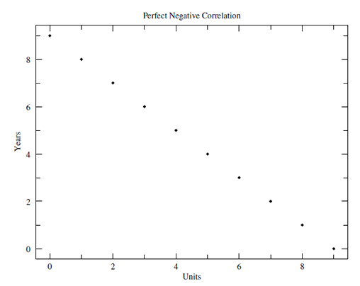
Correlational research examines relationships among variables. An example is the relationship between frequency/duration of exercise and diabetic health status (blood-sugar level). As the frequency/duration of exercise increases, the blood-sugar level decreases. This is an example of a negative correlation.
A positive correlation is one in which if one variable increases, then the other variable increases as well (similarly, if one variable decreases, the other variable decreases). An example of a positive correlation is the relationship between religiosity and perceived health status. The higher the level of religiosity, the higher the level of self-reported wellness or health.
A correlation or relationship between two variables doesn't mean that a change in one variable causes a change in the other. It simply means there is a relationship between two variables.
The correlation coefficient is a measure of the strength of the relationship between two variables. It can range from -1 to +1. The closer the coefficient is to +1, the stronger the positive association between variables. The closer the coefficient is to -1, the stronger the negative association between variables. A correlation coefficient of 0 means that there is no relationship between the variables.
Figure 4.3
Graphing Correlational Data: Perfect Positive Correlation
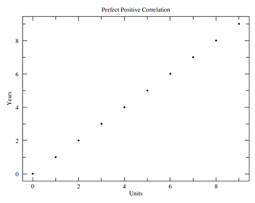
Figure 4.4
Graphing Correlational Data: Perfect Negative Correlation
Experimental research attempts to prove that a change in one variable causes a change in another variable. An experimental study manipulates an independent variable to examine its effect on an outcome (the dependent variable). Study participants are randomly assigned to an experimental or control group. The experimental group receives the intervention while the control group does not. Then the outcomes are measured and compared. One example of experimental research is the examination of the impact of a new health-promotion program for seniors on specific outcome or dependent variables such as food choice, sleep patterns, or physical activity.
The decision of whether to choose a quantitative or a qualitative design is a philosophical question that depends on the nature of the project, the type of information needed, the context of the study, and the availability of resources (time, money, and personnel). This chart spells out some of the distinguishing characteristics of quantitative and qualitative research.
Check your understanding of the differences between qualitative and quantitative research by sorting these research questions.
Research Methods
Research Questions
Now, check your understanding of the differences between qualitative and quantitative research by classifying the following research questions as qualitative or quantitative in nature:
Qualitative
Quantitative
Both Methods
Feedback
Data Analysis
An understanding of certain basic statistical concepts such as variables, hypotheses, scales of measurement, populations, samples, and estimates is essential in the social sciences. This section of the module examines the meaning of these concepts by using an example.
Let's say that we want to look at how talkative people are in general. There is a basic assumption inherent in this interest—we assume that people vary in terms of their "talkativeness" (i.e., some talk more than others). Therefore, we consider "talkativeness" to be a variable. If we wanted to compare how talkative people are at work compared to how talkative they are at parties, then location (work vs. parties) would also be a variable. We now have two distinct variables, talkativeness and location.
In this case, location is our independent variable because we have some control over it (it may help to use the first letter of independent, i, to represent the phrase "I control"). Talkativeness is our dependent variable; we can measure it, but we cannot control it (here, you may think of the first letter of dependent, d, to represent "don't control").
Going further with our example, we will posit that people are more talkative at parties than at work. This would be our research hypothesis. The opposite of our research hypothesis is that people are either equally talkative at work and parties, or that they talk less at parties. These are called null hypotheses. In order to evaluate our research hypothesis, we need to figure out how to measure our two variables, location and talkativeness. Location is an easily-measured variable. You can only be in one place at a time (work vs. party)! You cannot be working a bit and partying a lot at the same time (presumably)! Therefore, the scale of measurement here is considered nominal.
Talkativeness can be measured in many different ways. If we compare the talkativeness of some people to the talkativeness of others, then we have an ordinal scale of measurement. However, if we count the number of actual words spoken, we have a ratio scale of measurement.
We typically like to make statements about "people in general," but how can we do this when we are basing our results only on the friends who are at our party? On the other hand, is it feasible to invite all the people in the world to our party? Therefore, we are drawing conclusions based on the behaviors of a sample of the larger population. Nevertheless, by using the appropriate research methods, we can make a guess or estimate about talkativeness based on our sample situations.
As we move into the area of analyzing the data that we’ve collected, let’s look at a different example. Suppose we were to ask you, "How many movies have you seen per week in the past year?"
Let’s say you can only remember the number of movies that you saw during each of the last 10 weeks. This is a sample since you don’t have numbers for all 52 weeks. Suppose that the numerical values for the past 10 weeks of movies are:
Figure 4.5
Sample Frequency Data
| Week 1 | Week 2 | Week 3 | Week 4 | Week 5 | Week 6 | Week 7 | Week 8 | Week 9 | Week 10 |
| 2 | 1 | 3 | 1 | 4 | 1 | 3 | 2 | 1 | 1 |
Source: UMUC STAT 225.
Making Sense of Raw Data
Raw data such as numbers of movies watched per week per year only make sense when they are organized. There are two standard ways of making sense of distributions of raw data. The first method is aimed at counting the amount (or frequency) of data that is of a particular value or range of values. The numerical representation of all these individual frequencies of a distribution is called a frequency distribution.
Translating the above raw data into a frequency distribution, we have:
Figure 4.6
Sample Frequency Chart
| Number of Movies | Frequency |
| 1 | 5 |
| 2 | 2 |
| 3 | 2 |
| 4 | 1 |
Source: UMUC STAT 225.
Central Tendency
Central tendency is one of the most basic concepts used to make sense of a data distribution. It is used to answer questions that contain words like usually, typically, and average; questions such as "How many movies do you see during an average week?" All of these words describe what we generally expect to happen. This is the core of the concept of central tendency.
Of course, nothing is that simple in statistics. We must have a few ways of describing central tendency in order to make it more complicated! There are three types of central tendency: the mean, median, and mode. Any distribution has all three types.
The Mean
The mean of a distribution is the mathematical "average." To obtain its specific value, you simply add all the scores and divide by n (the number of scores). The mean number of movies in our sample is 1.5.
The Median
The median of a distribution is the value representing the middle point of that distribution, with half the scores falling above it and half below. To find the specific value, you simply use the formula, (n + 1)/2. For our movie example, n = 10. Therefore, the median would be the value associated with the (10 + 1)/2 = 5.5.
The Mode
The mode is simply the most frequently occurring score. Looking at our movie example, we see that in five out of the 10 weeks, you saw only one movie. One movie per week is the most frequently occurring score in this distribution. Therefore, the mode in this example is one. Sometimes two or more scores share the highest degree of frequency. In these cases, you have bimodal or multimodal distributions. While a distribution can have only one mean and median, it can have more than one mode.
Comparing the Mean, Median, and Mode
The mean and the median both take all the scores of a distribution into consideration when calculating central tendency. Furthermore, the mean takes into consideration each score's specific numerical value. The median uses the knowledge that a distribution has x number of scores to determine central tendency. The mode ignores all information except which score occurs most frequently. In the next section, we cover variability. We will see that different measures of variability are very similar to these three types of central tendency.
Let’s say we had different samples of how many movies you watched over the last year. Each sample recorded 10 weeks of movie watching, but no two samples had the identical set of 10 weeks in it. What we would probably see is similar mean values for all samples; in other words, the means would be more alike than either the medians or modes. You can also say that "the mean is the type of central tendency that is least subject to sampling variability."
Graphing
The second method of making sense of a frequency distribution is graphing. Graphing takes the numerical summary of a distribution and provides a visual representation of it. Various types of graphical figures can be used, depending on the types of data and the way they are organized. Graphs offer the ability to step back and look at the big picture rather than getting stuck in the minutia of numerical values of a distribution. See the "Presenting Data" section for some examples of frequency graphs.
Variability
If we were to ask people how many movies they tend to see per month, the response might be "two, give or take one." The "two" is an estimate of central tendency and the "give or take one" is a guess about variability. This idea of variability is important because not all values in a distribution are the same. Values can differ a great deal or just a little. Variability gives us a sense of the extent to which scores are alike. It is another important characteristic of a distribution.
For example, another classmate says that "on average" she sees the same number of movies per week as you do. She says that the number of movies she has seen in the last 10 weeks, respectively, are:
Figure 4.7
Movies Per Week (Individual Data)
| 4 | 4 | 0 | 1 | 4 | 2 | 0 | 1 | 1 | 1 |
Source: UMUC STAT 225.
Organizing these data creates the following frequency distribution:
Figure 4.8
Frequency Distribution (Individual)
| Number of Movies | Frequency |
| 0 | 4 |
| 1 | 1 |
| 2 | 1 |
| 3 | 0 |
| 4 | 4 |
Source: UMUC STAT 225
The mean and median values for your classmate’s movie distribution are the same as those for your distribution (in the central tendency activity). However, by looking at them, you can see they differ in their variability. This section looks at standard ways used to measure this variability.
The Range
The range is a lot like the mode. Remember, the mode represented the most frequently occurring value. The range is similar in that it captures the highest and lowest scores of a distribution, neglecting the information contained in between. The range is useful to get a sense of how broad (or variable) is the score distribution. It is limited by its ability to describe the extremes, but not the internal variability of a distribution.
The Standard Deviation and Variance
What if we want to get a measure of how scores vary from some central tendency? Since the mean value is the one measure of central tendency that takes into consideration the value of every score, we use standard deviation and variance to perform this calculation. Standard deviation and variance are very similar concepts. The only difference is that variance is in squared units, and the standard deviation is not.
Z Scores
We learned in the previous sections that the mean and standard deviation are significant characteristics of any distribution. Another significant characteristic is unit of measurement (e.g., meters vs. inches). Would you expect to get the same value for a person’s height in meters as in inches? Of course you wouldn't. But you would agree that they measured the same degree of height but just in different kinds of units.
Z scores solve that problem. They are a universal form of measurement. Transforming regular scores into z scores (otherwise known as standard scores) allows a comparison across different units of measurement. How can this be? Look at the example on height we just talked about. Transforming meters and inches into z scores allows an easy comparison of mean values (subtraction) and standard deviation (division). The two new z distributions should be identical (if the original measurements are precise).
The Normal Curve
The normal or "bell curve" represents a normal distribution of data that always "behaves" in the same manner. A seemingly infinite number of datasets exhibit this pattern. Mathematical formulas (or functions) for a bell curve are identical with the exception of their mean values and standard deviations.
If we were to take the means and standard deviations out of any normal distribution, we would be left with z scores. This is called "the z distribution." The standard normal (z) distribution allows us to find percentages, percentiles, and proportions associated with a single score or the area between scores.
Figure 4.9
Normal Distribution (Bell) Curve

Source: UMUC STAT 225.
Inferential Statistics
Inferential statistics provides us with the means to make statements about what is likely to be true about populations based upon information about a smaller segment of that population (sample).
For example, imagine that we want to see if a new type of medication helps allergy sufferers by decreasing the severity of their symptoms. It would be difficult, and very expensive, to test the drug on all the allergy sufferers in the world. So instead, we try it on a sample and see what happens for this smaller group.
Let’s say we find that, for the allergy sufferers in the sample, their symptoms are reduced by 50 percent. What we are really interested in is the whole population of allergy sufferers. So we use the information we got from the sample and guess what might be true for the population. In this case, we would estimate that on average, the symptoms of all allergy sufferers (a population) would be reduced by 50 percent if the medicine were used.
We use a sample statistic to provide an estimate of a population parameter. Inferential statistics allows us to evaluate whether our estimate is predictable or just due to chance. To help us decide whether the difference is due to chance, we use probability theory.
Probability and Statistical Significance
As scientists, when we conduct an experiment or make observations, we are hoping for definitive findings. The term "probability" (or likelihood) refers to how likely it is that an event will occur or that a statement is true. A probability is given as a percentage from 0 (0 percent chance of occurring) to 100 (100 percent chance of occurring).
If we get the same result in 100 percent of our experiments, we can be confident that our results are "real" (or true), but what conclusions can we draw if the same result occurs only 50 percent of the time? We may conclude that extraneous variables or conditions are affecting our results. If we get similar results when we "control" for these variables or conditions, we need to face the possibility that our findings are not real; they may be occurring by chance or coincidence. How do we calculate that likelihood?
The term statistical significance refers to whether the probability of the difference between two results is real or due to chance alone. Statistical significance is expressed in terms of levels of confidence. We can say that the probability that a result is due to chance is less than 5 percent. We can also say that we are 95 percent confident that a research finding is real, and not due to chance. If we want to be even more conservative, we can say that the probability that the difference is due to chance is less than 1 percent, or that we are 99 percent confident that our result is not due to chance. These probability values are usually reported in research articles as p<.05 and p<.01, respectively.
Presenting Data
Presenting data clearly is as important to the success of a research study as methods and statistical procedures. As you look at the following table and graphs, ask yourself why the researcher decided to present the data in this way.
Click on the individual figure number to check your response.
Figure 4.10
Ratio Data Presented in a Table
| Ratio of Social Security Covered Workers to Beneficiaries Calendar Years 1940-2010 |
|||
|---|---|---|---|
| Year | Covered Workers (in thousands) | Beneficiaries (in thousands) | Ratio |
| 1940 | 35,390 | 222 | 159.4 |
| 1945 | 46,390 | 1,106 | 41.9 |
| 1950 | 48,280 | 2,930 | 16.5 |
| 1955 | 65,200 | 7,563 | 8.6 |
| 1960 | 72,530 | 14,262 | 5.1 |
| 1965 | 80,680 | 20,157 | 4.0 |
| 1970 | 93,090 | 25,186 | 3.7 |
| 1975 | 100,200 | 31,123 | 3.2 |
Source: U.S. Social Security Administration.
Figure 4.11
Trend-Mapping Graph
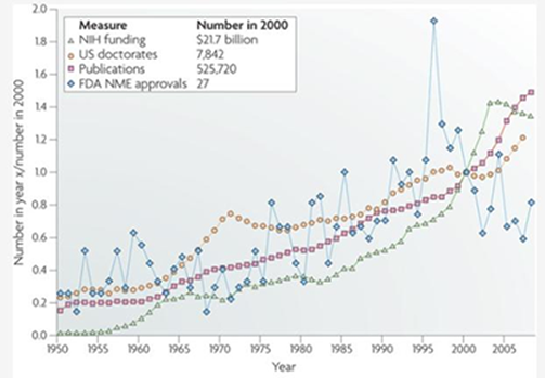
Source: Nature Reviews Drug Discovery.
Figure 4.12
Scatterplot Graph
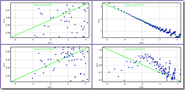
Source: National Institutes of Health, Research Services Branch.
Figure 4.13
Bar Graph
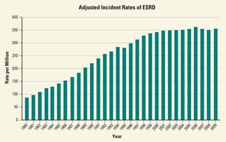
Source: National Kidney and Urologic Diseases Information Clearinghouse (NKUDIC).
Figure 4.14
3-D Bar Graph
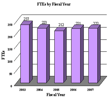
Source: National Institutes of Health, National Eye Institute.
Figure 4.15
Pie Chart
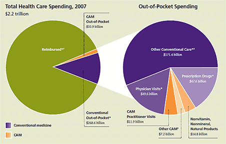
Source: National Institutes of Health, National Center for Alternative and Complementary Medicine.
Figure 4.16
Standard Line Graph
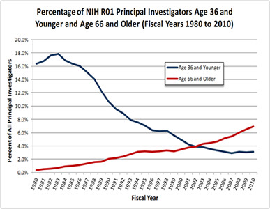
Source: National Institutes of Health.
Figure 4.17
3-D Shape Graph
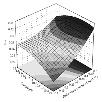
Source: Journal of Automated Methods and Management in Chemistry. Used under the terms of the Creative Commons Attribution license.
Graphing Tutorial
To check your knowledge and skills in presenting data graphically, give this graphing tutorial a try.
http://coursedev.umgc.edu/VCBW000/Concentration/pHLevelsGraph.html